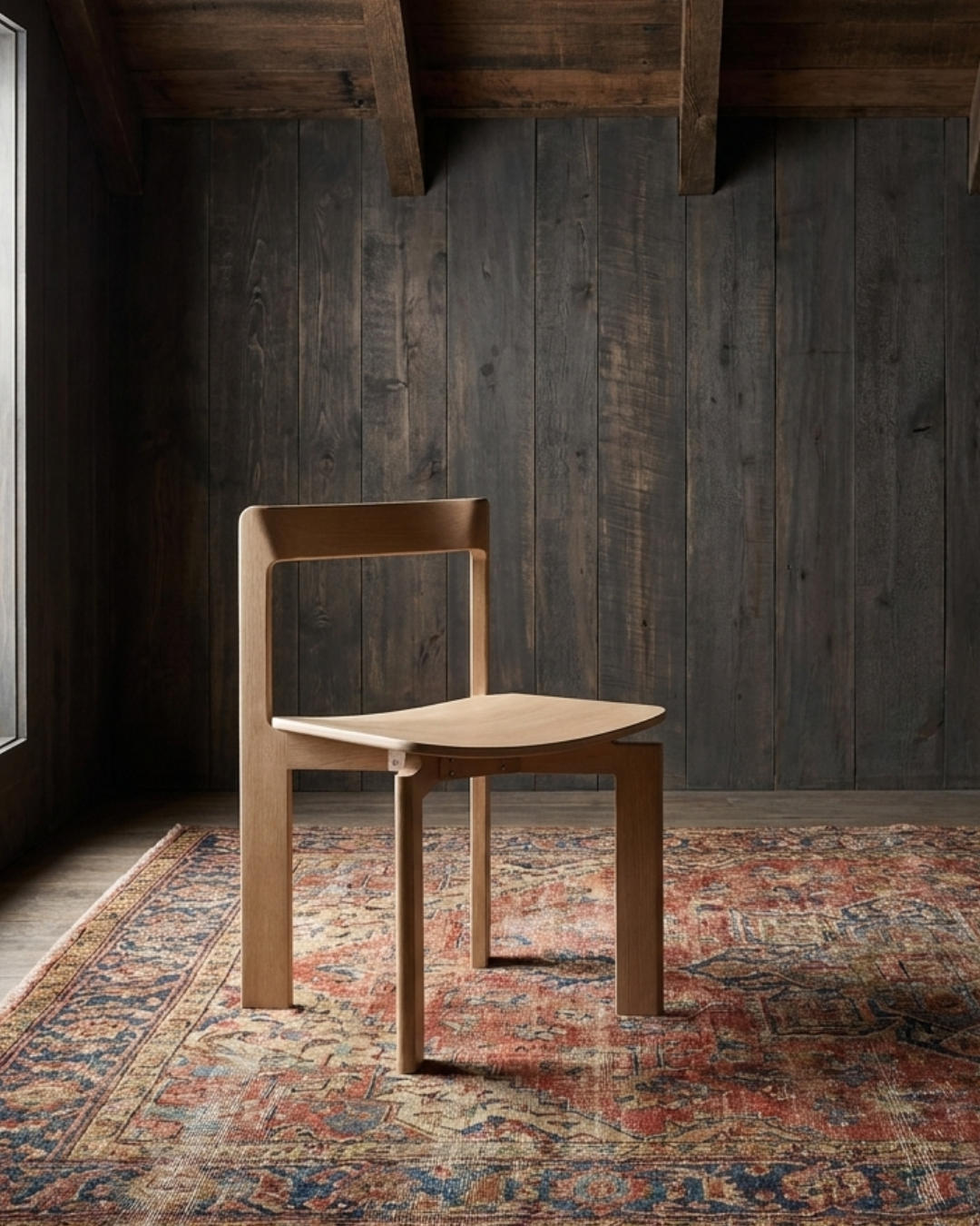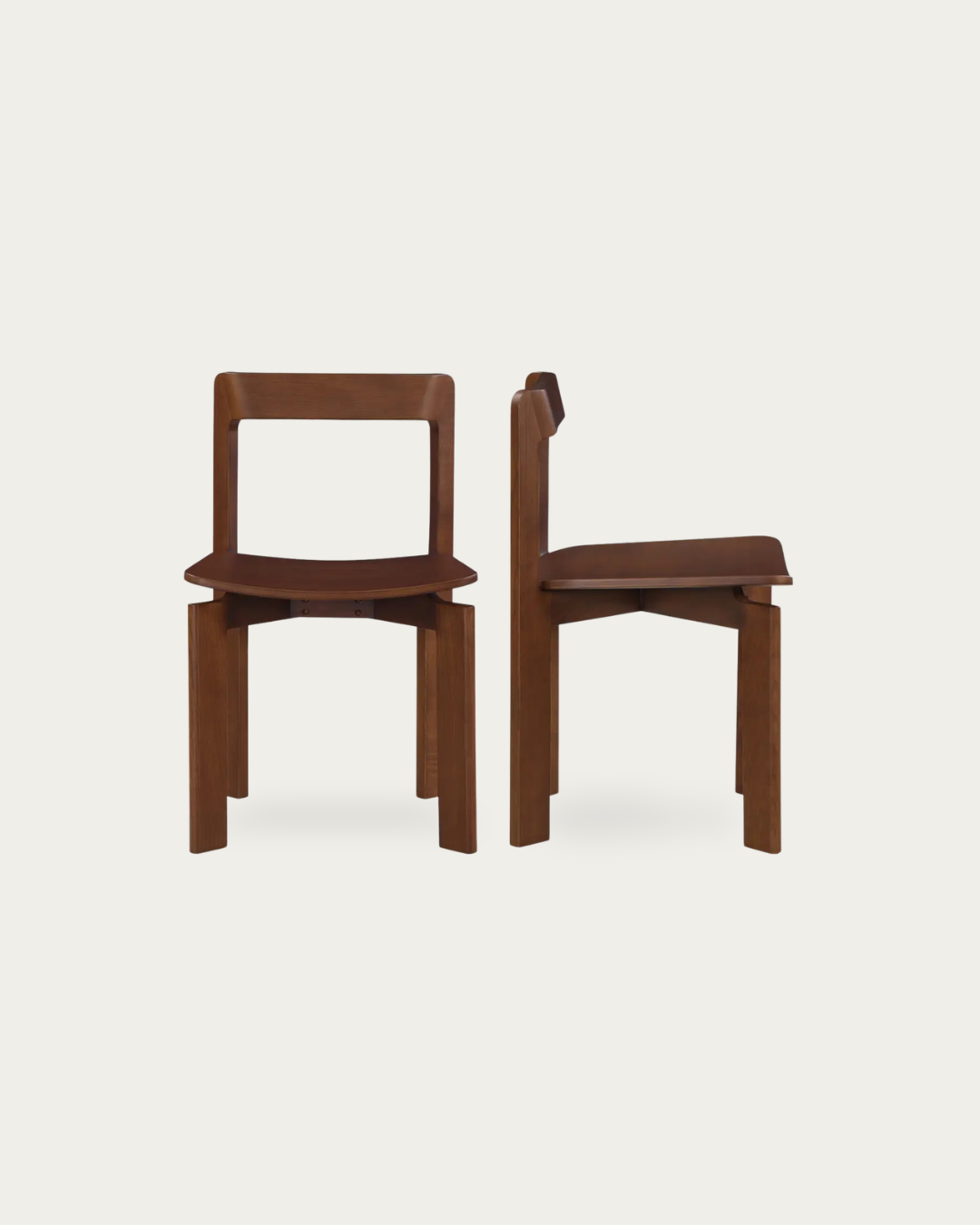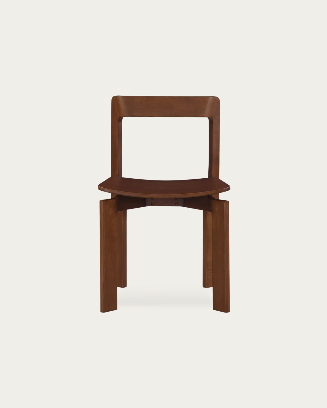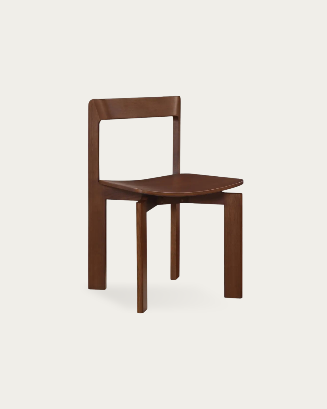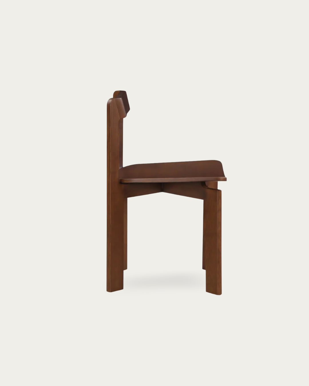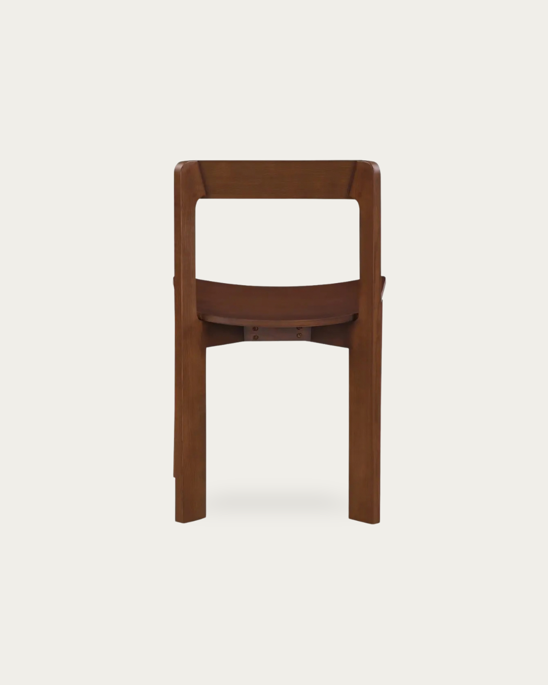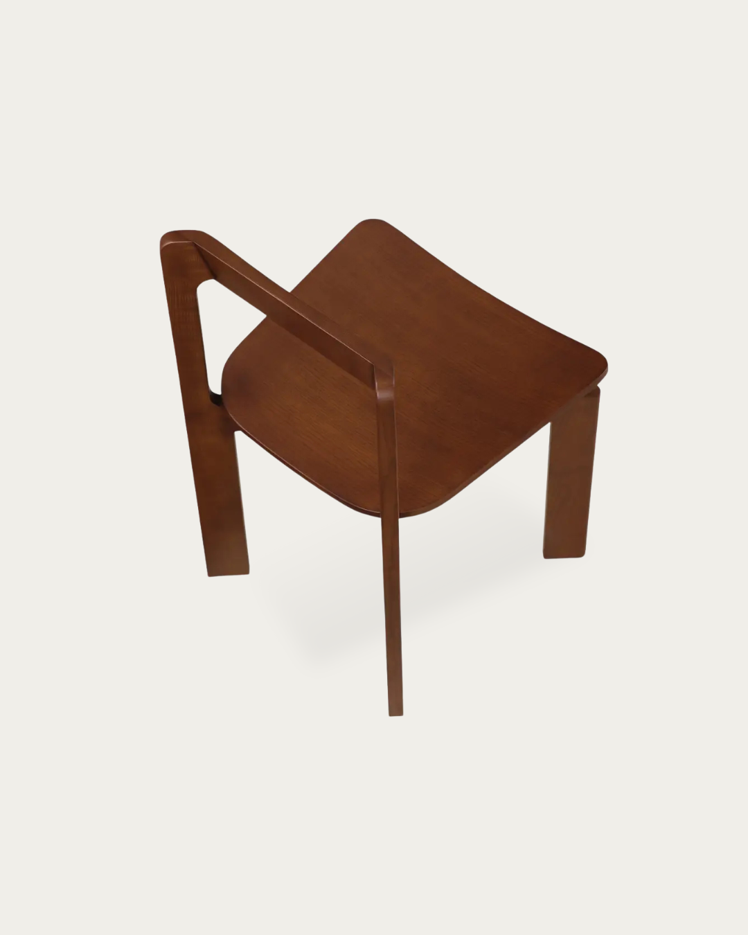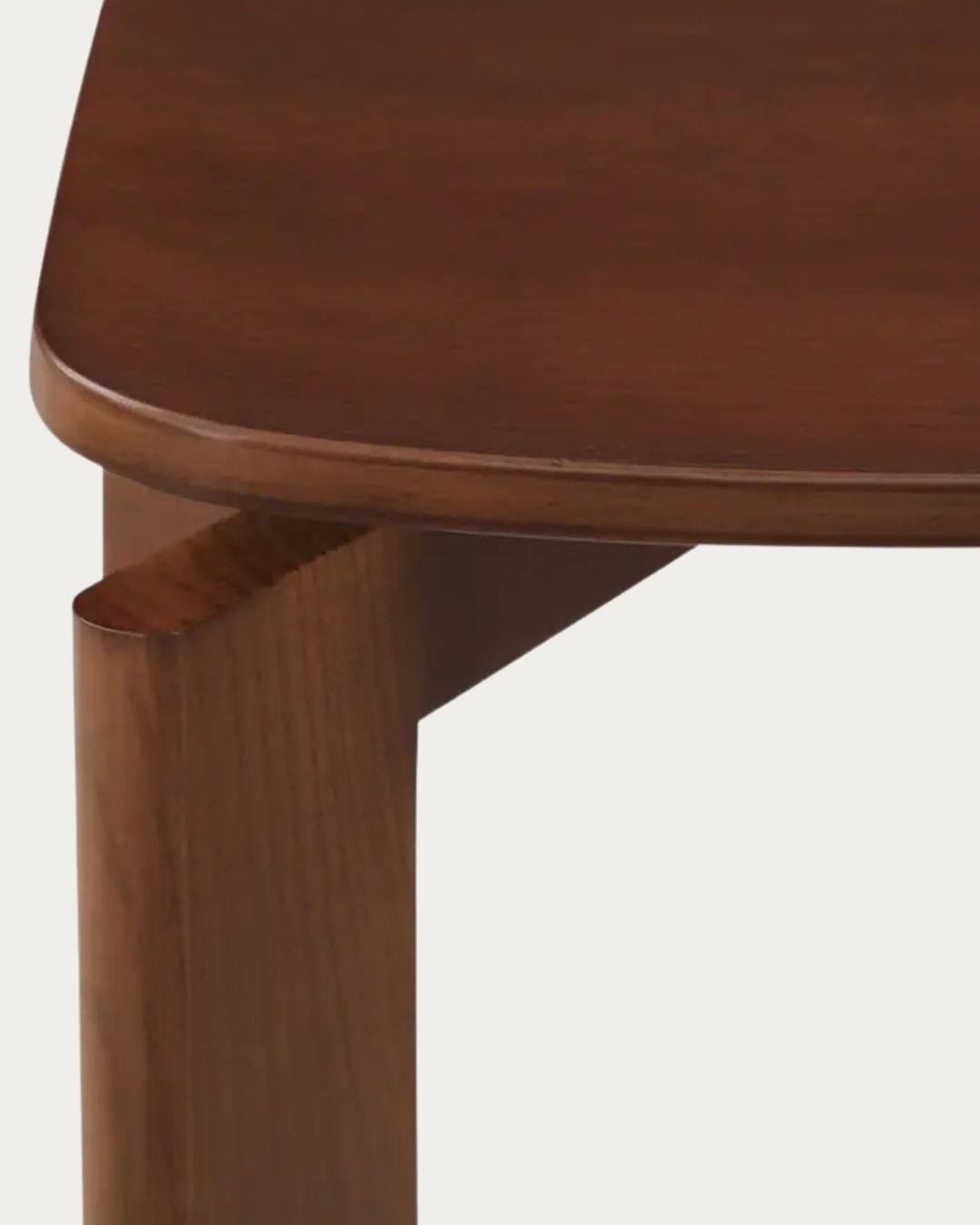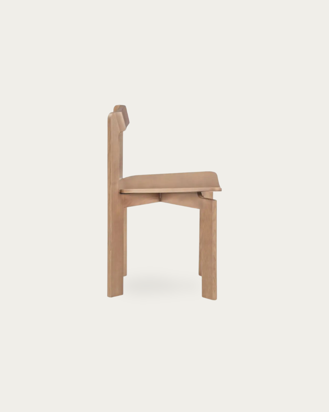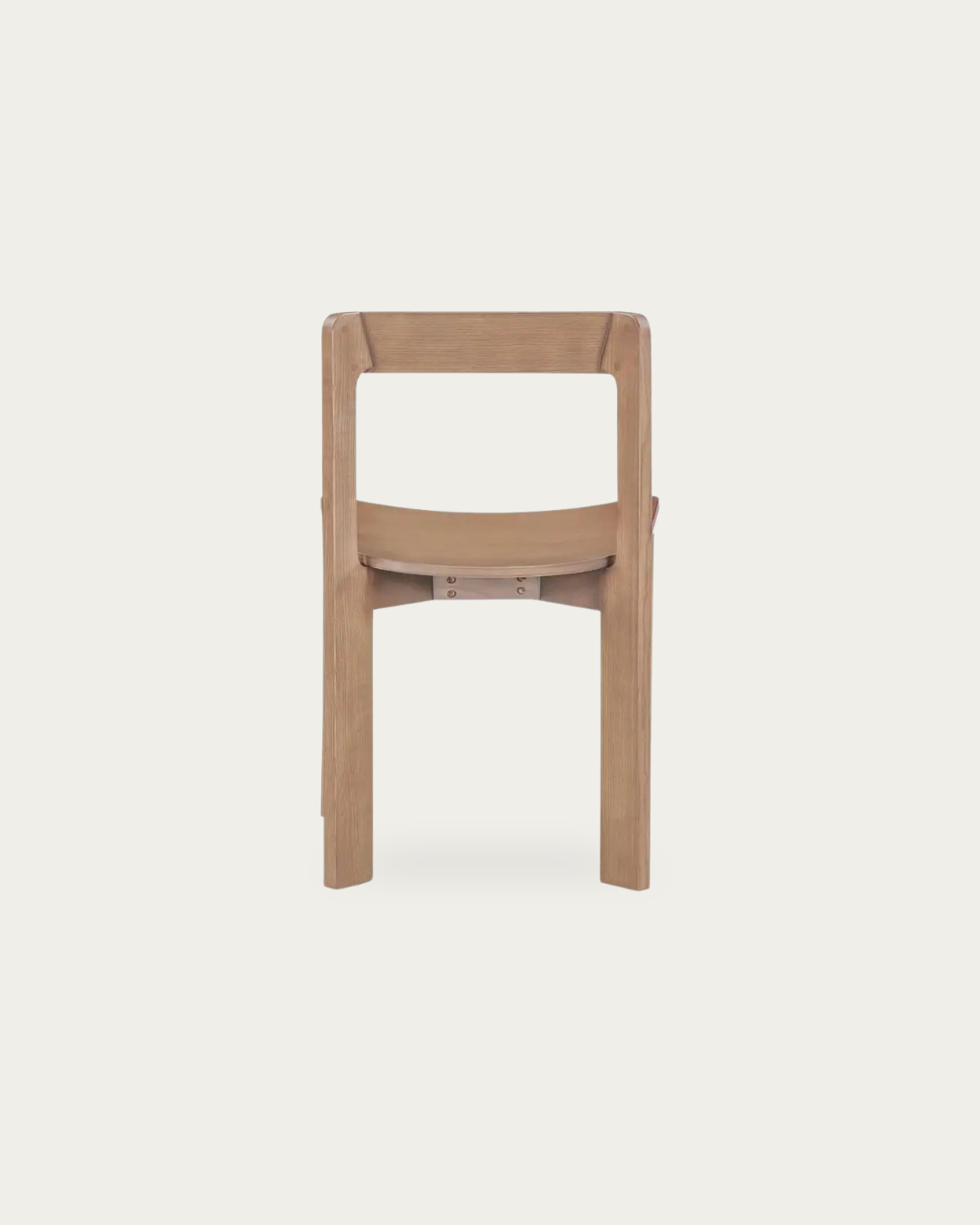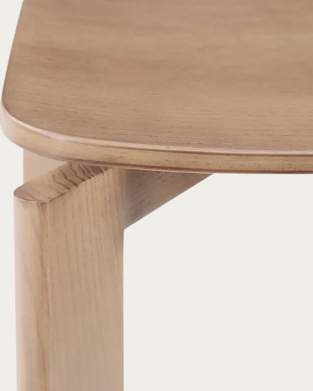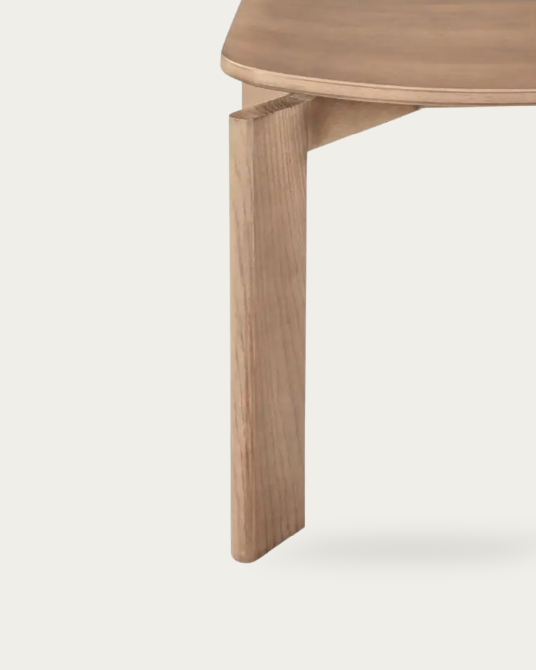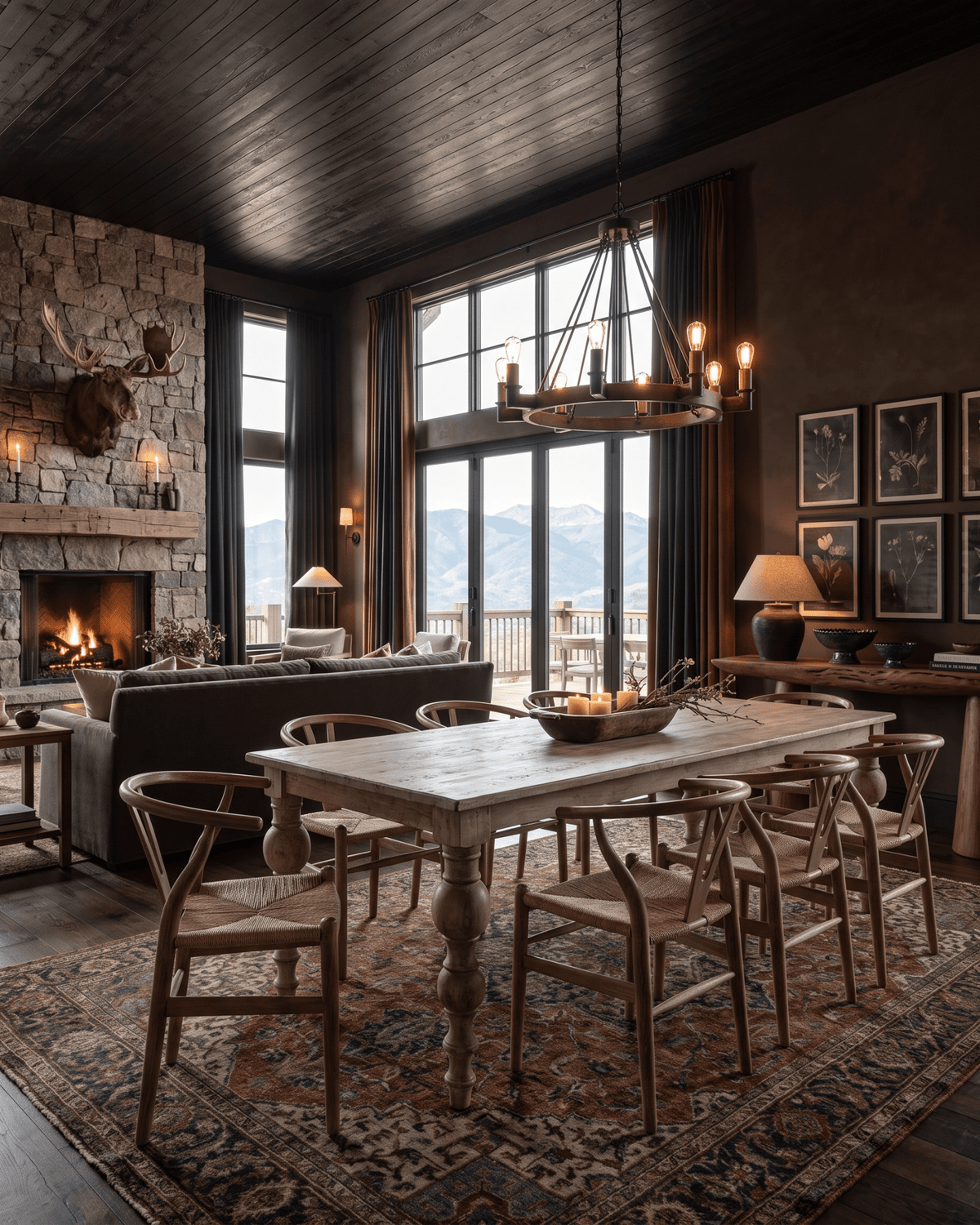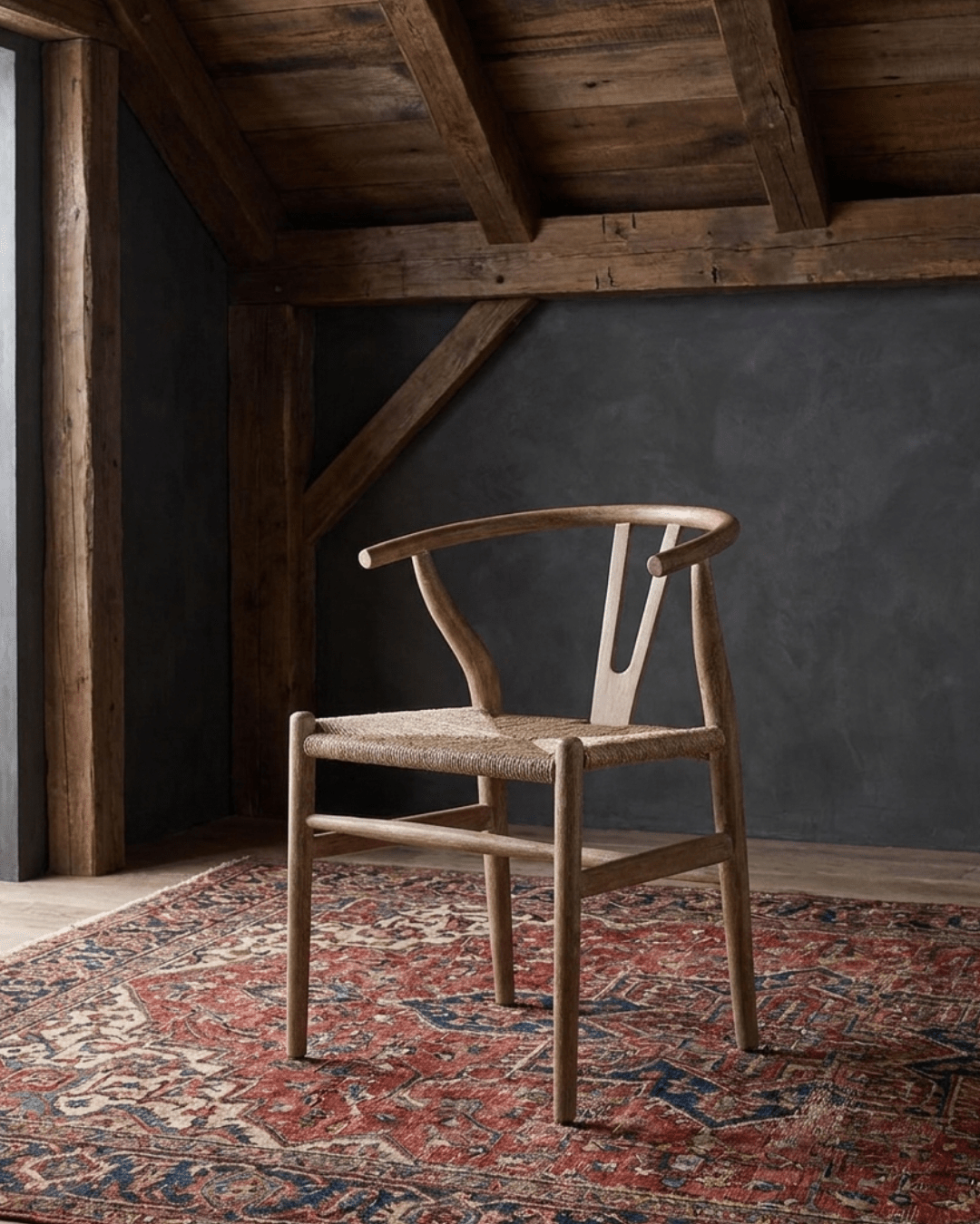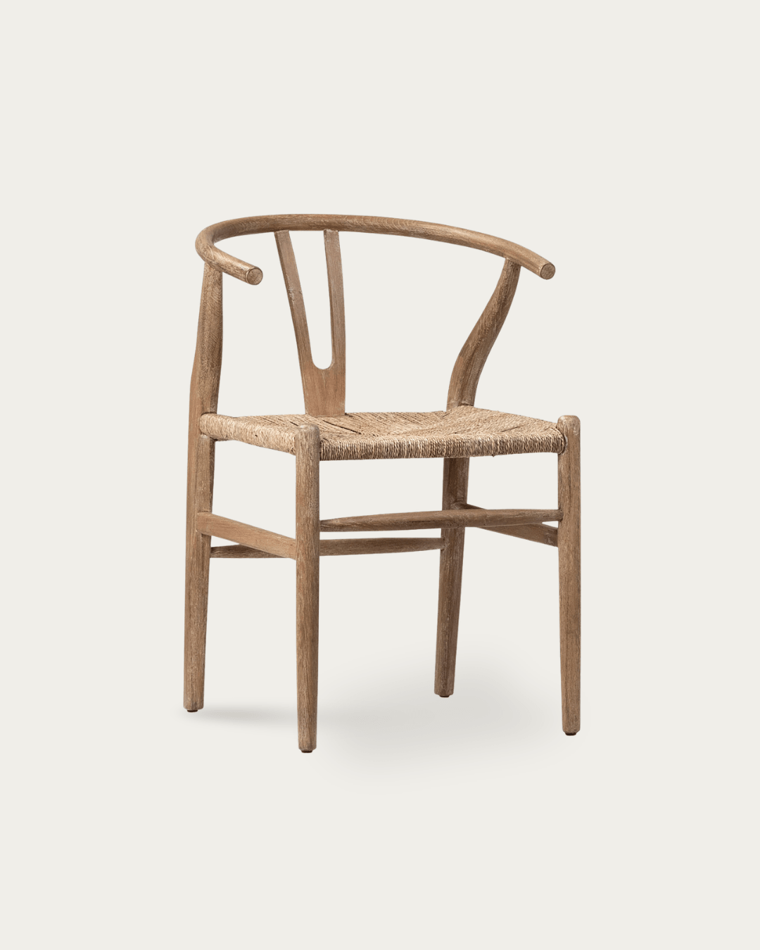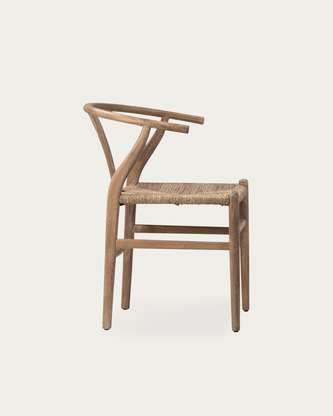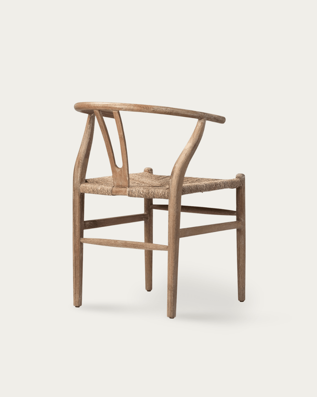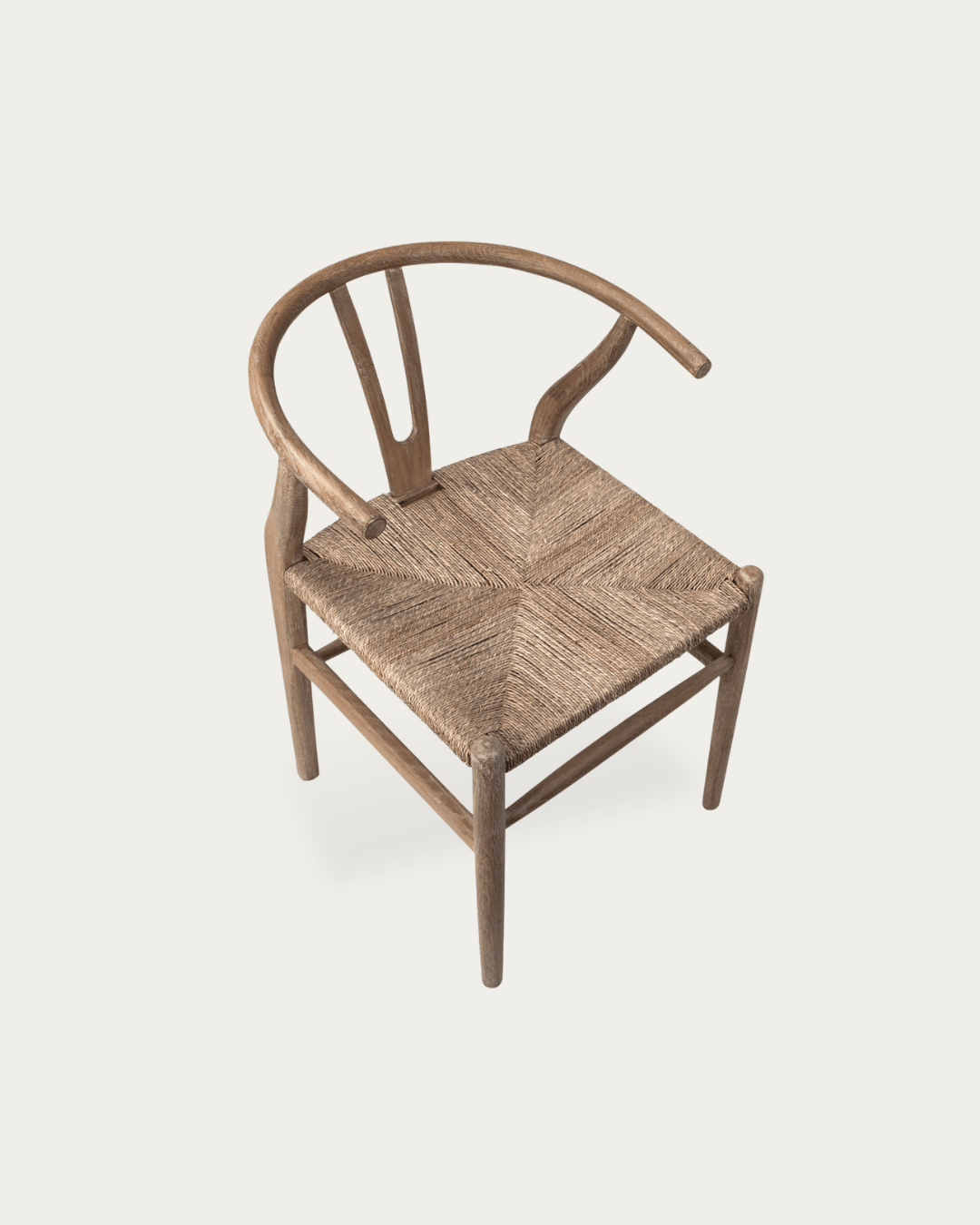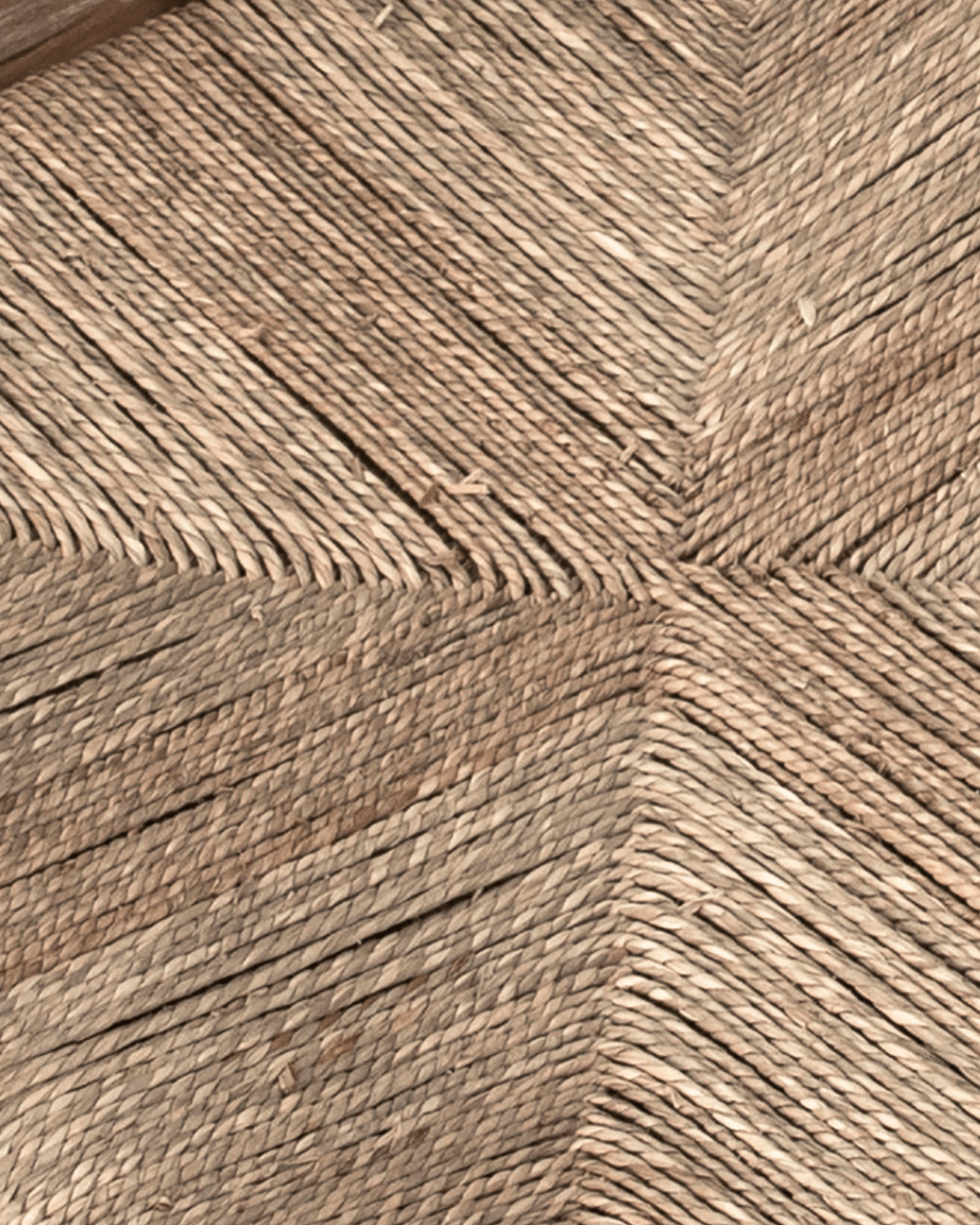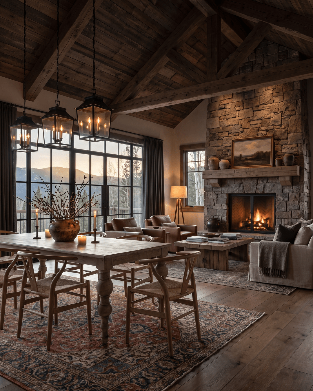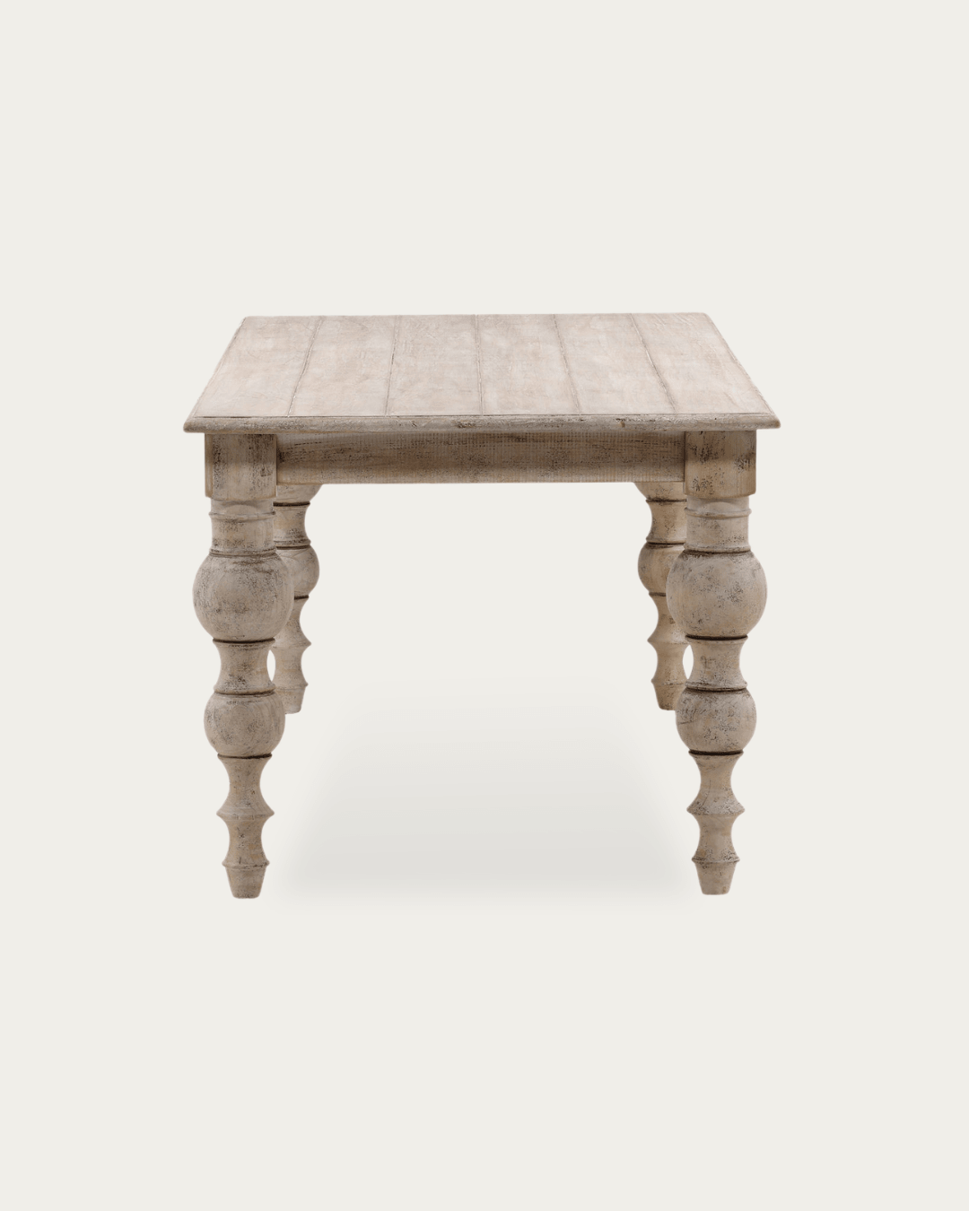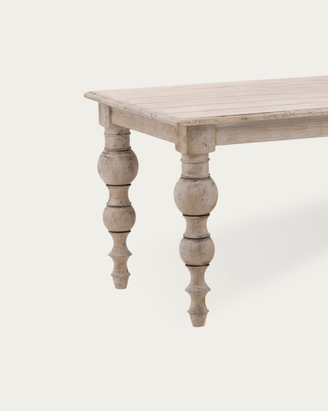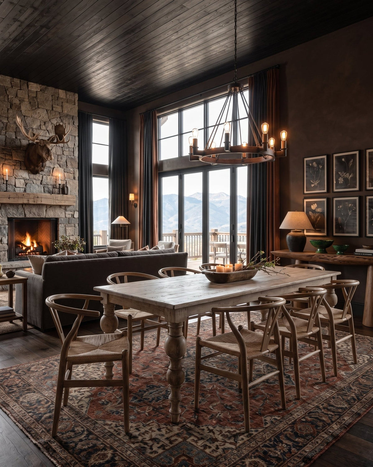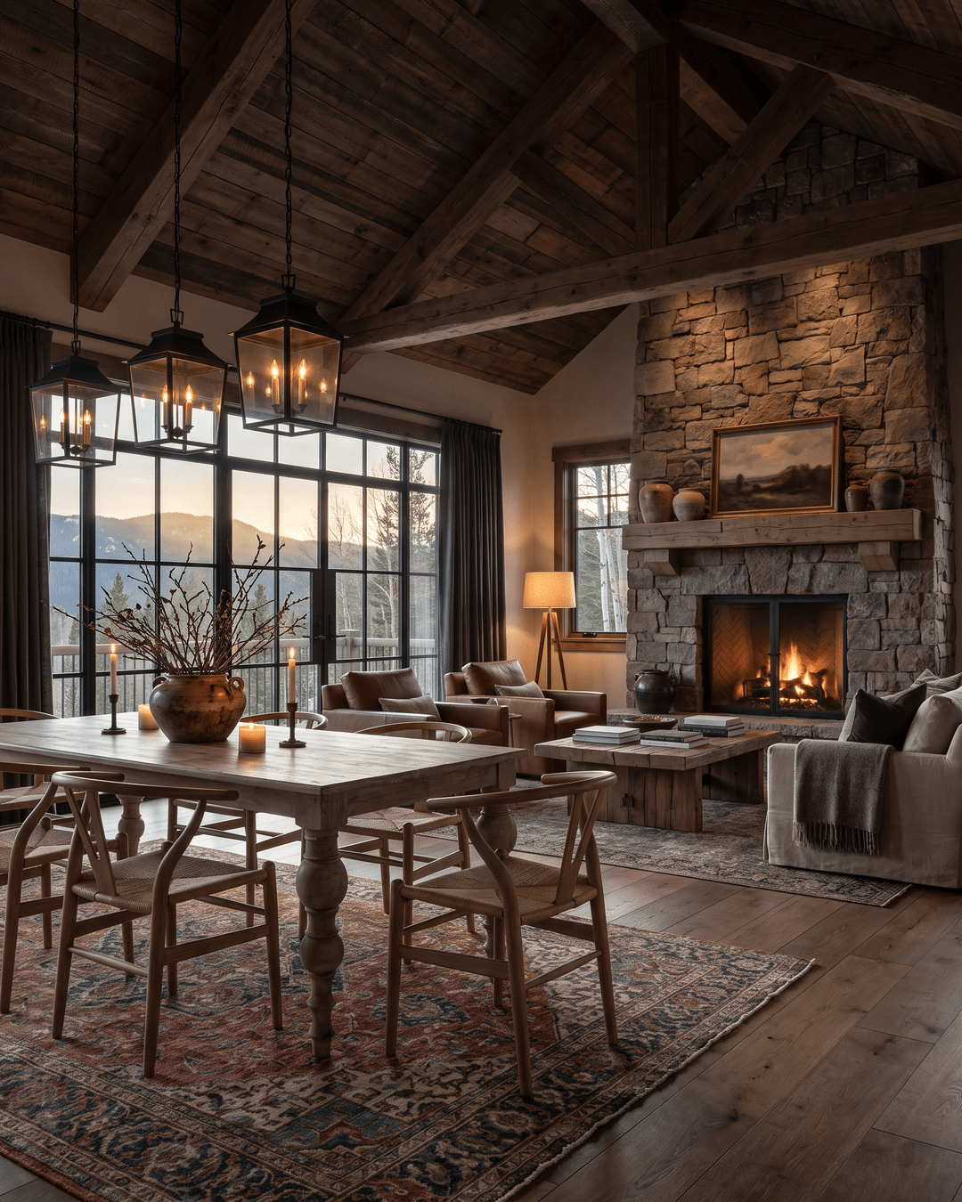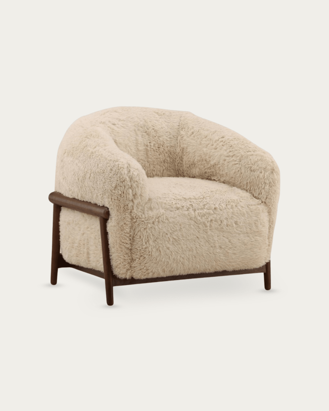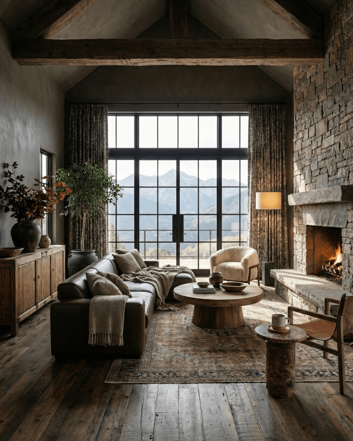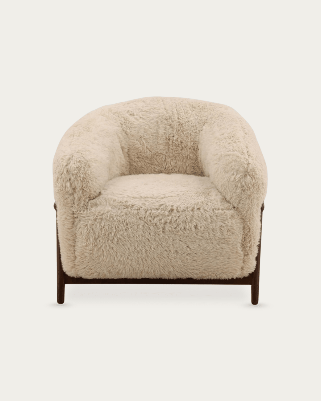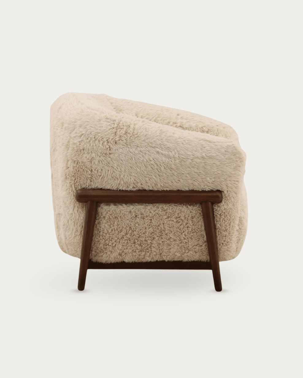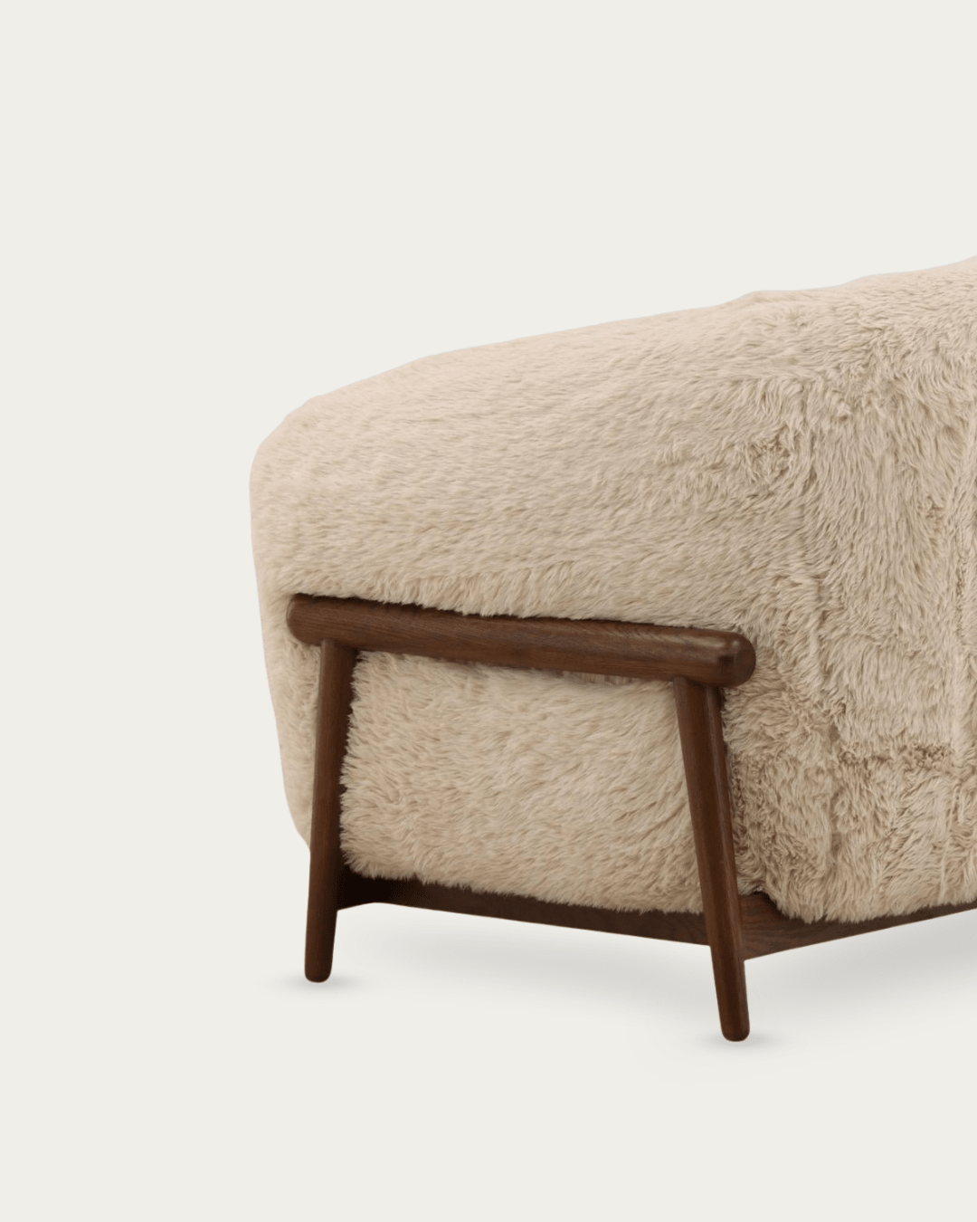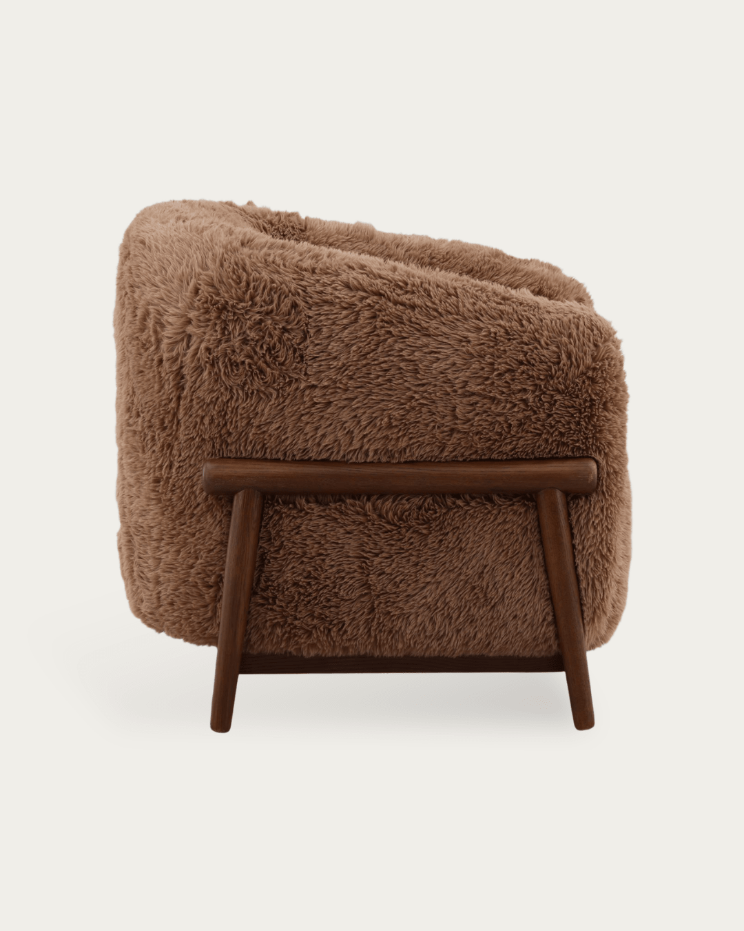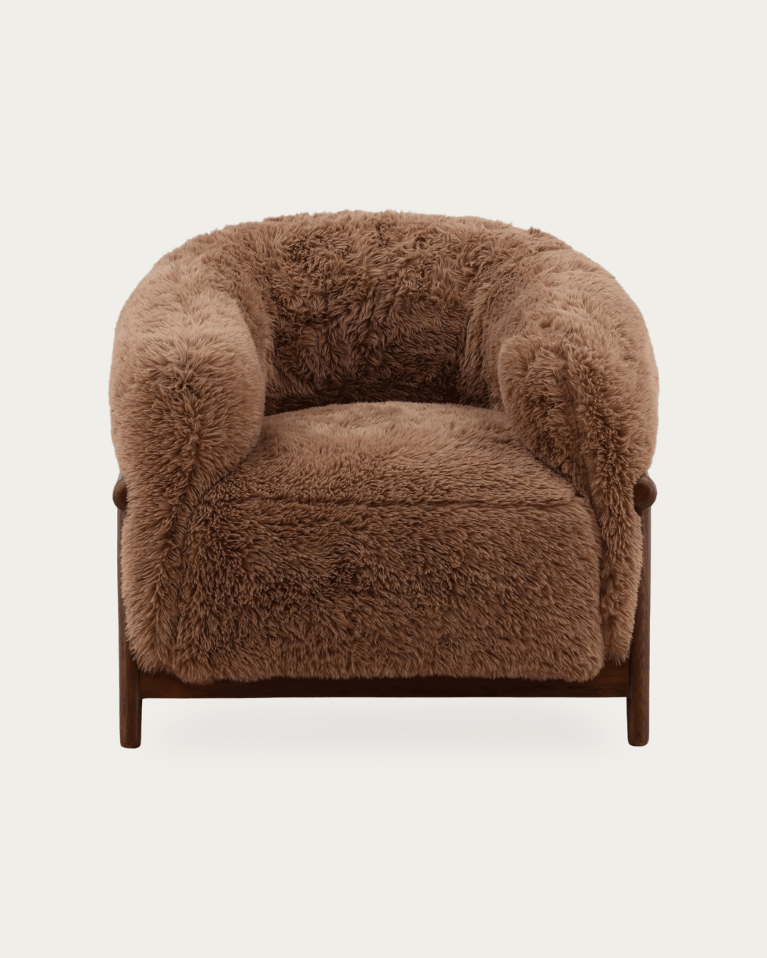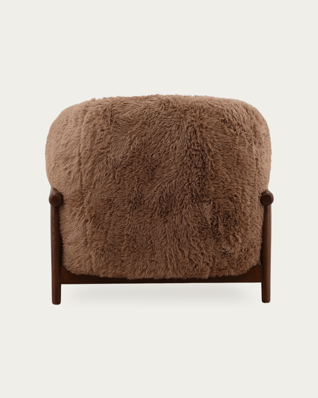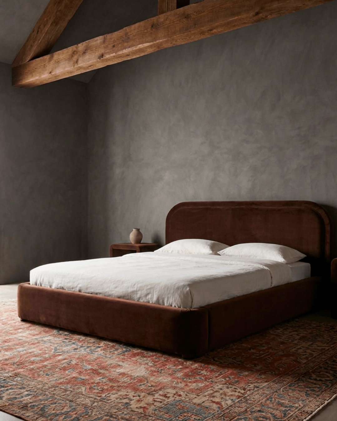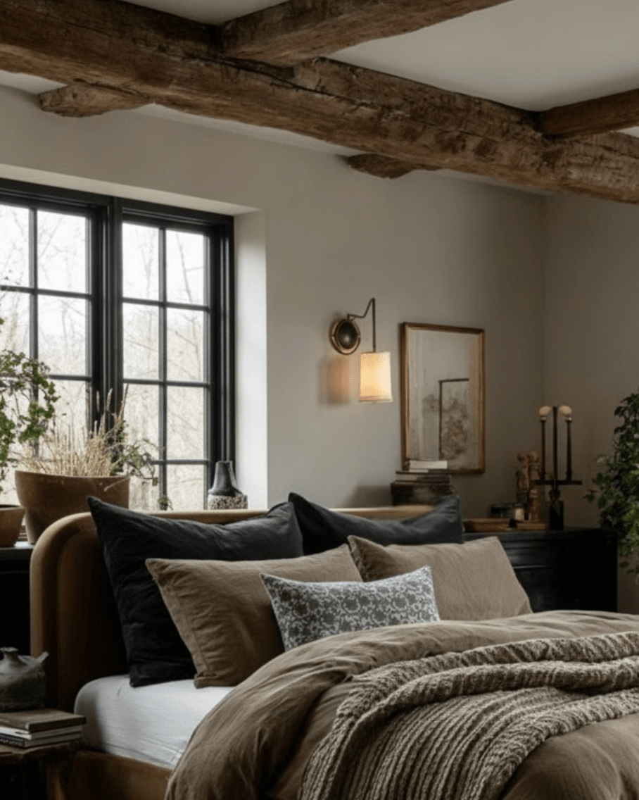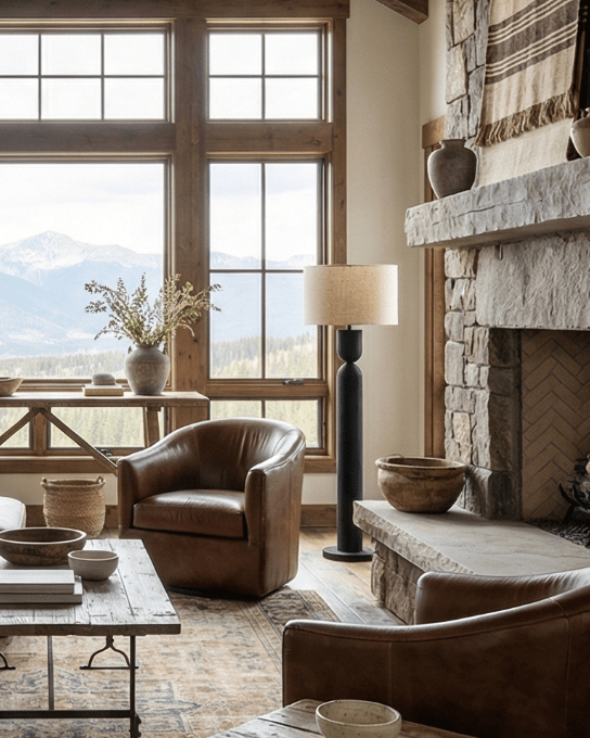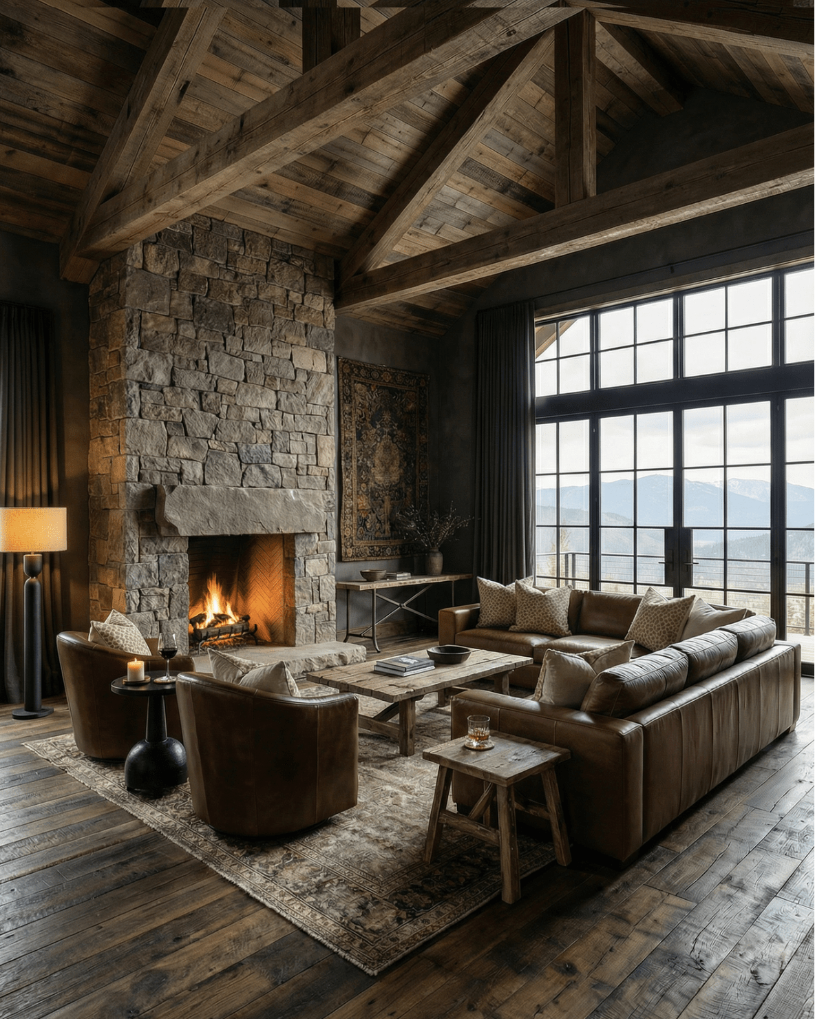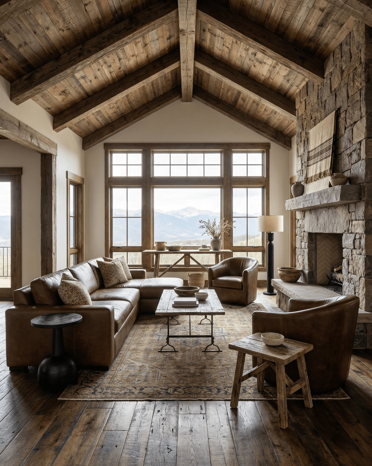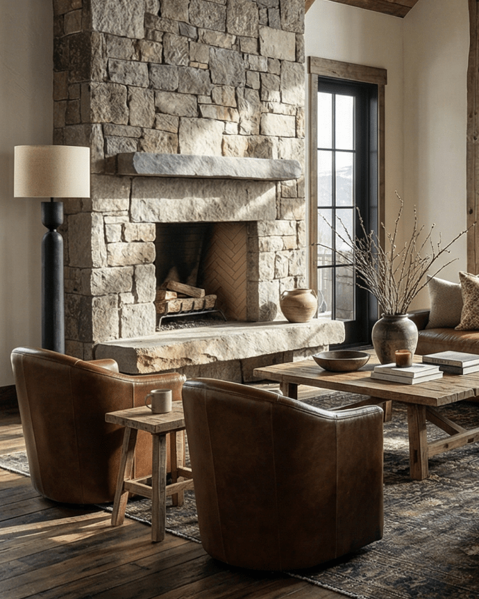






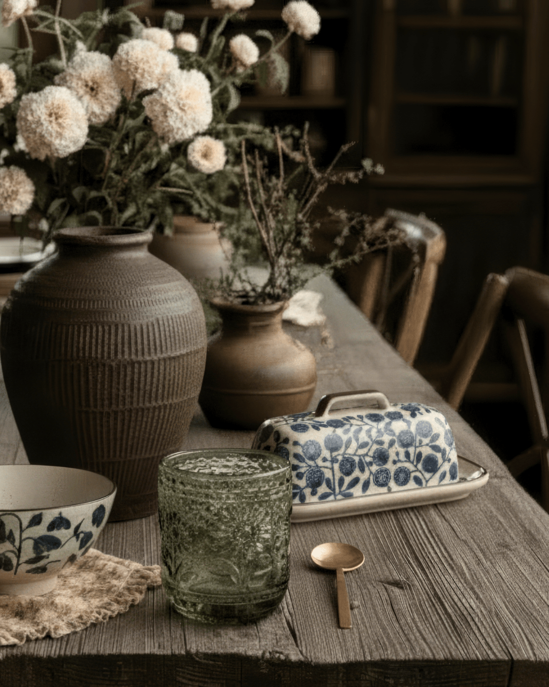


You've chosen the cream sofa, pale rug, natural wood, linen curtains, and soft off-white walls. Everything is coordinated. Nothing looks obviously wrong.
And somehow the room still feels flat.
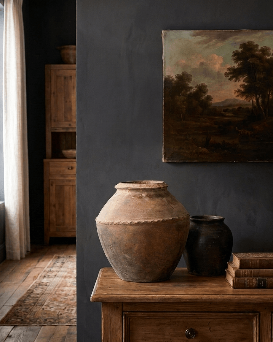
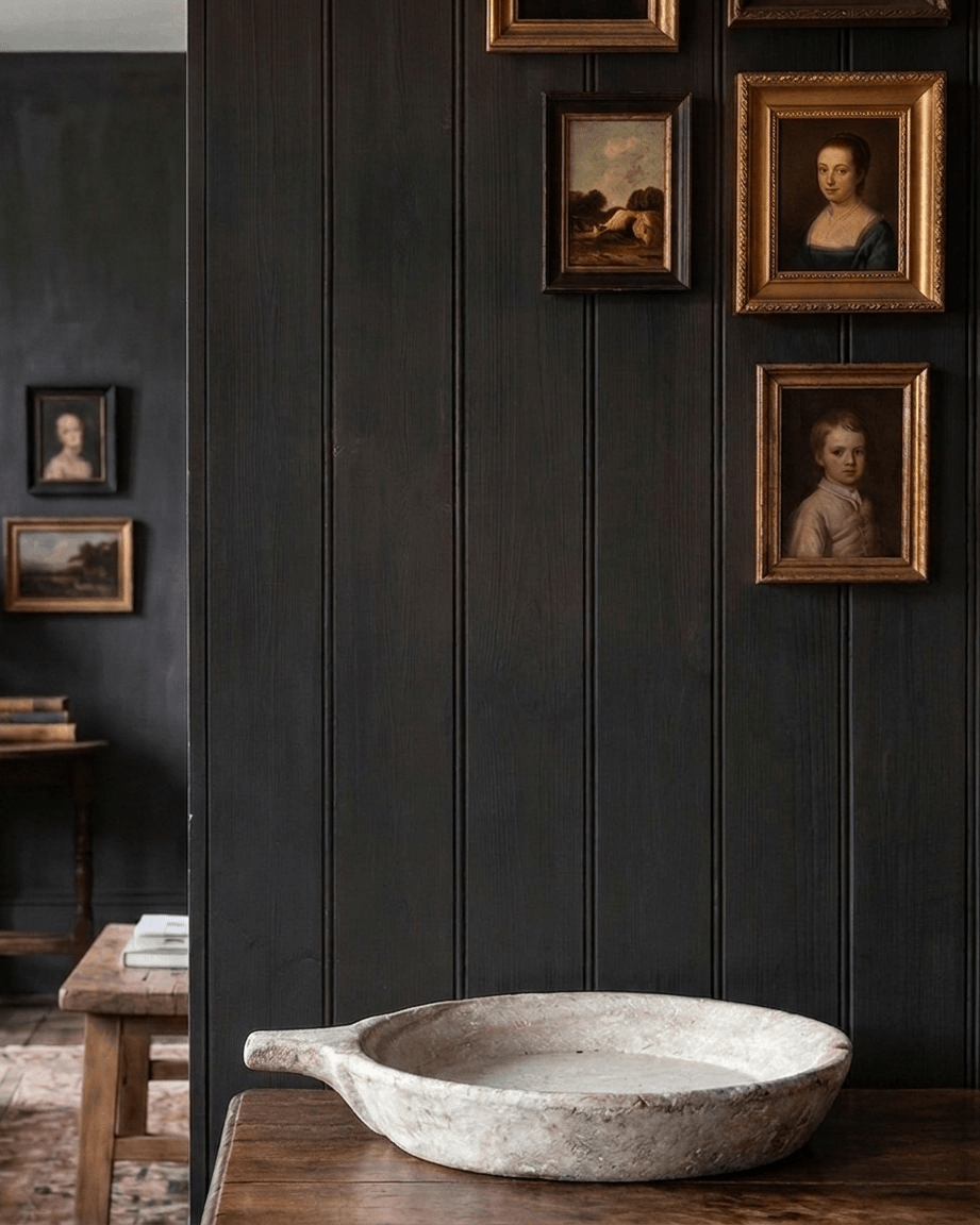
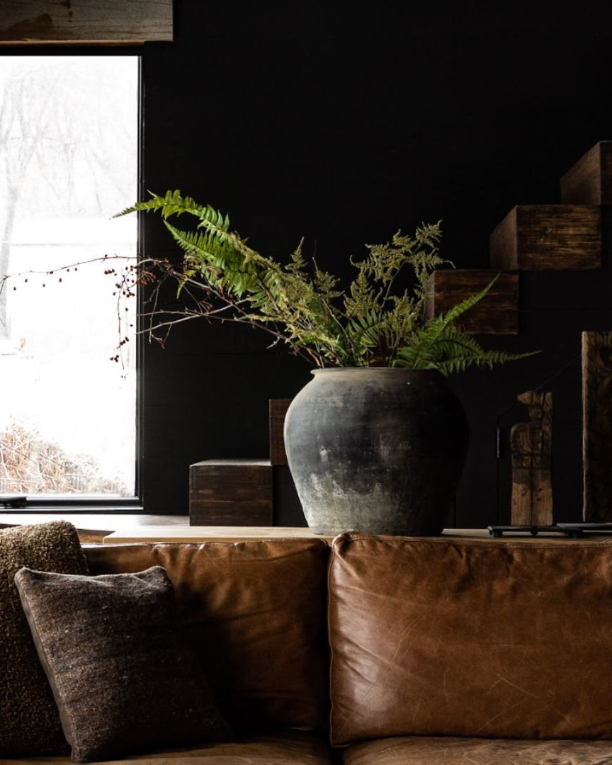
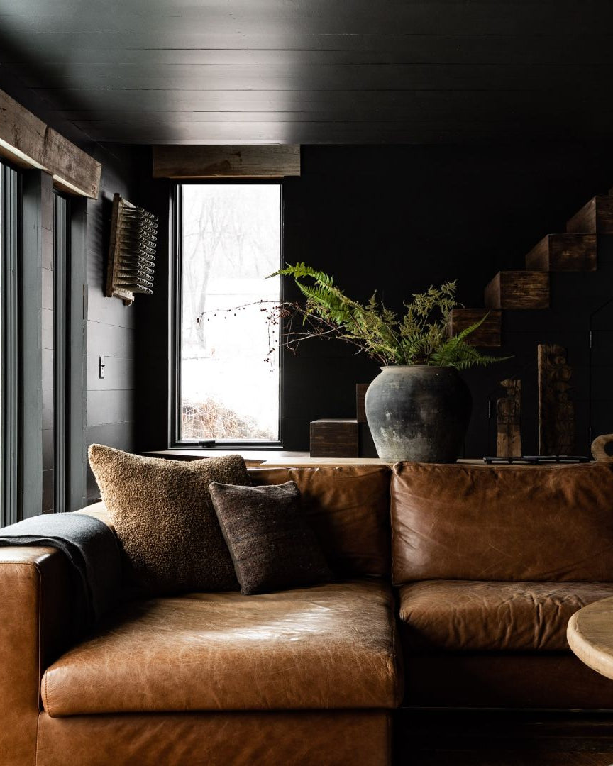
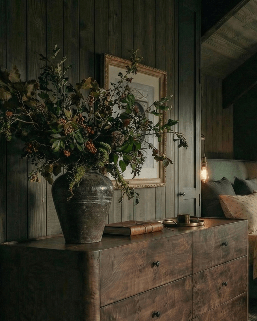
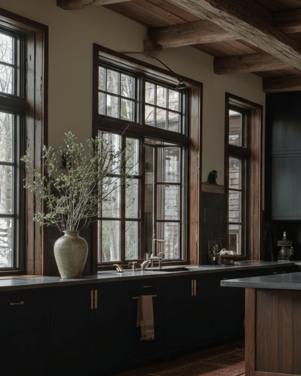
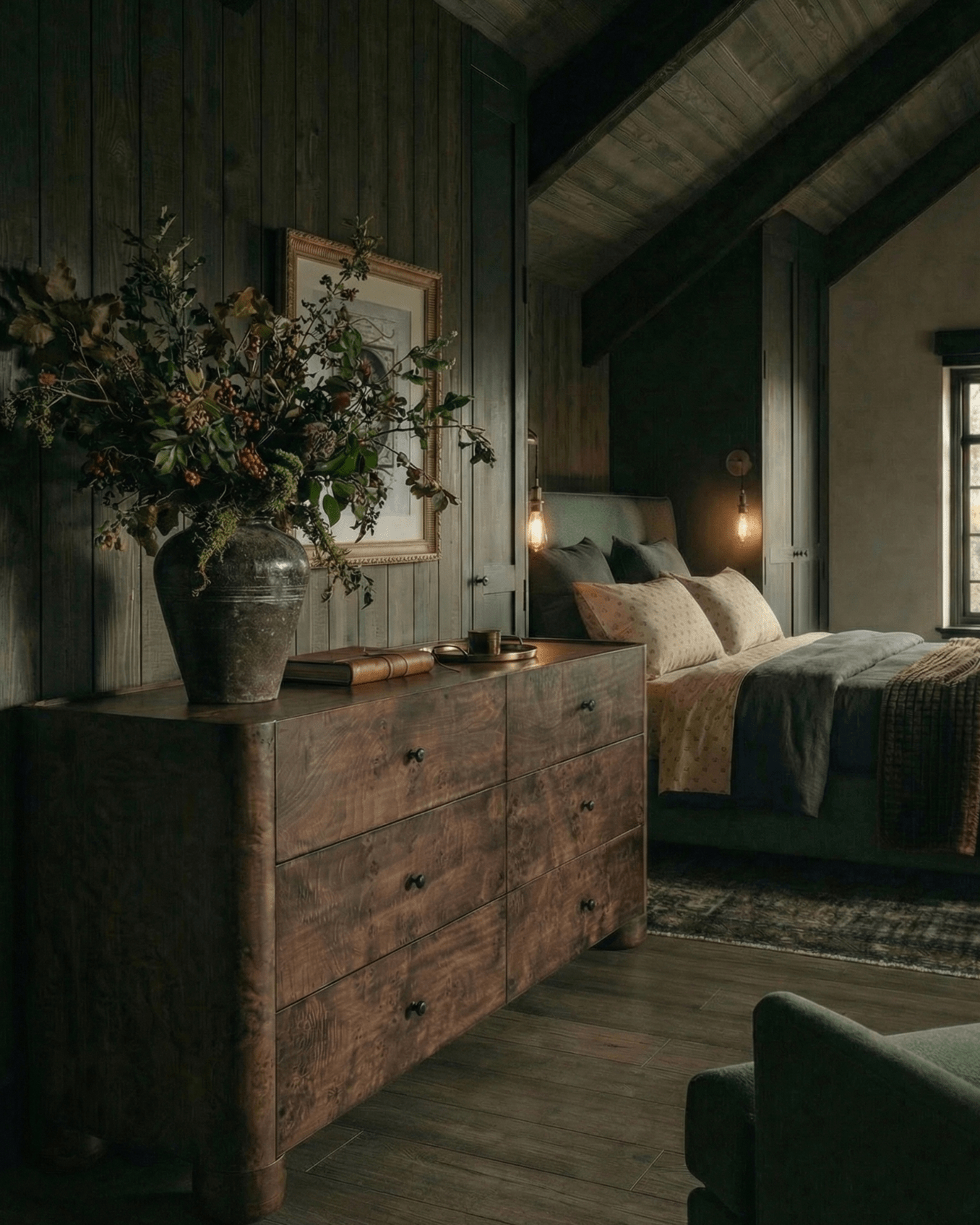
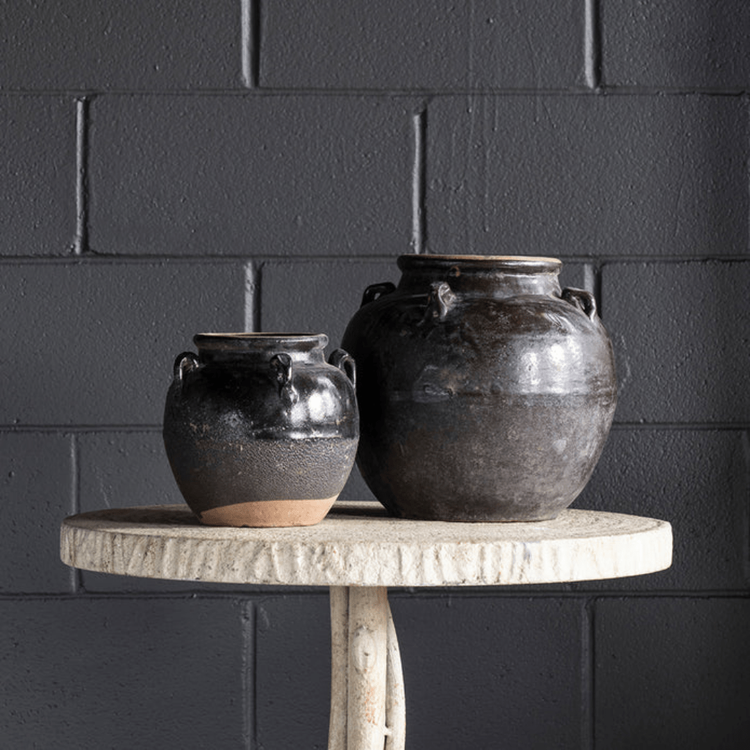
The missing ingredient may be contrast. When too many surfaces sit within the same tonal range, edges become less distinct, and furniture can visually blend together. Introducing black furniture gives the eye stronger reference points, making lighter colors, natural materials, and architectural details easier to distinguish.
The goal isn't to turn a neutral living room into a black-and-white one. It's to give all those quieter tones something to work against.
Explore Hello Norden's black furniture collection for pieces that can introduce definition without rewriting your entire room.
Neutral Isn't the Problem. Low Contrast Is.
Beige isn't boring.
Cream isn't boring.
Natural wood isn't boring.
The problem starts when every major surface has roughly the same visual intensity.
Imagine a cream sofa sitting on a beige rug against an off-white wall with a pale oak coffee table in the middle. Each material may be beautiful individually, but from across the room their boundaries begin to soften.
The eye gets very little hierarchy.
Nothing says, "Look here first."
That's where darker furniture becomes useful.
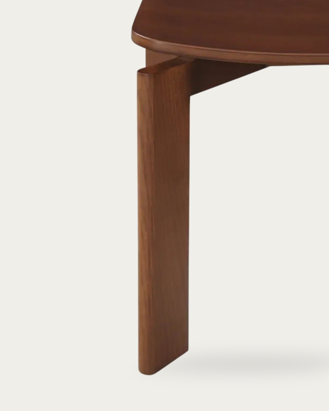
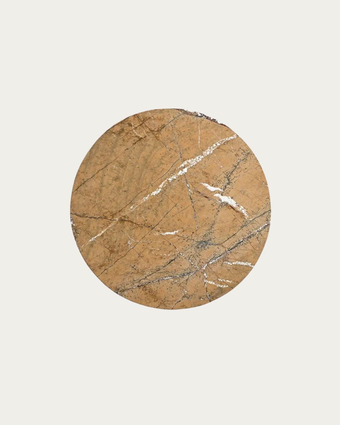
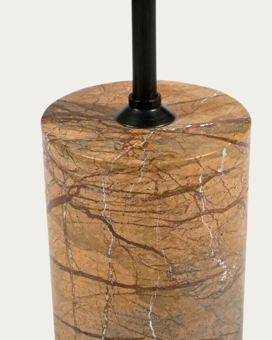
The Alvhild coffee table can establish a defined center within a pale seating arrangement. The Astri marble coffee table introduces darker contrast while retaining natural variation through its material.
Think of Contrast as Definition
Contrast doesn't need to be dramatic.
It simply needs to create enough separation between neighboring elements.
Dark against light.
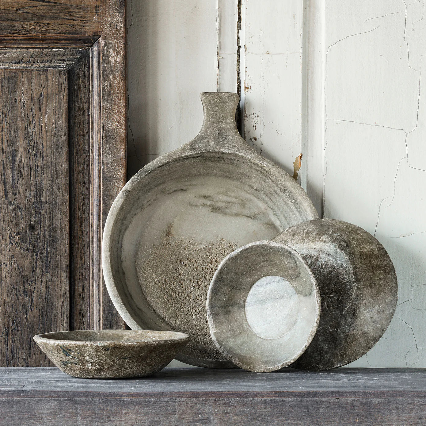
Rough against smooth.
Solid against open.
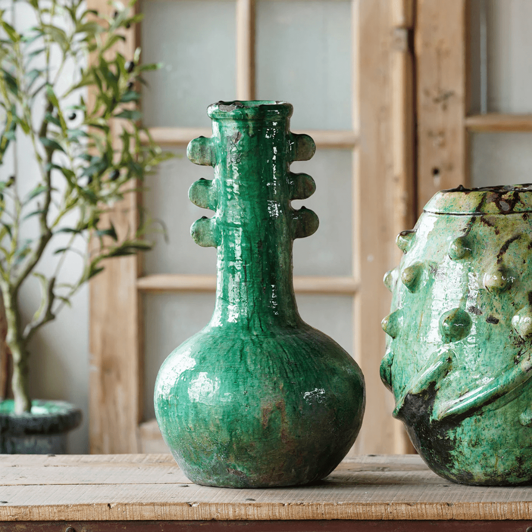
Matte against reflective.
A successful neutral room often contains more contrast than you initially realize. It just doesn't necessarily come from bright colors.
A Black Coffee Table Can Give the Room a Center
If you're going to introduce one substantial darker piece, the coffee table is a logical place to start.
Why?
Location.
A coffee table sits between the largest pieces of furniture in the room. Your eye encounters it while moving between the sofa, lounge chairs, rug, fireplace, and surrounding architecture.
When that table has enough visual presence, it helps pull those individual pieces into one recognizable seating zone.
A black coffee table can be especially effective when the sofa and rug are similar in tone.
The Hedvig wood coffee table introduces darker definition while preserving the visible character of wood, while the Signe stone and wood coffee table uses contrasting materials to add another layer of visual depth.
Don't Automatically Cover the Table
Once you've introduced a strong central anchor, let it work.
A tray, books, bowl, vase, candle, sculpture, and decorative chain aren't mandatory membership requirements for coffee tables.
If the surface already has interesting grain, stone variation, or texture, leaving some of it visible creates useful negative space.
Sometimes styling means knowing when you're finished.
Flat Rooms Usually Need More Than Color Contrast
There's another trap here.
You notice the room needs contrast, so you start adding black accessories.
Black vase.
Black frame.
Black candleholder.
Black bowl.
Now you technically have contrast, but the room still feels flat.
Why?
Because contrast also comes from scale and material.
Ten tiny black objects don't necessarily provide the same visual counterweight as one substantial piece of furniture.
A darker table creates mass.
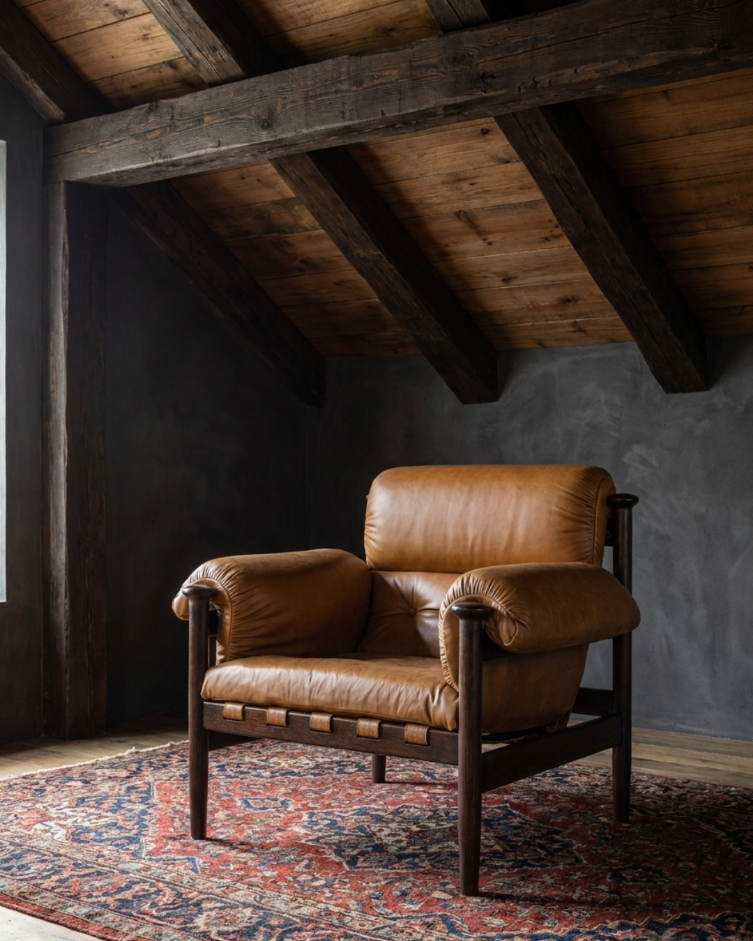
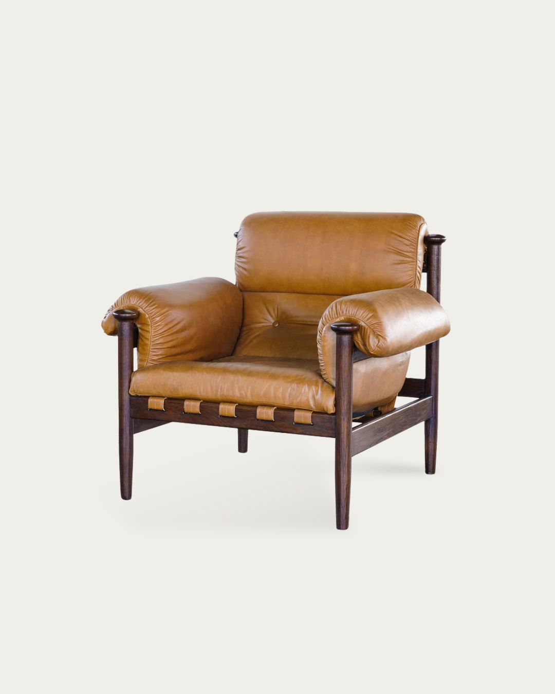
Leather creates tactile contrast against linen.
Stone changes how light behaves.
Wood grain adds pattern without introducing another color.
Build Contrast in Layers
Think beyond the color palette.
A room can combine:
light upholstery + dark furniture
smooth stone + textured wood
soft linen + leather
matte surfaces + subtle reflection
low furniture + taller seating
Those differences give the eye more information without making the room feel busier.
Use a Black Lounge Chair as a Vertical Anchor
Coffee tables introduce contrast close to the floor.
Sometimes that's not enough.
If every darker element sits below knee height, the lower half of the room may feel grounded while everything above it still looks visually washed out.
A black lounge chair brings contrast upward.
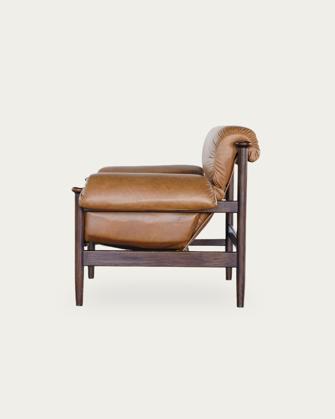
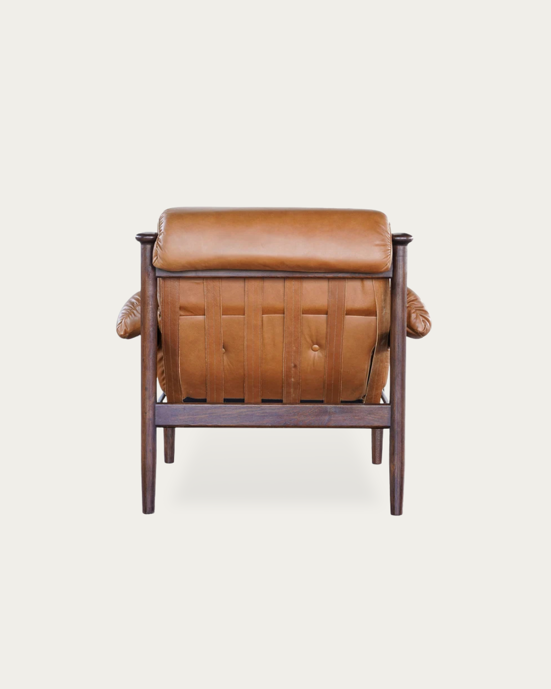
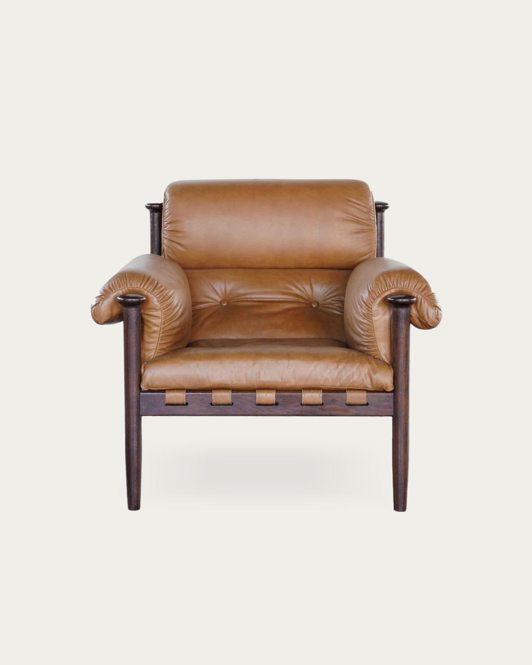
The Gustav black leather chair combines a darker silhouette with the changing surface of leather, creating contrast in both color and texture. The Holmes wingback leather chair can create an even stronger vertical presence where the room needs more height and definition.
Position It Where the Room Loses Energy
Don't automatically place the chair symmetrically opposite another chair.
Look at the room first.
Is there an empty corner beside a large window?
Does one side of the fireplace feel visually heavier?
Does the sofa dominate one half of the room?
Place the darker chair where it solves that imbalance.
Furniture placement should respond to the room, not an imaginary grid.
The Best Neutral Rooms Use Tonal Distance
A sophisticated neutral room doesn't necessarily use more colors.
It uses more distance between those colors.
Instead of cream, beige, tan, and pale oak all sitting close together, introducing deep brown, charcoal, or black expands the tonal range.
That increased range makes the midtones easier to see.
Suddenly the pale wood looks more dimensional.
The linen texture becomes clearer.
Stone variation becomes more noticeable.
Even the wall color may look more intentional because it now has something darker to contrast against.
Black Can Make Your Neutrals Look Better
This is the useful part.
Black doesn't have to become the focus.
It can function as the visual reference point that makes everything else easier to read.
Think of it less as another color and more as punctuation.
You probably don't need punctuation after every word.
But remove all of it and things get confusing fast.
RUTED Tip: Take a photo of your living room and switch it to black and white.
Ignore the styling and look at the tonal blocks.
If your sofa, walls, rug, tables, and curtains all become roughly the same shade of gray, you've found the problem.
Your room doesn't necessarily need more color.
It needs more contrast.
Small Black Furniture Can Connect the Bigger Pieces
Once you have a larger dark anchor, you don't necessarily need another one.
Smaller furniture can repeat the tone elsewhere.
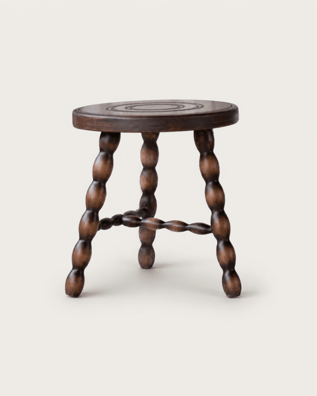
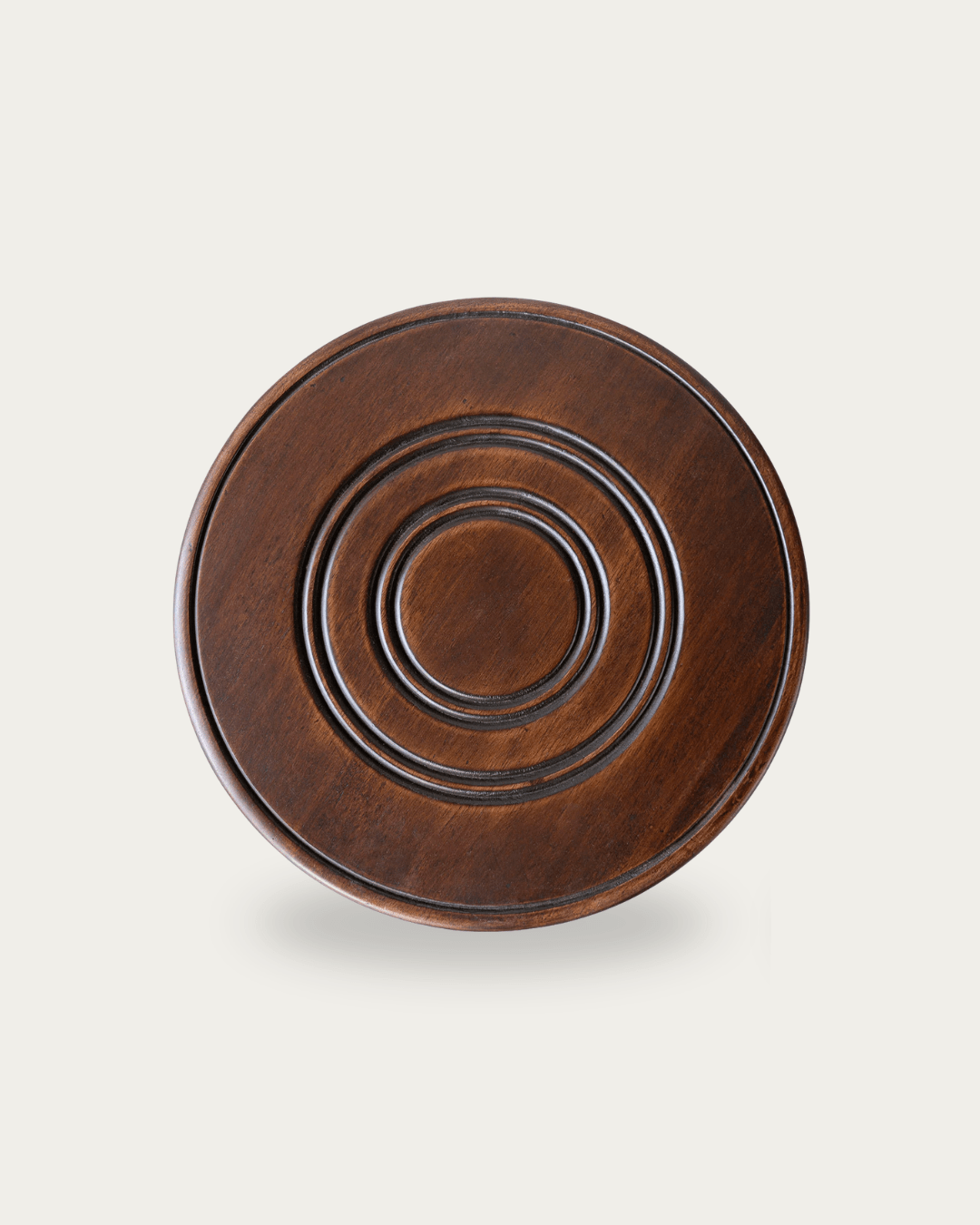
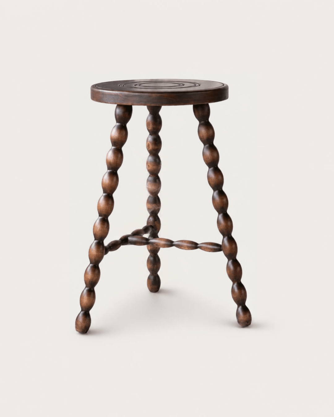
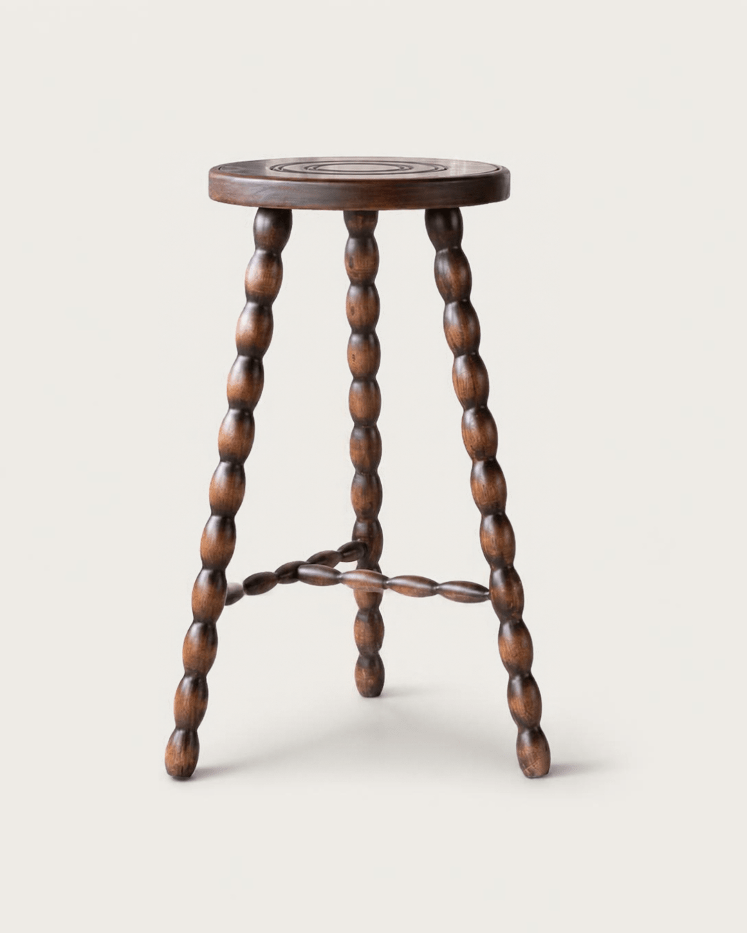
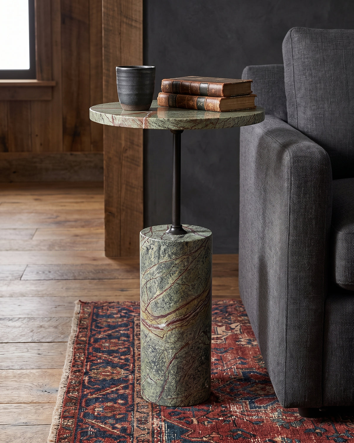
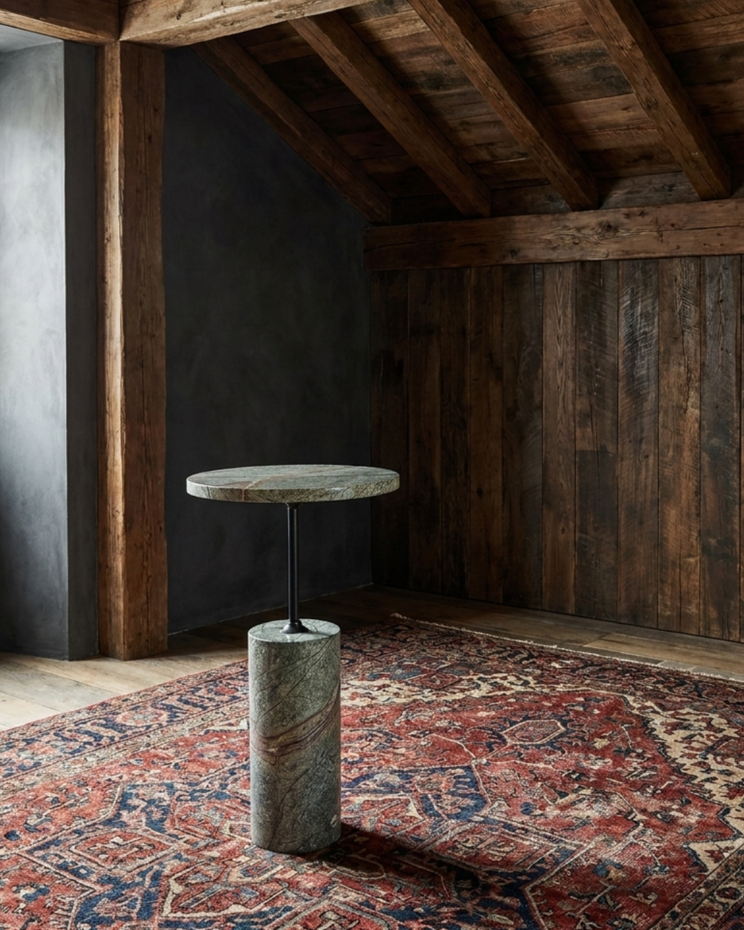
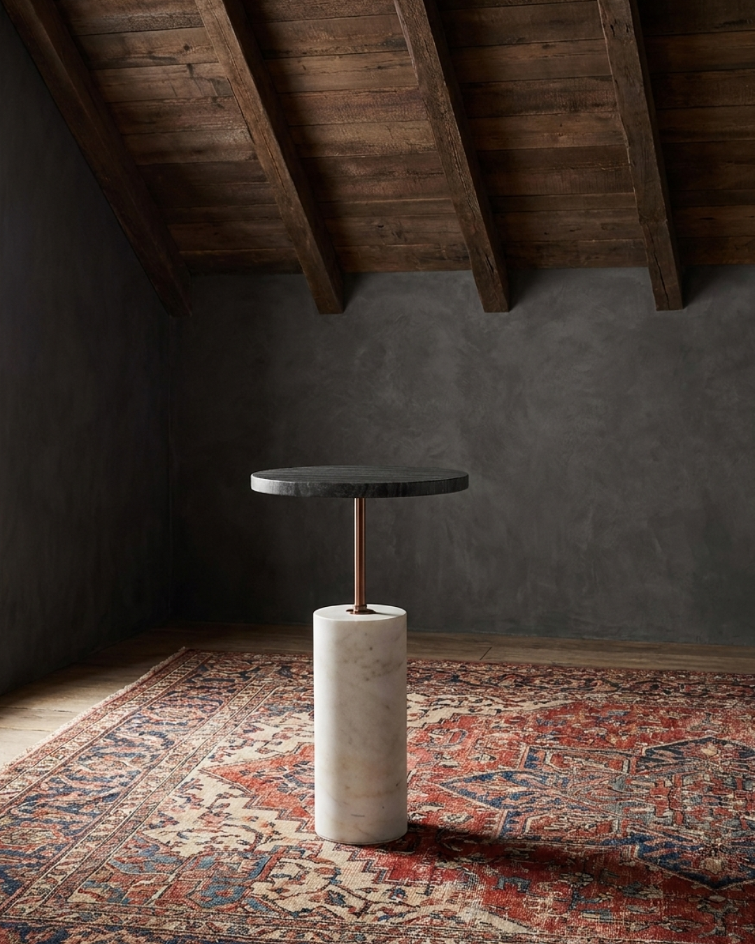
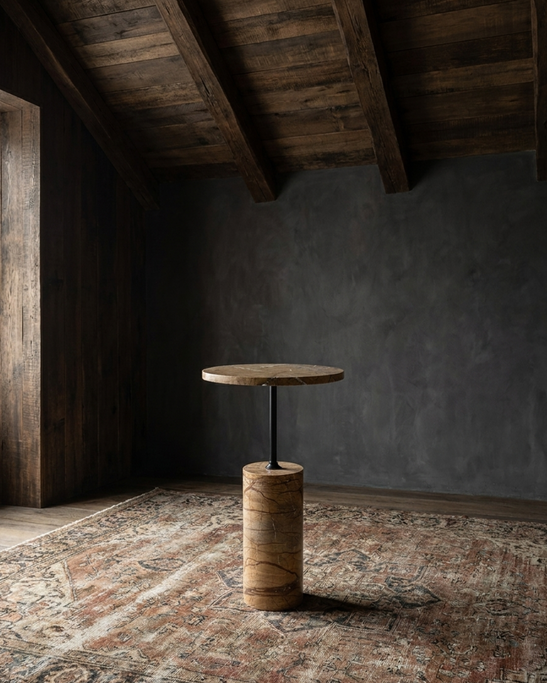
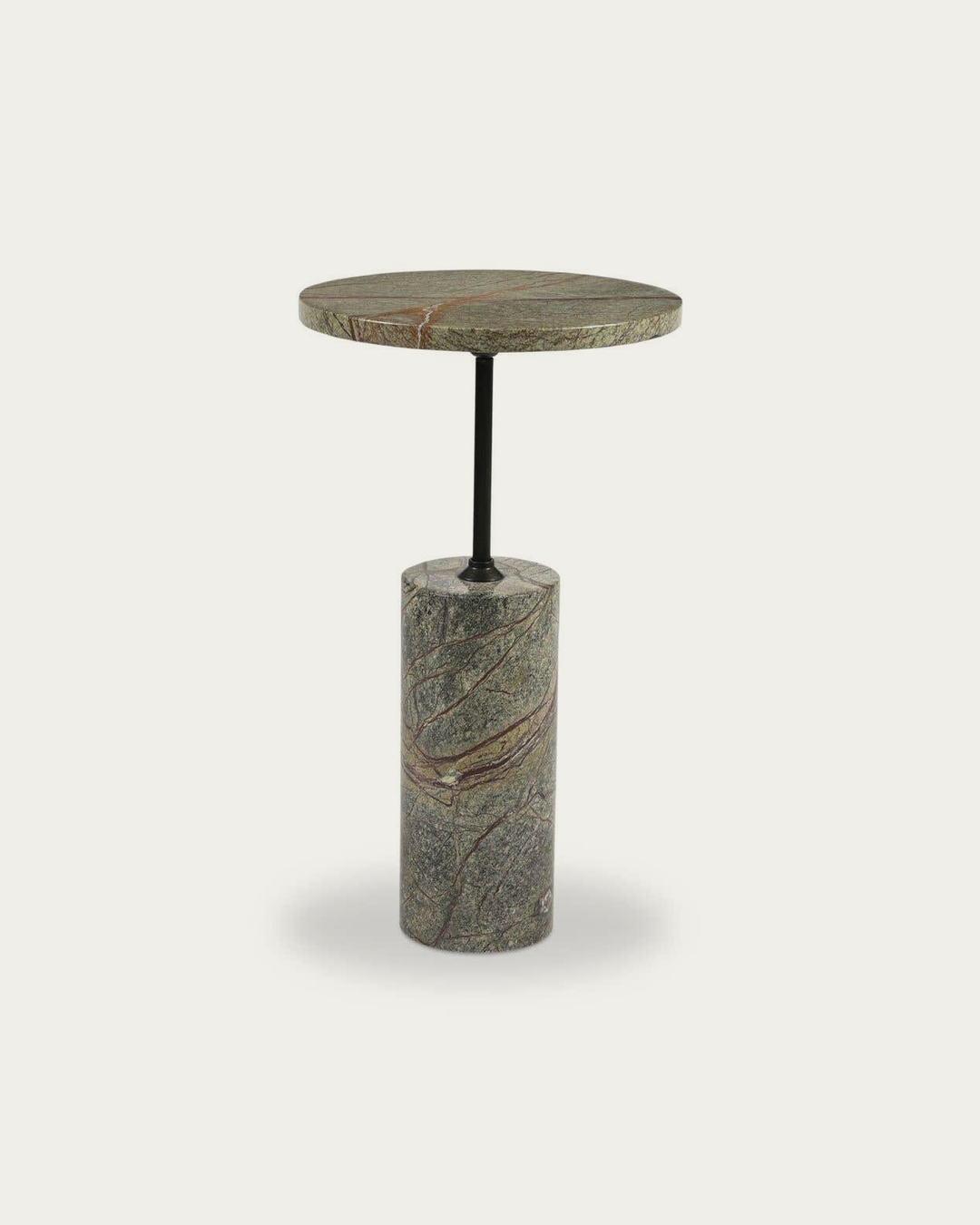
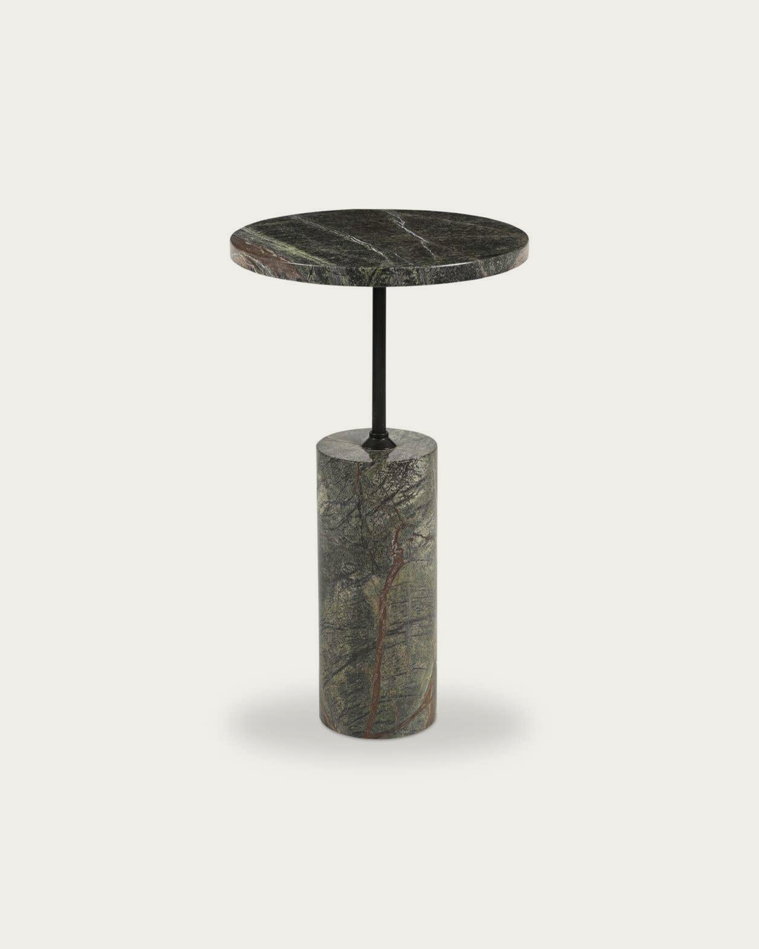
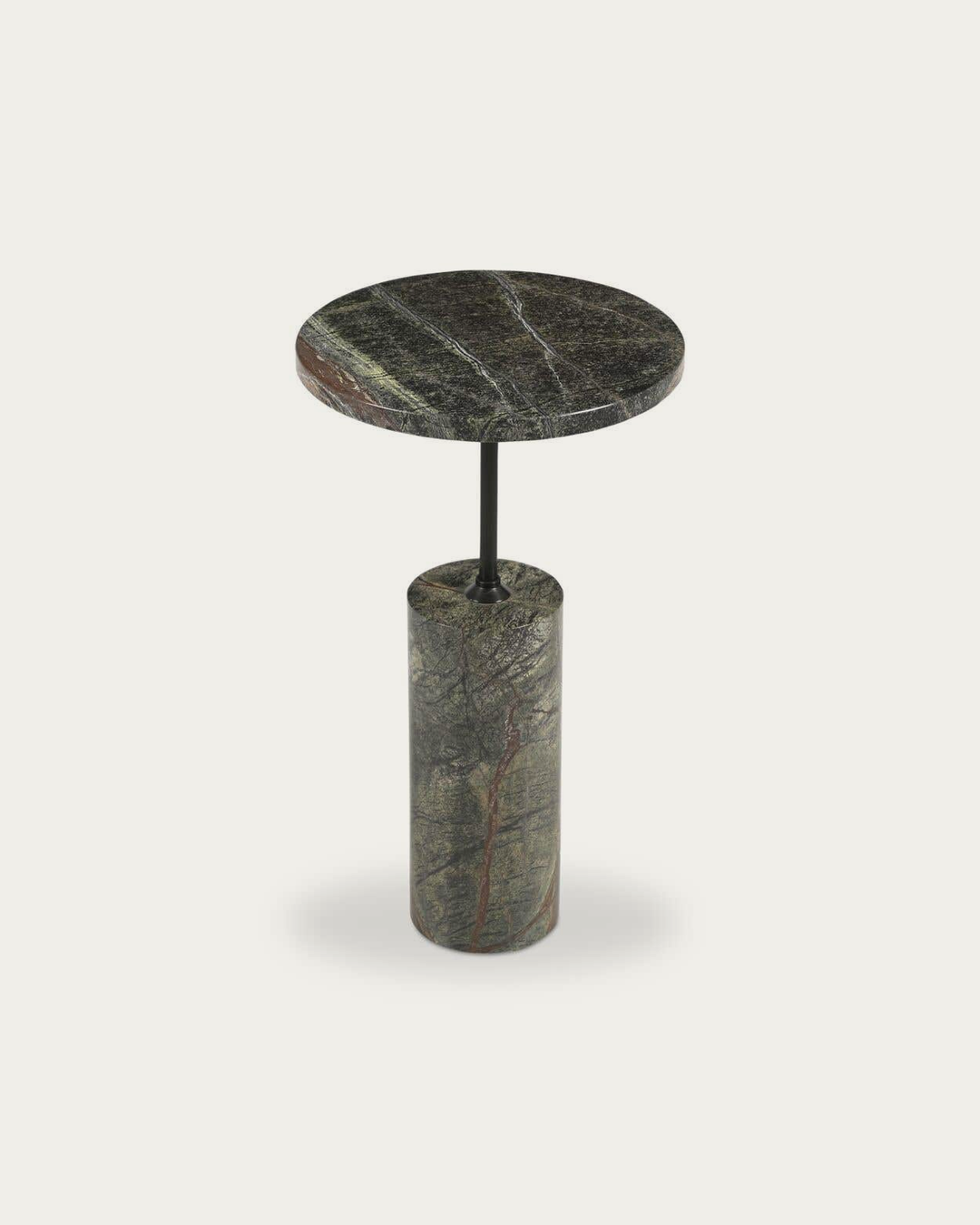
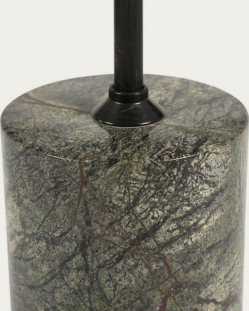
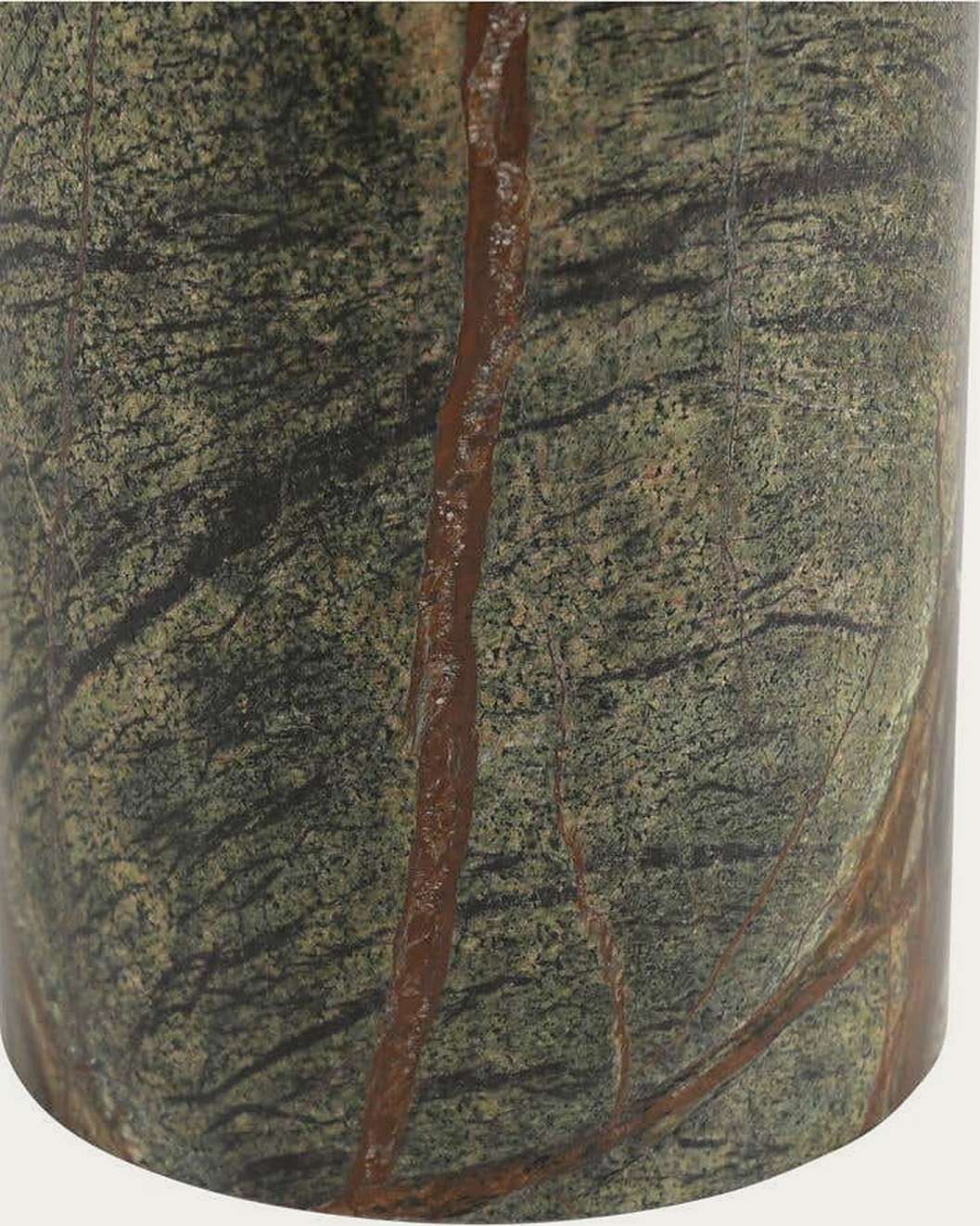
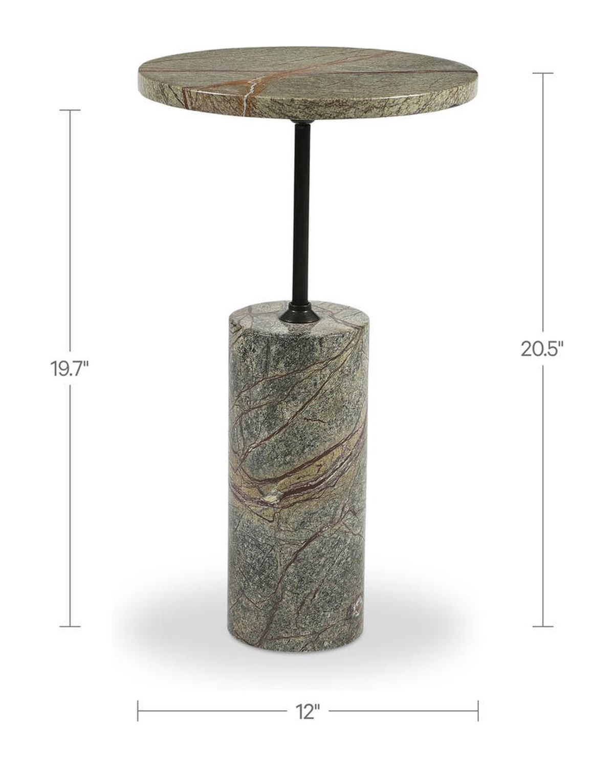
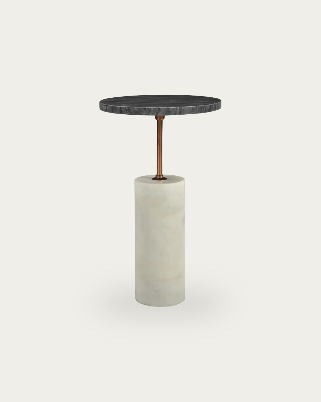
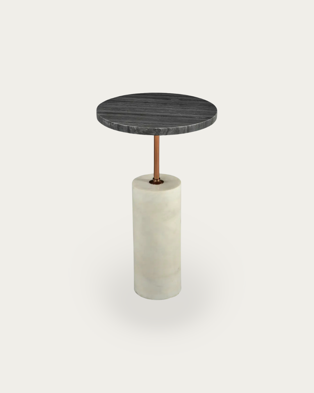
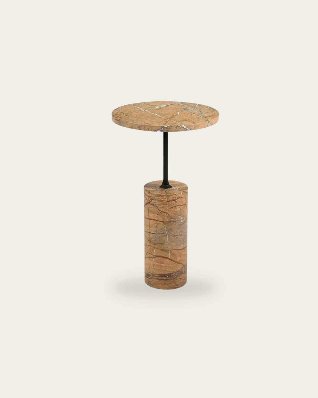
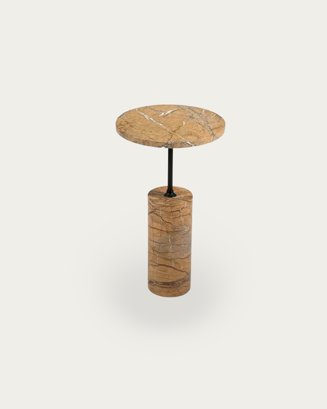
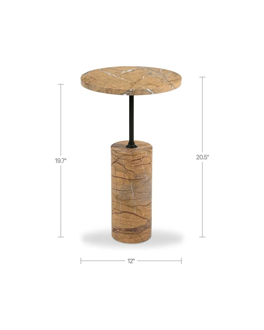
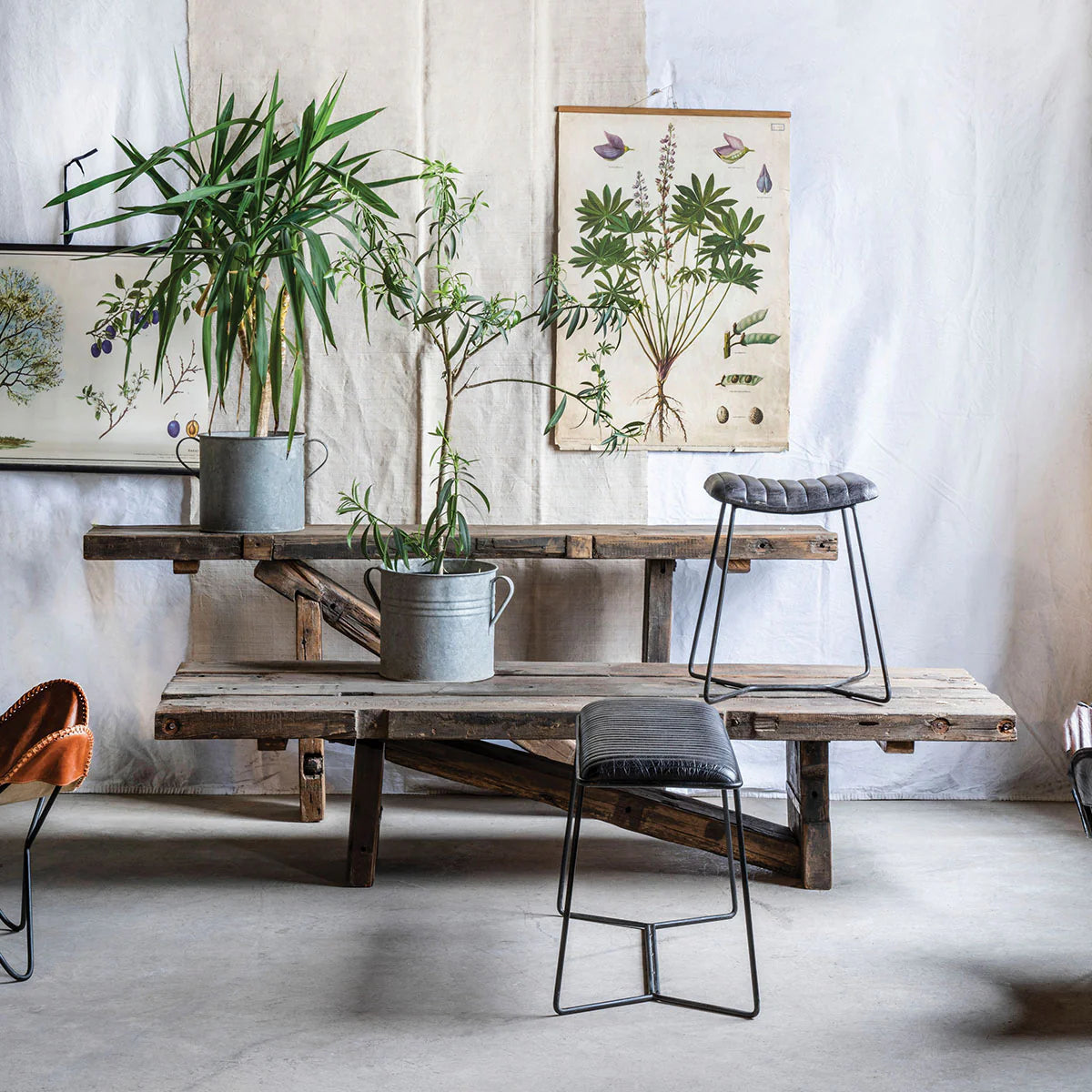
The Yrla side table can create a compact visual stop beside pale upholstery without adding another substantial mass to the floor plan.
This kind of repetition matters.
One isolated black table can look like an exception.
Repeat black subtly elsewhere, and the first piece begins to make sense.
Don't Turn Repetition Into Matching
The coffee table and side table don't need to be identical.
Neither does the lounge chair.
Instead, repeat one characteristic while changing another.
Repeat the dark tone but change the material.
Repeat wood but change the silhouette.
Repeat a curved form at a different scale.
These relationships create cohesion without making the room look like everything arrived in the same delivery truck.
Scale Is Part of the Contrast Equation
Sometimes the issue isn't the color of the furniture.
It's the proportion.
A tiny dark chair won't necessarily balance a huge pale sectional simply because the chair is black. Likewise, an oversized black coffee table can become unnecessarily dominant in a compact living room.
Contrast attracts attention, which means scale becomes more noticeable.
That's why choosing the right dimensions matters even more when introducing a darker focal piece.
For rooms where standard dimensions, materials, or finishes aren't quite resolving that relationship, Hello Norden's Made to Order line offers another route for considering furniture around the proportions and material needs of the actual space.
Hello Norden Take: The right piece shouldn't simply fit the measurements. It should carry the right amount of visual weight for everything around it.
Don't Forget Negative Space
Once you introduce darker furniture, resist the urge to surround it immediately.
Contrast creates strong silhouettes.
Those silhouettes need enough open space around them to remain readable.
A black coffee table with a visible rug around its perimeter feels clearly defined.
Push furniture too tightly around it and several separate objects can begin reading as one dense visual block.
The same applies to lounge chairs.
Give the chair some wall or floor space around it. Let the silhouette breathe.
Negative space isn't unfinished space.
It's part of the composition.
Use Black Where the Architecture Needs Definition
Black furniture can also help make sense of architectural areas that otherwise disappear.
An open-plan living room without obvious boundaries may benefit from a darker coffee table defining the seating zone.
A pale corner beside large windows may need a darker chair to visually hold its position.
A long neutral room may need a few distributed dark points to prevent the eye from sliding straight through it.
The goal isn't symmetry.
It's a visual rhythm.
You want the eye to move from one point to another rather than either stopping immediately or finding nowhere to stop at all.
A Neutral Room Doesn't Need More Stuff. It Needs Better Relationships.
When a neutral living room feels flat, buying more neutral decor usually isn't the answer.
Look at contrast first.
Does the room have a clear center?
Are all the materials similar in tone?
Is every darker object concentrated in one area?
Do your furniture pieces have enough variation in height, texture, and visual weight?
Black furniture can solve several of these problems because it creates clear boundaries and stronger visual anchors. But the goal isn't adding black for the sake of adding black.
It's creating enough contrast for the rest of the room to become more visible.
Let a black coffee table define the center. Use a darker lounge chair where the room needs vertical weight. Repeat the tone with a smaller side table if the first piece feels isolated. Then stop and see what happens before adding anything else.
Your neutral living room may already have everything it needs.
It might simply need a little more definition.
Explore Hello Norden's black furniture collection and look for contrast where the room actually needs it—not wherever there's an empty corner.