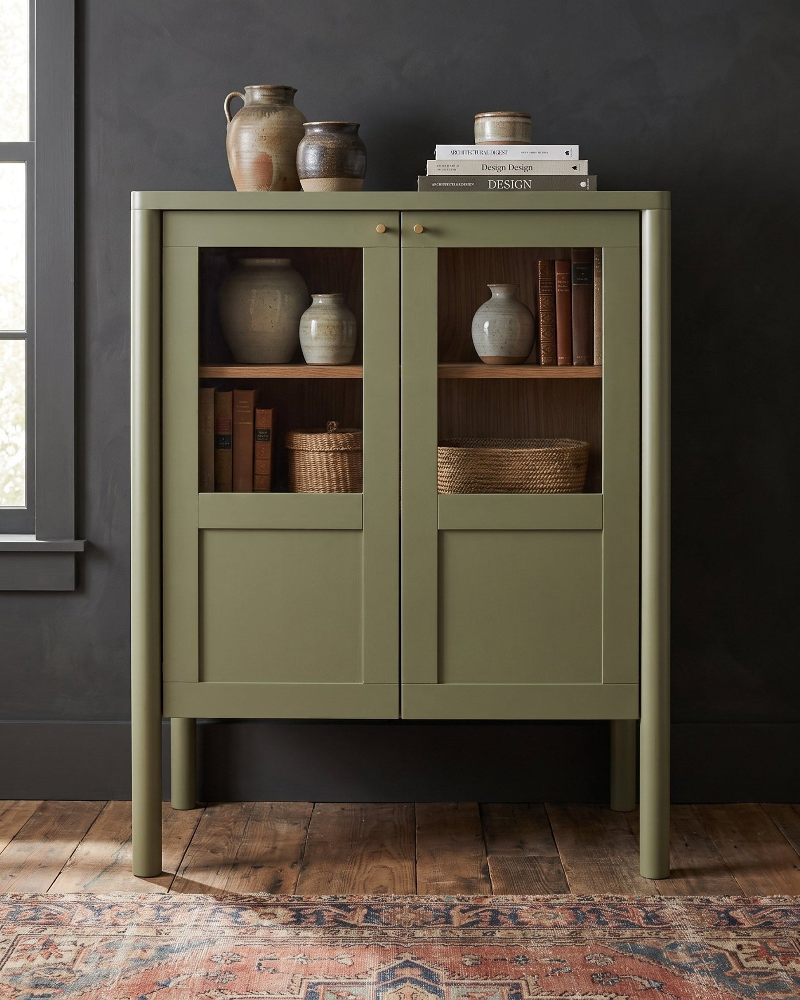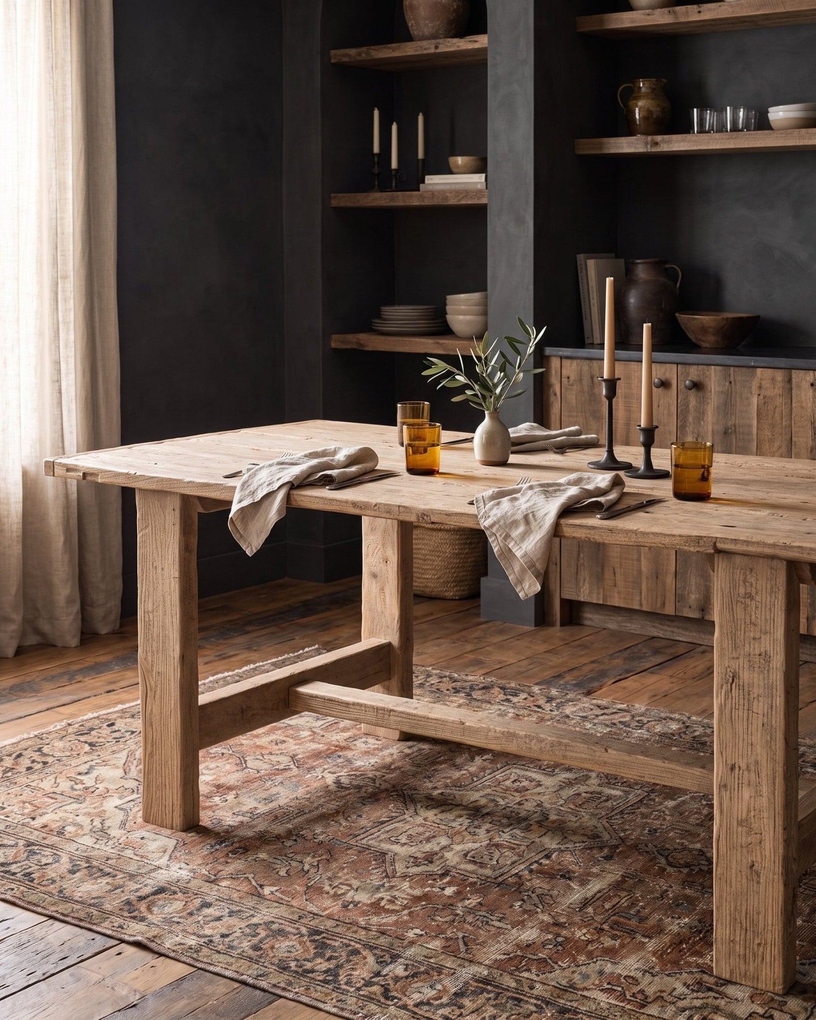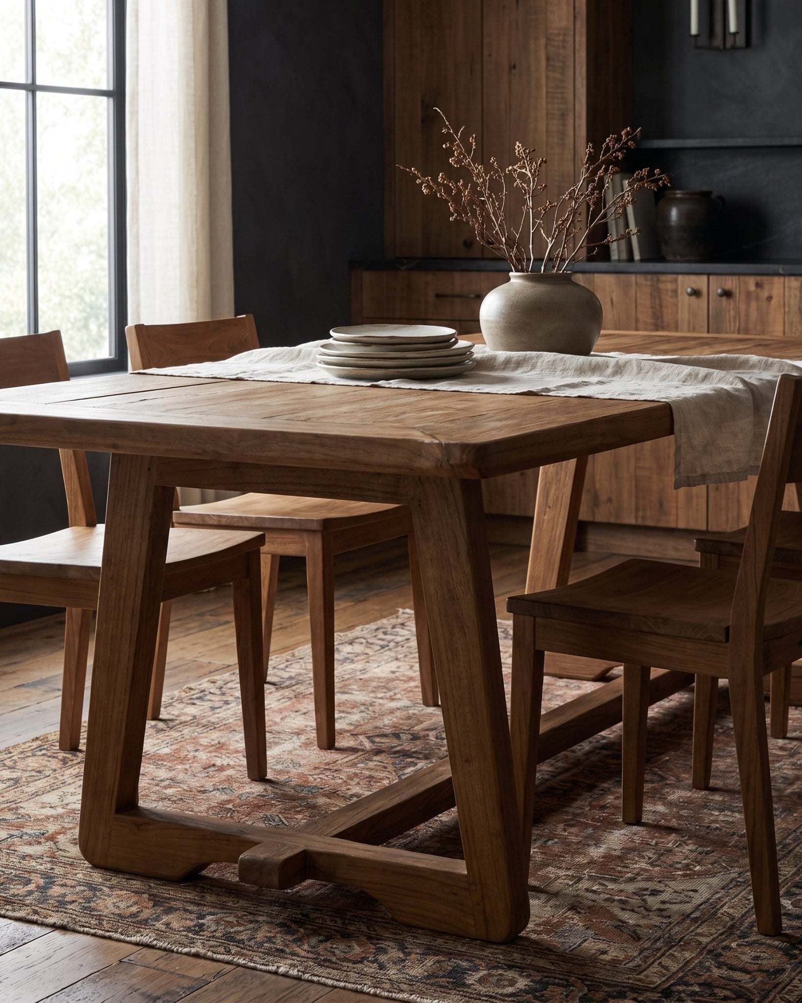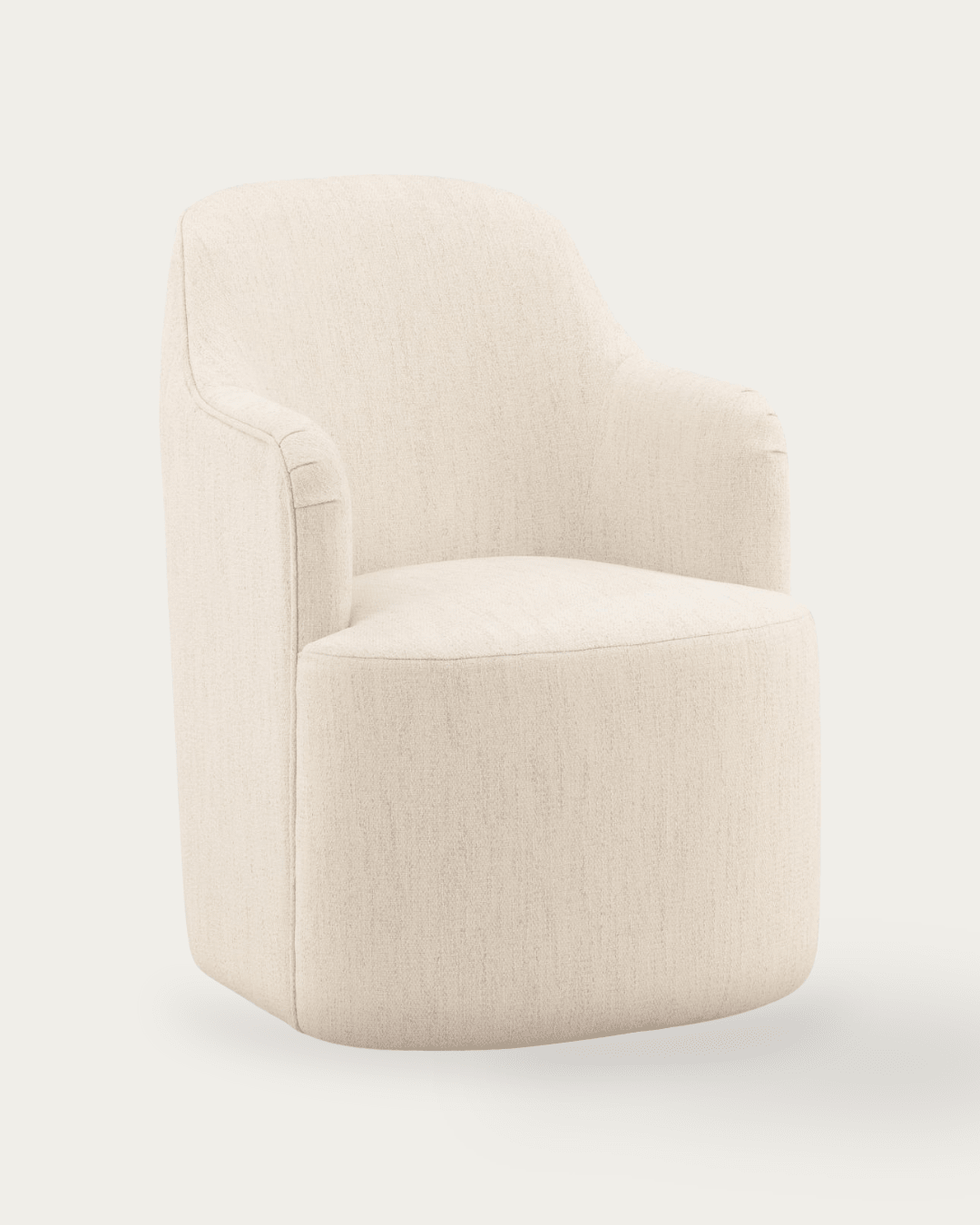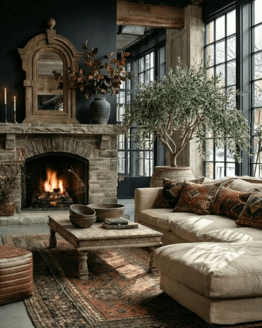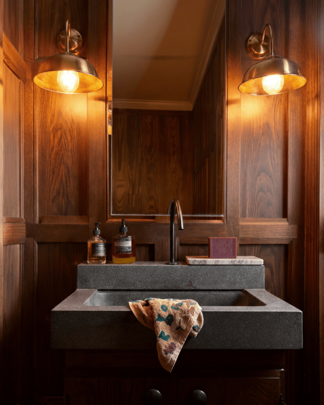


Most console tables fail for the same reason: they’re treated like blank canvases instead of architectural responses. A vintage console table isn’t meant to be styled into submission. It’s meant to listen first. When the vintage console table is chosen and placed based on light, proportion, and circulation—rather than trends or symmetry—it quietly upgrades the entire room without trying to be the star.
This is the shift: stop asking how to decorate a console table, and start asking what the room already needs.
Rule One: Let Natural Light Decide Placement
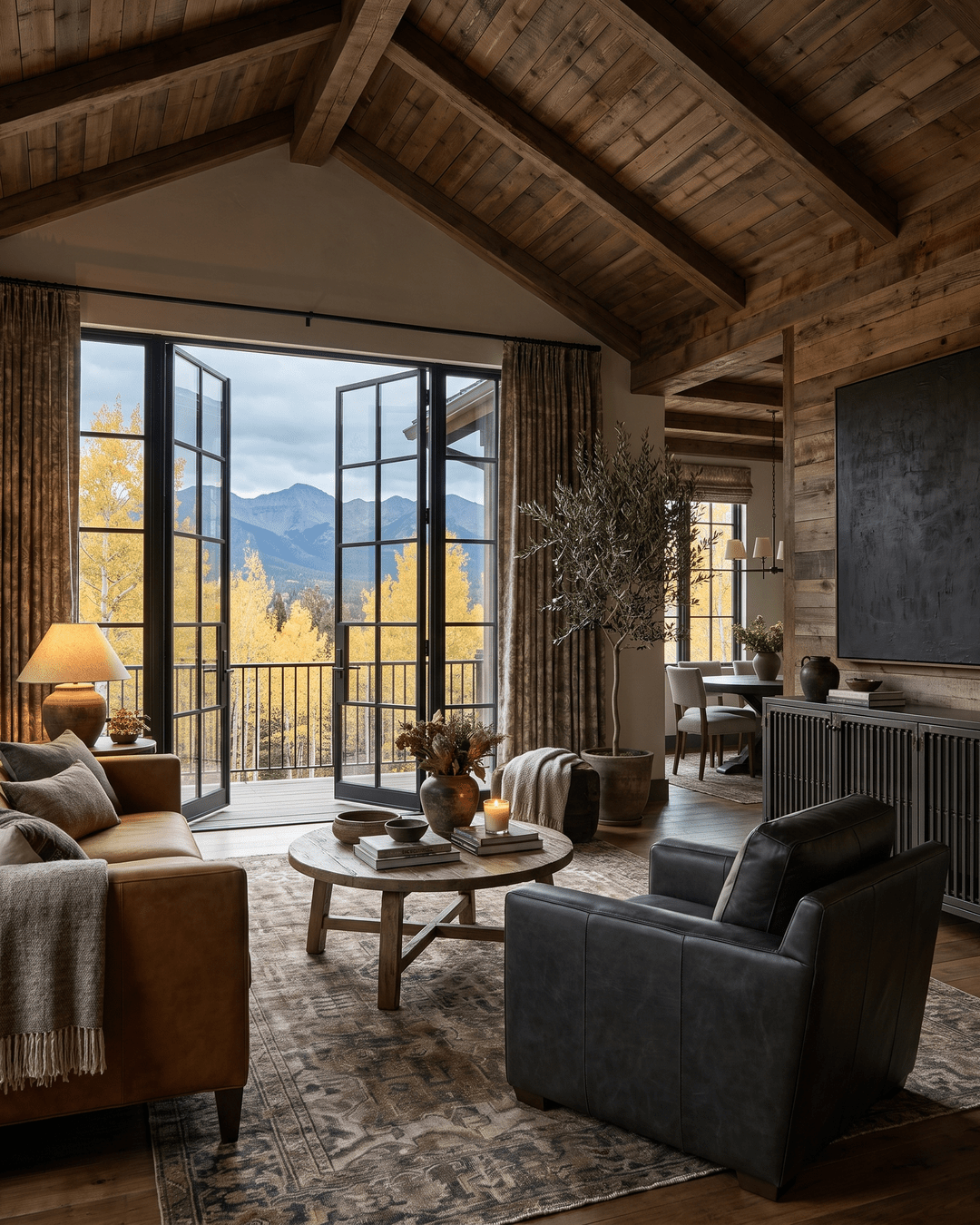
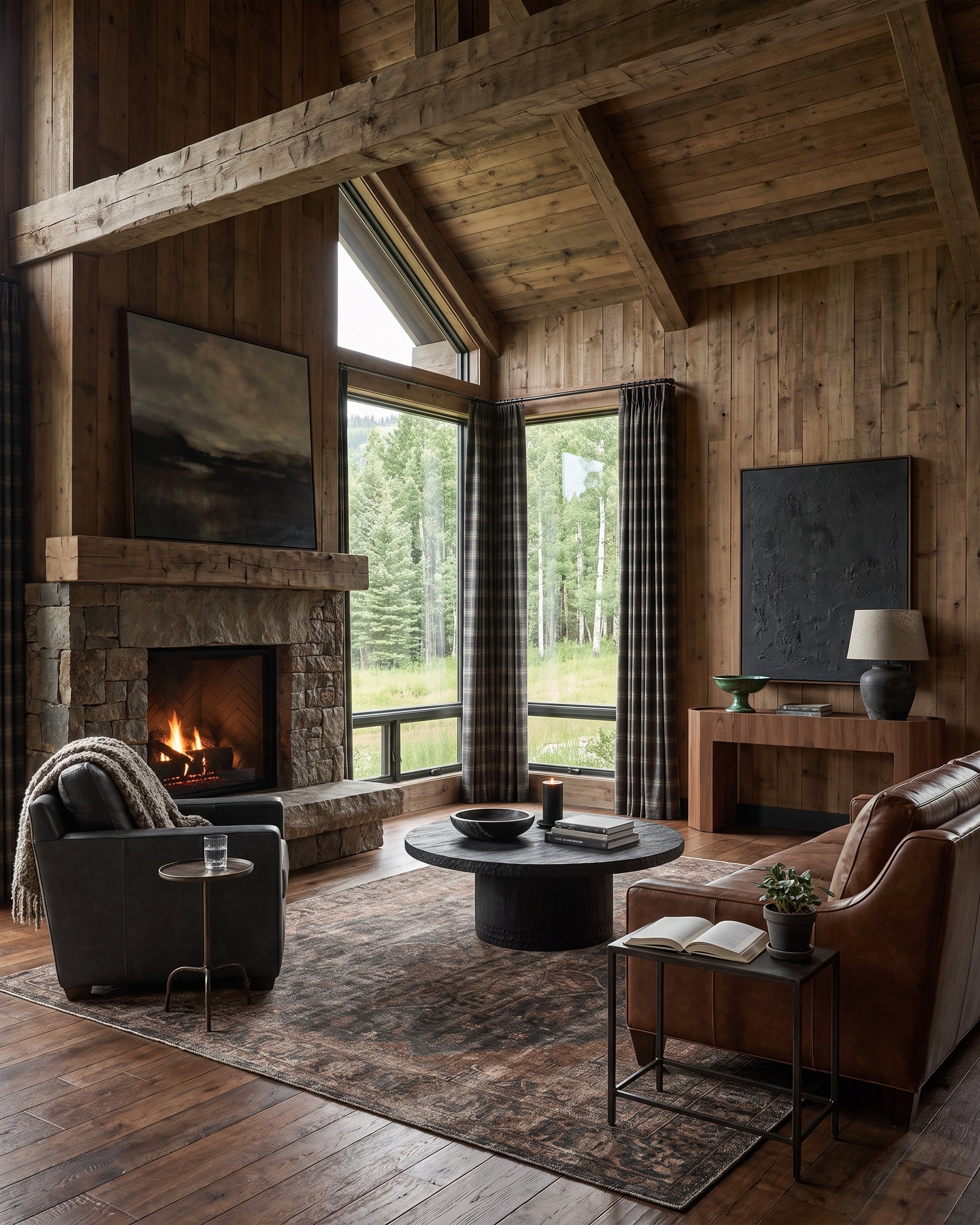
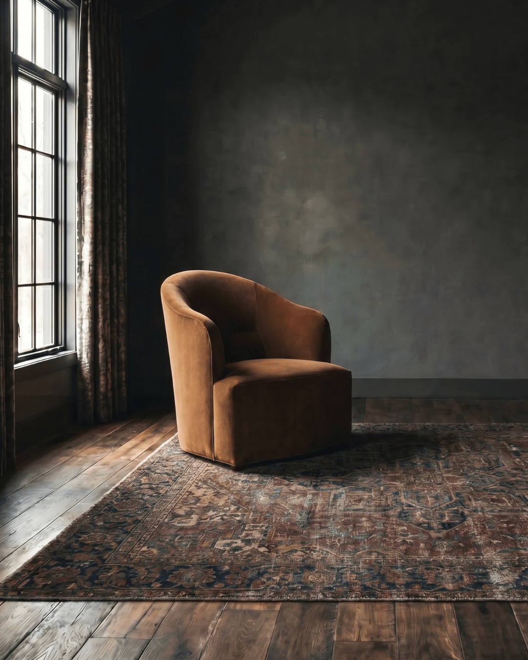
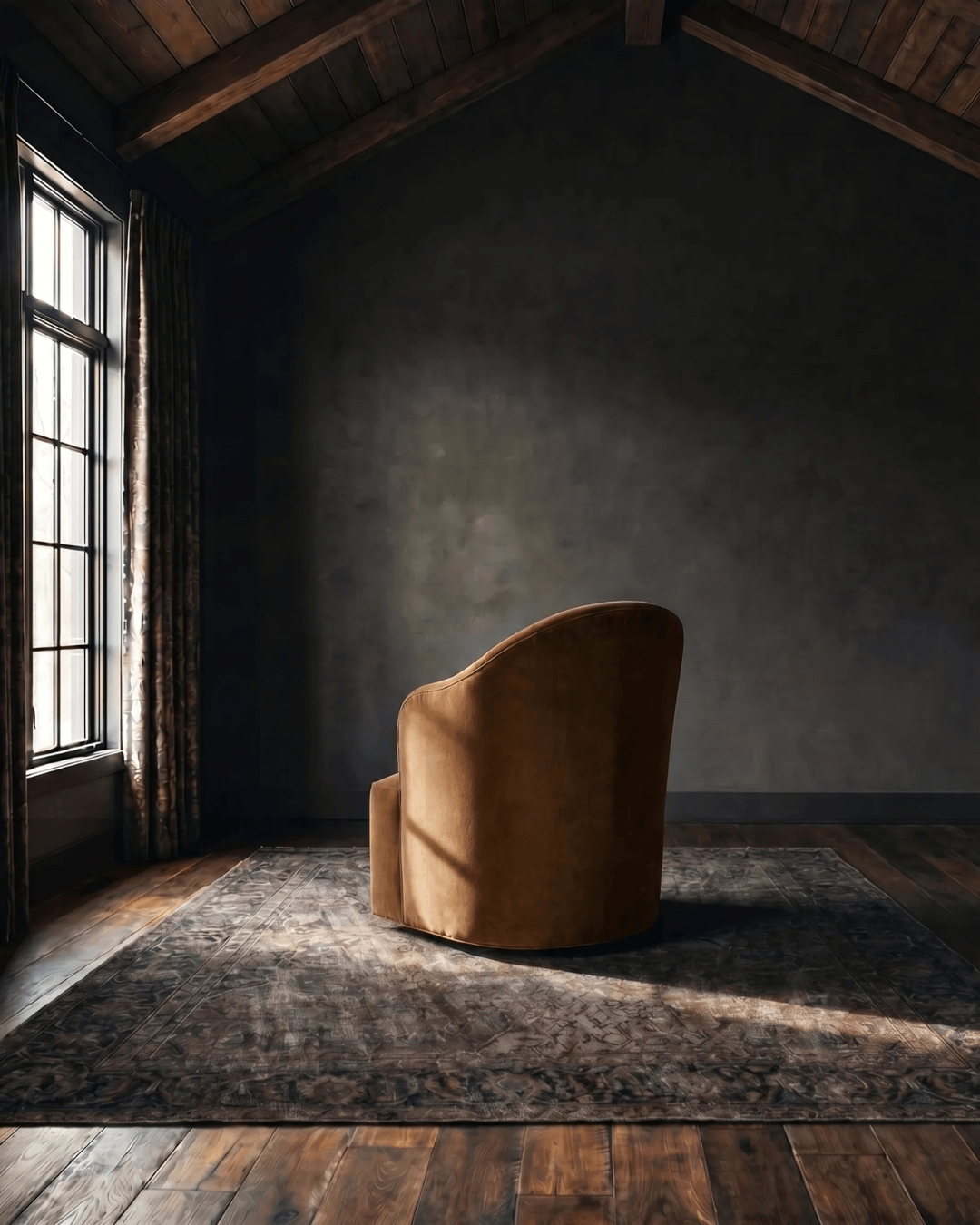
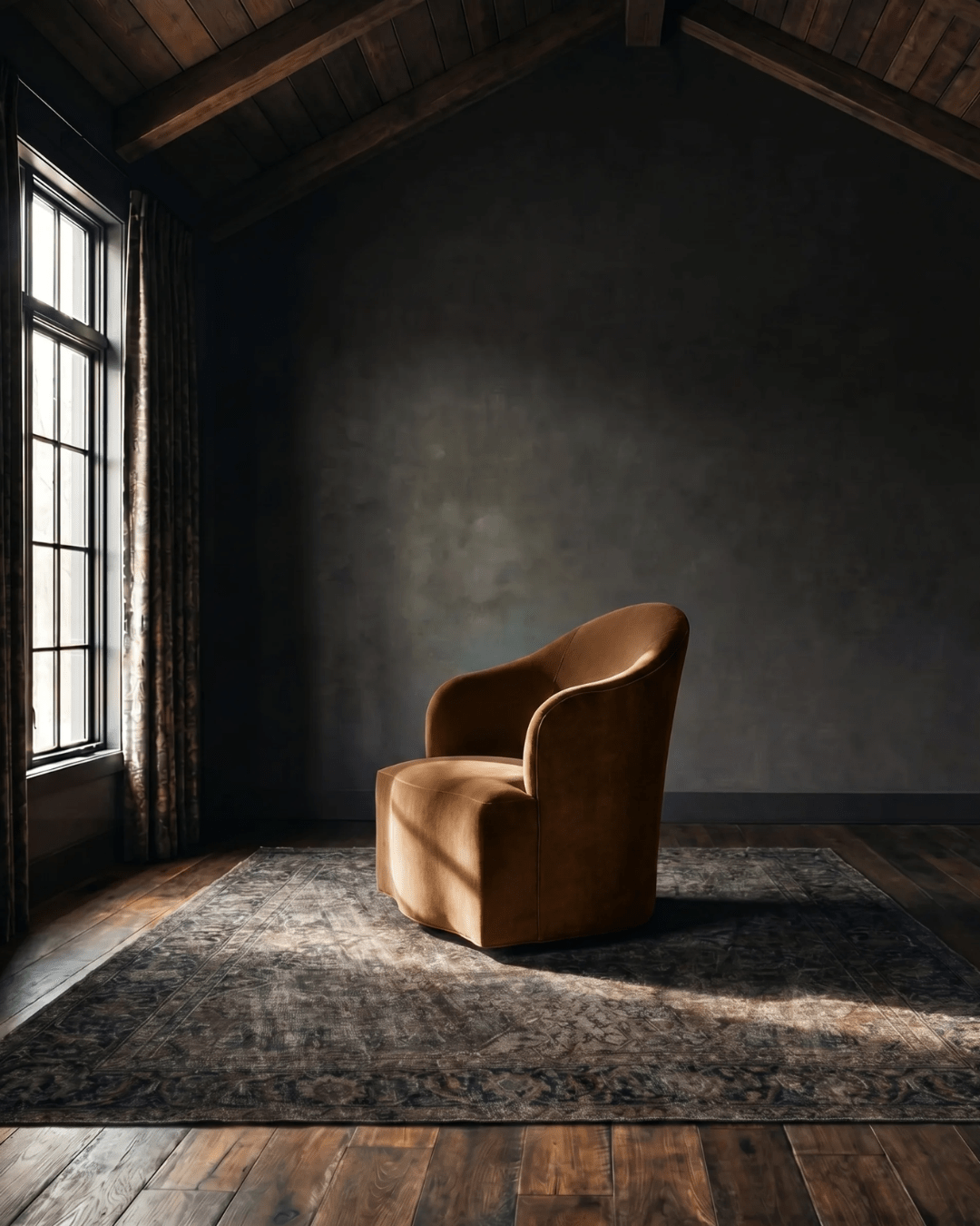
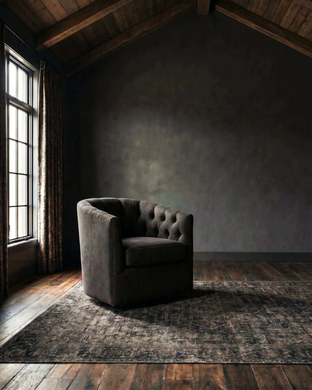
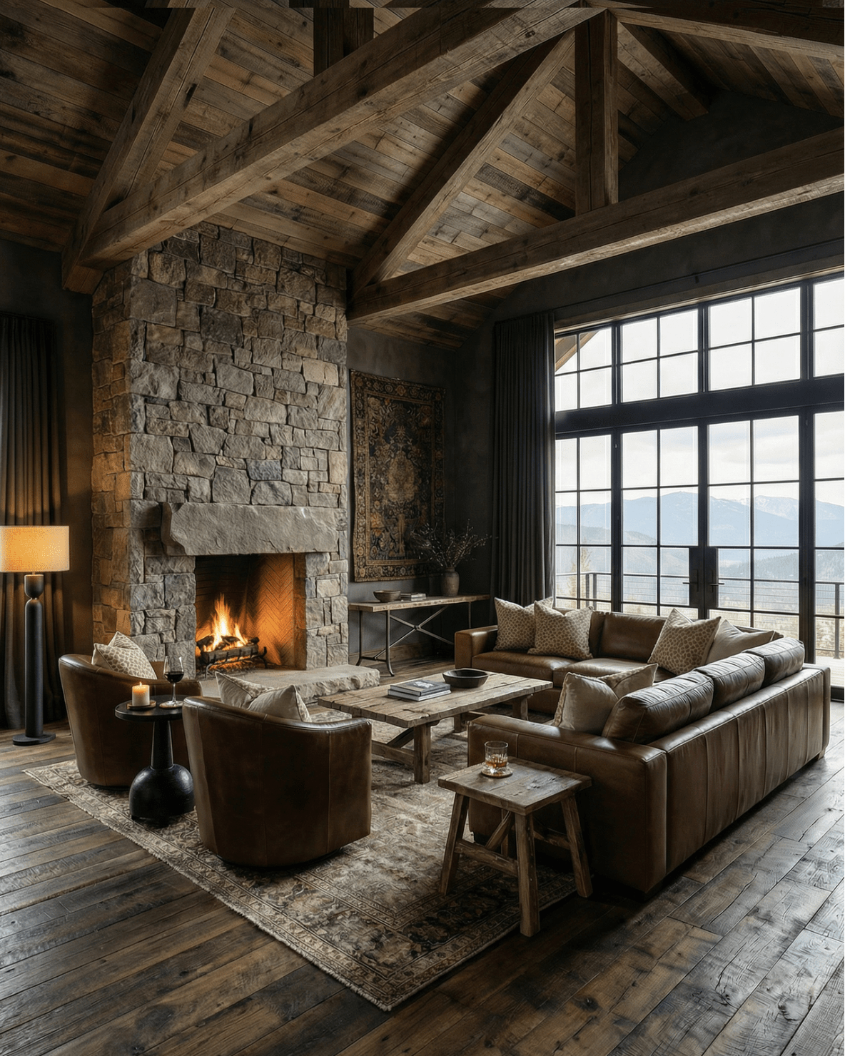
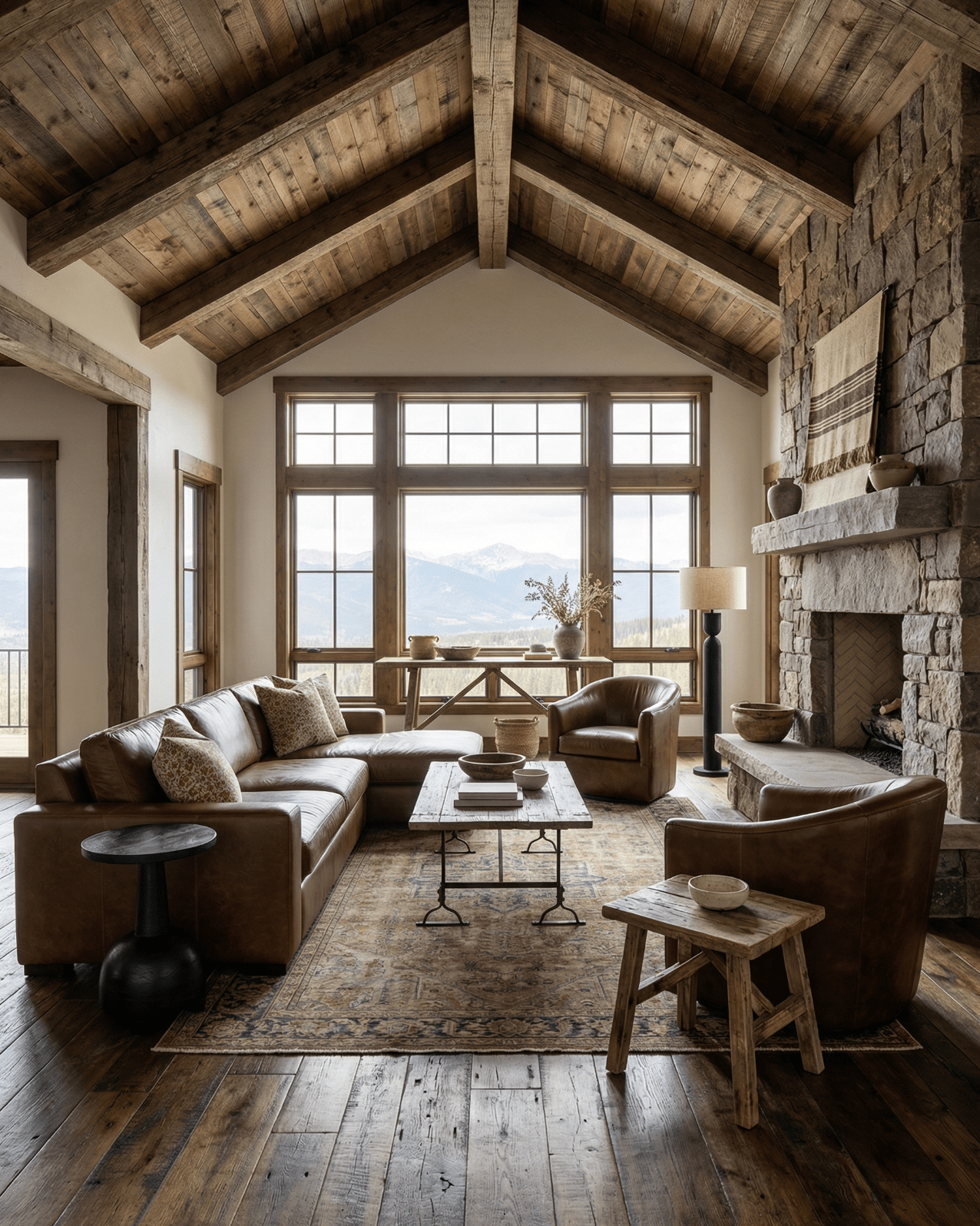
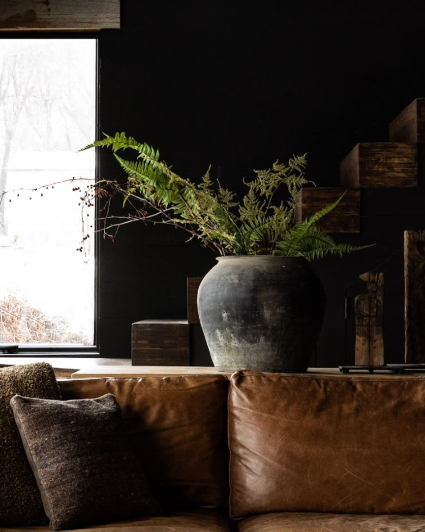
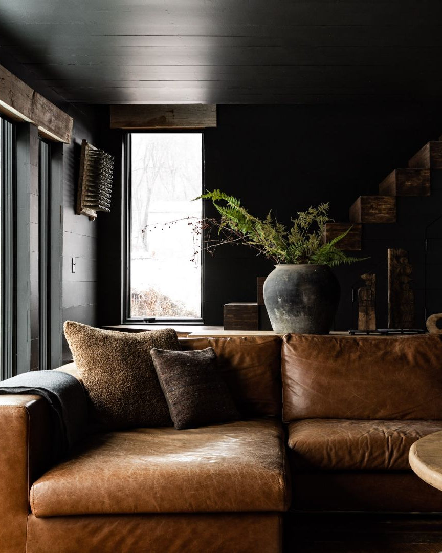
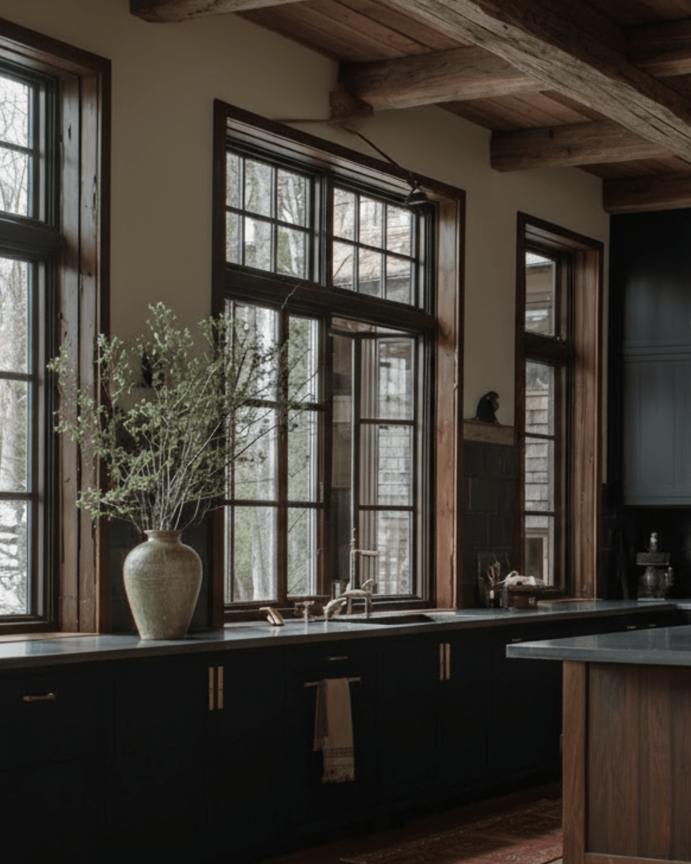
The most successful vintage console tables don’t compete with light—they cooperate with it. Natural light defines how a space is used throughout the day, and the console should sit where that rhythm already exists.
Near a window, a console catches changing light and shadow, which gives even simple objects more dimension. In a hallway with borrowed light, it creates a pause instead of a passage. Against a darker wall, it becomes a grounding line rather than a focal point.
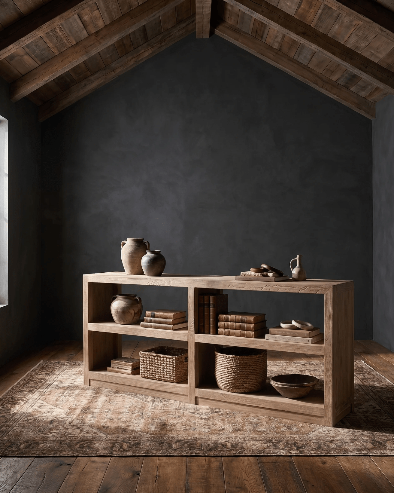
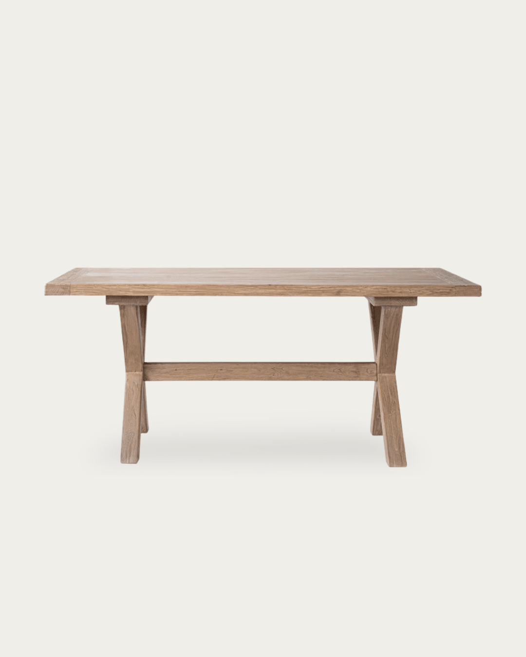
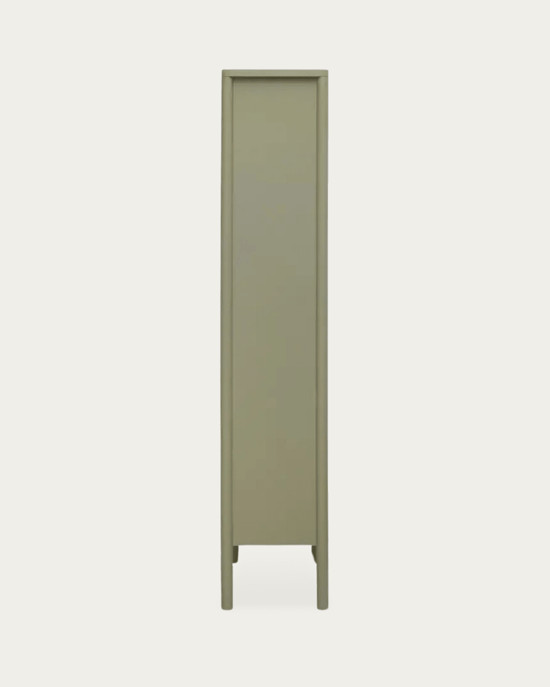
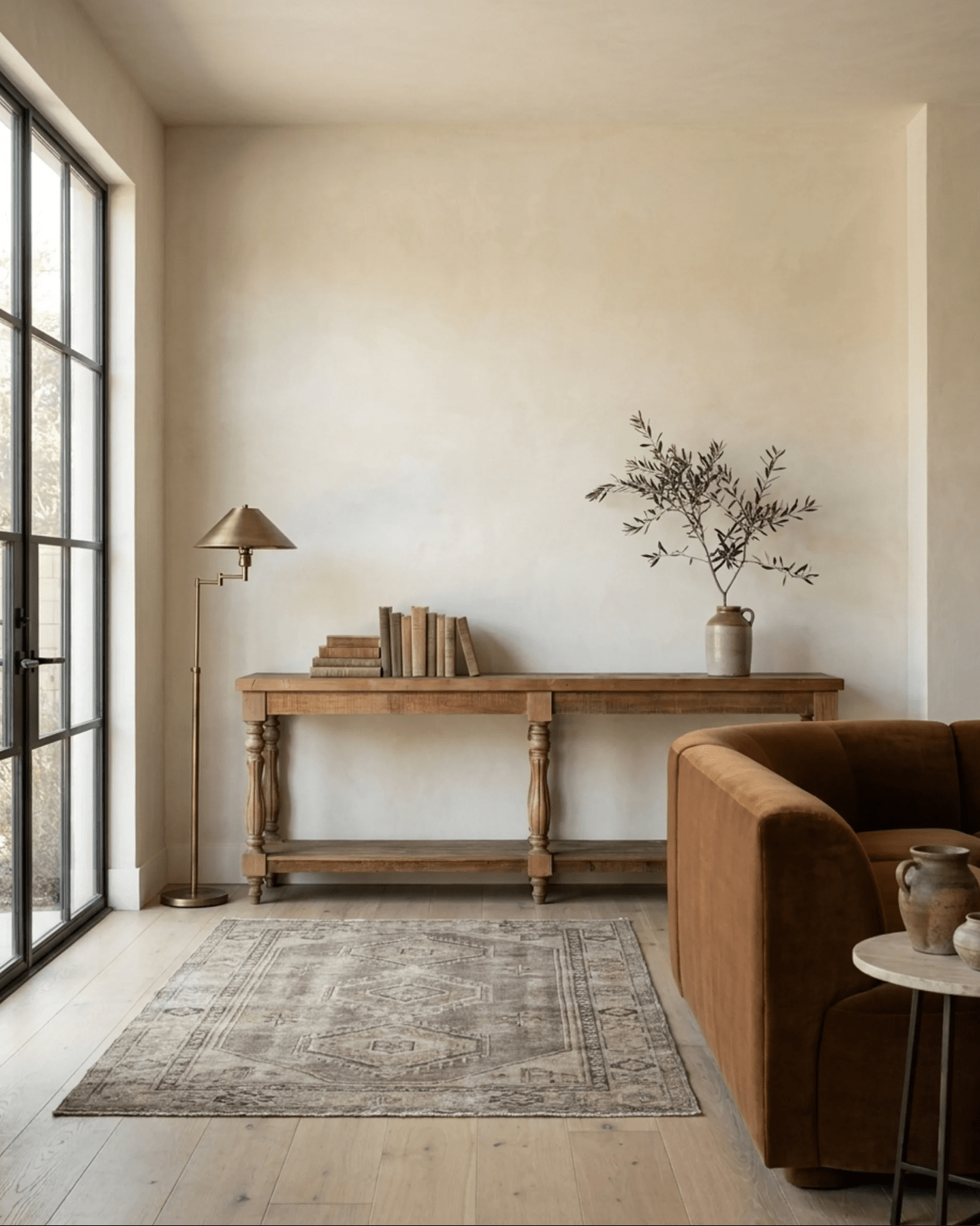
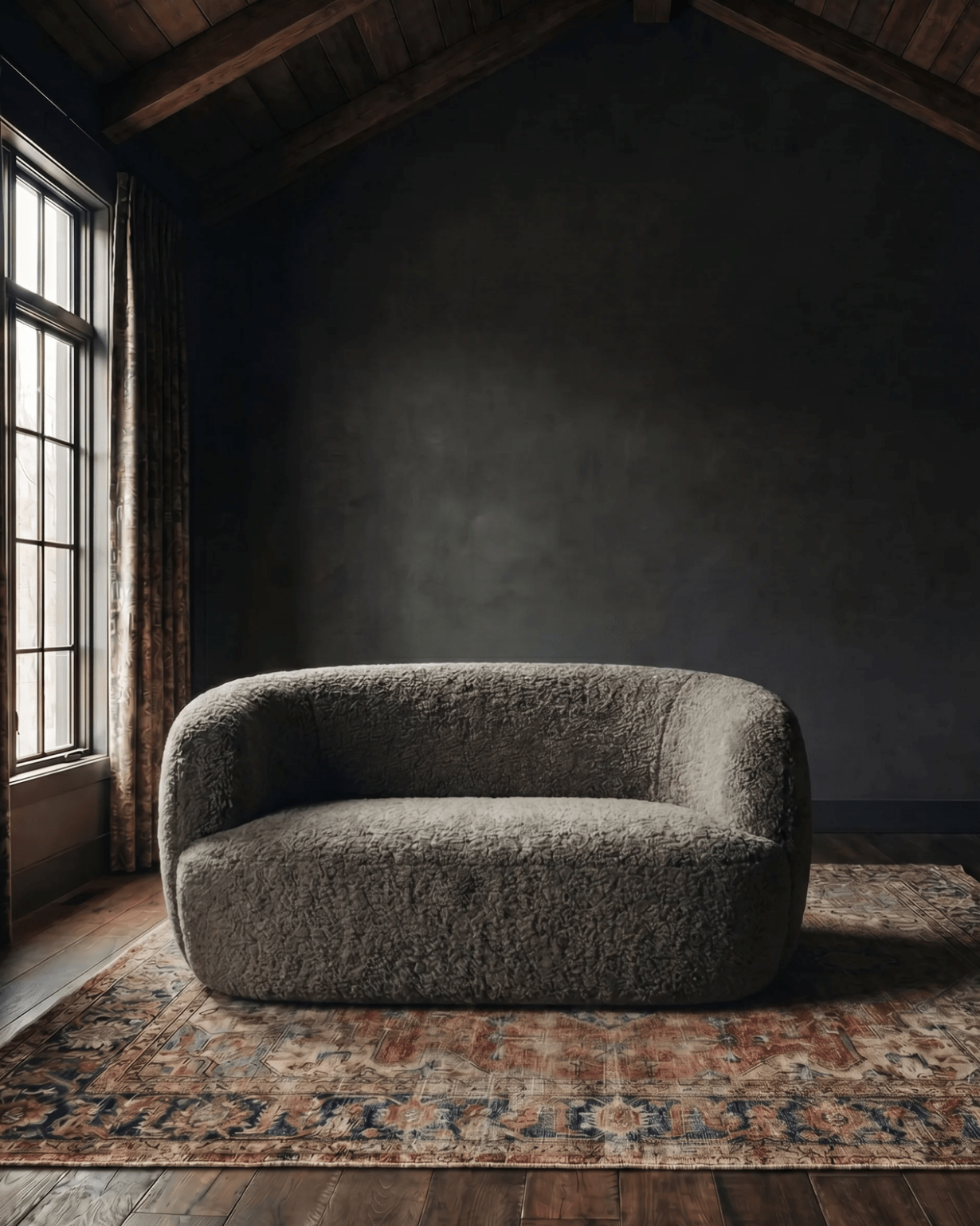
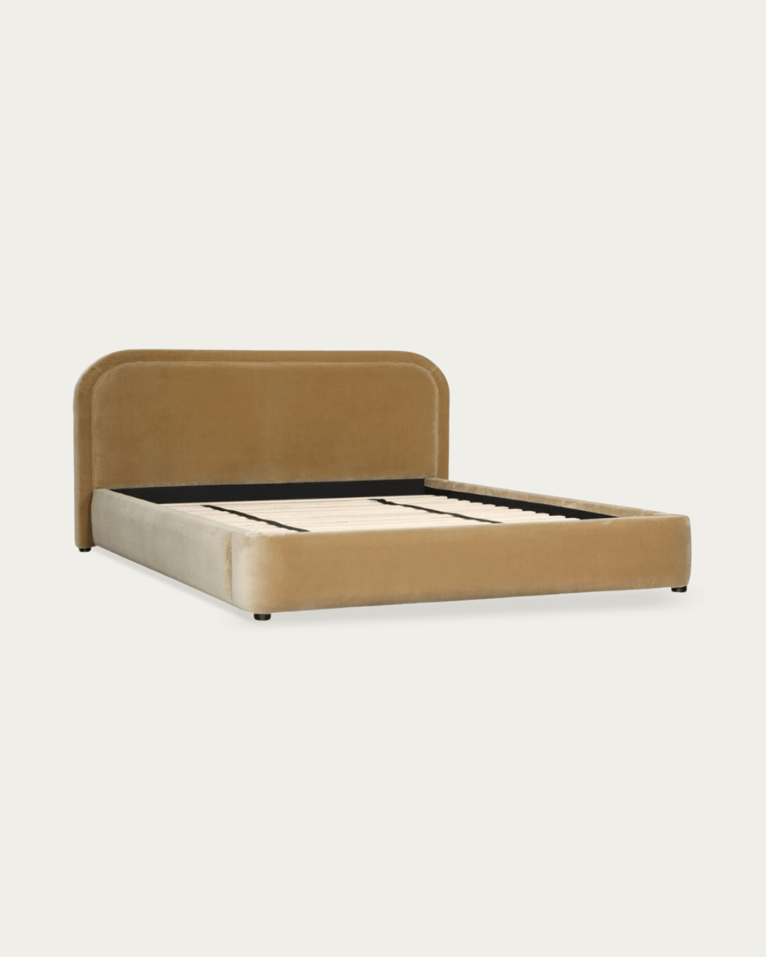
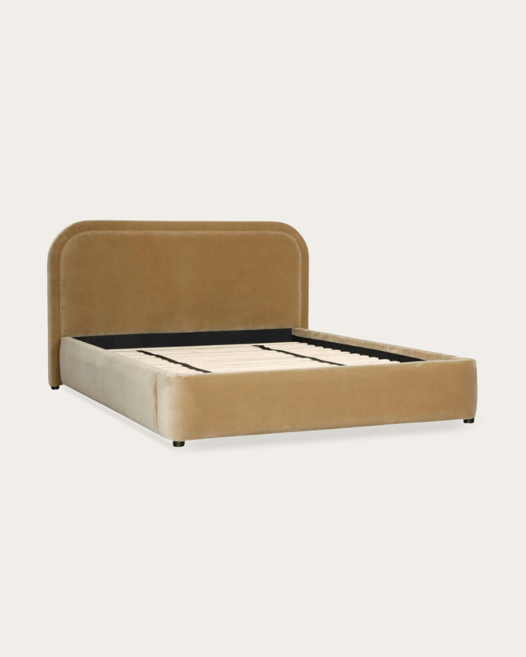
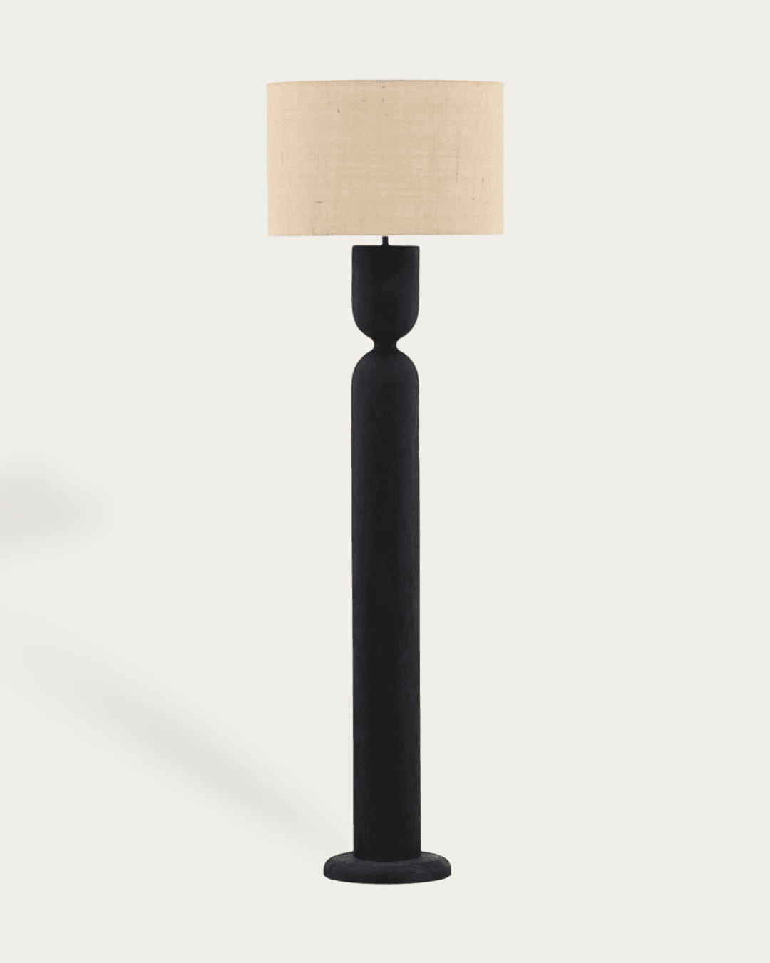
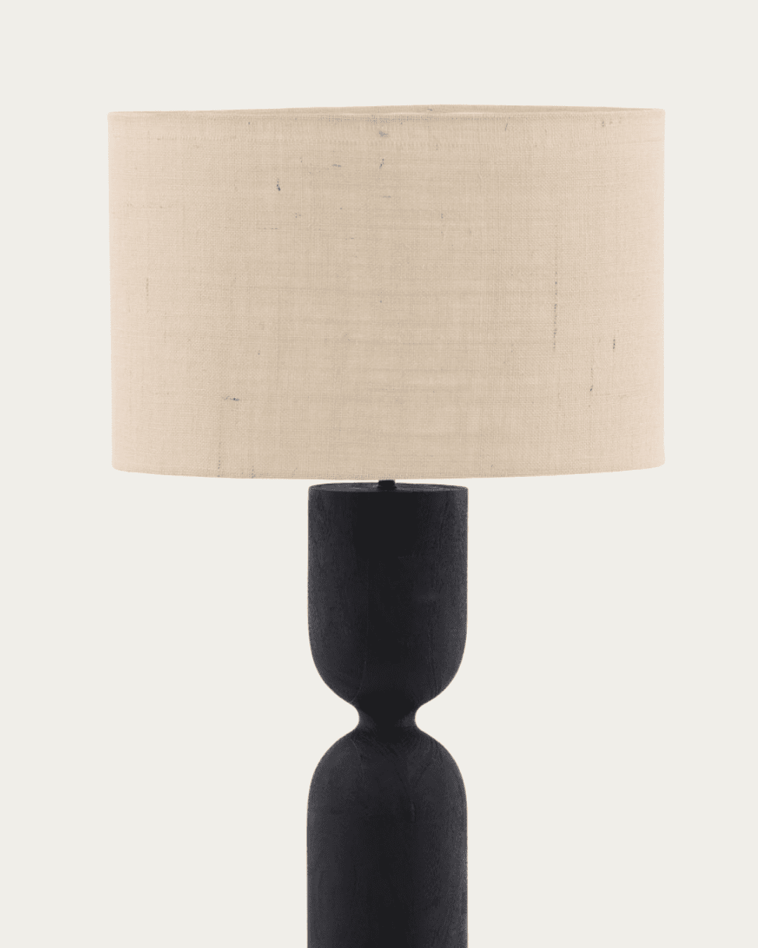
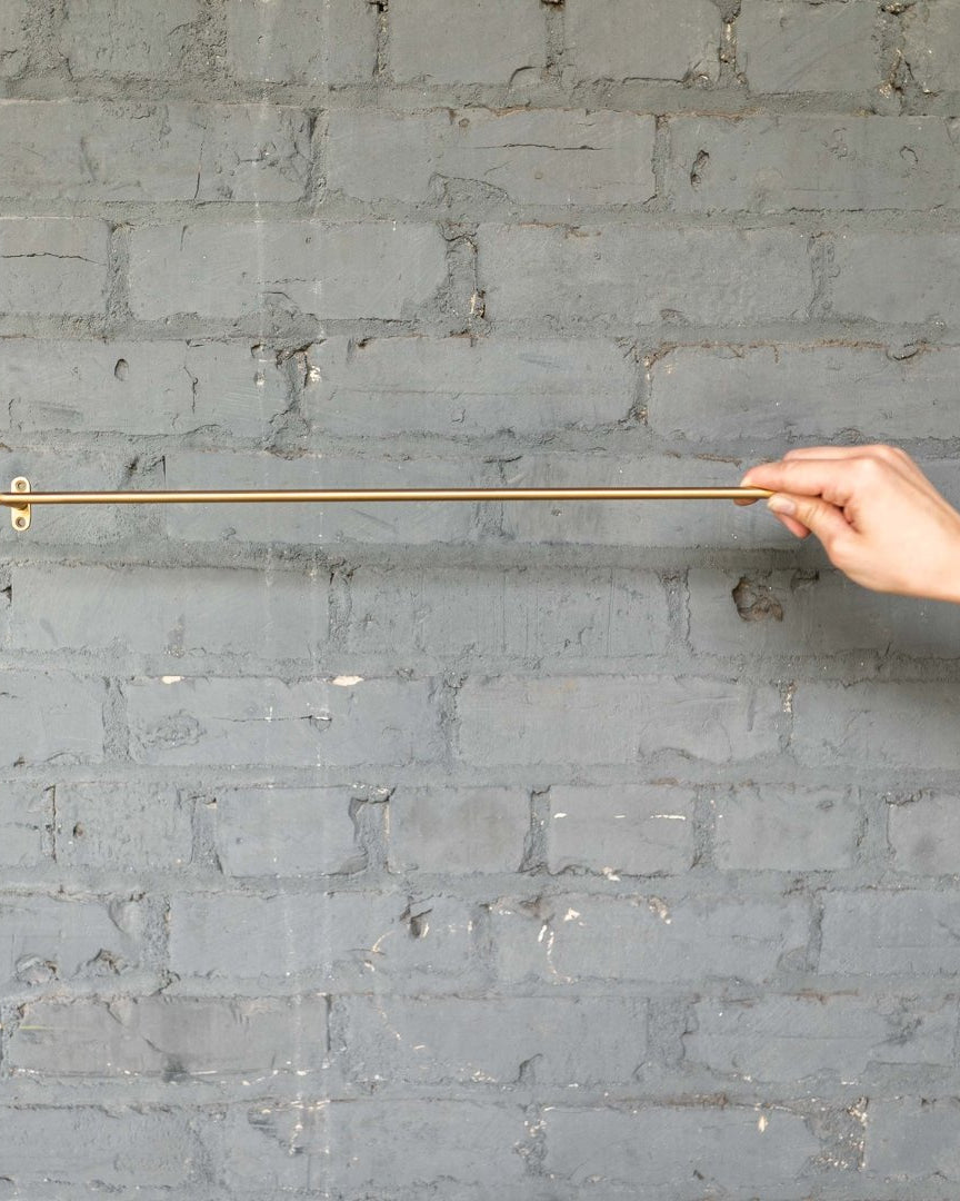
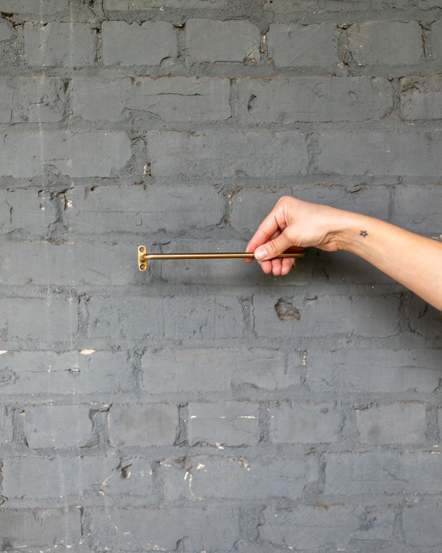
A piece like the Helena console table works particularly well in these scenarios because its proportions feel resolved without excess. It holds space without demanding center stage.
In narrower zones, the Edith console table reads lighter visually while still offering enough surface to anchor artwork or objects. The room doesn’t feel rearranged around it—it feels clarified.
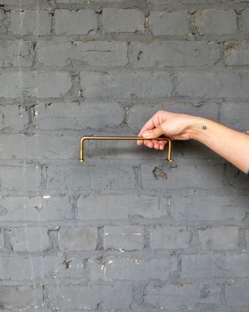
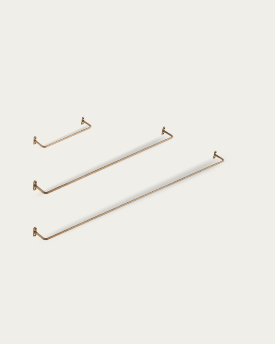
Rule Two: Scale First, Styling Second
If a console table feels “off,” it’s almost always a scale issue. Too shallow, and it looks apologetic. Too deep, and it blocks flow. Too tall, and it fights the wall behind it.
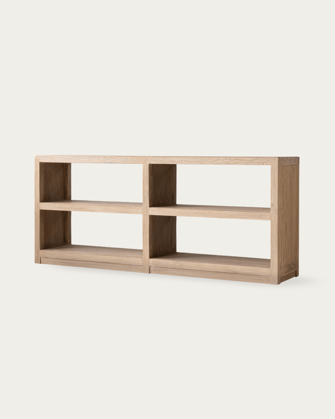
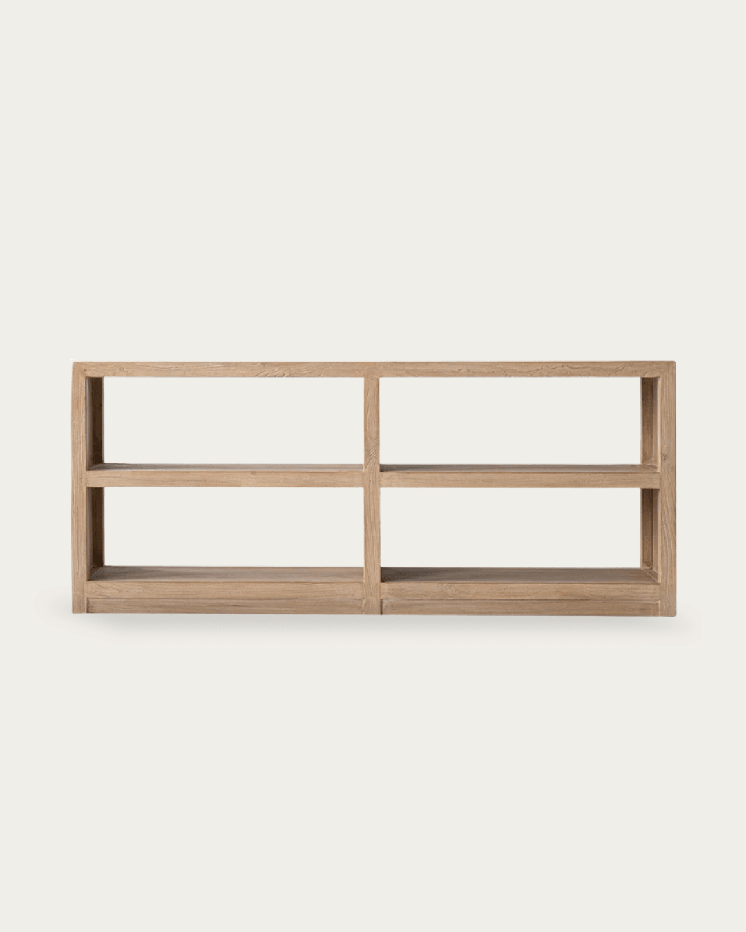
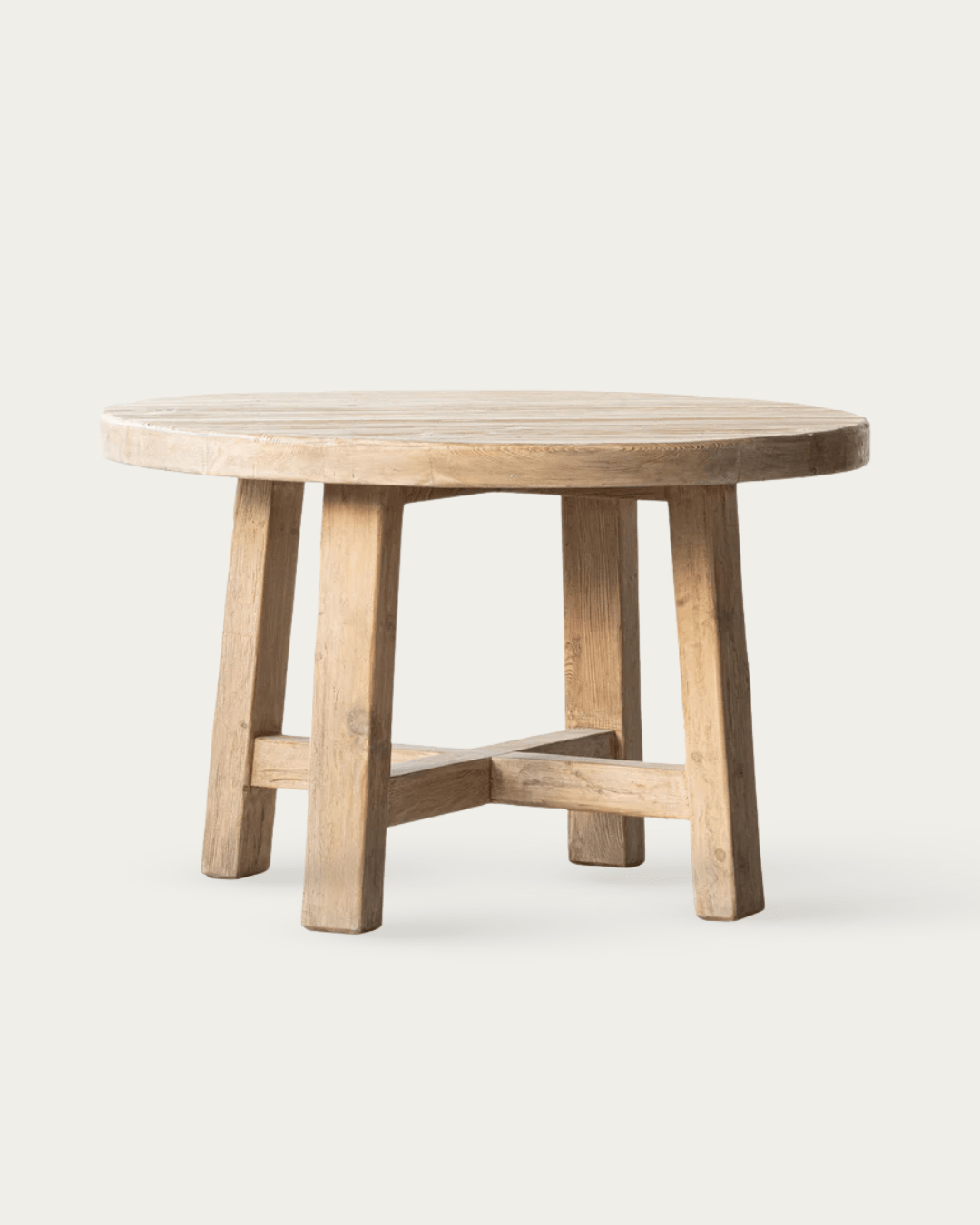
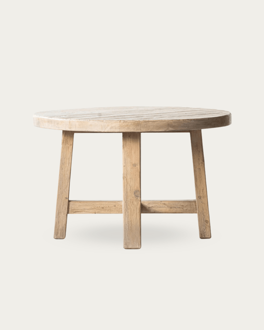
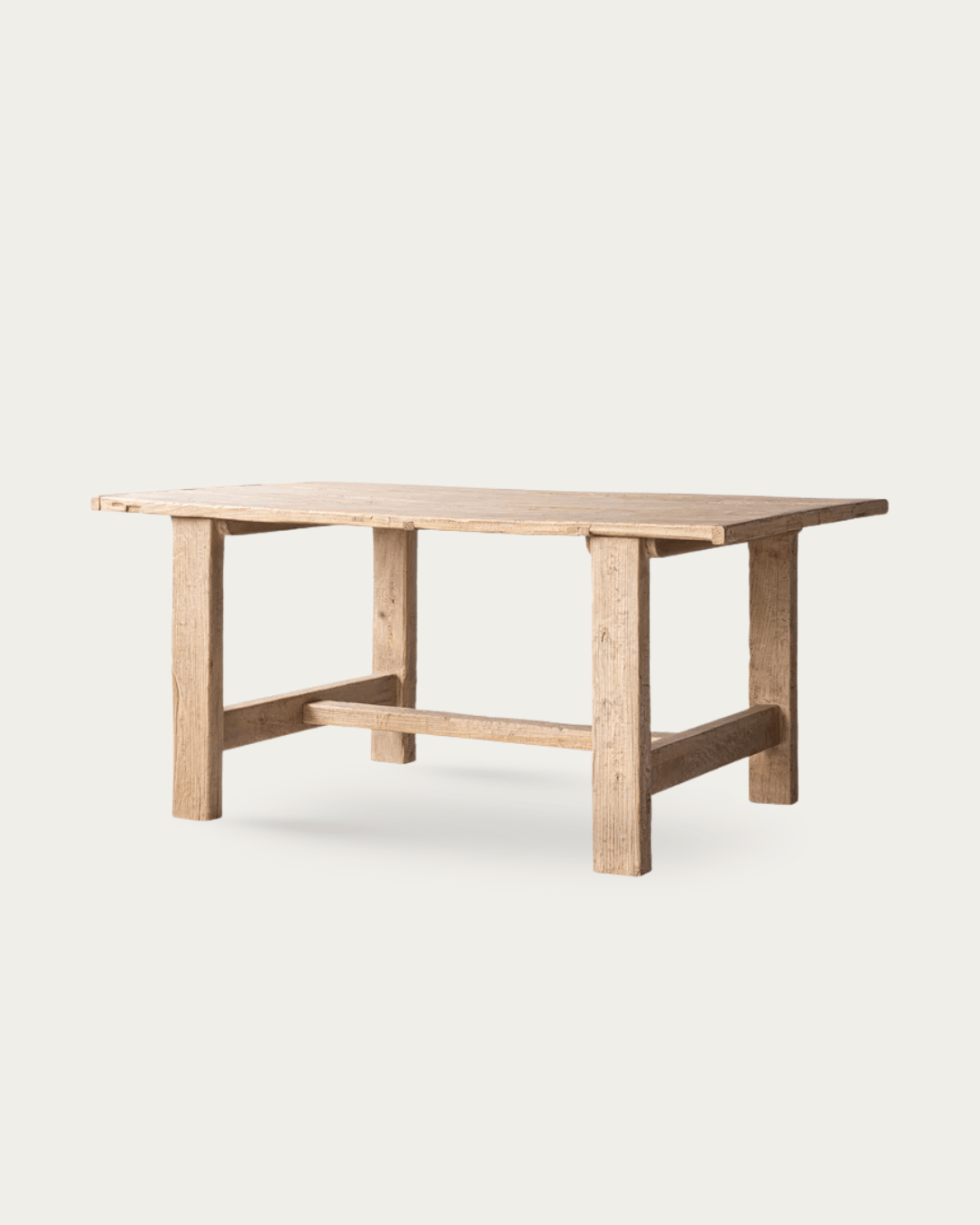
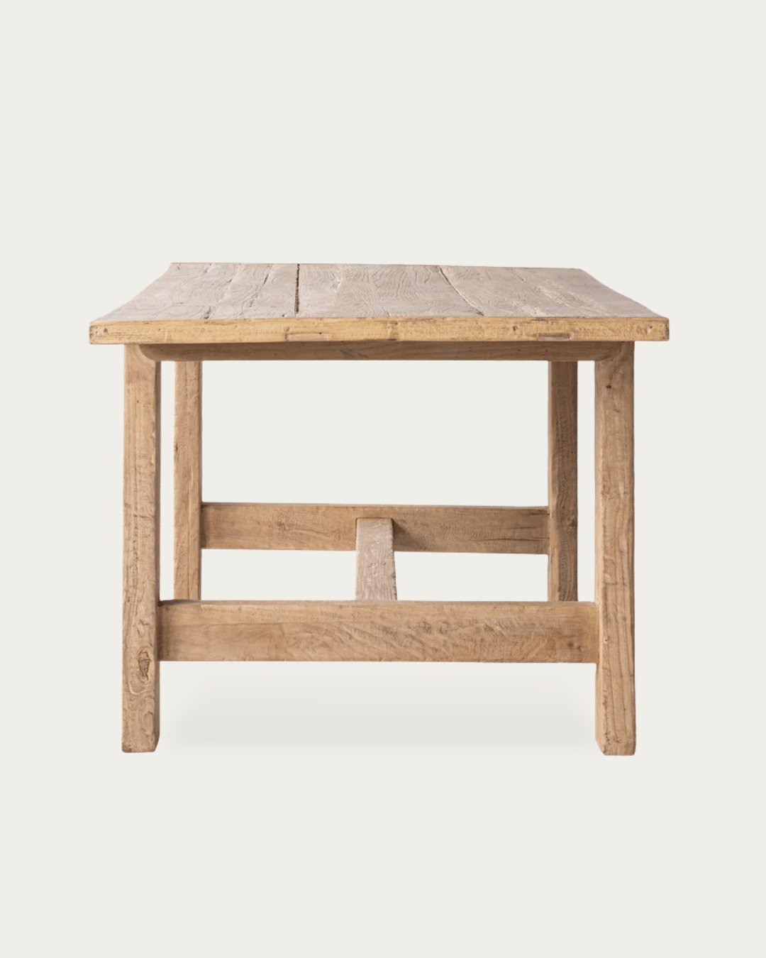
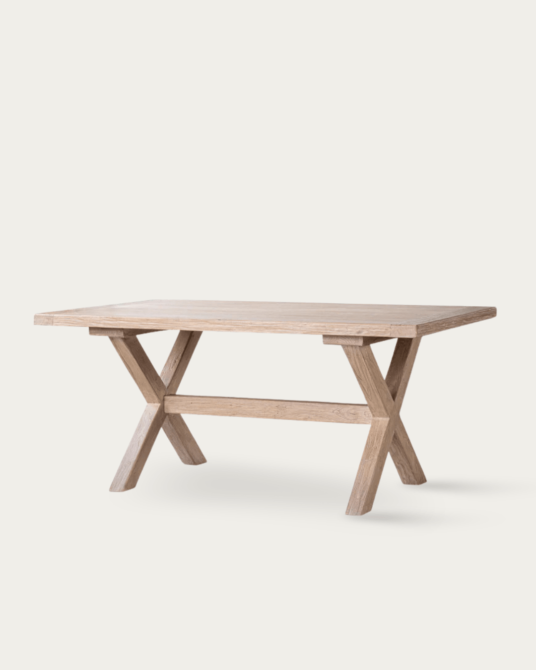
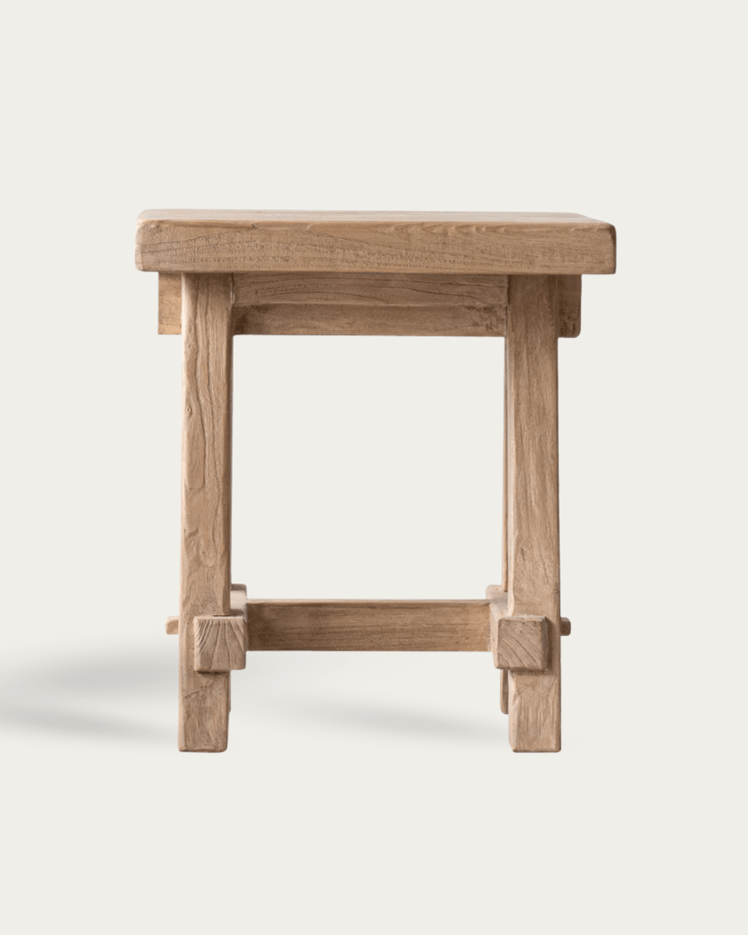
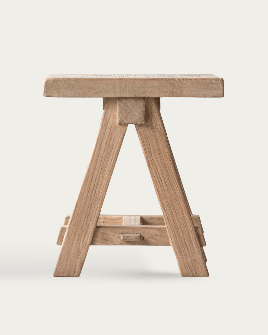
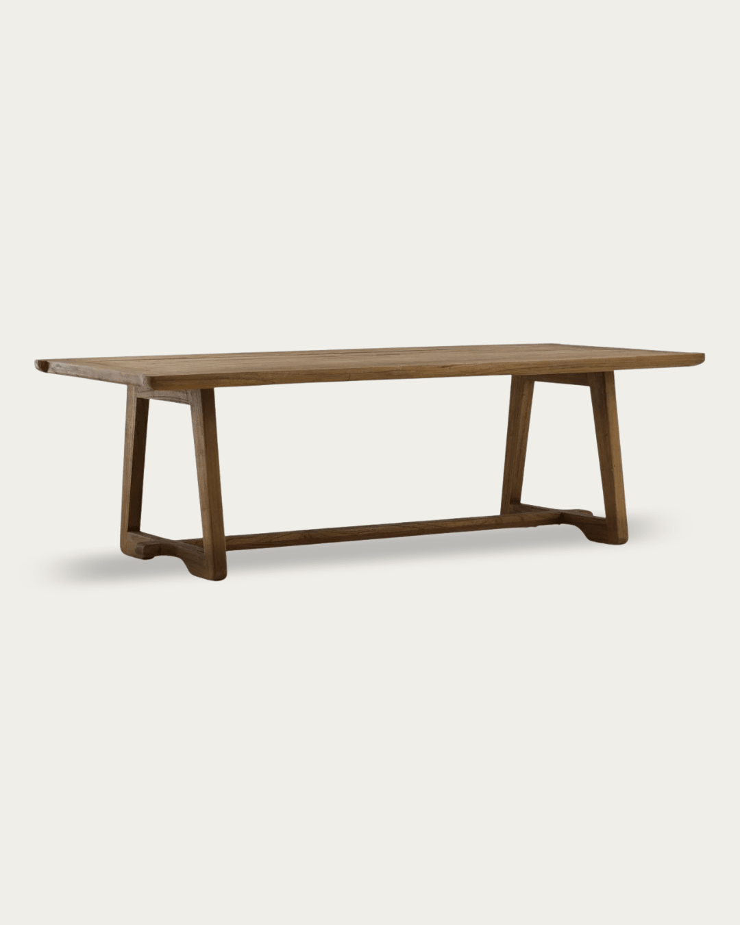
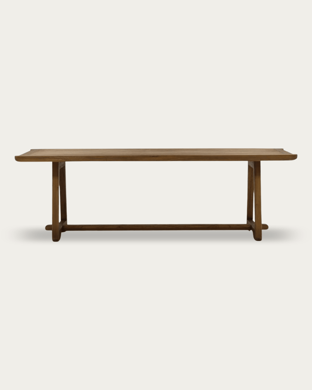
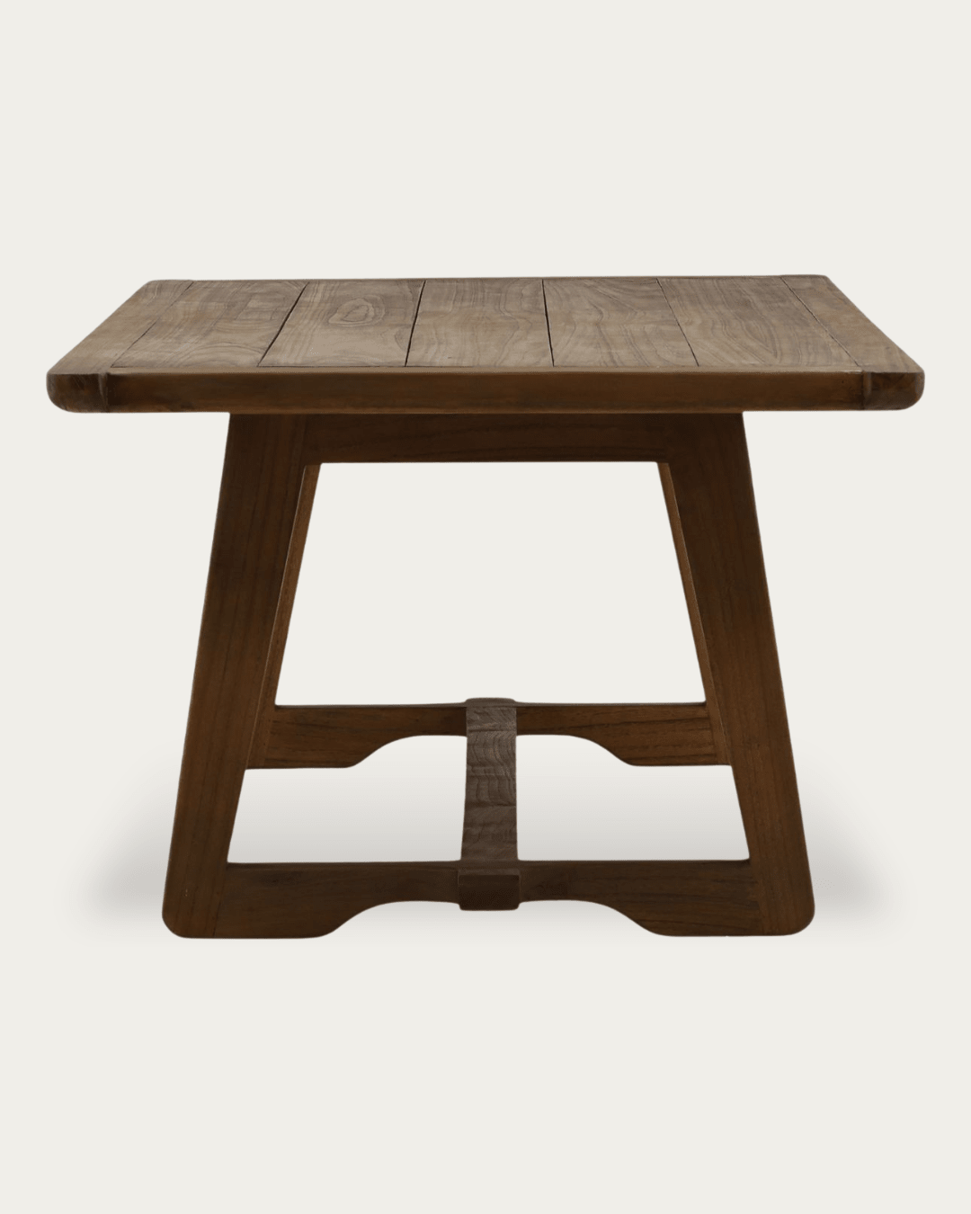
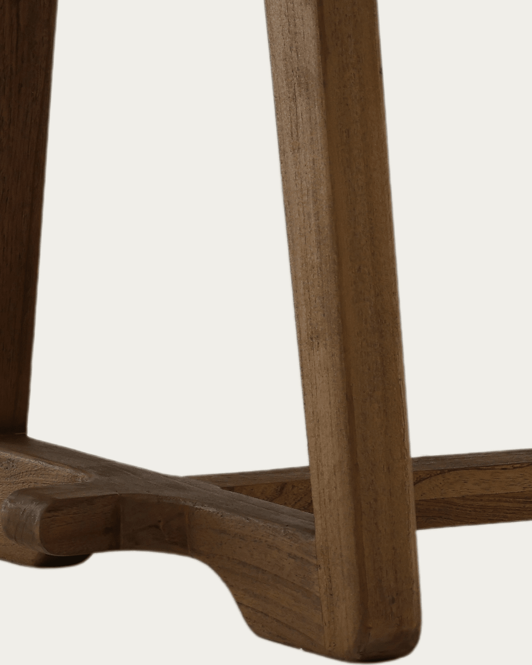
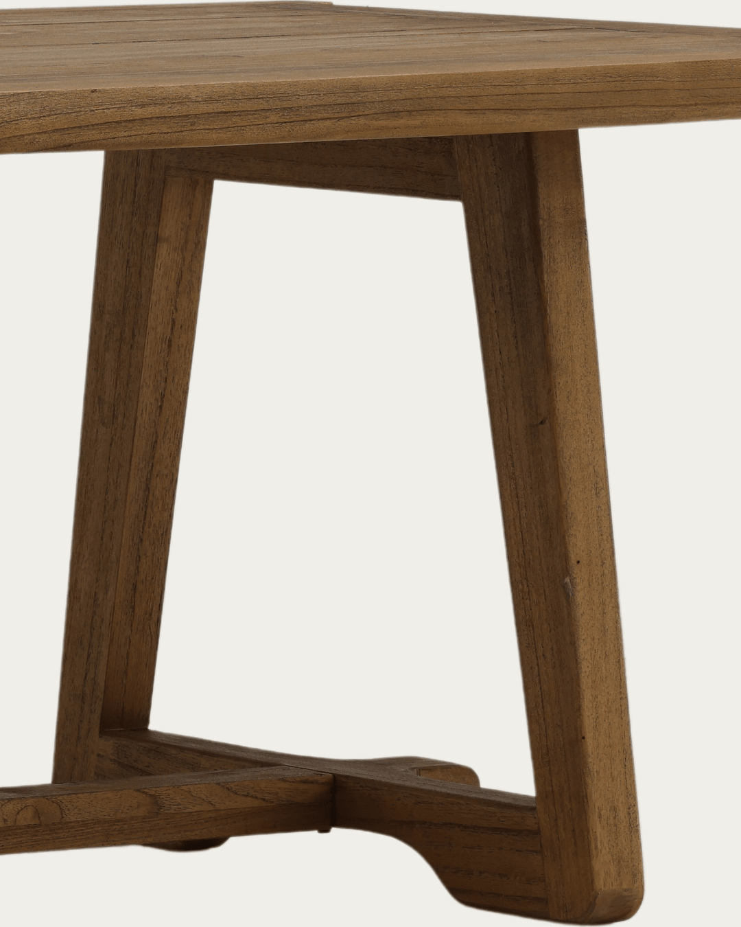
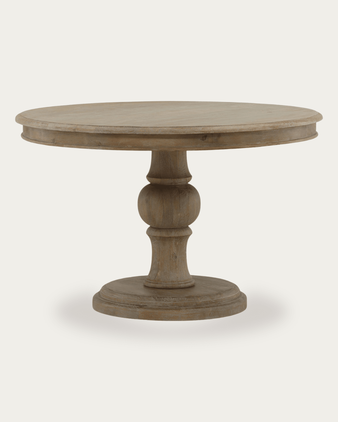
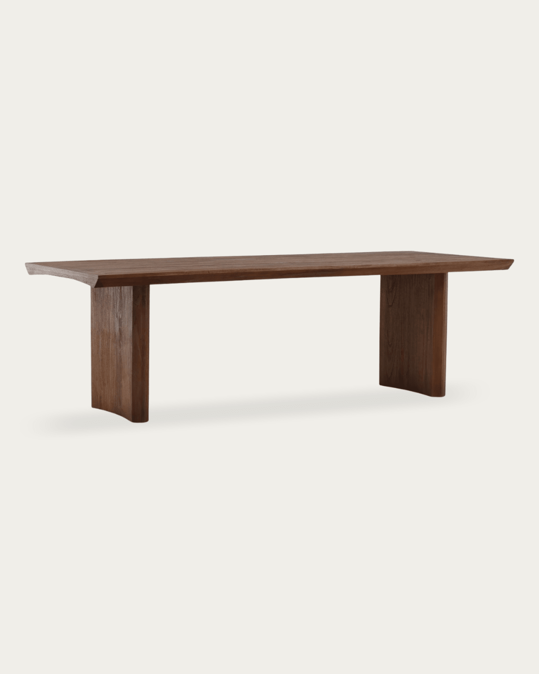
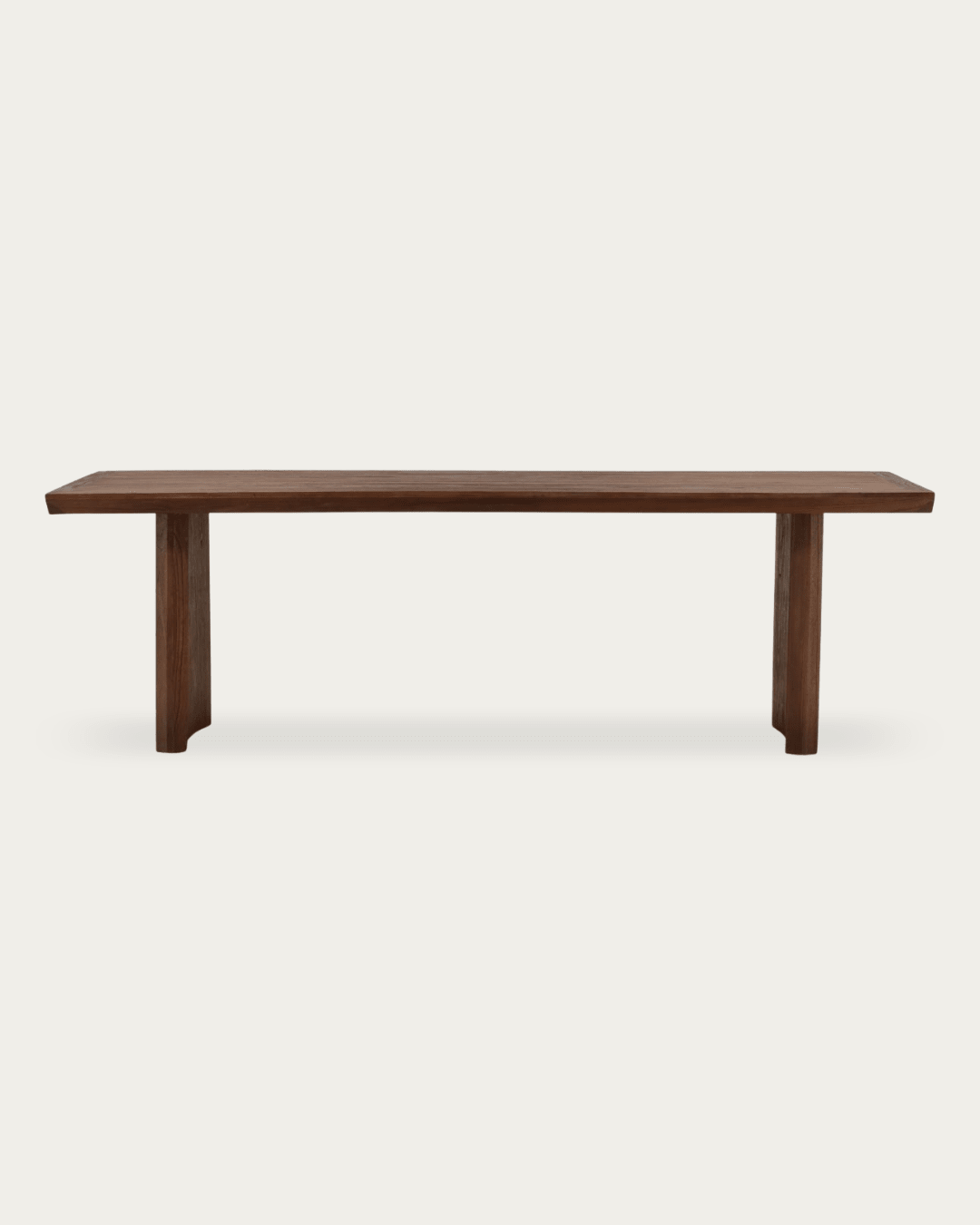
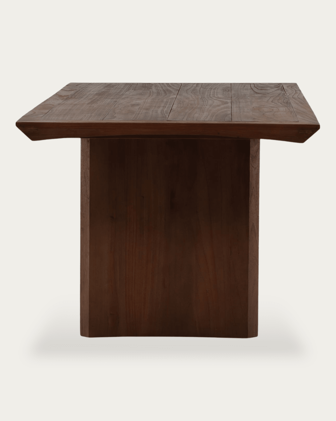
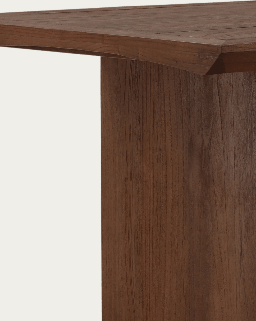
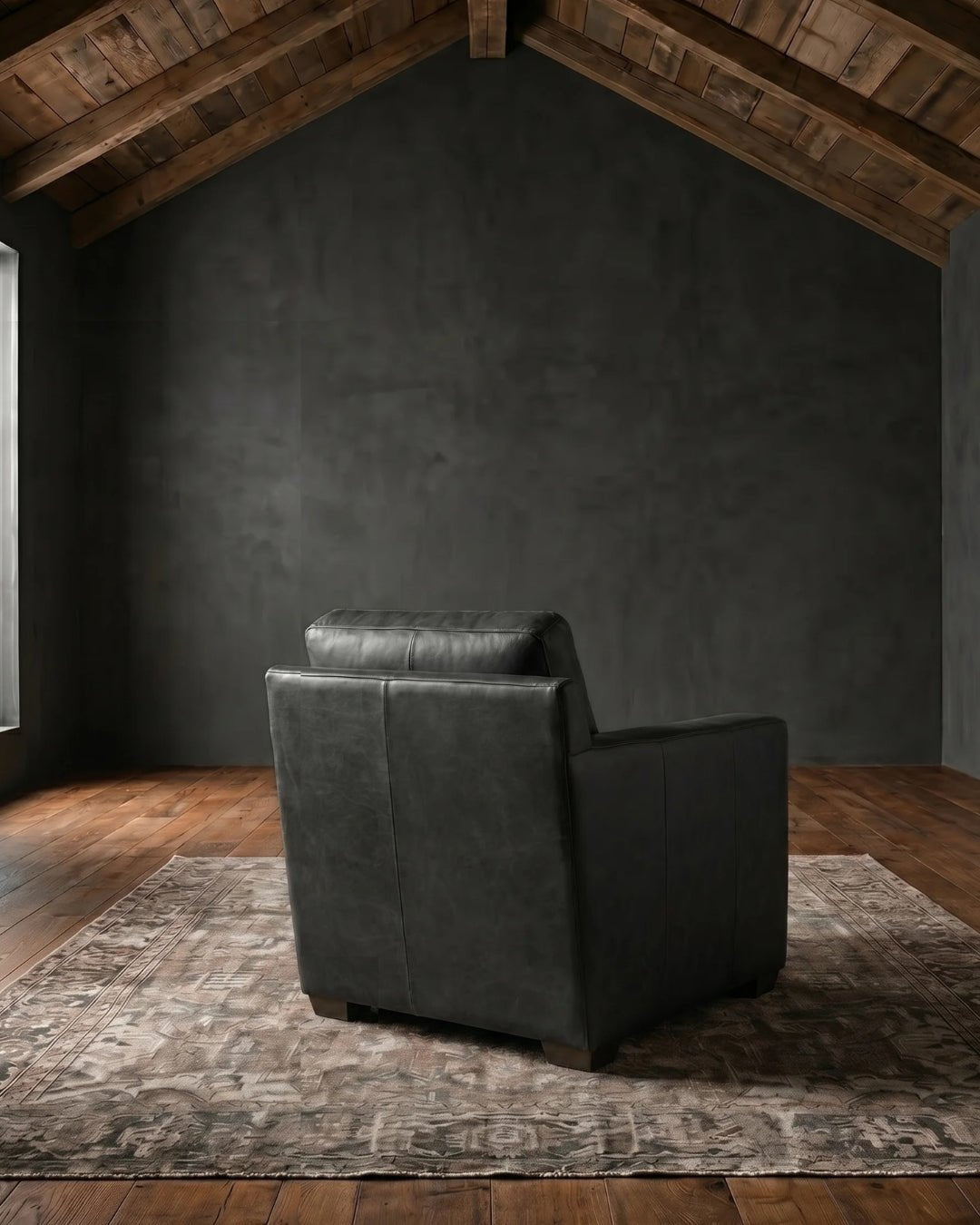
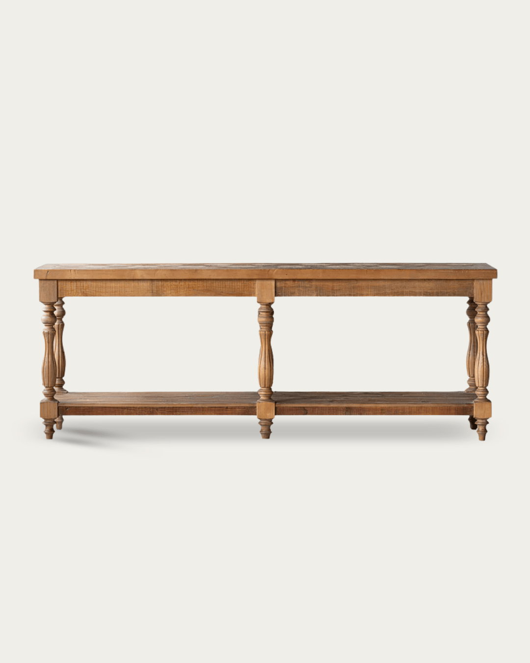
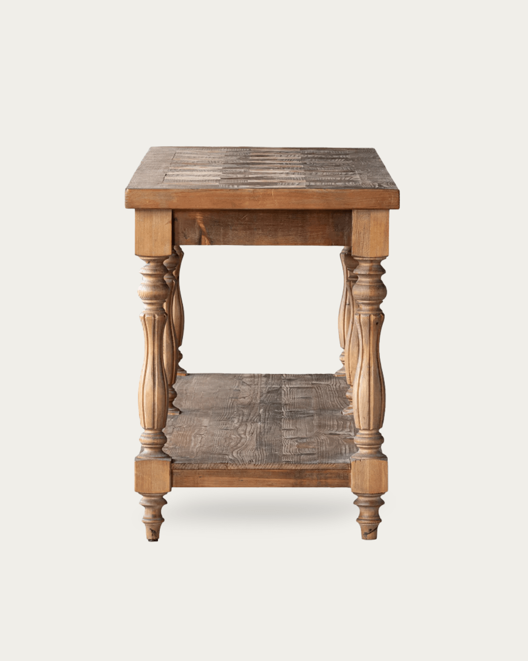
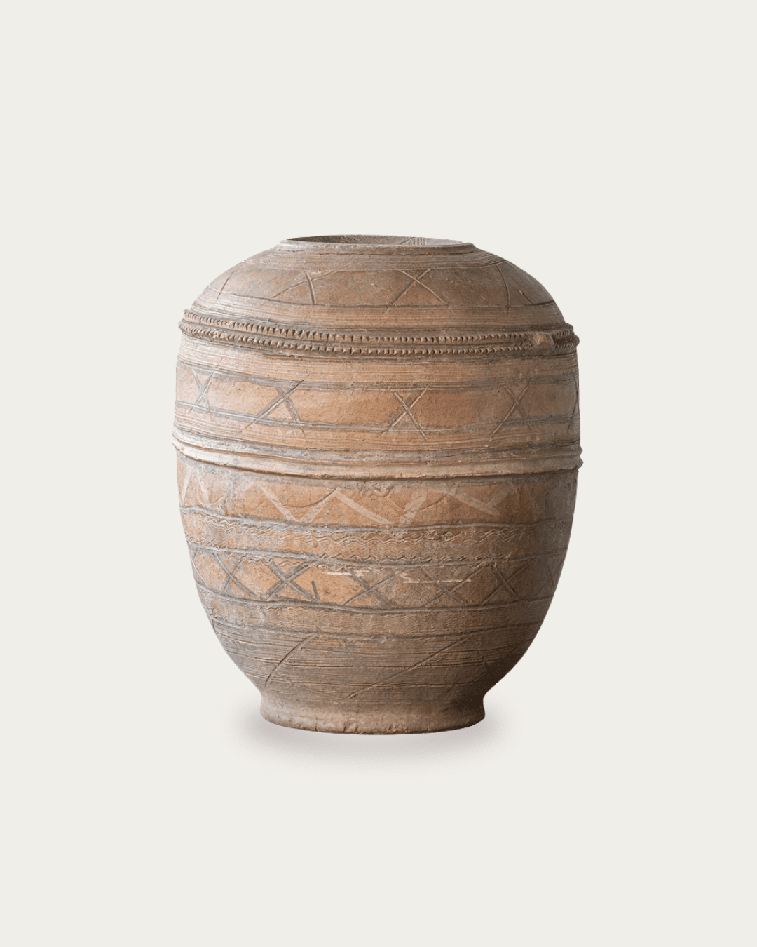
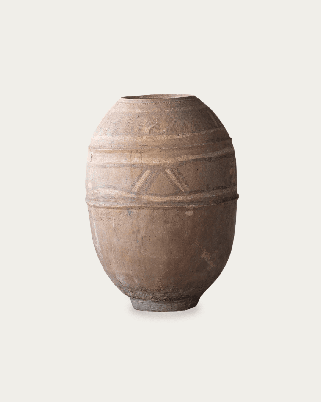
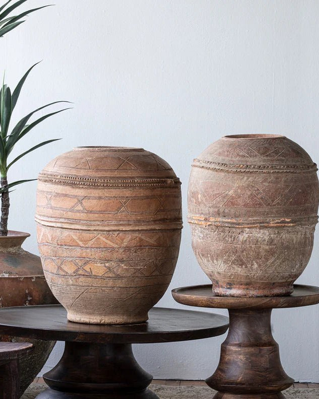
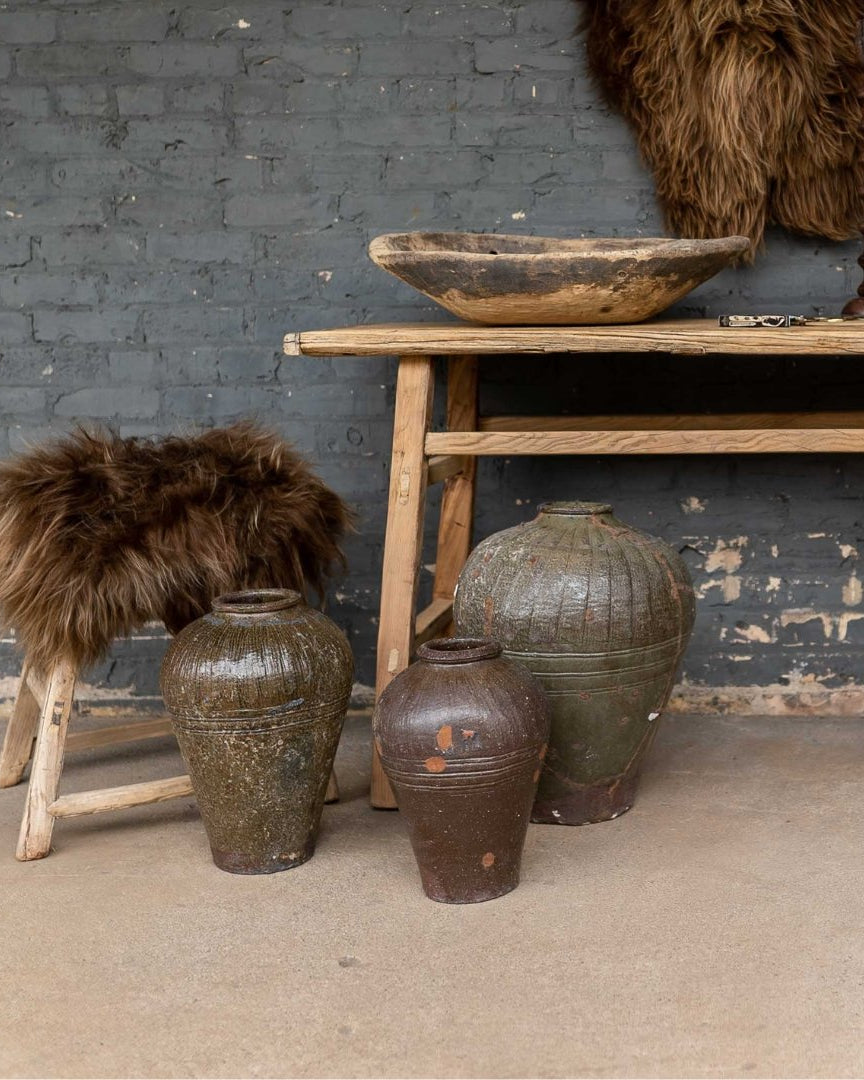
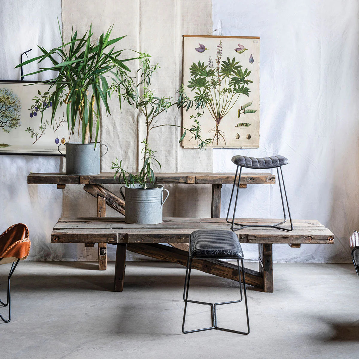
Vintage and reclaimed consoles tend to succeed because they weren’t designed as afterthoughts. Their dimensions are rooted in function—work tables, architectural remnants, utilitarian surfaces. That history shows up as better balance.
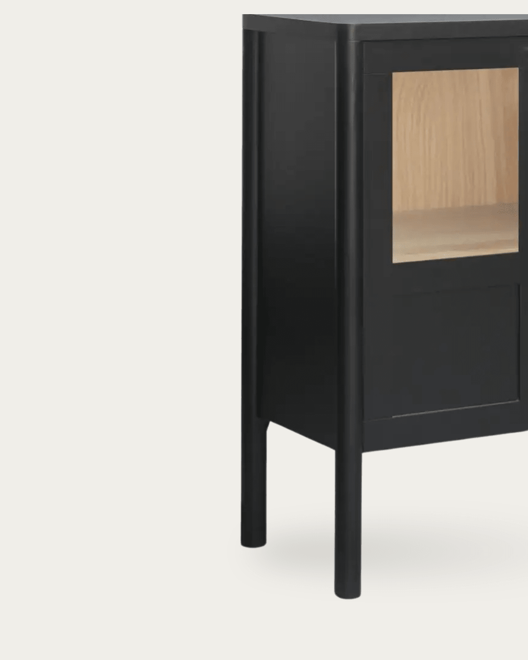
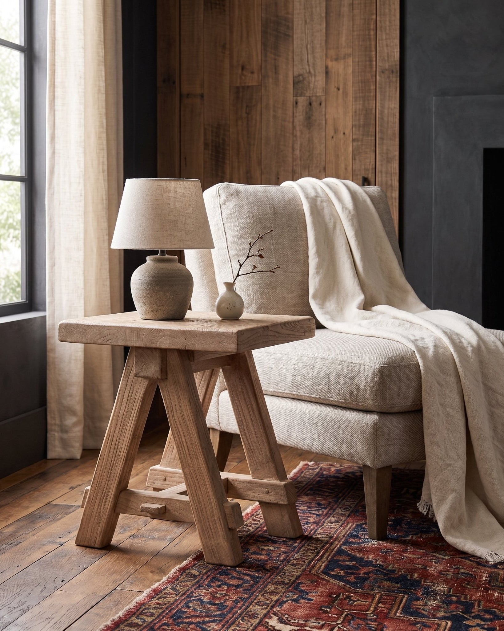
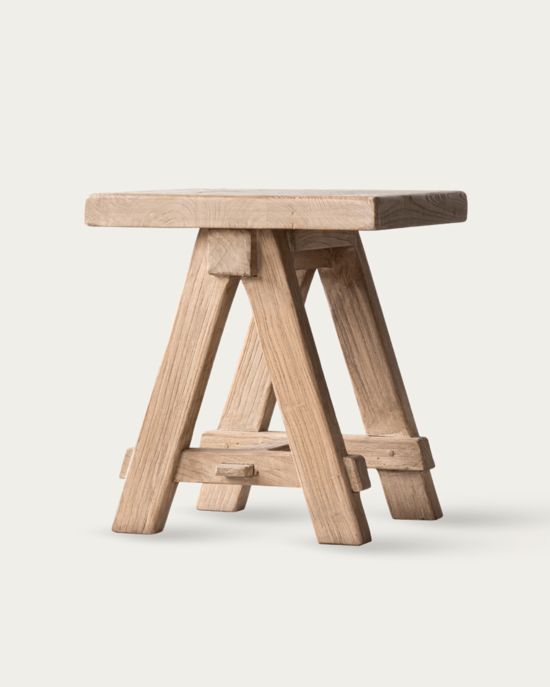
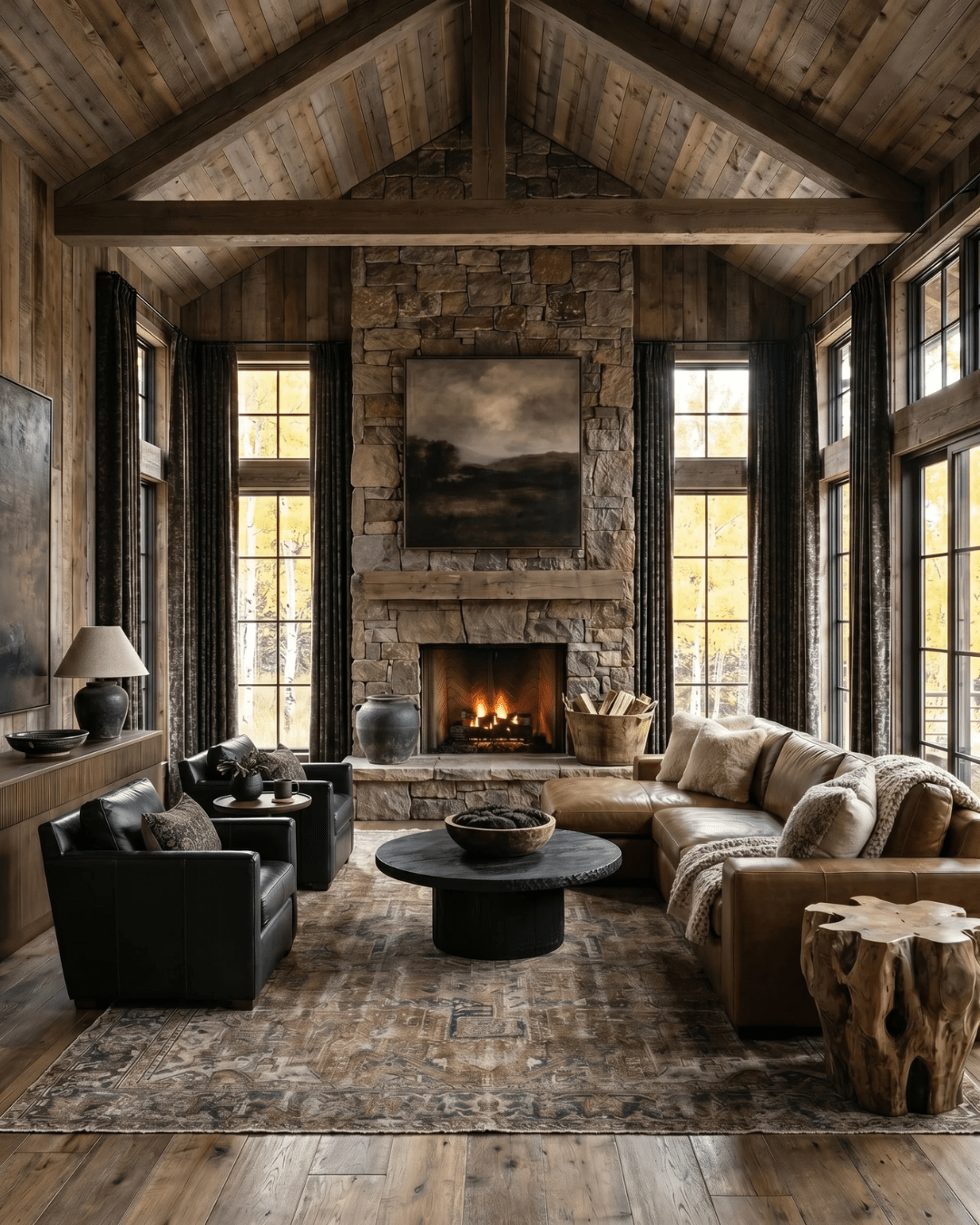
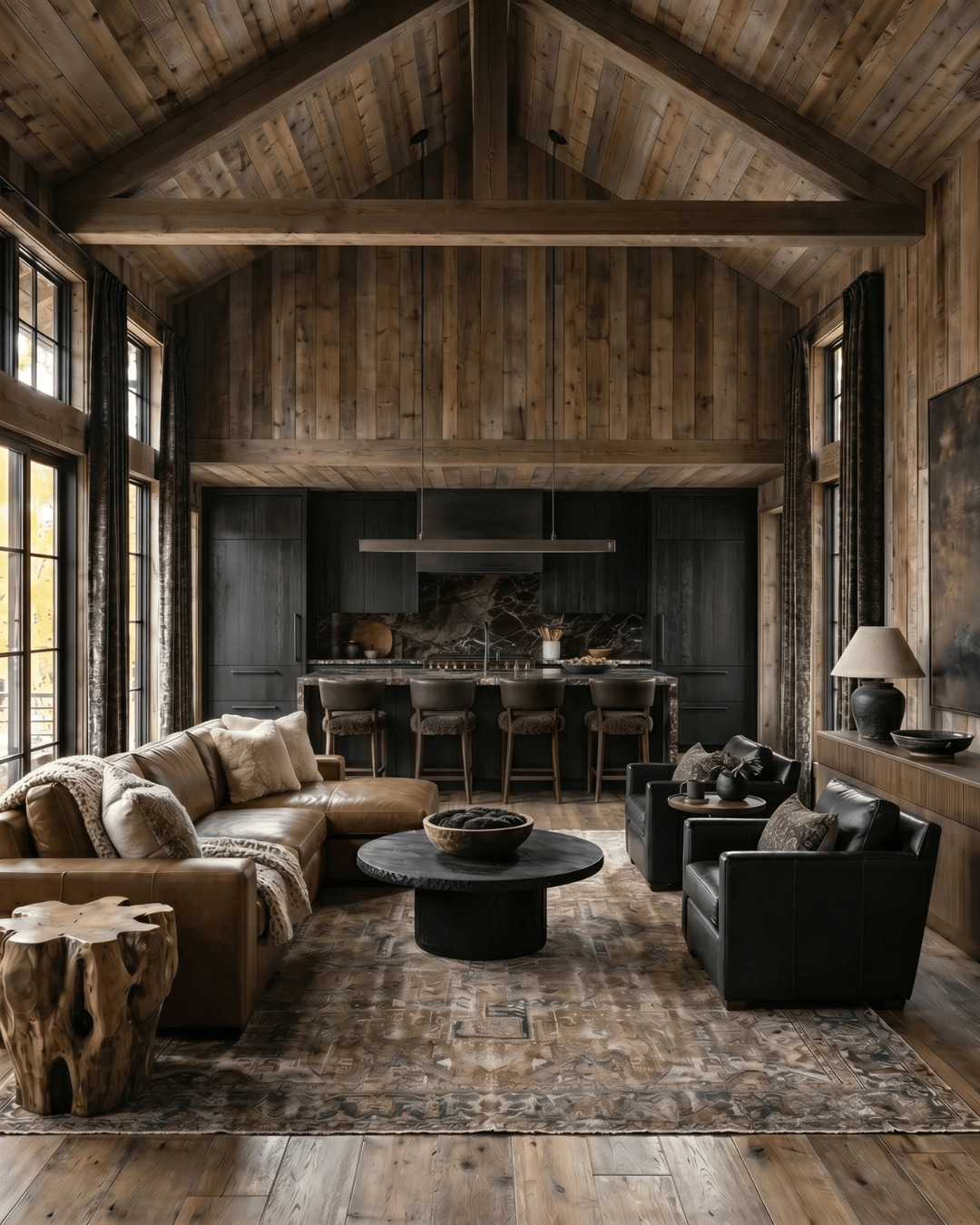
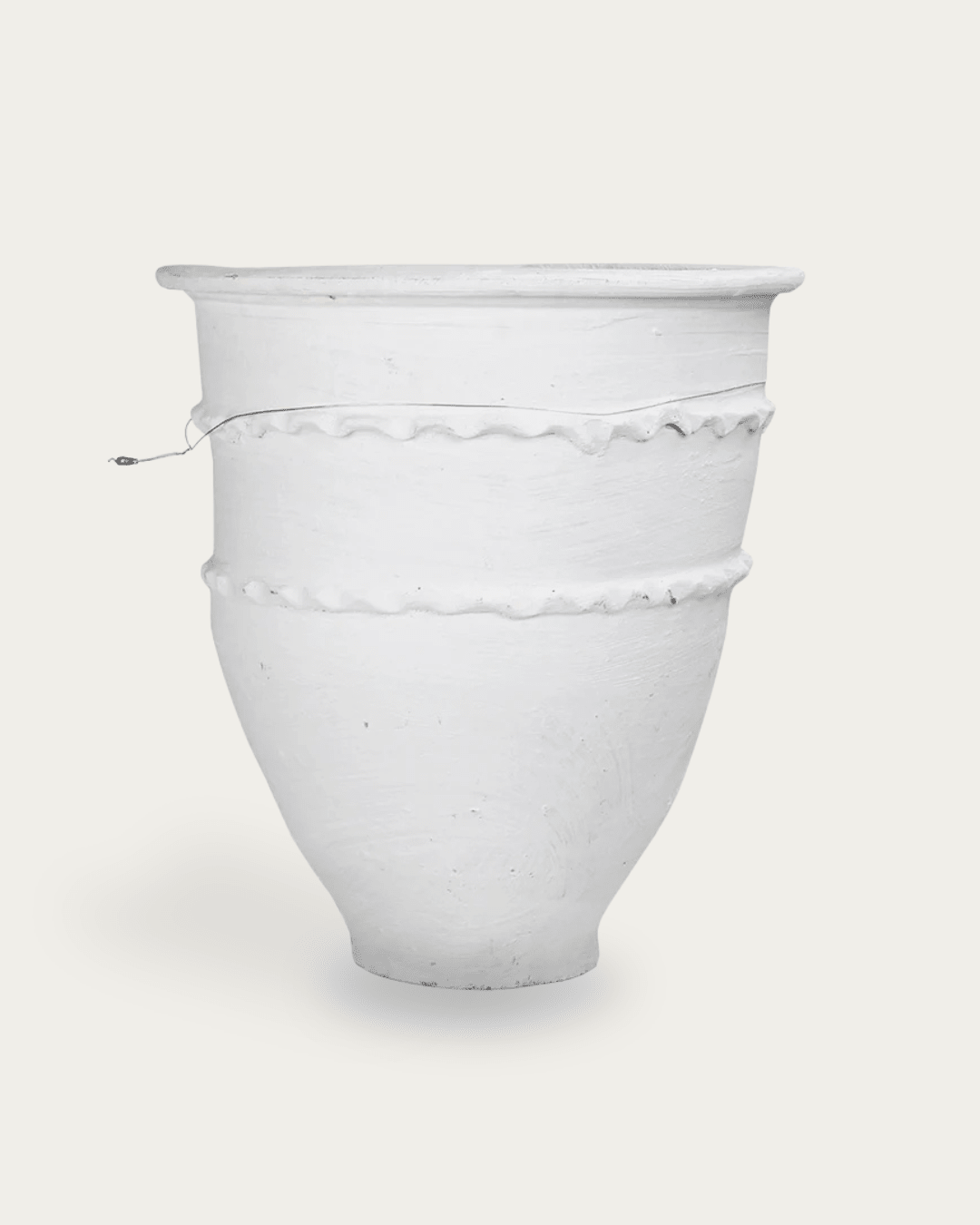
The Bryndis console carries visual weight through thickness rather than ornament. It works best in rooms that already have strong vertical elements—windows, doors, beams—where the console can act as a horizontal counterpoint.
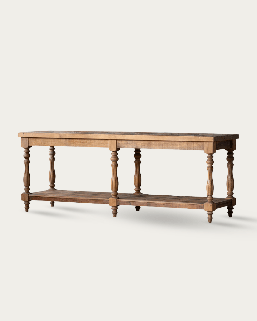
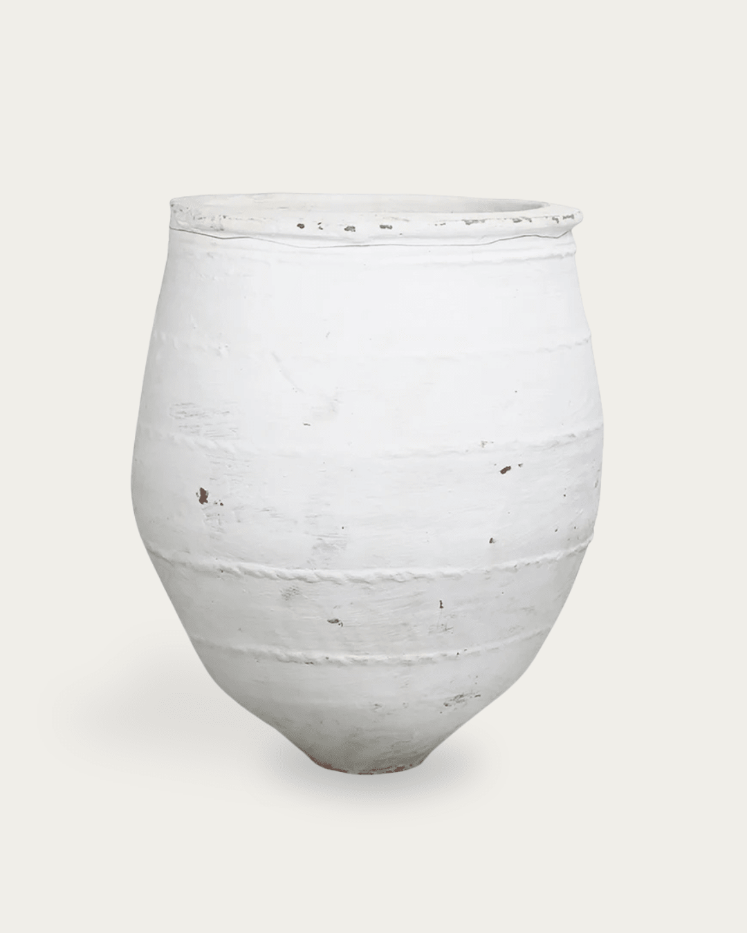
For larger rooms or open-plan layouts, the Linden architectural salvage console table holds its own without filling space unnecessarily. It doesn’t need to be centered or styled heavily; its scale does the work.
RUTED Tip: If you feel tempted to add more objects to a console, pause. The problem is usually the table’s scale—not the styling.
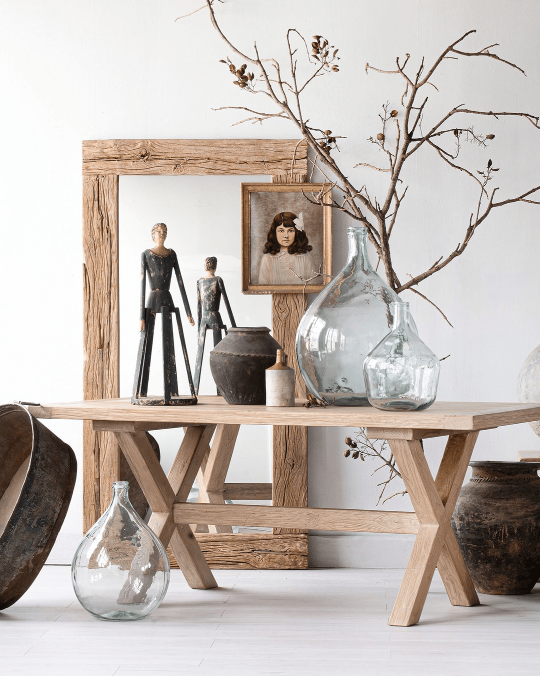
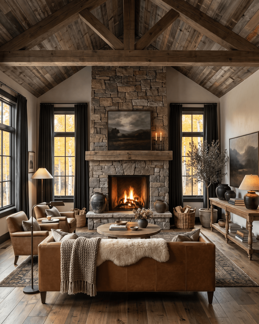
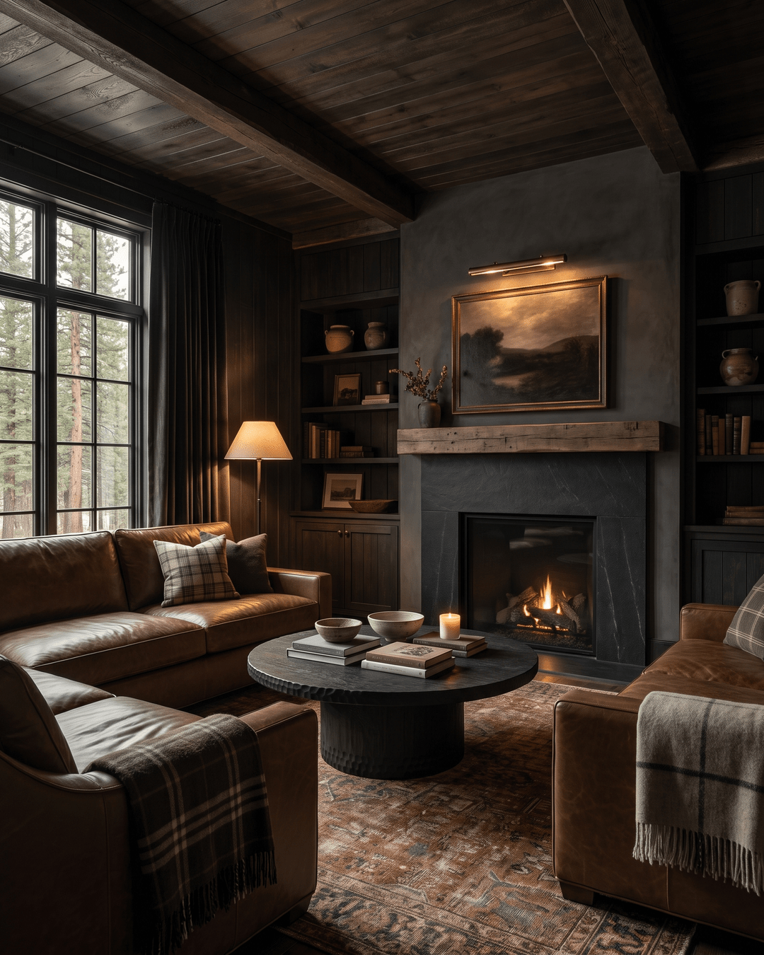
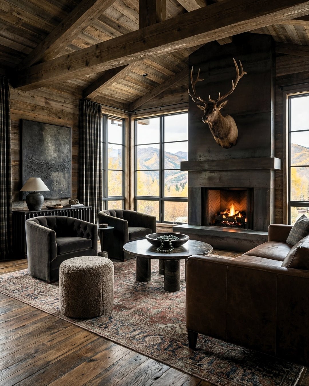
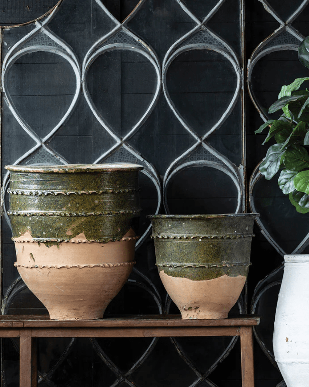
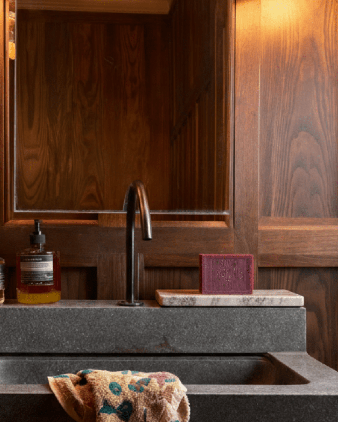
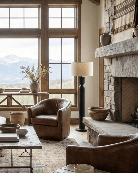
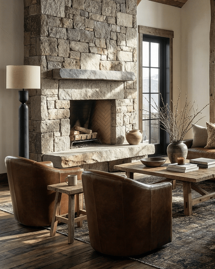
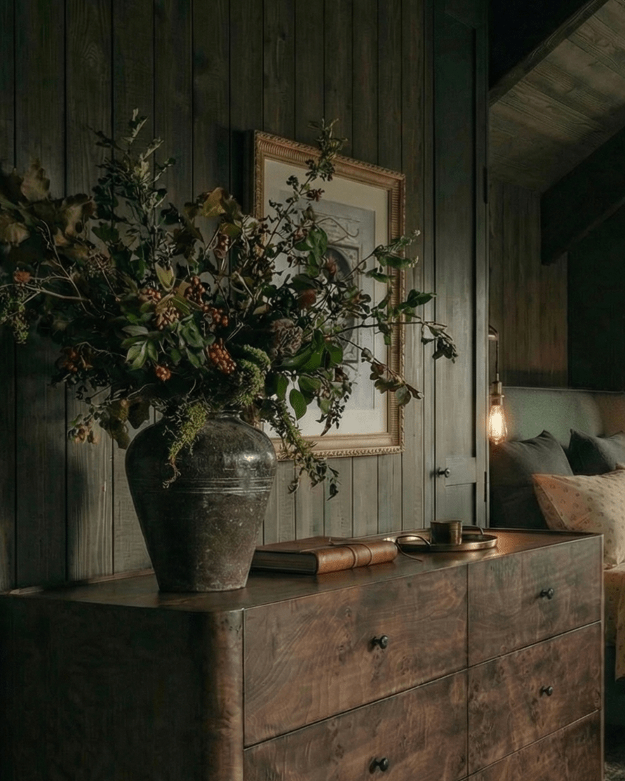
Rule Three: Materials Should Quiet the Space, Not Energize It
Console tables often sit in transitional areas—entryways, hallways, edges of living rooms. These are not places that benefit from high-gloss finishes or sharp contrasts.
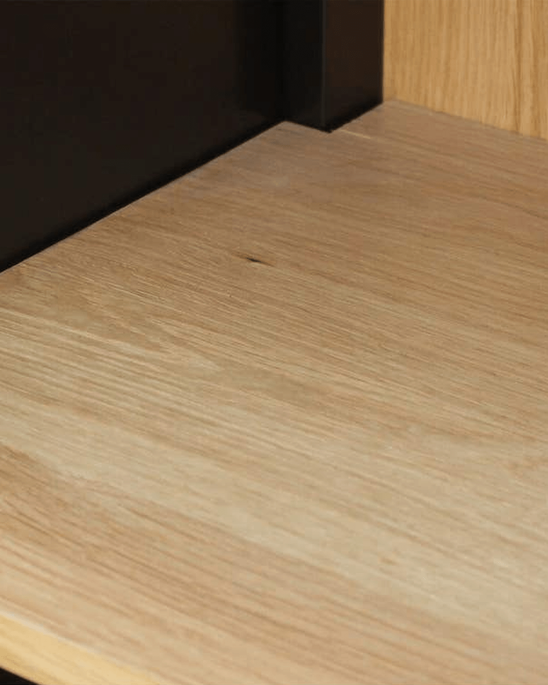
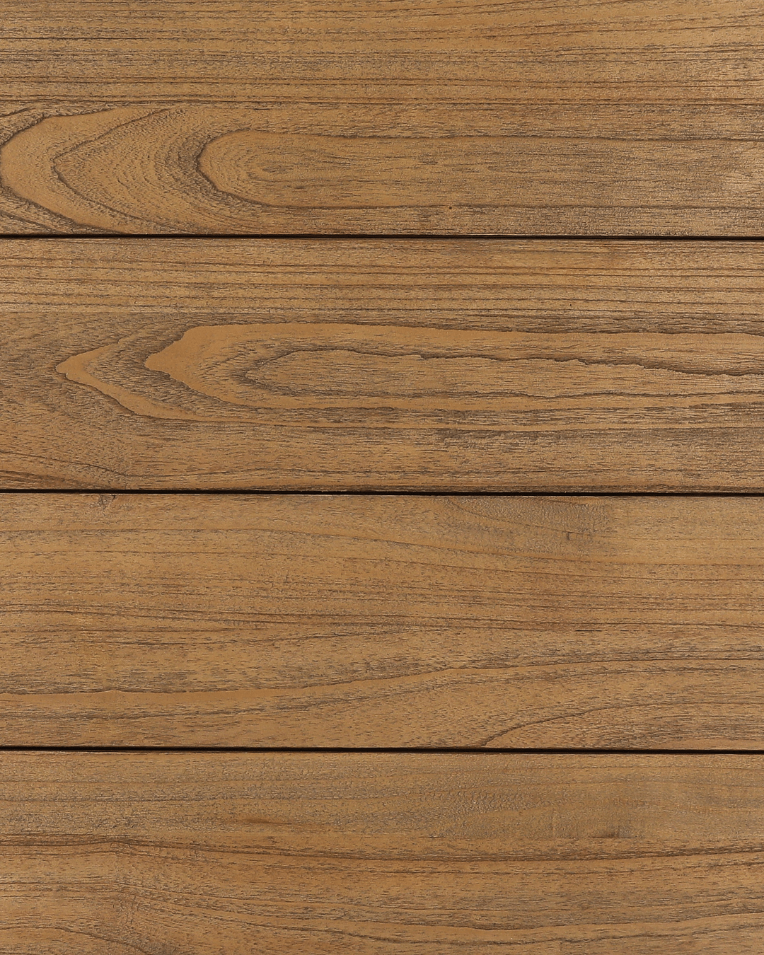
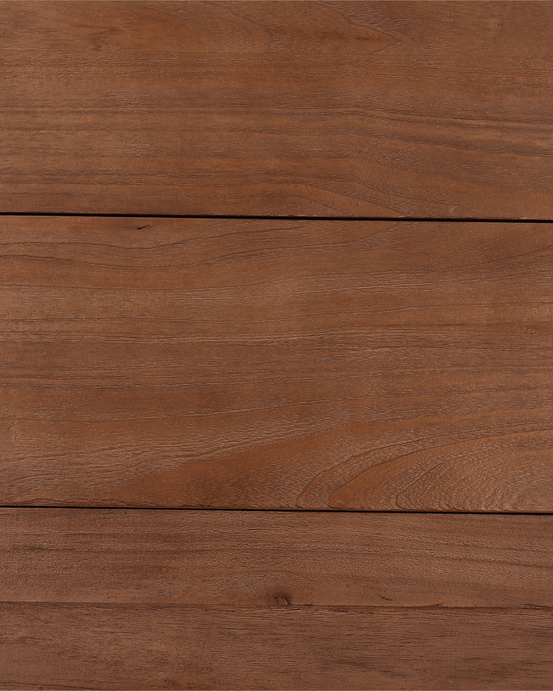
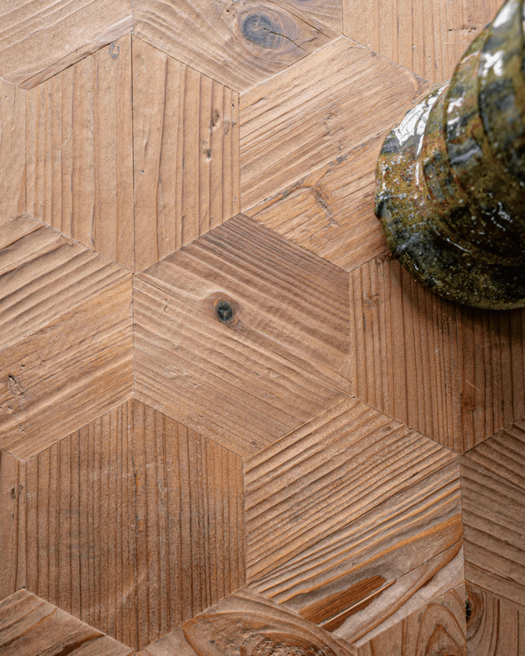
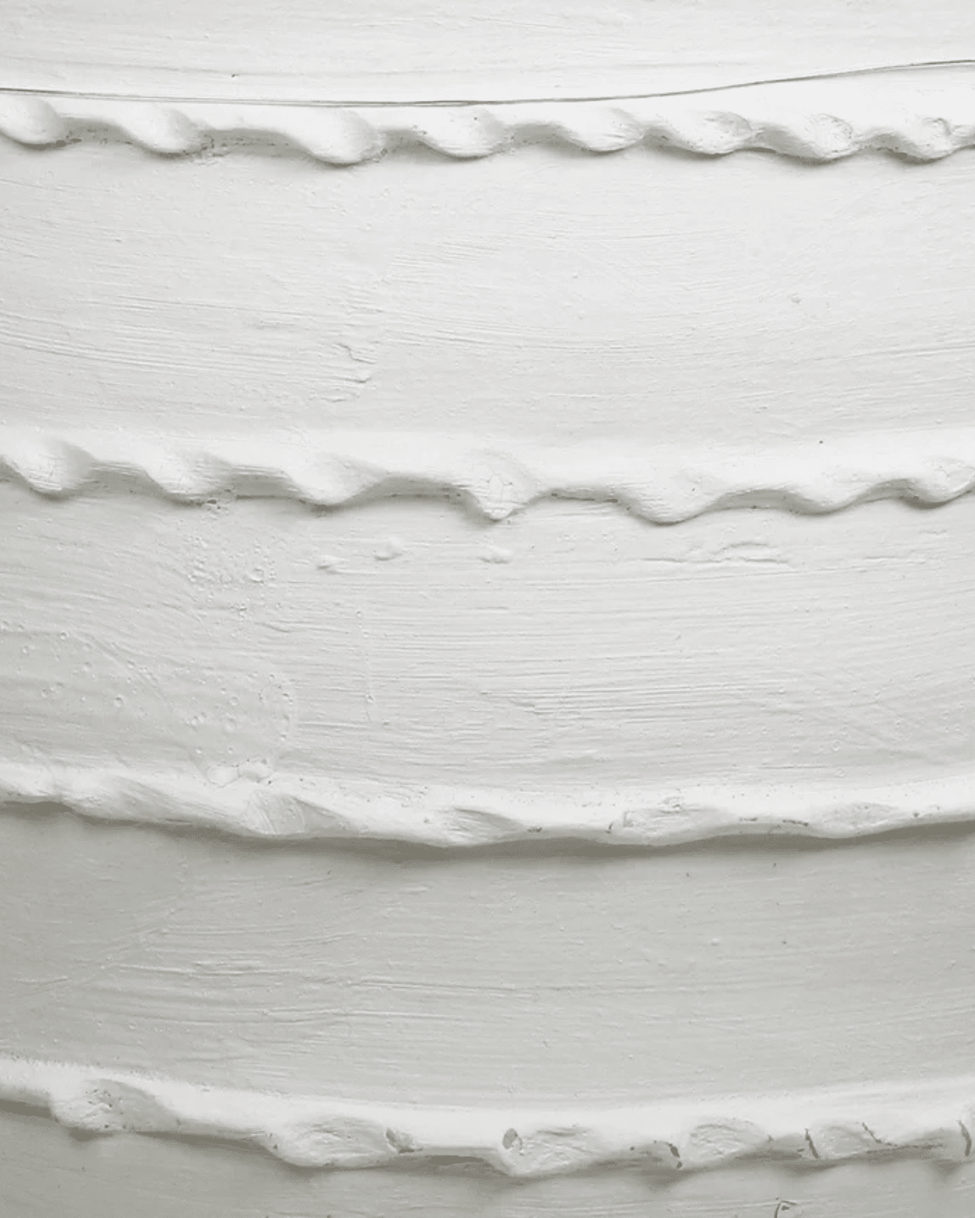
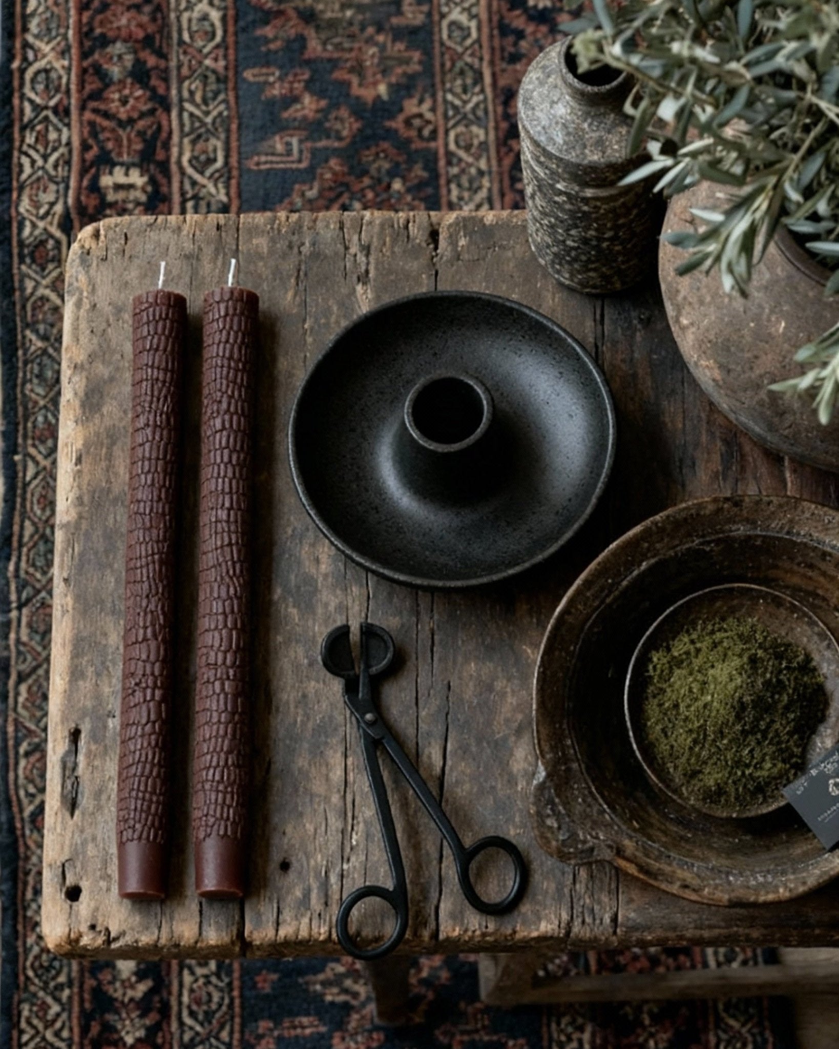
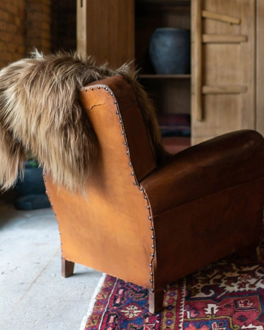
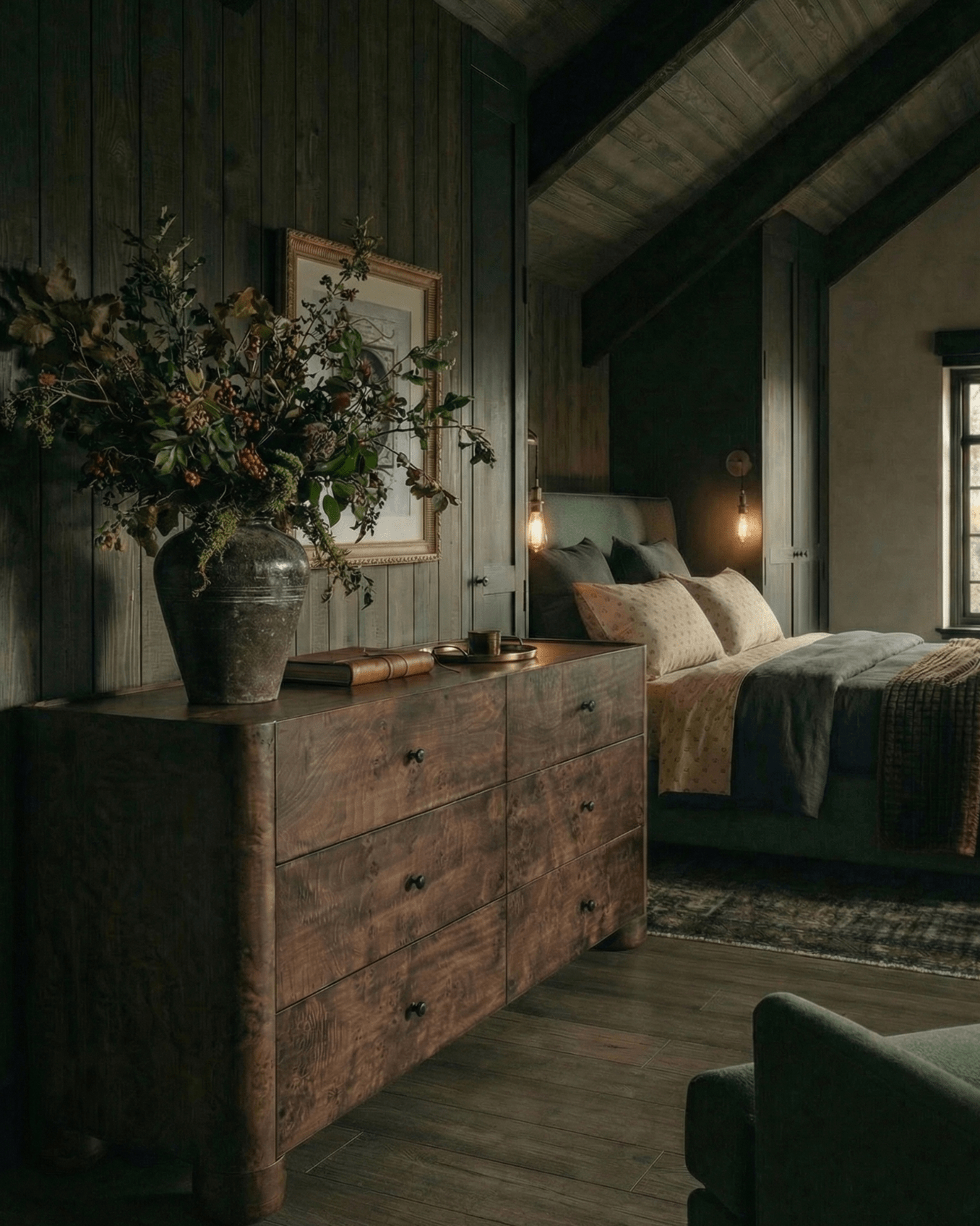
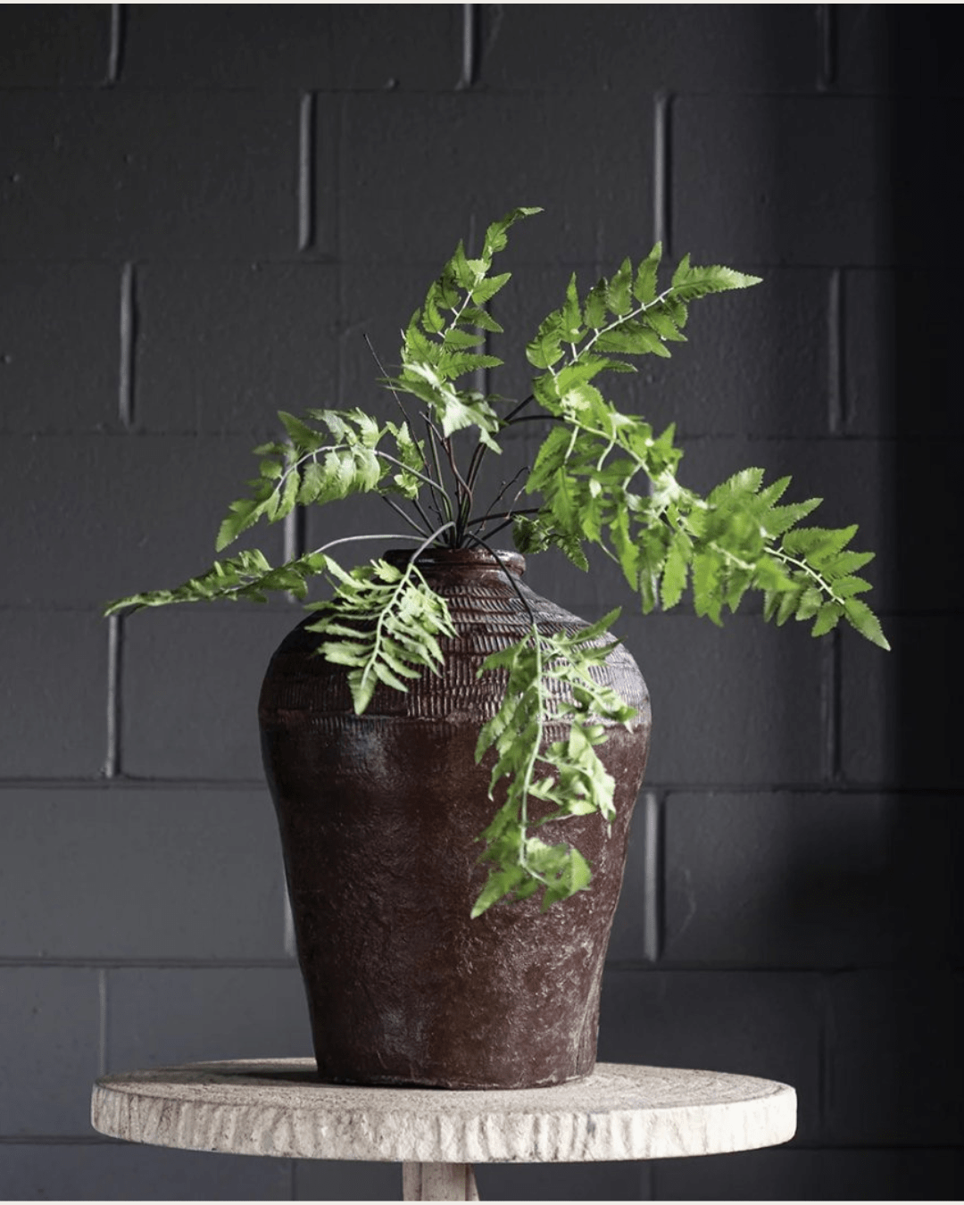
Reclaimed wood, aged surfaces, and visible joinery absorb light and soften edges. They reduce visual friction, which matters more than decoration in these zones.
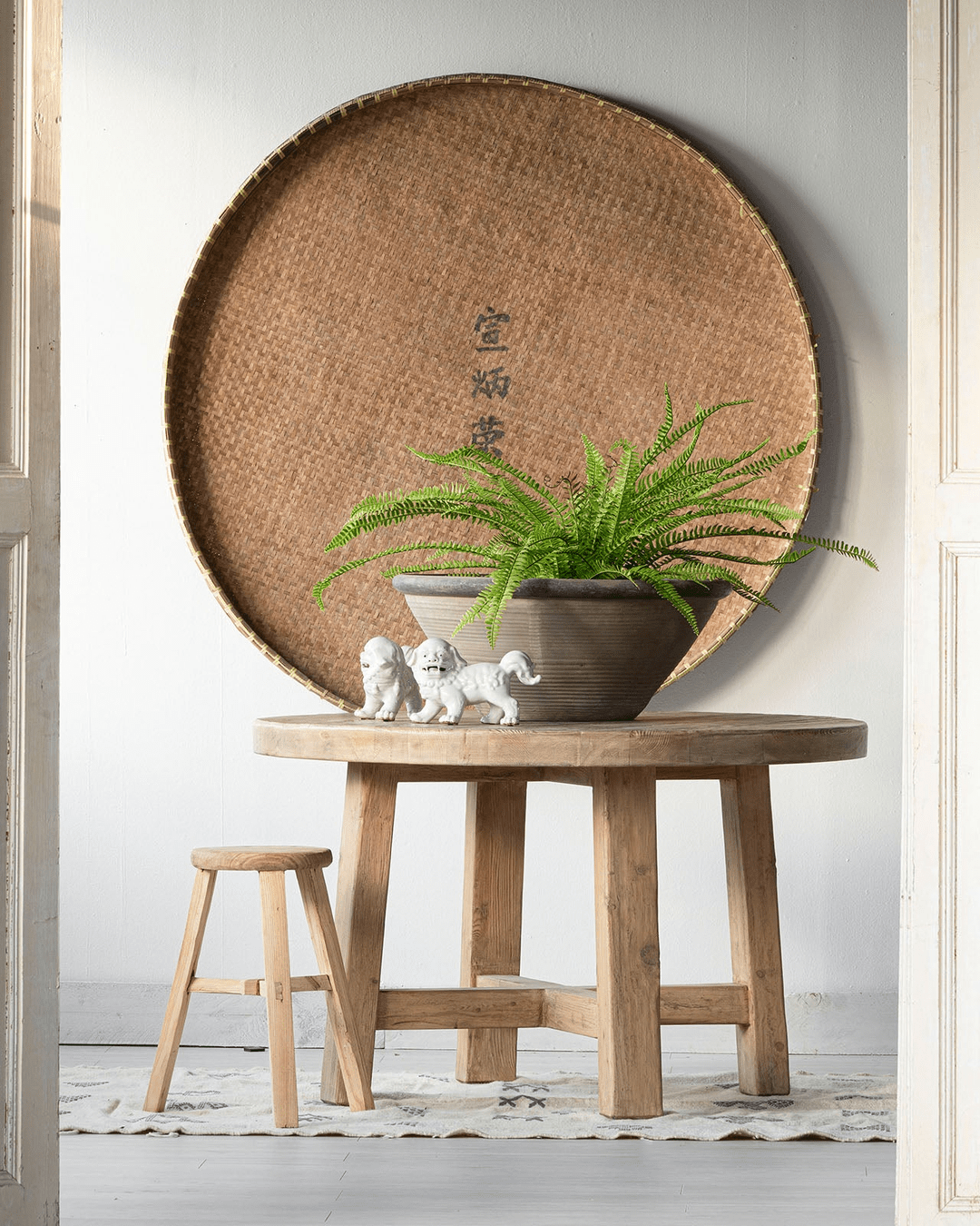
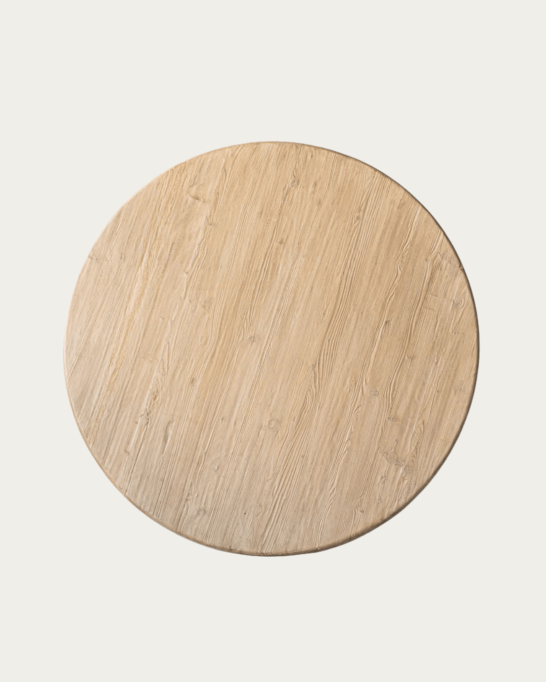
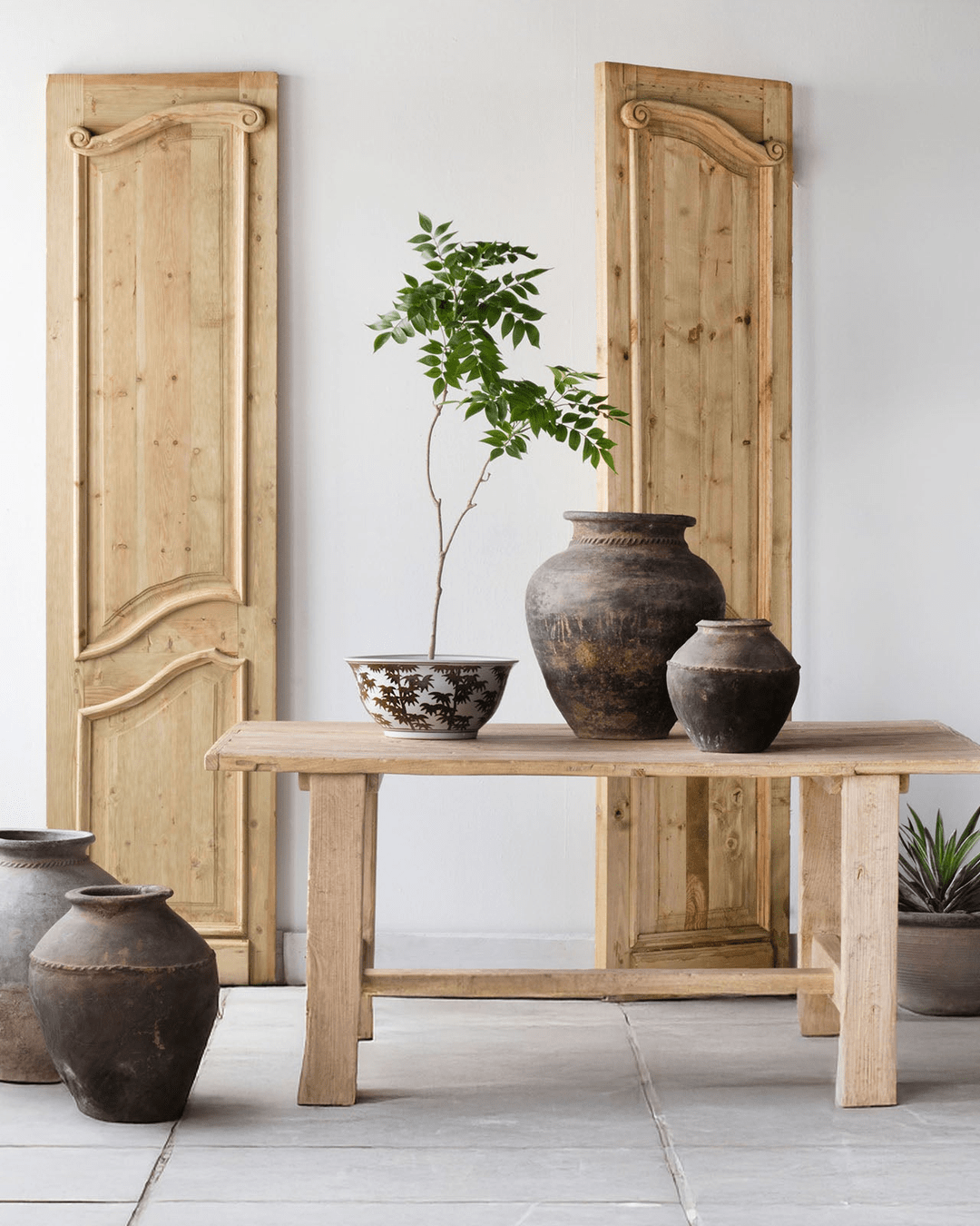
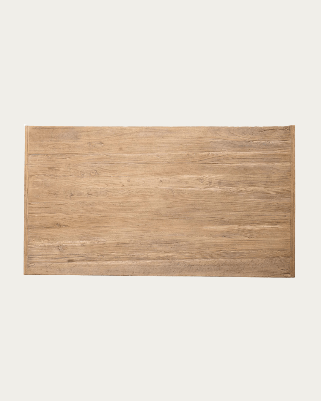
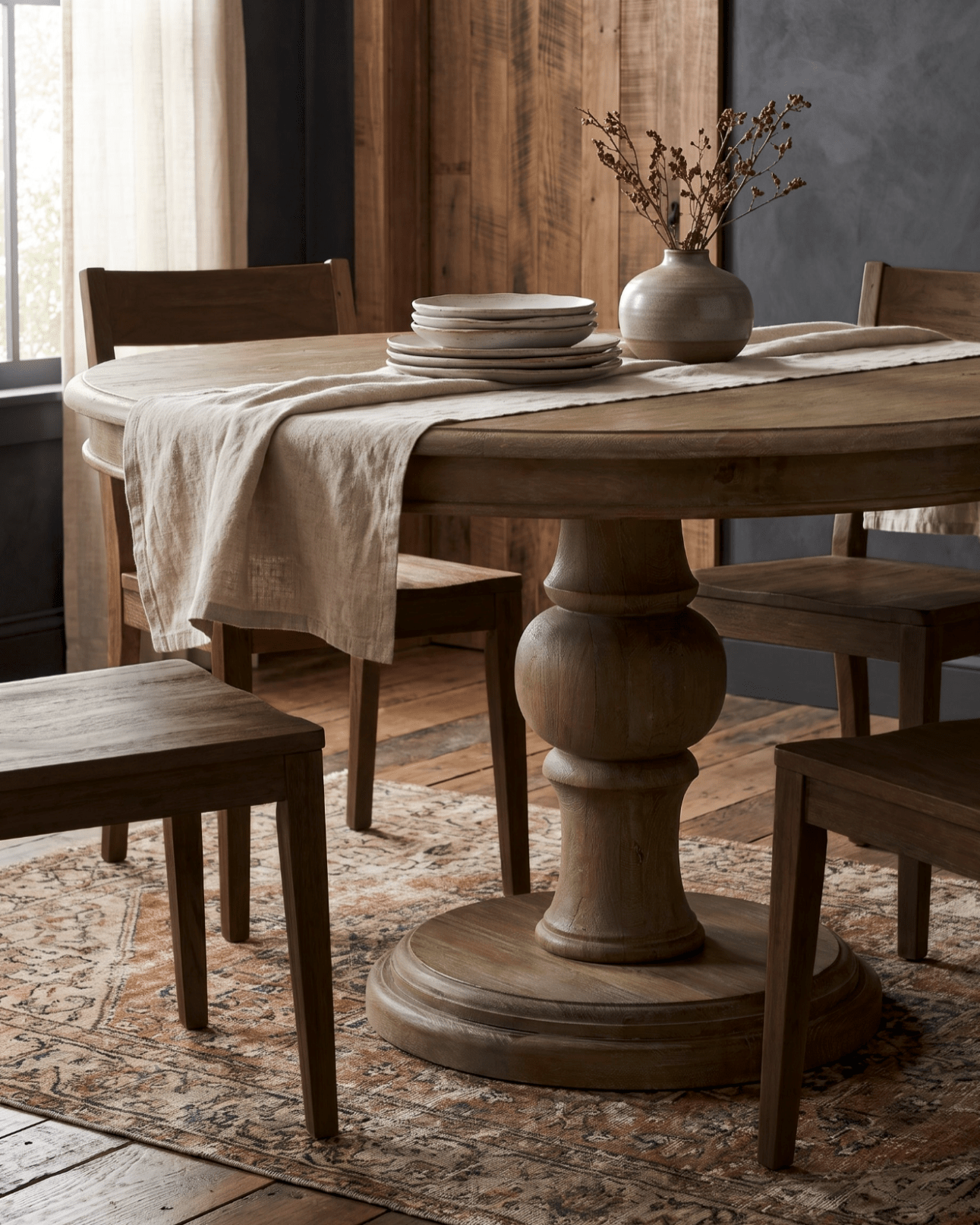
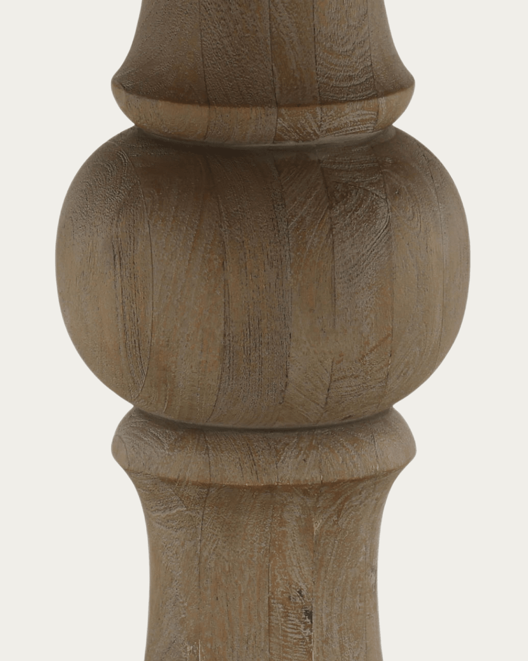
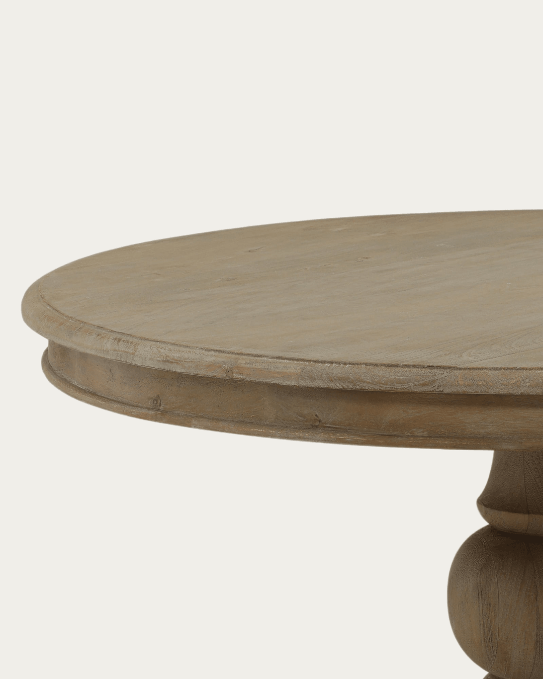
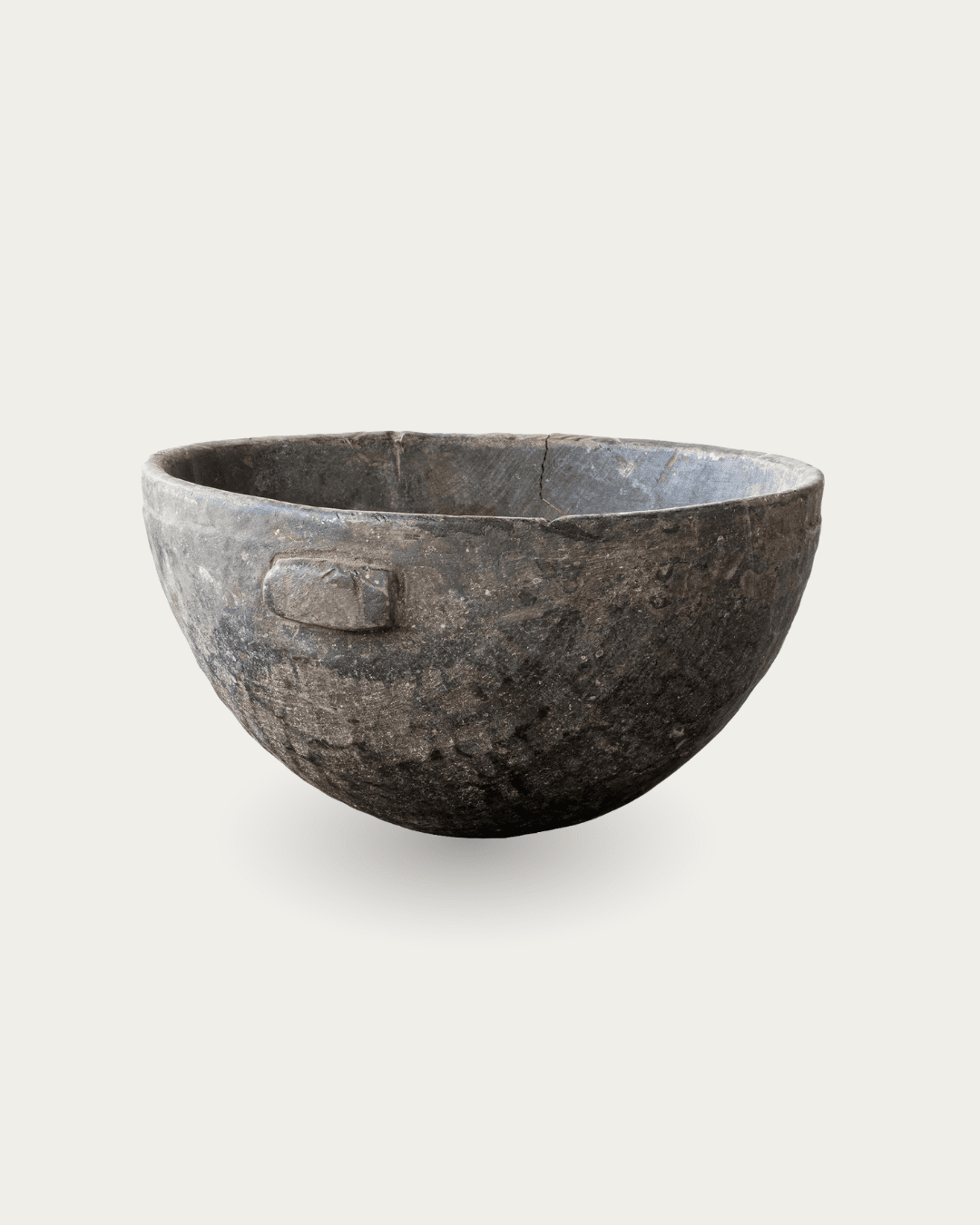
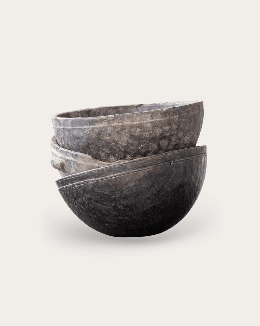
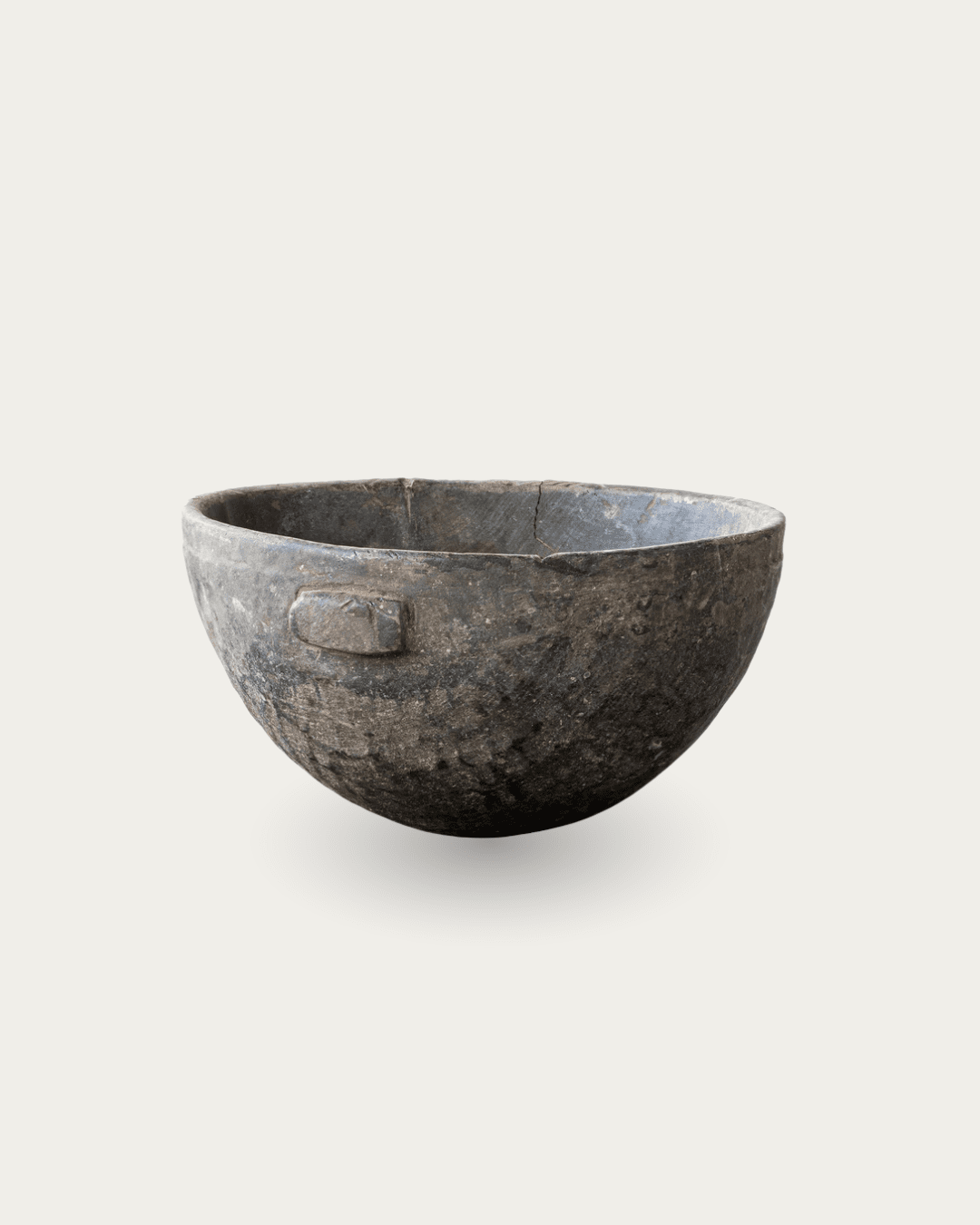
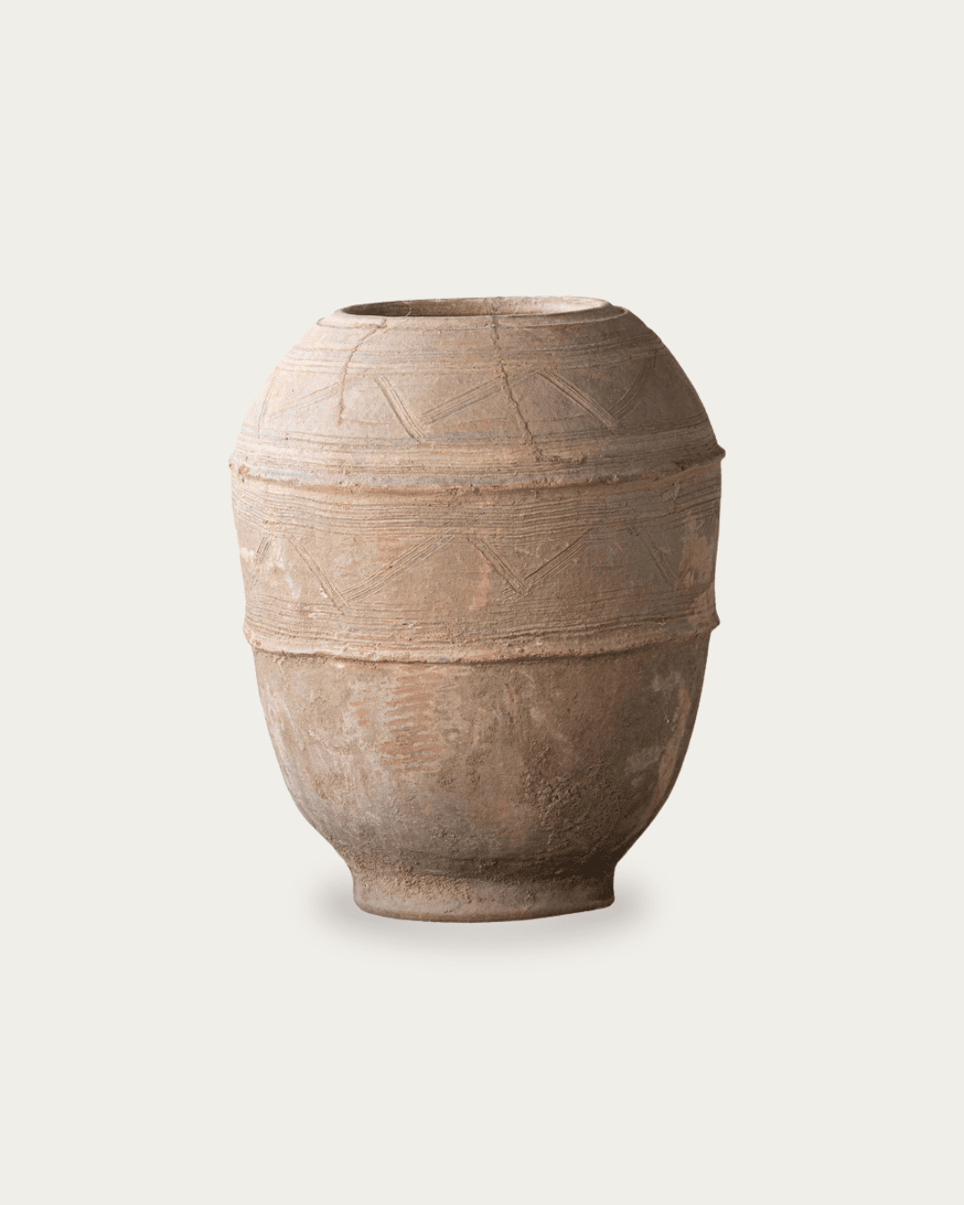
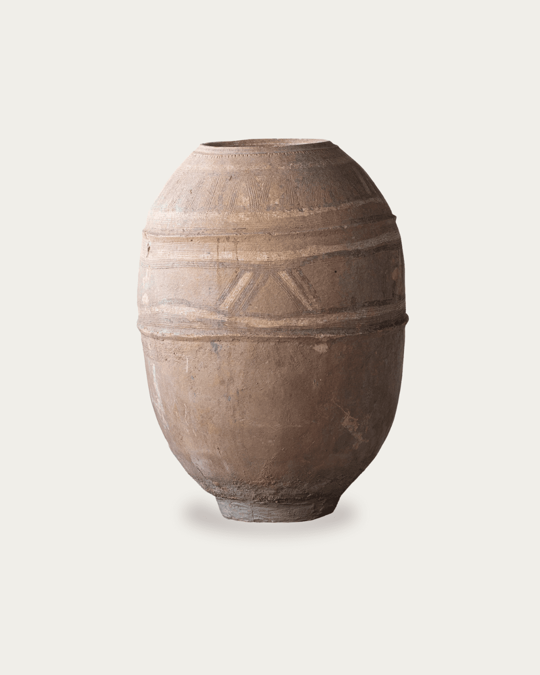
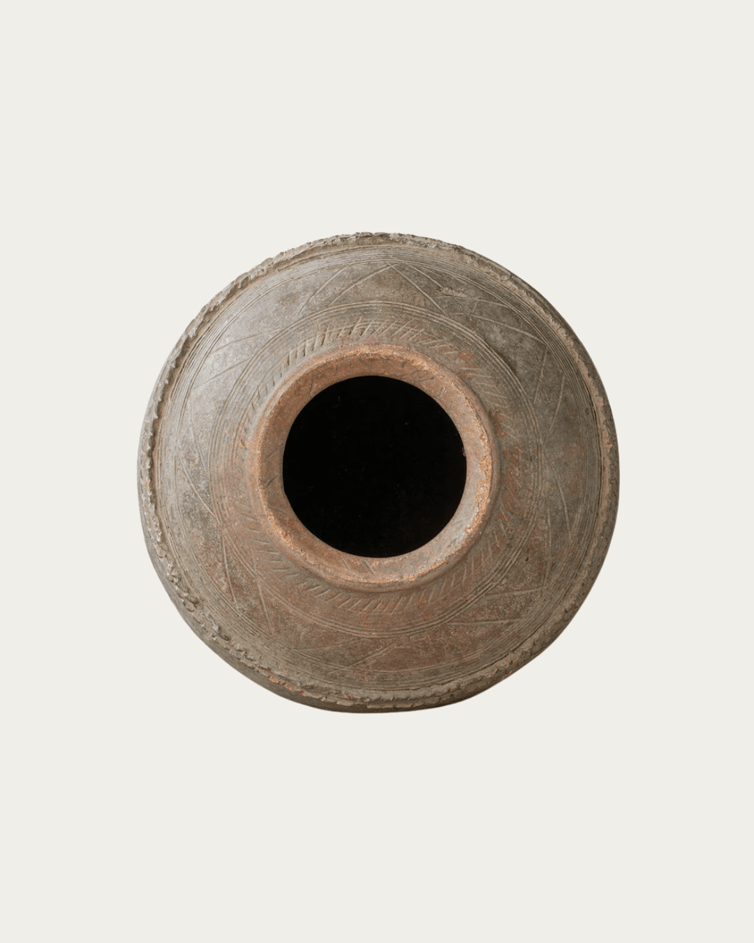
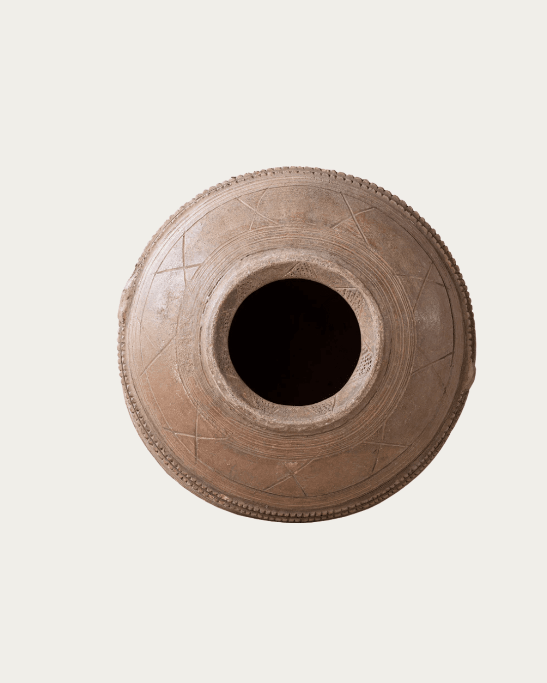
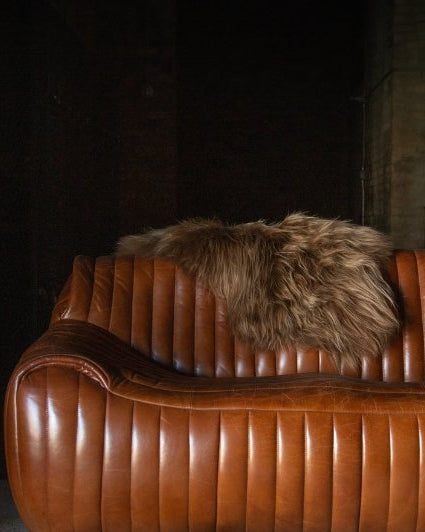
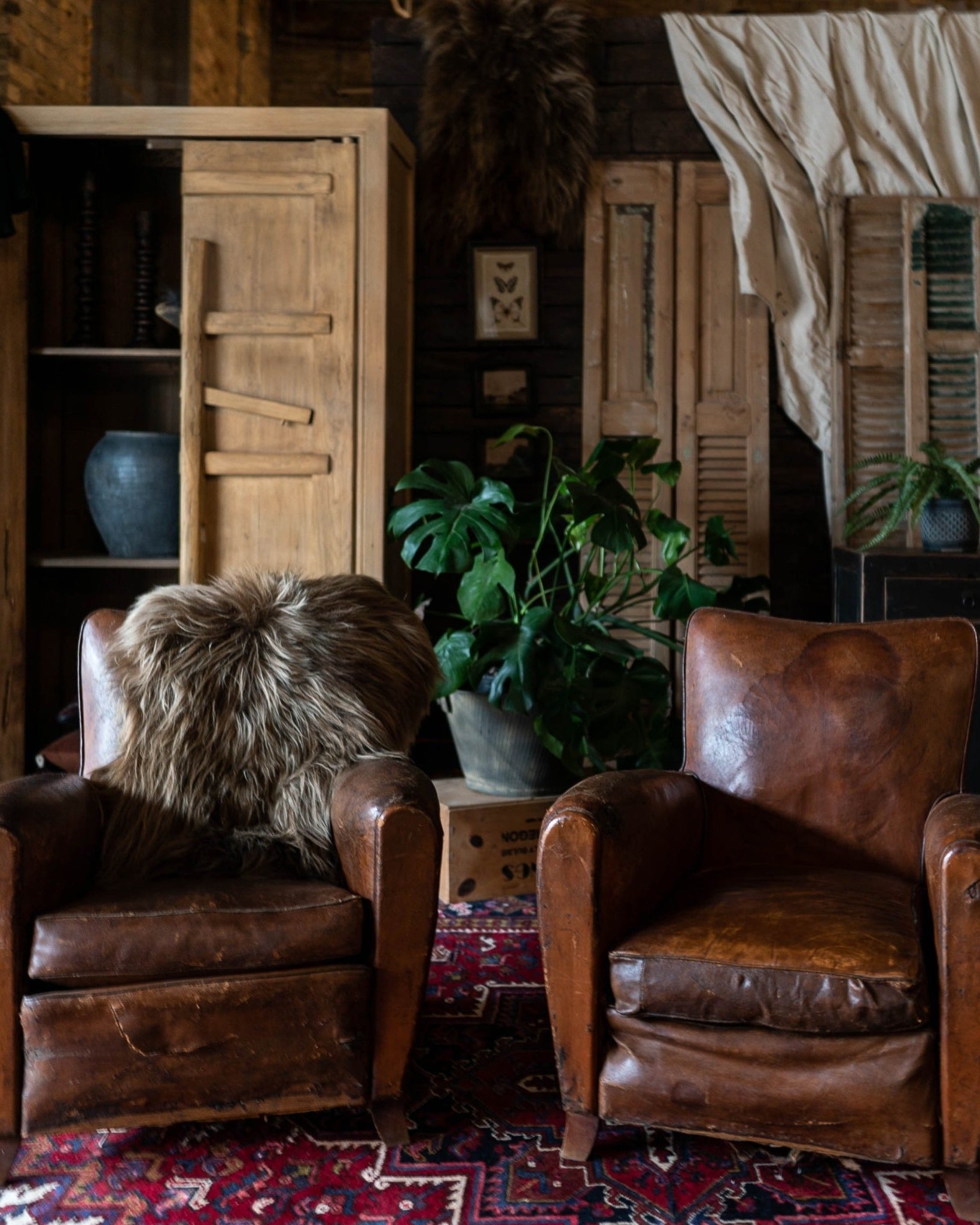
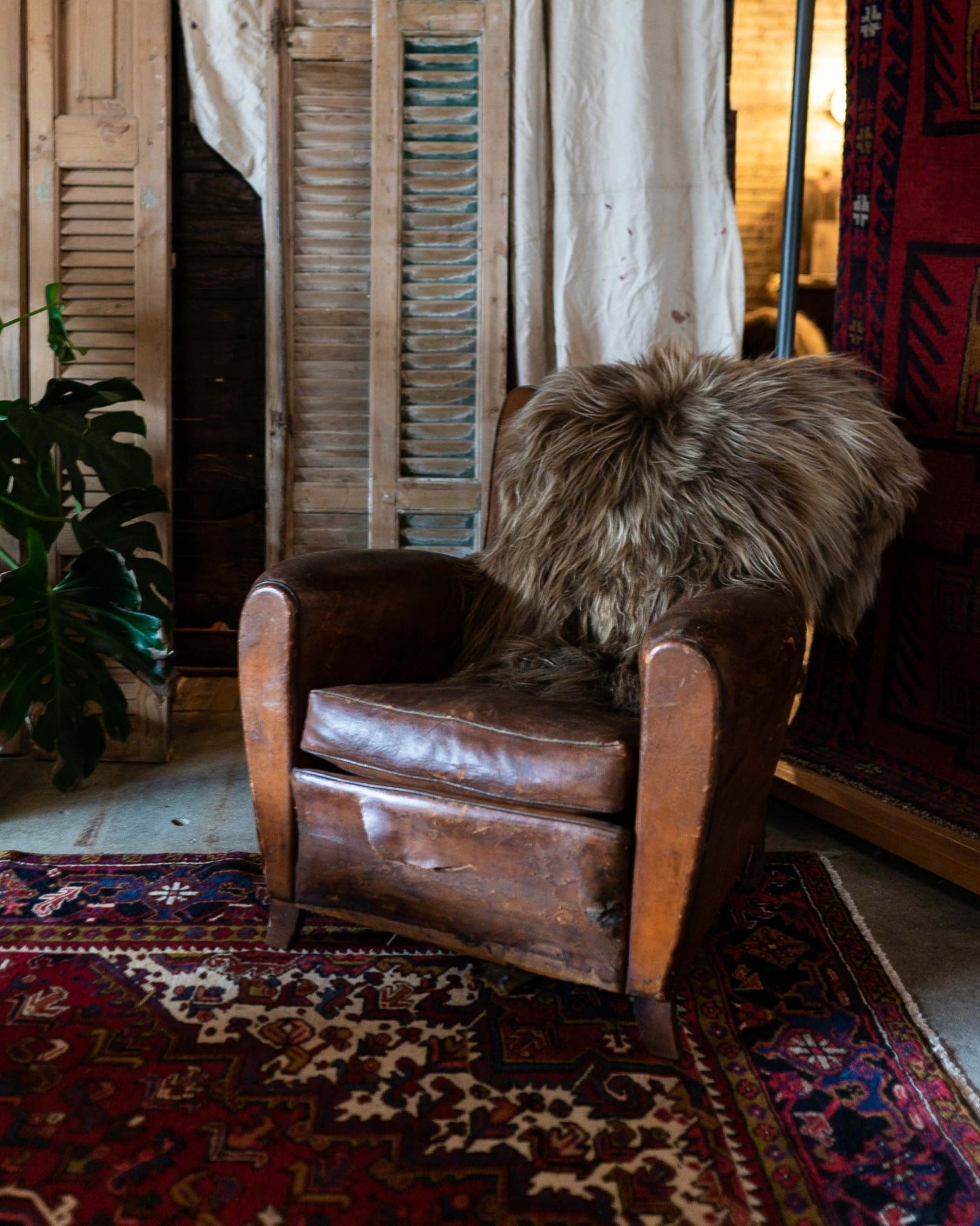
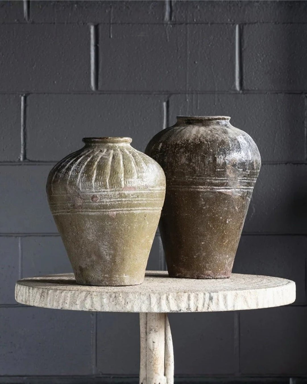
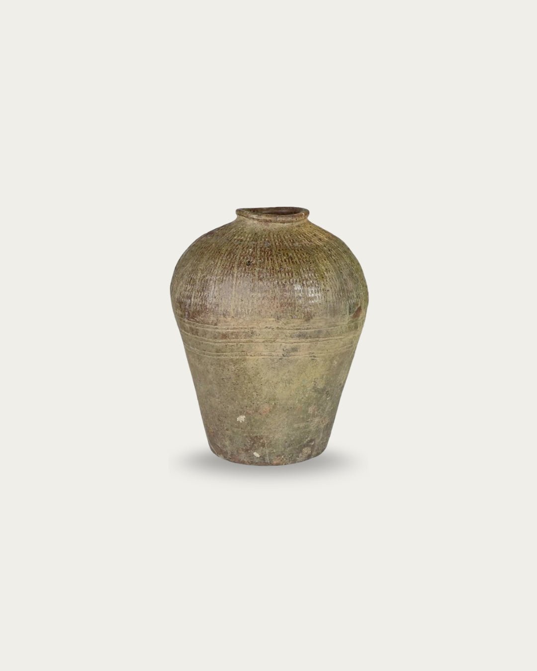
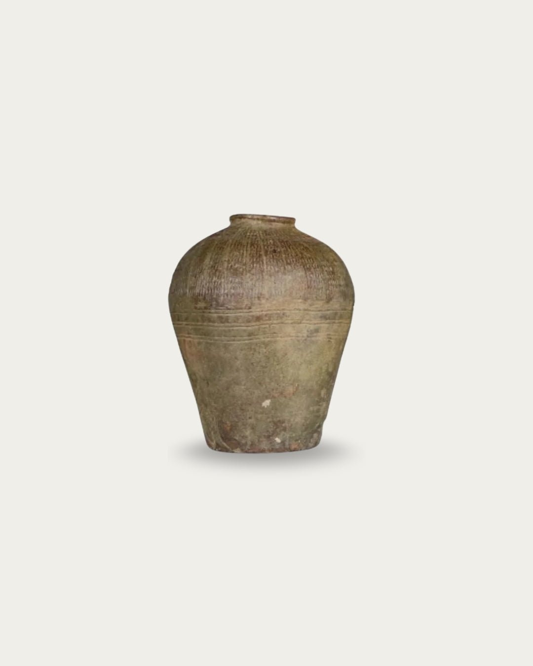
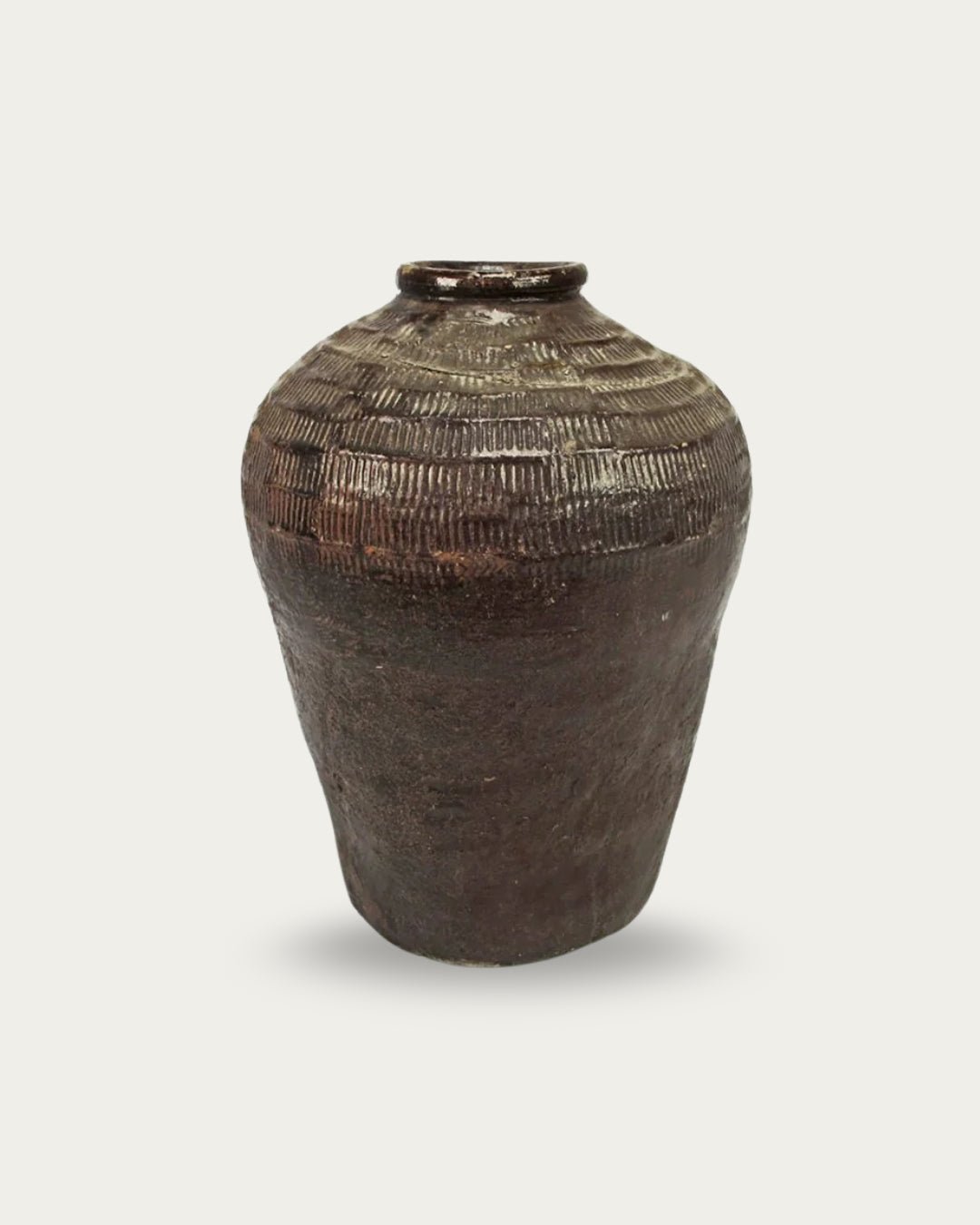
A console with surface variation—grain shifts, subtle wear, and irregular edges—adds interest without demanding attention. This is where vintage and reclaimed pieces consistently outperform new ones.
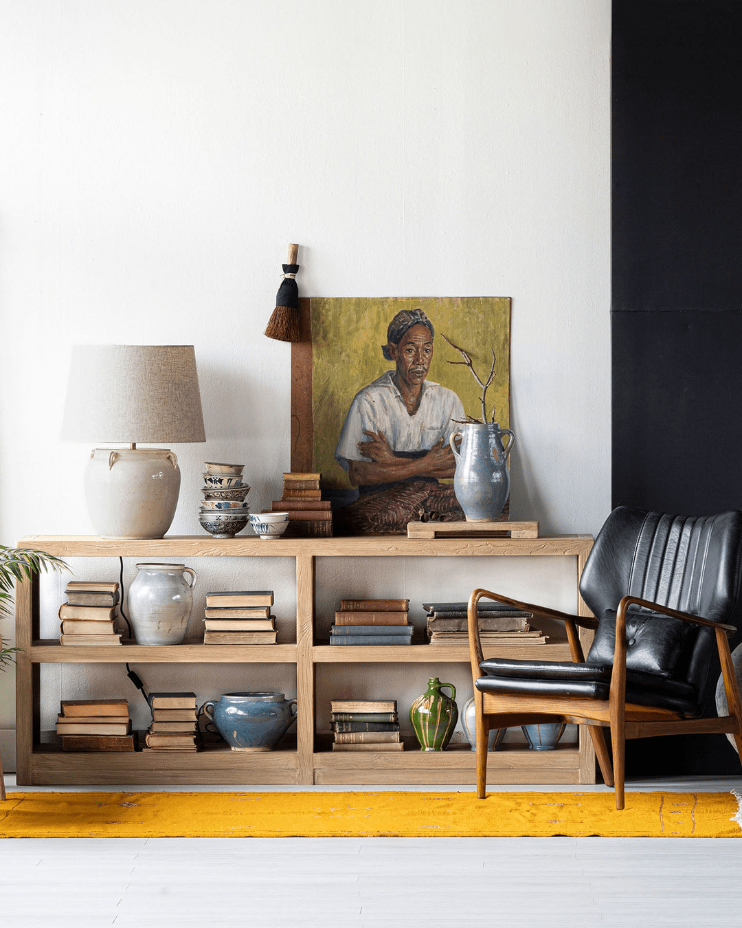
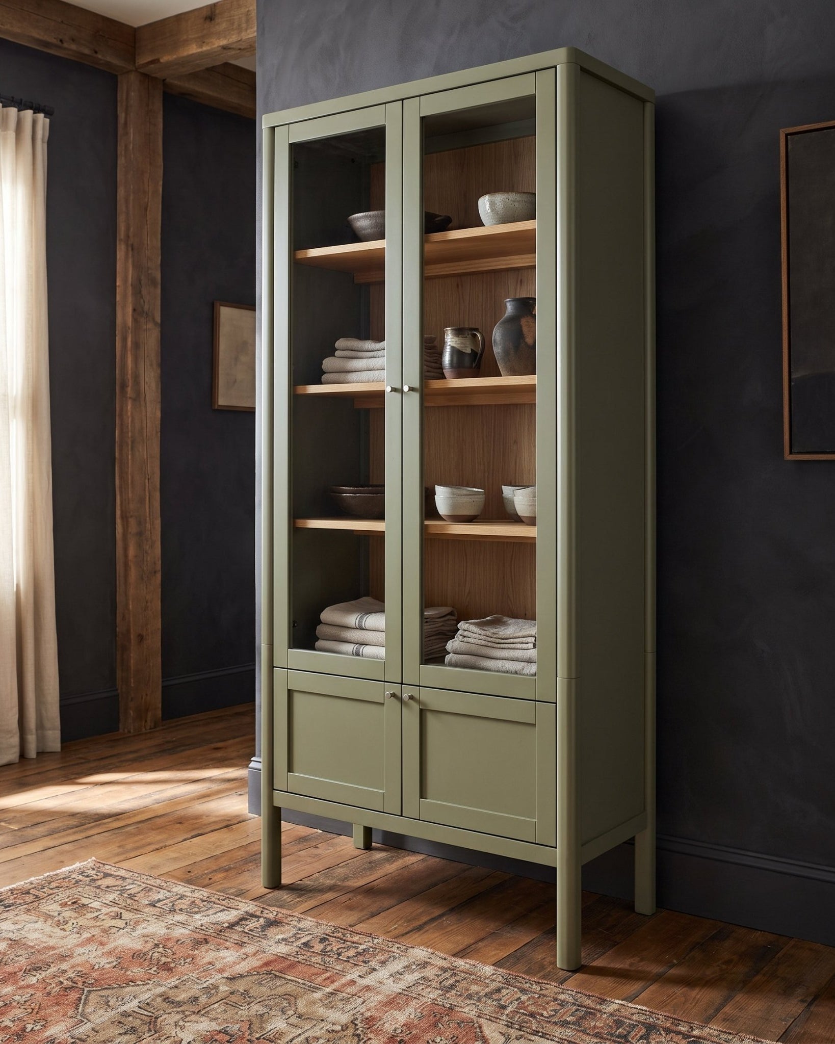
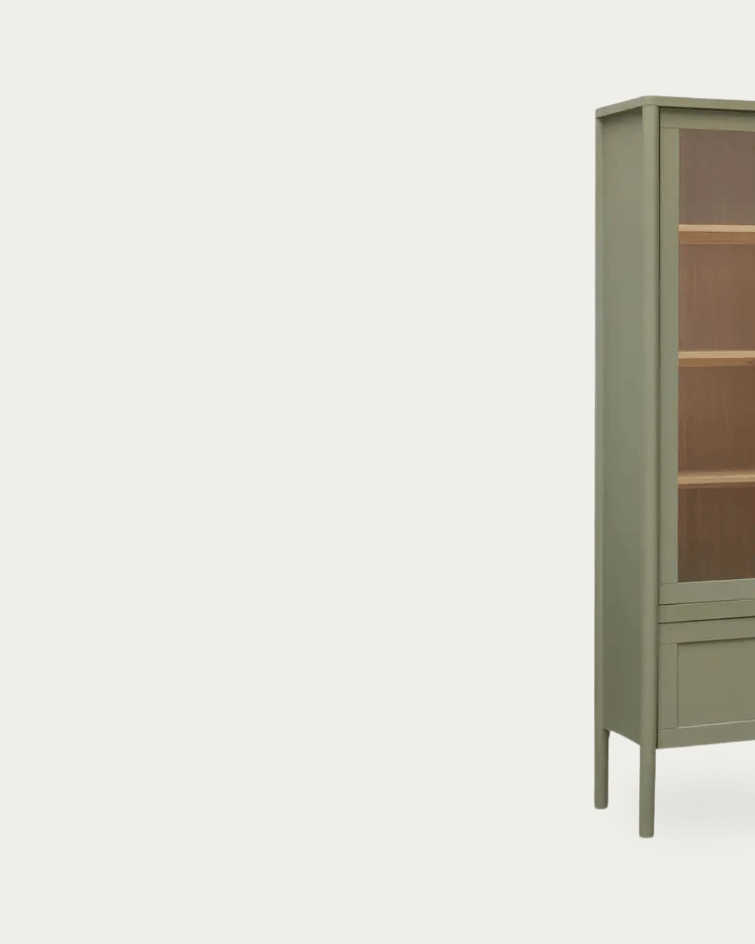
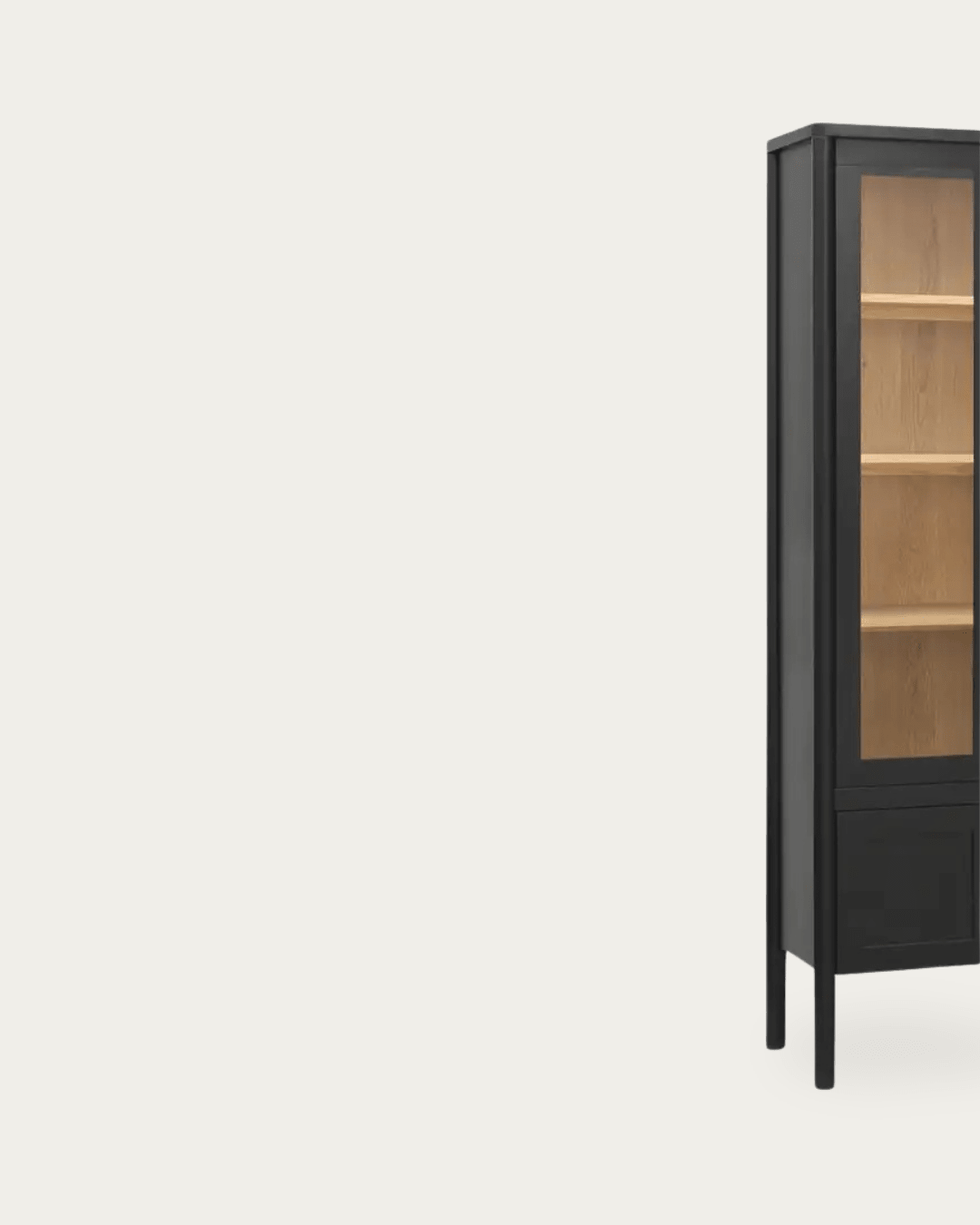
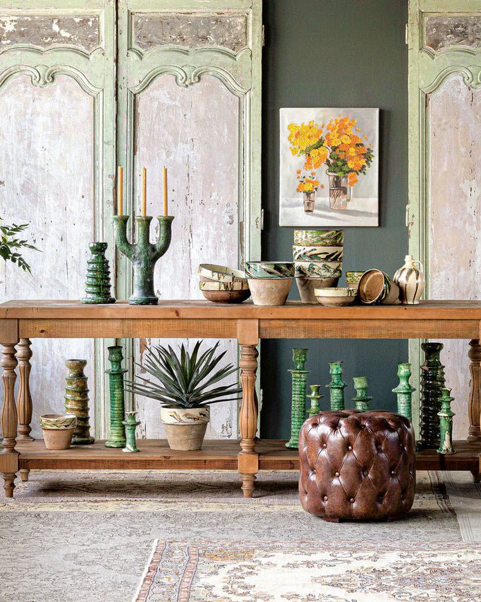
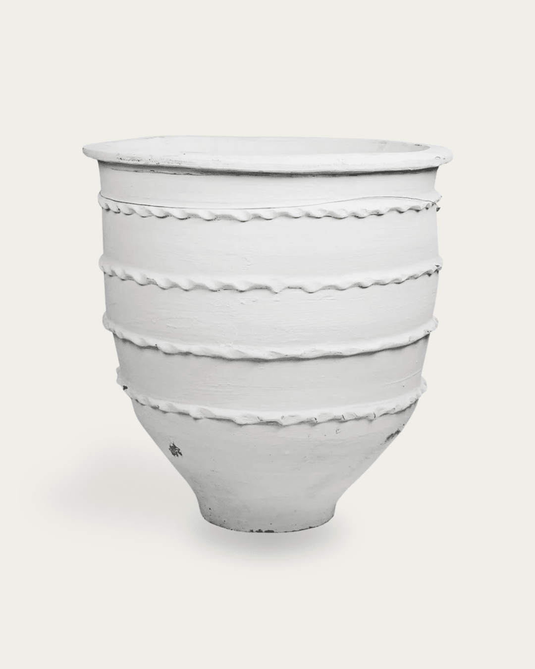
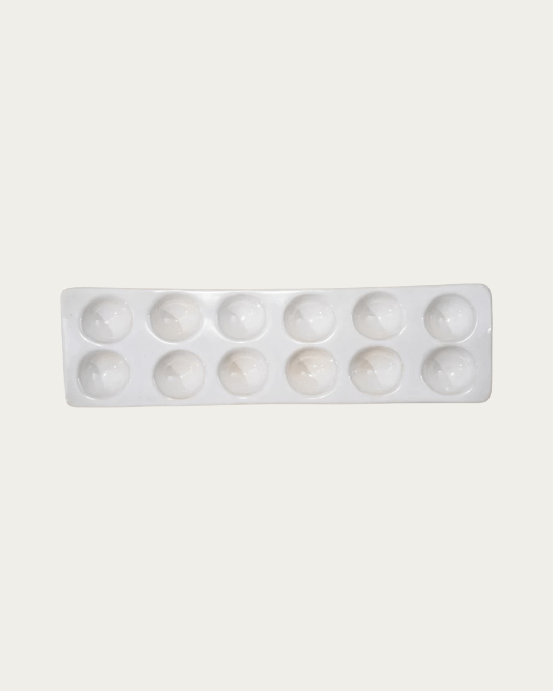
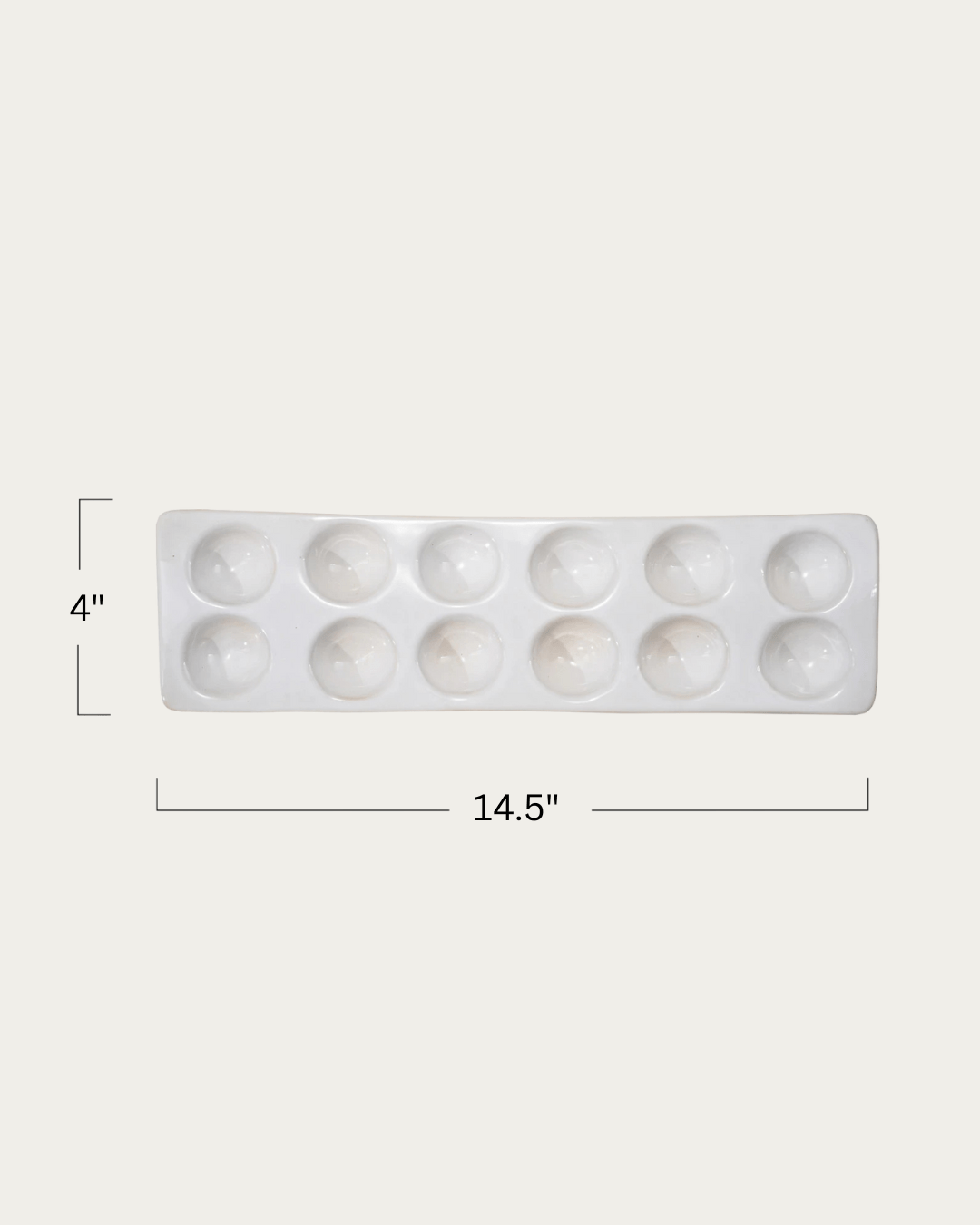
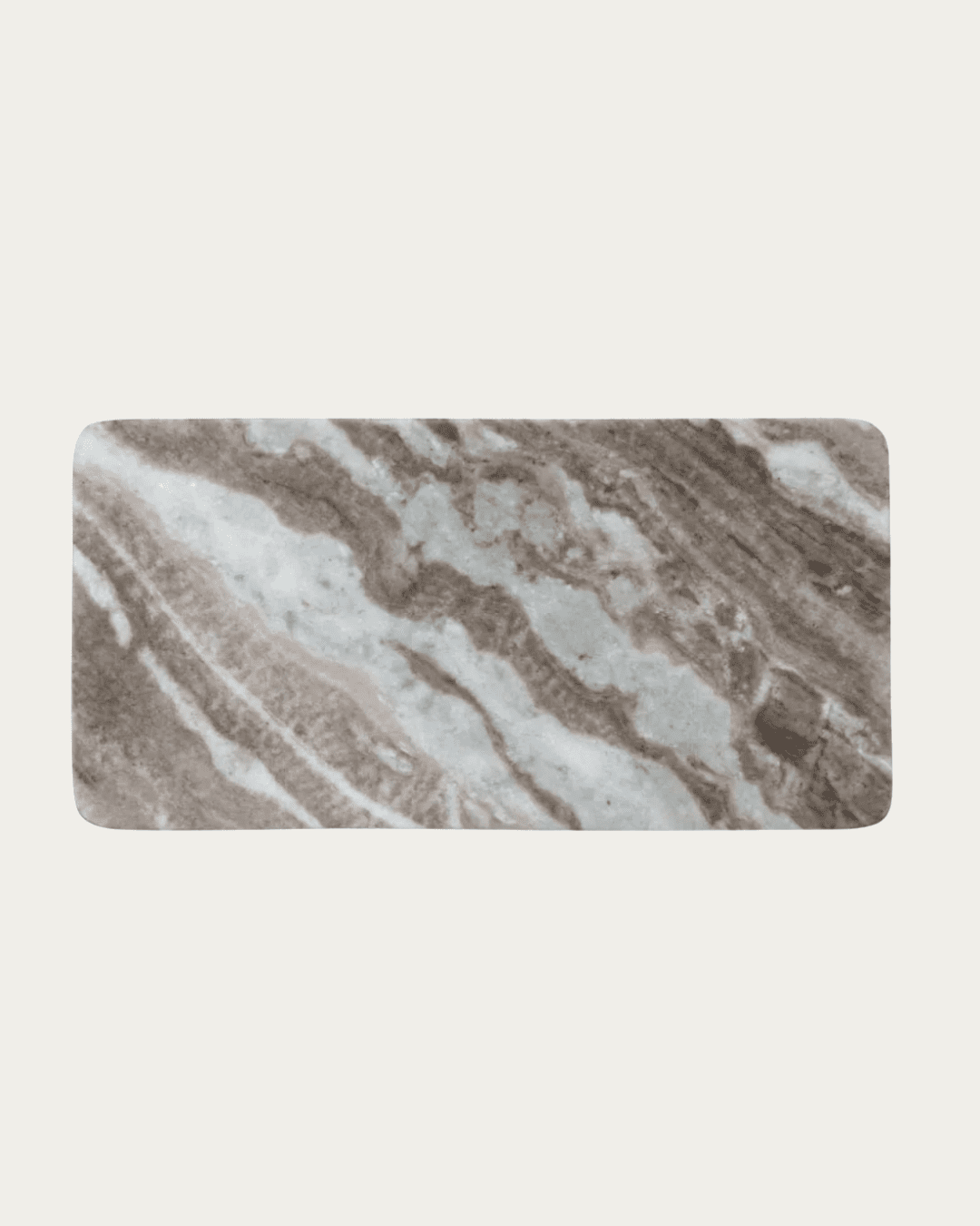
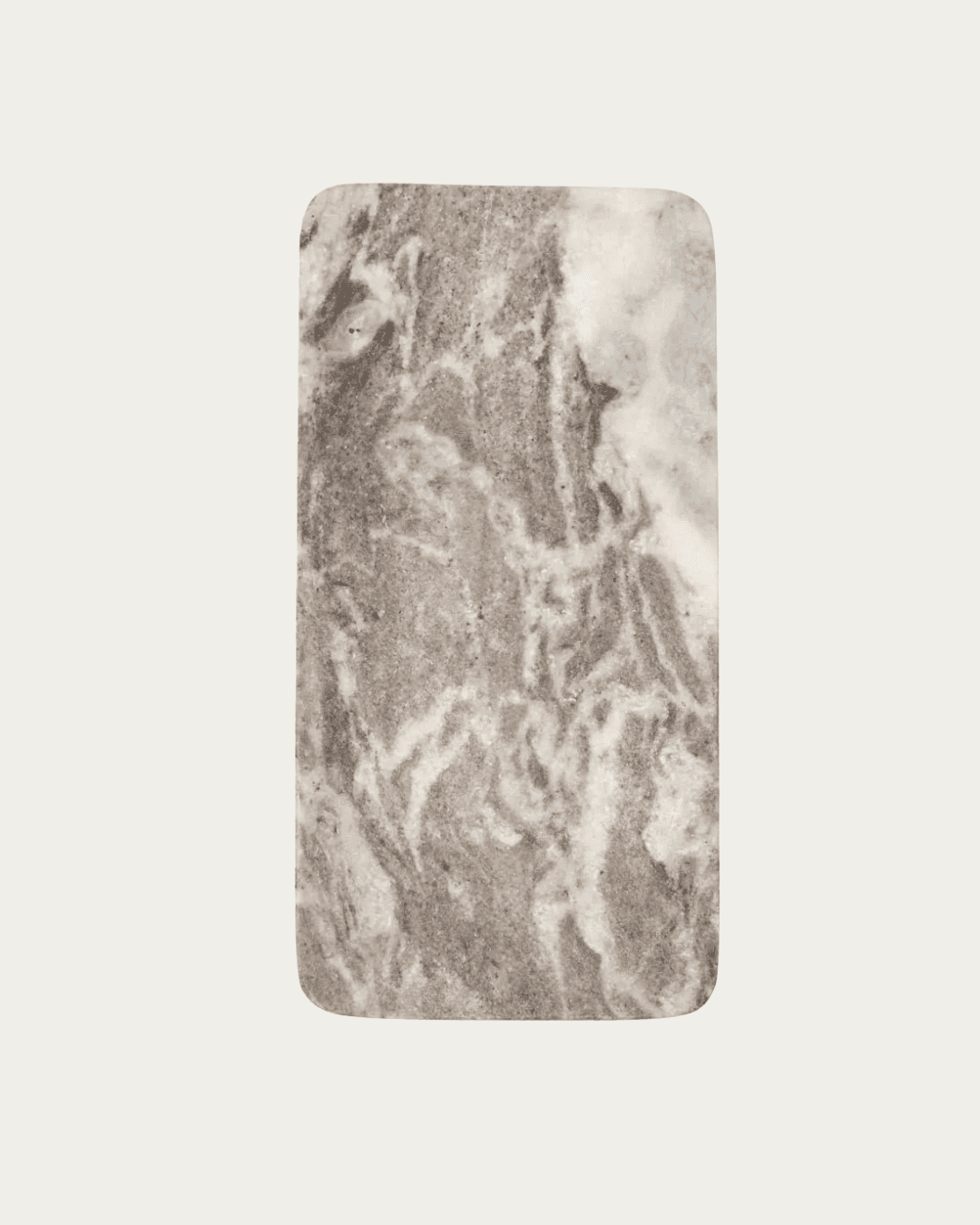
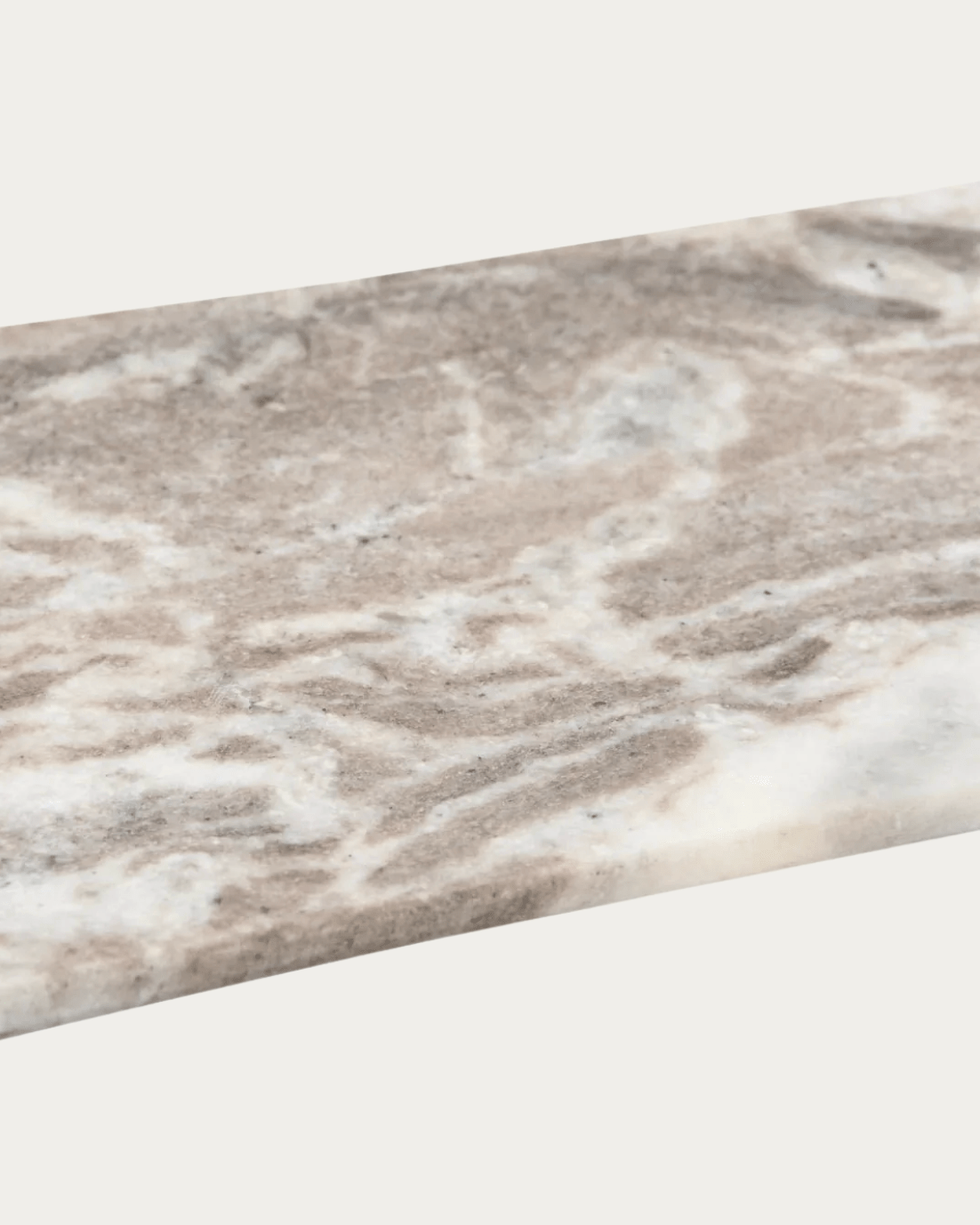
The Guobjorg console table is a good example of material doing the heavy lifting. Its presence is felt even when minimally styled, making it ideal for spaces that already have artwork, views, or architectural detail.
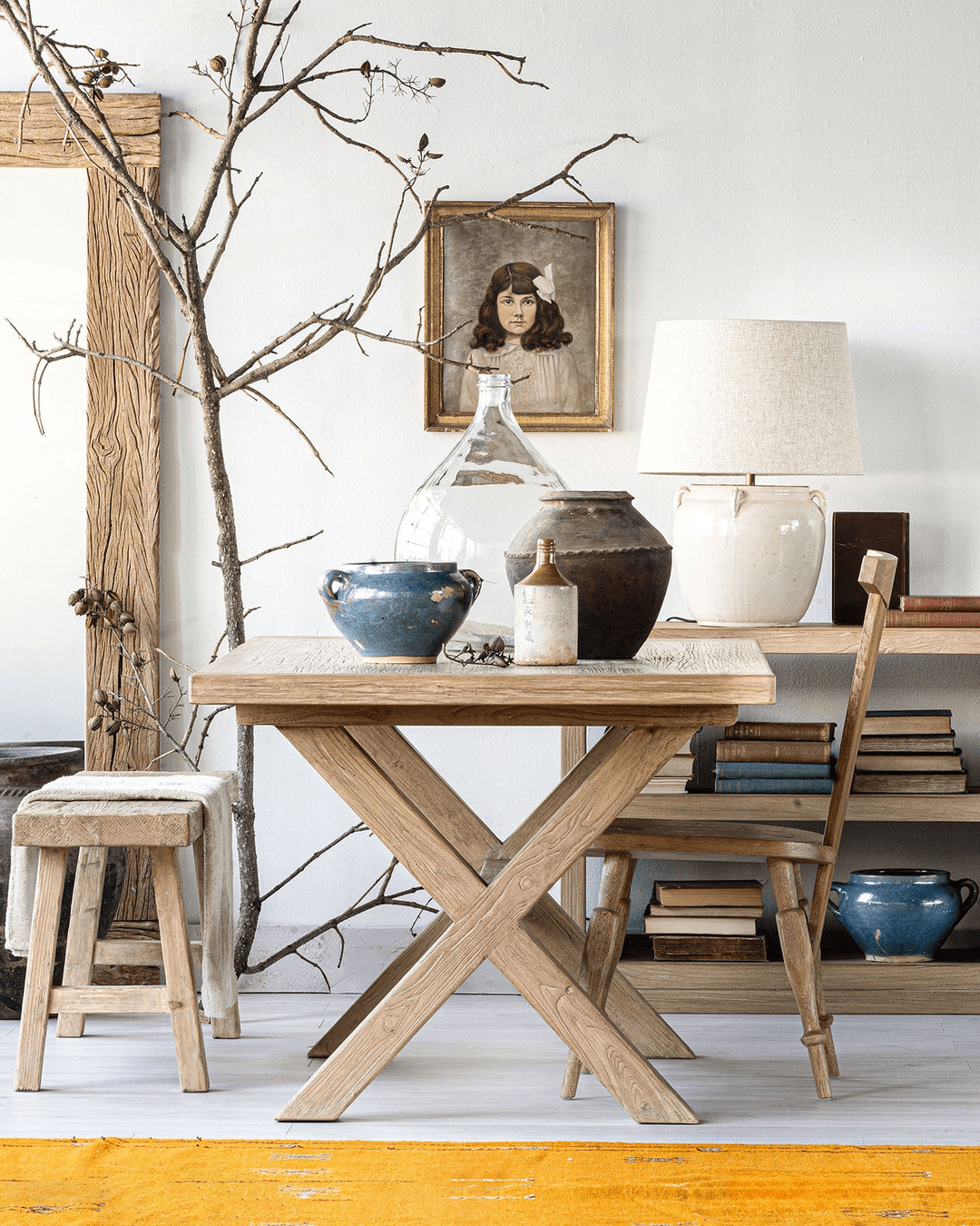
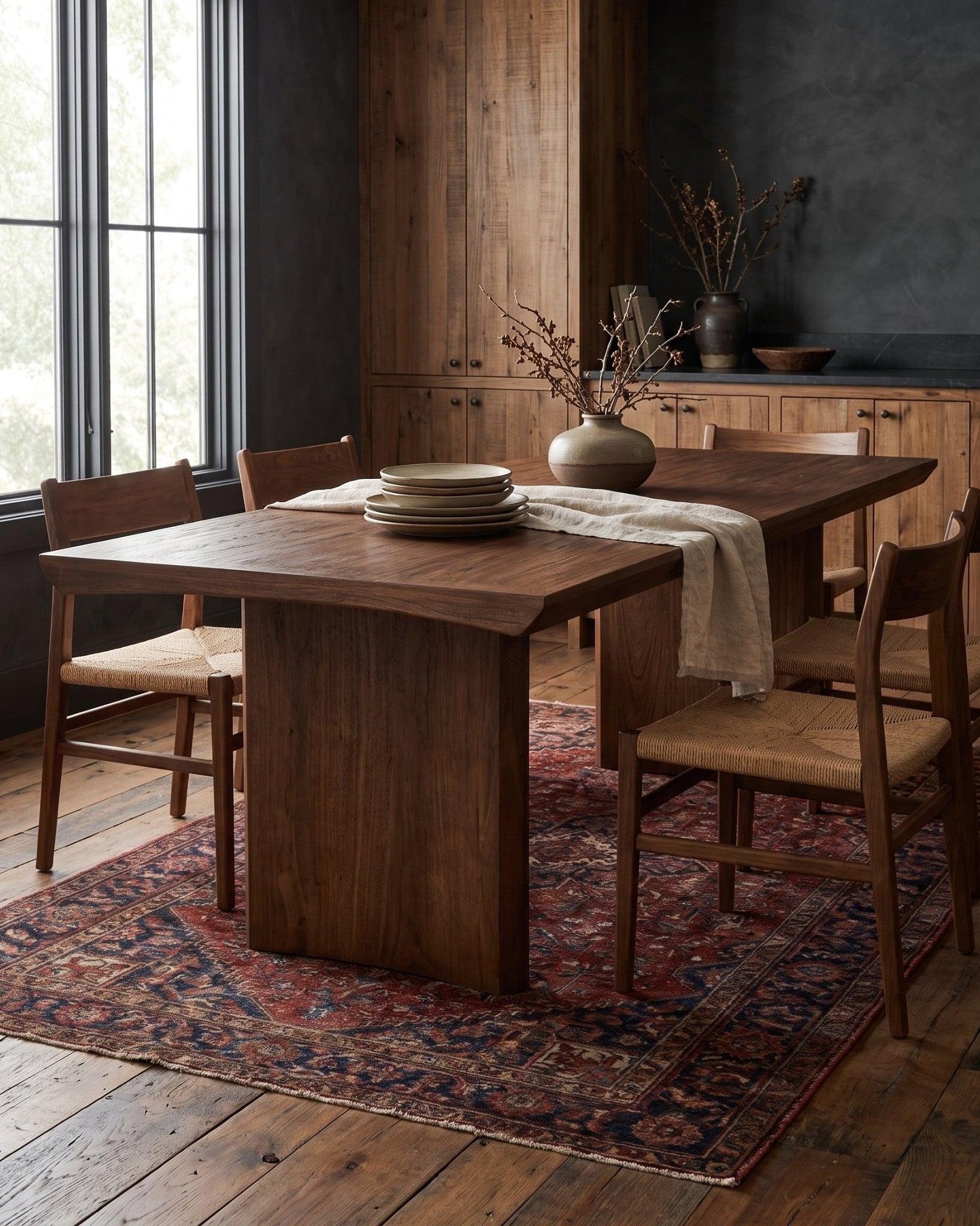
Rule Four: Treat the Console as Architecture, Not Furniture
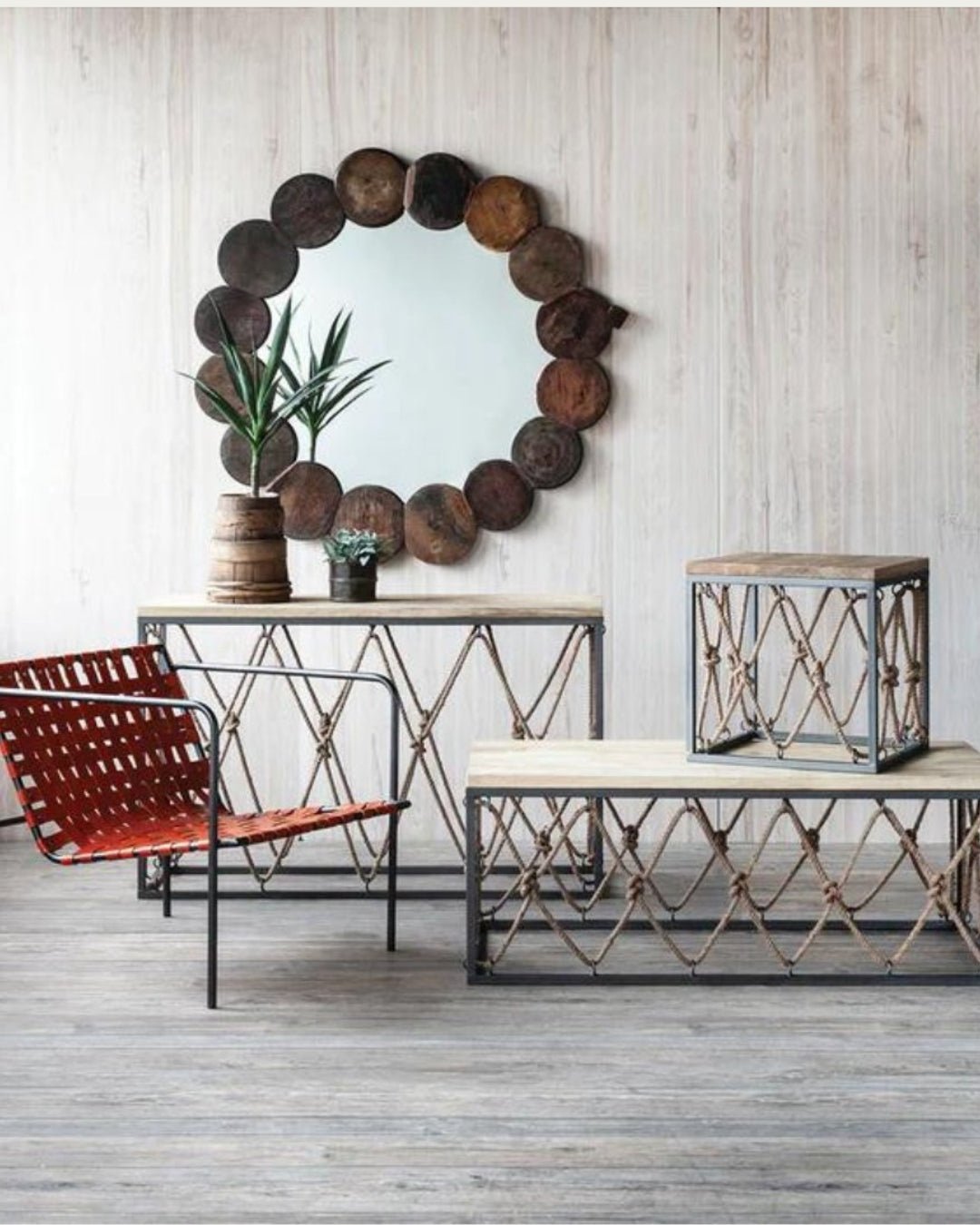
The best vintage console tables behave like built-ins, even when they’re freestanding. They align with door frames, echo window mullions, or sit flush with wall planes.
When a console is treated as architecture, styling becomes secondary. One or two objects are enough. The table itself carries the room’s rhythm.
This approach is especially effective when the console sits beneath artwork or mirrors. Instead of thinking in terms of vignettes, think in terms of lines: horizontal table, vertical wall, and negative space between.
Architectural consoles—especially salvaged or reclaimed pieces—thrive here because they already feel anchored. They don’t need symmetry or matching pairs to feel complete.
Rule Five: Function Should Be Subtle but Real
A console table doesn’t need to work hard, but it should work at least a little. When it has no function at all, it becomes decorative clutter.
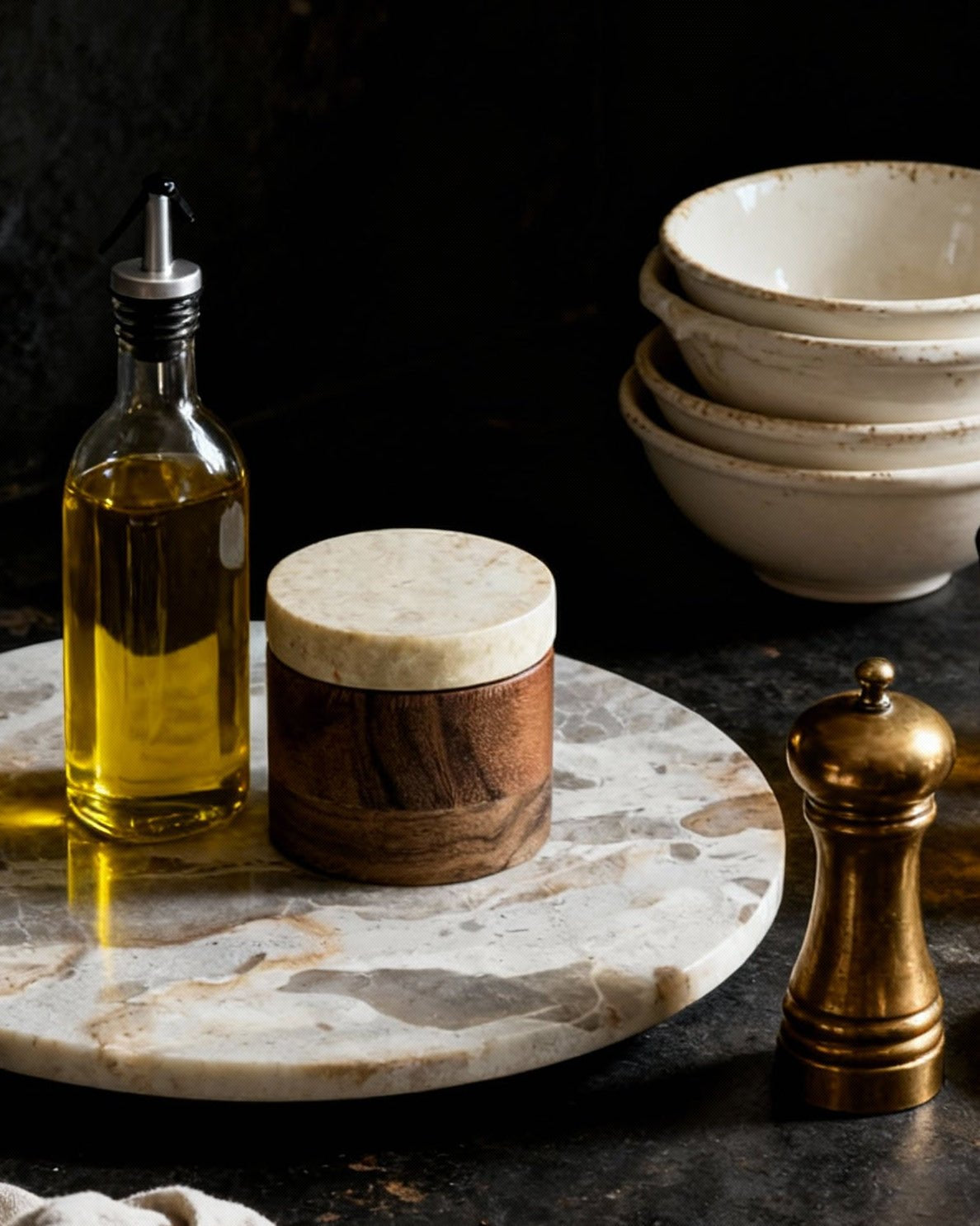
In living spaces, a console might hold keys, books, or a single lamp. In dining areas, it might support serving pieces or storage below. In bedrooms, it can replace bulky dressers or nightstands in tight layouts.
The key is restraint. One function is enough. Two is the maximum.
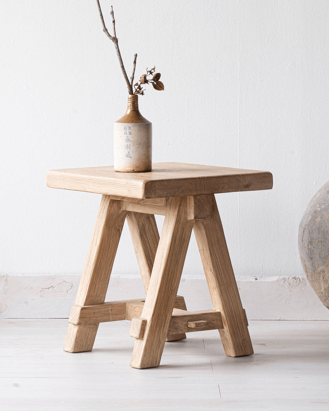
Reclaimed consoles are especially good at this because they were never designed for single-purpose living. Their surfaces are forgiving, their construction sturdy. They invite us without requiring it.

Rule Six: Negative Space Is Part of the Design
One of the most overlooked rules: the space around the console matters as much as the table itself. Vintage console tables benefit from breathing room.
Crowding a console with furniture on either side flattens its impact. Leaving space—especially near windows or along walls—allows light to move and shadows to form. This is what gives the room depth throughout the day.
It’s also why consoles placed slightly off-center often feel better than perfectly aligned ones. The asymmetry introduces movement without chaos.
Rule Seven: Let Time Do Some of the Styling
The temptation with a new console table is to finish it immediately. Vintage and reclaimed pieces don’t need that urgency.
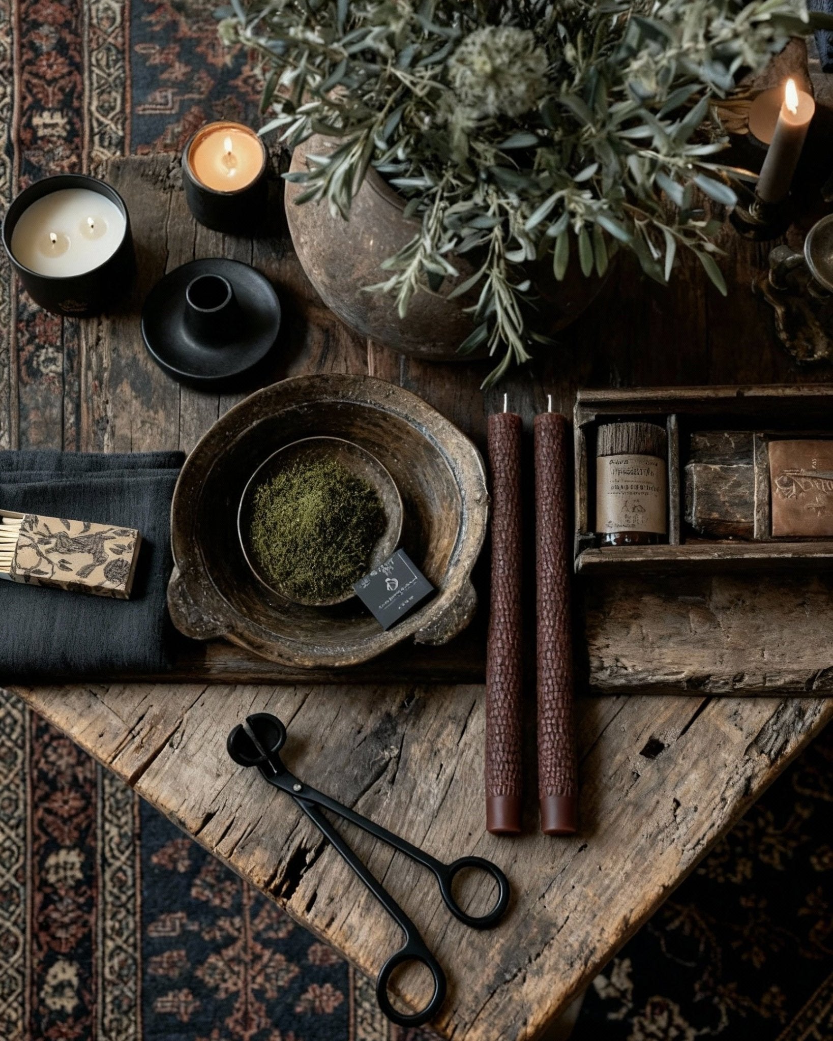
They’re meant to collect slowly—one object now, another later, nothing for months. Their surfaces look better with use, not with perfection.
A reclaimed console that feels slightly empty is usually doing its job. It’s holding space, not filling it.
Final Thoughts: When the Room Leads, the Console Follows
A vintage console table works best when it responds instead of performs. When placement follows light, scale respects the room, and materials are quiet rather than shout, the console becomes part of the architecture—not an accessory.
Let the room lead. Choose a table that listens. Style less than you think you should.
Explore the reclaimed furniture collection to find console tables that earn their place through proportion, material, and restraint—no overstyling required.