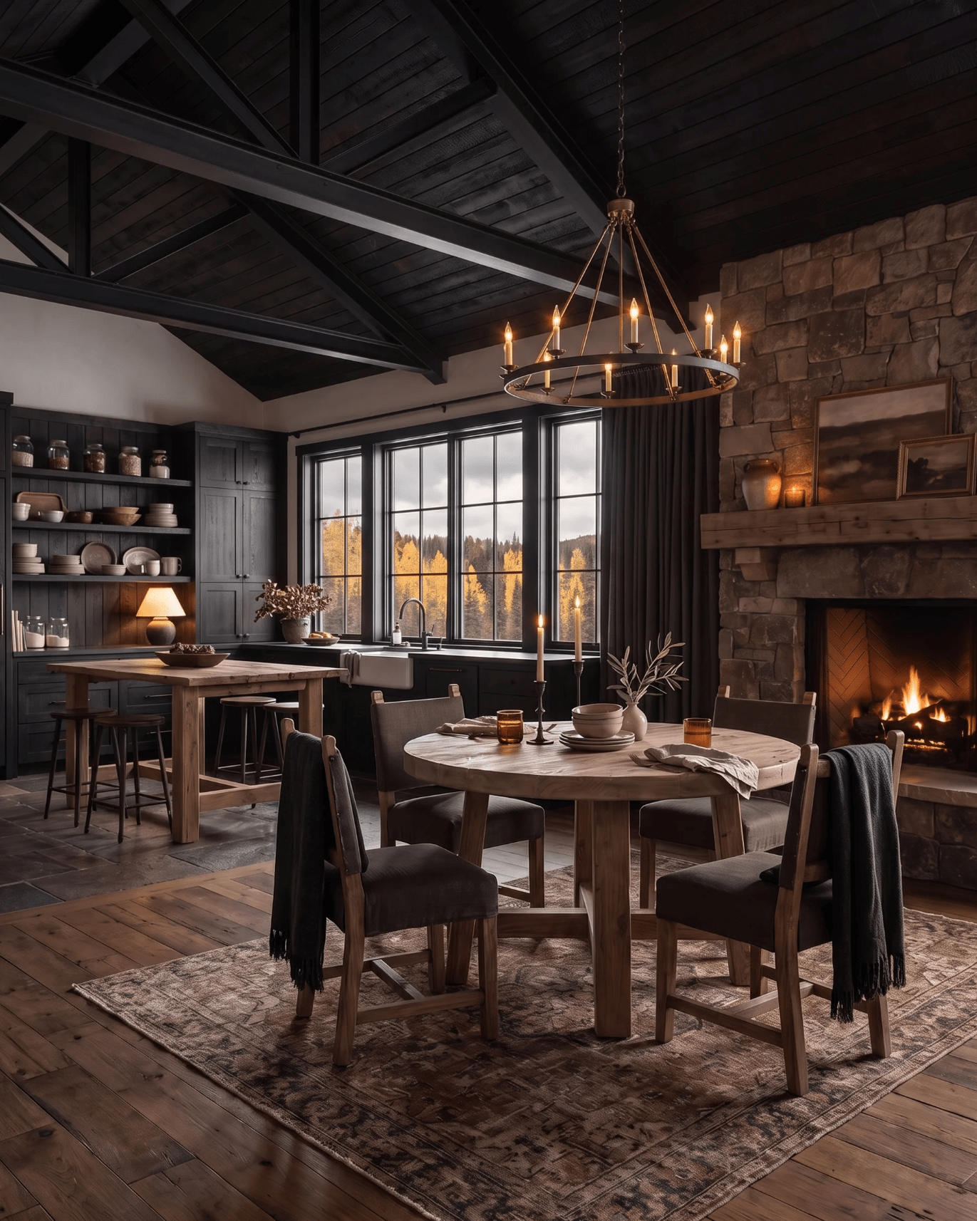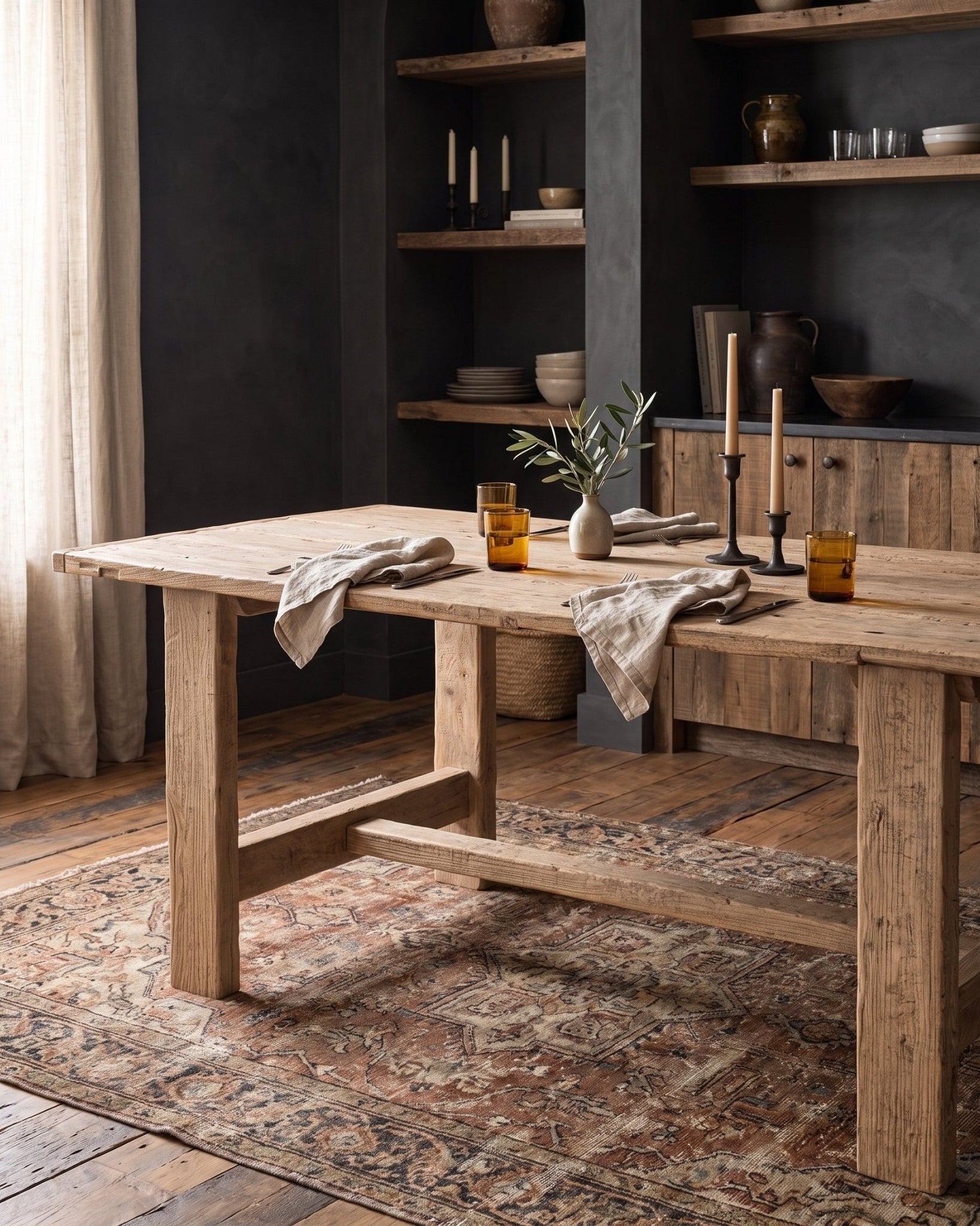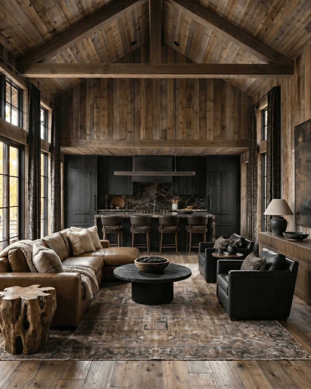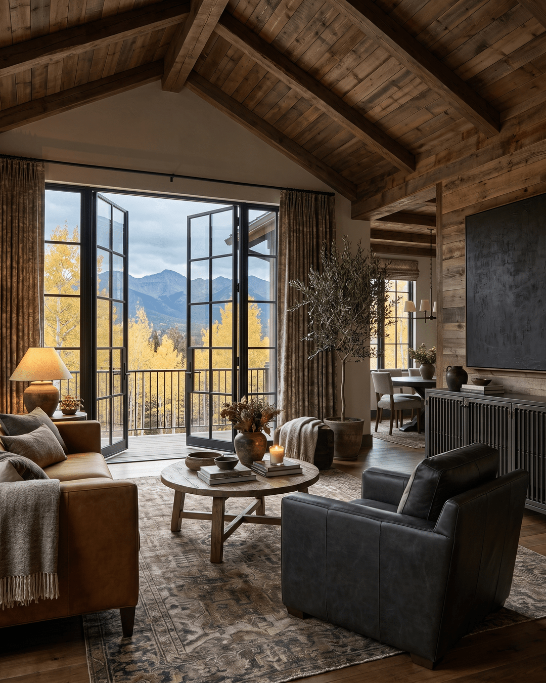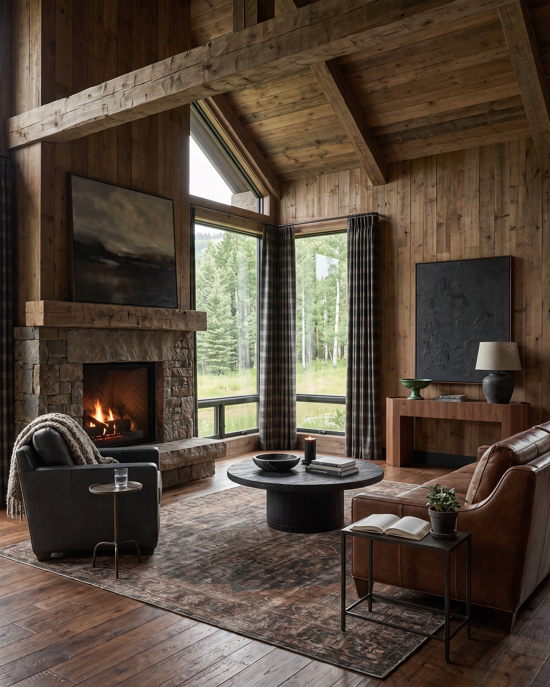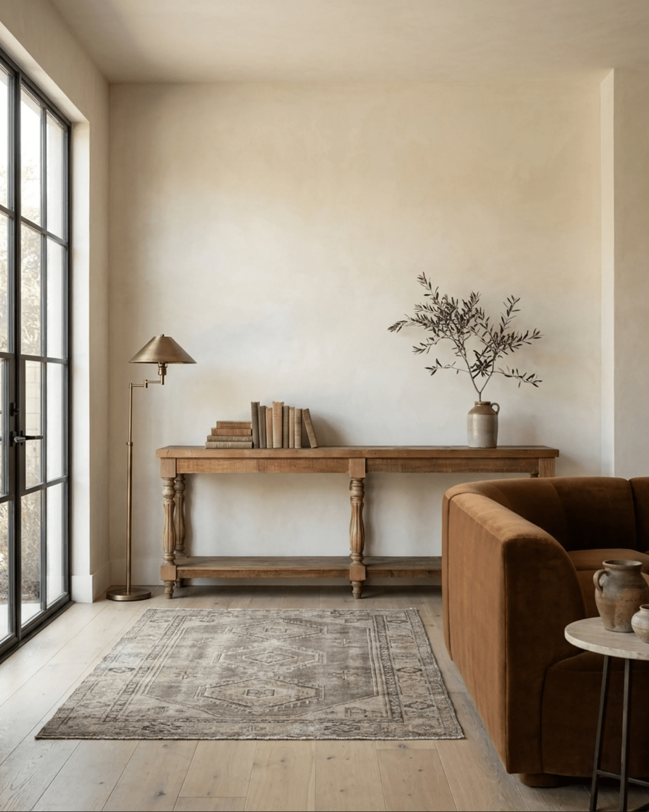


Summer decor doesn’t have to be light and breezy. Sometimes, it’s richer, deeper, and moodier than you expect — and that’s exactly where this season’s Hello Norden Summer Collection was born. Welcome to this week’s Kassina’s Edit, where I’m pulling back the curtain on every creative decision that shaped our newest summer lineup. From the first spark of inspiration to the final curation of over 225 products, our Summer Moodboard was the anchor for it all.
The Moodboard That Started It All
Every Hello Norden collection begins the same way: with a mood, a feeling, and a color story that sets the tone.
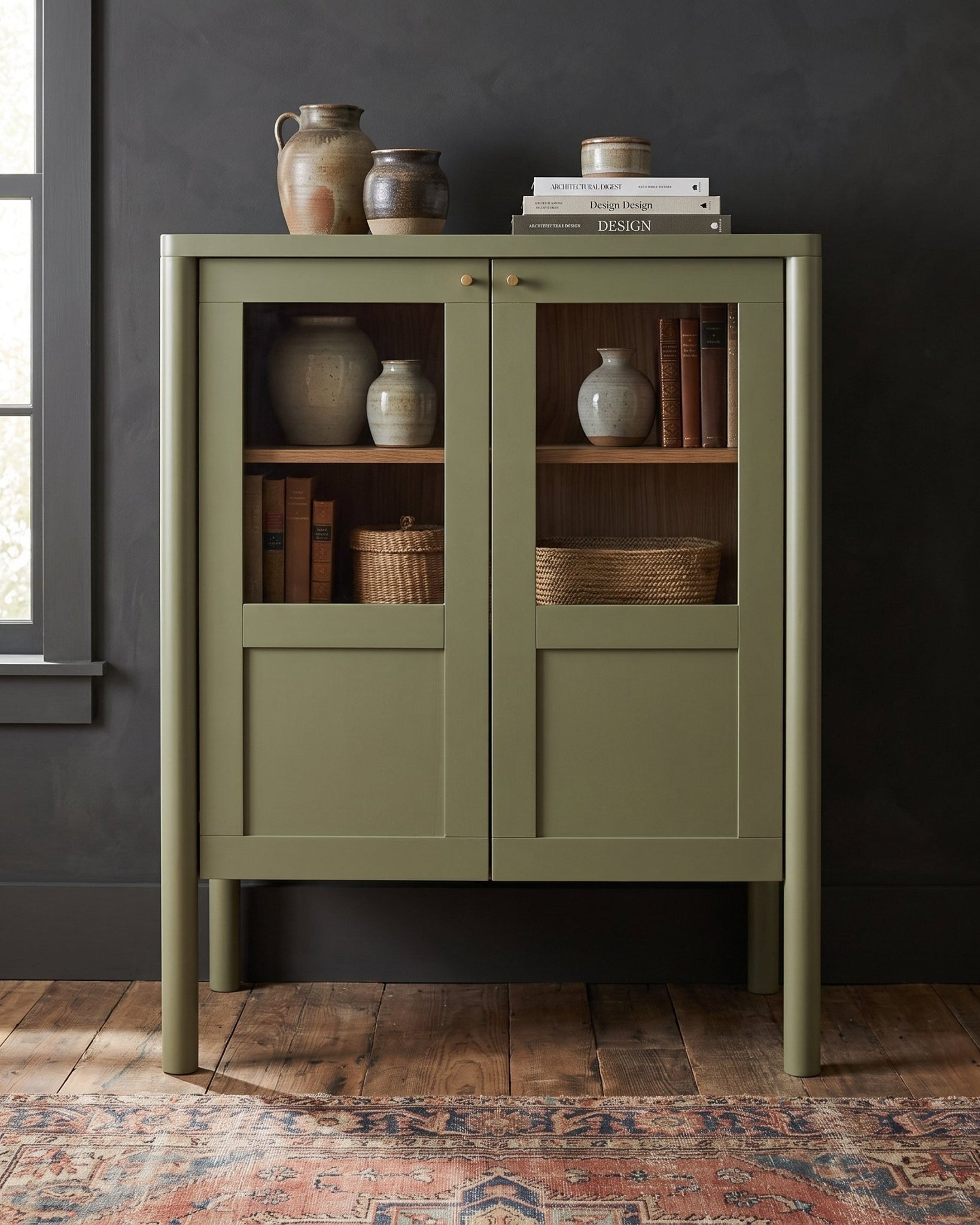
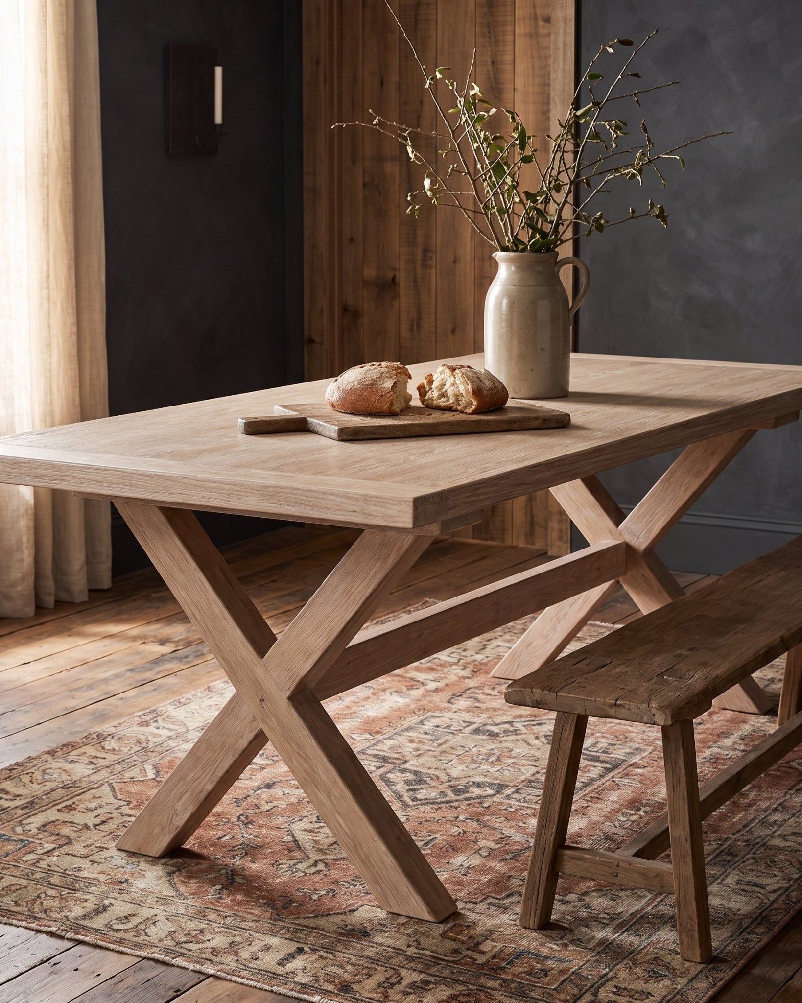
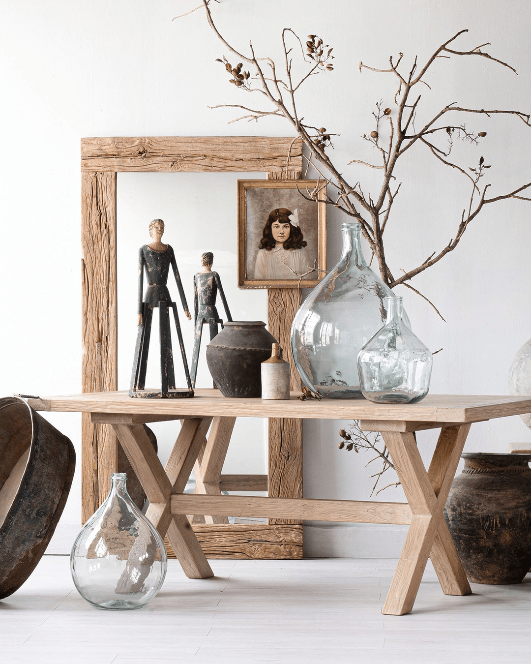
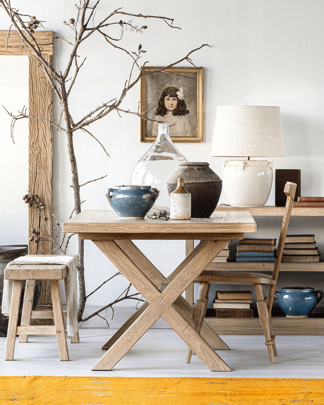
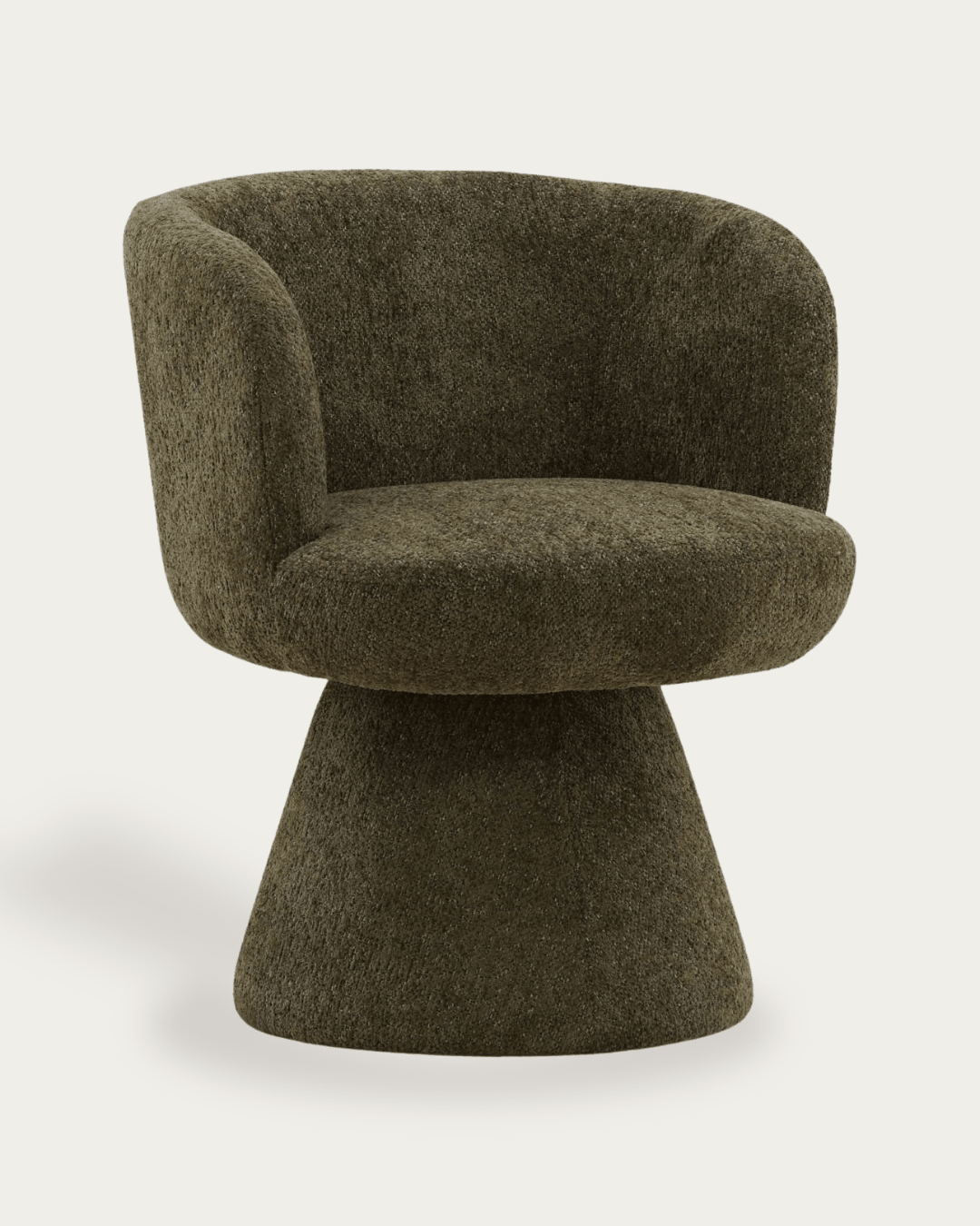
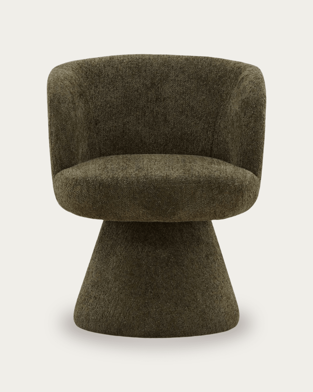
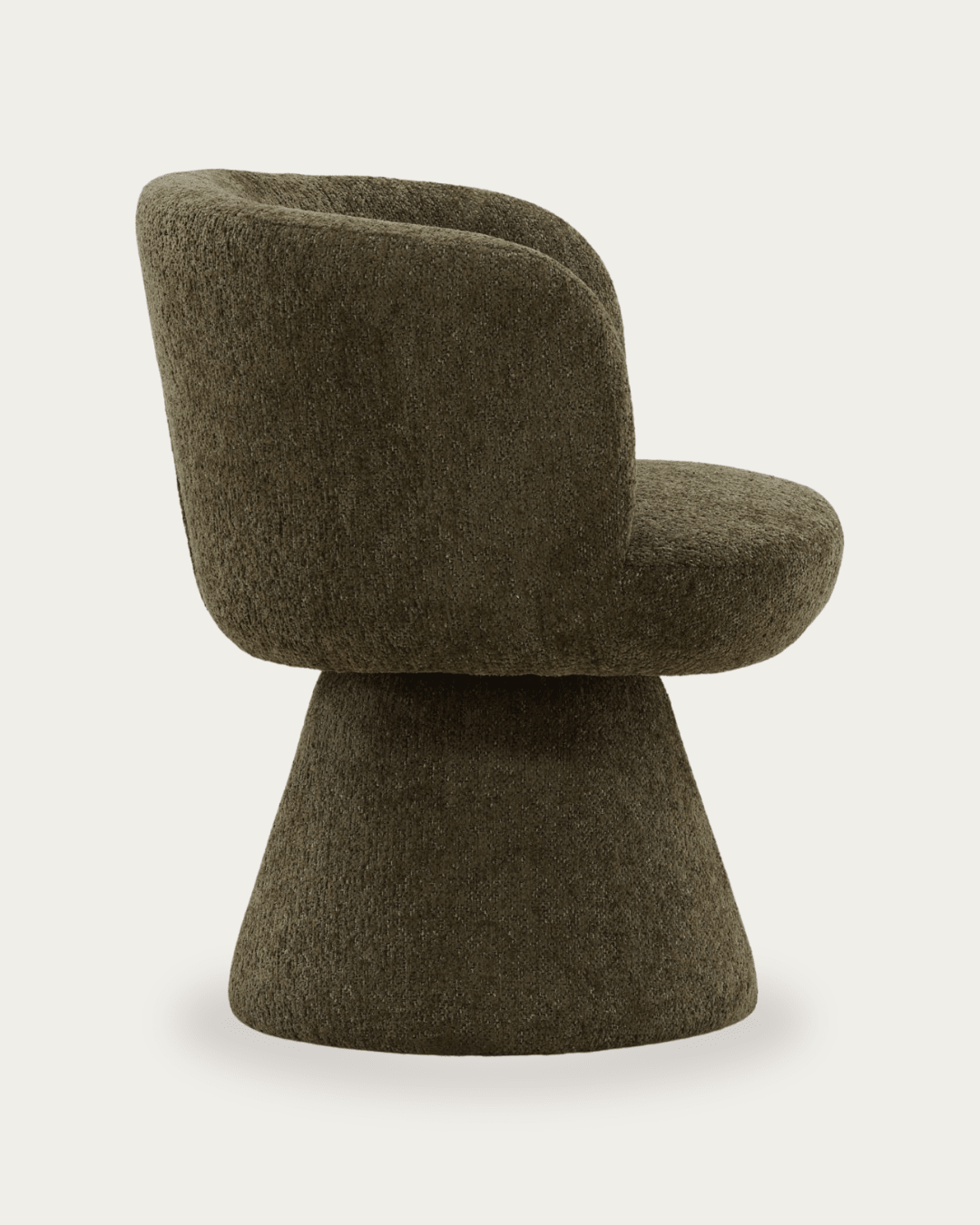
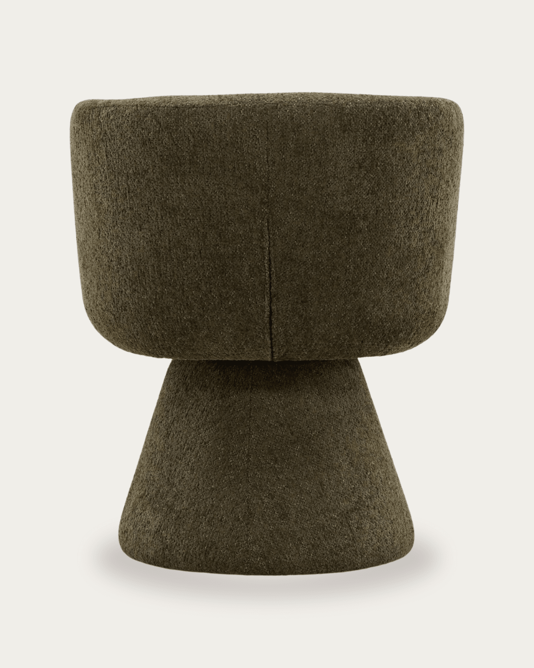
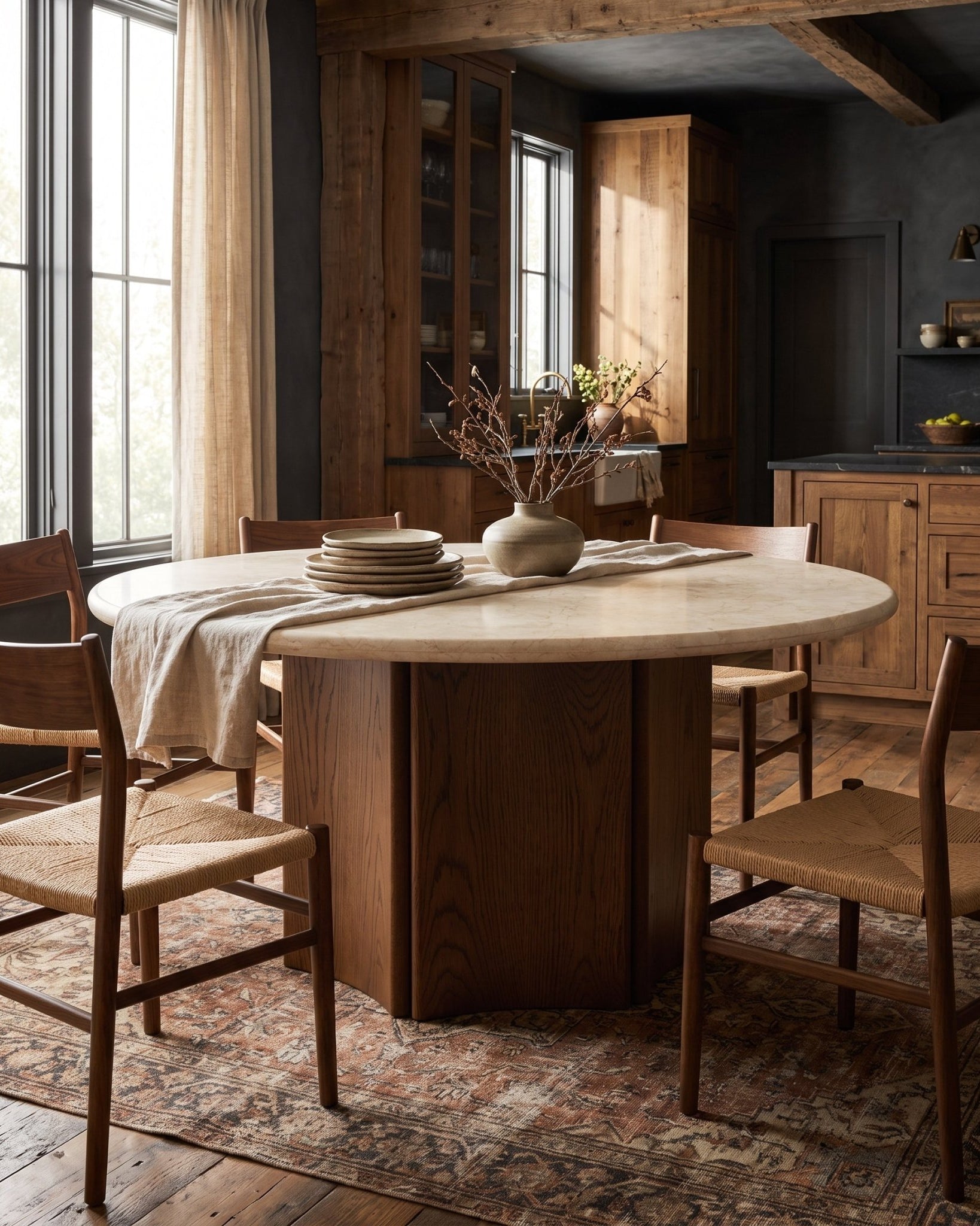
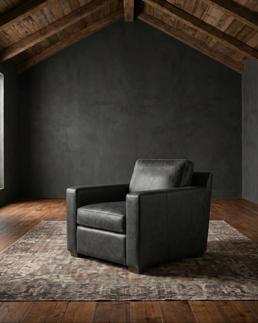
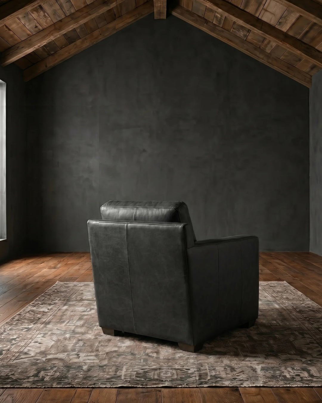
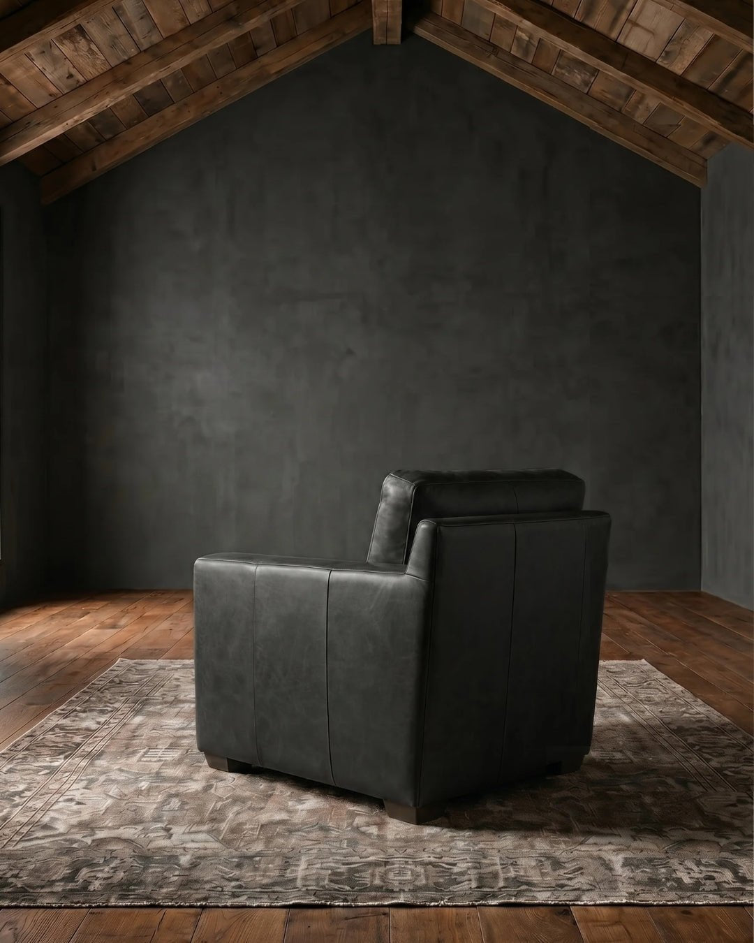
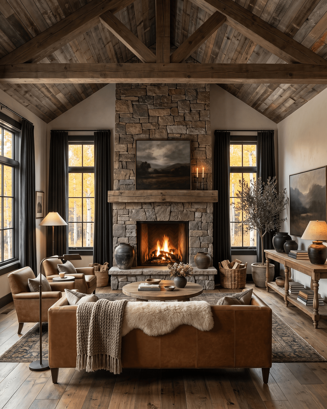
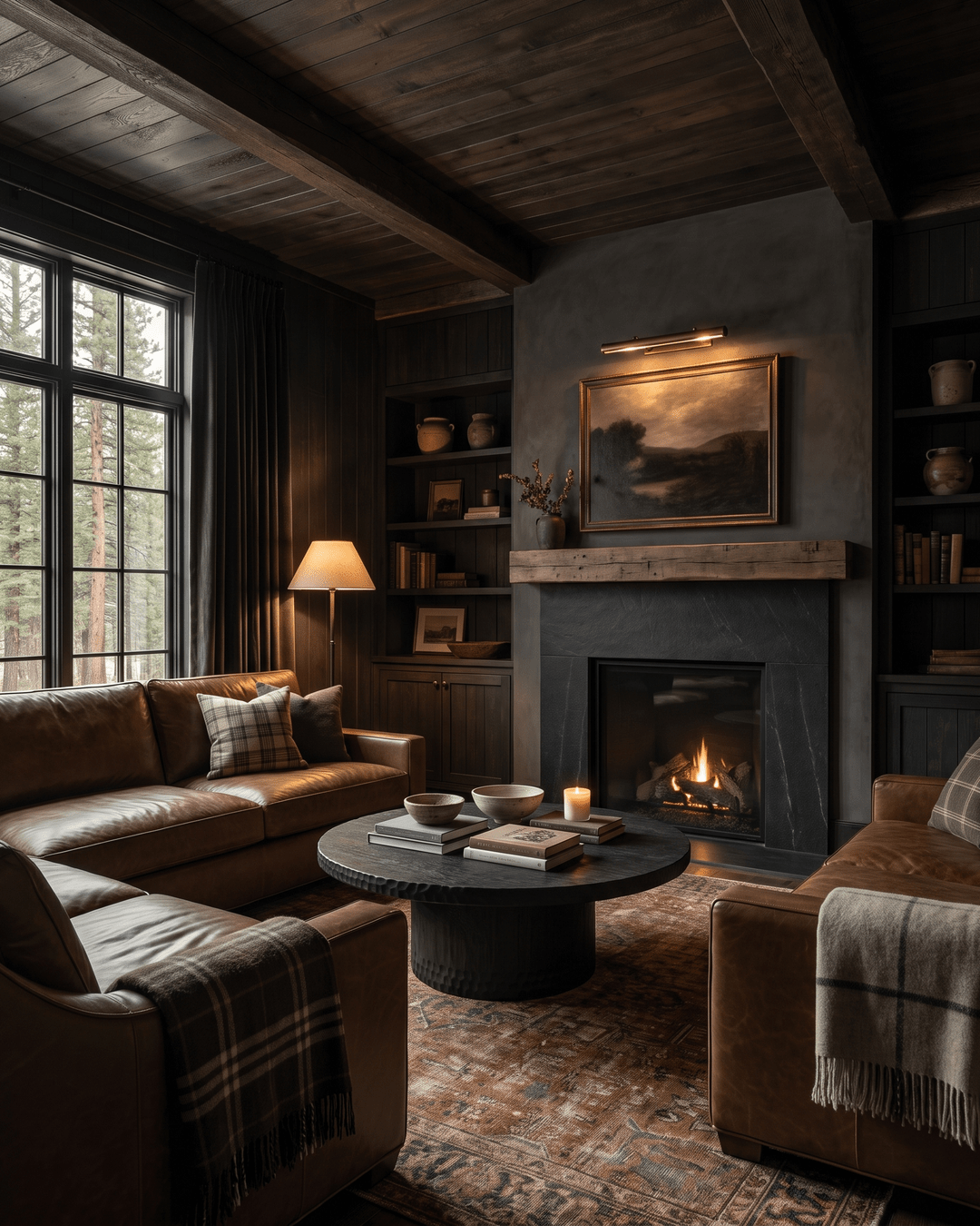
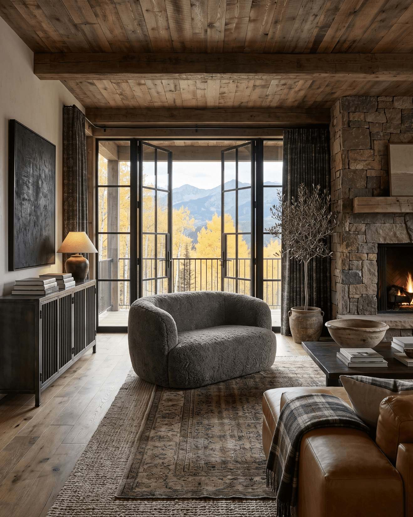
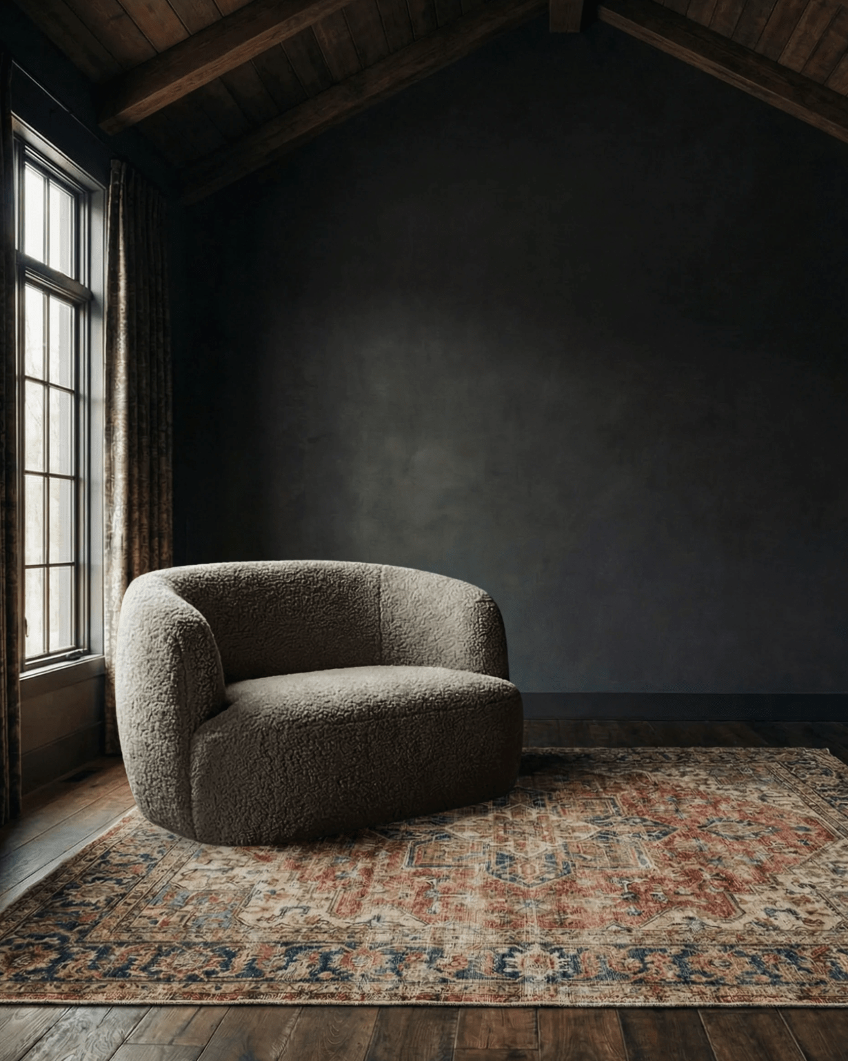
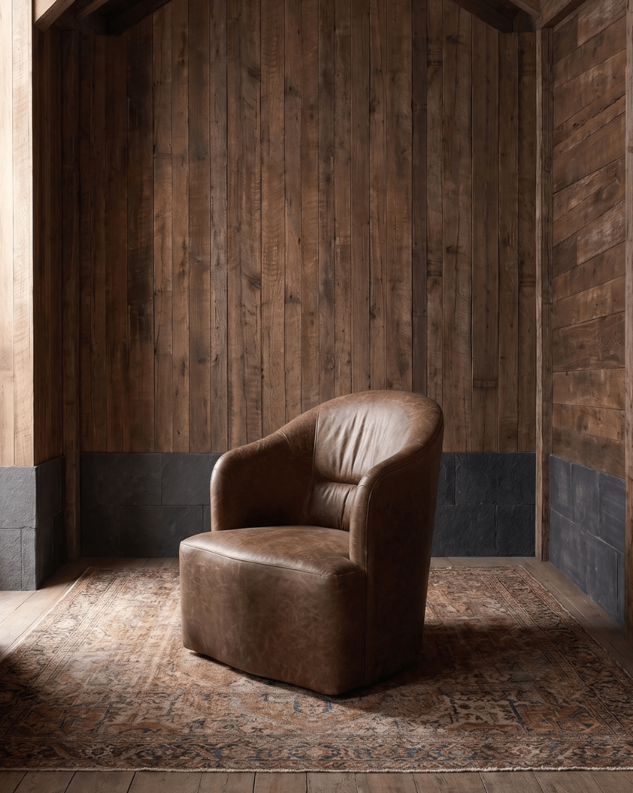
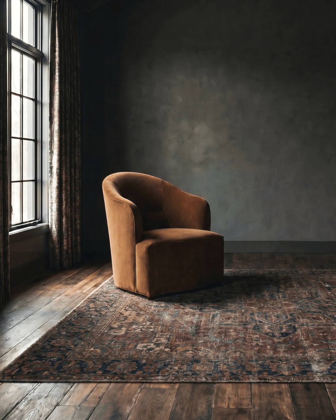
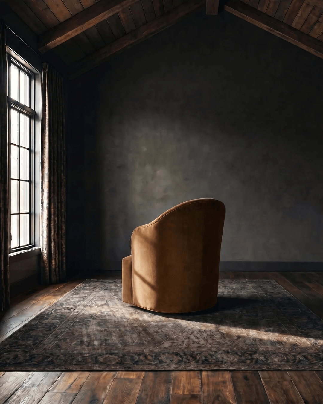
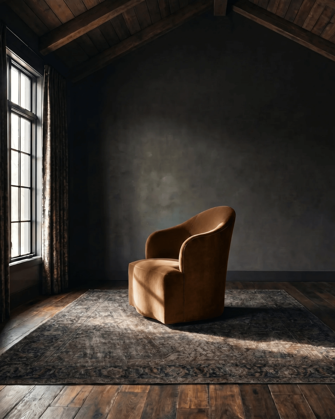
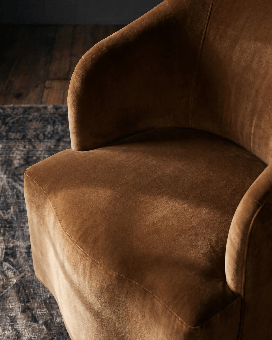
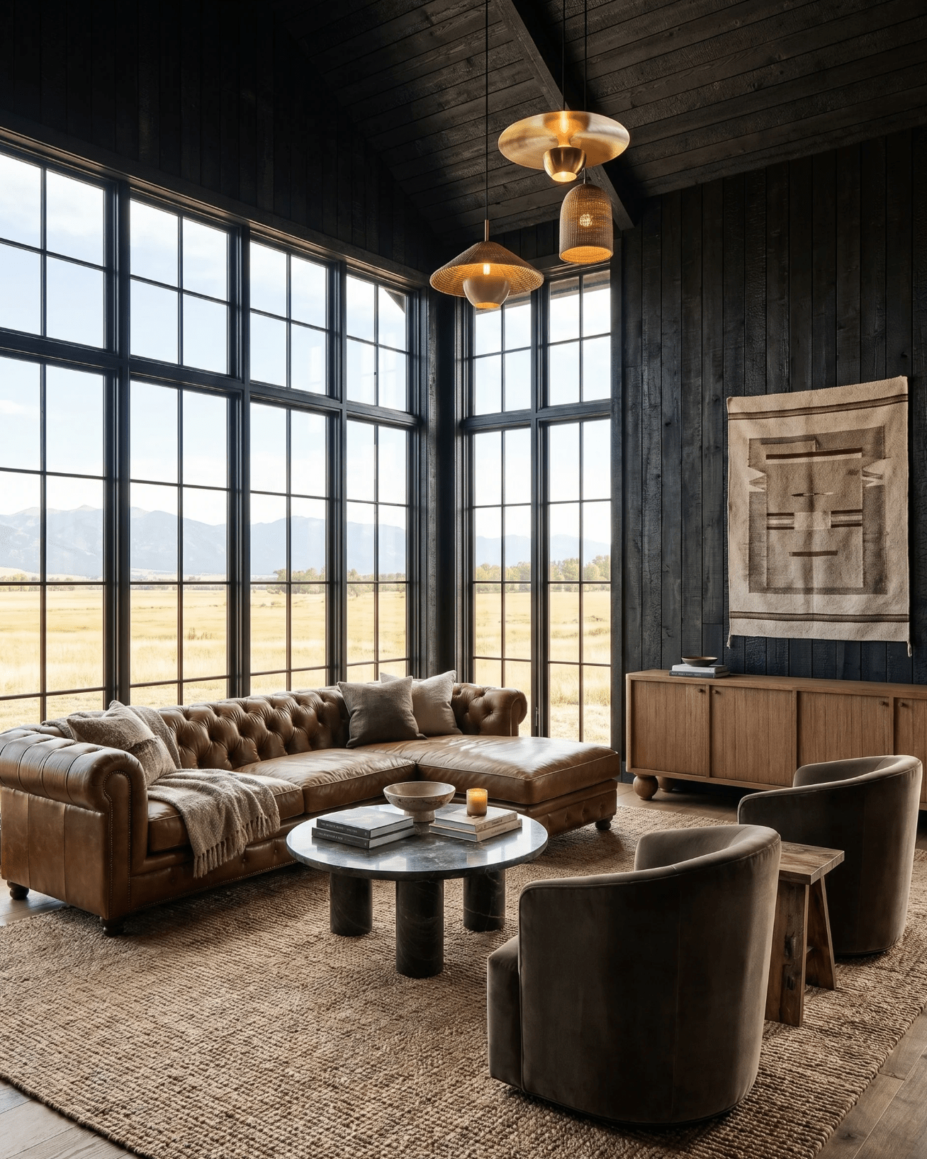
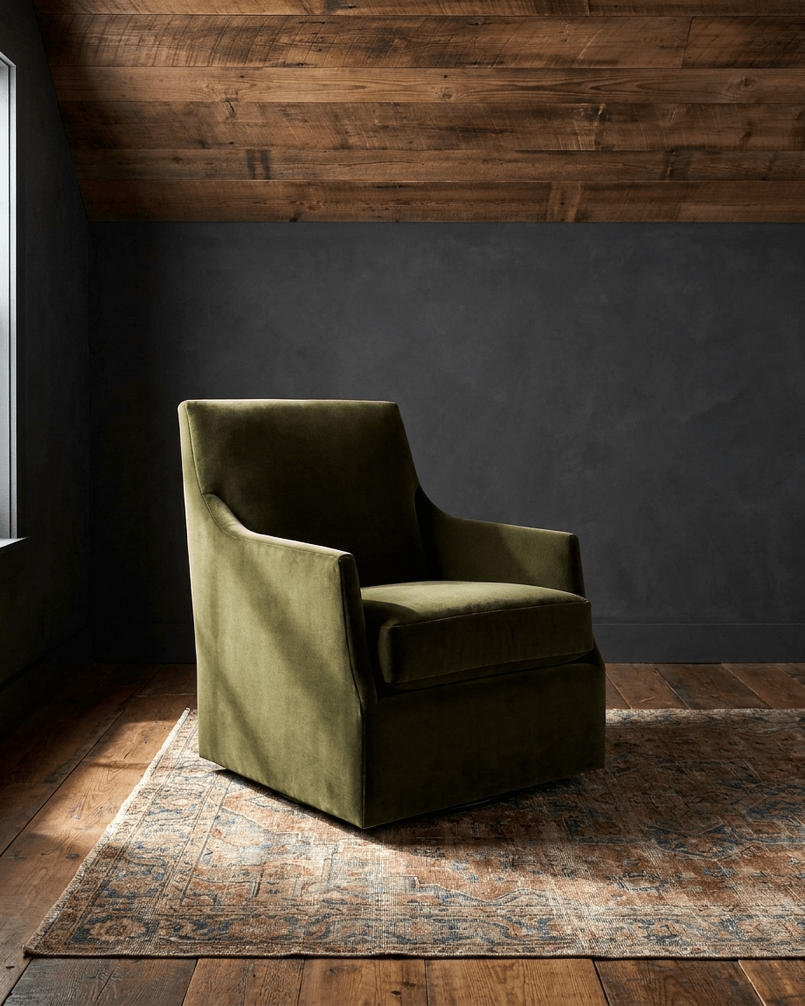
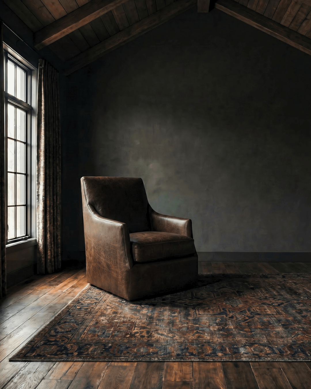
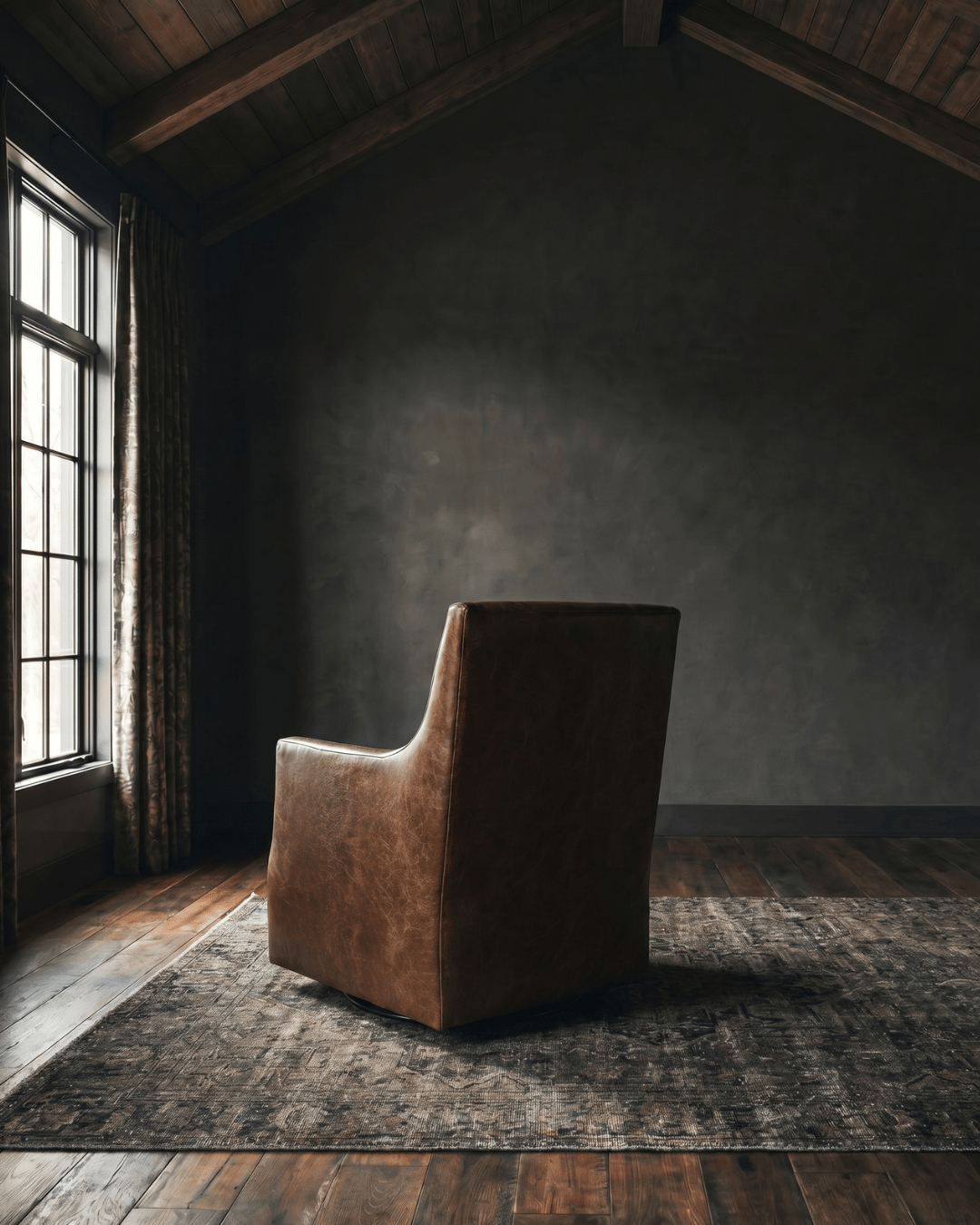
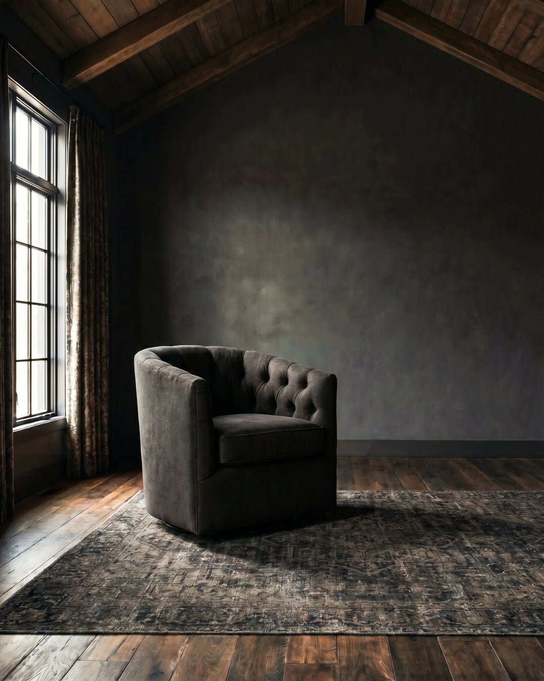
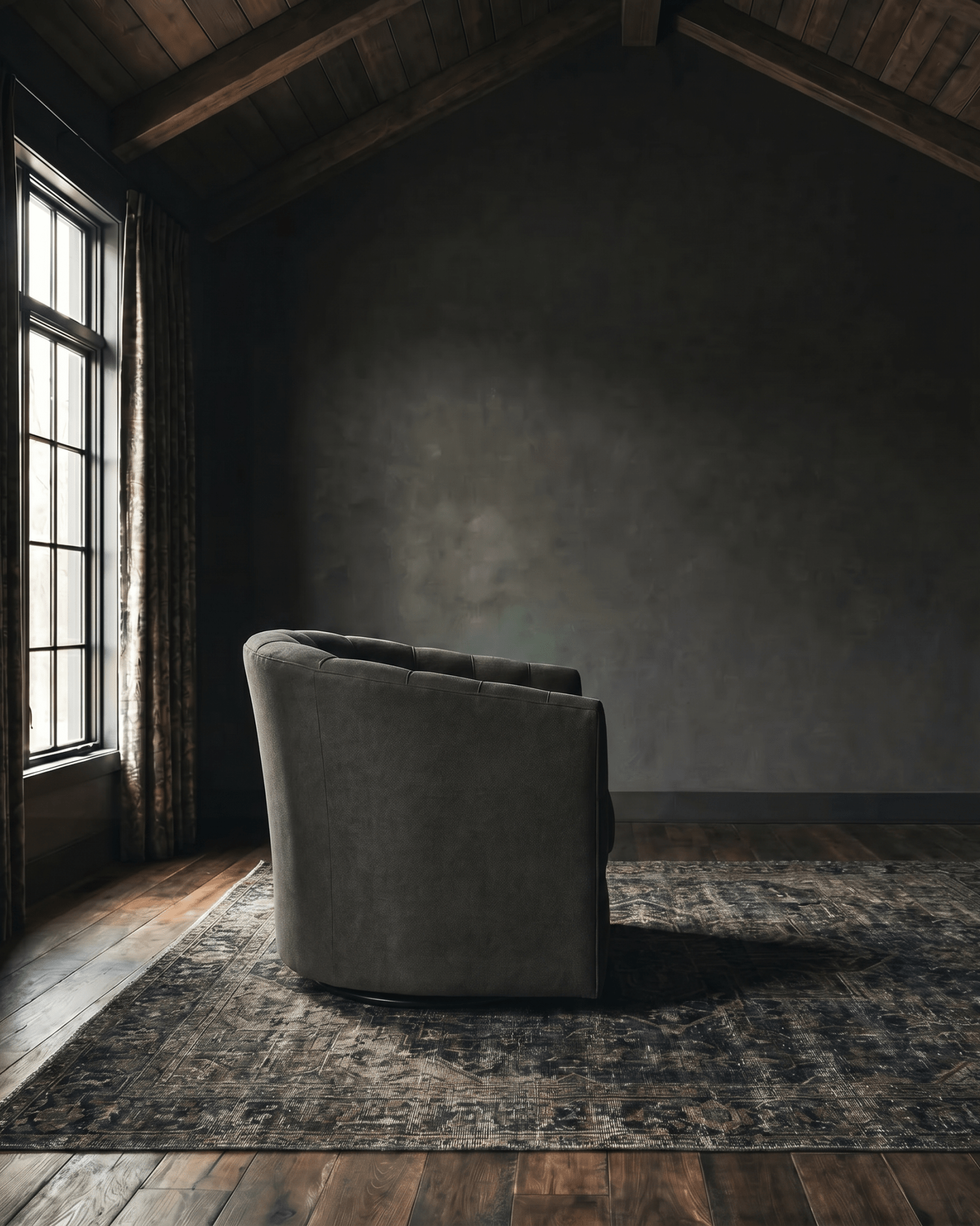
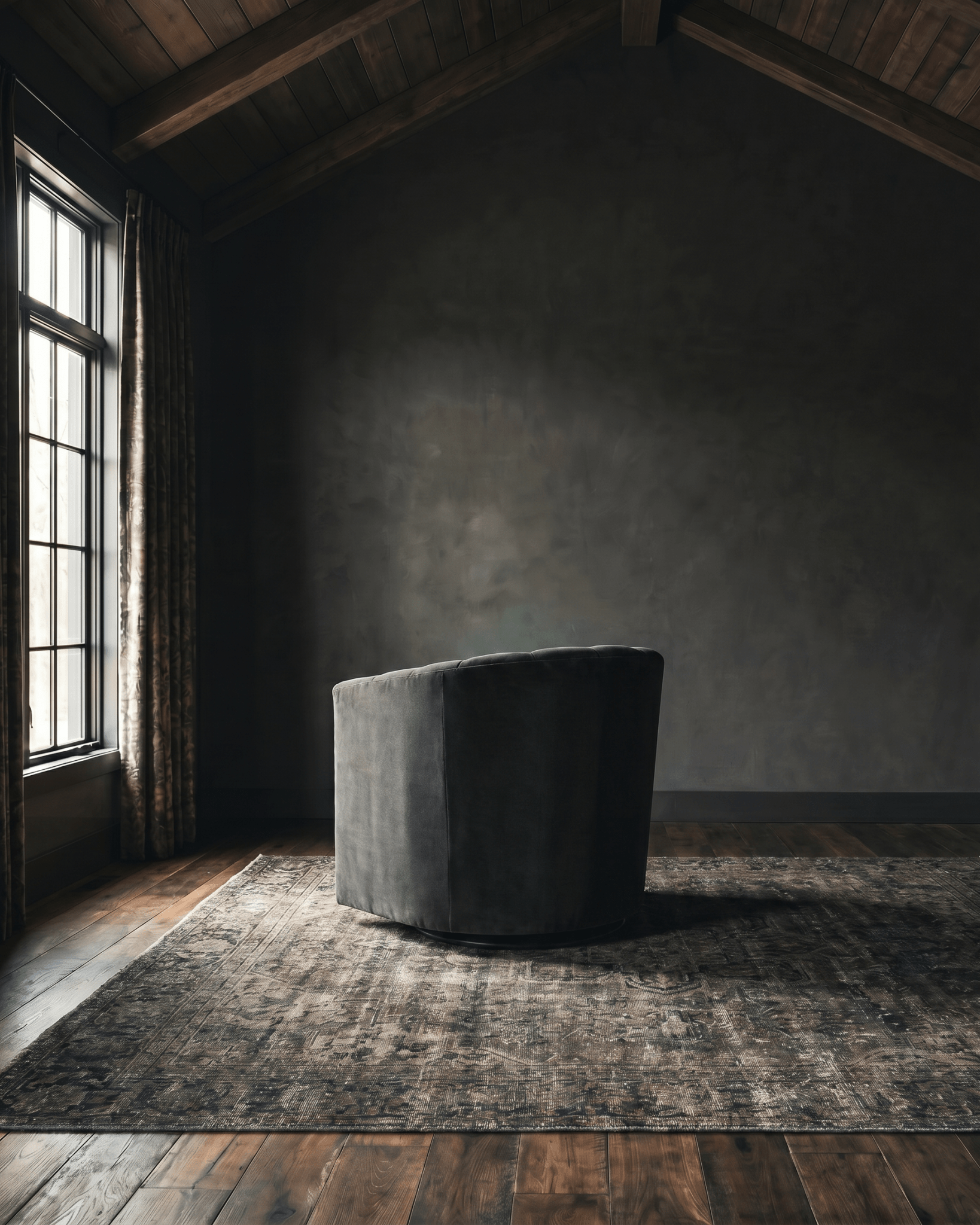
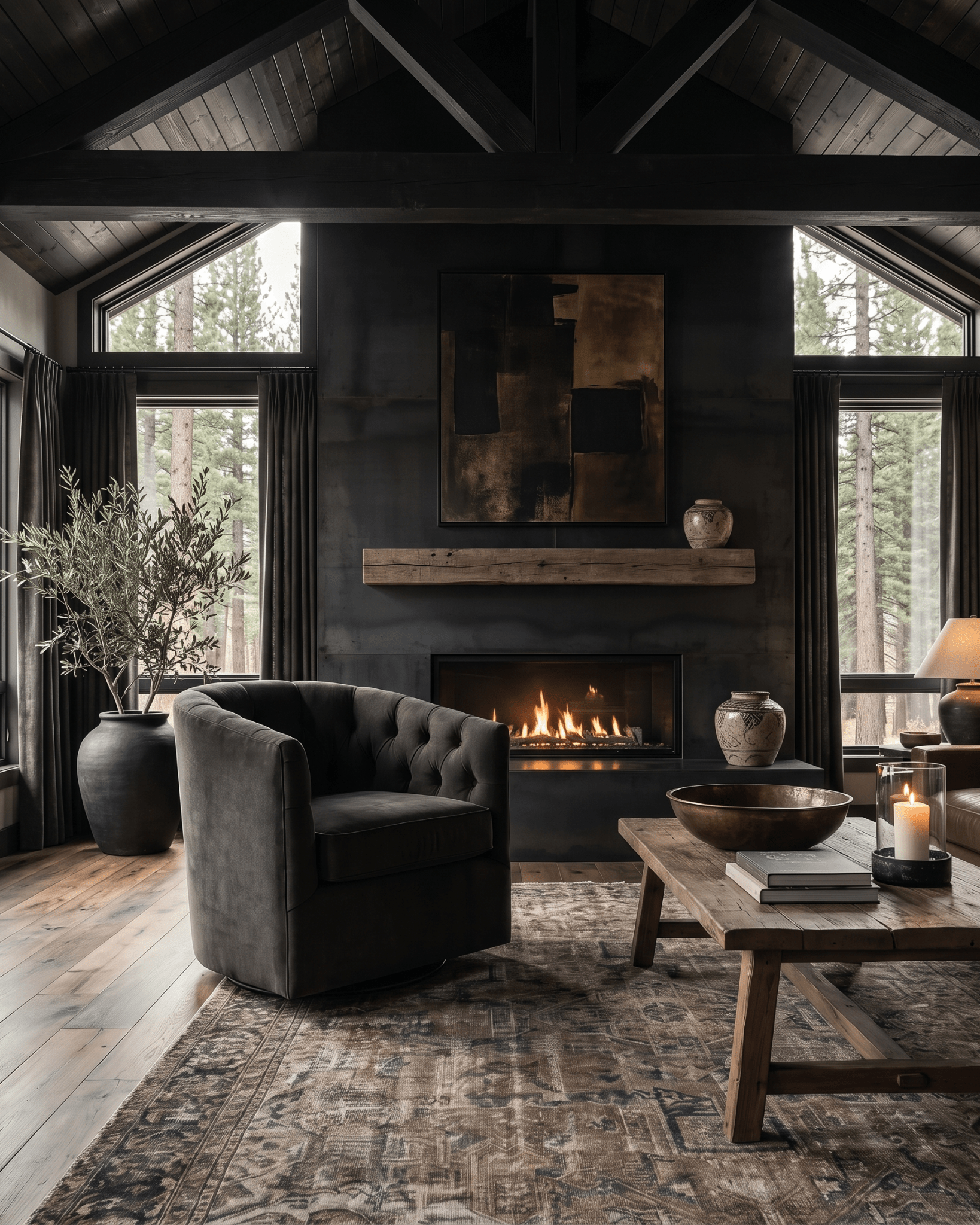
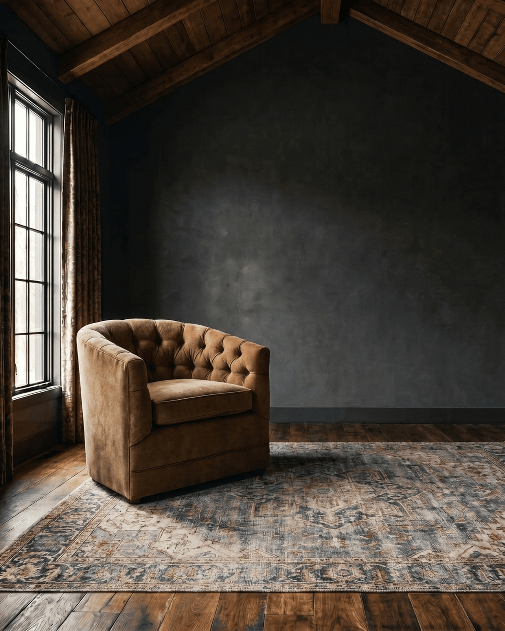
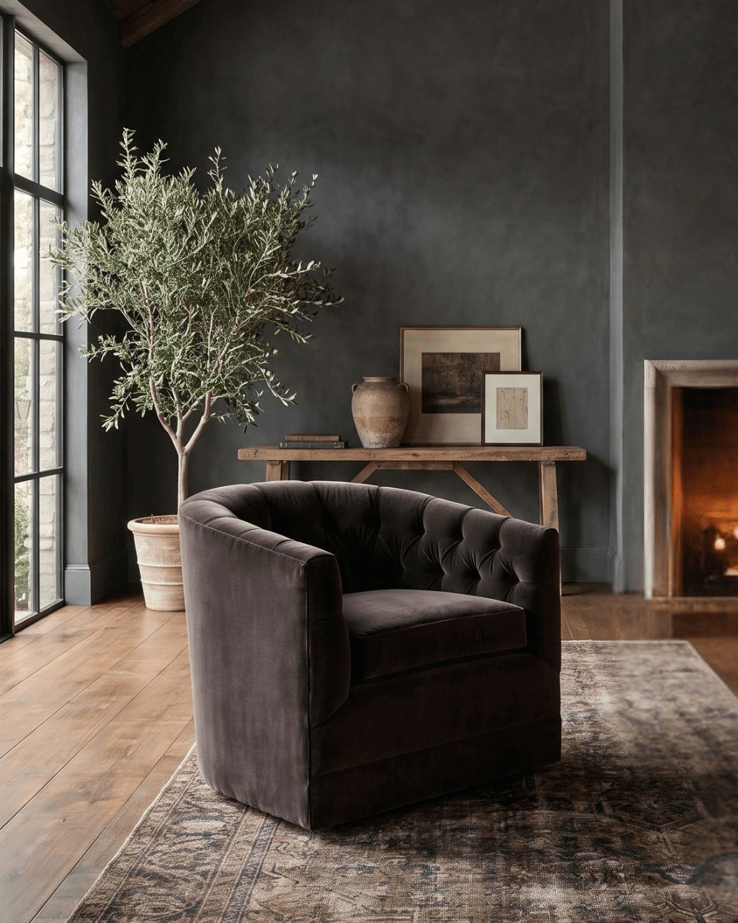
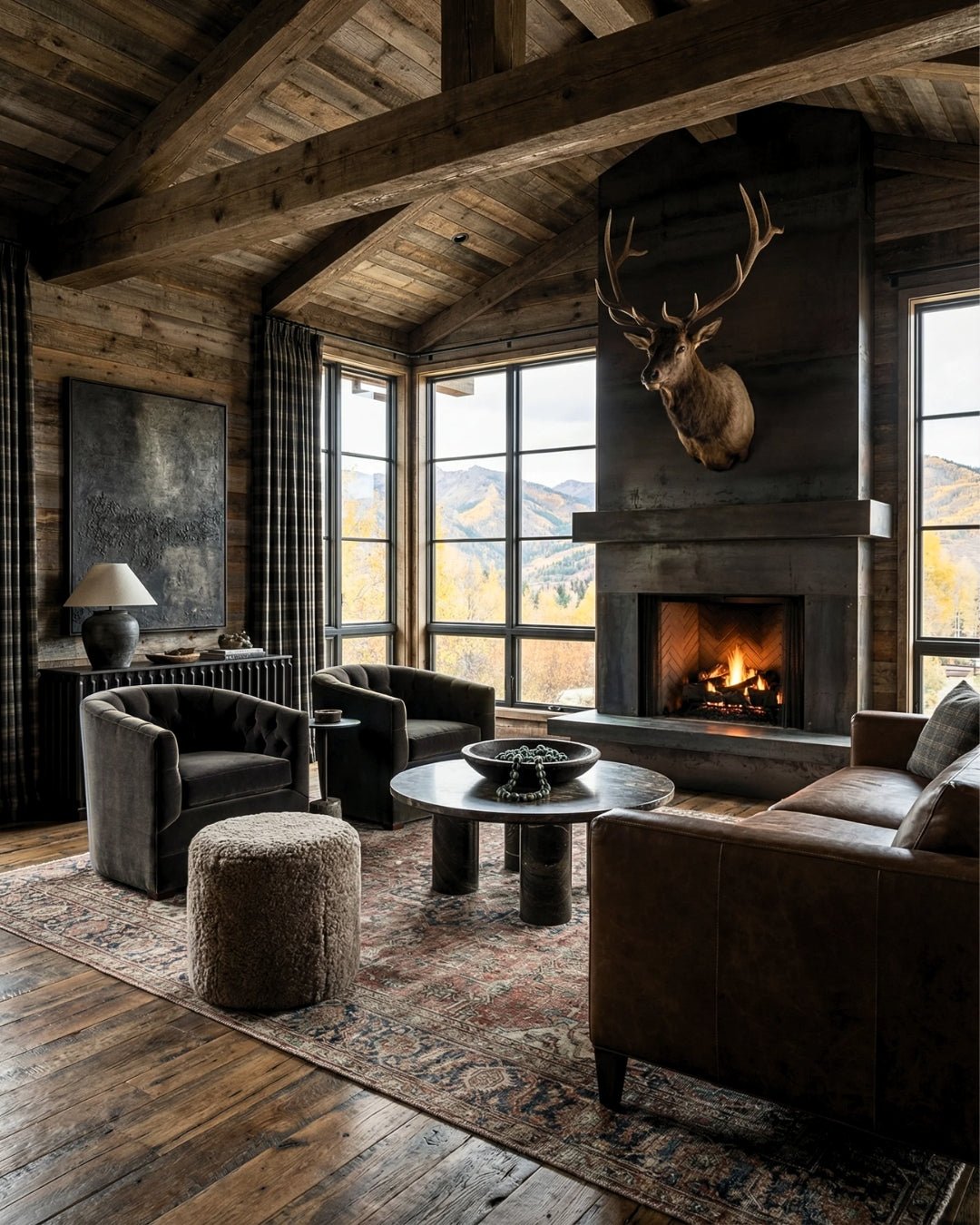
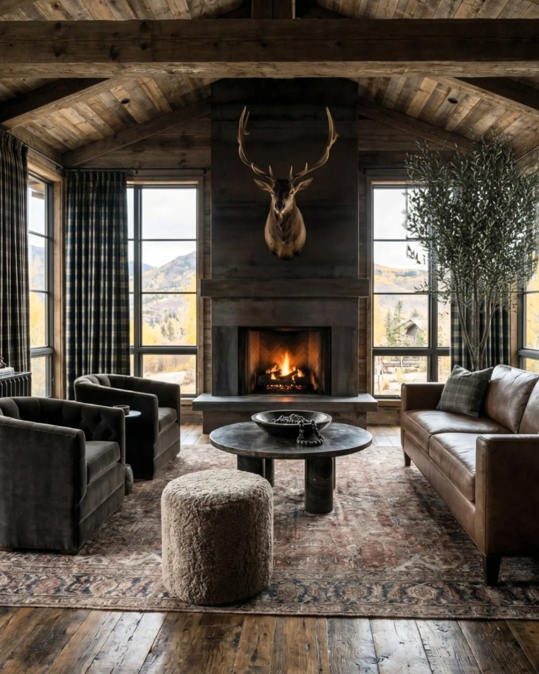
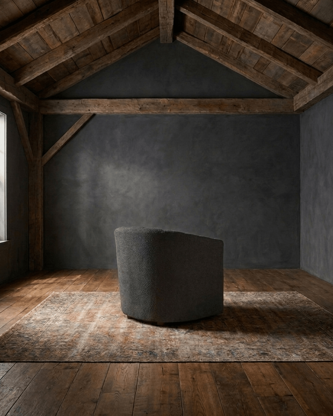
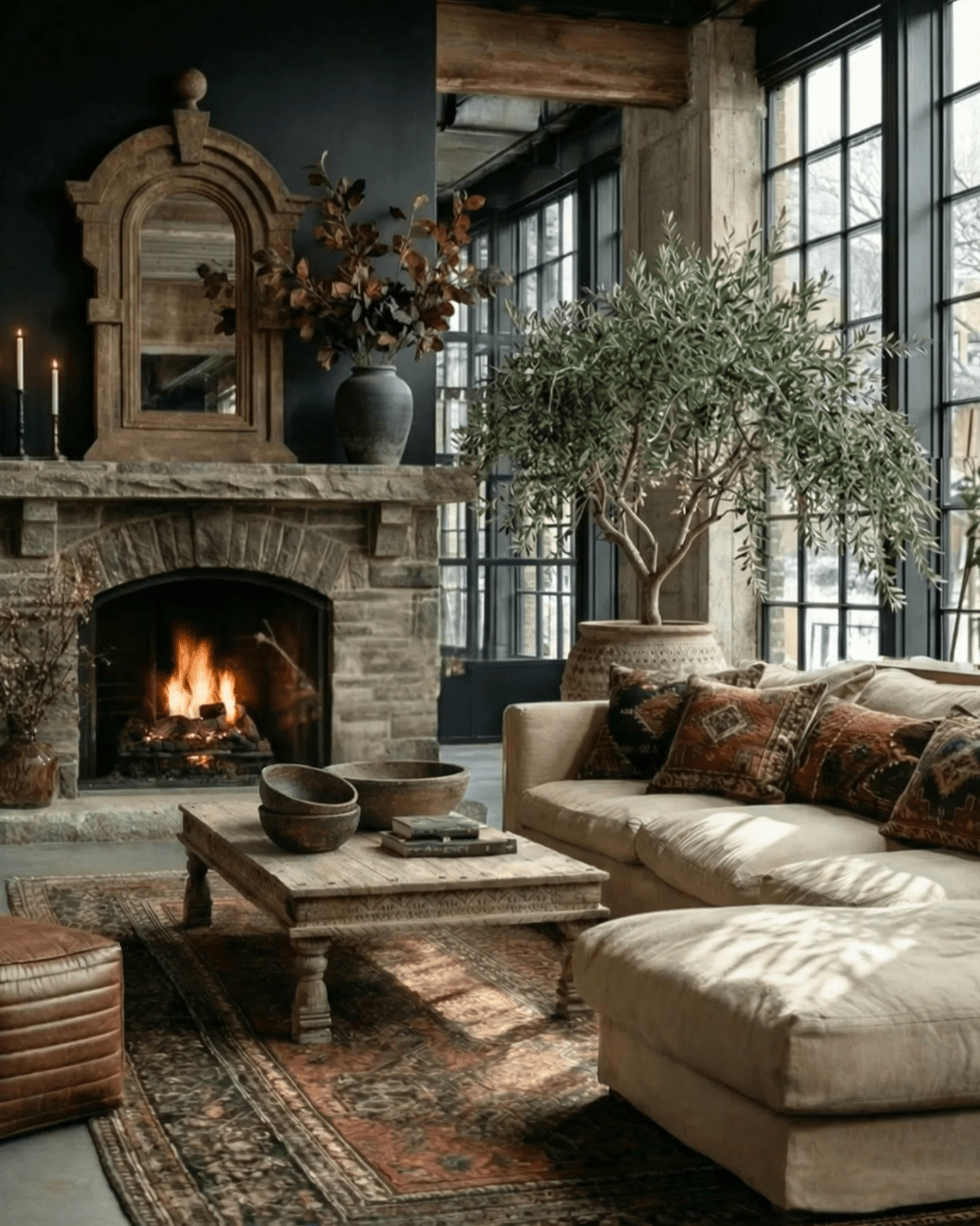
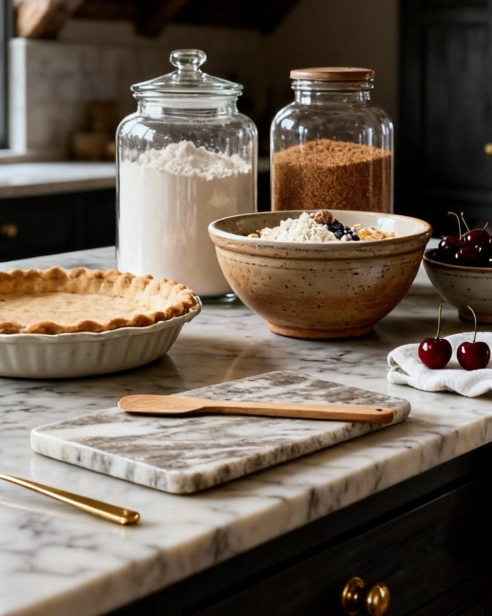
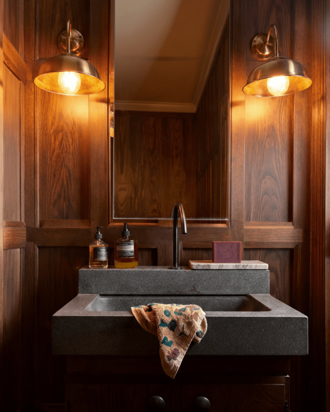
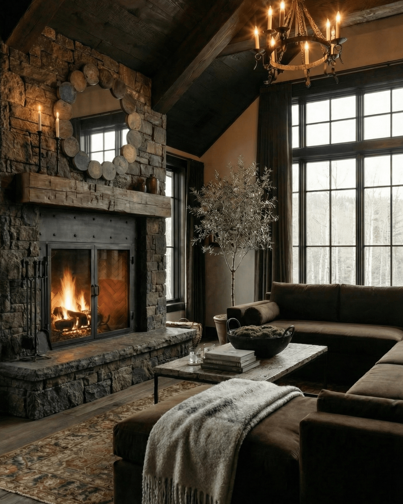
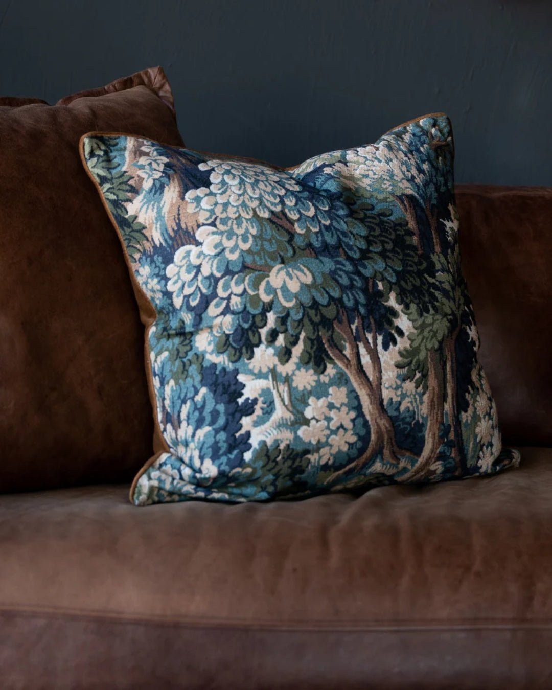
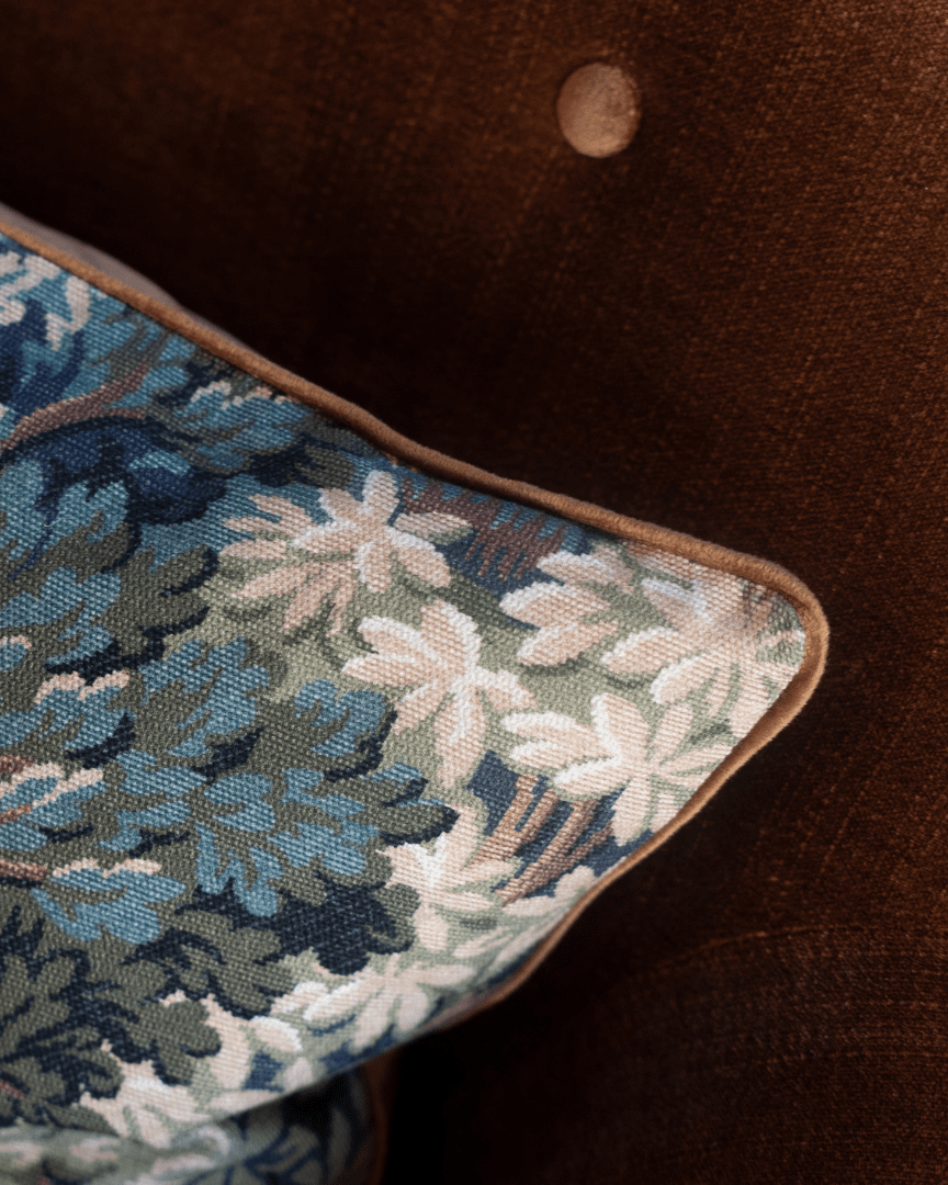
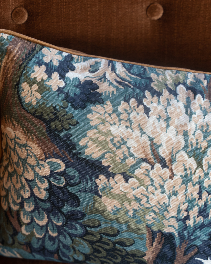
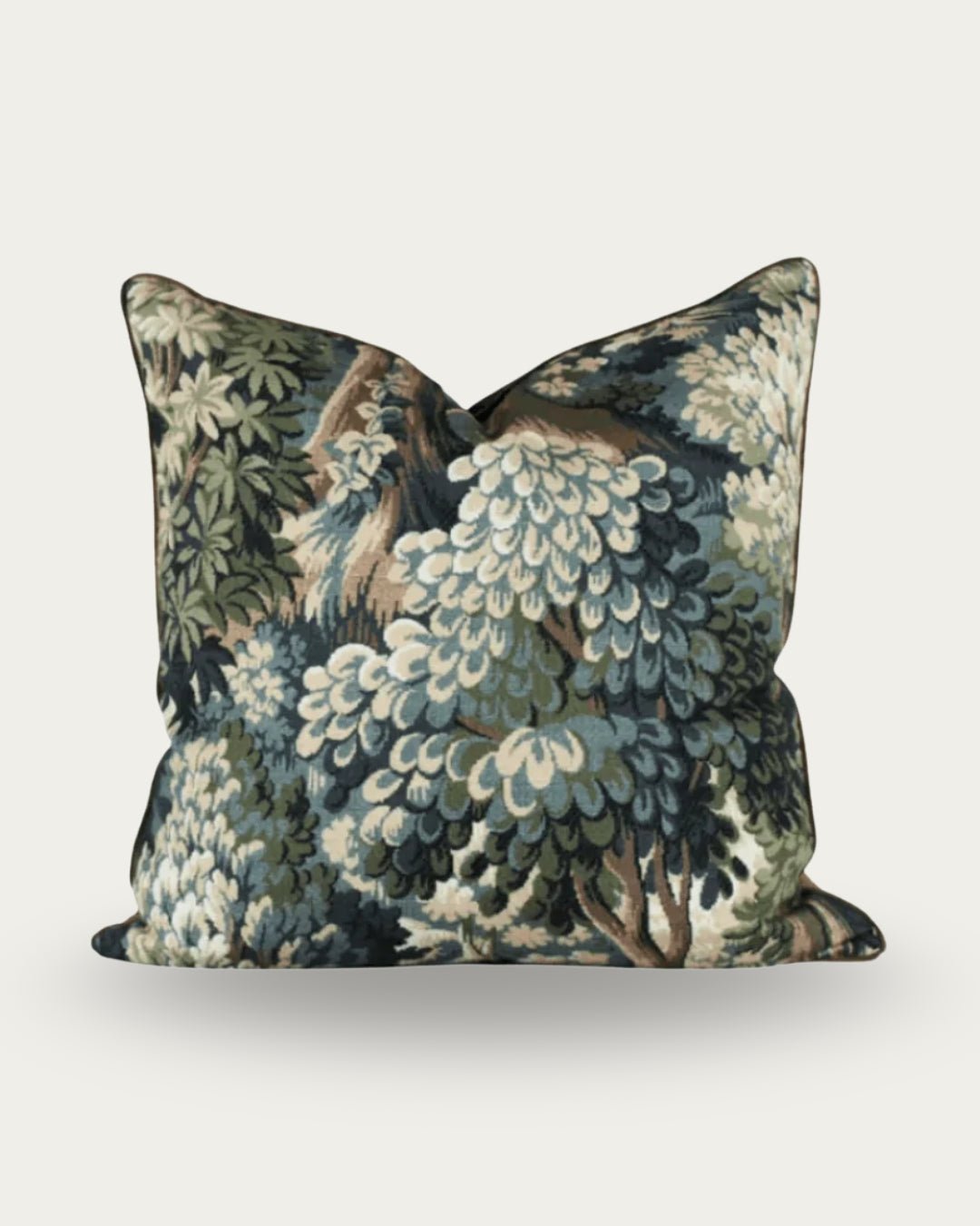
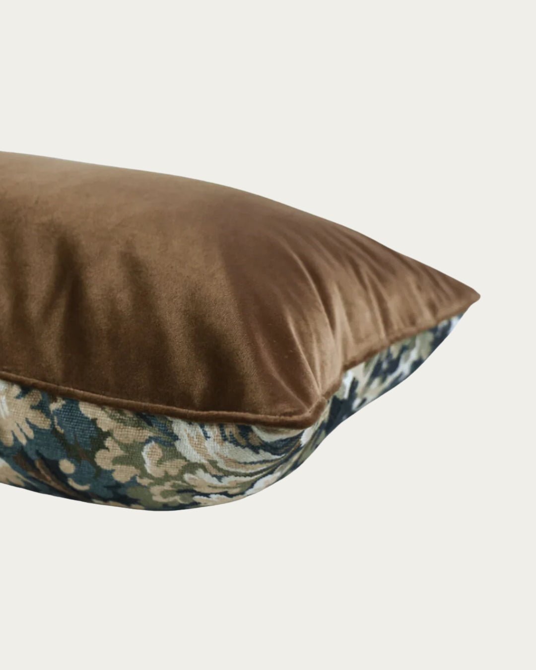
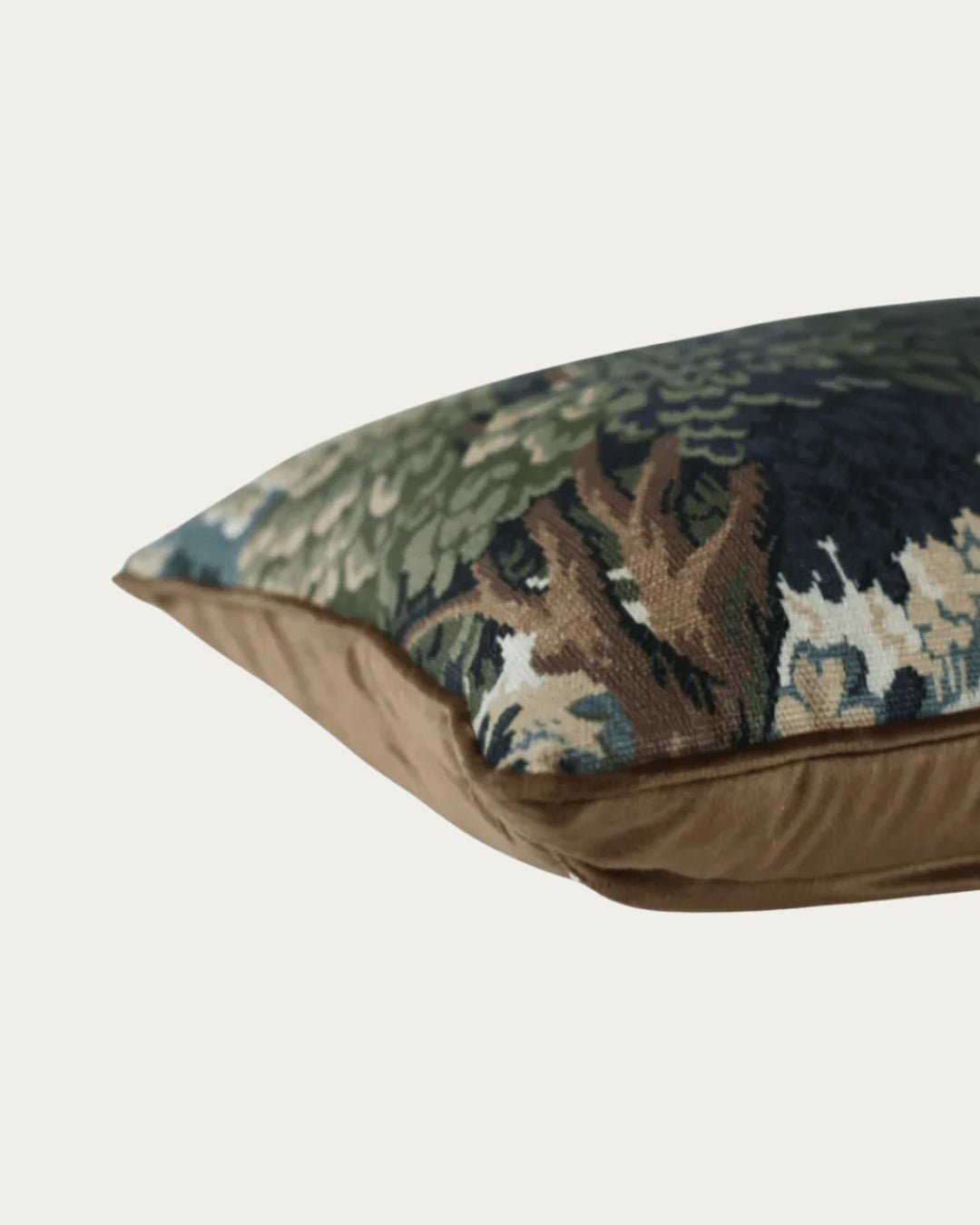
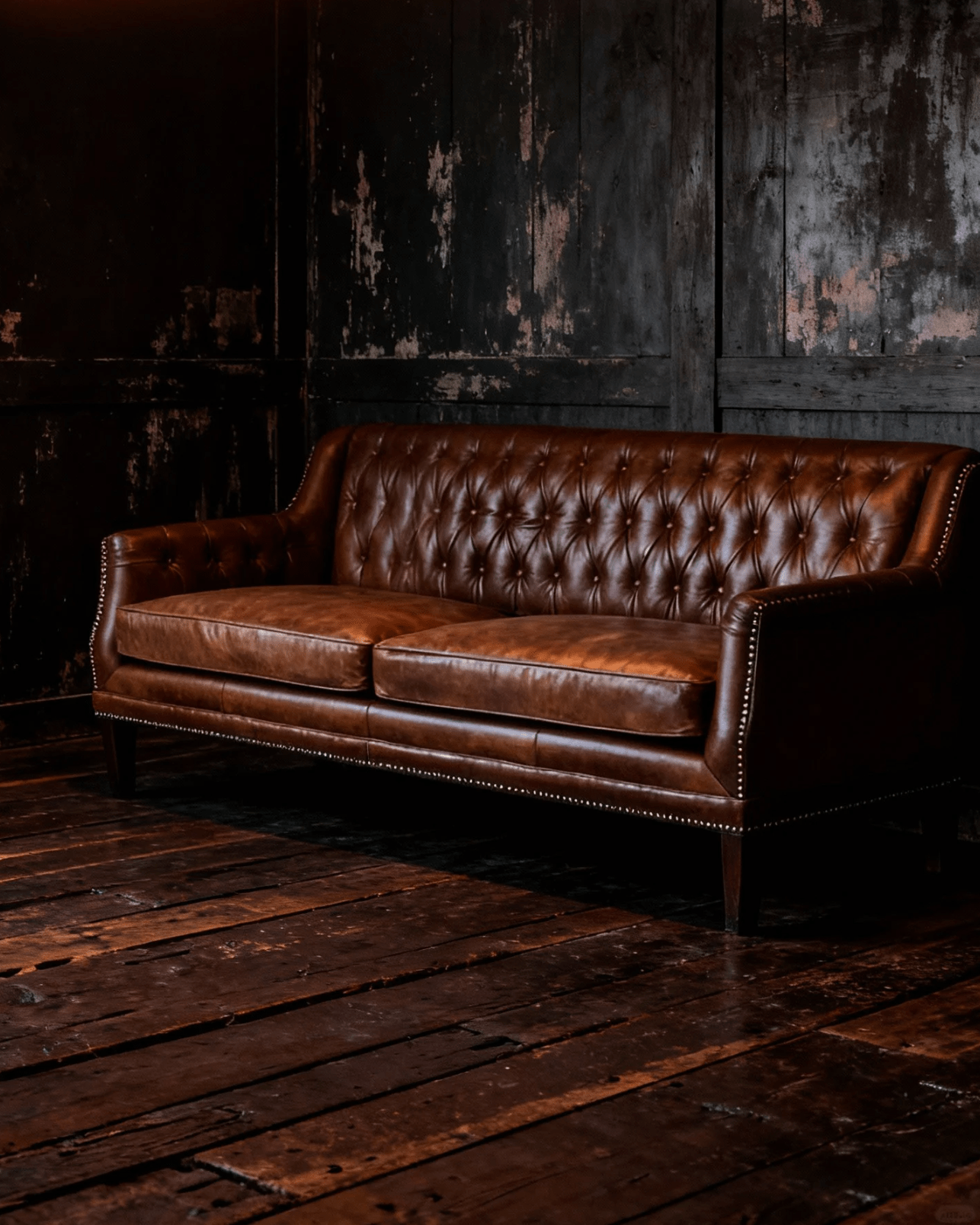
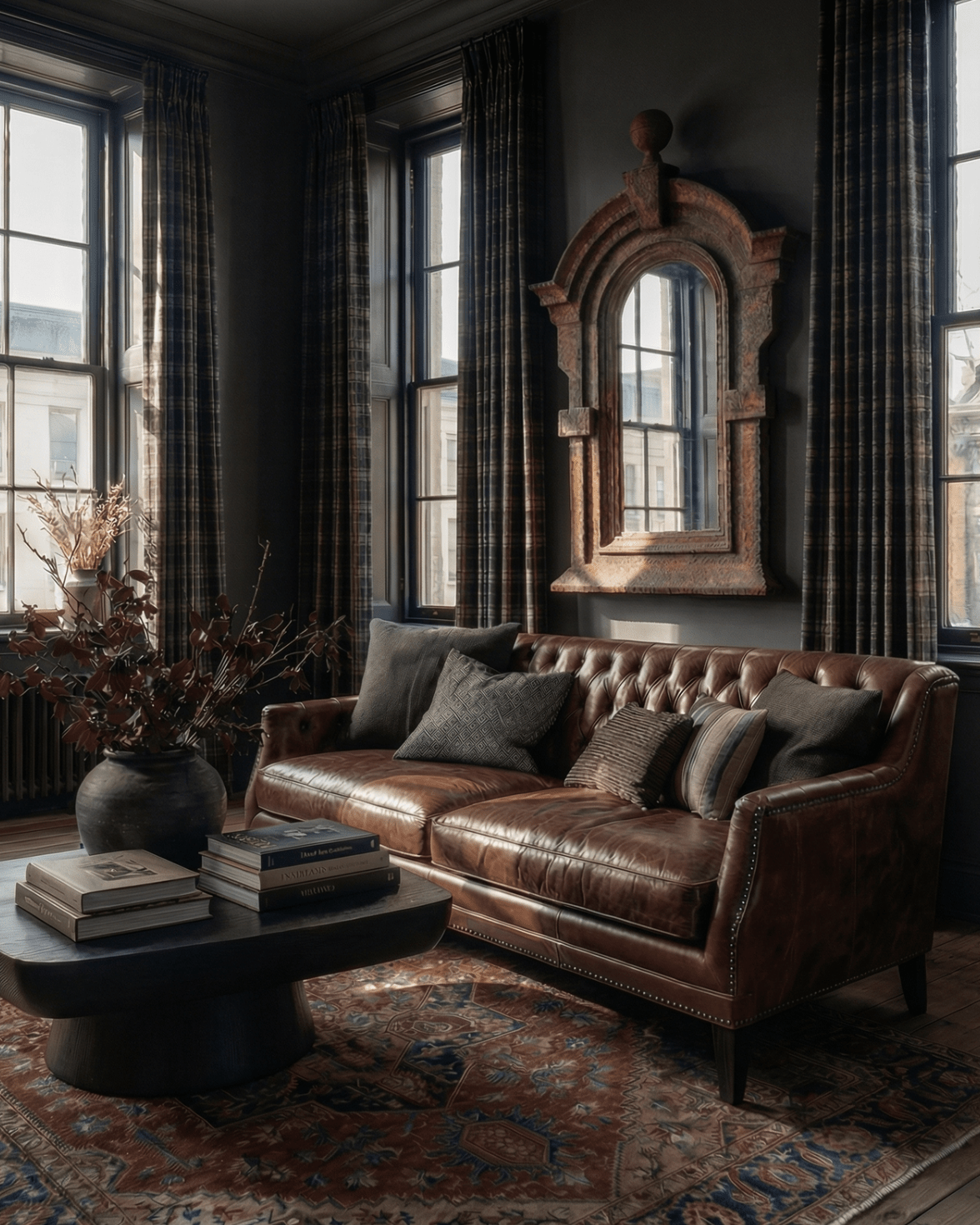
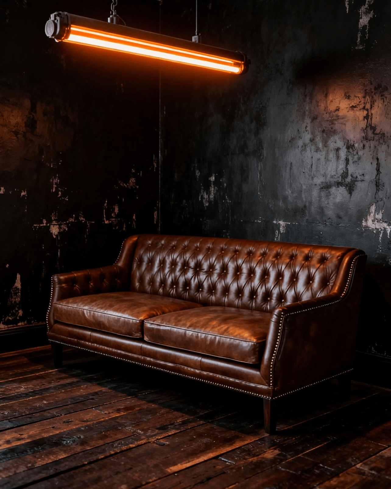
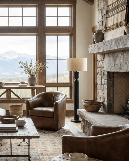
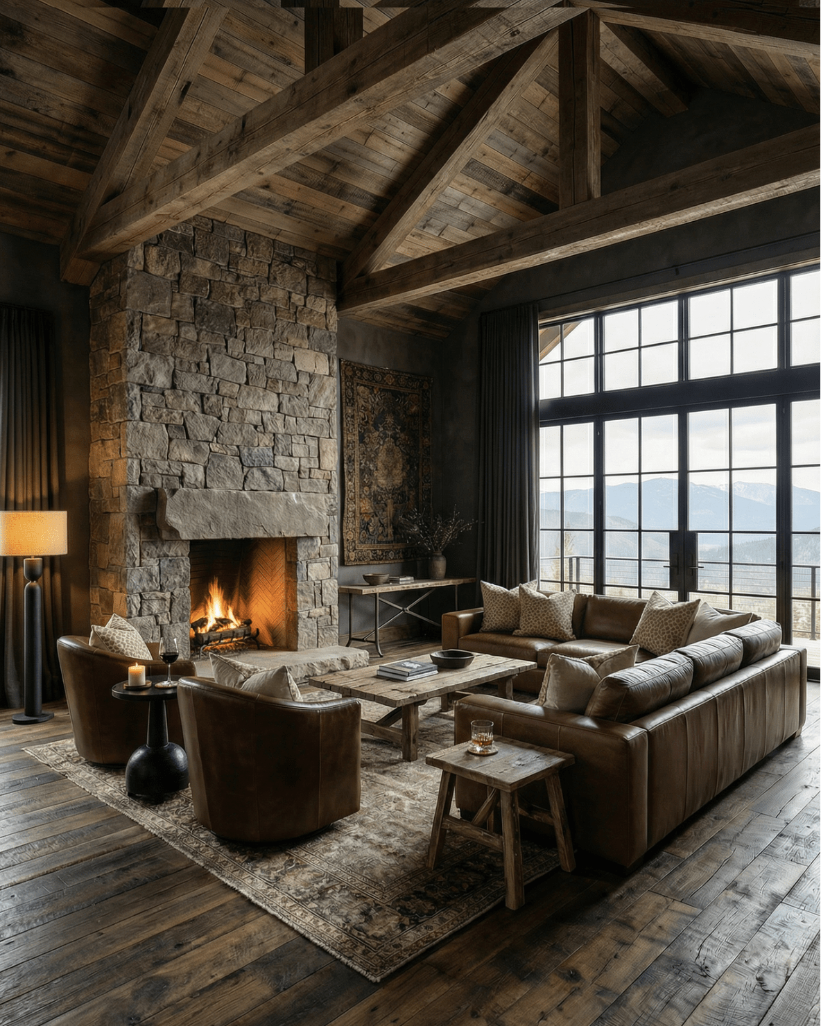
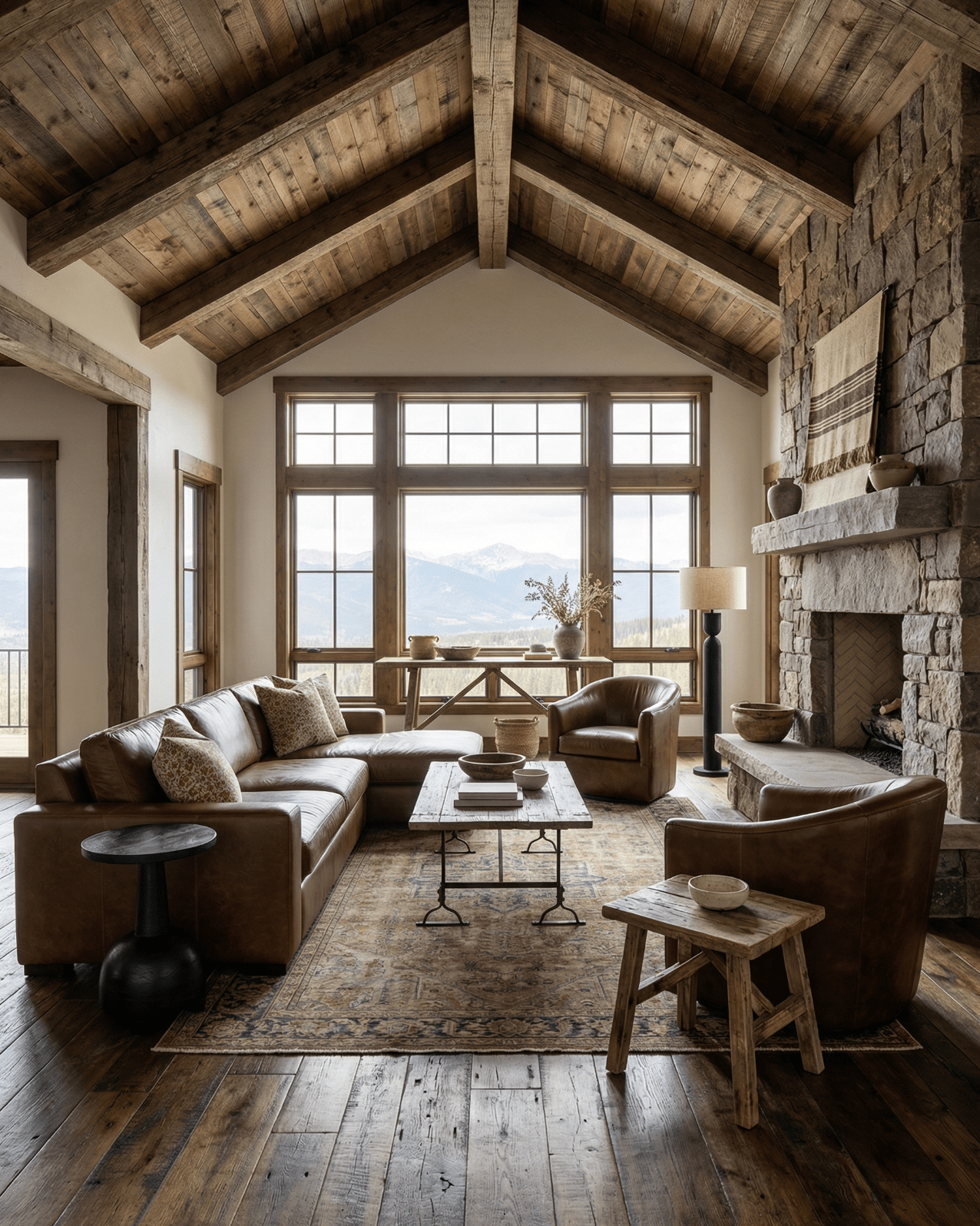
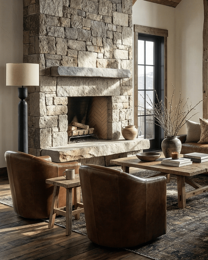
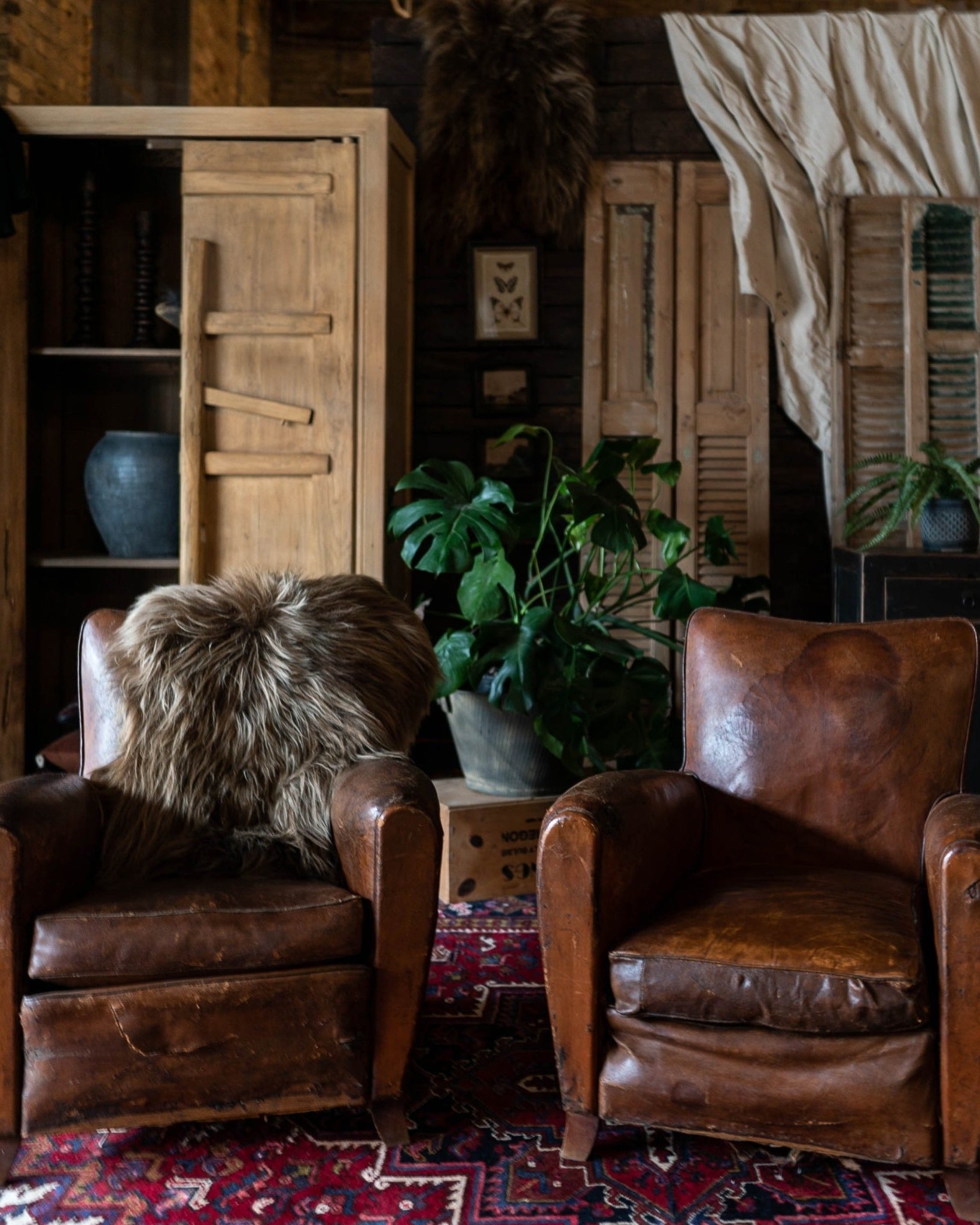
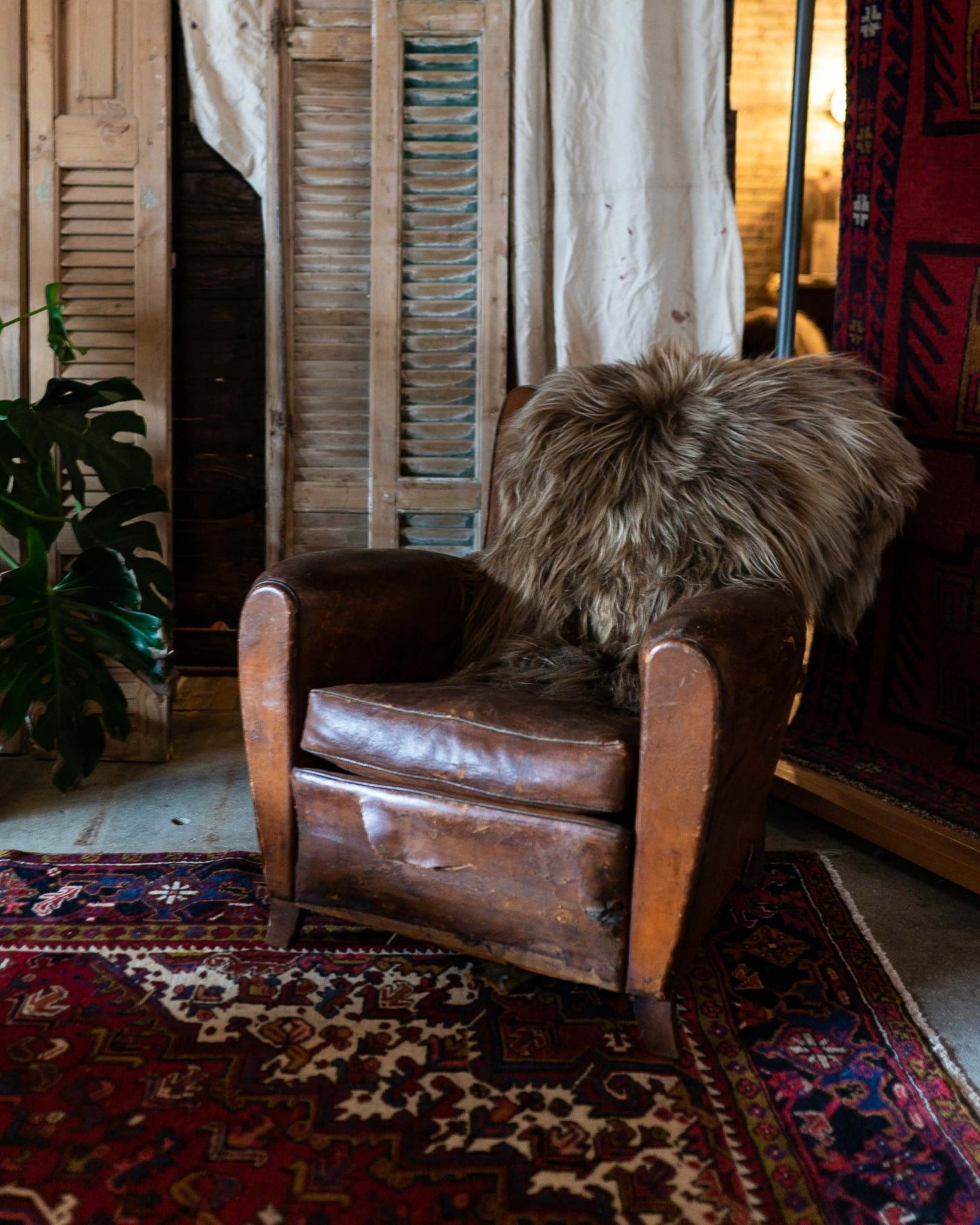
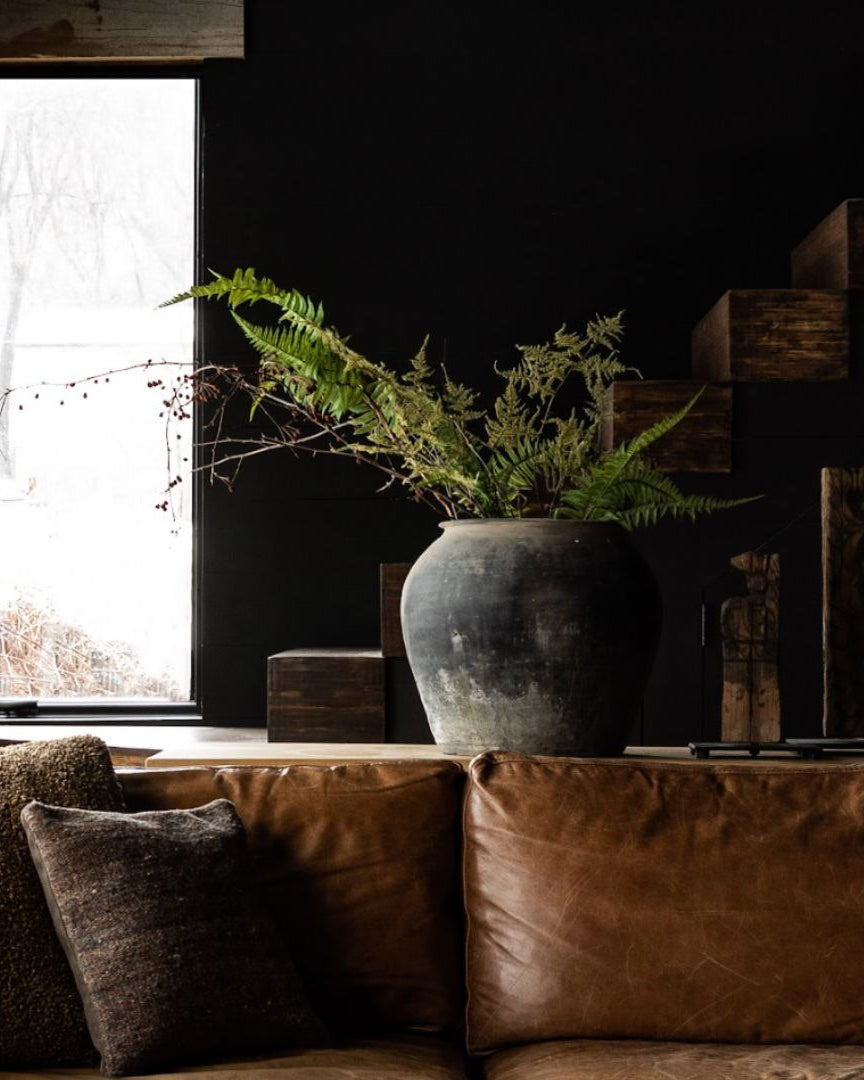
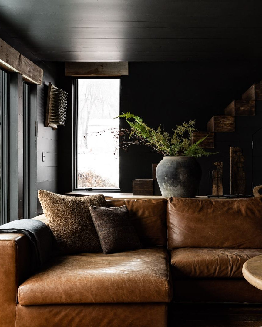
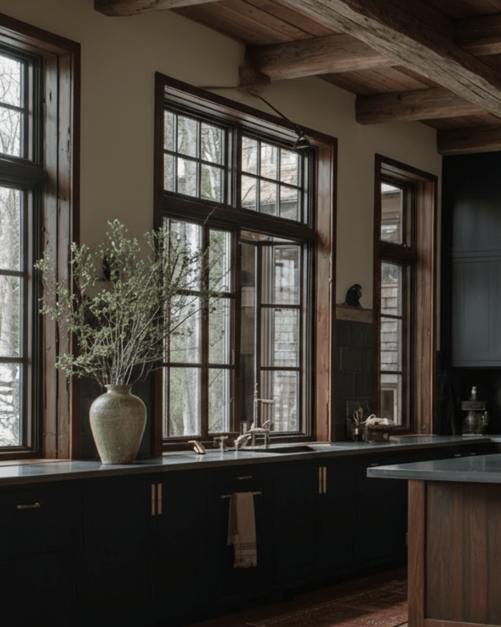
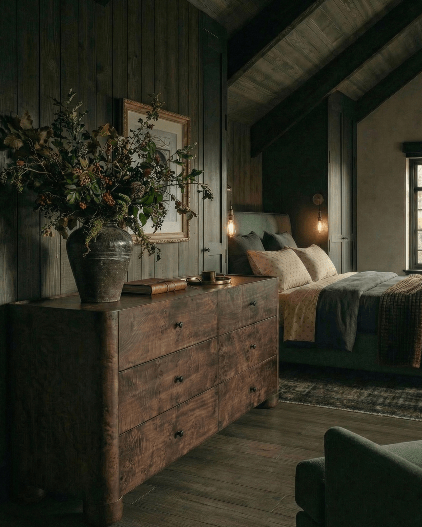
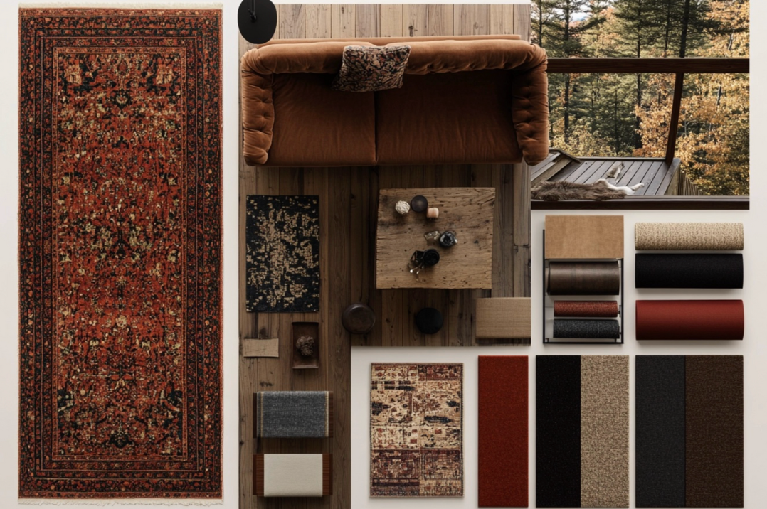
For Summer 2025, my creative compass pointed somewhere unexpected. Instead of going “summery” with pale linens and washed-out neutrals, I found myself drawn to jewel tones and layers of texture that felt luxurious and soulful.
“I even embraced a dark navy this season — which is rare for me. I’m usually a green person through and through, but something about that deep, greyish-blue felt right. It’s moody but grounded. Who knew!”
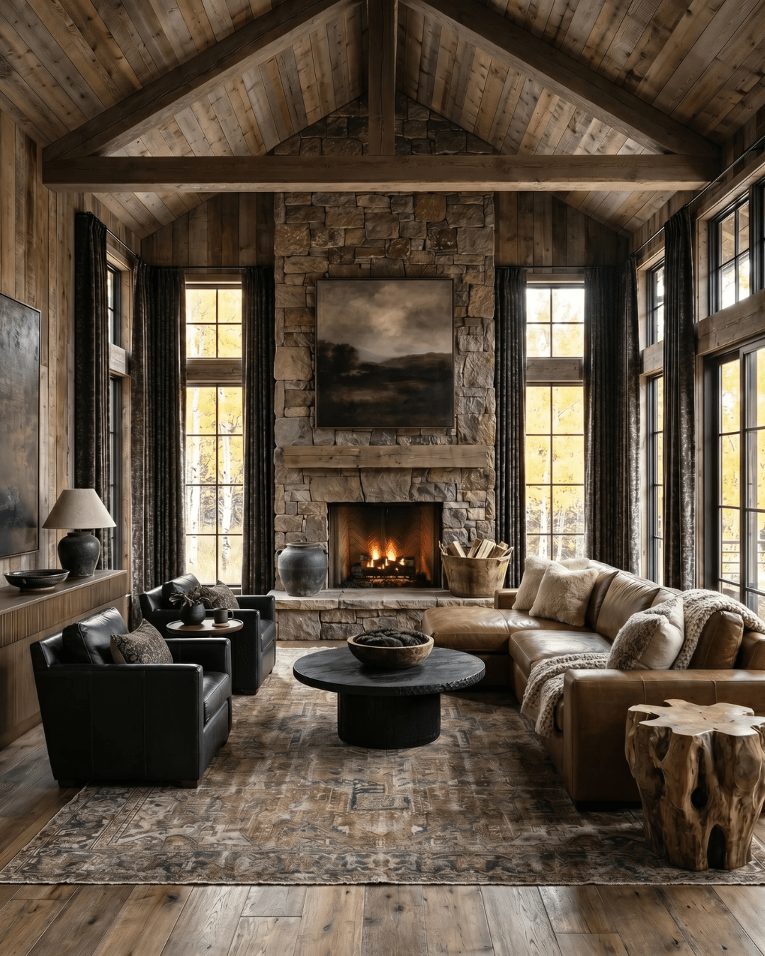
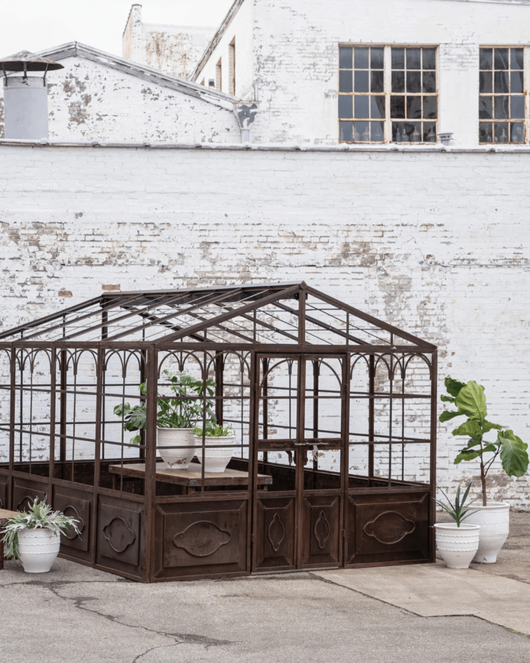
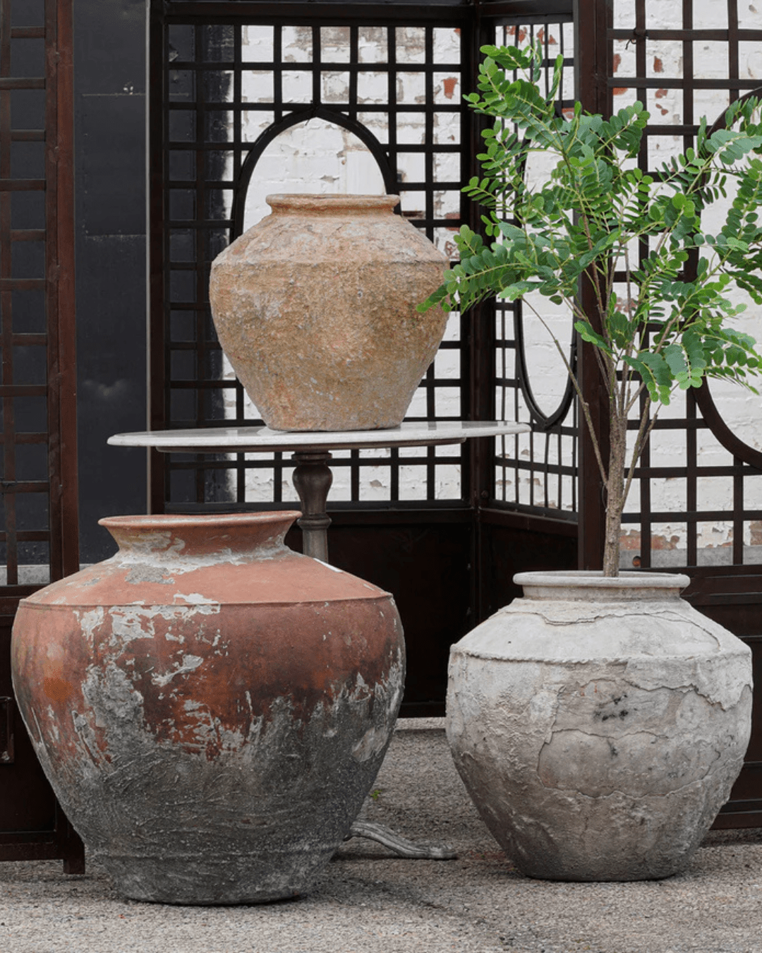
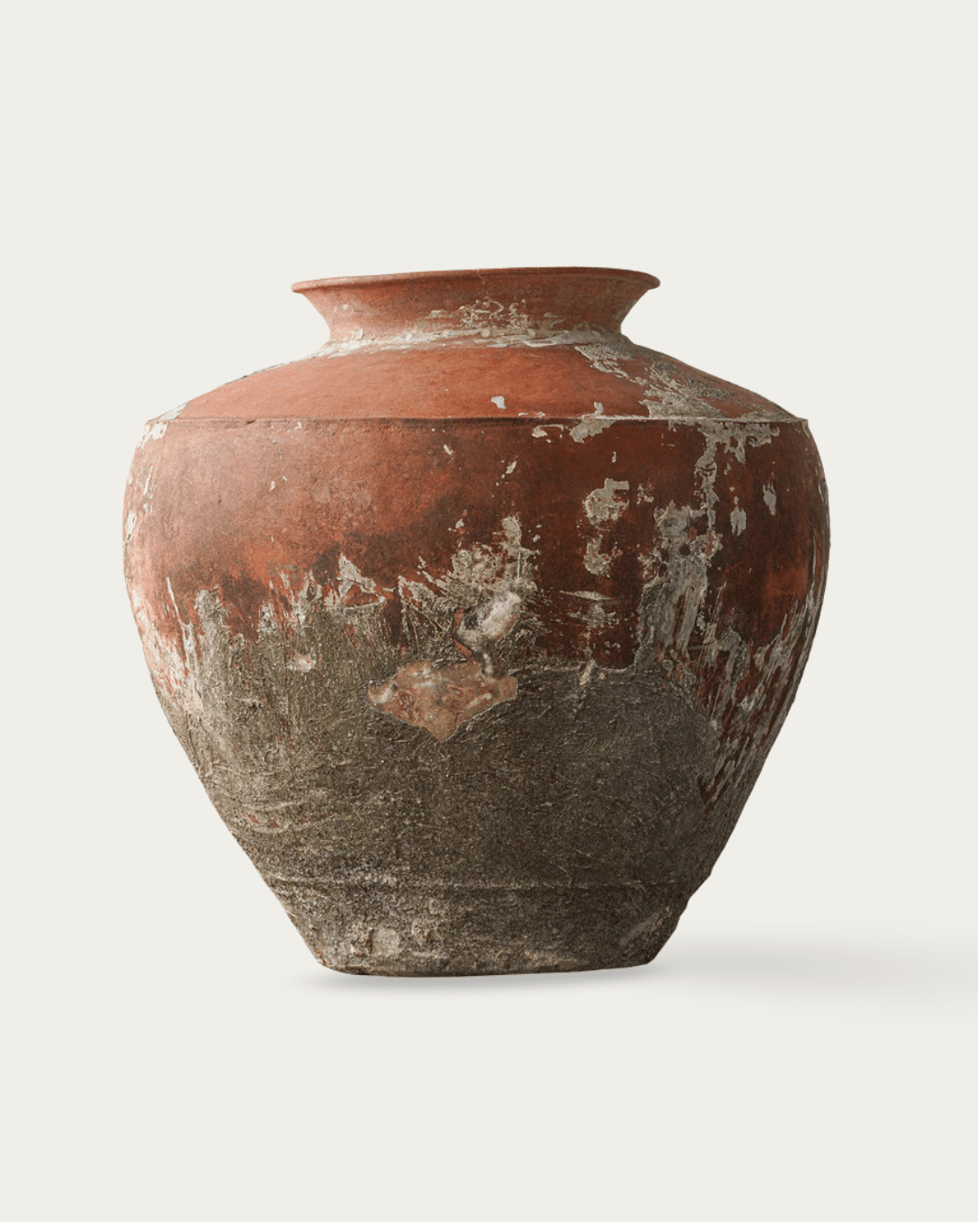
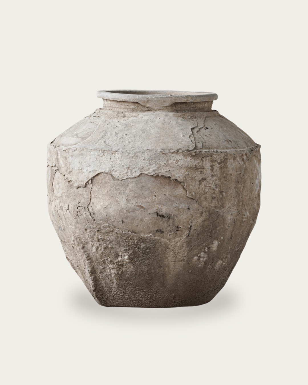
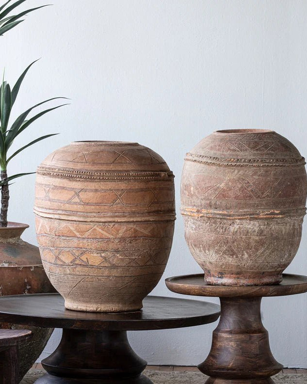
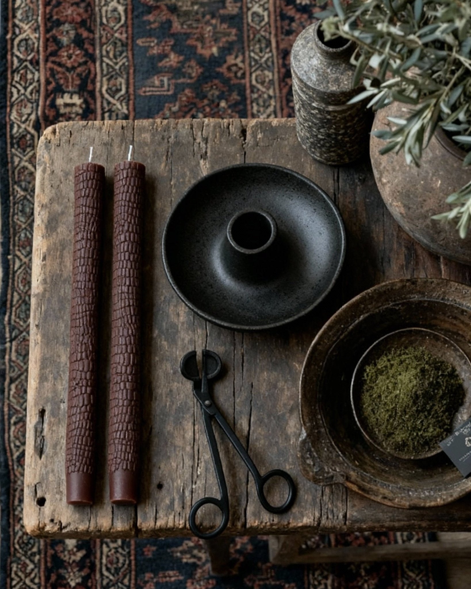
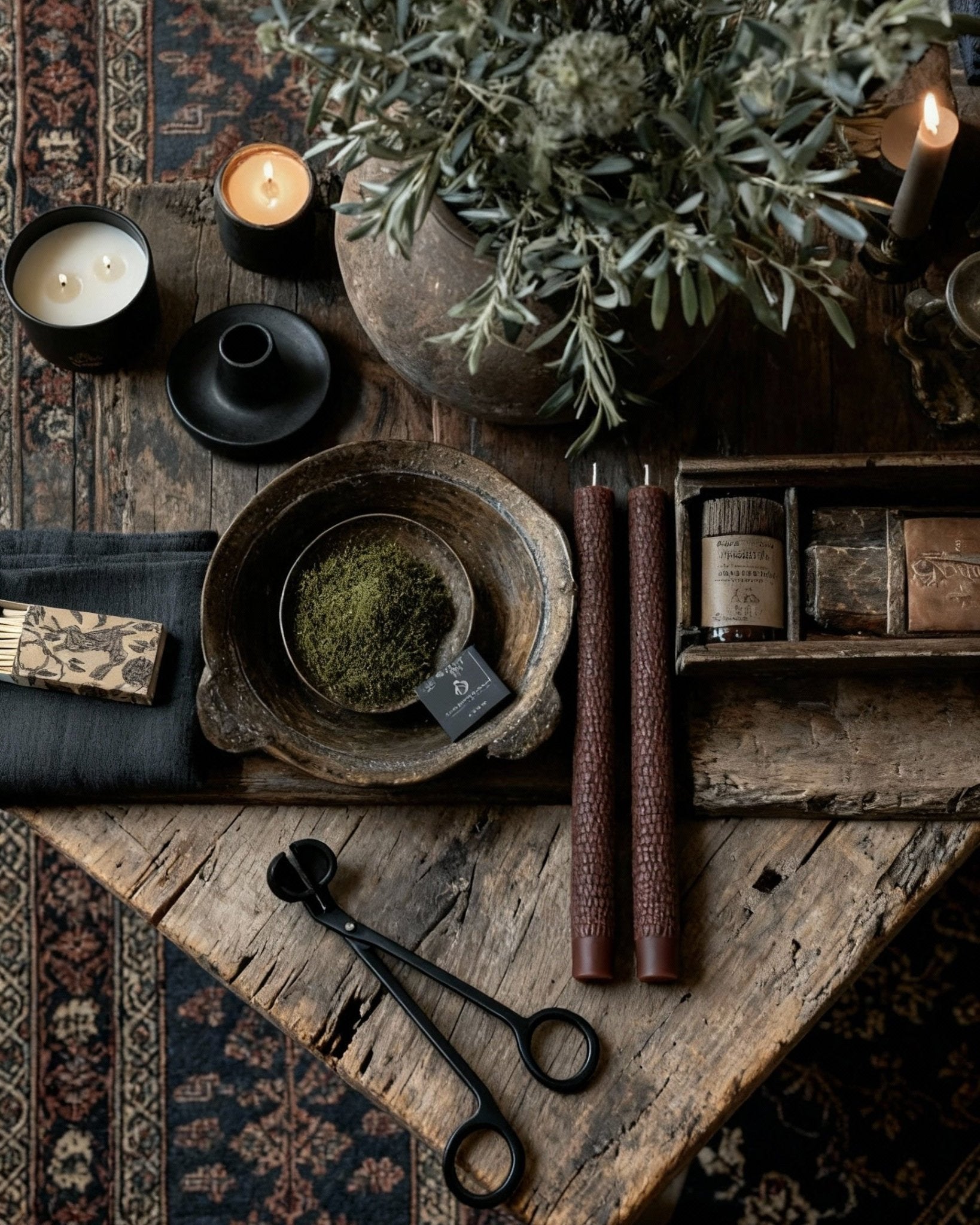
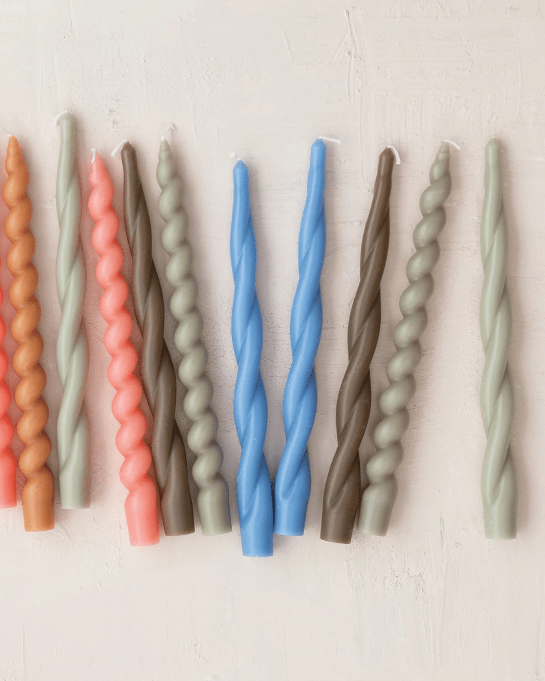
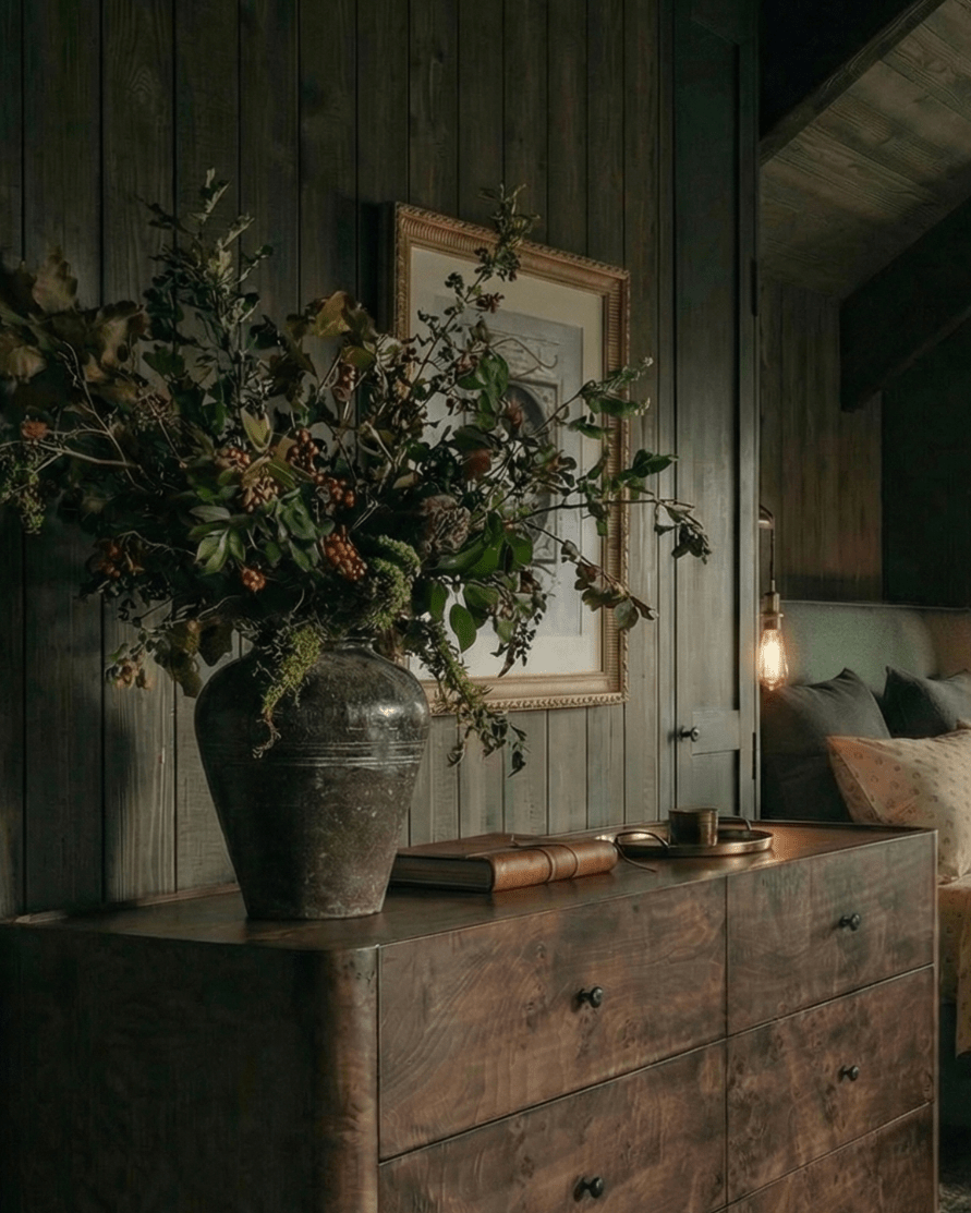
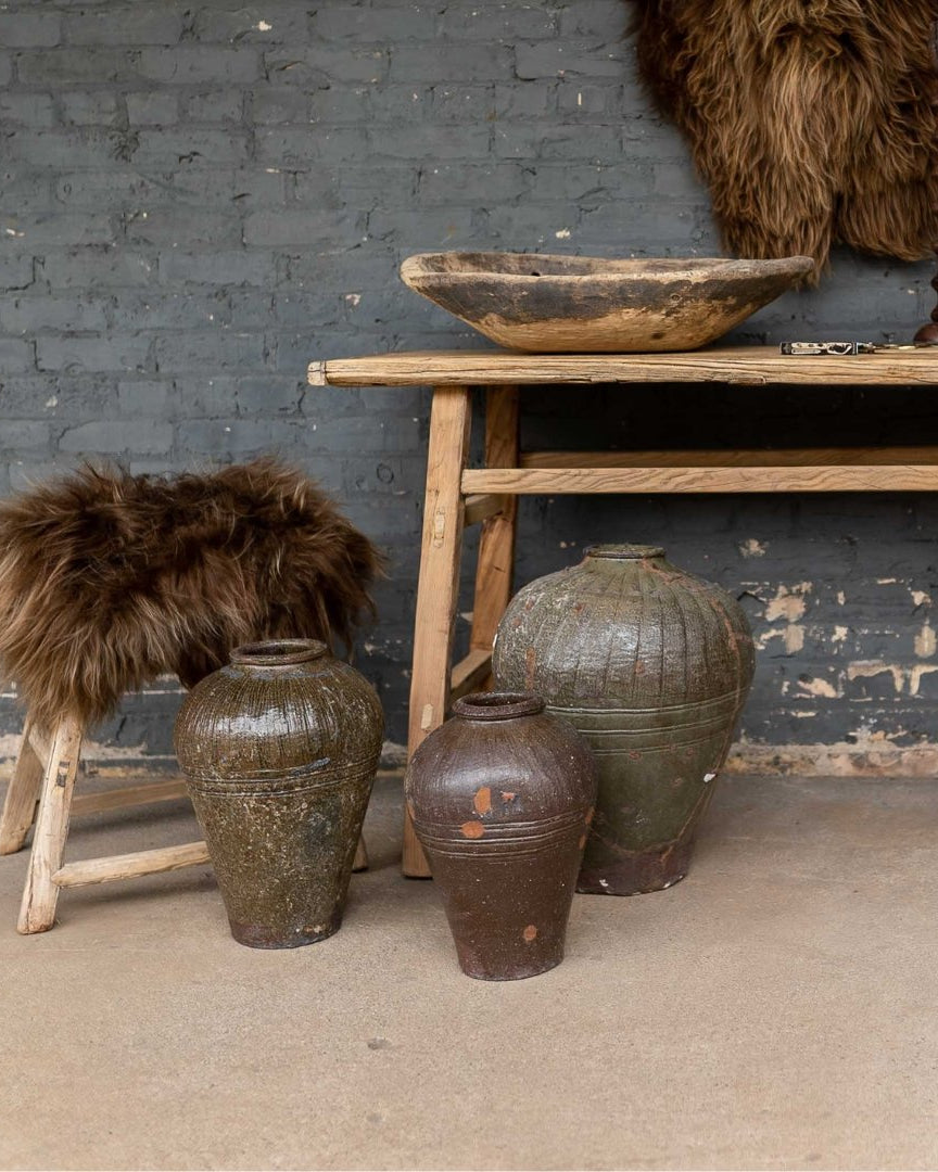
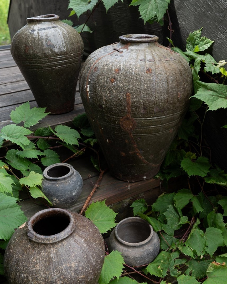
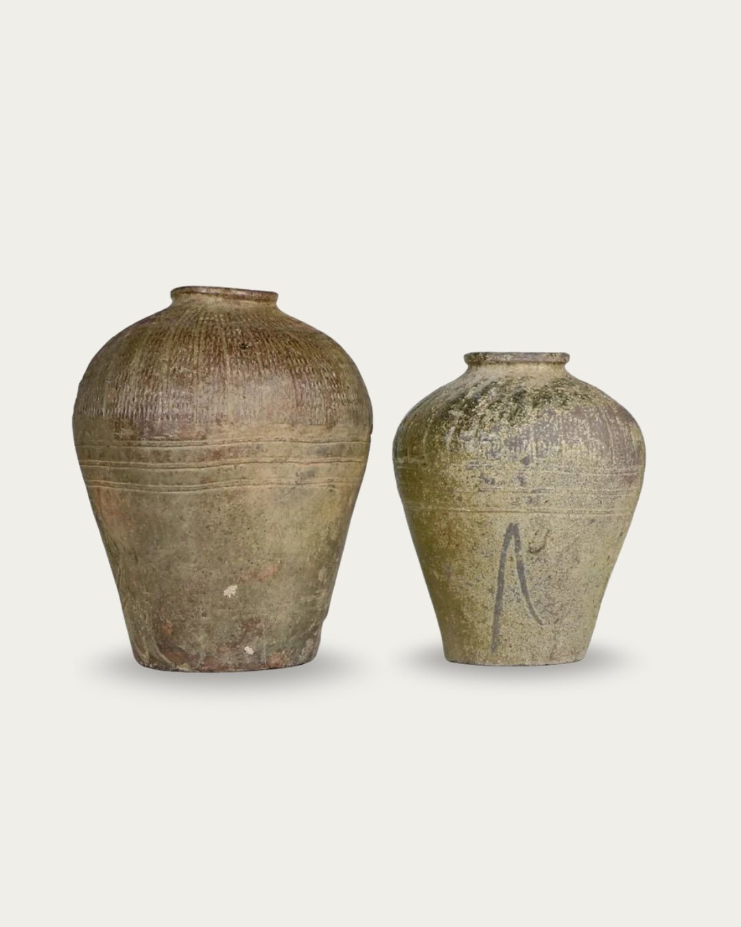
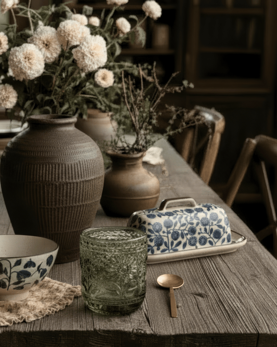
My moodboard became a playground of rust reds, earthy greens, warm browns, and that surprising navy — all tied together by richly textured fabrics, vintage finds, and timeless silhouettes.

A Big Project on the Horizon
This summer’s collection was also influenced by a big project we have in the works (more on that soon!). The same color palette and moodiness flowing through our moodboard are woven into every decision I’m making for that space. It’s a peek at how design inspiration crosses from personal projects into what I curate for Hello Norden.
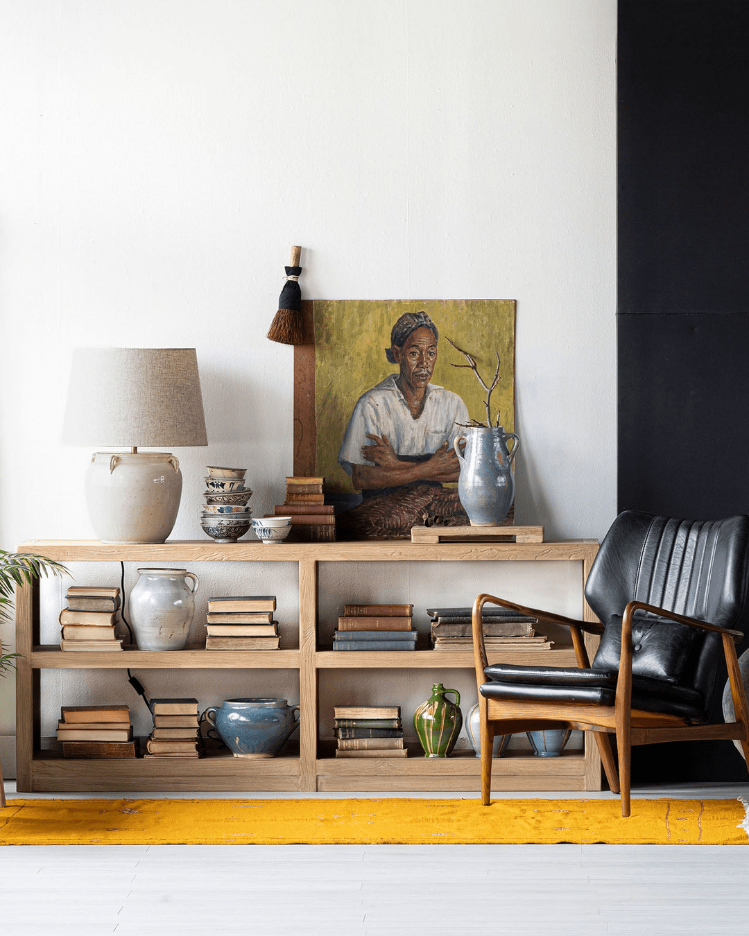
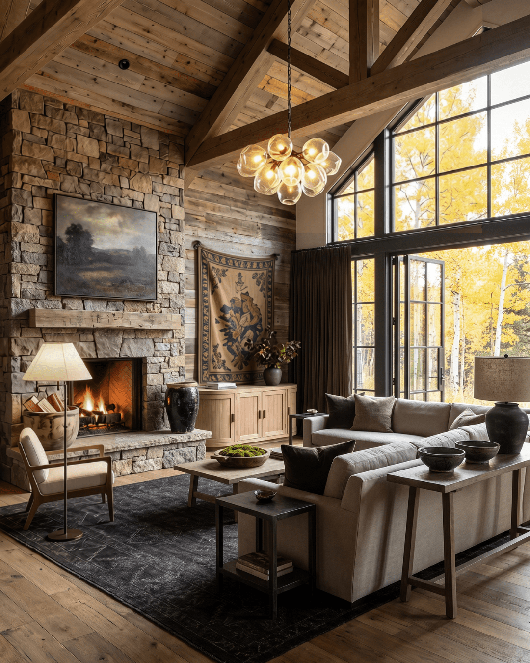
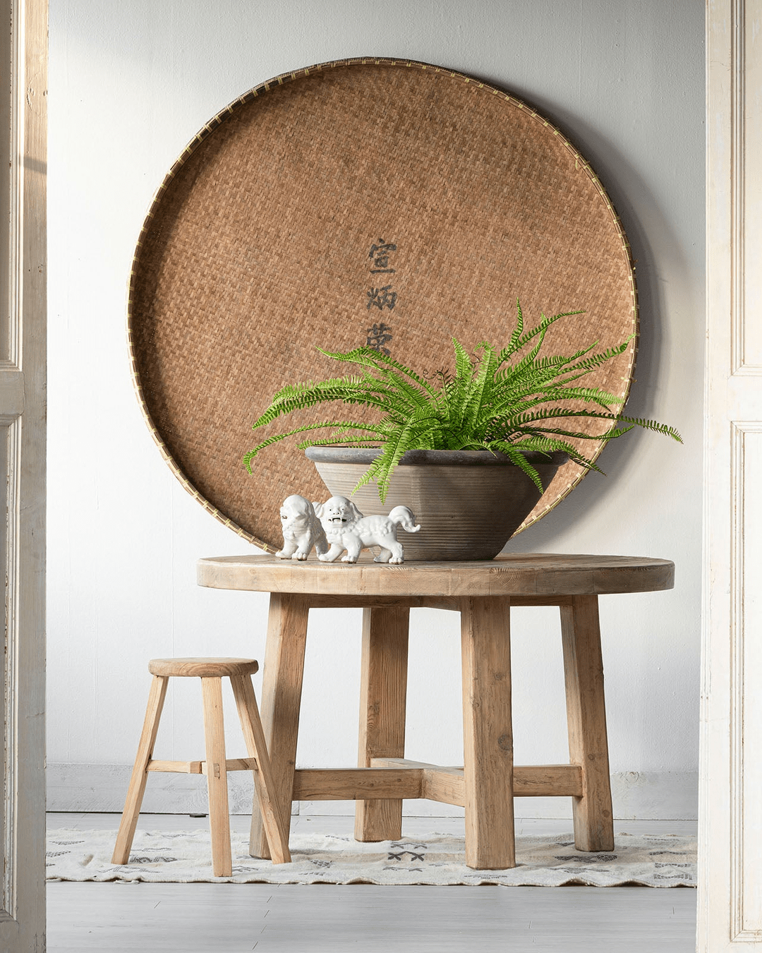
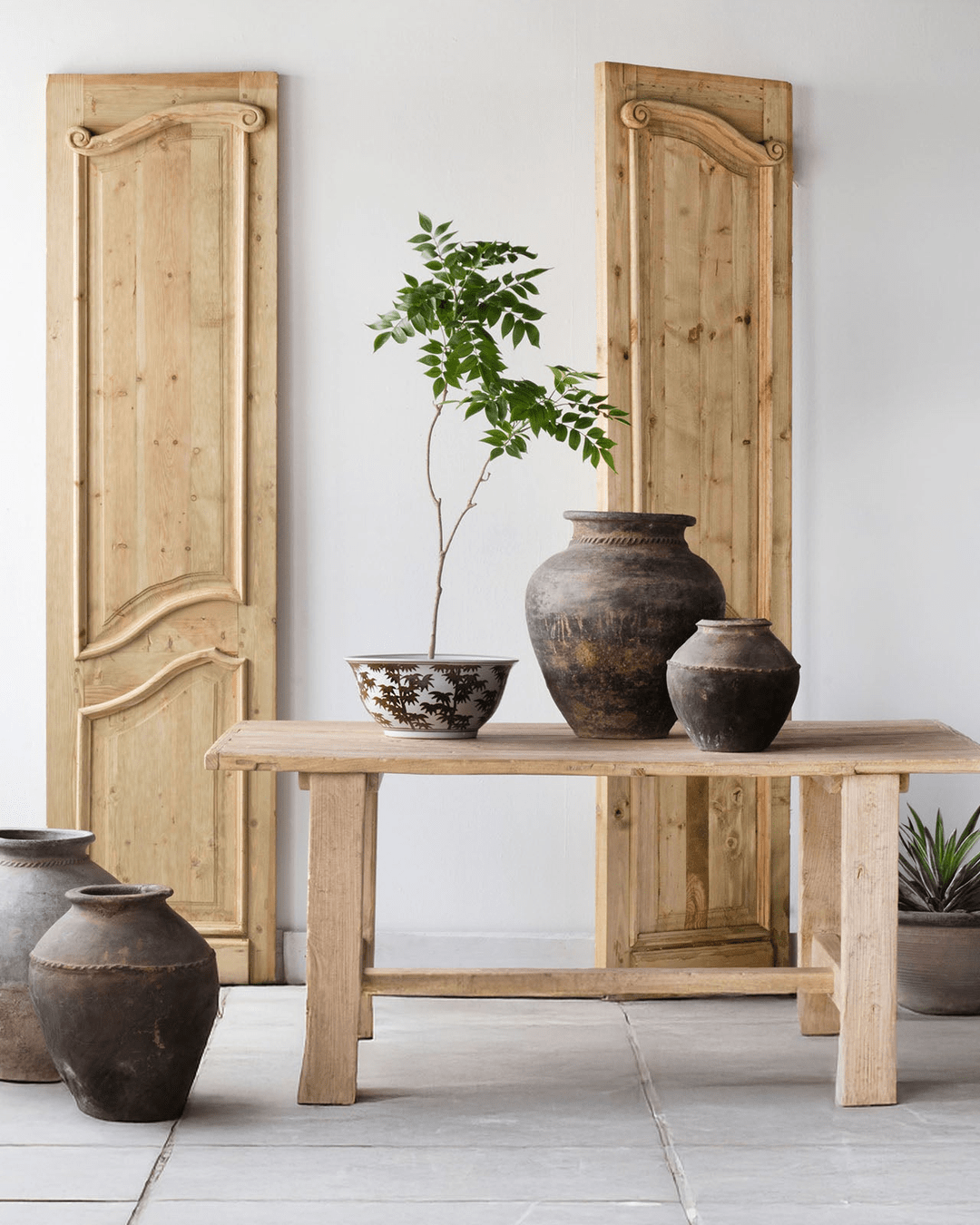
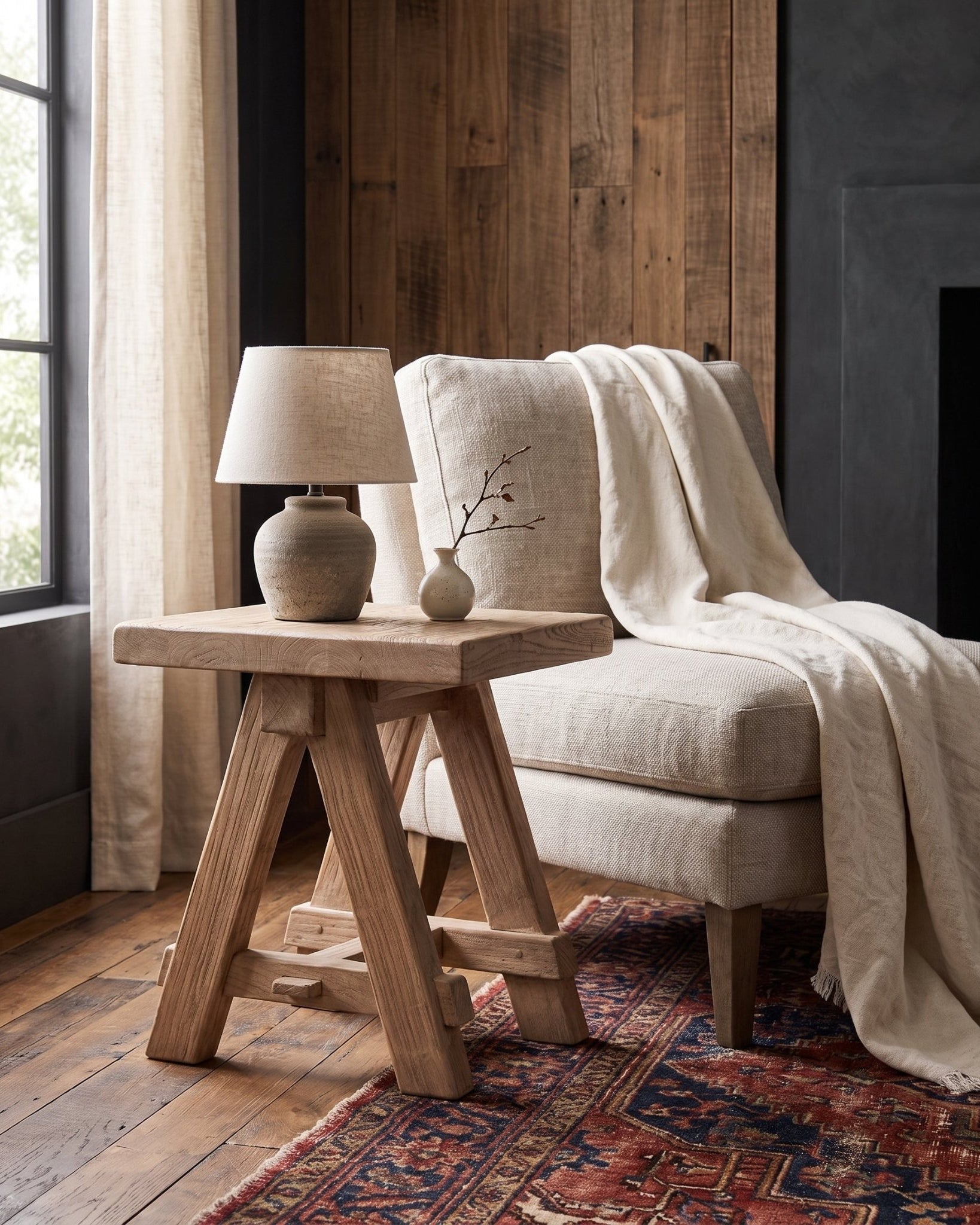
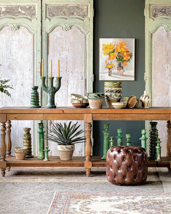
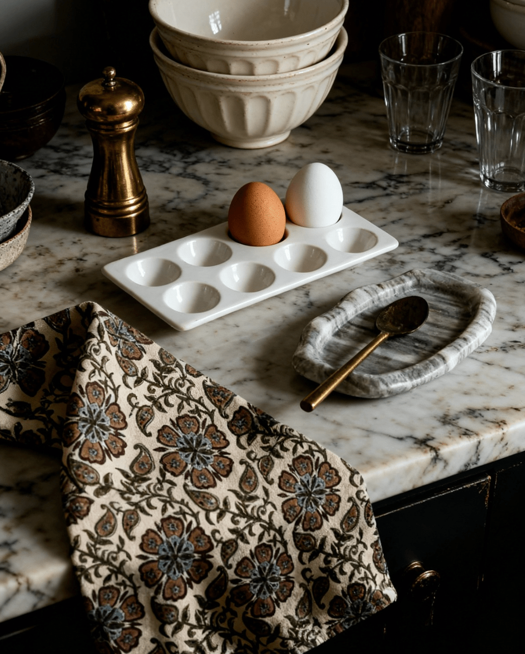
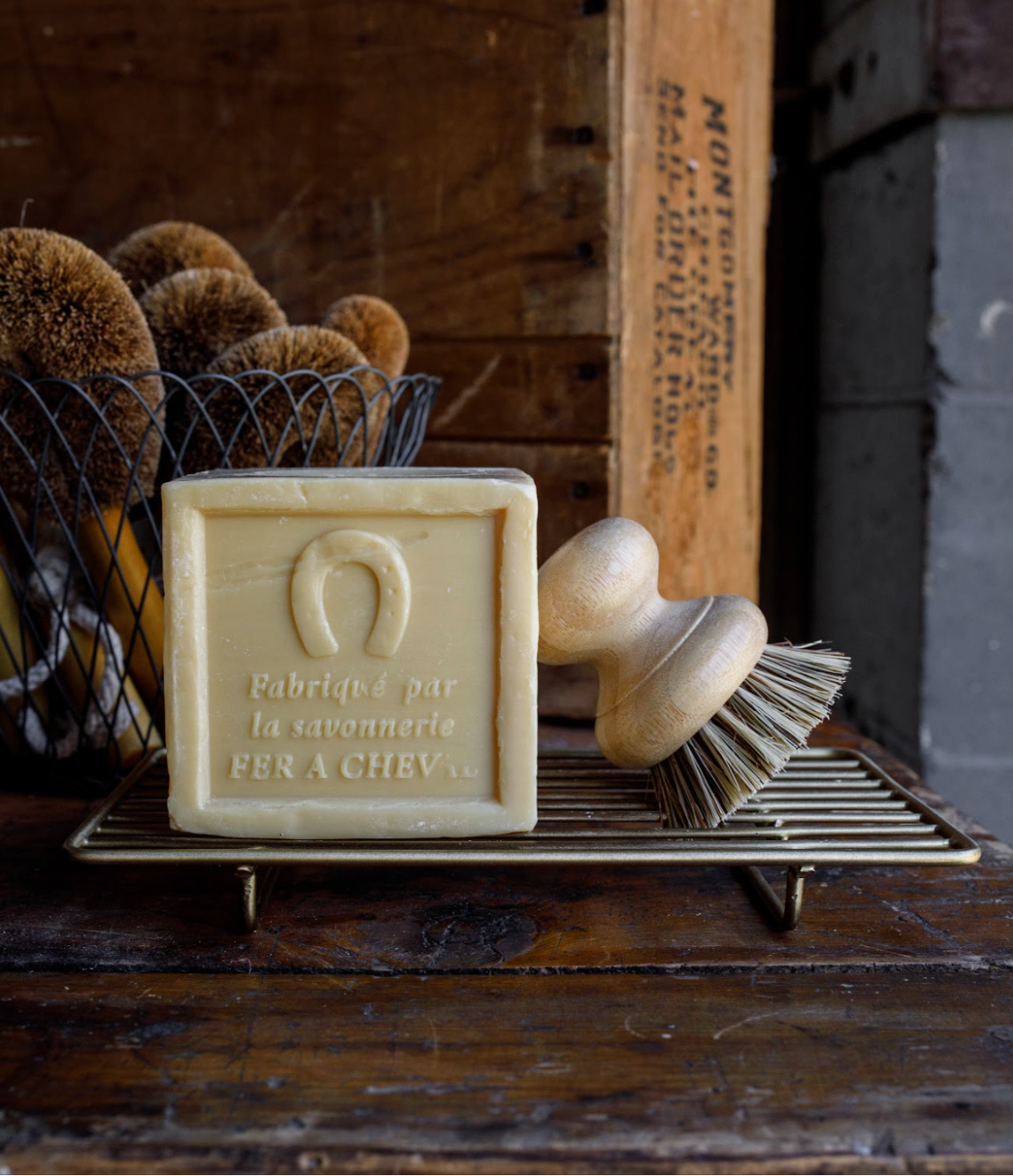
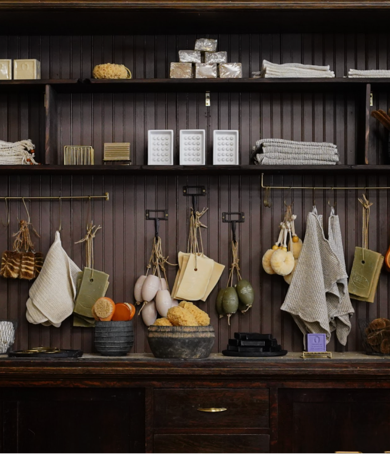
Texture, Tone, and Over 225 Finds
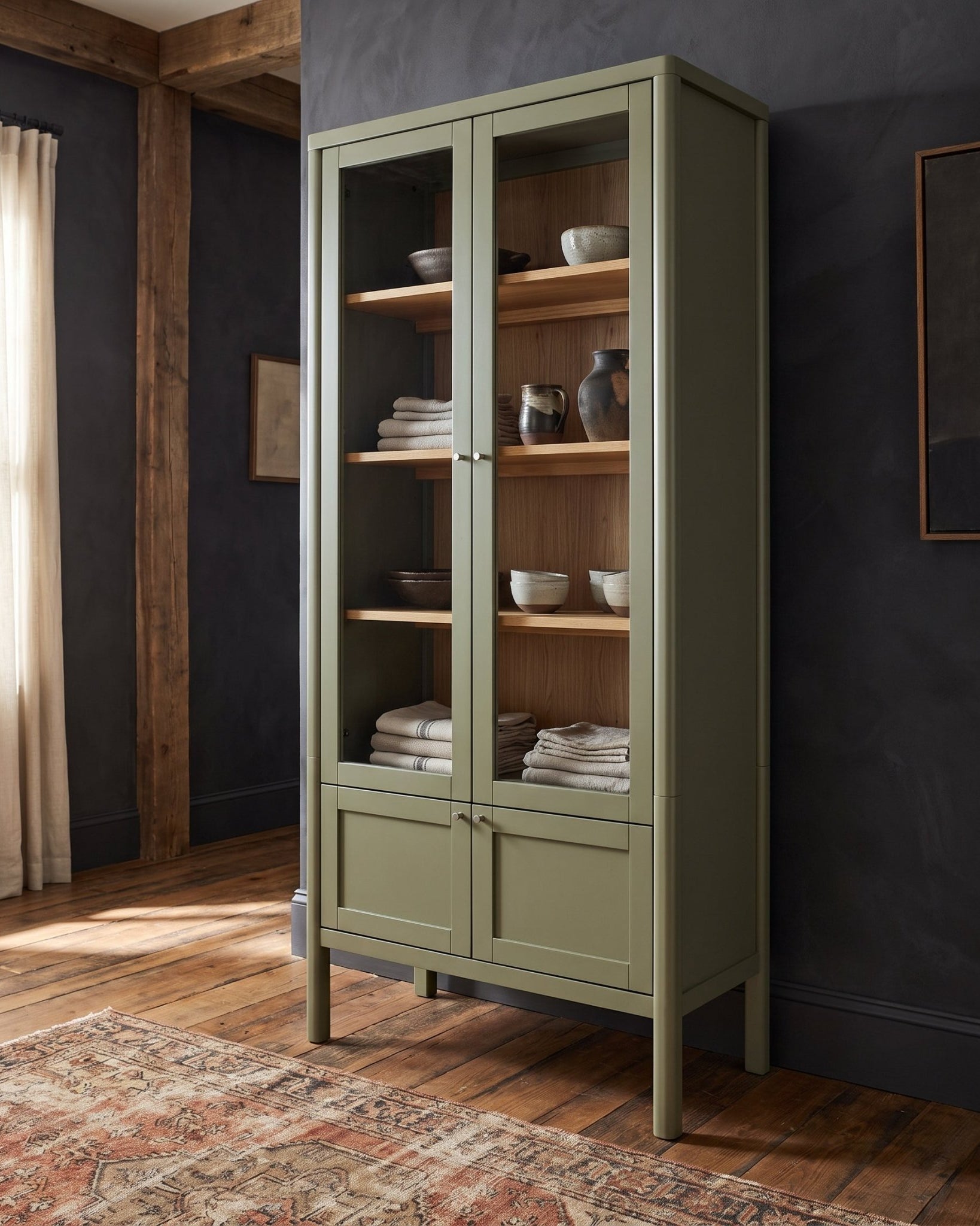
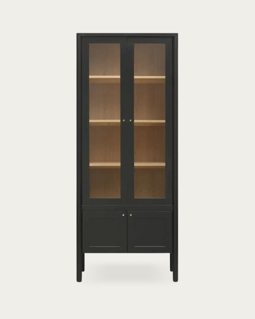
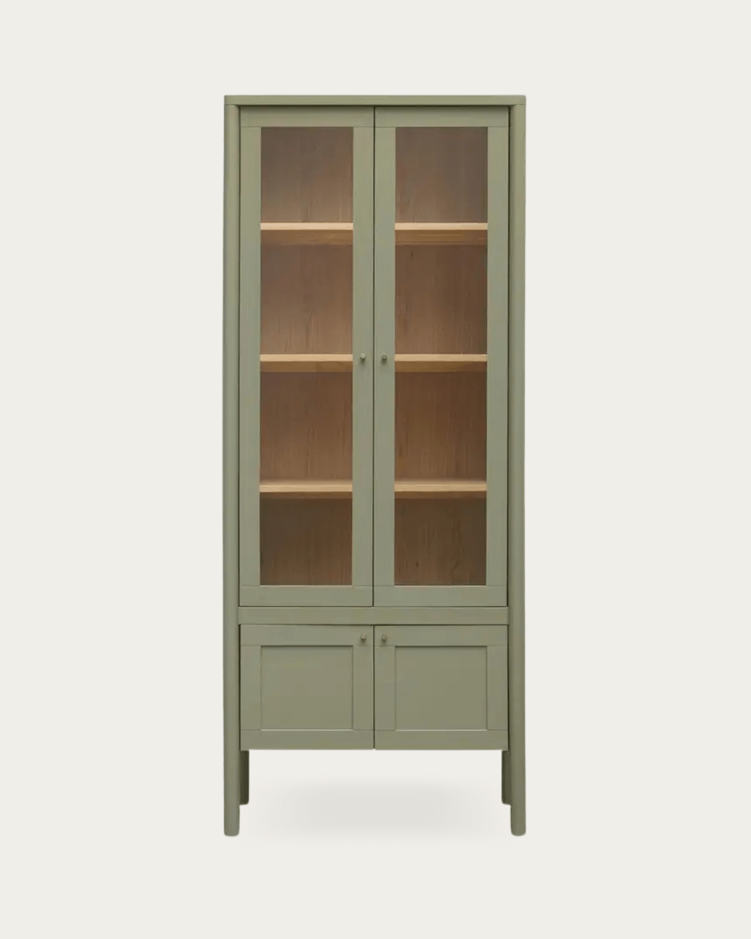
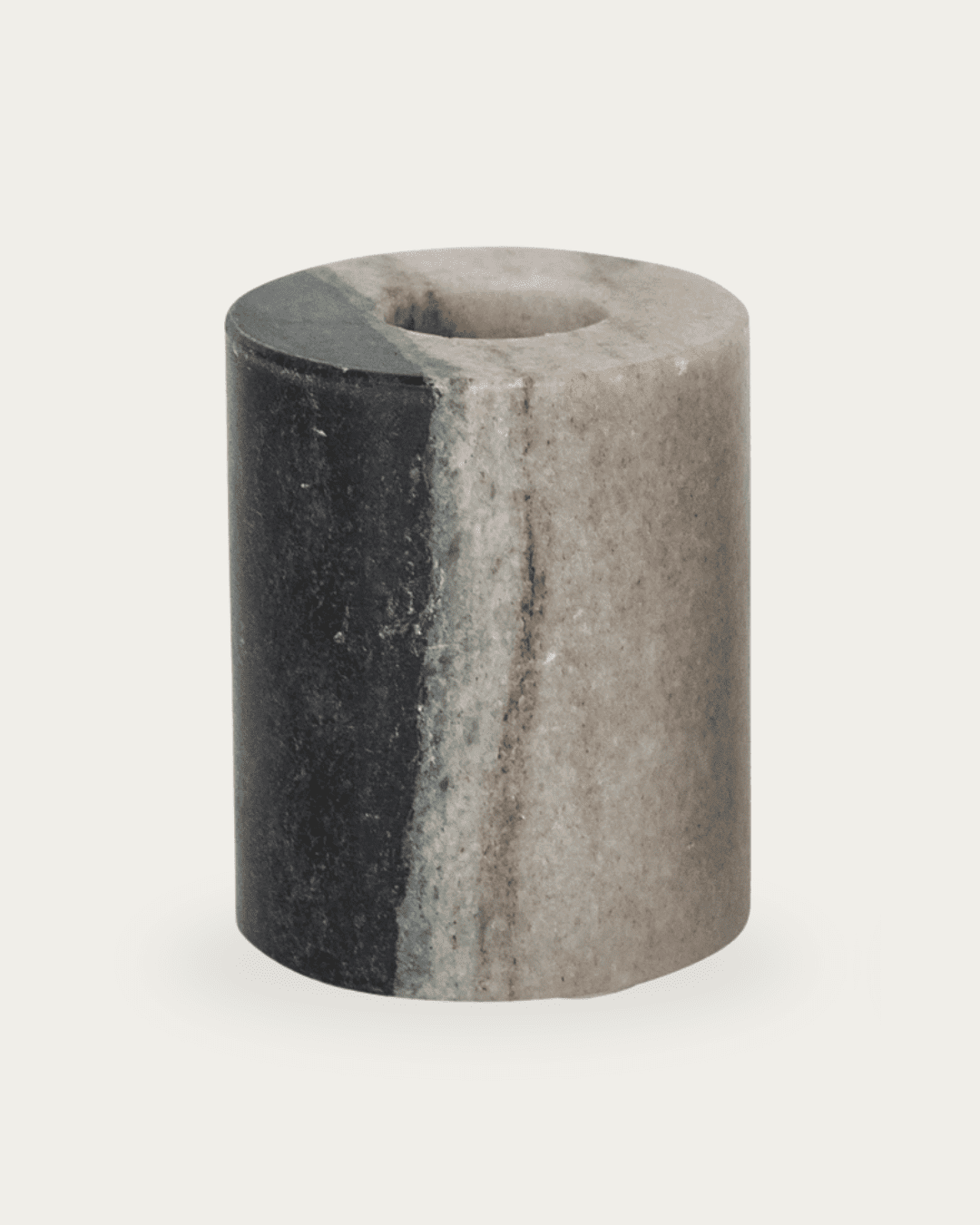
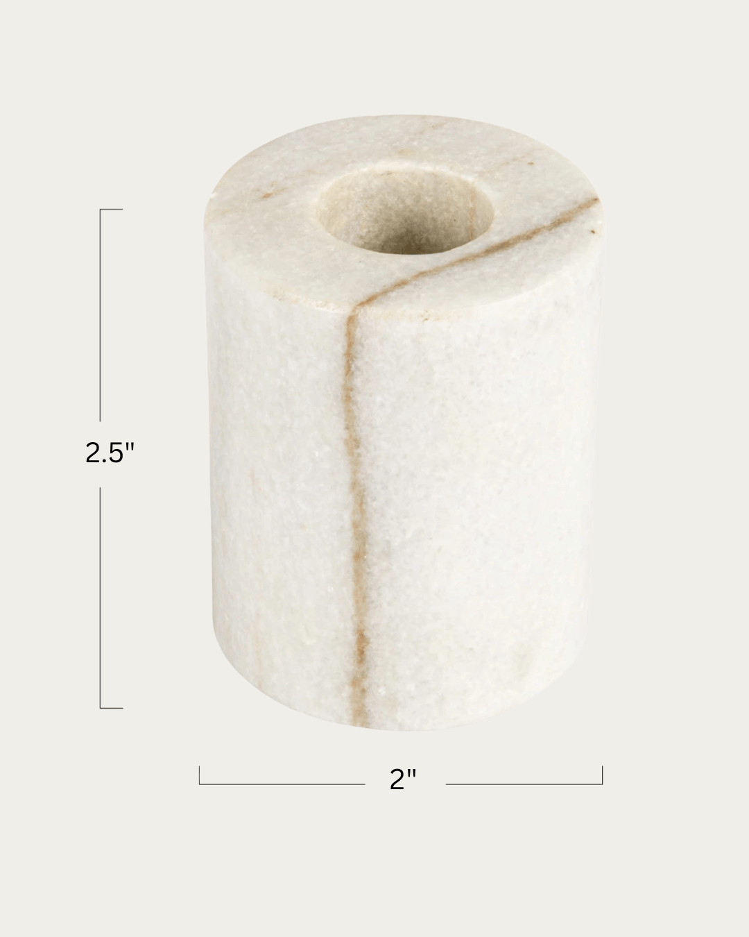
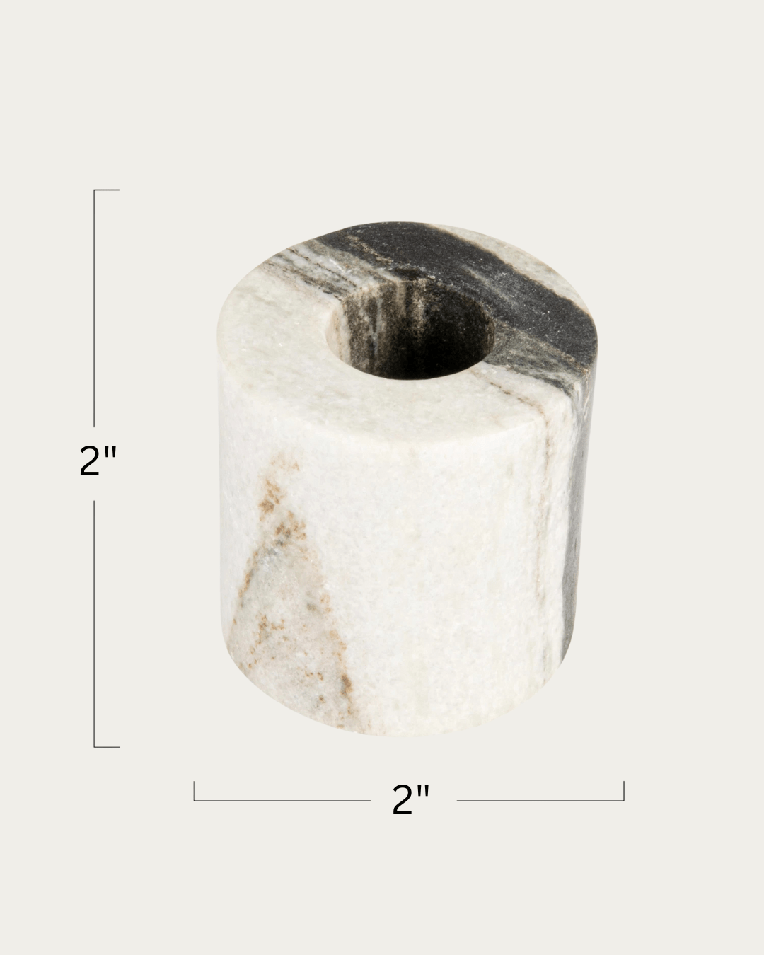
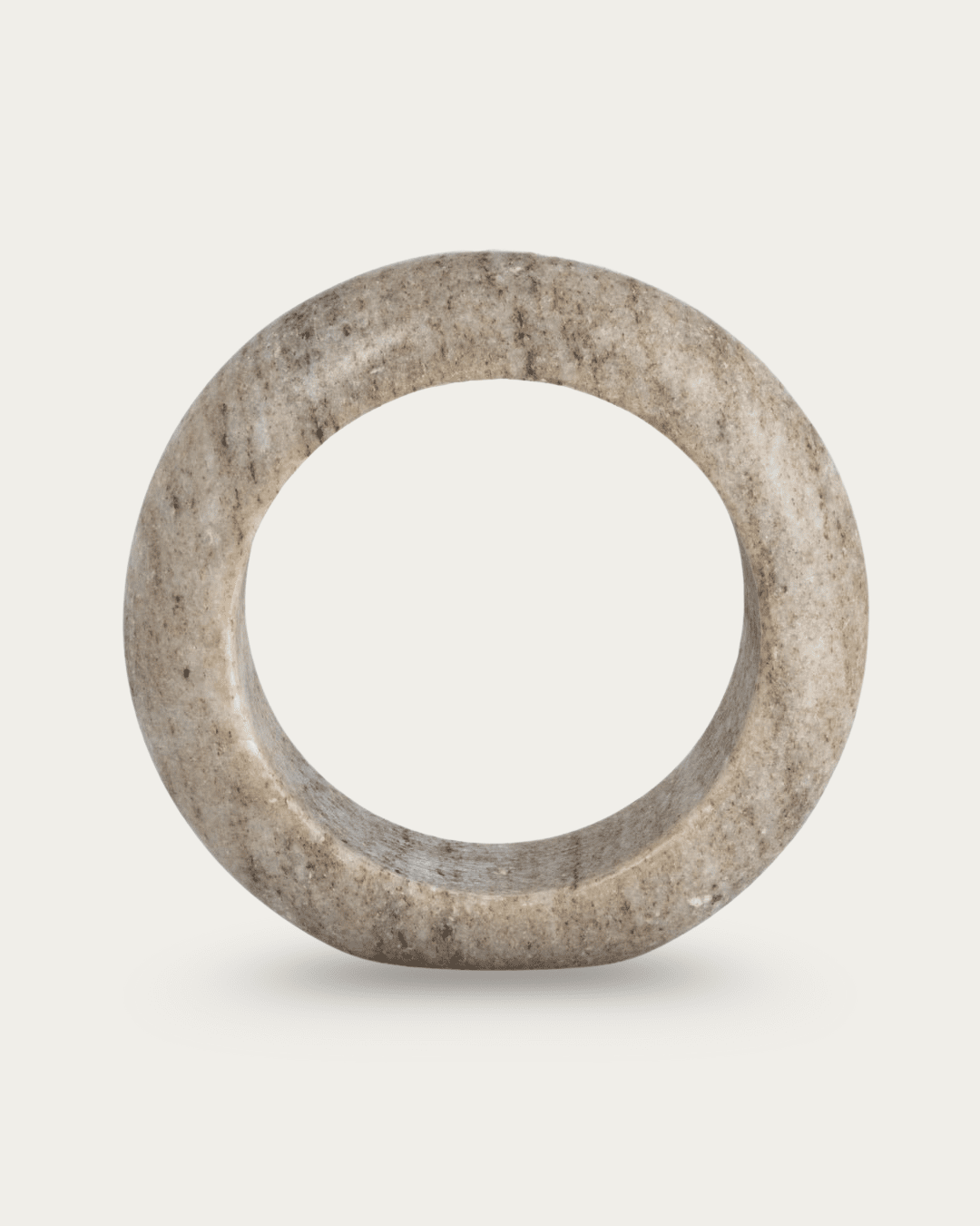
Here’s what you’ll see throughout the Hello Norden Summer Collection :
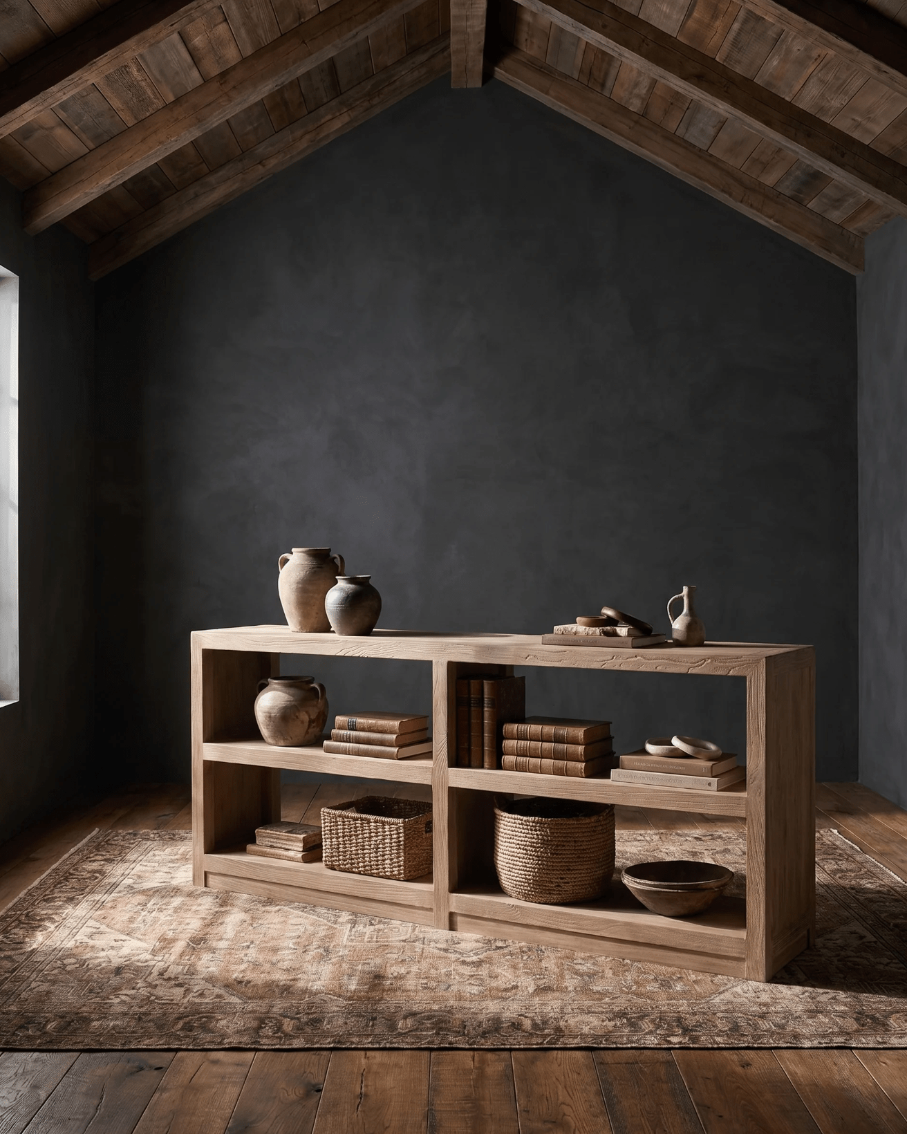
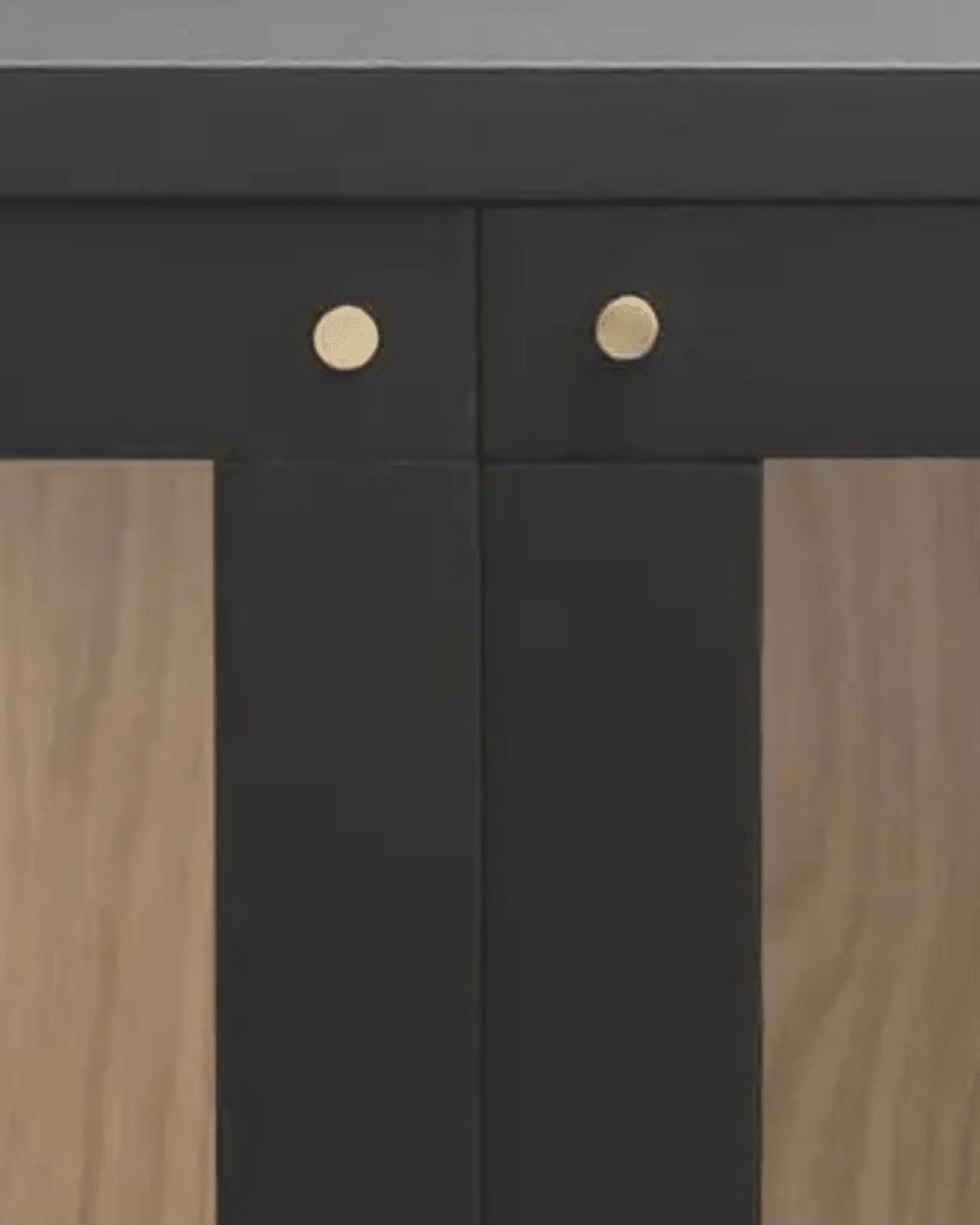
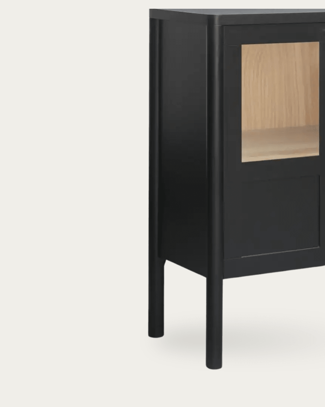
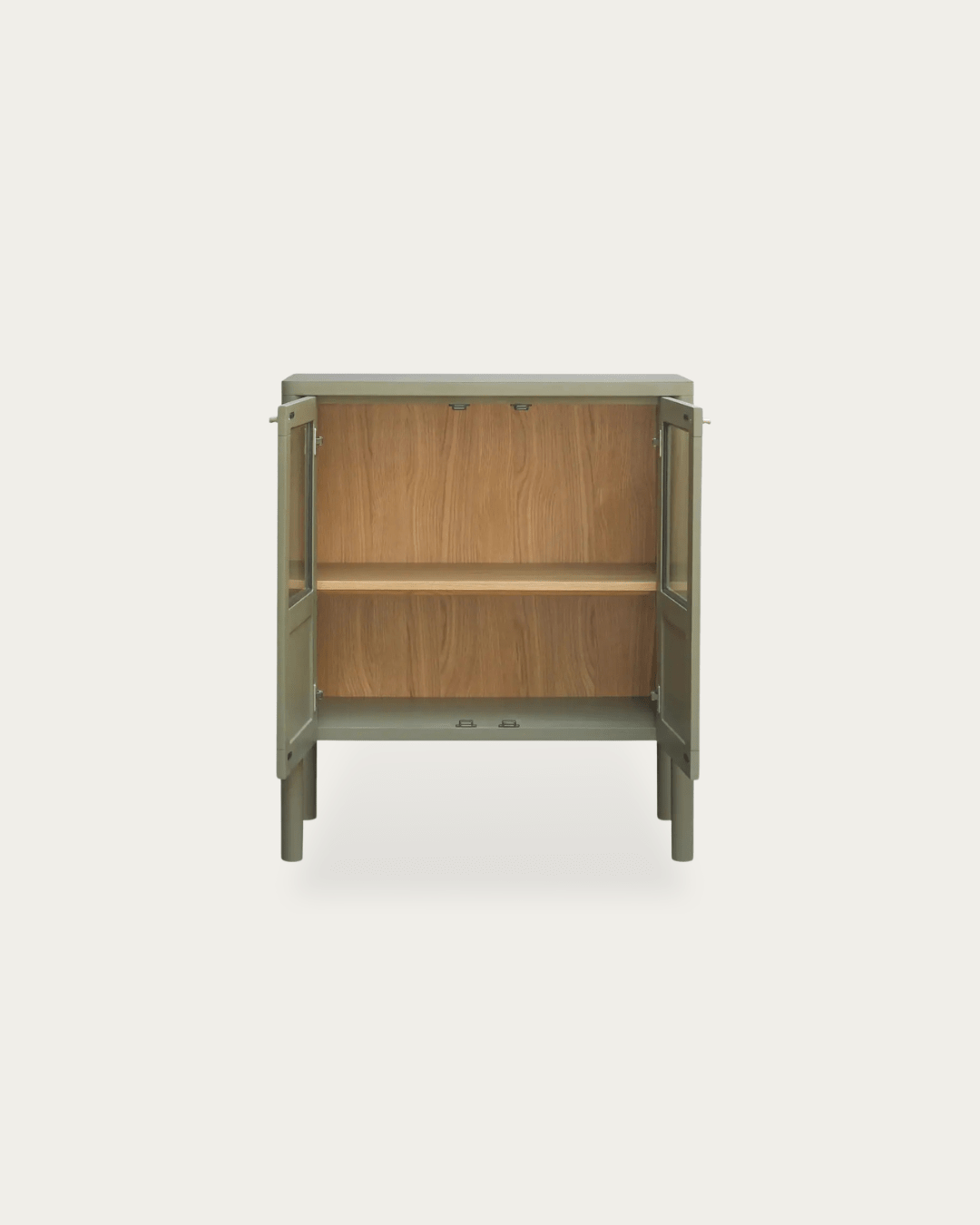
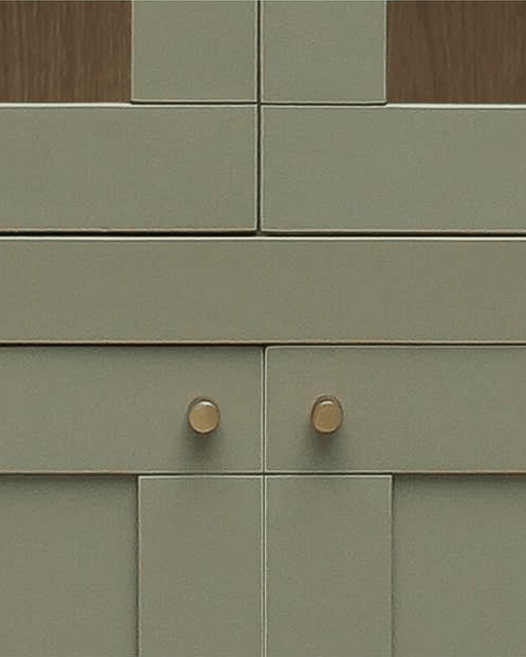
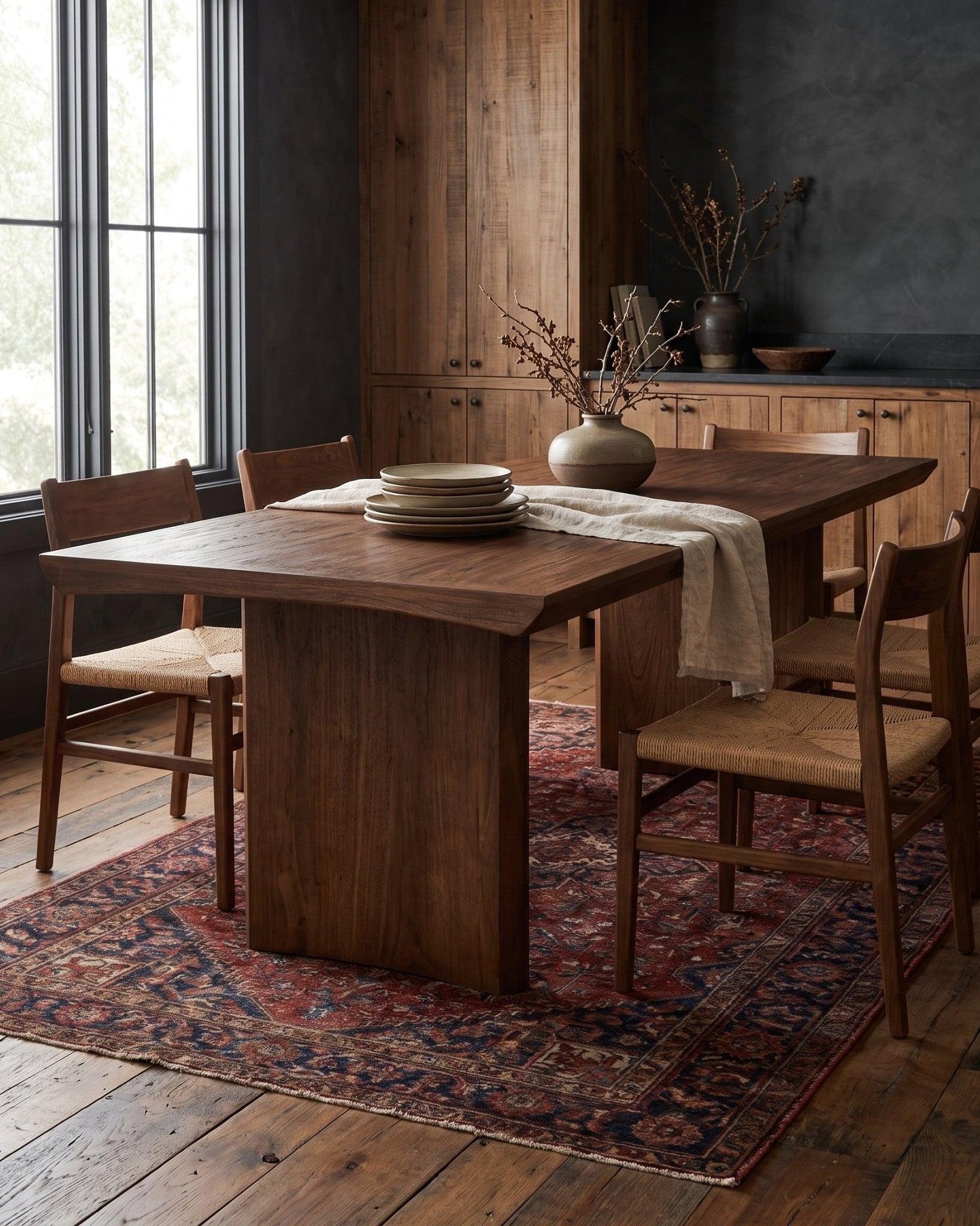
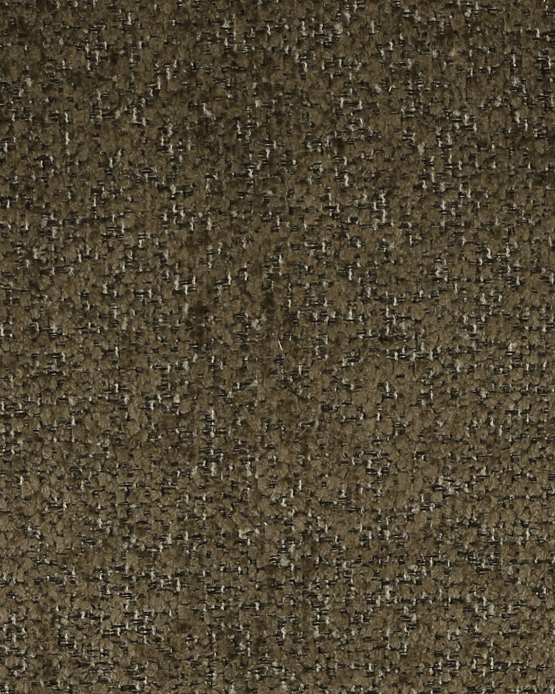
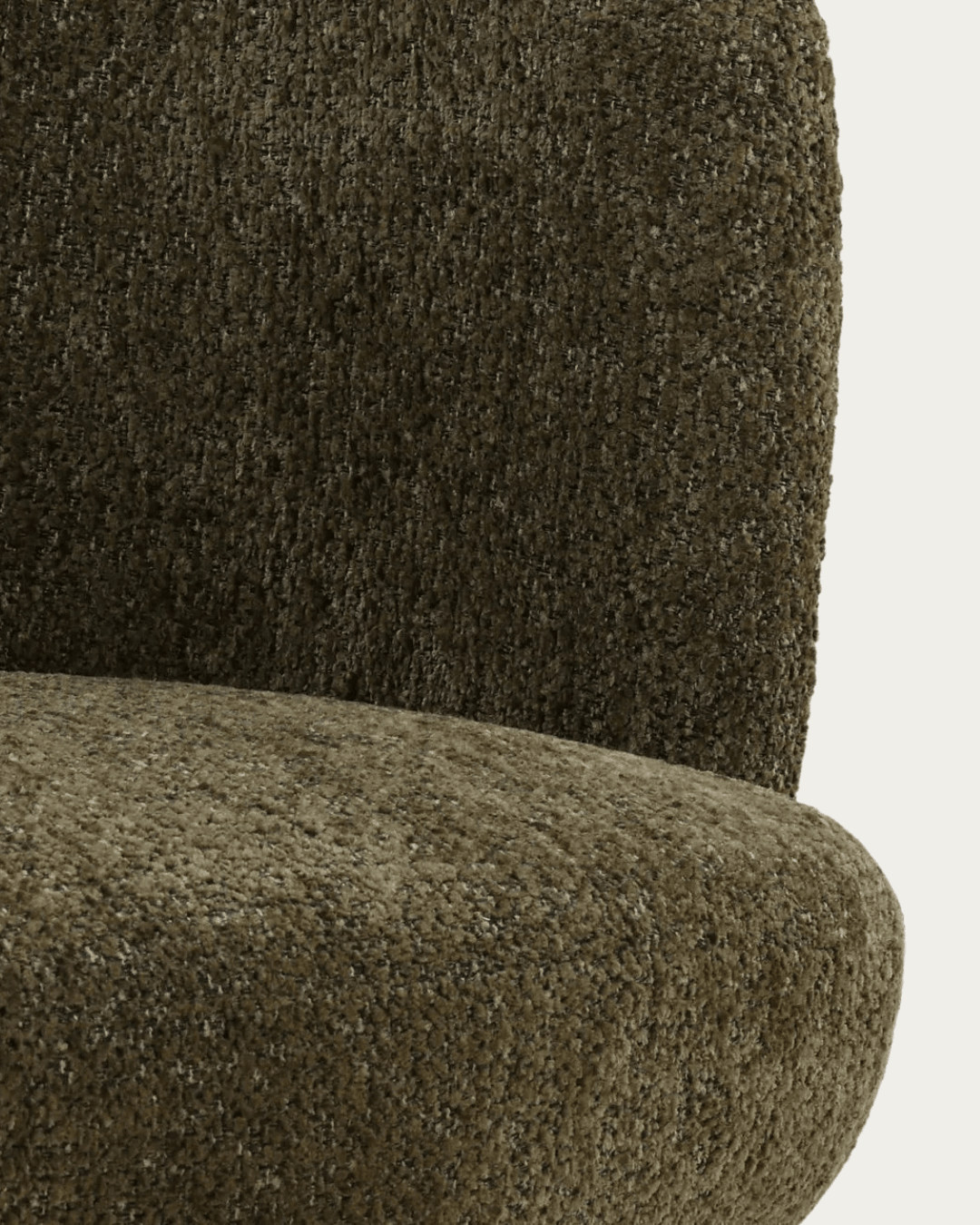
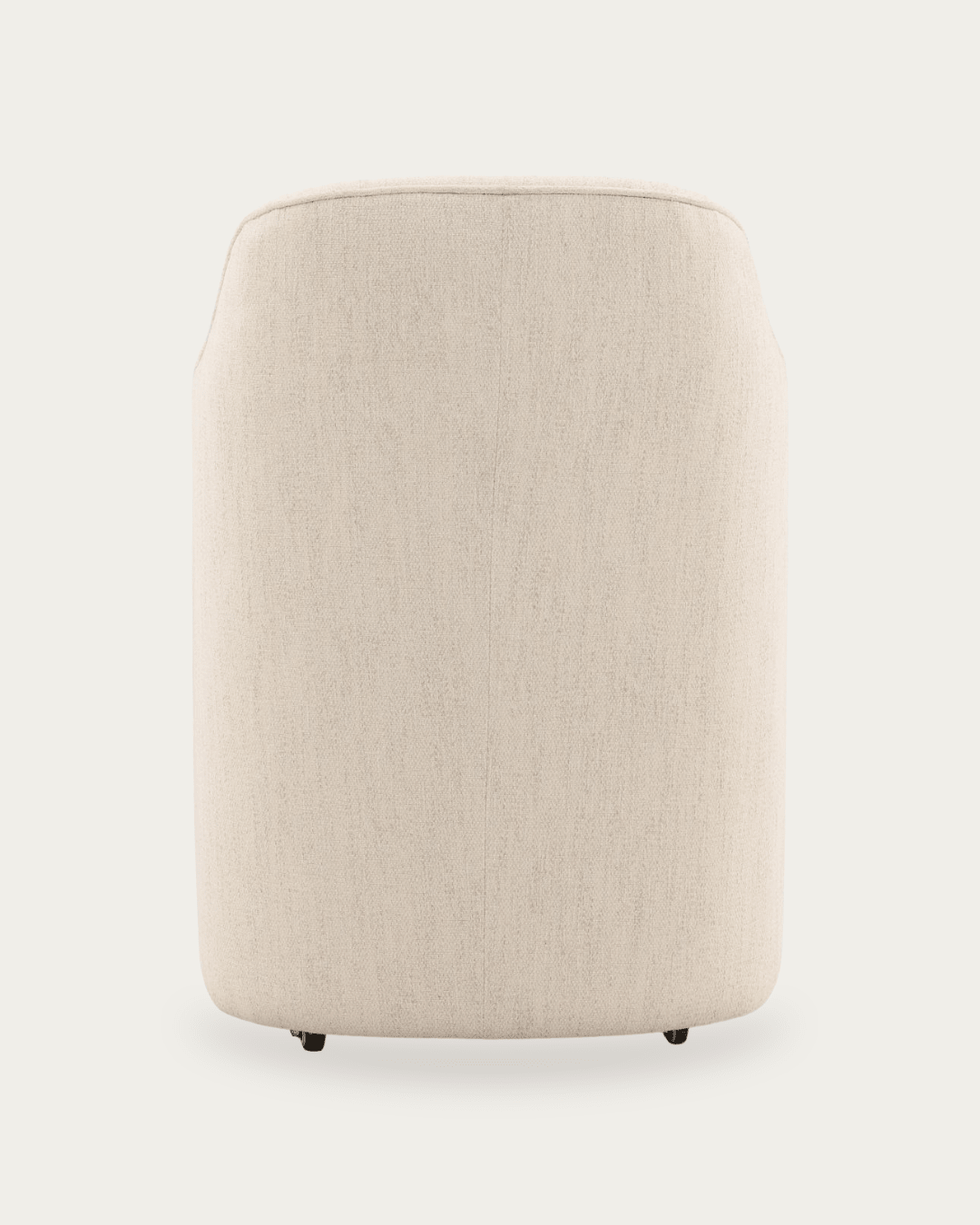
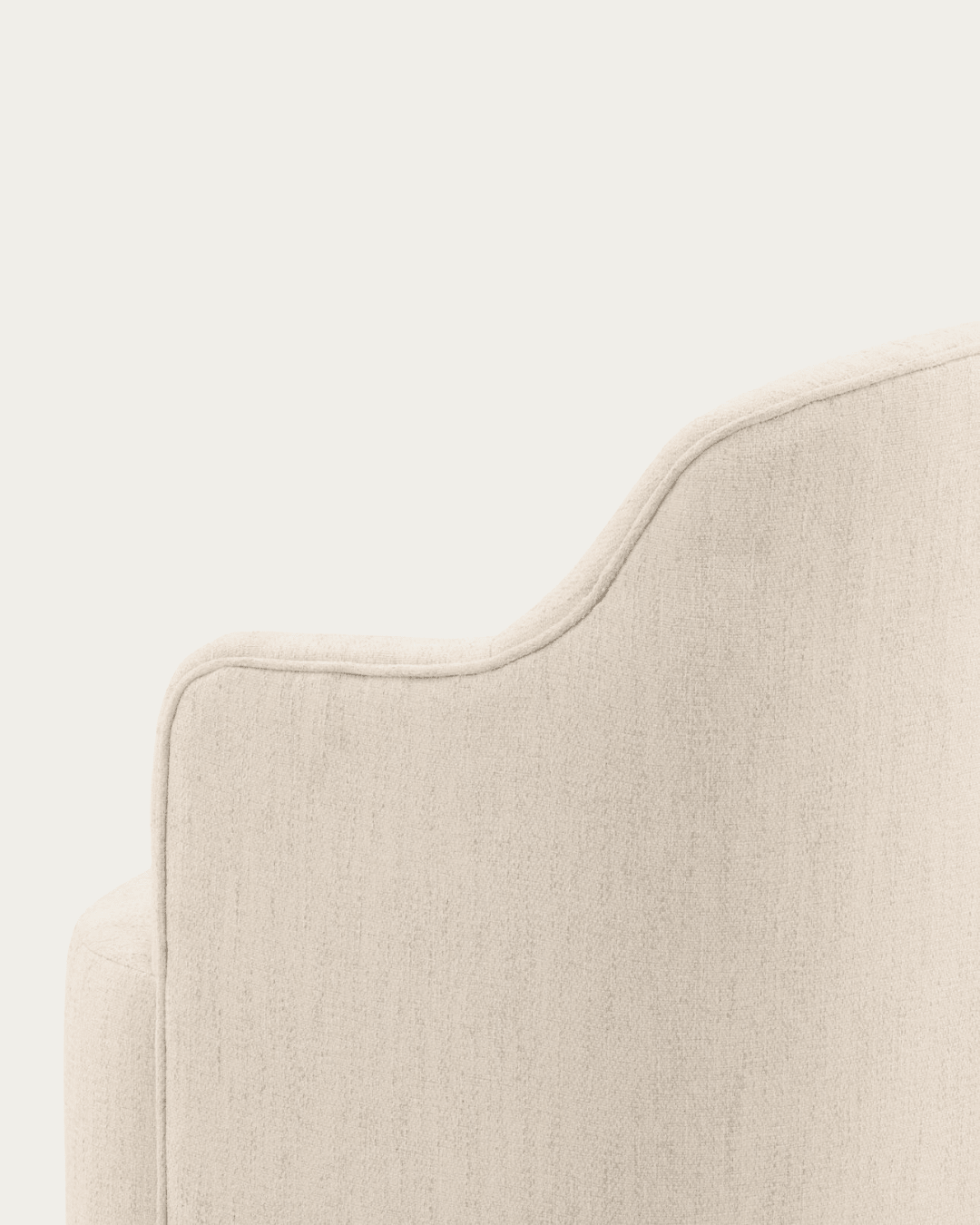
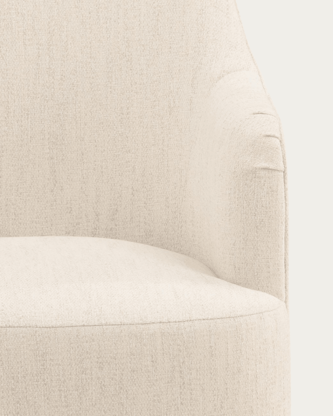
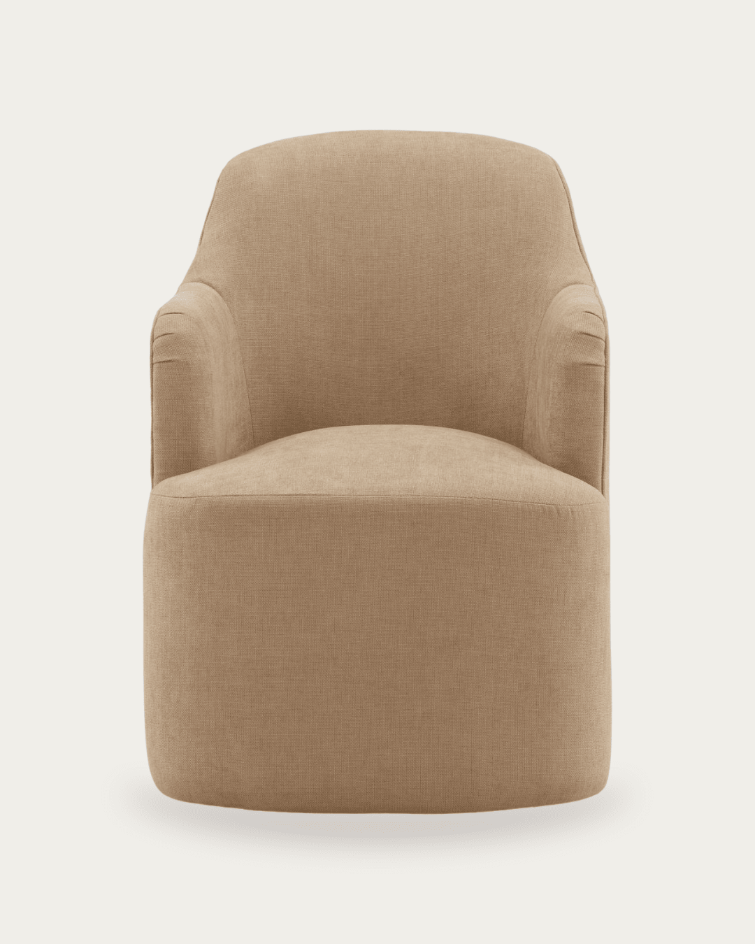
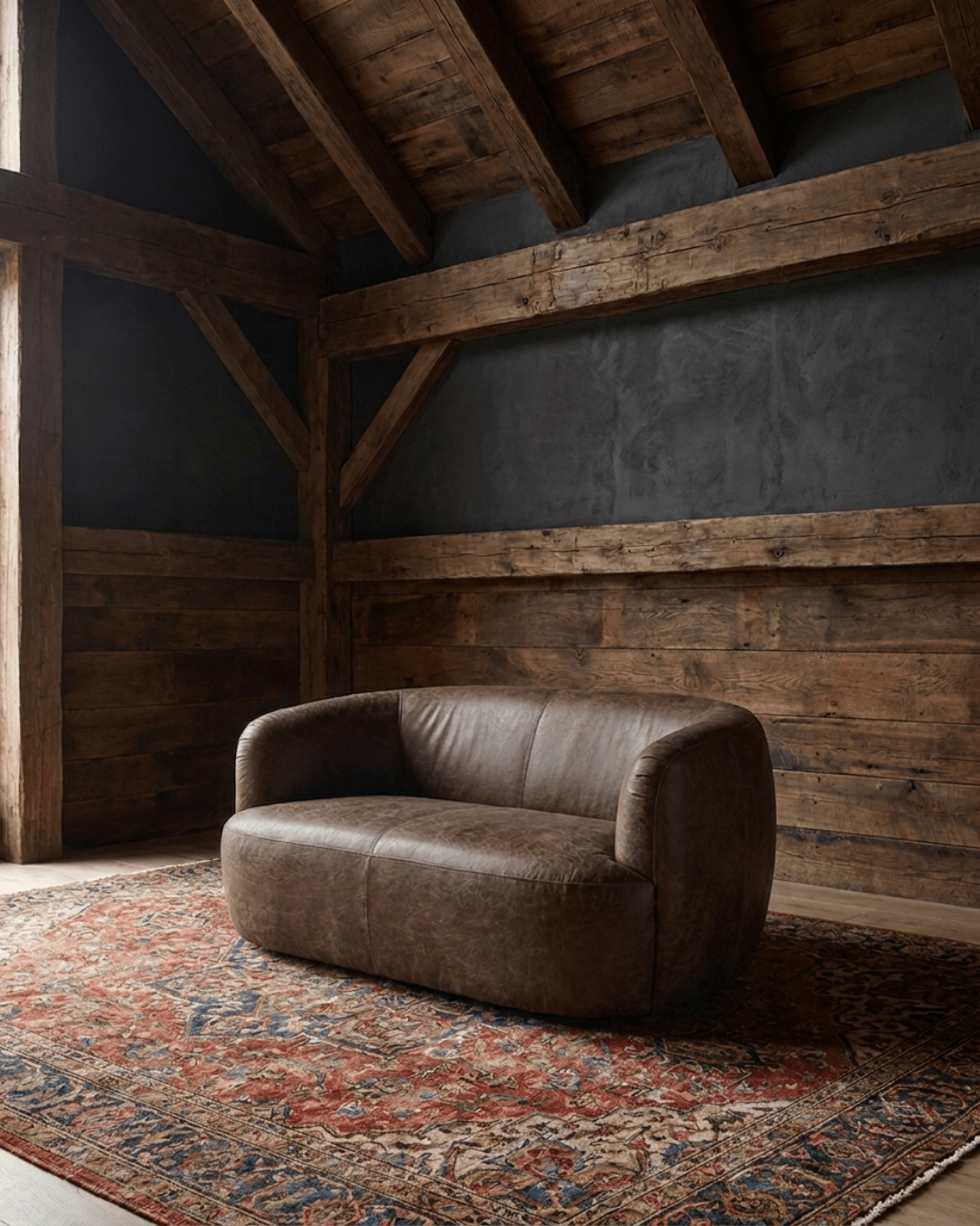
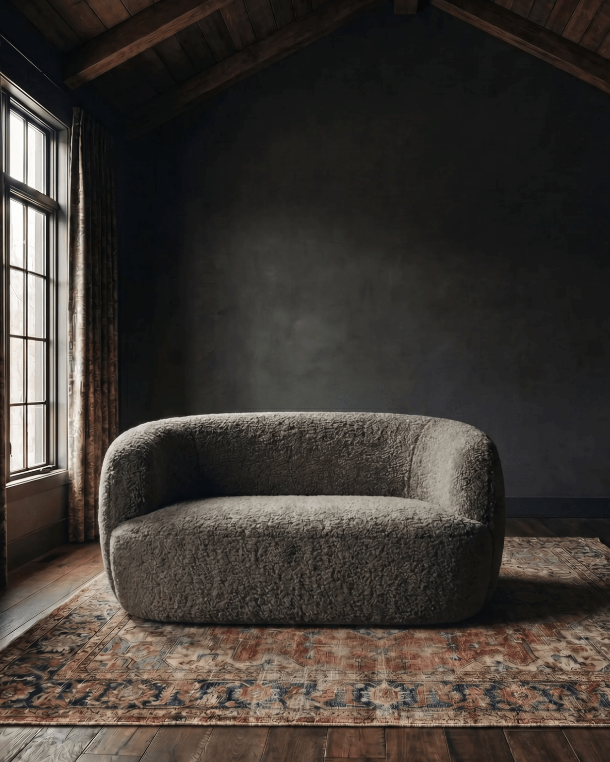
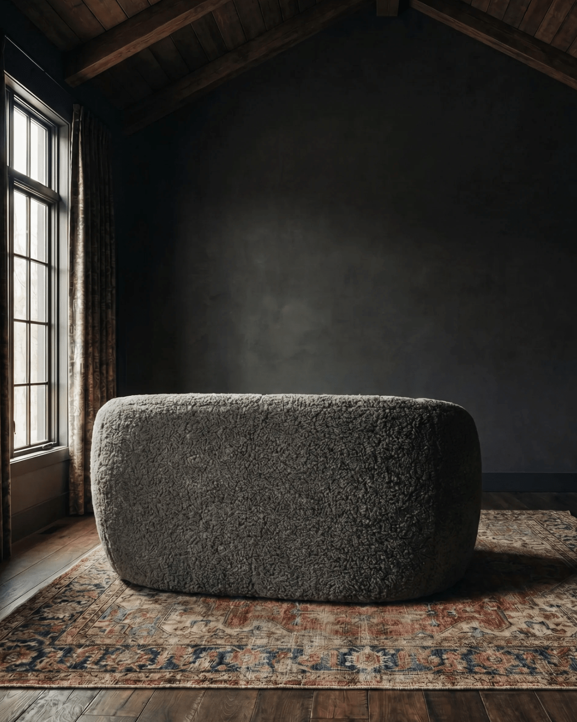
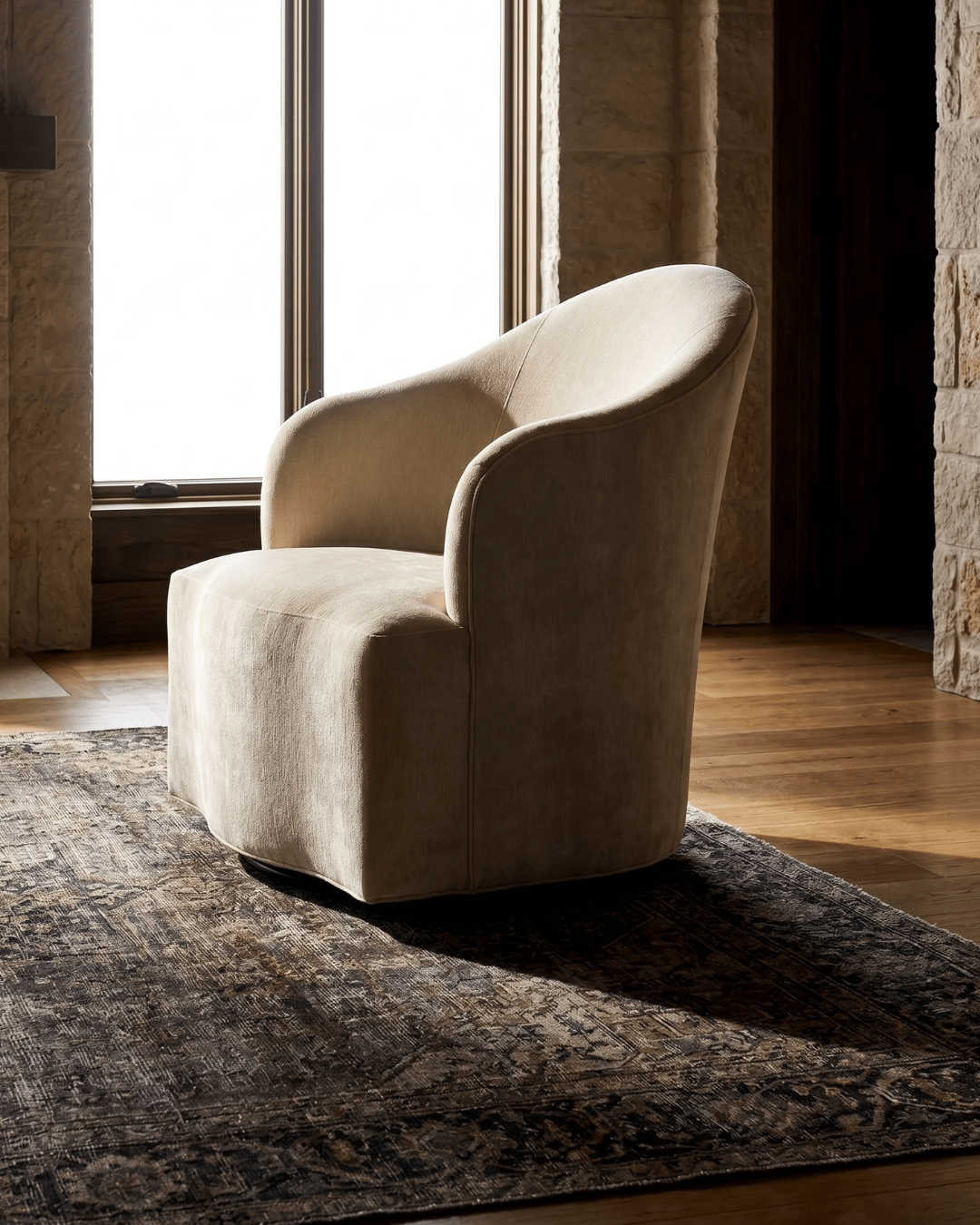
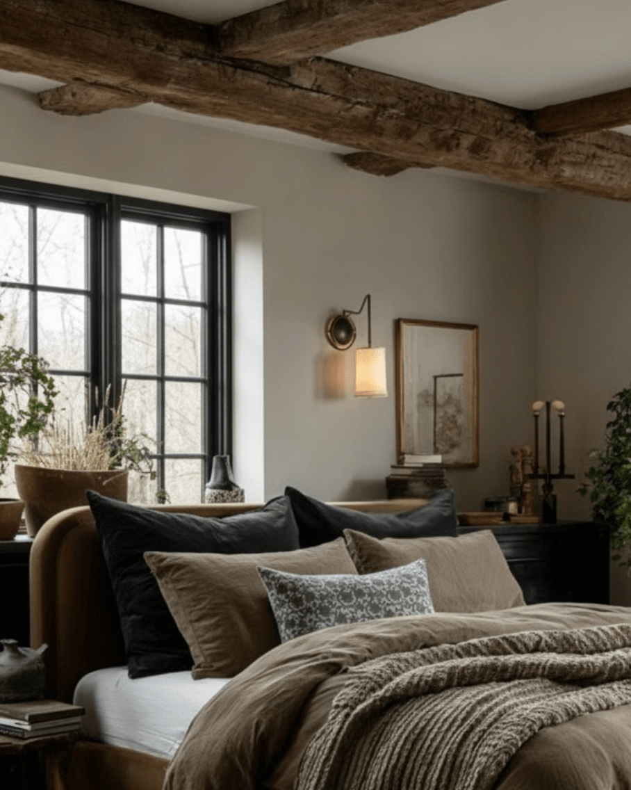
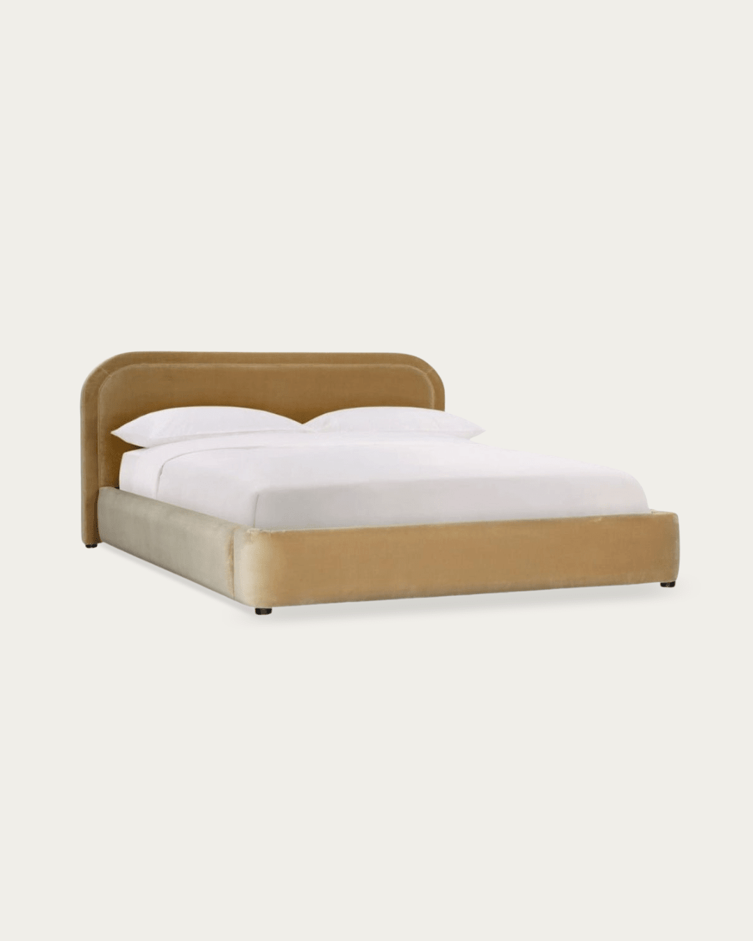
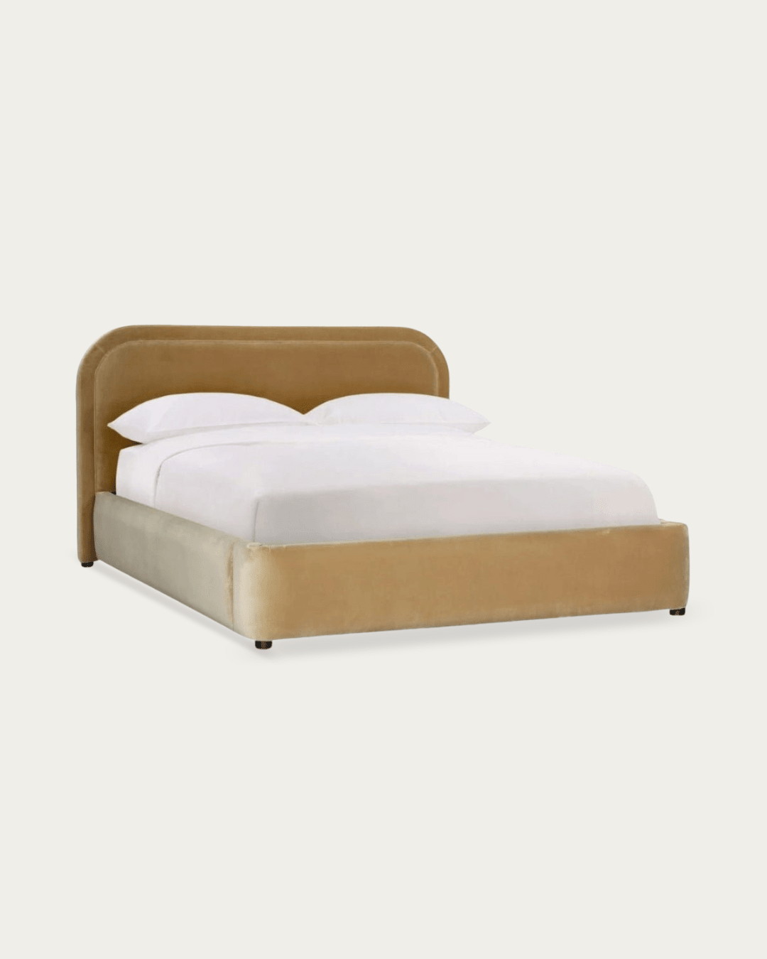
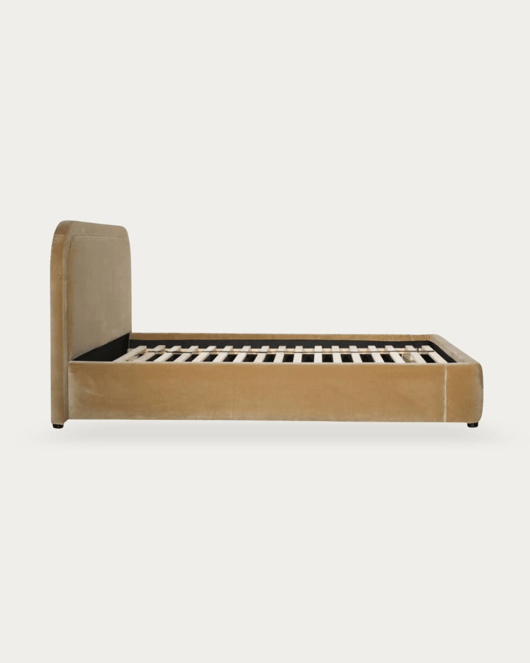
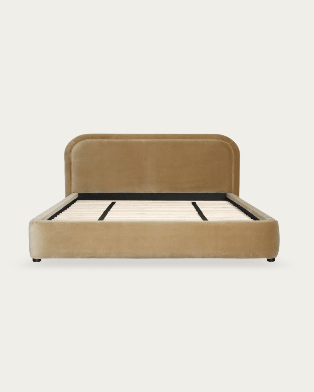
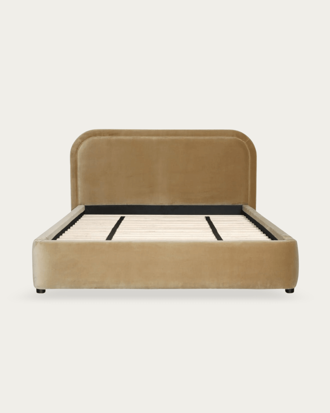
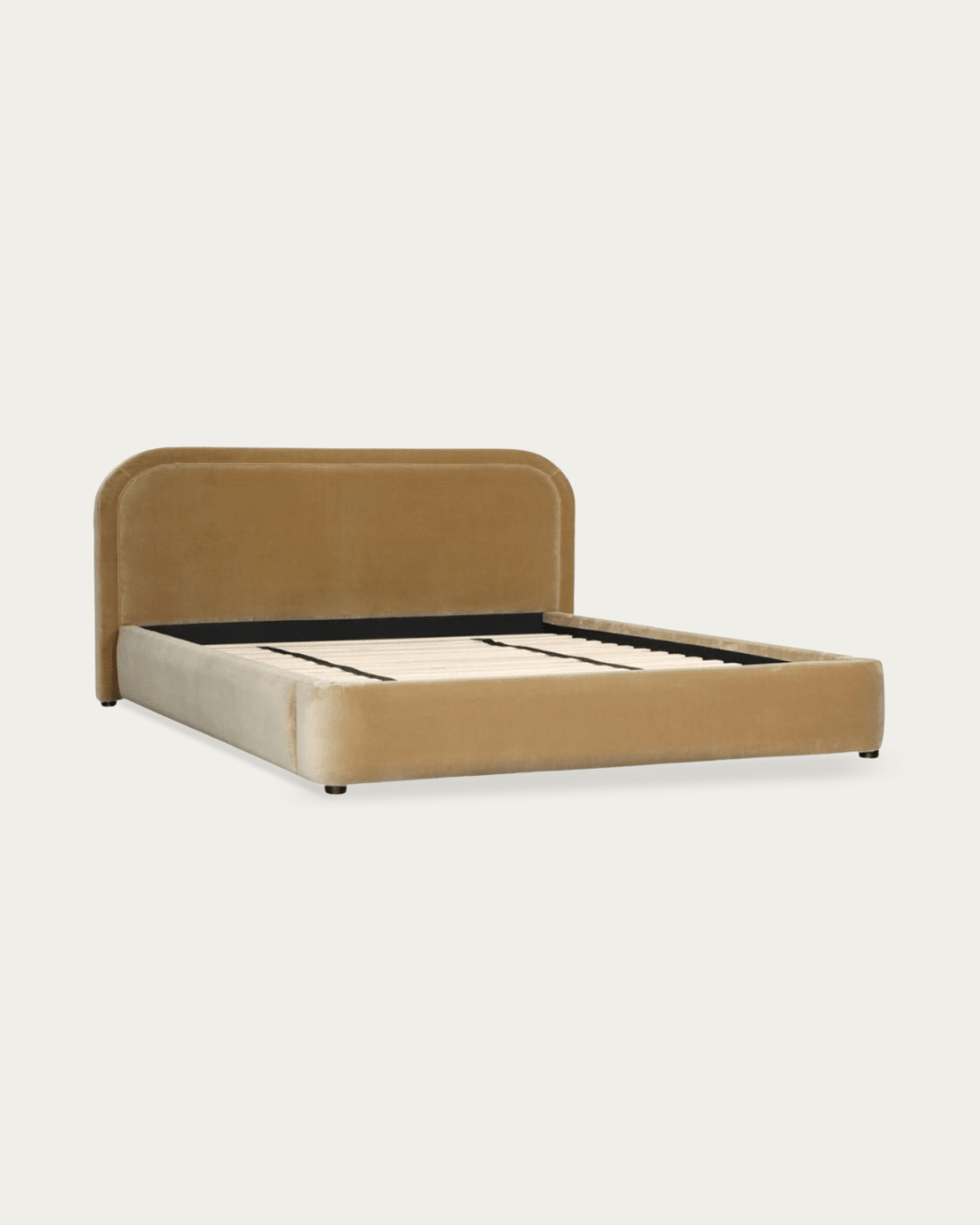
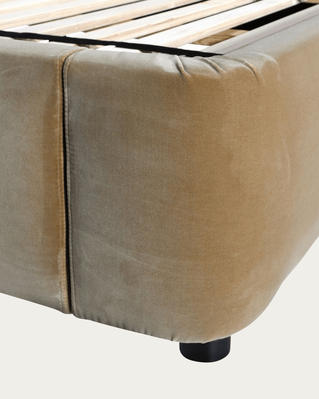
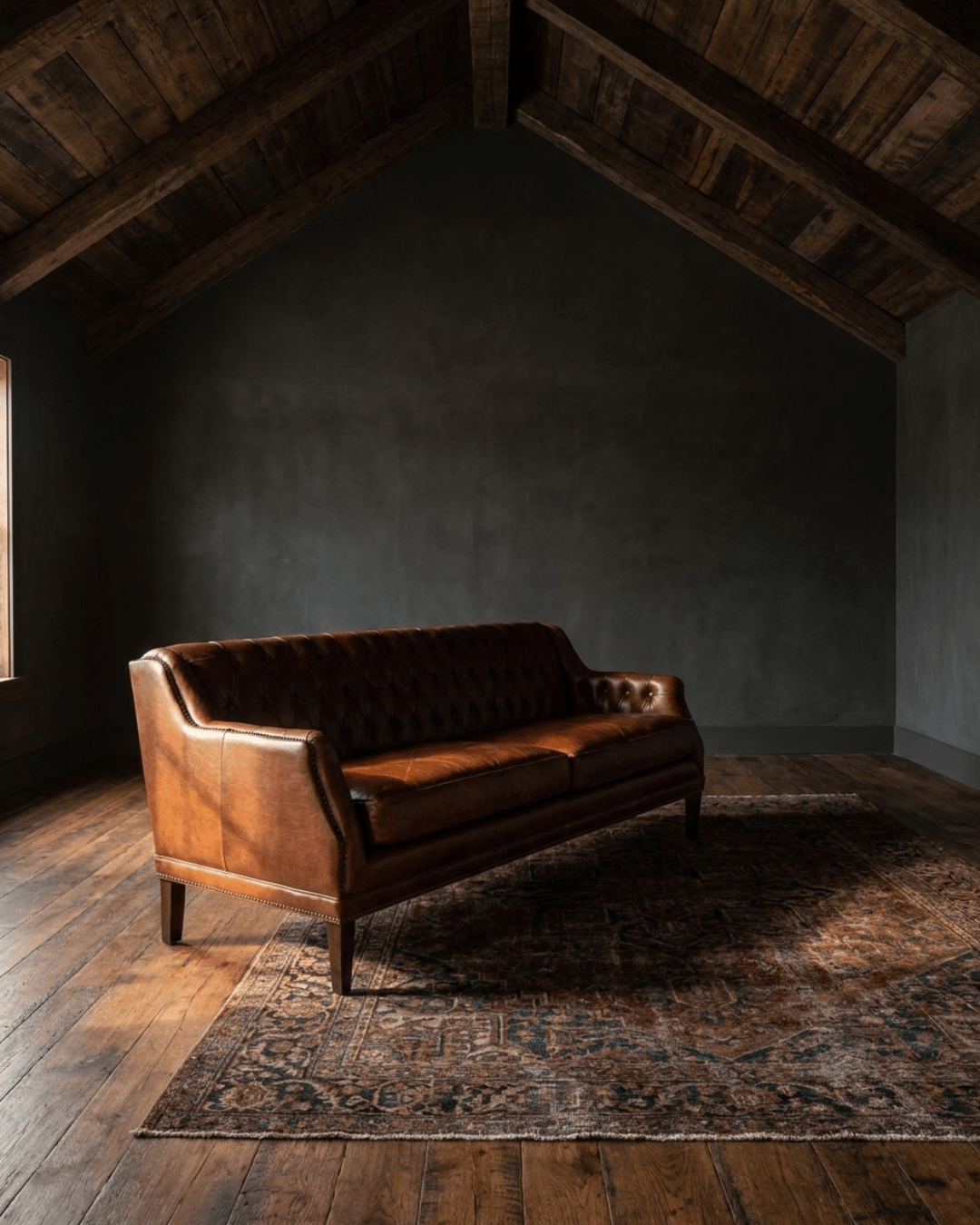
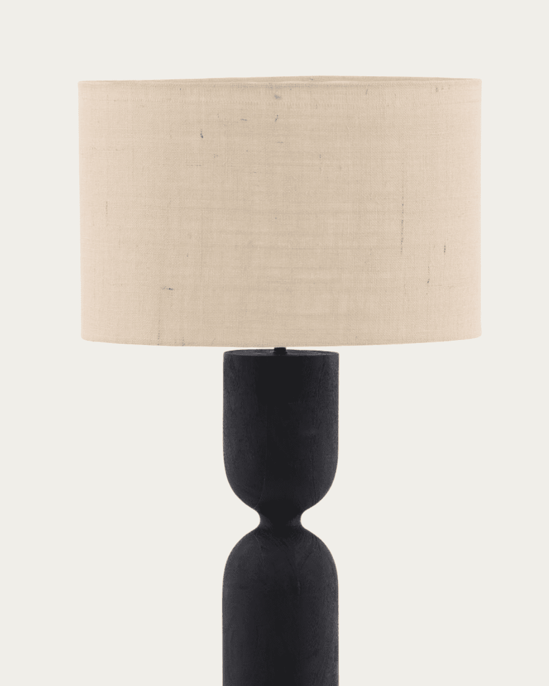
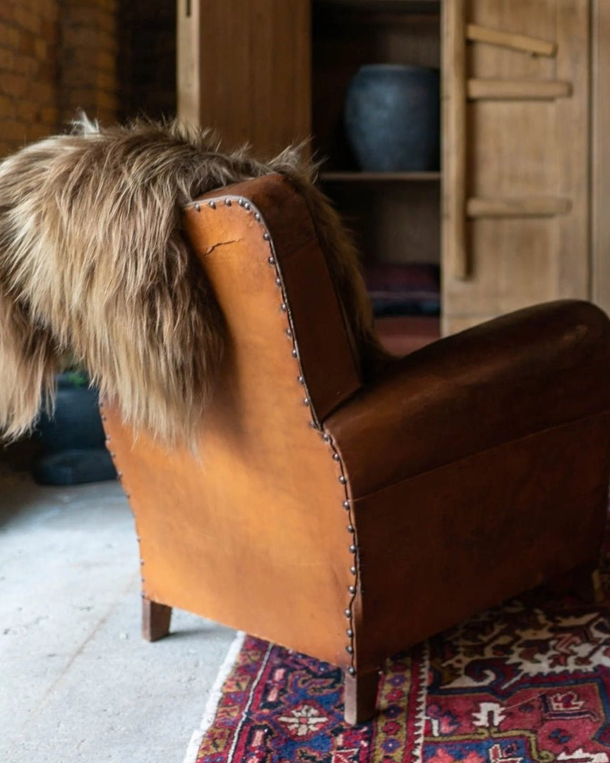
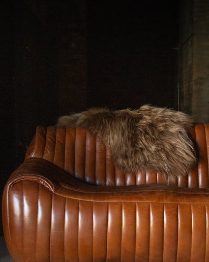
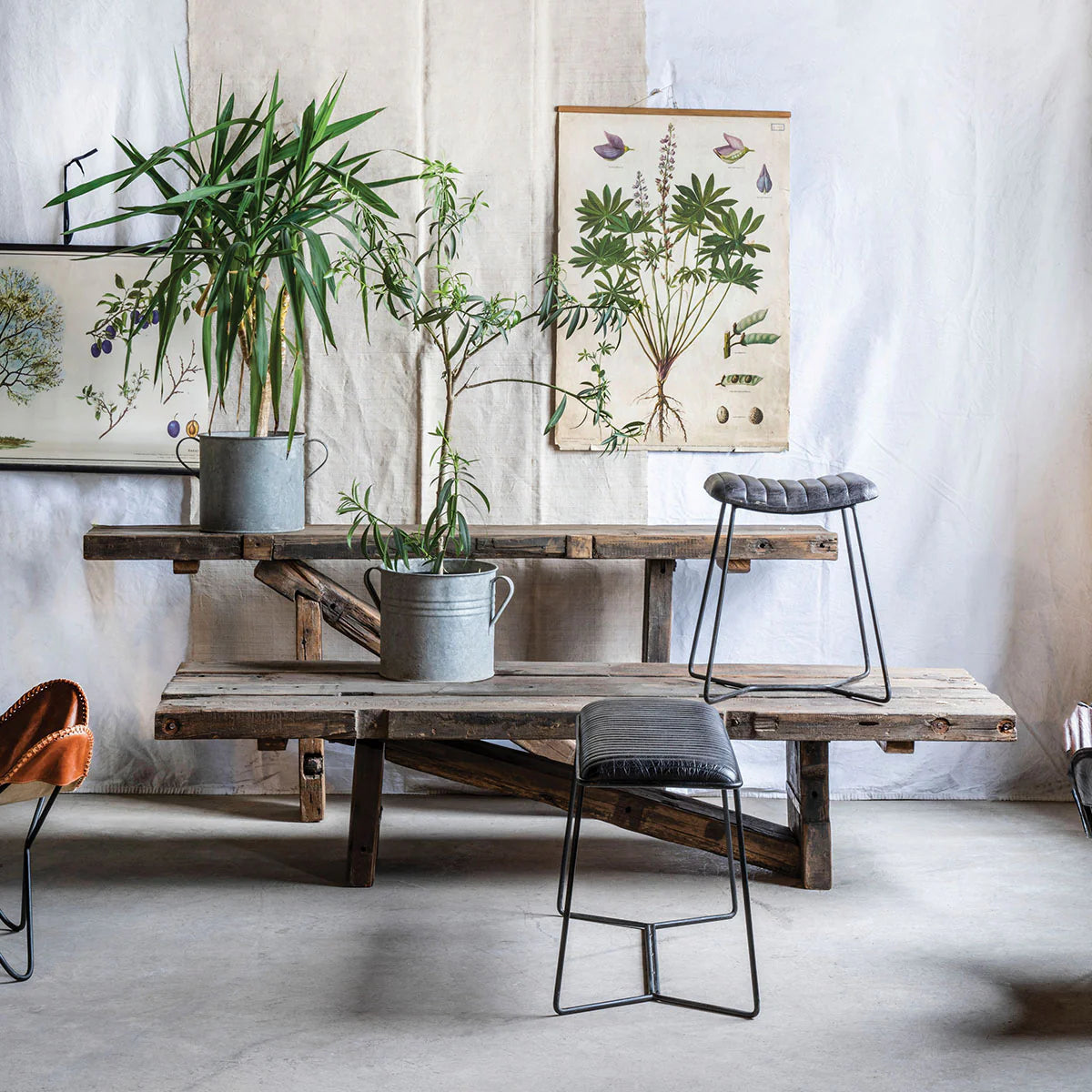
Lush velvet upholstery in deep, saturated colors
Antique rugs layered for dimension and warmth
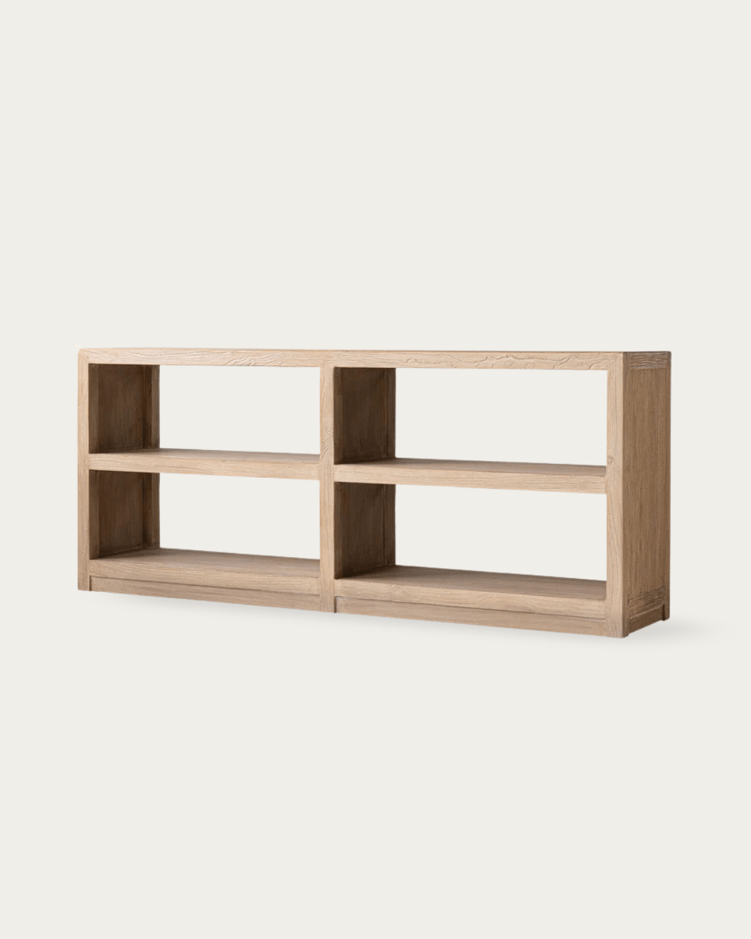
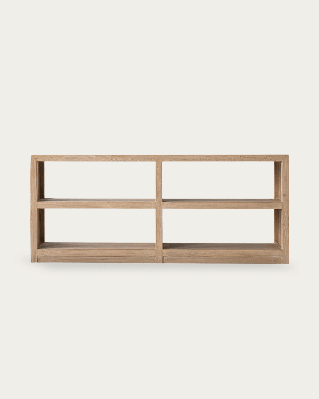
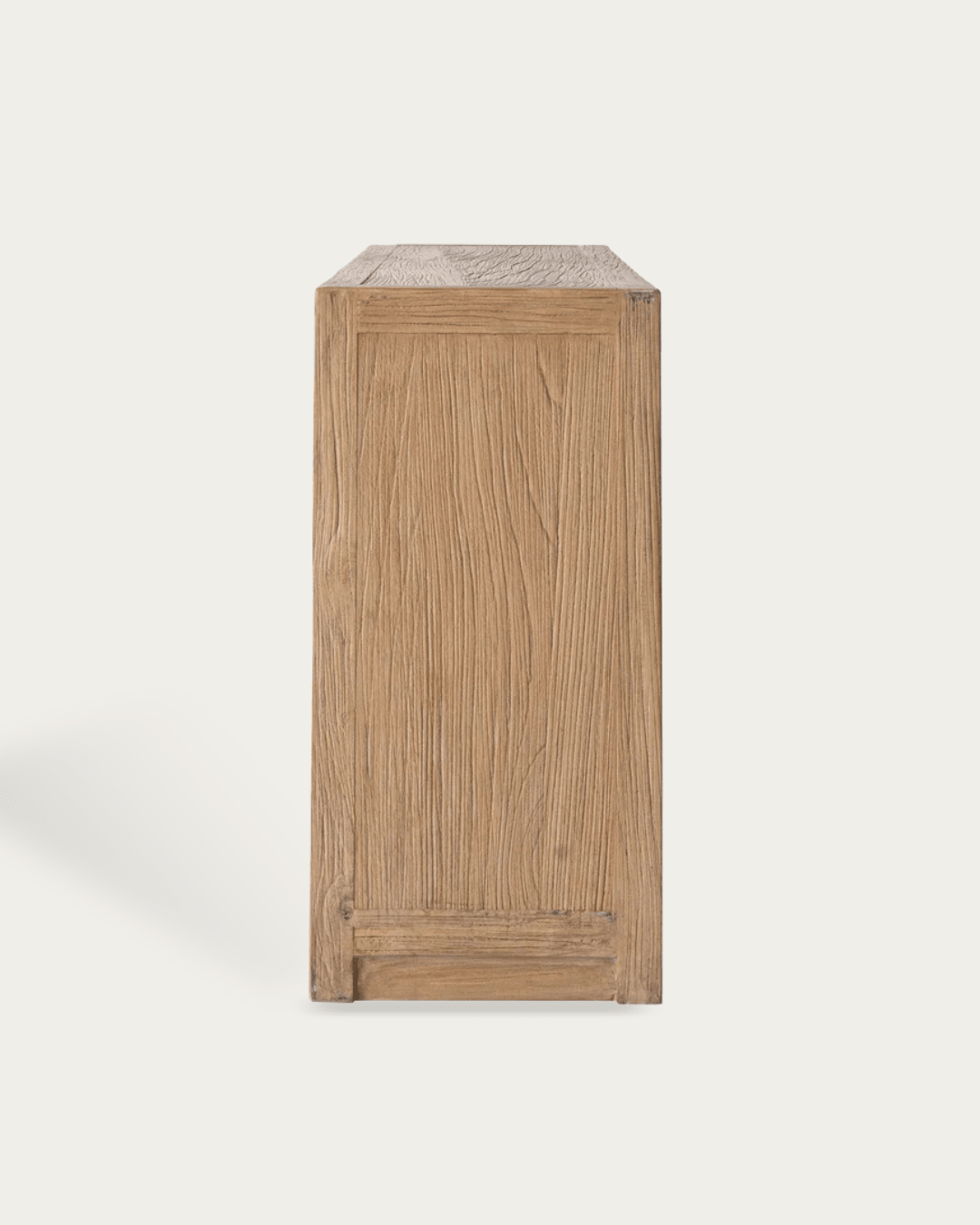
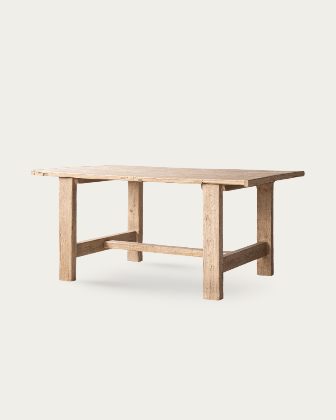
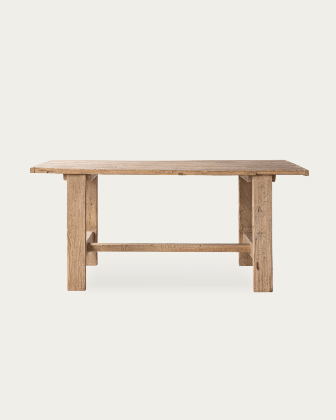
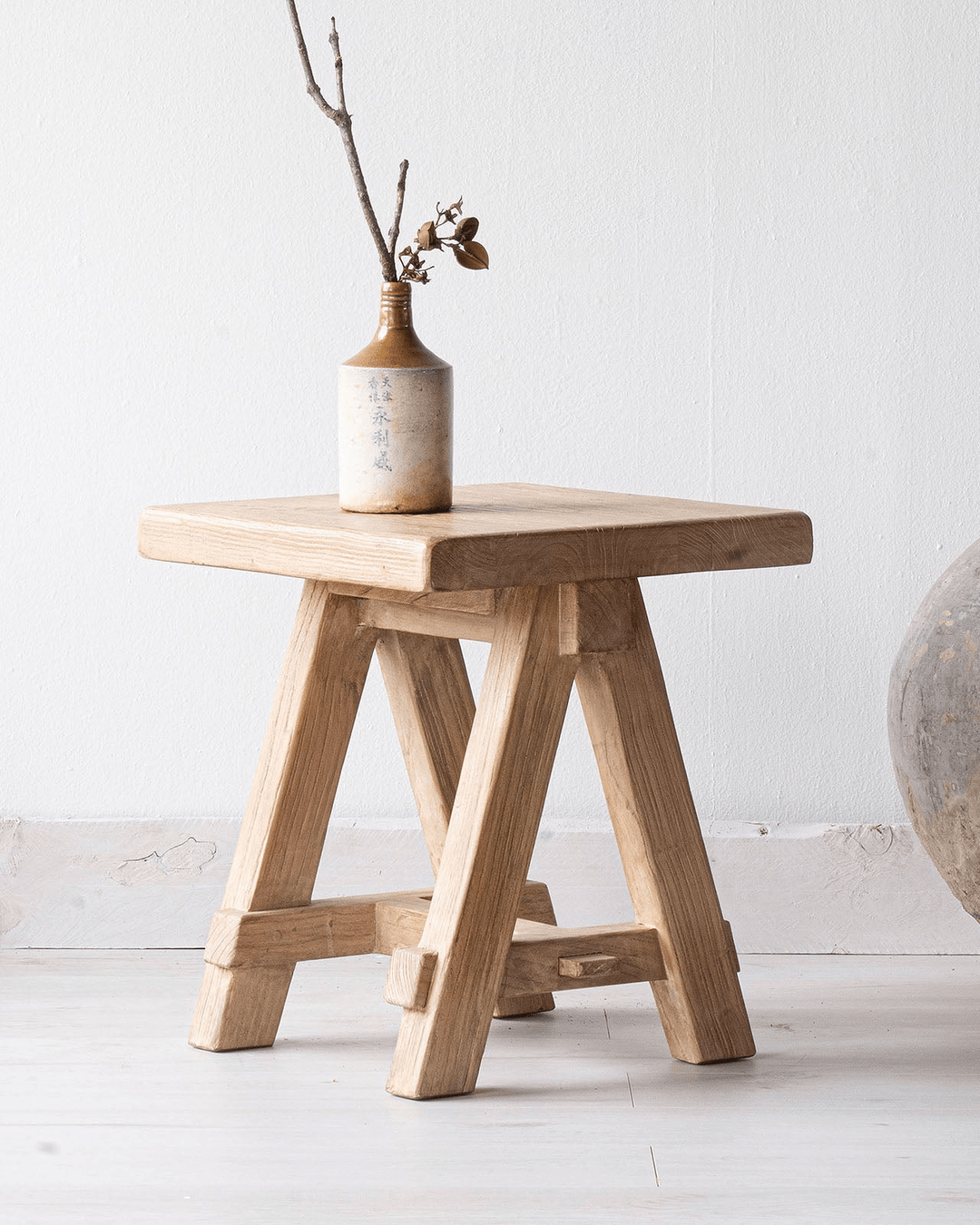
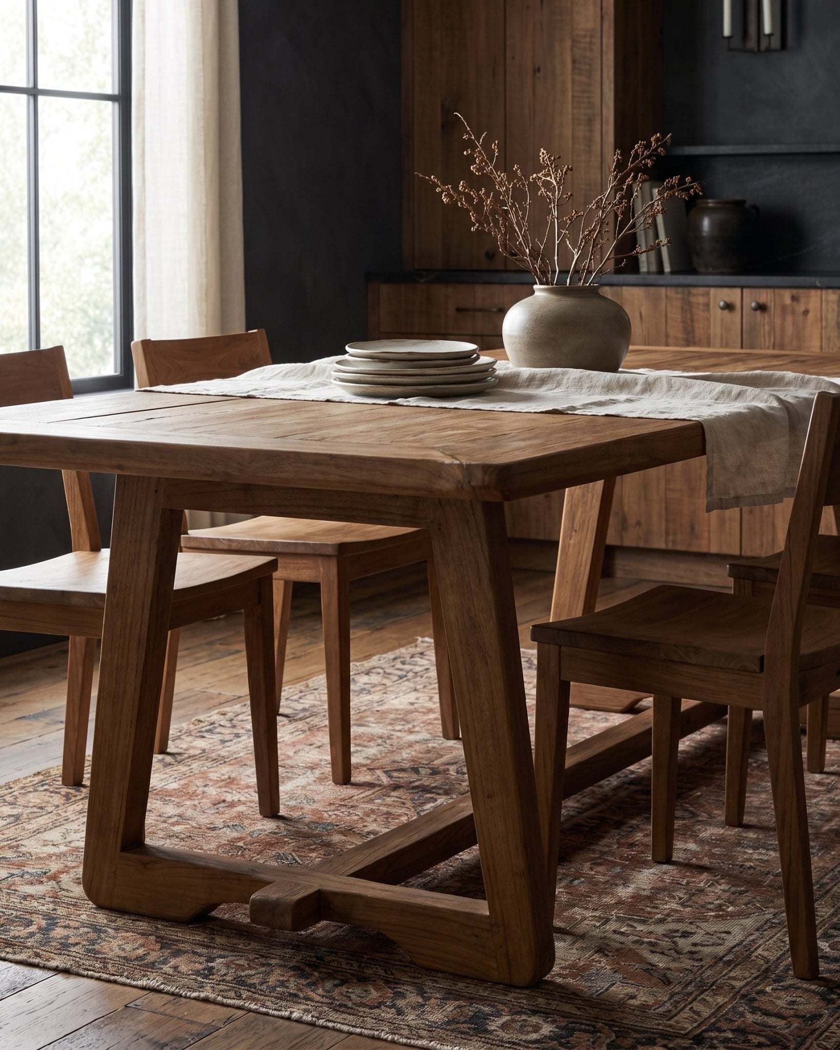
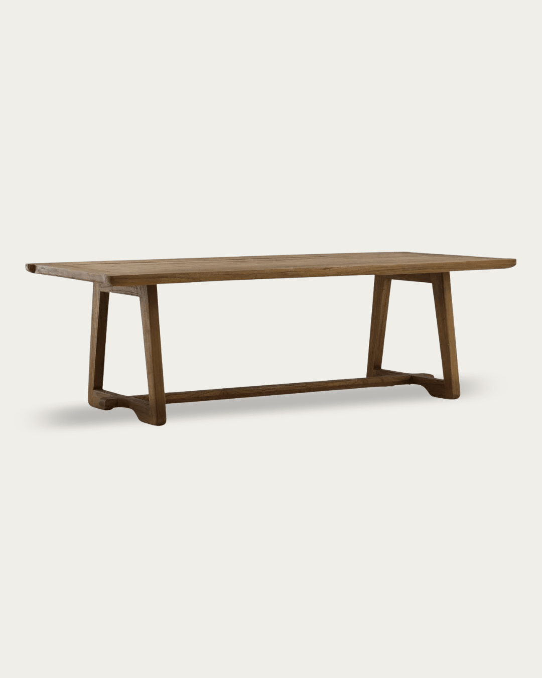
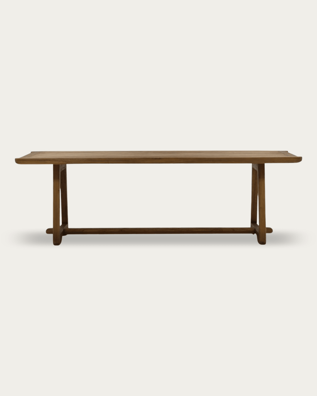
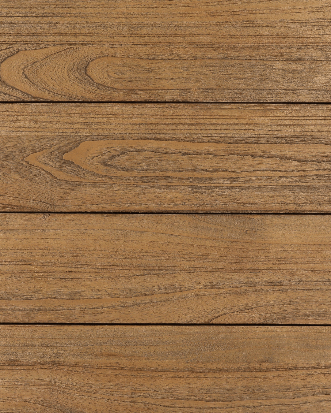
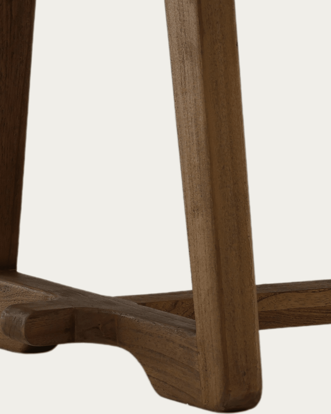
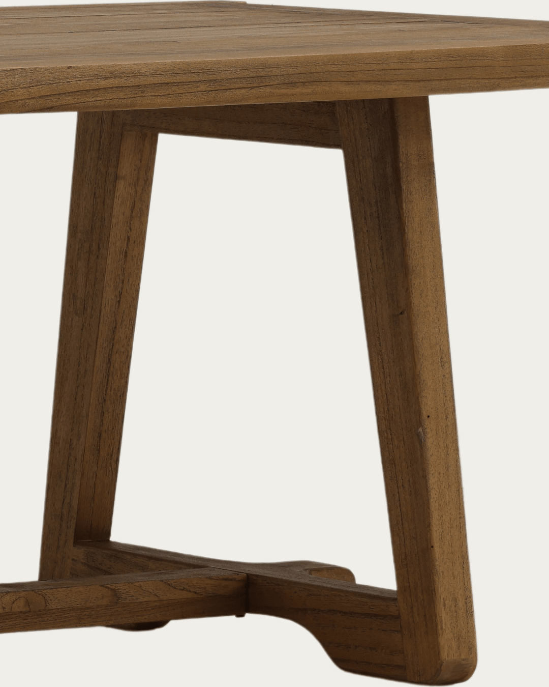
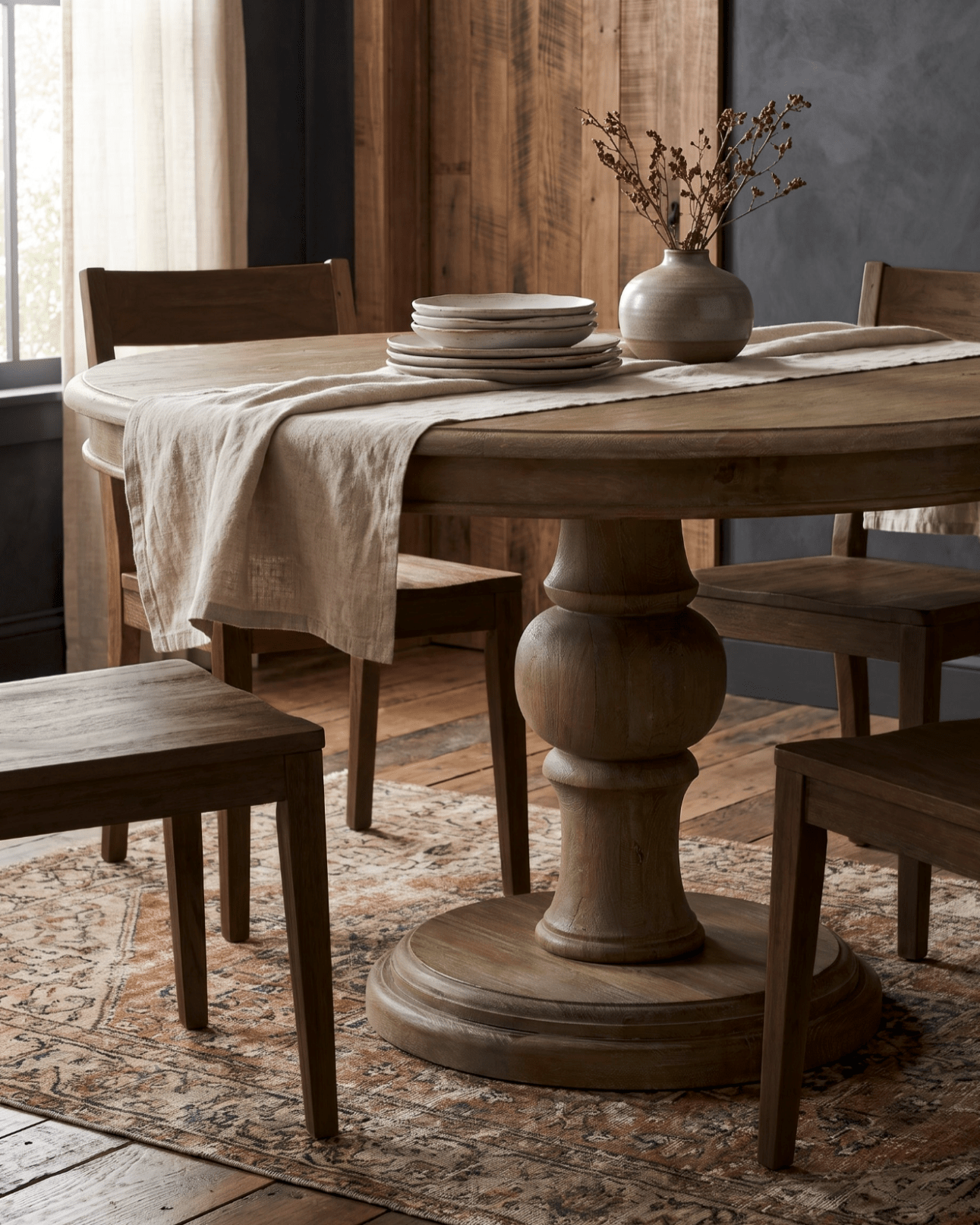
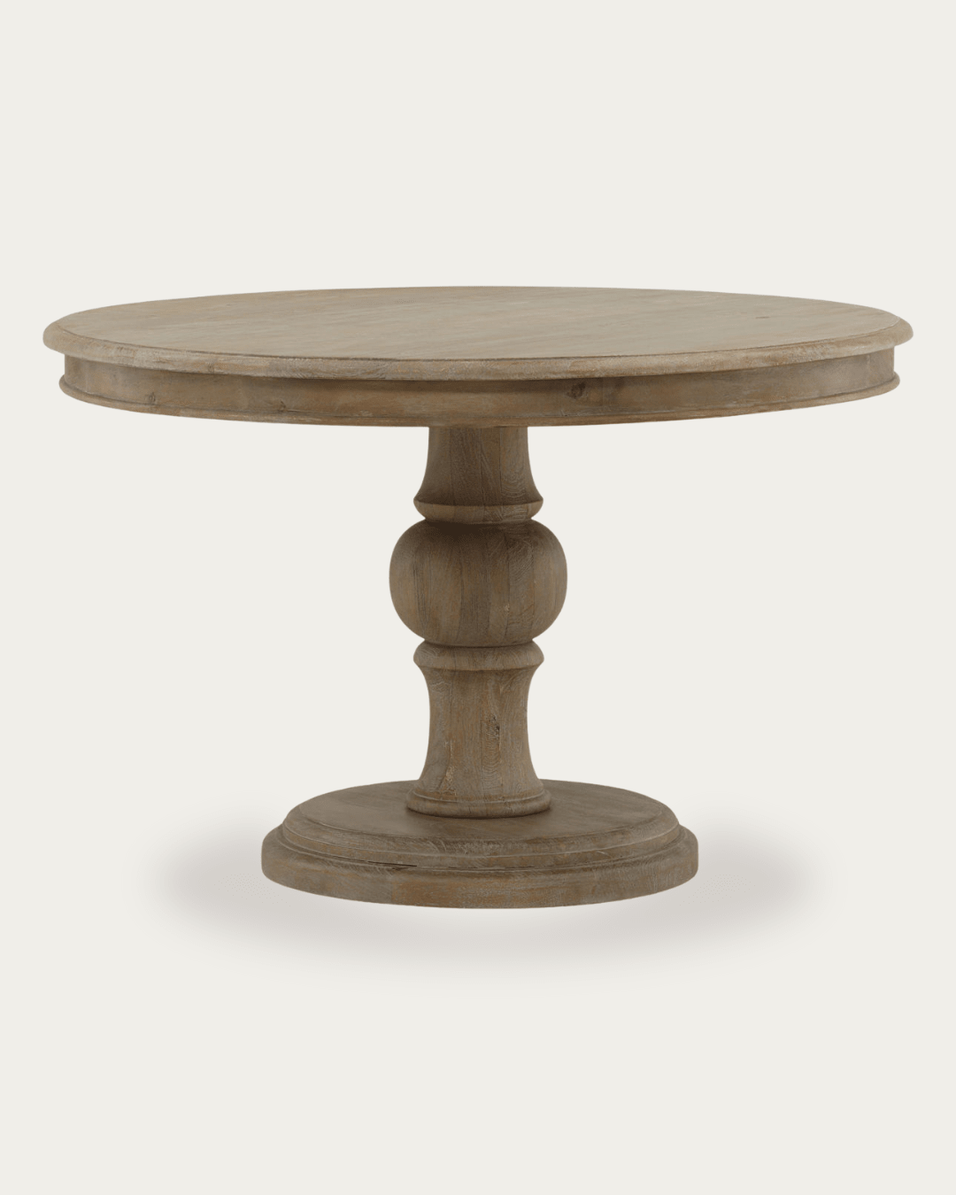
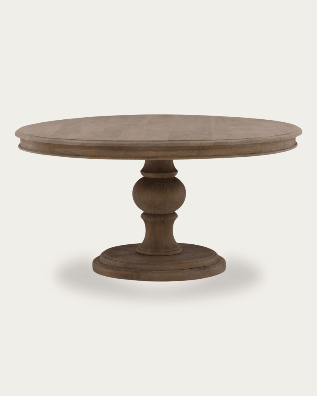
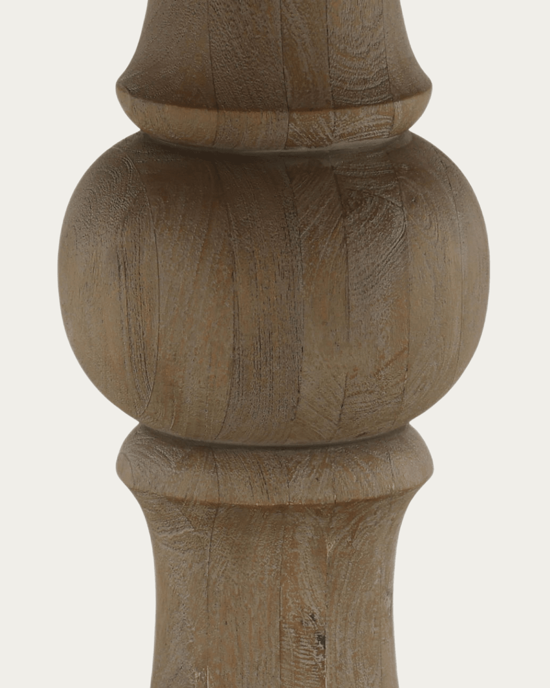
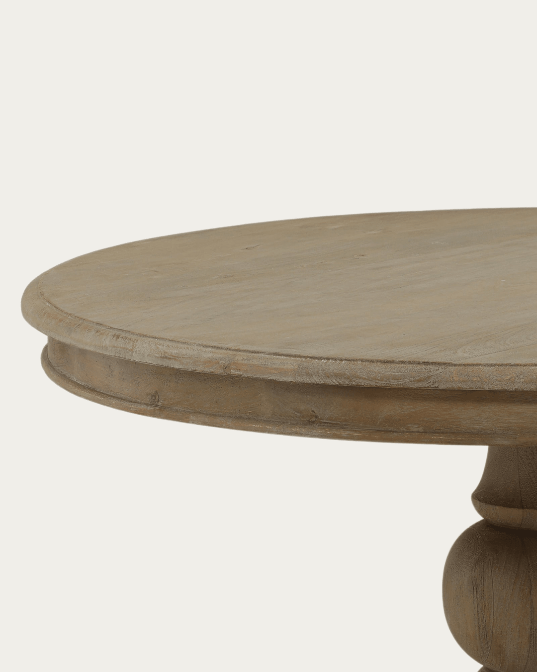
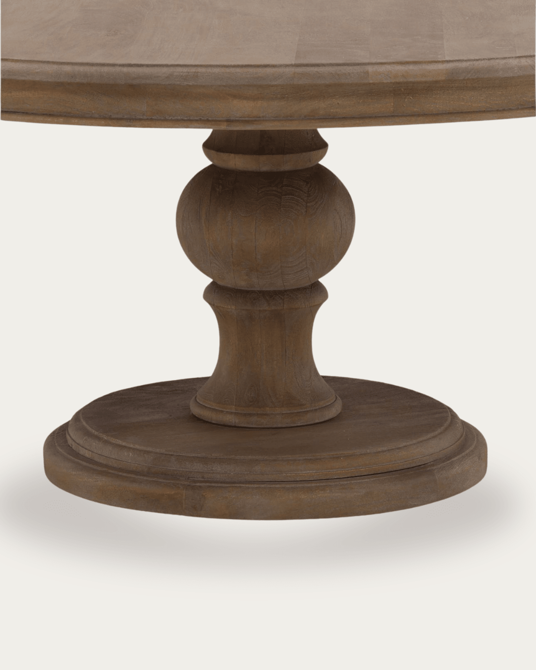
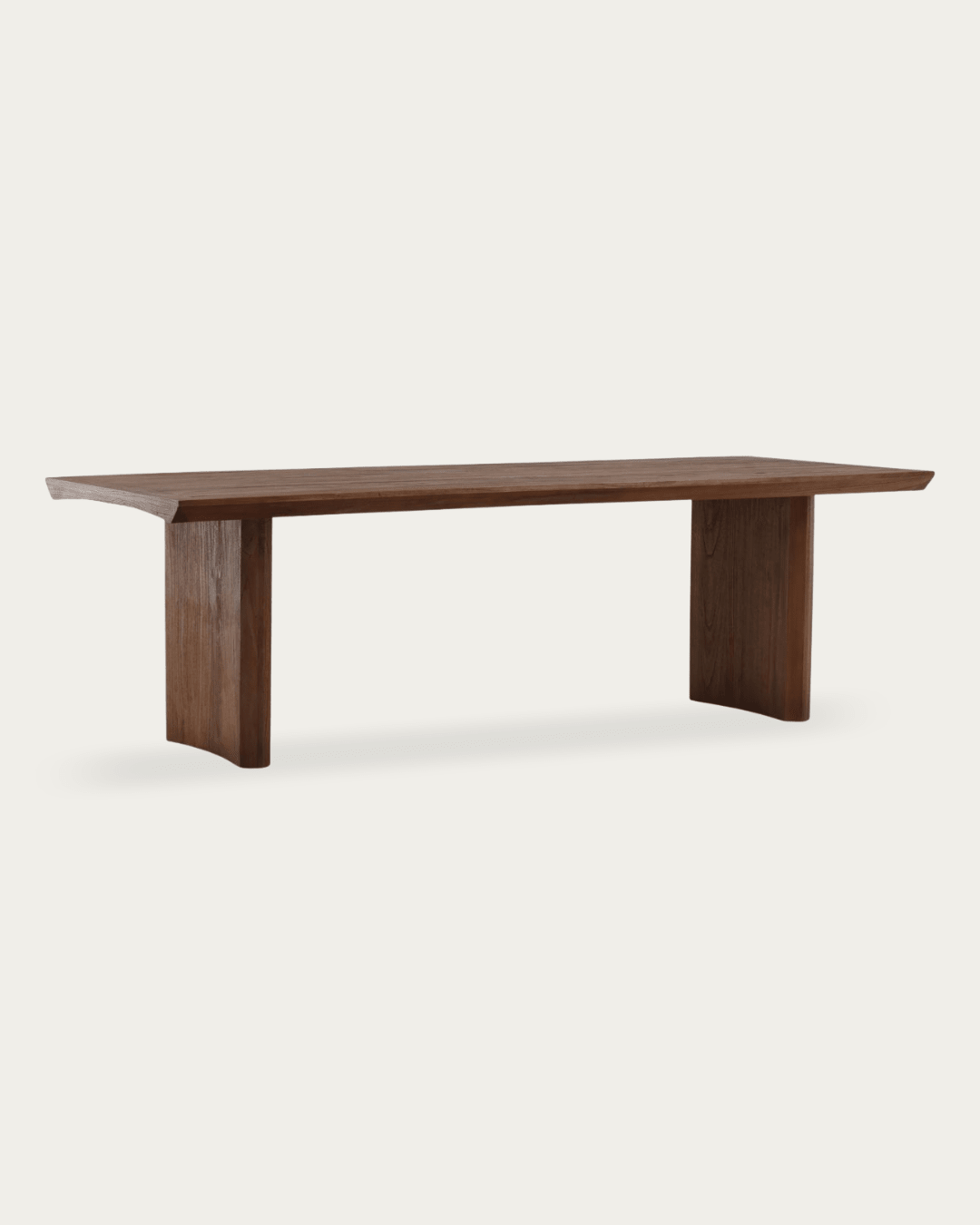
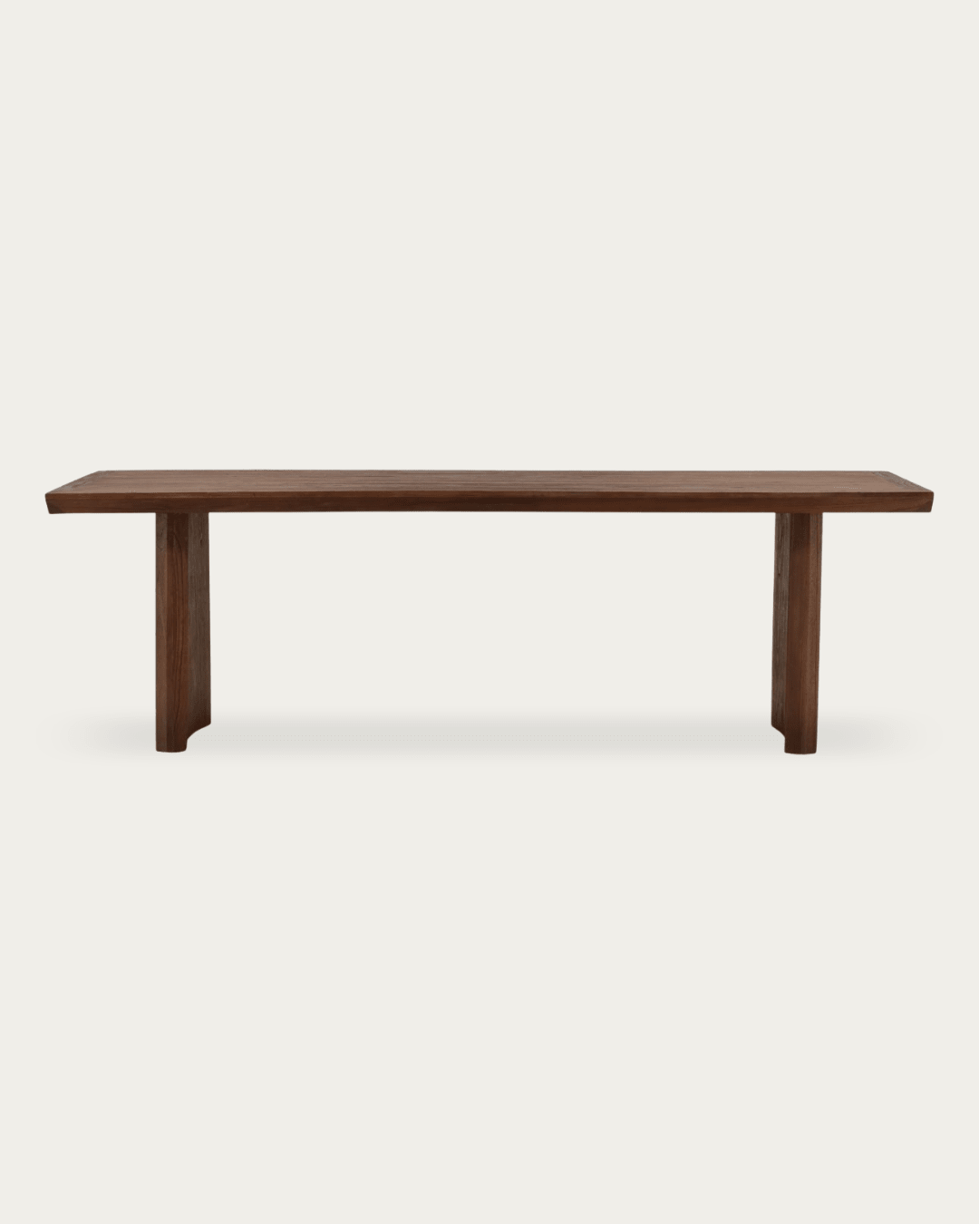
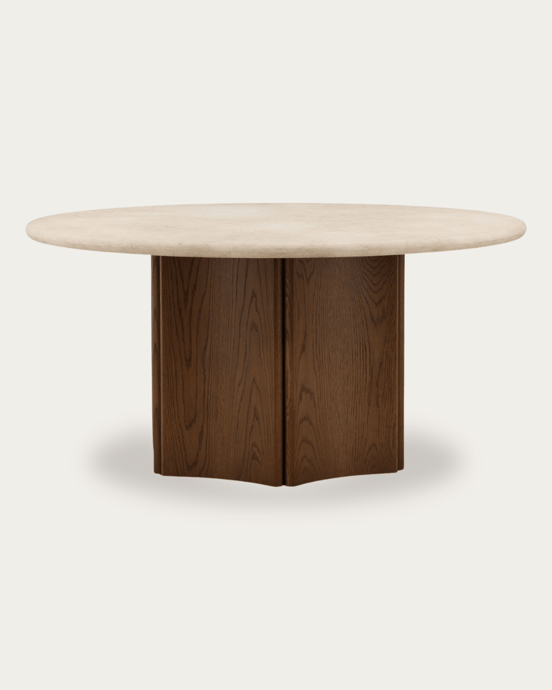
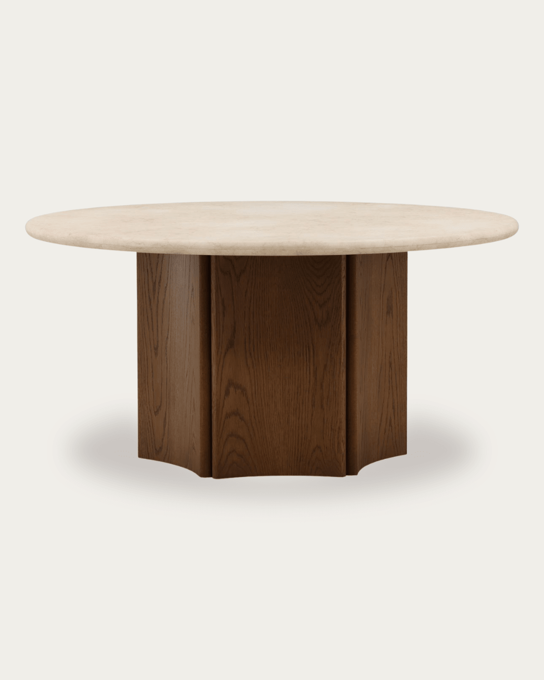
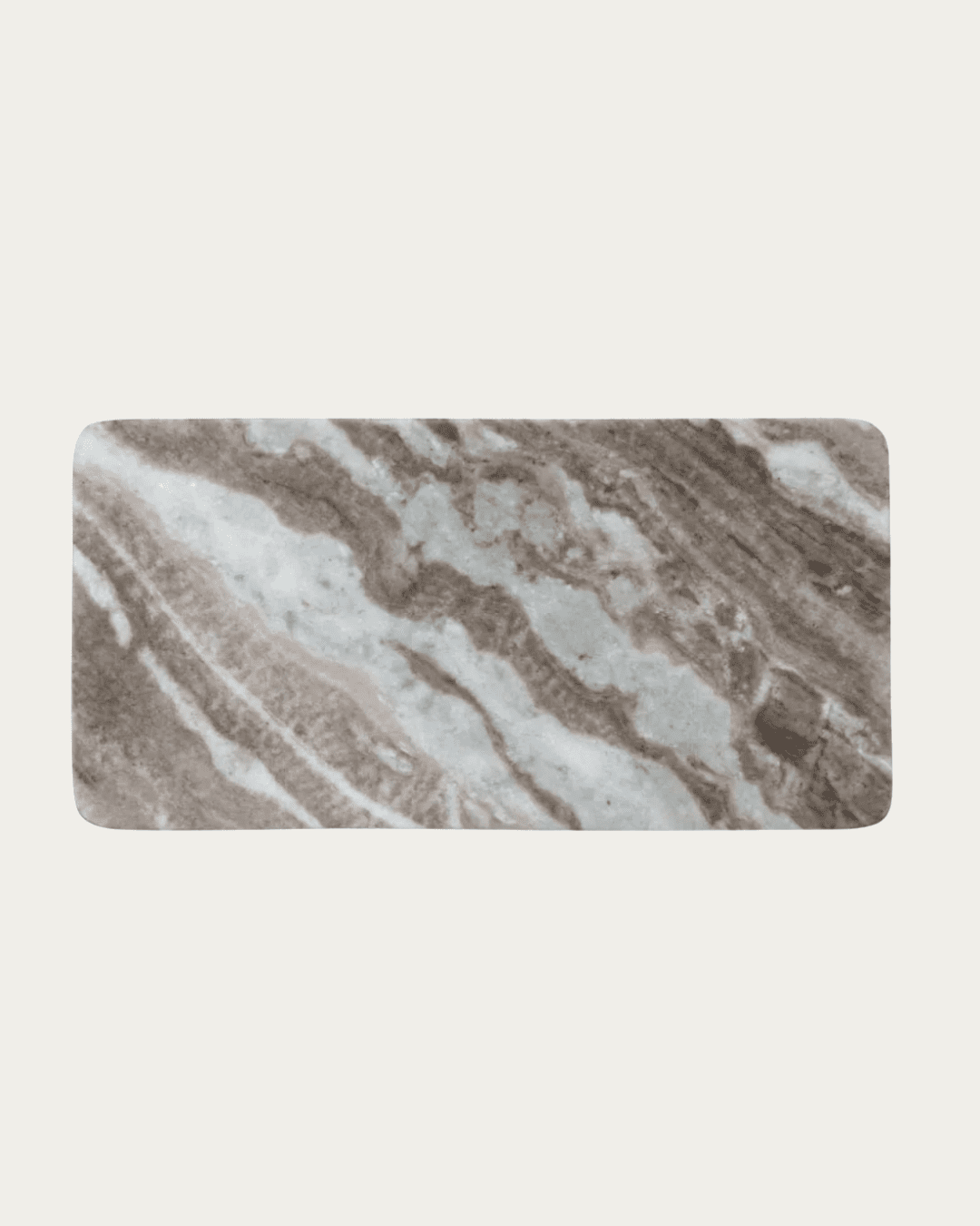
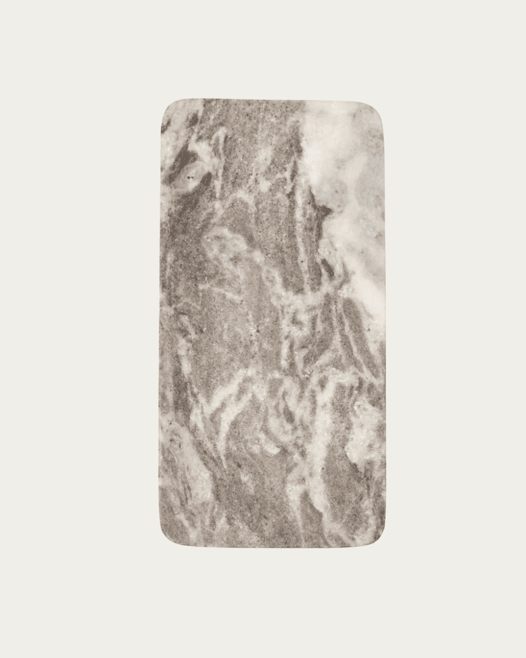
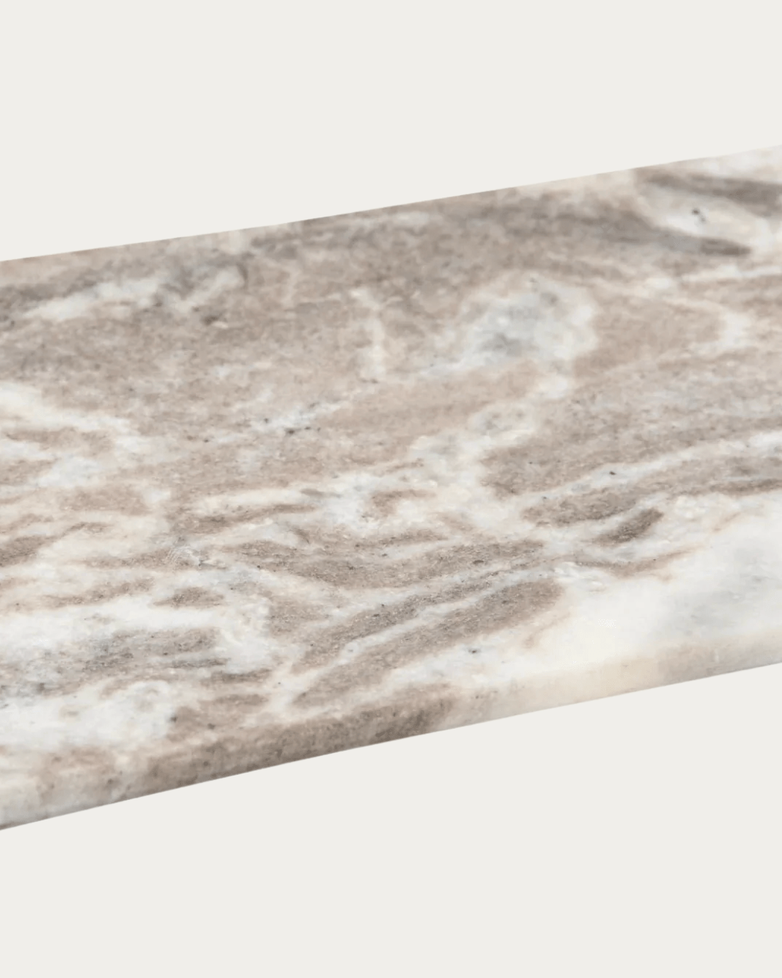
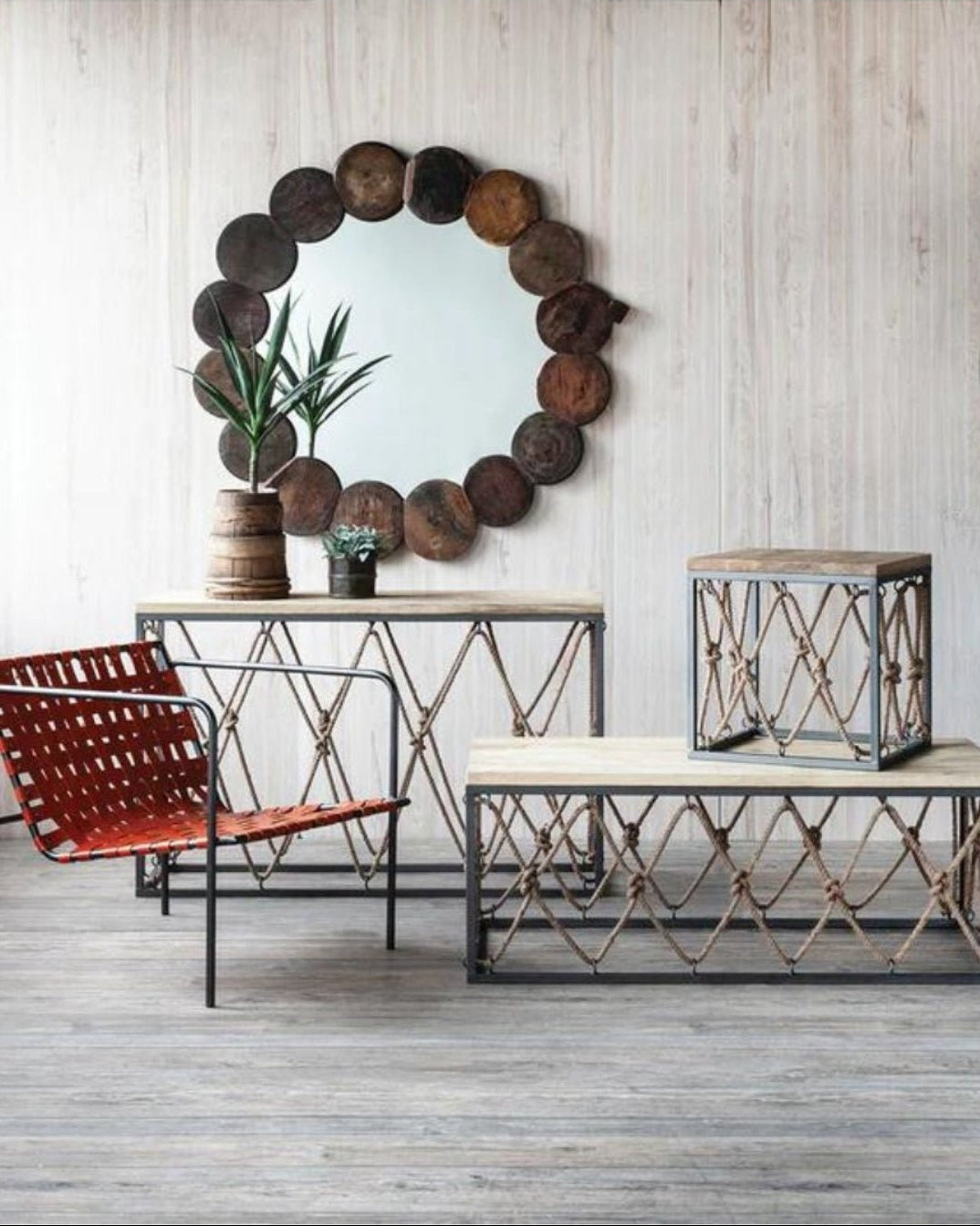
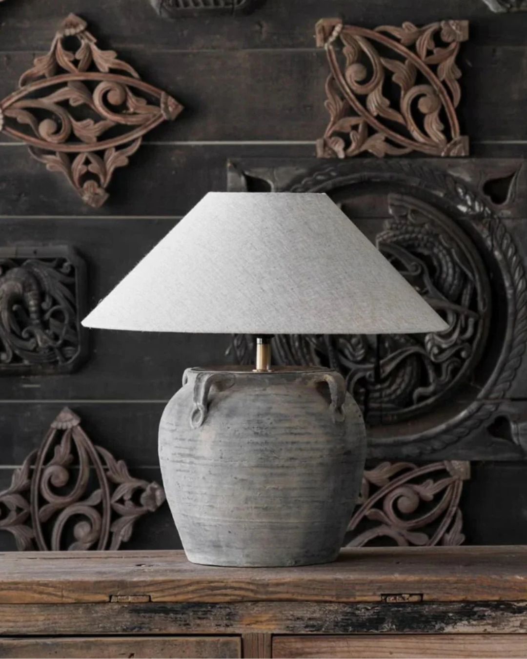
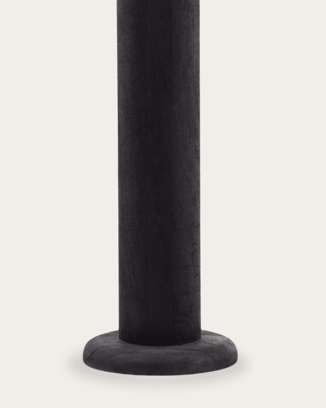
Rustic wood finishes that feel timeless yet modern
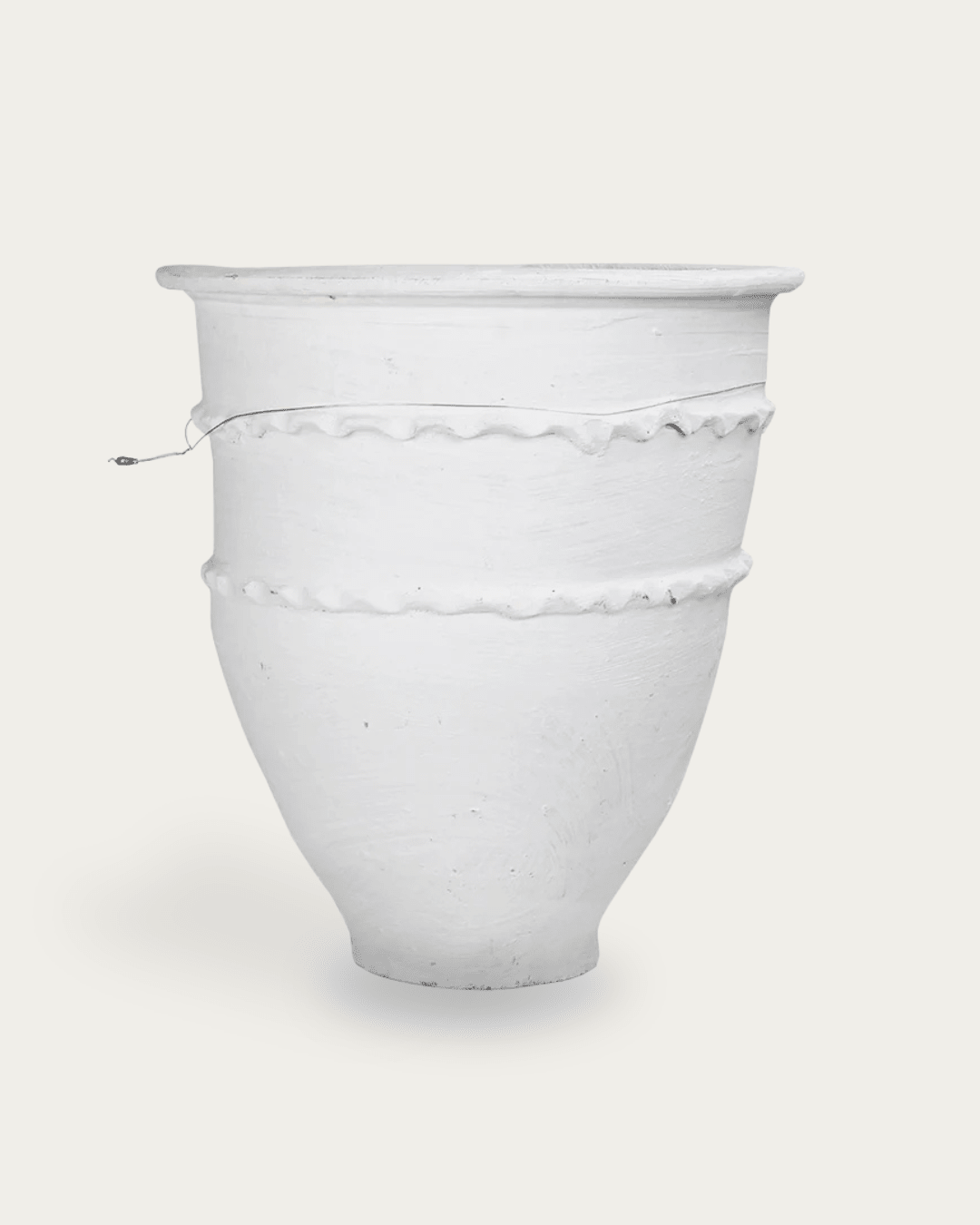
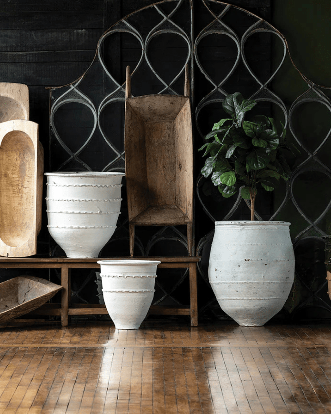
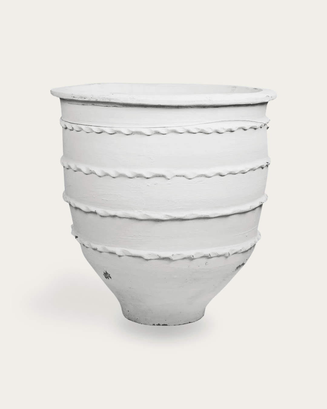
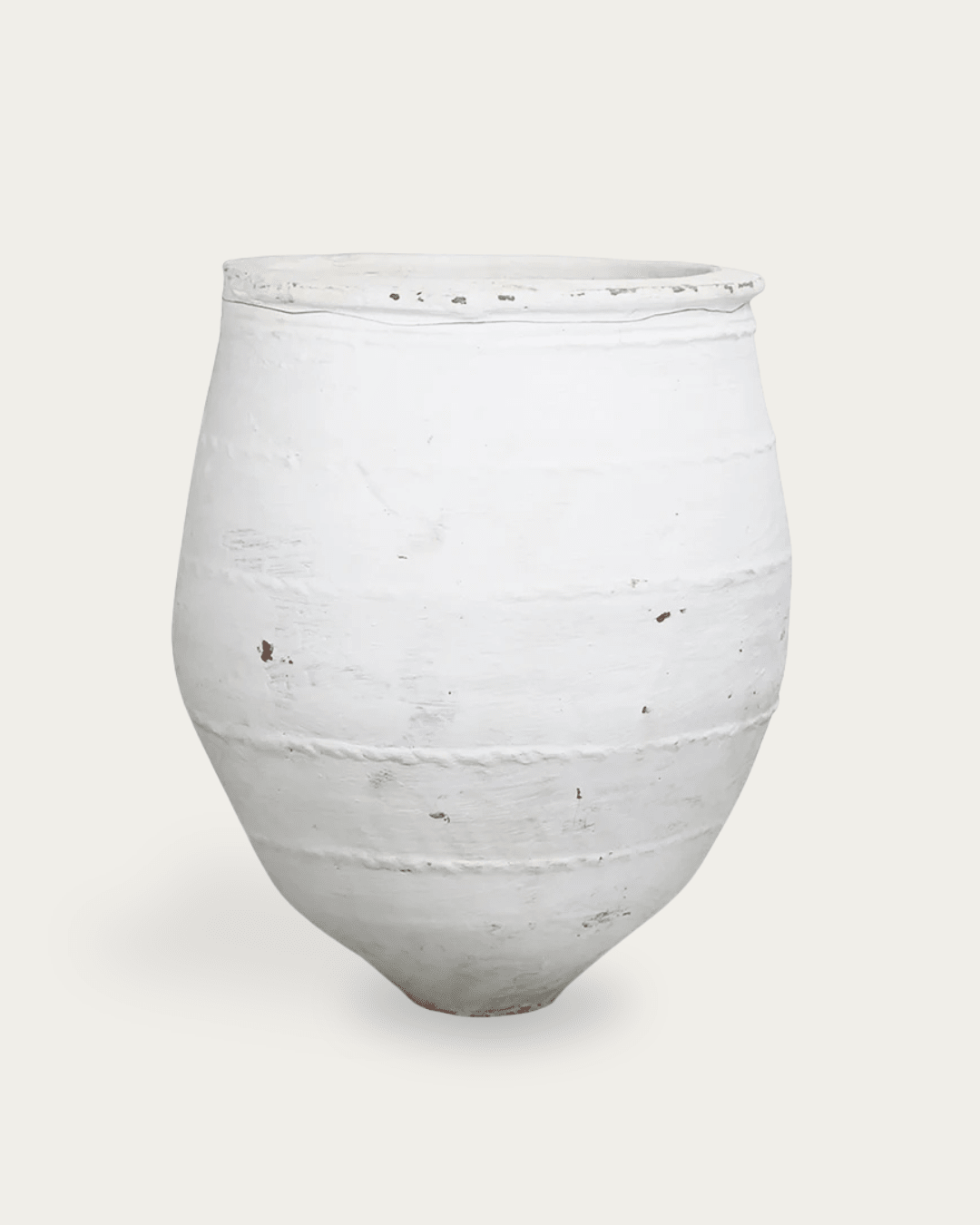
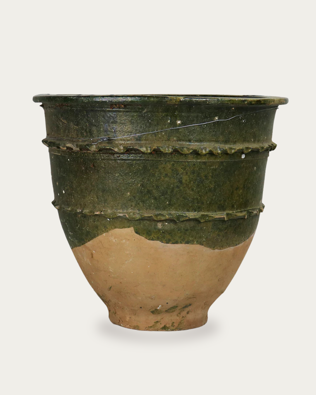
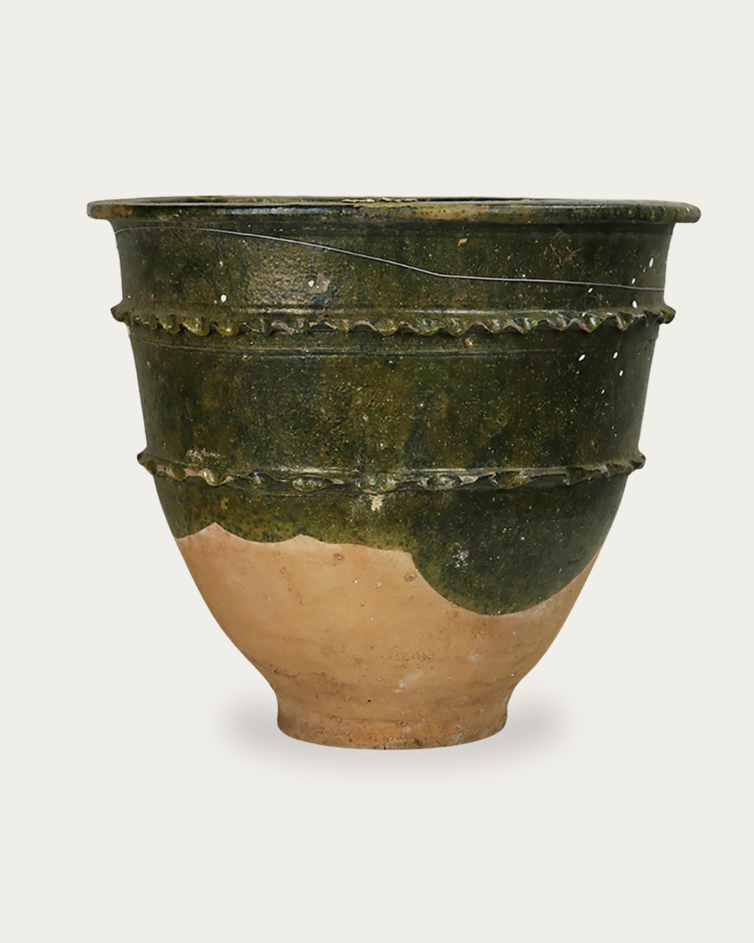
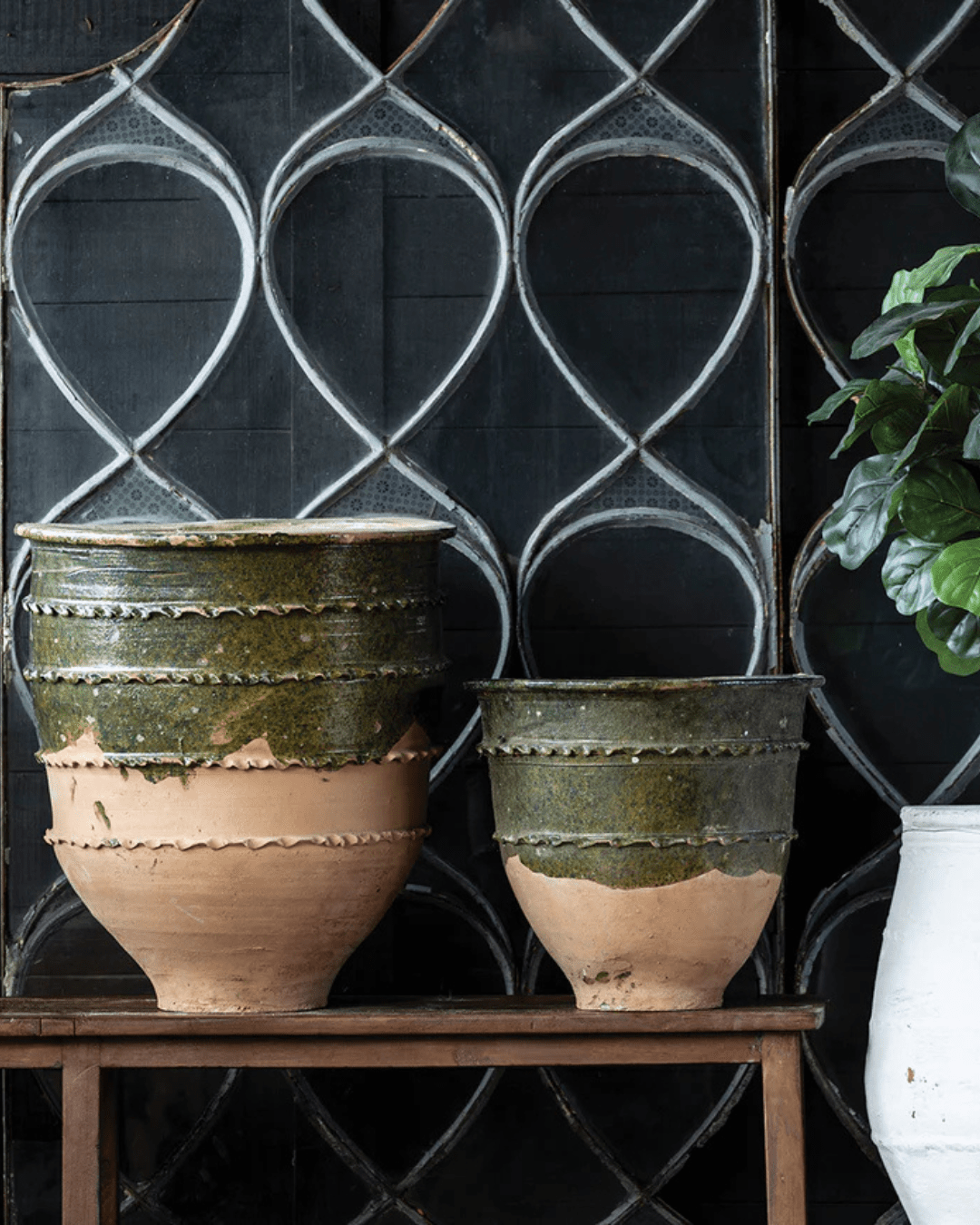
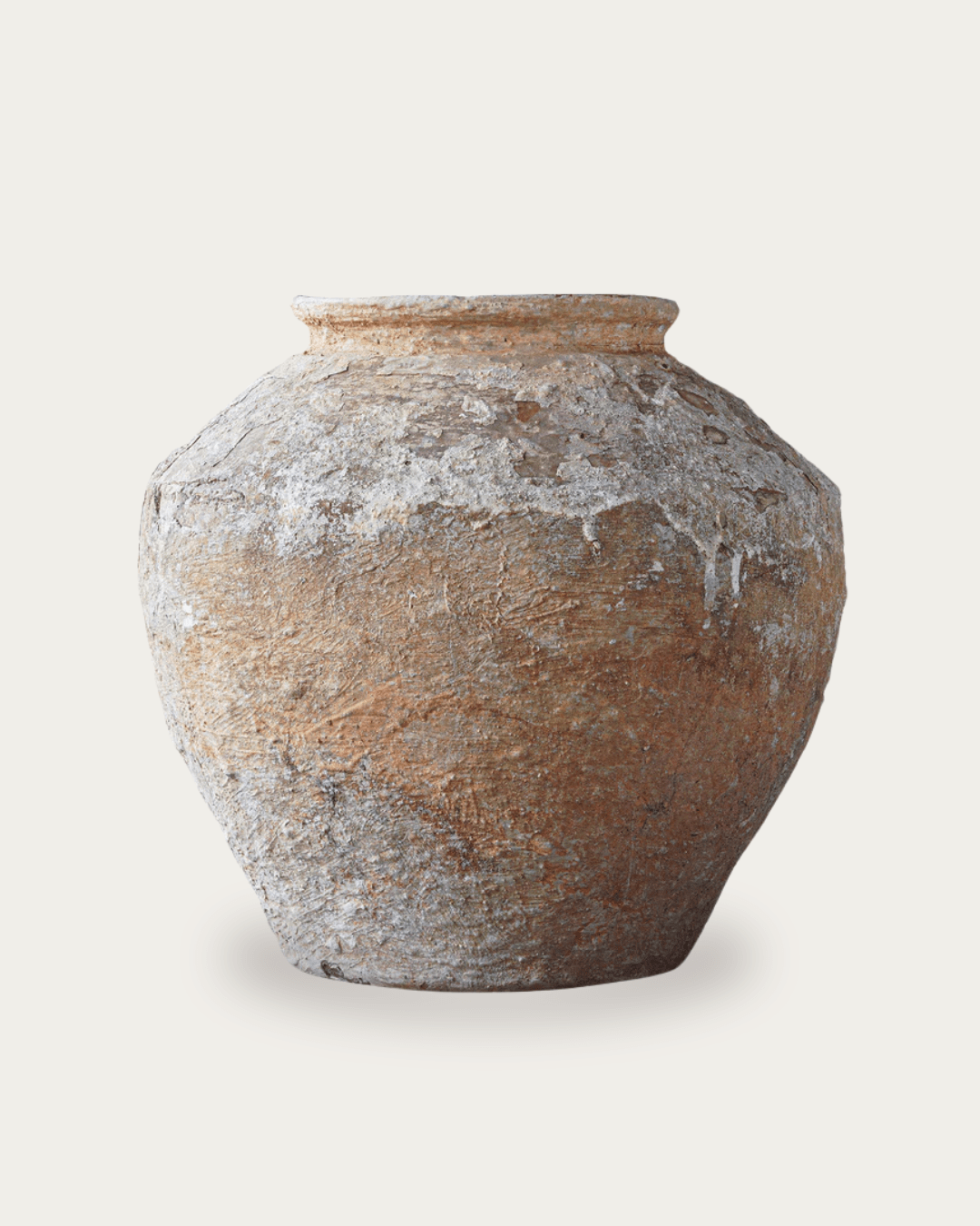
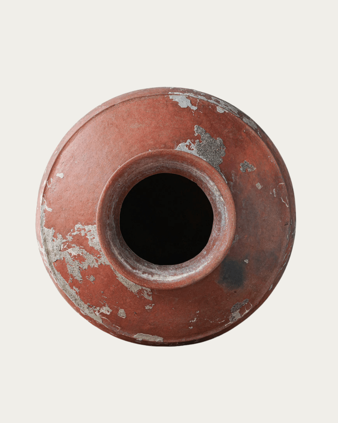
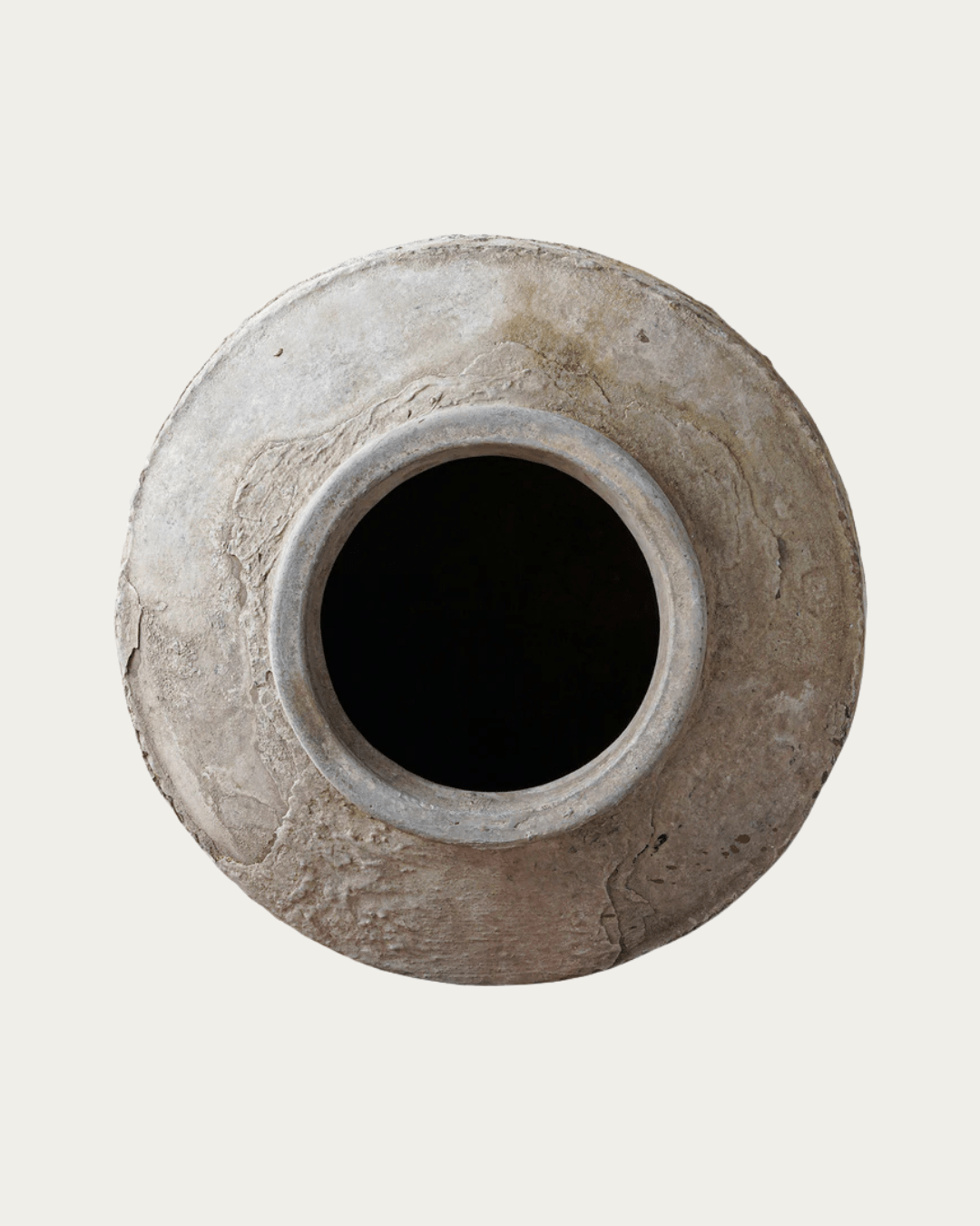
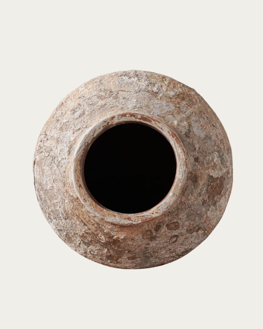
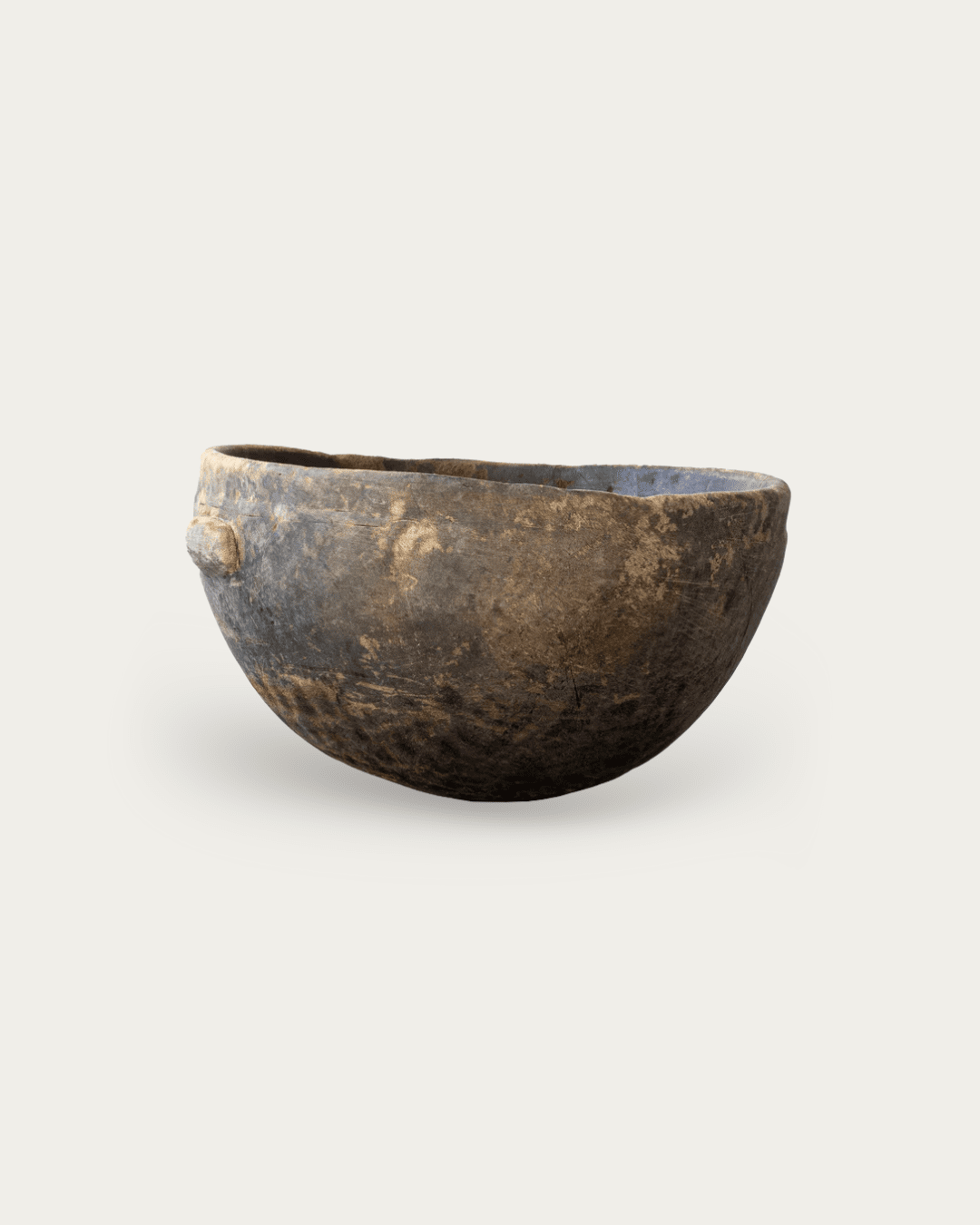
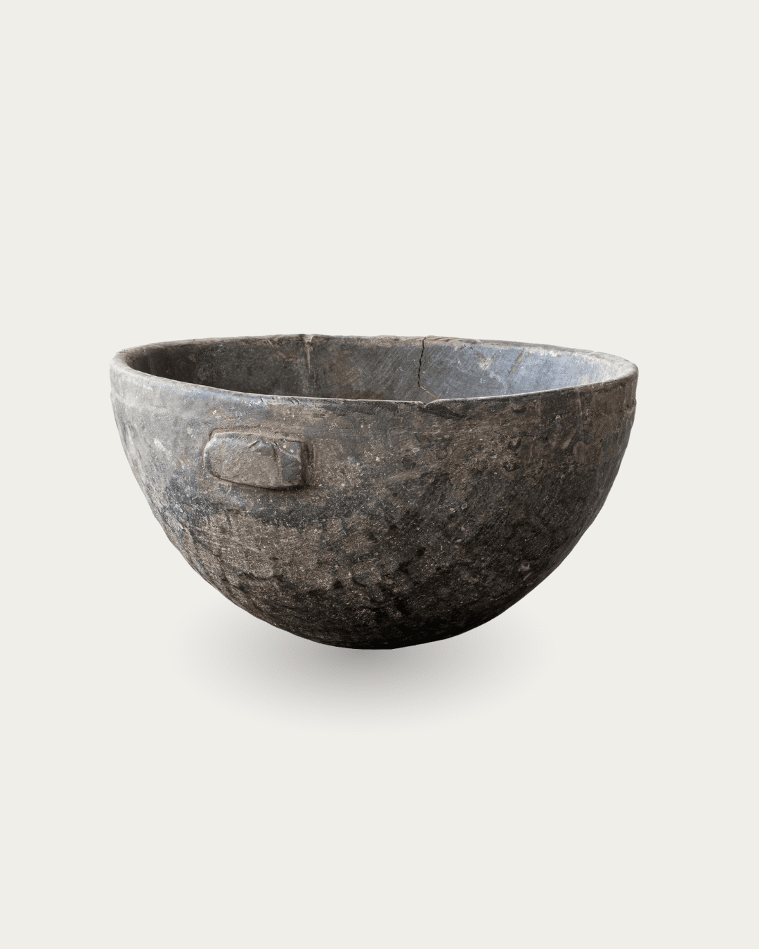
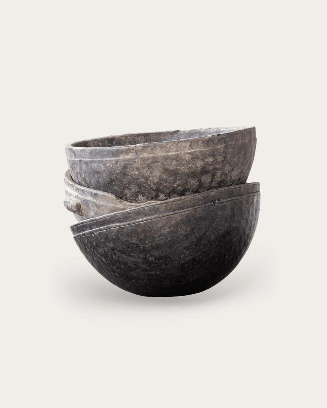
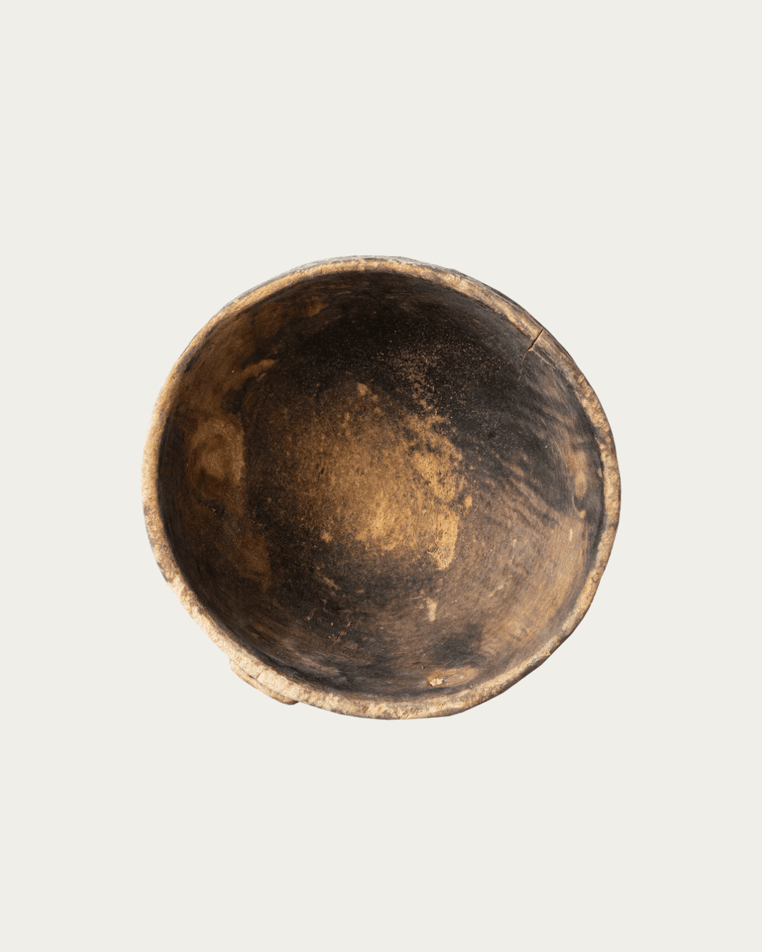
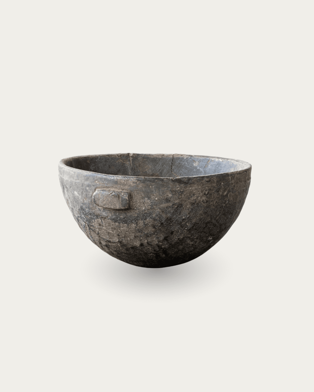
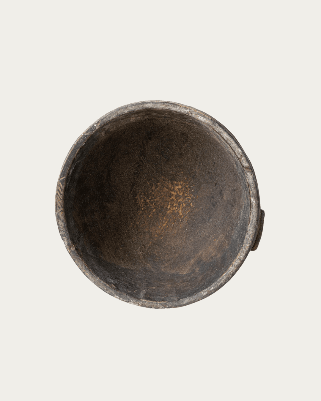
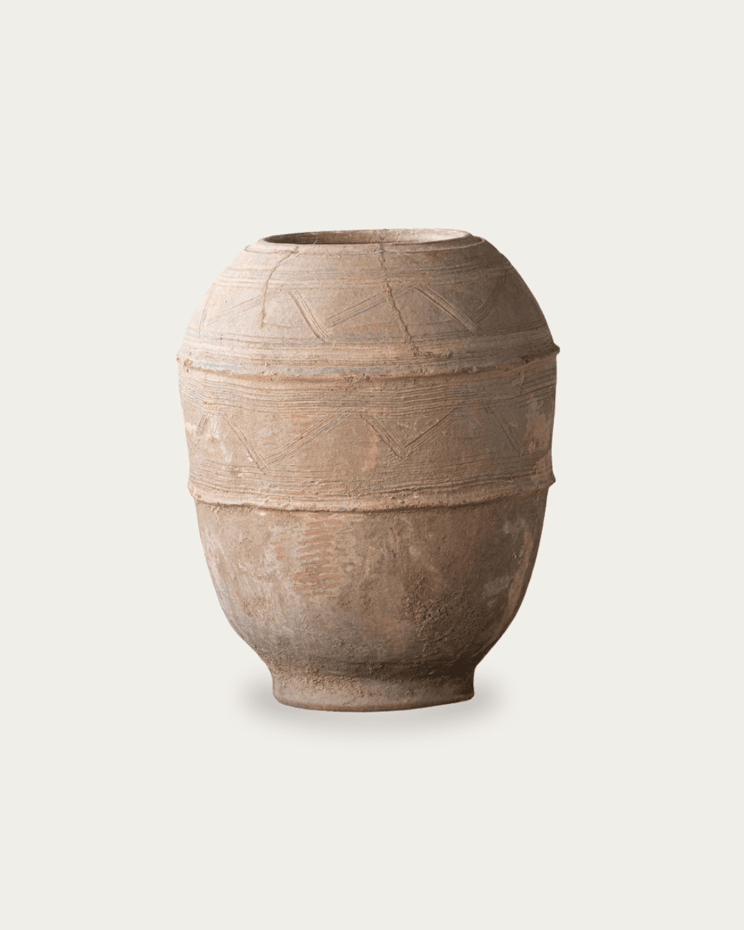
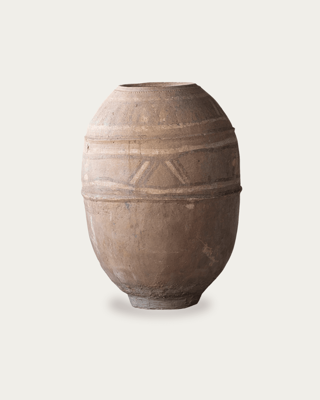
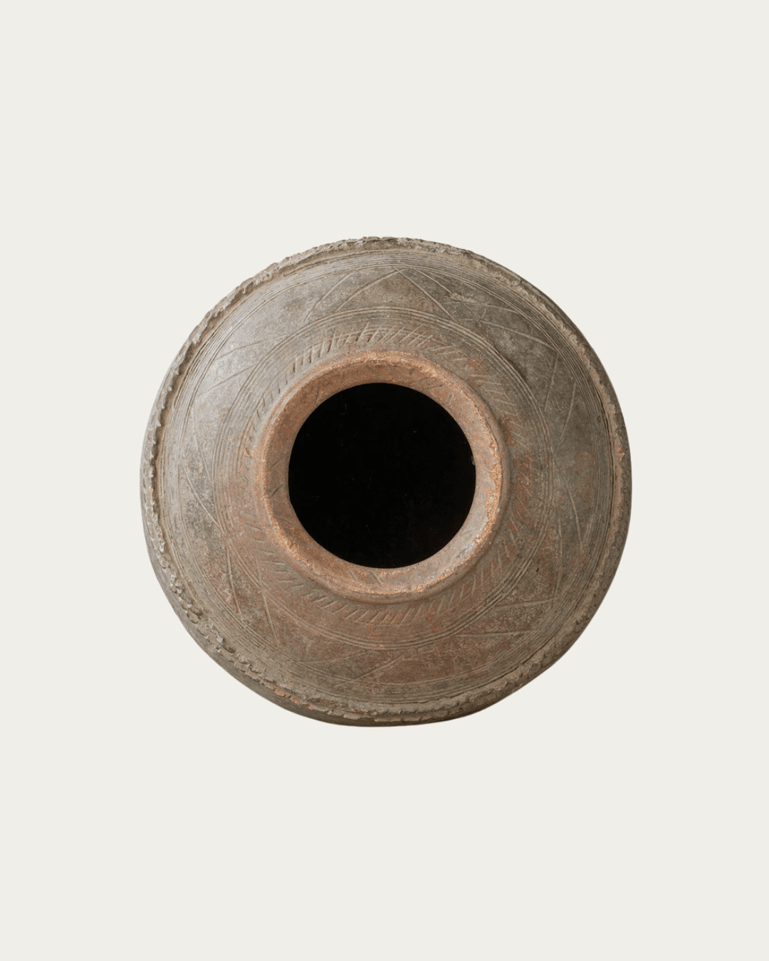
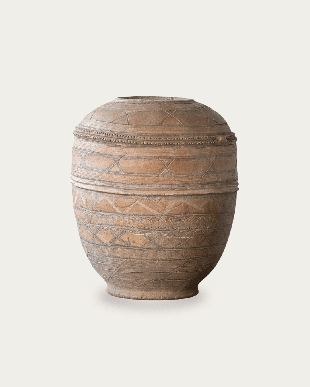
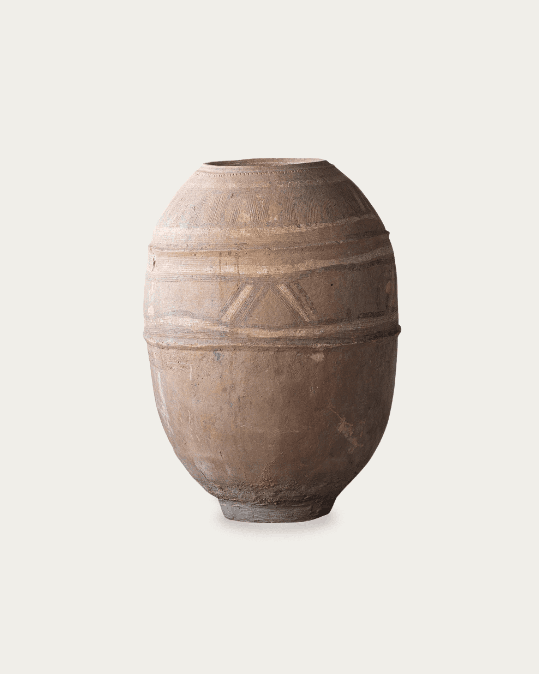
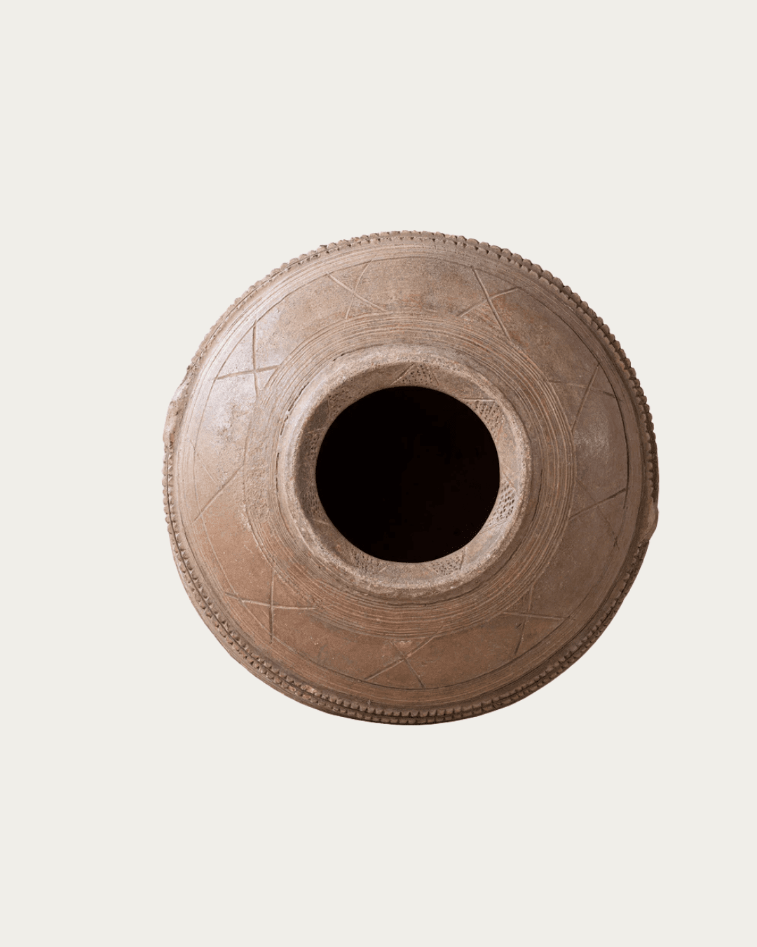
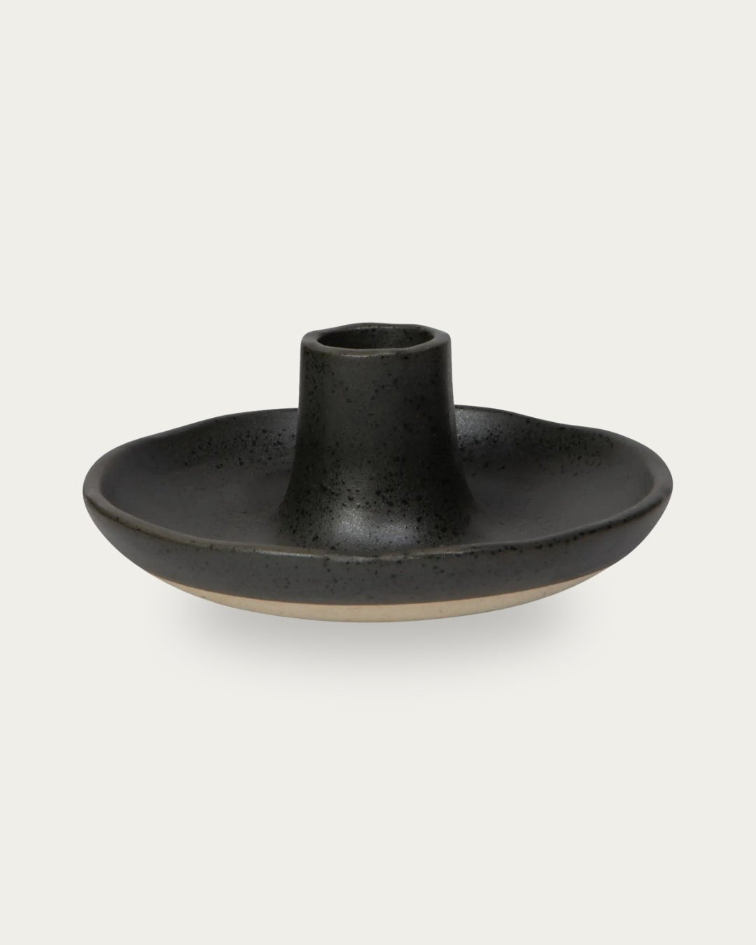
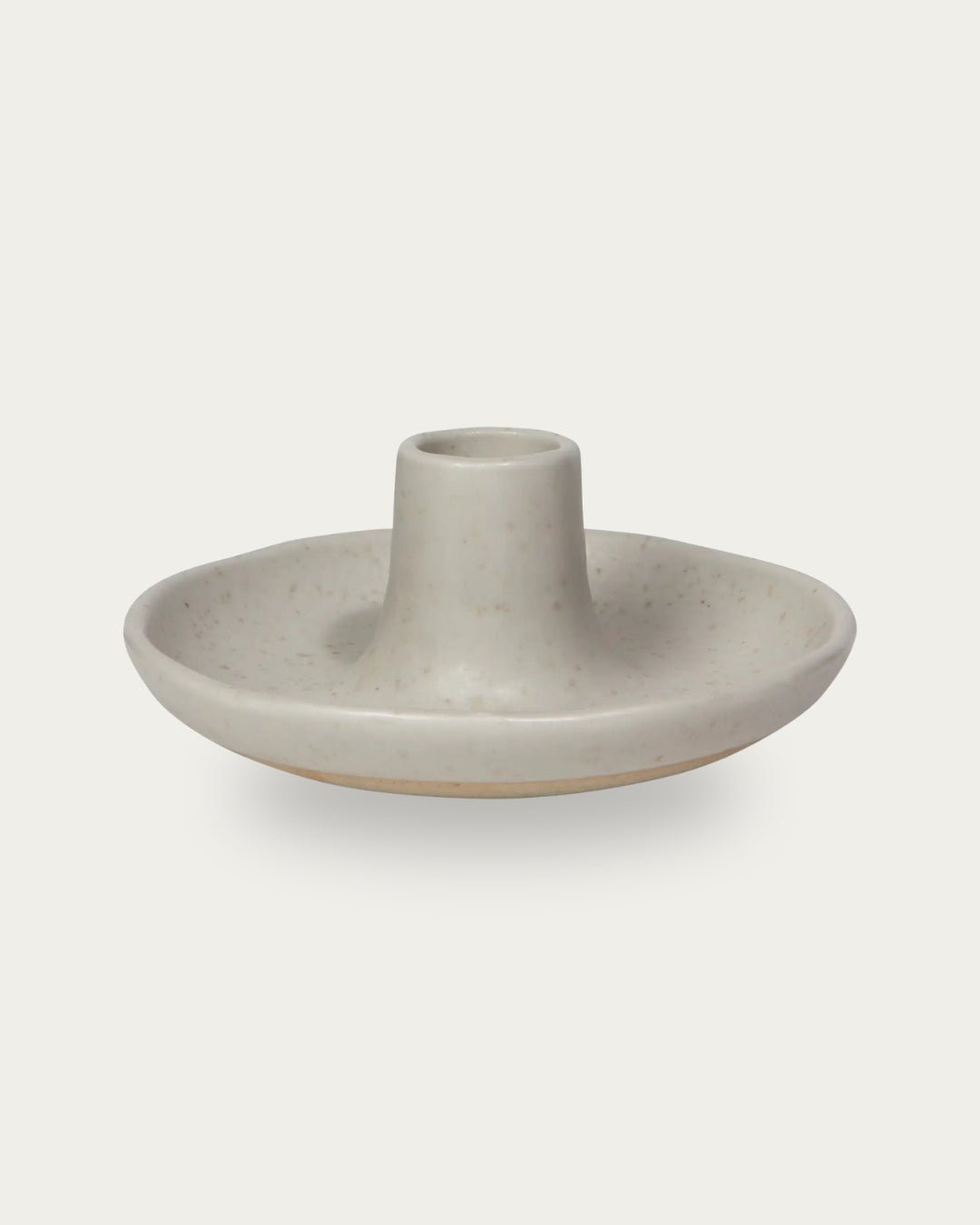
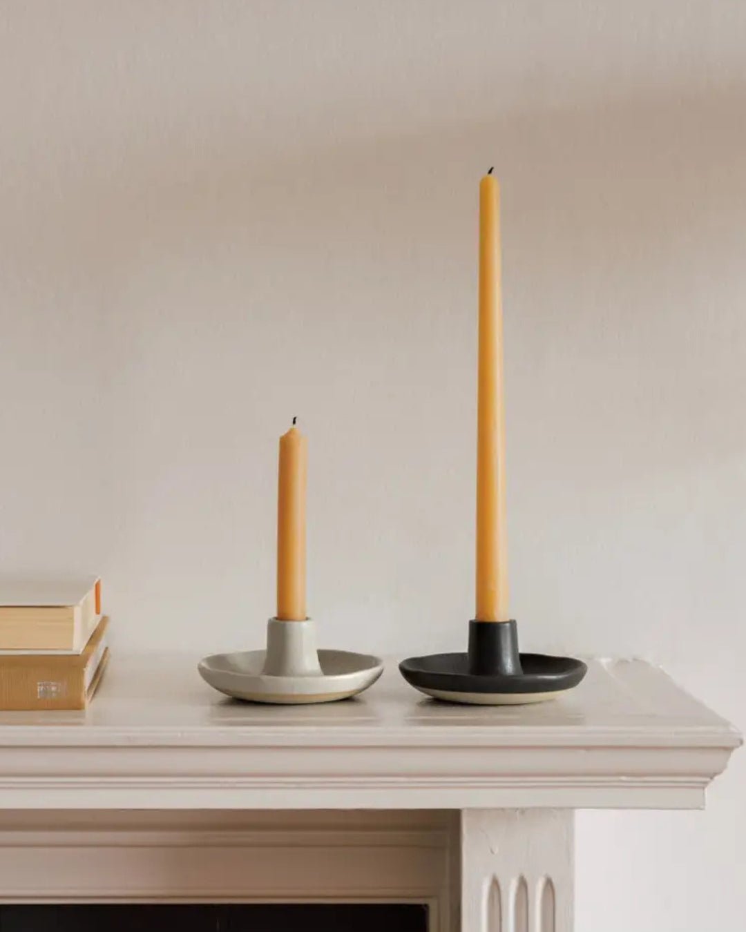
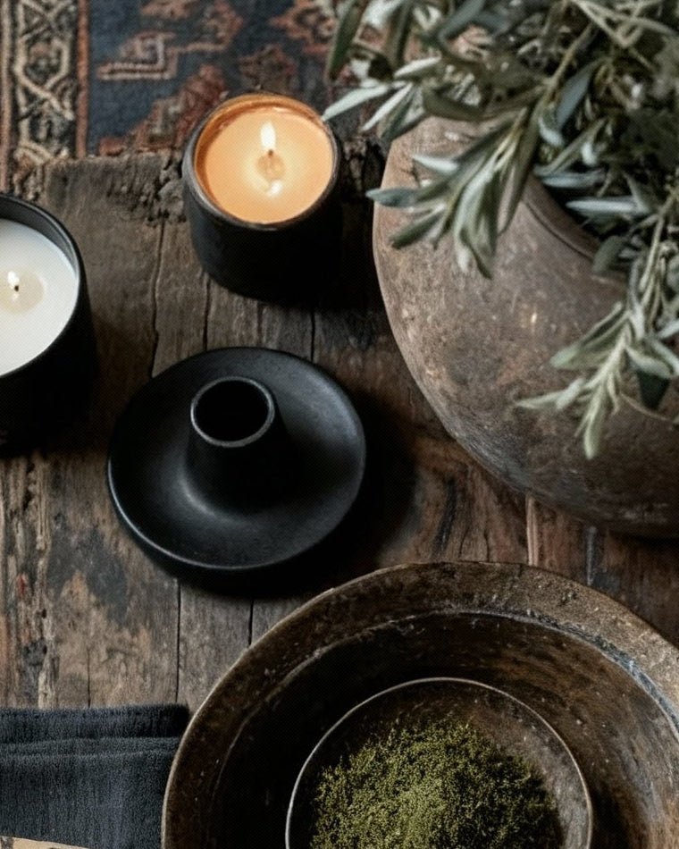
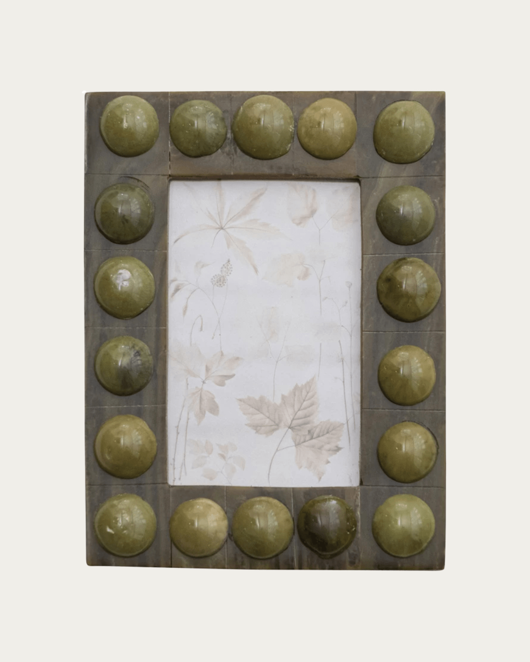
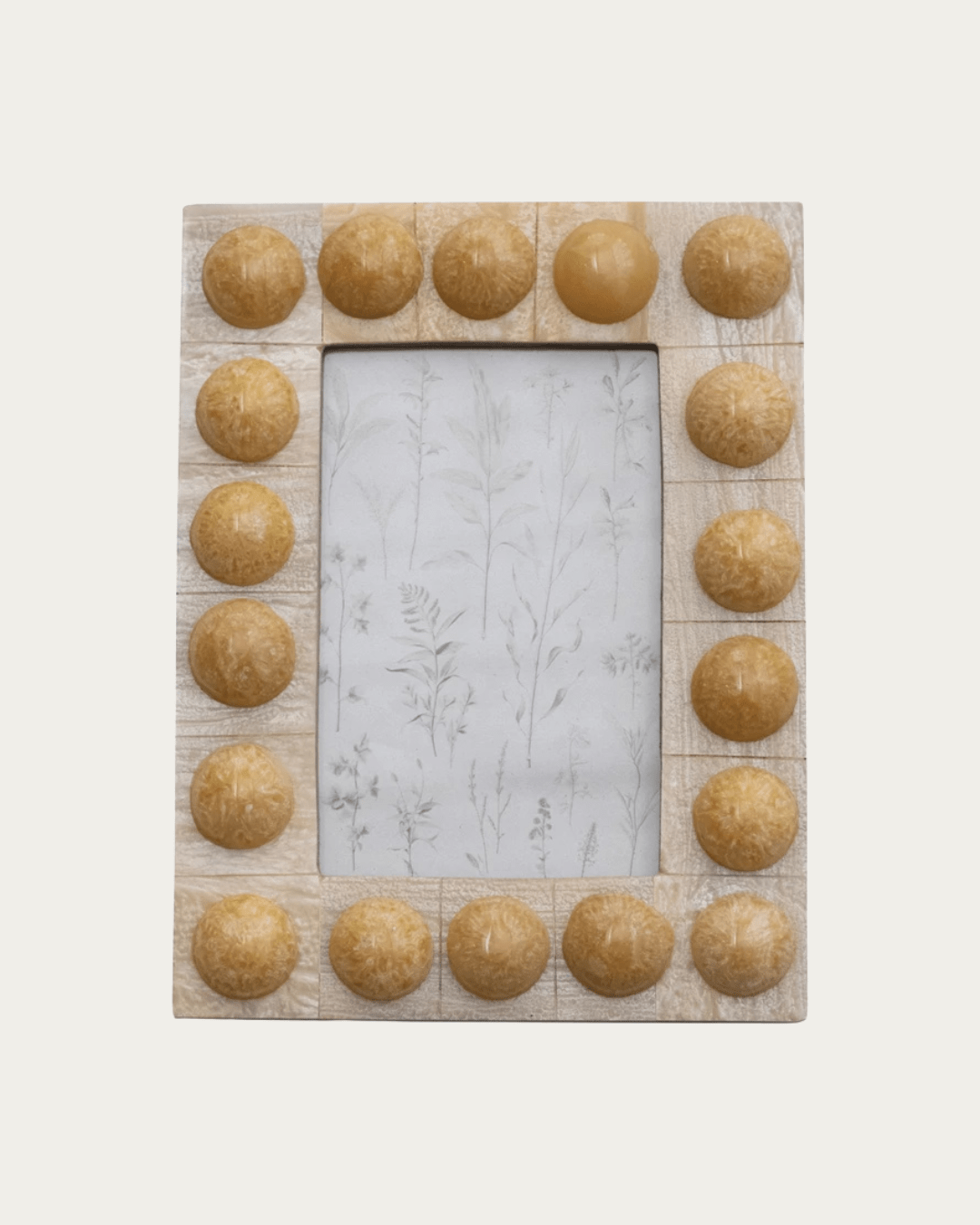
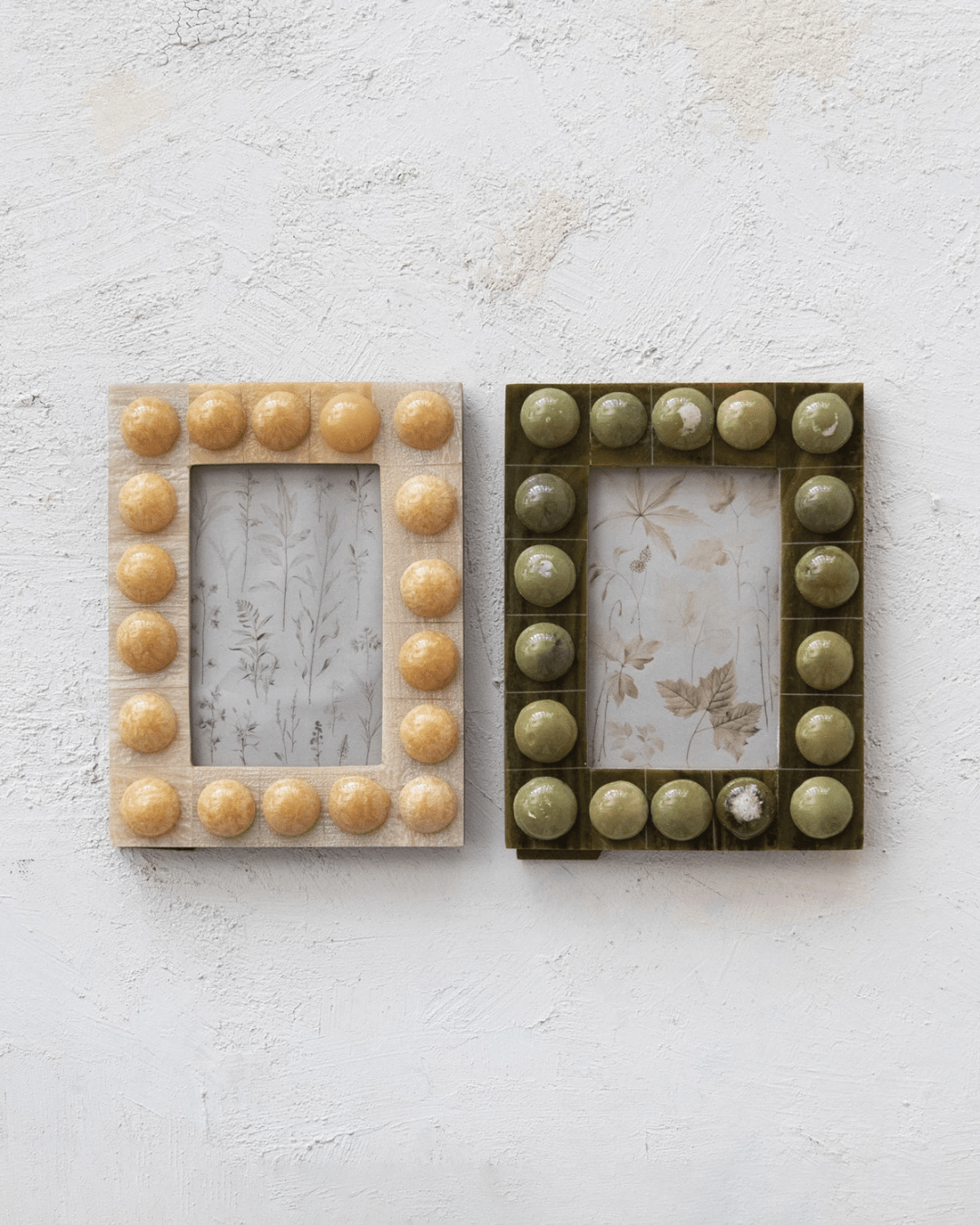
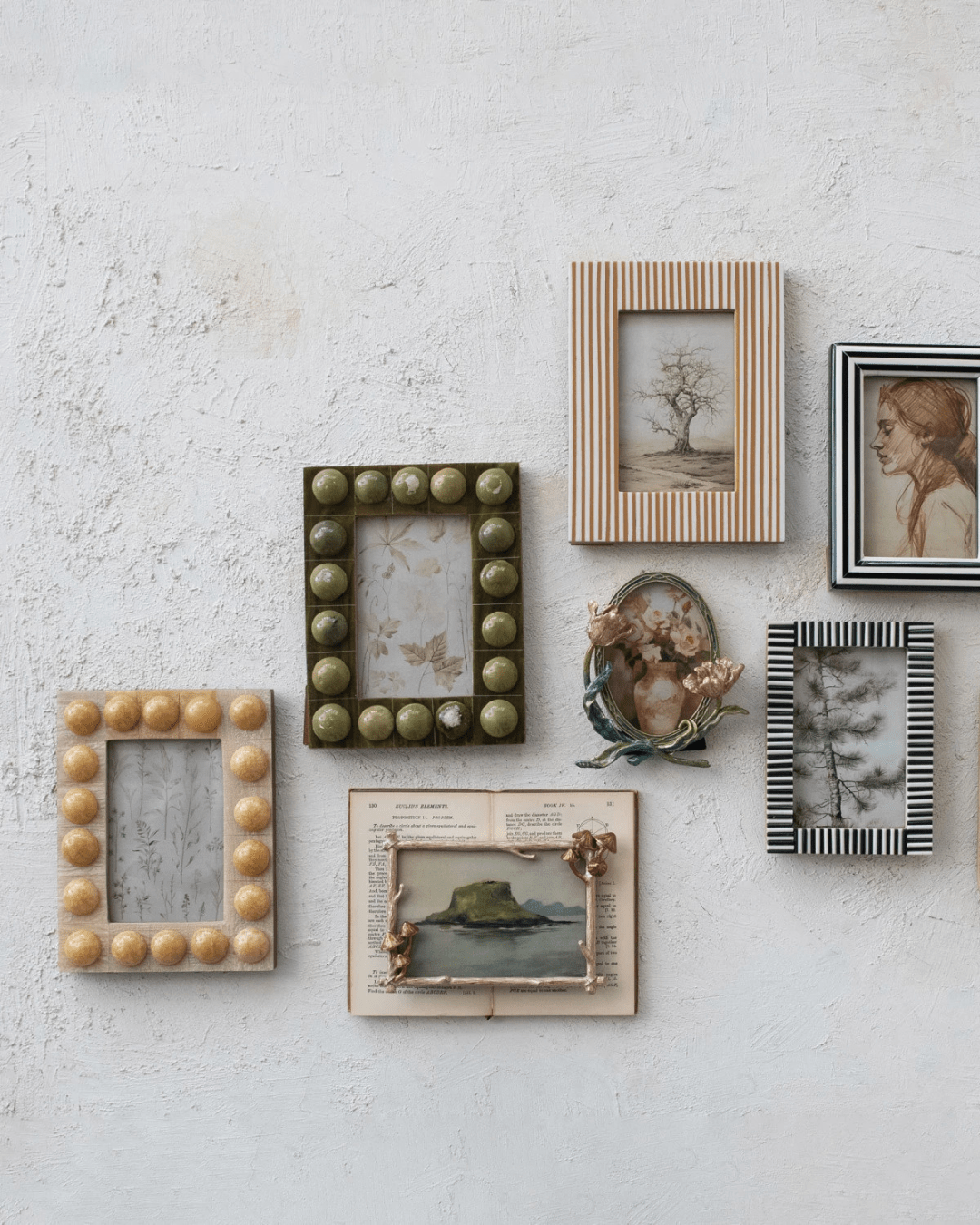
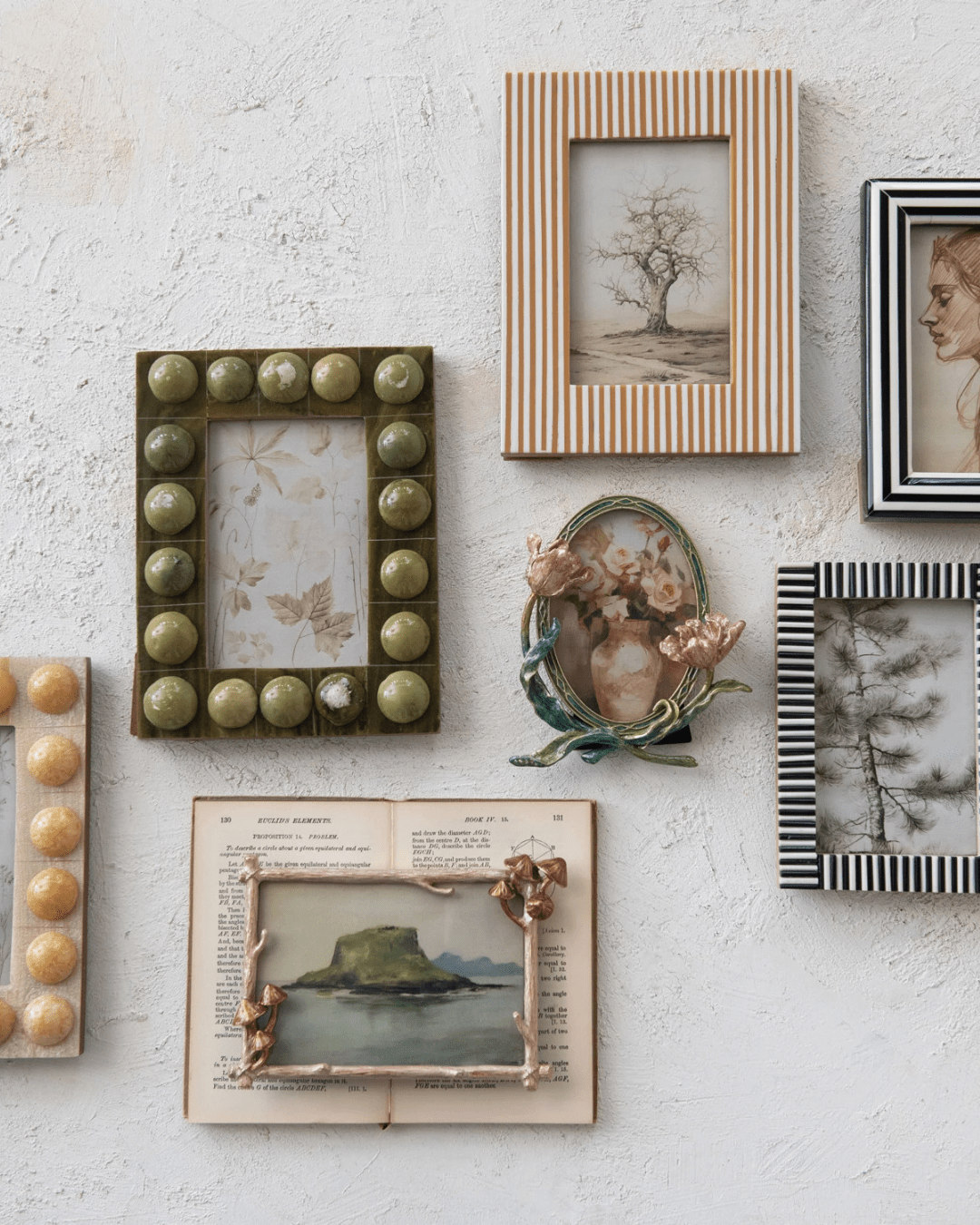
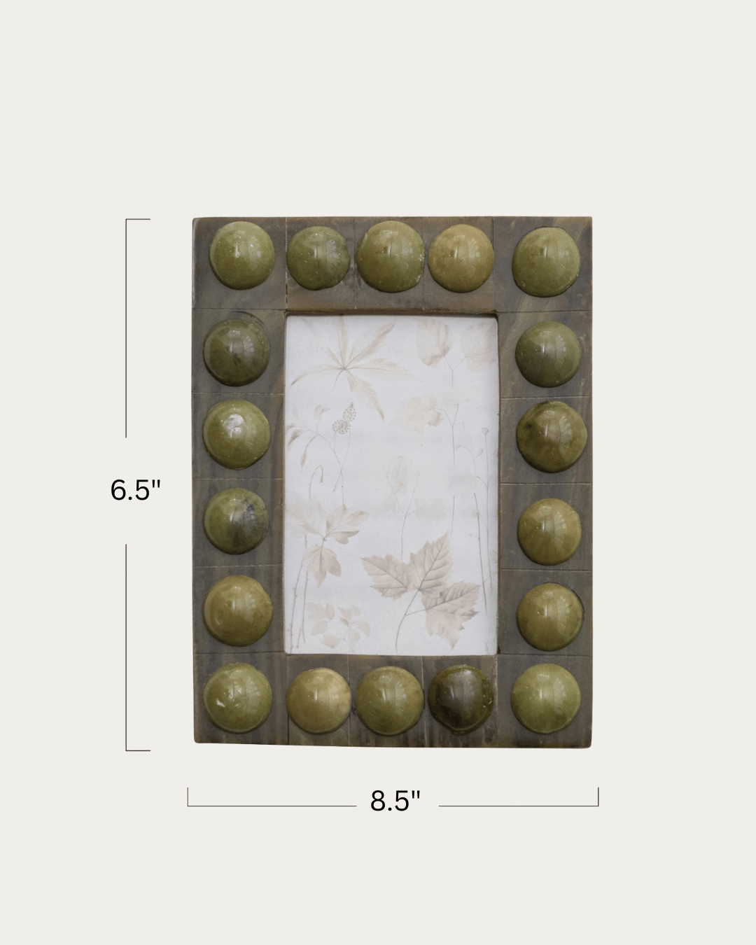
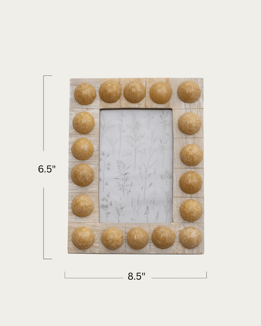
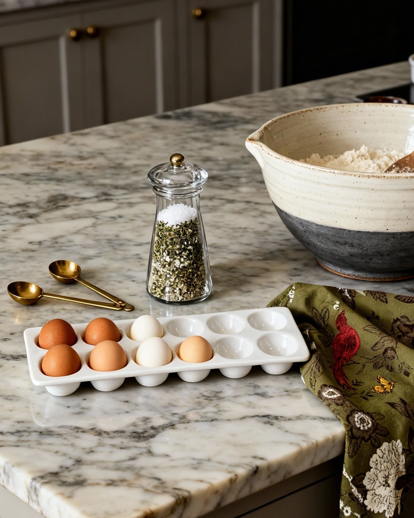
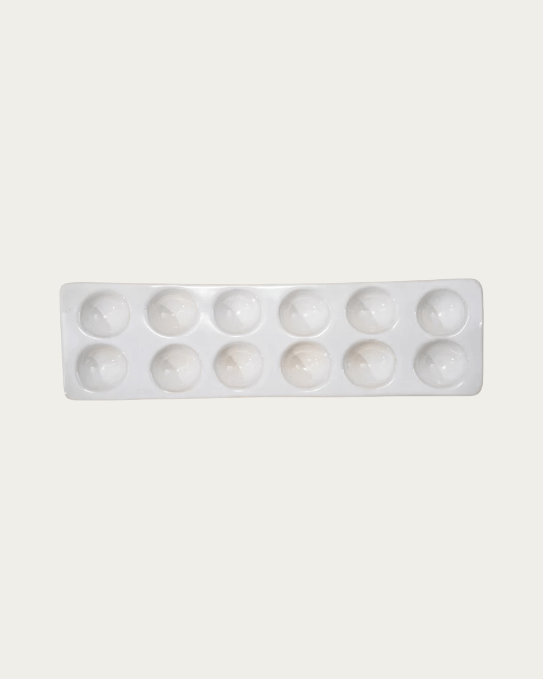
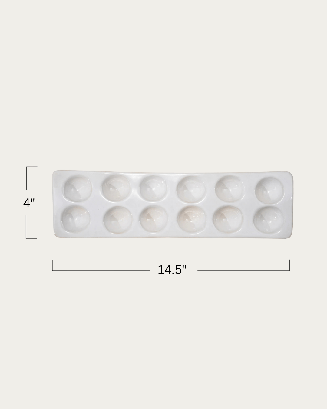
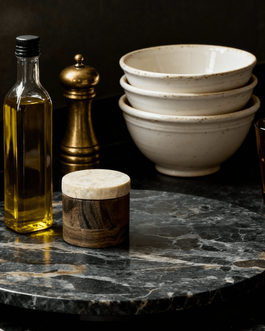
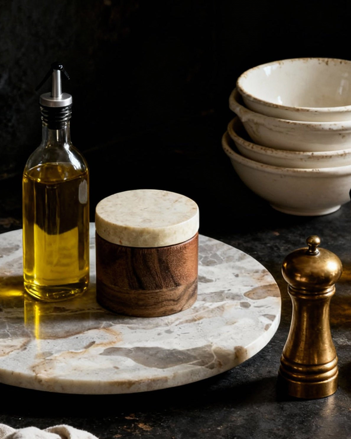
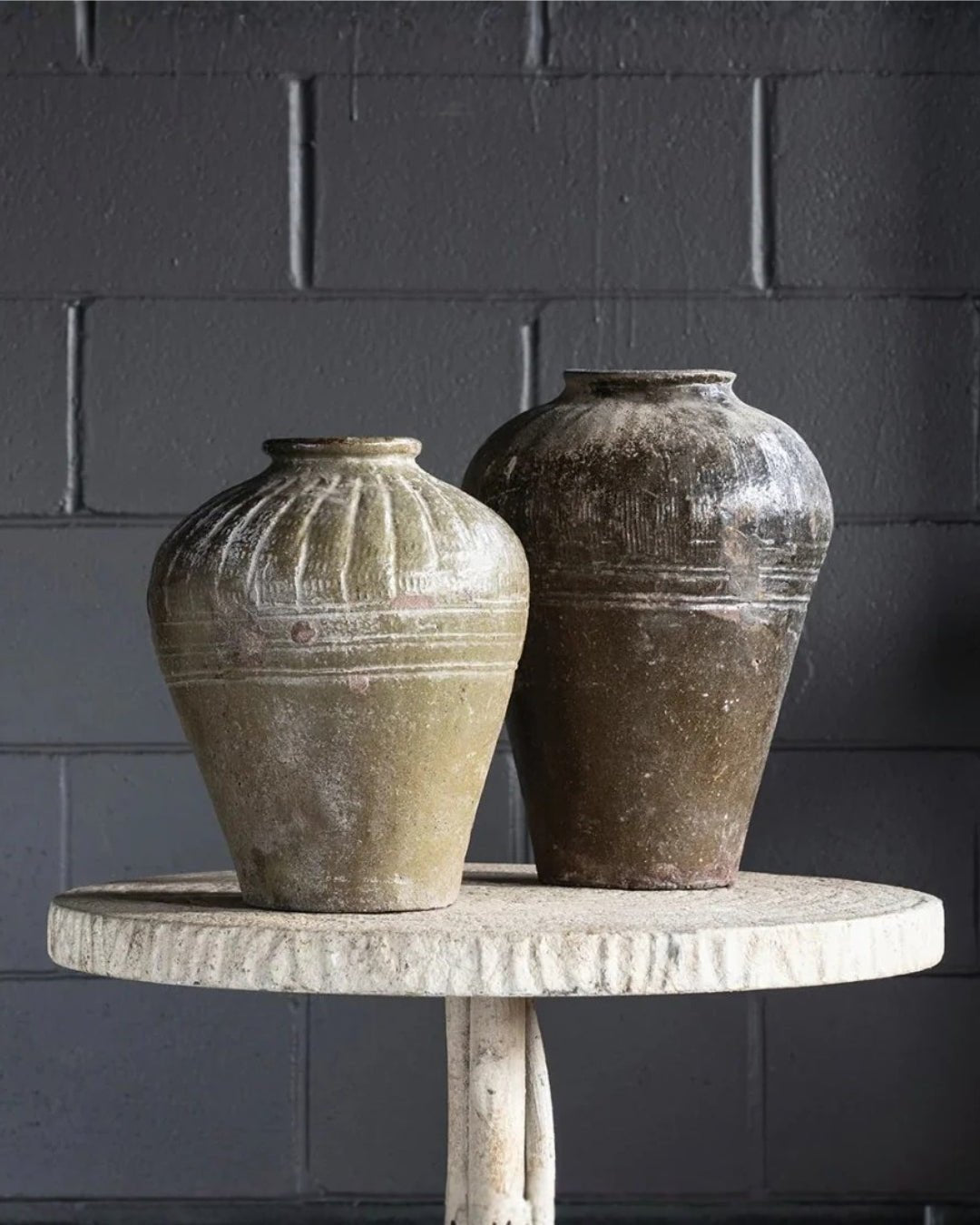
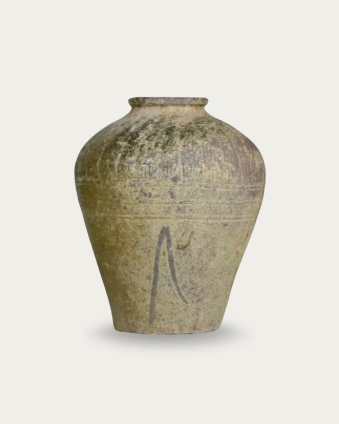
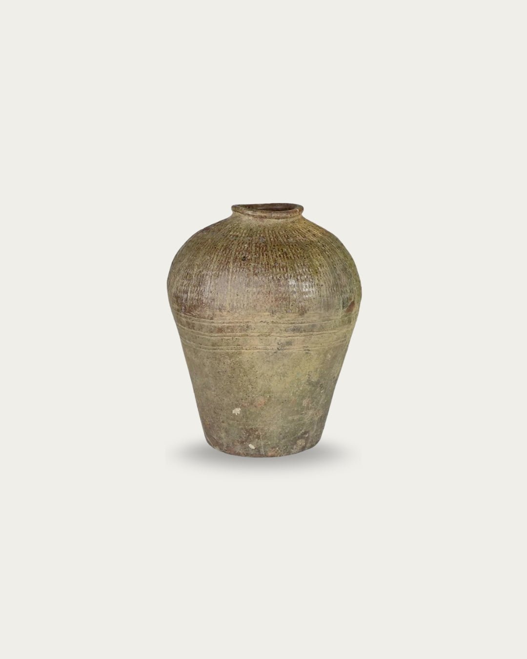
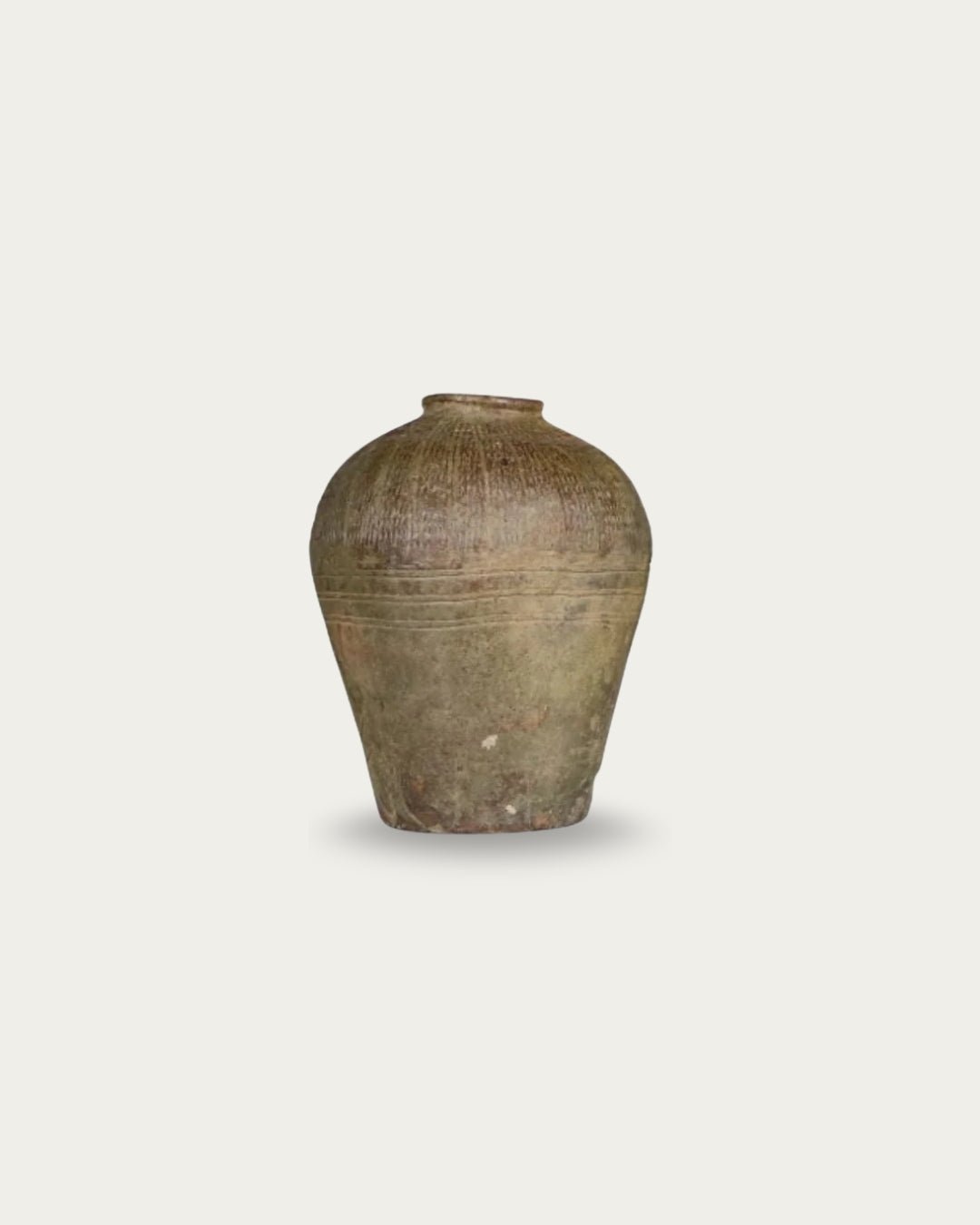
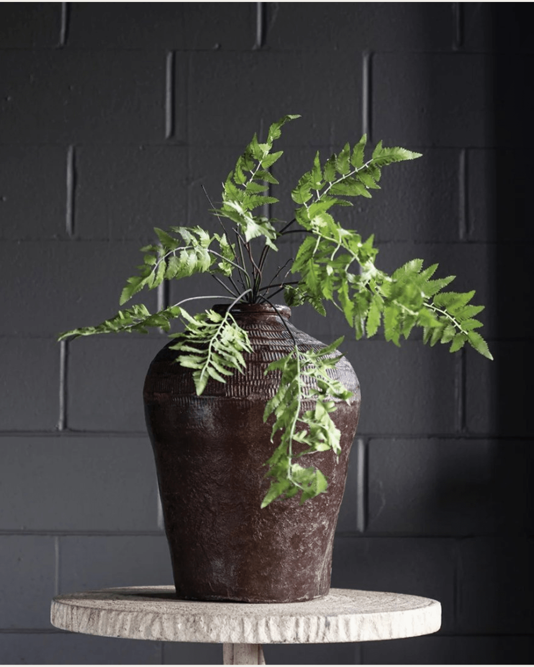
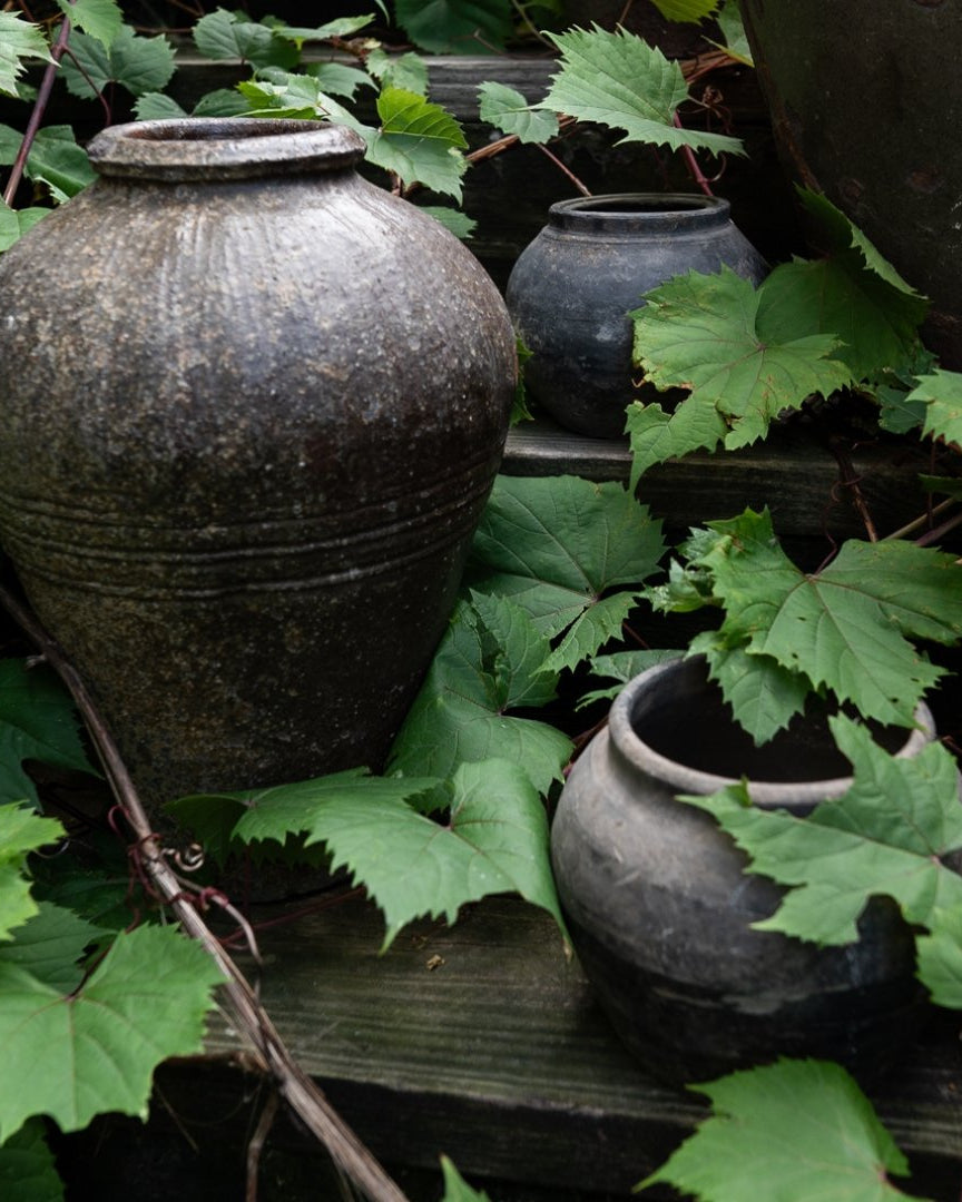
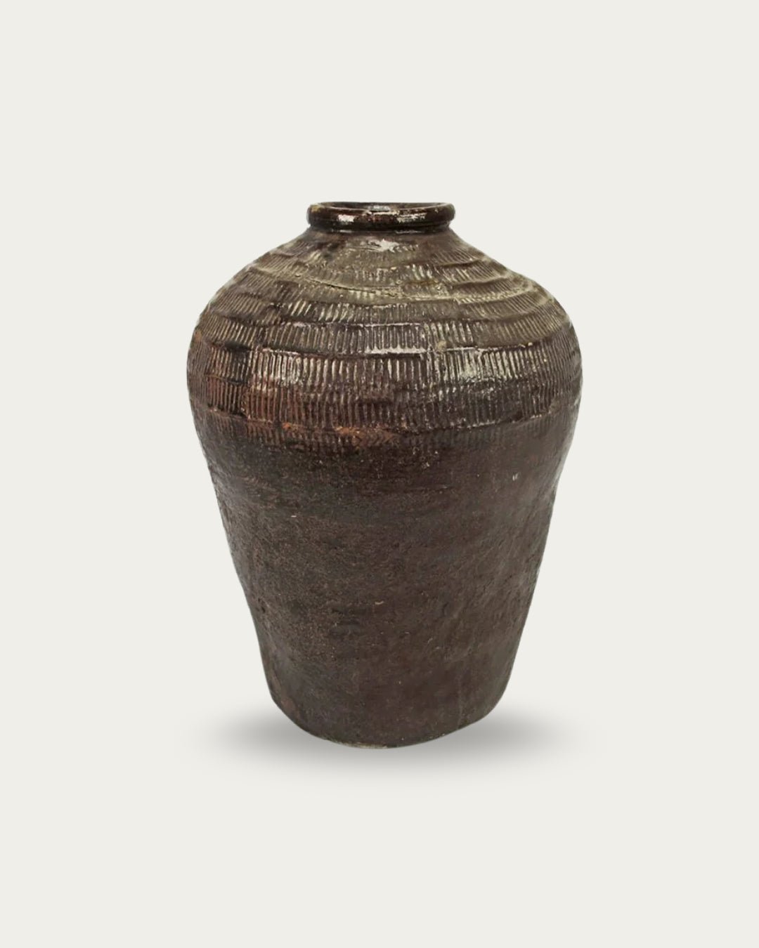
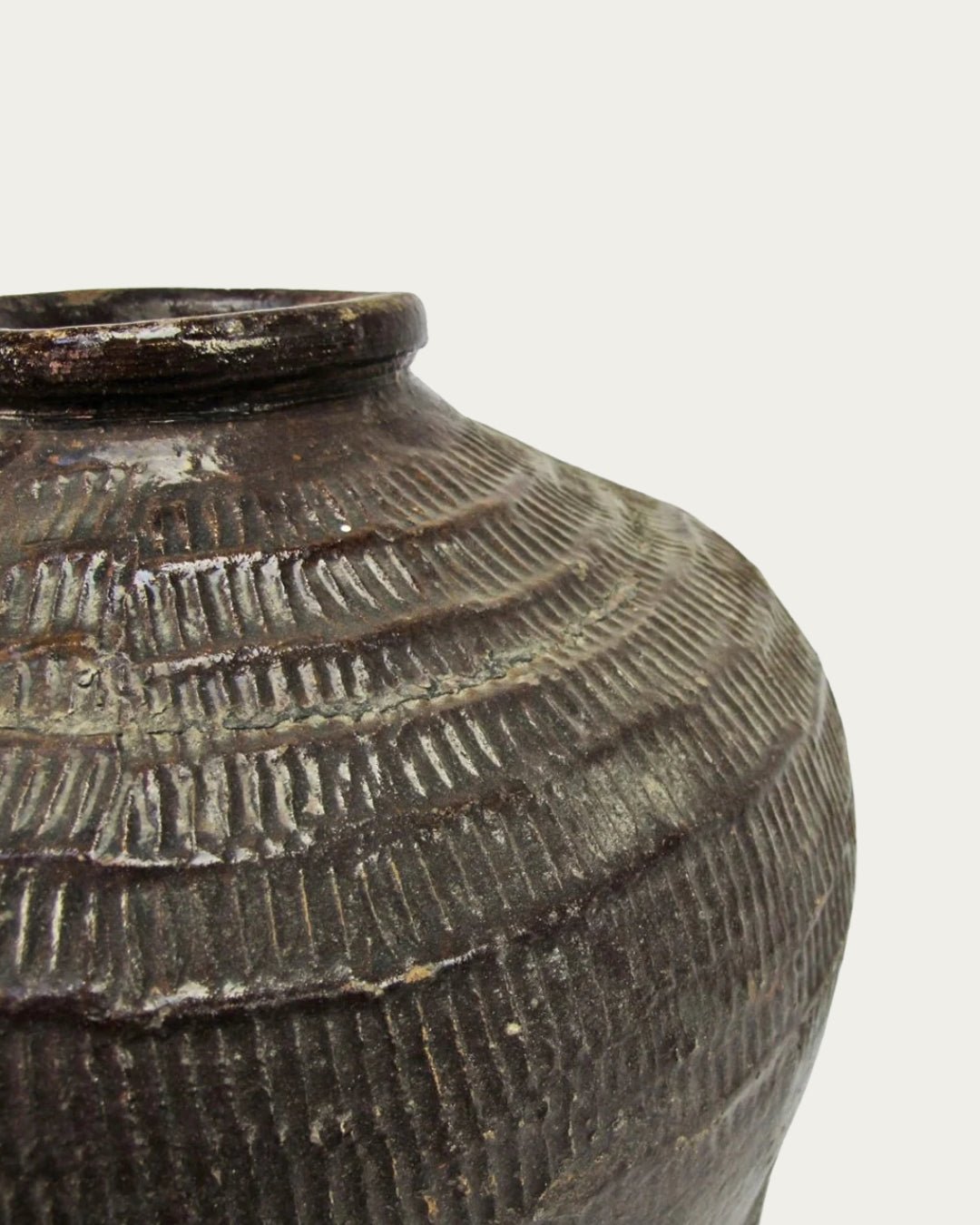
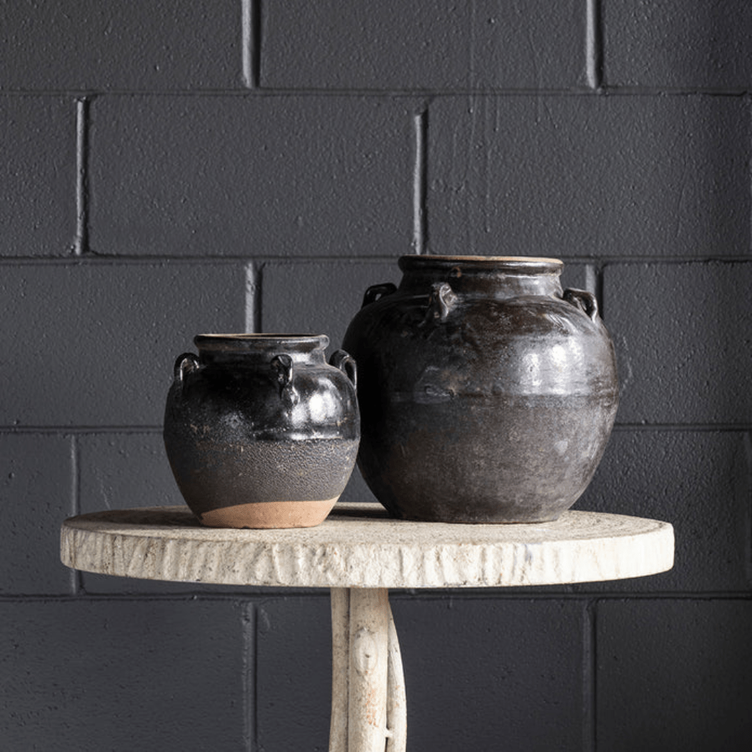
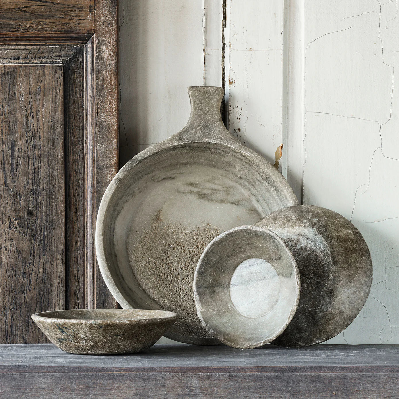
Vintage pottery and artwork for soulful storytelling
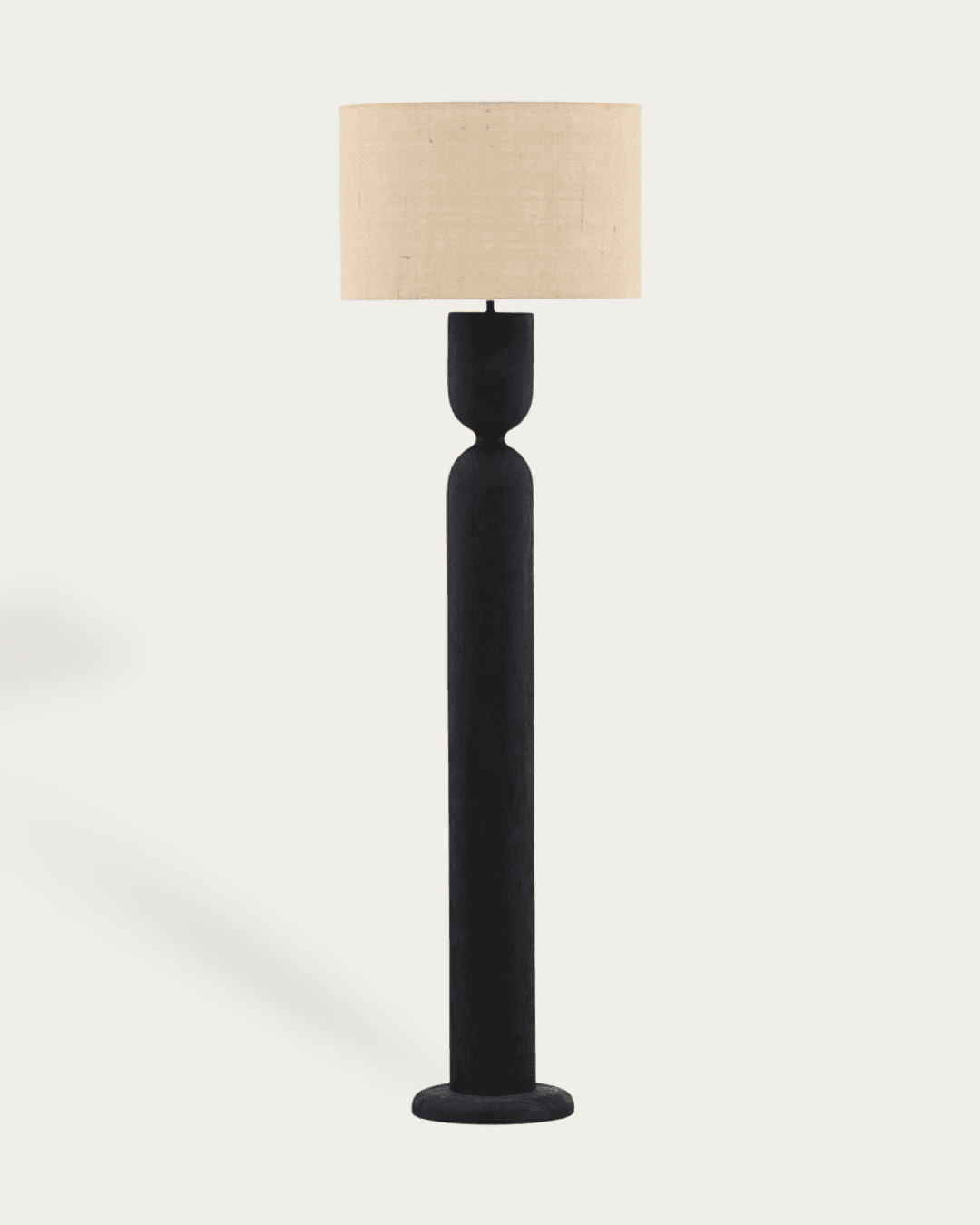
Lighting that casts a soft, moody glow
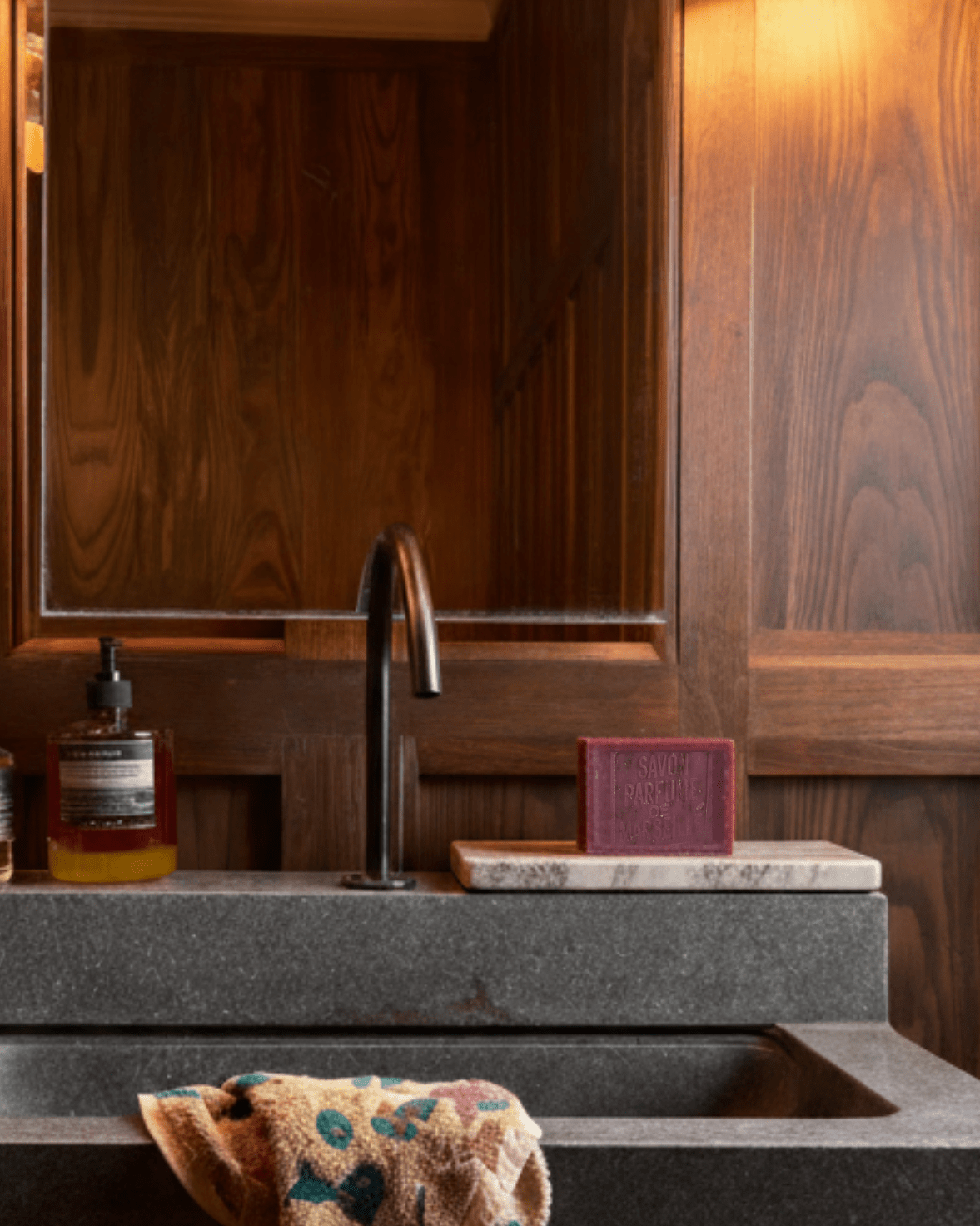
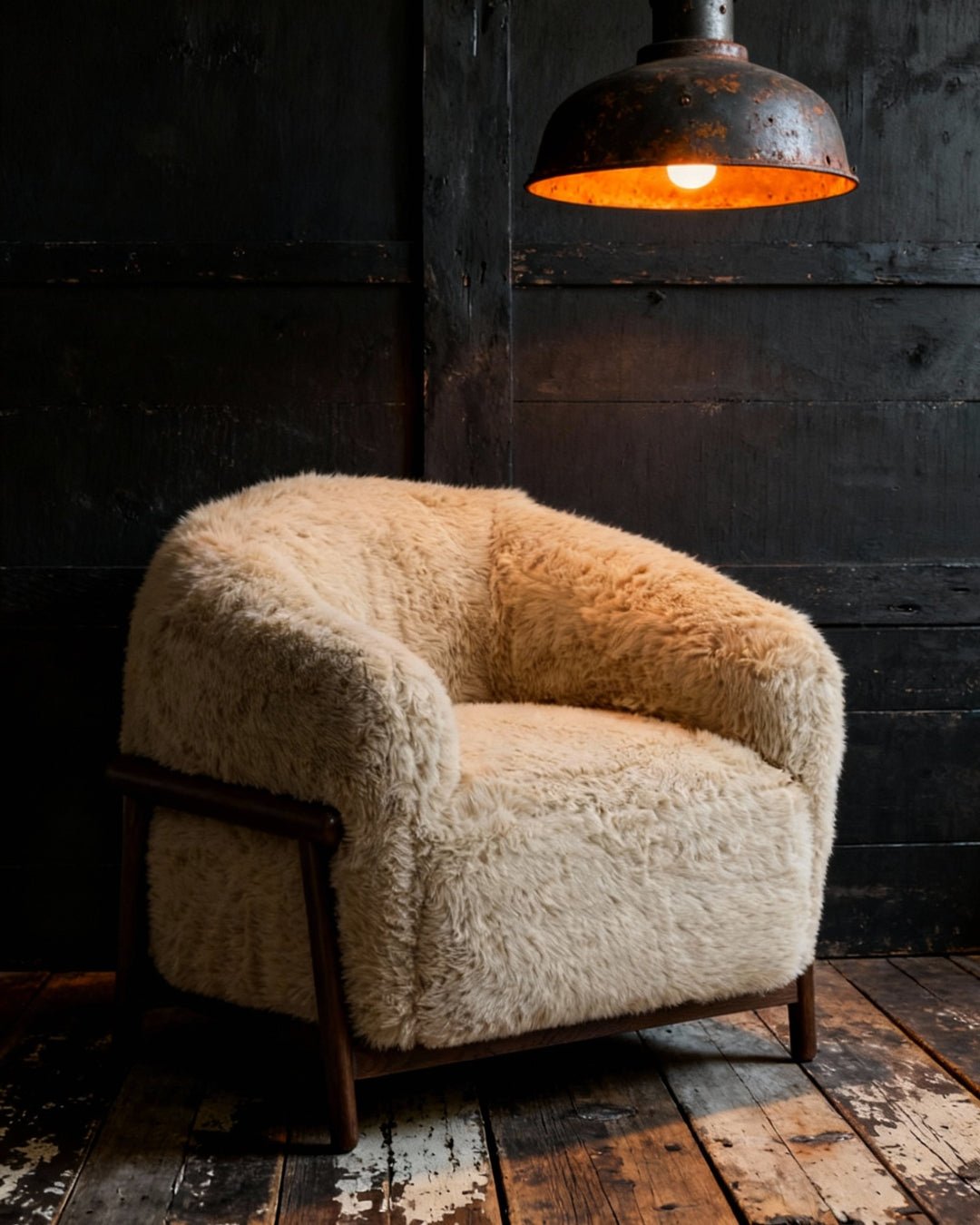
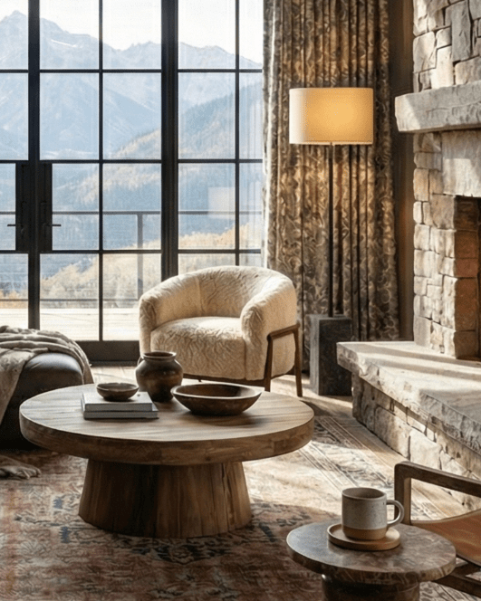
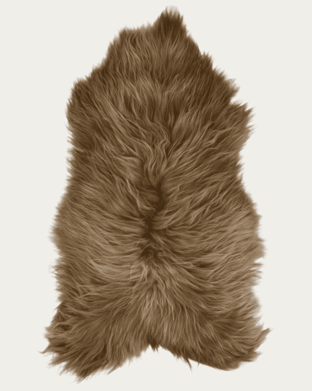
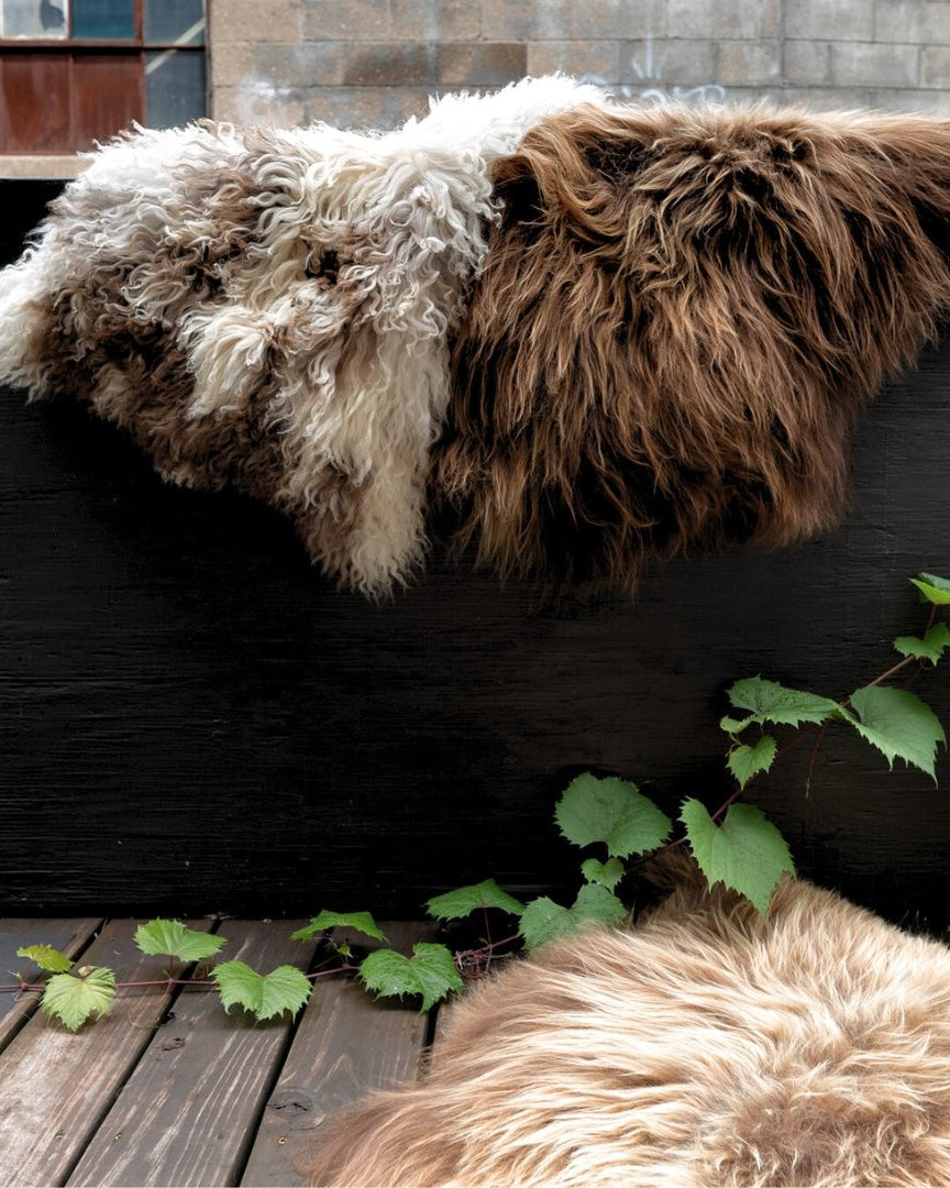
Natural materials like leather, sheepskin, and linen that beg to be touched
Each piece was chosen to help you create a space that feels grounding, alive, and deeply personal — not just trendy summer decor.
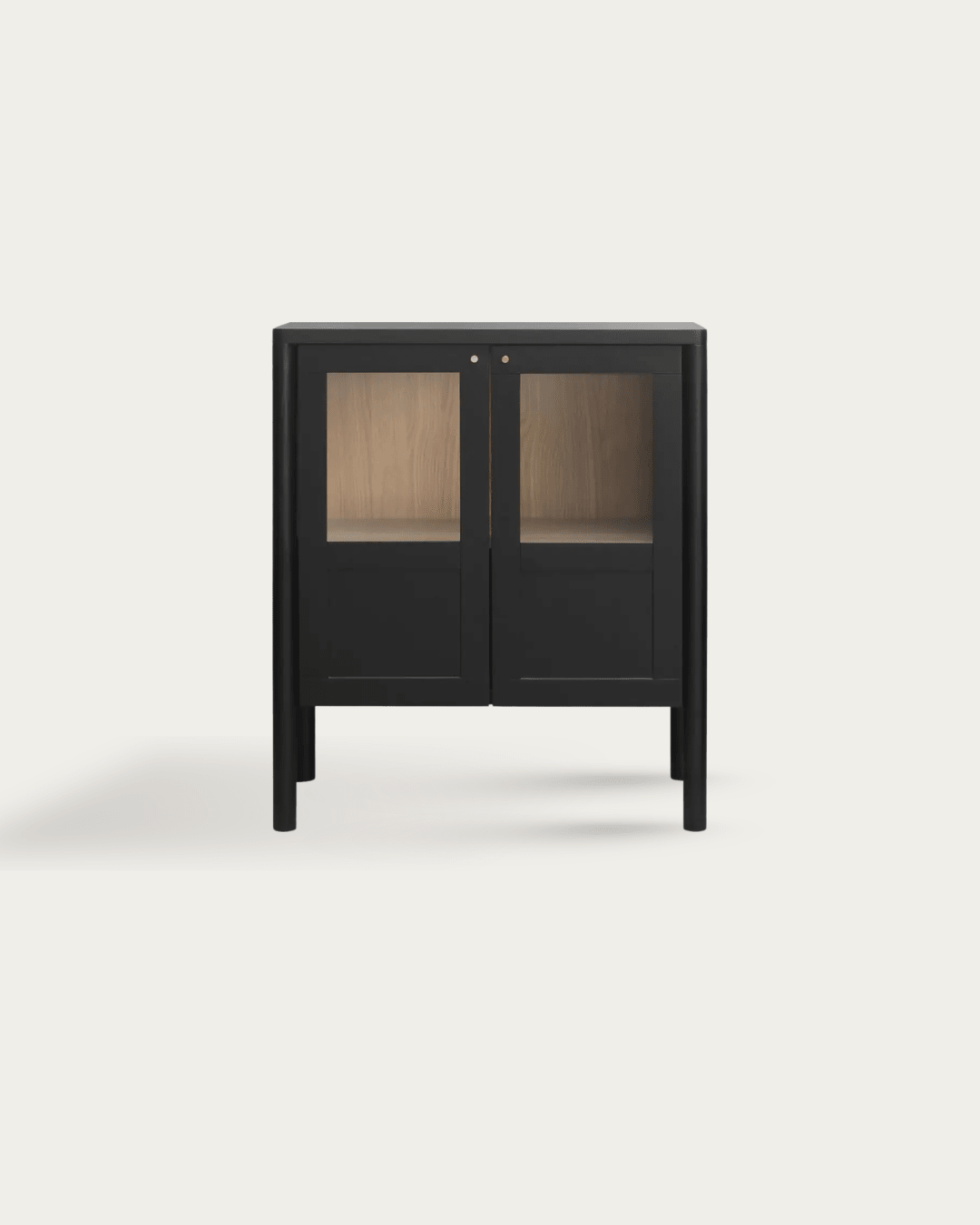
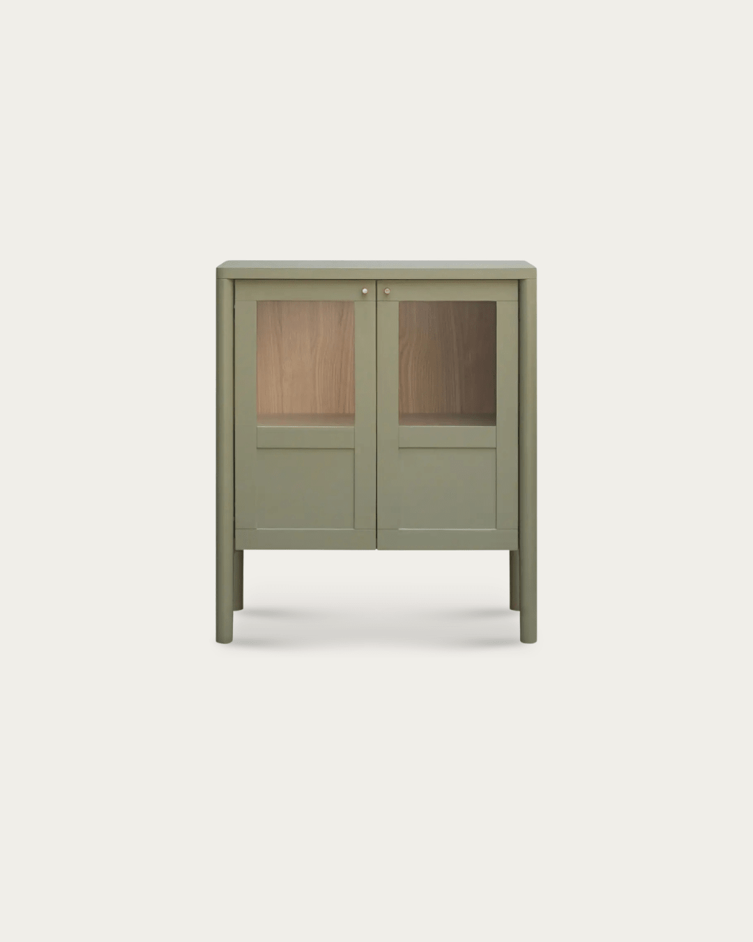
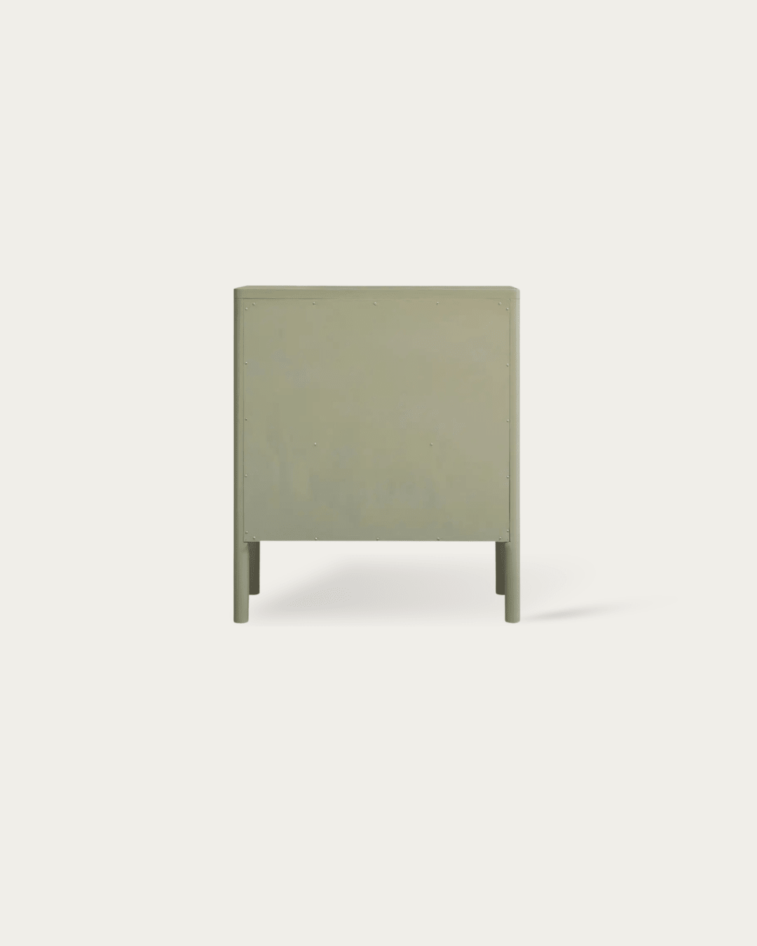
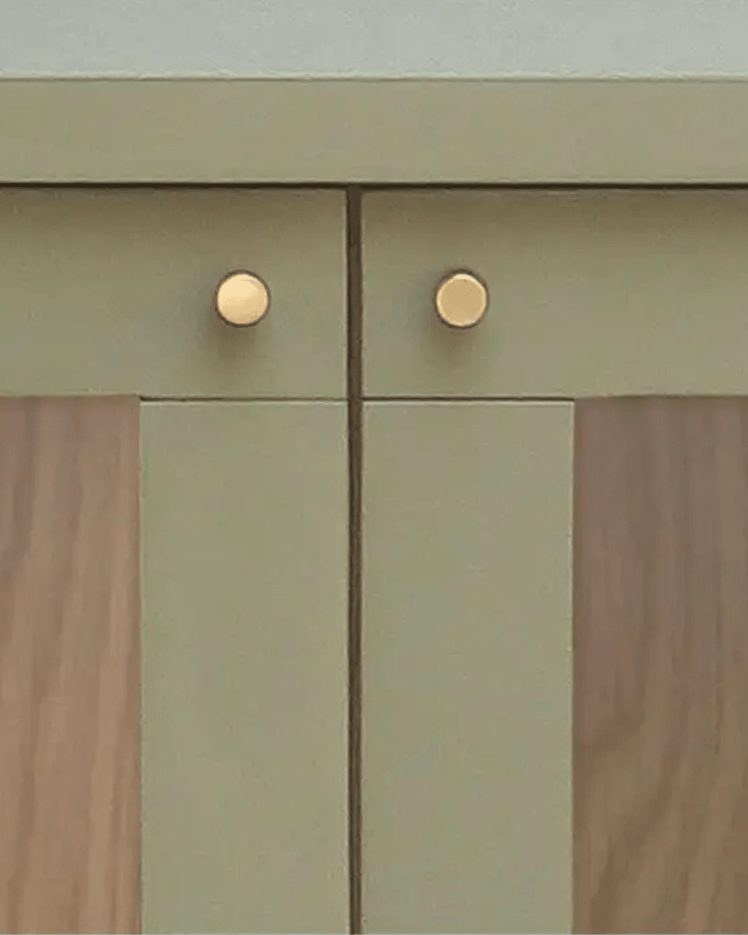
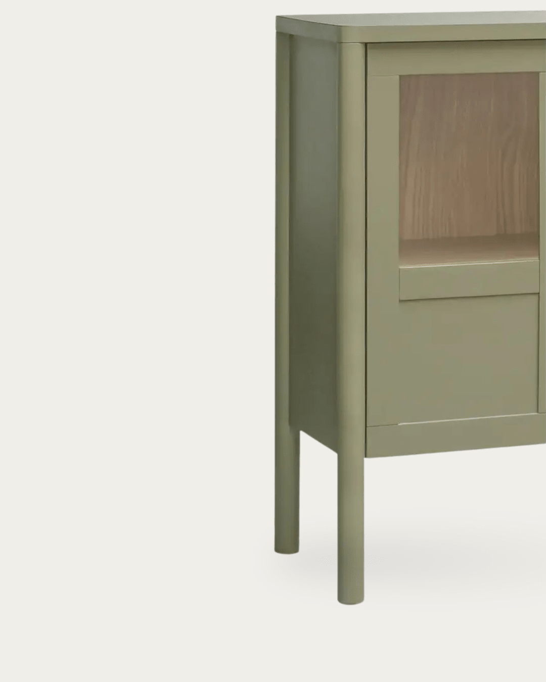
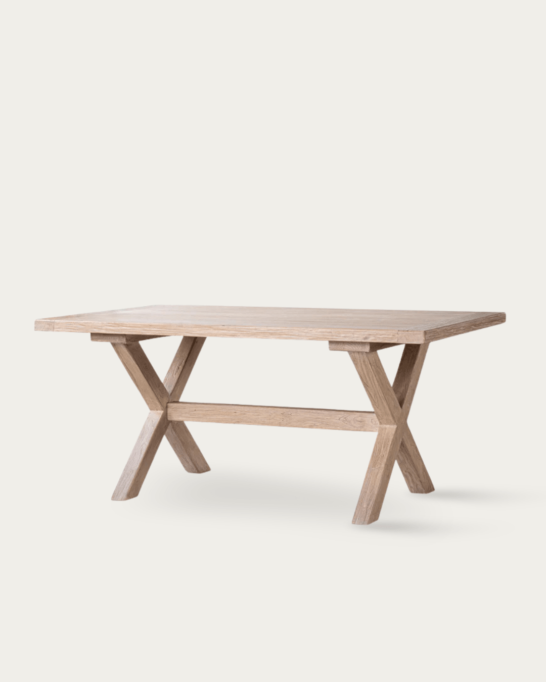
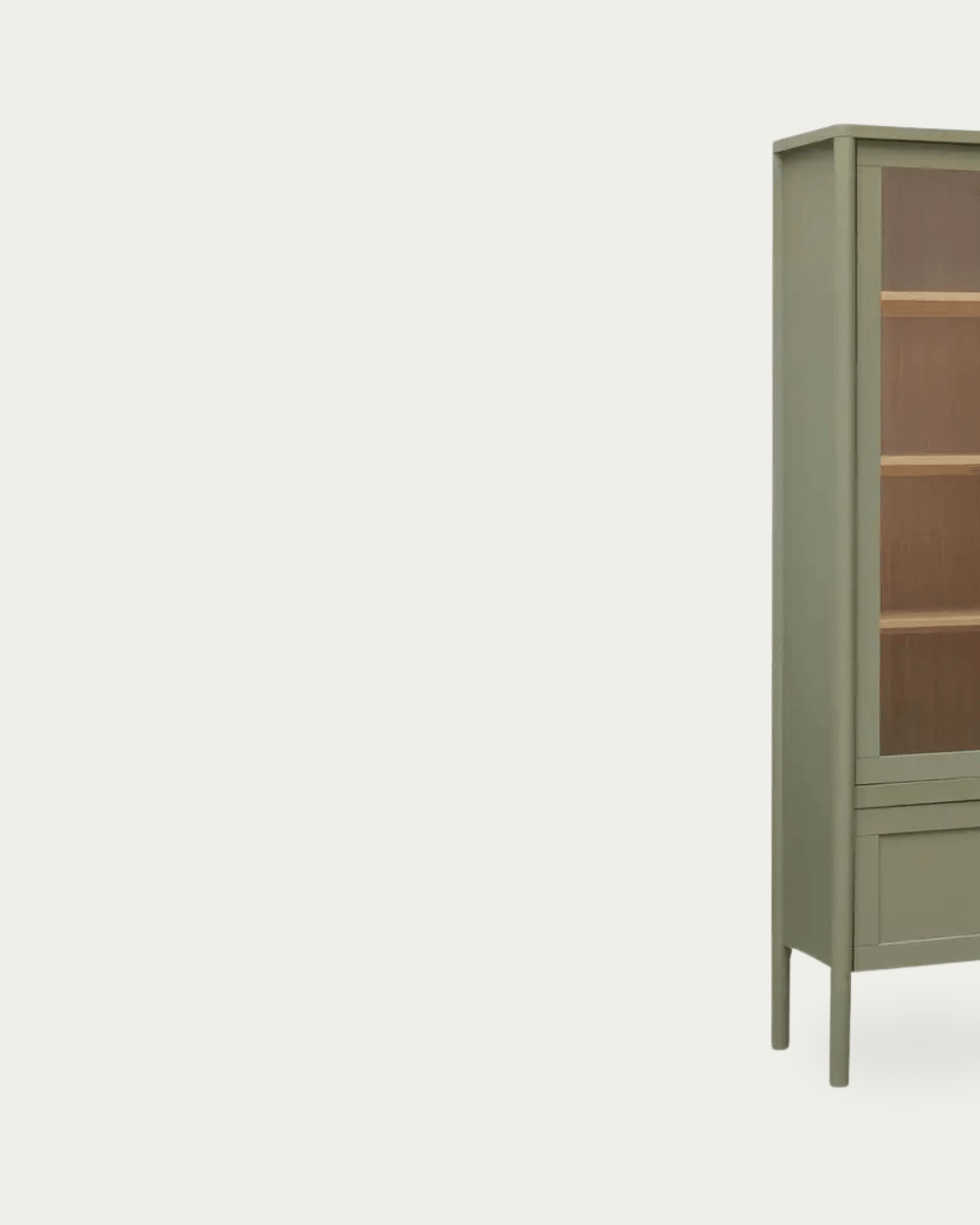
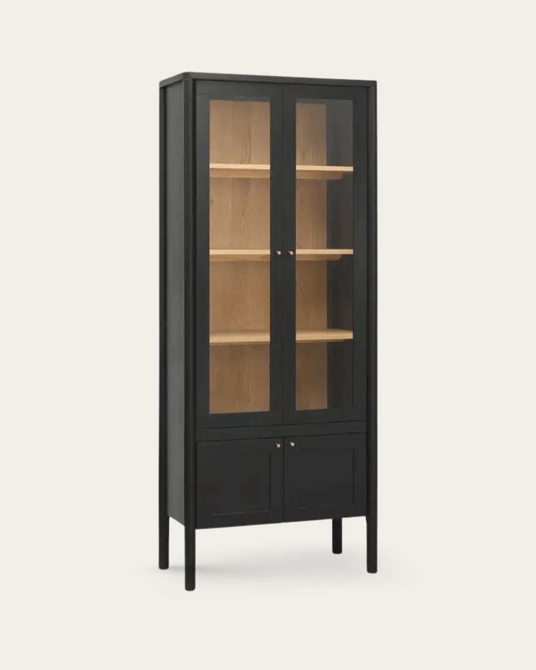
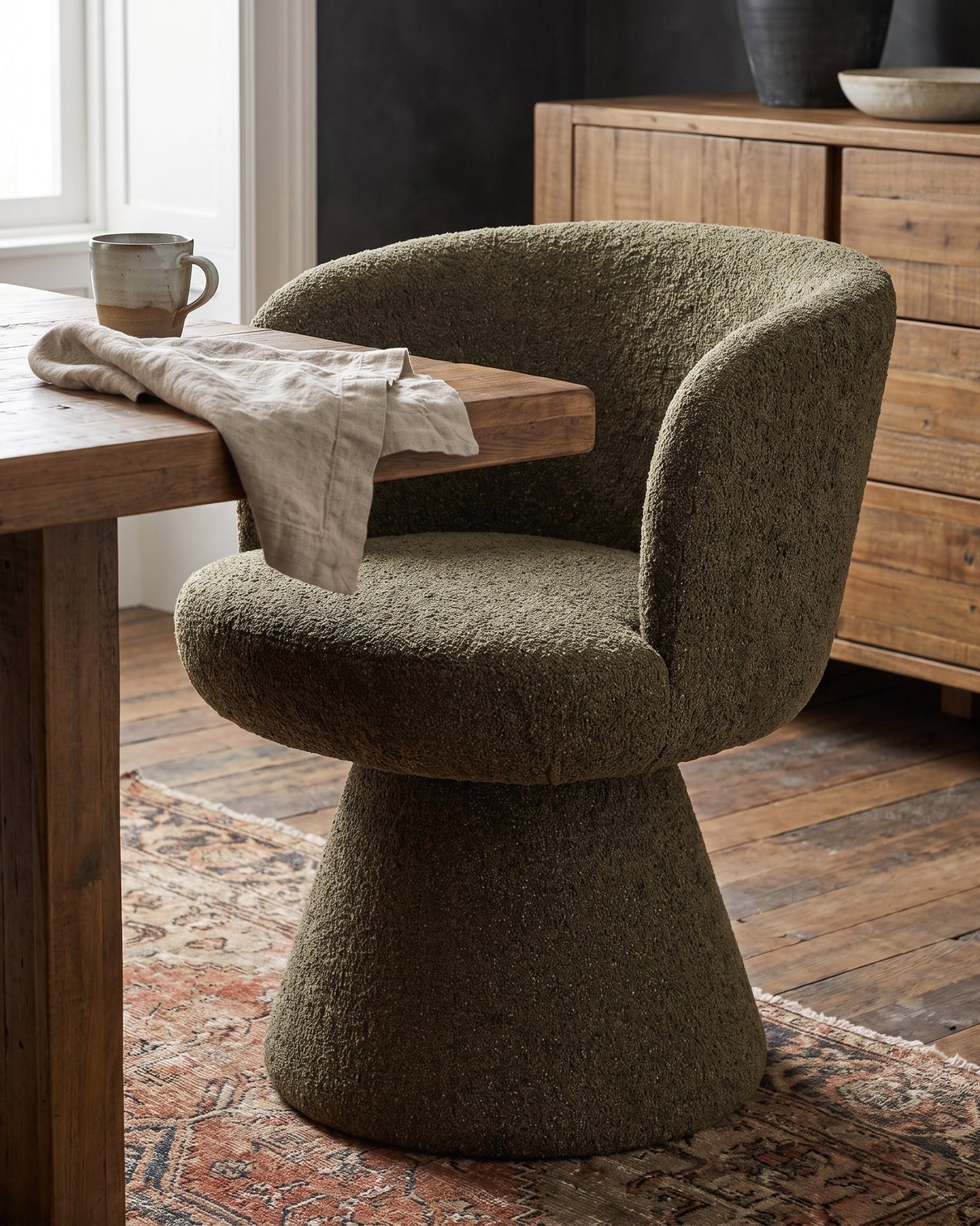
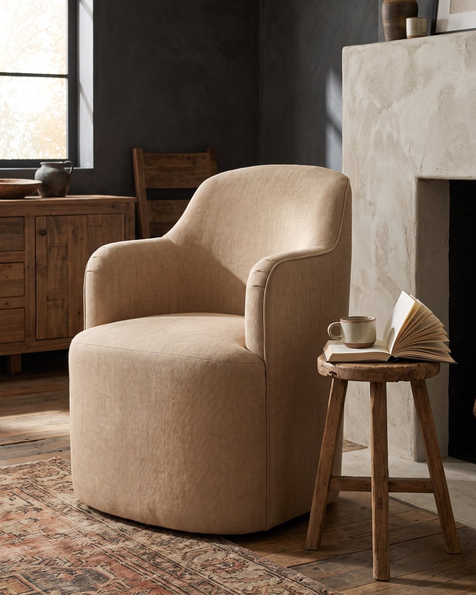
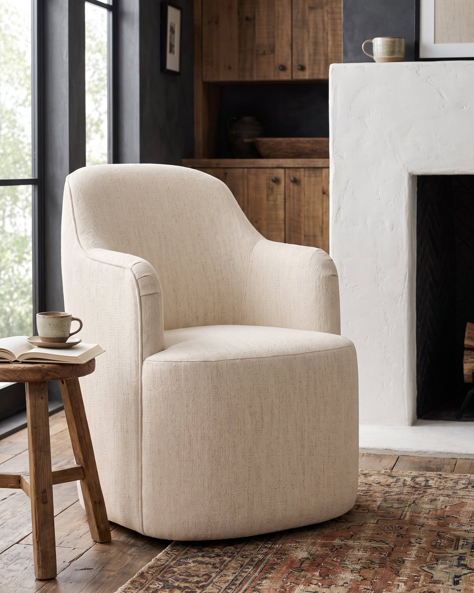
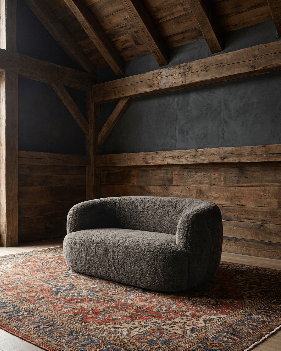
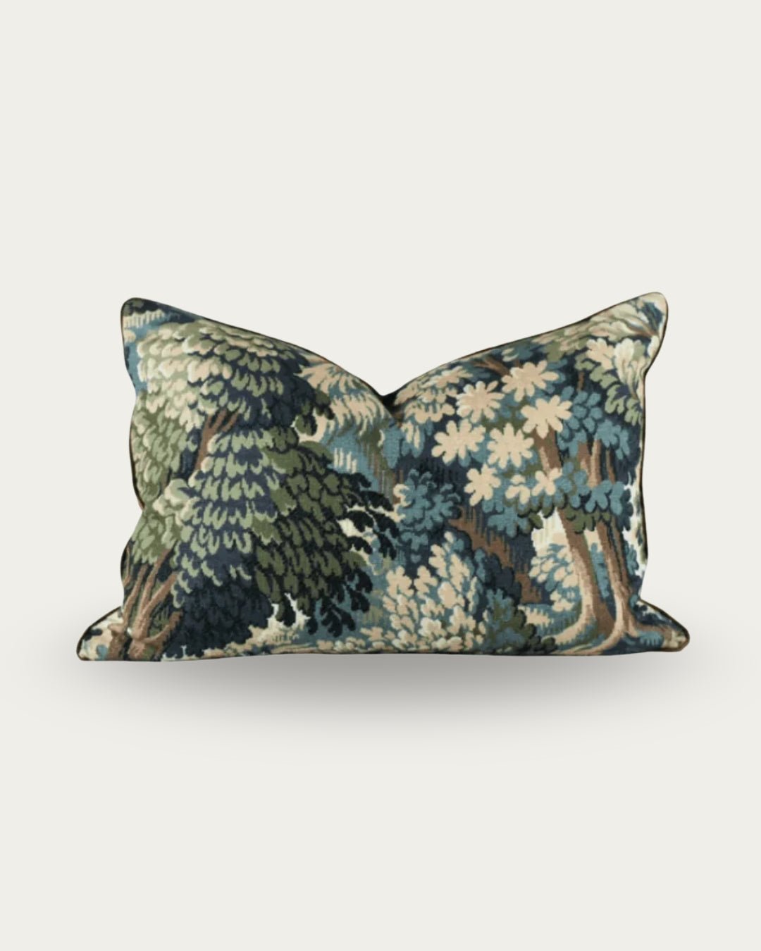
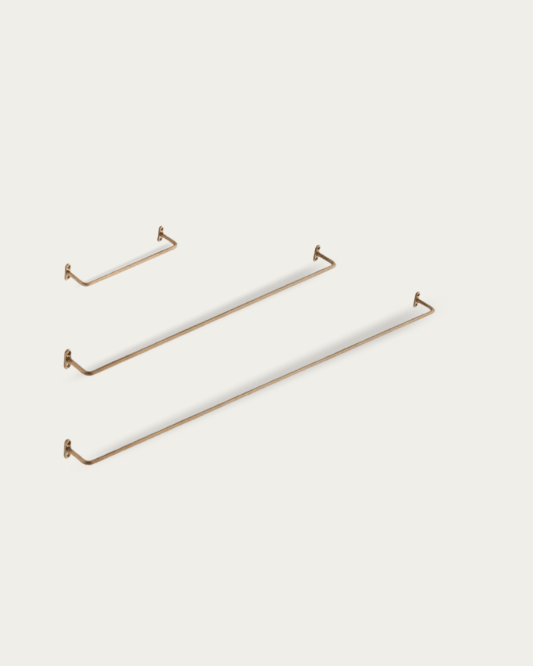
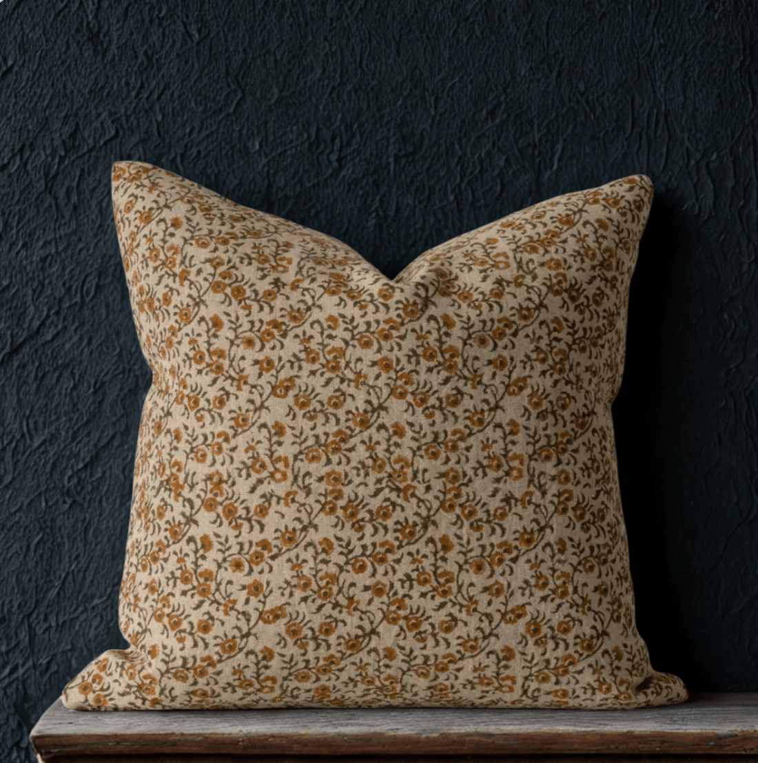
My Favorites from the Summer Decor Collection
My Favorites from the Summer Furniture Collection
Why Moody Works for Summer
Summer often pushes us toward crisp whites and airy pastels, but I wanted something different.
A moody color palette can feel cool and serene during hot months, while still feeling connected and comforting when the sun goes down. It creates spaces that invite you to linger, to feel cocooned, and to sink into softness — even in the middle of July.
If you’re craving a home that feels layered and soulful instead of cookie-cutter summer trends, this collection is for you.
What I Brought Home
This vintage weight scale once settled deals—spices, metals, whatever was on the table. The iron base is newly reconstructed, but the arms and pans are the real thing, pulled from trade markets across India. It’s all function-meets-form, even if you’re just using it to hold air plants or stage your shelf.
Shop the Summer Collection
Ready to bring this mood home? SHOP THE SUMMER COLLECTION
P.S. I’d love to know — which pieces from the new summer collection are speaking to you most? Leave a comment below or connect with me on Instagram and let’s talk summer design.


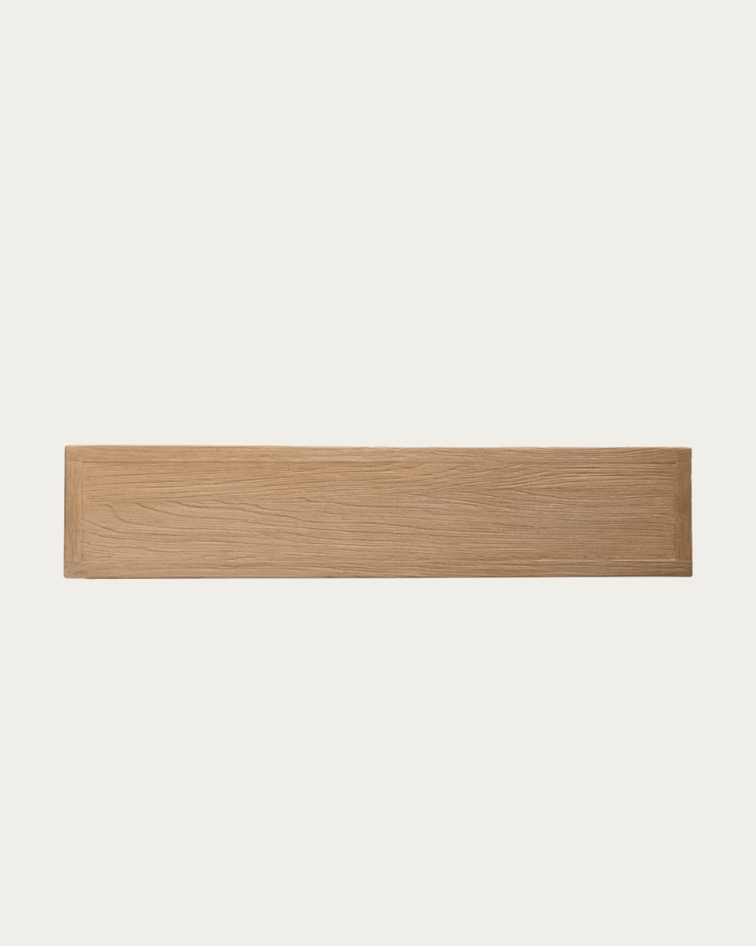
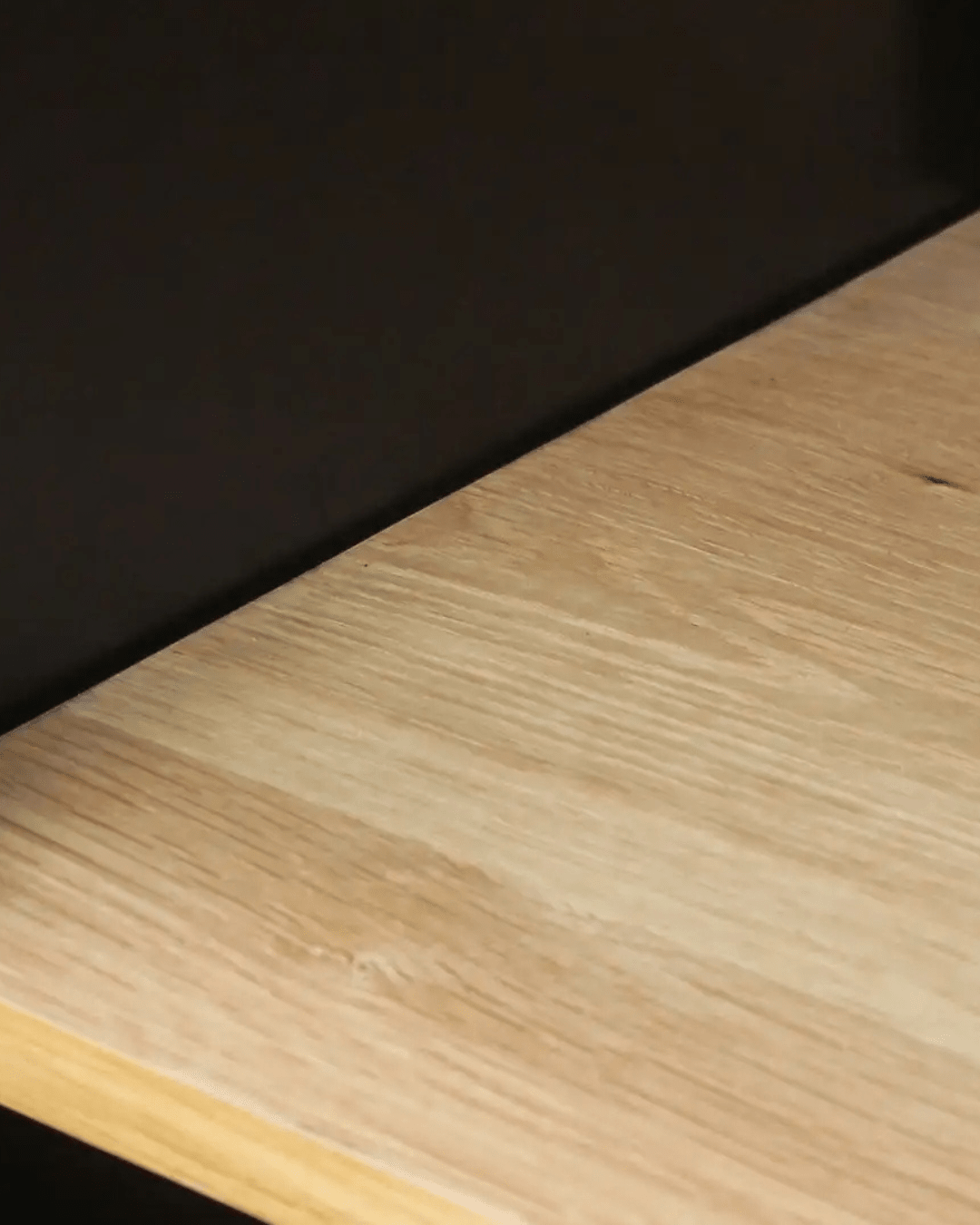
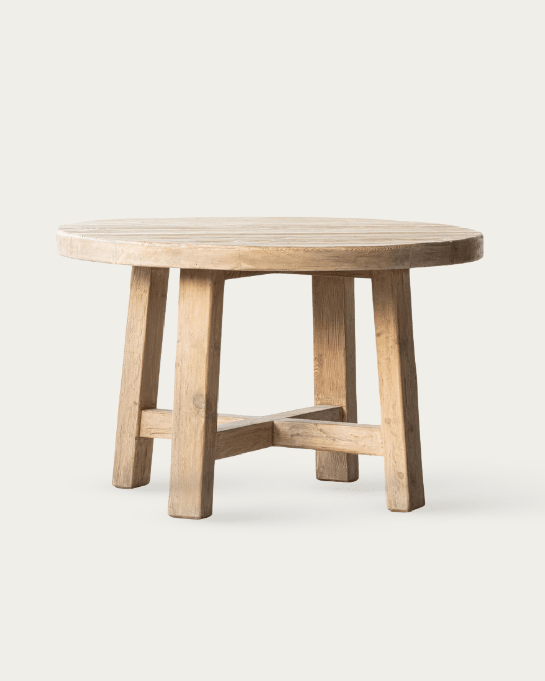
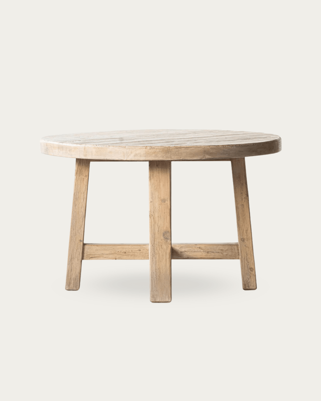
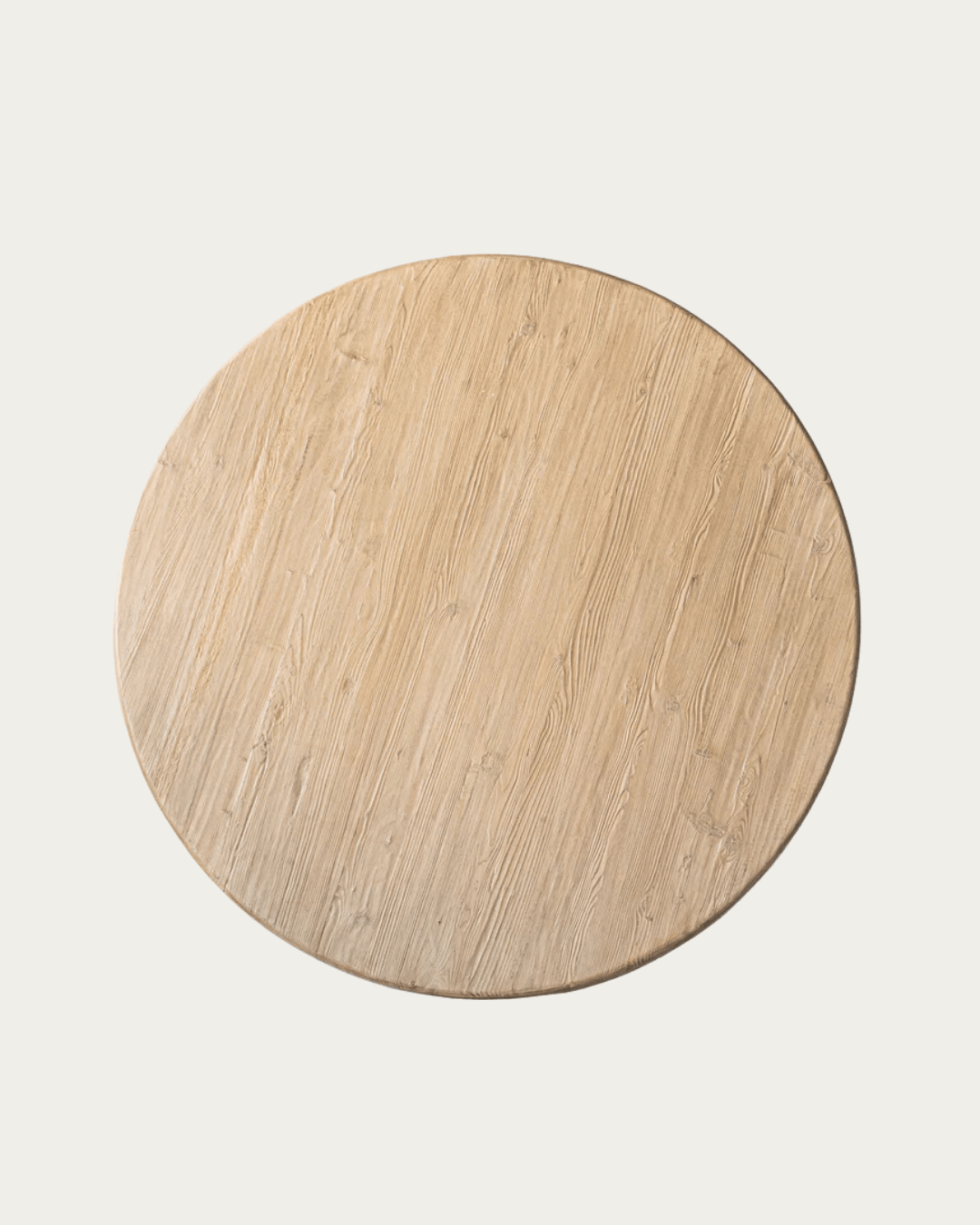
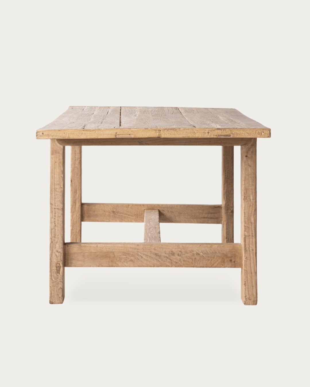
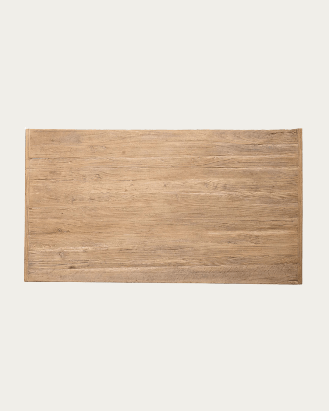
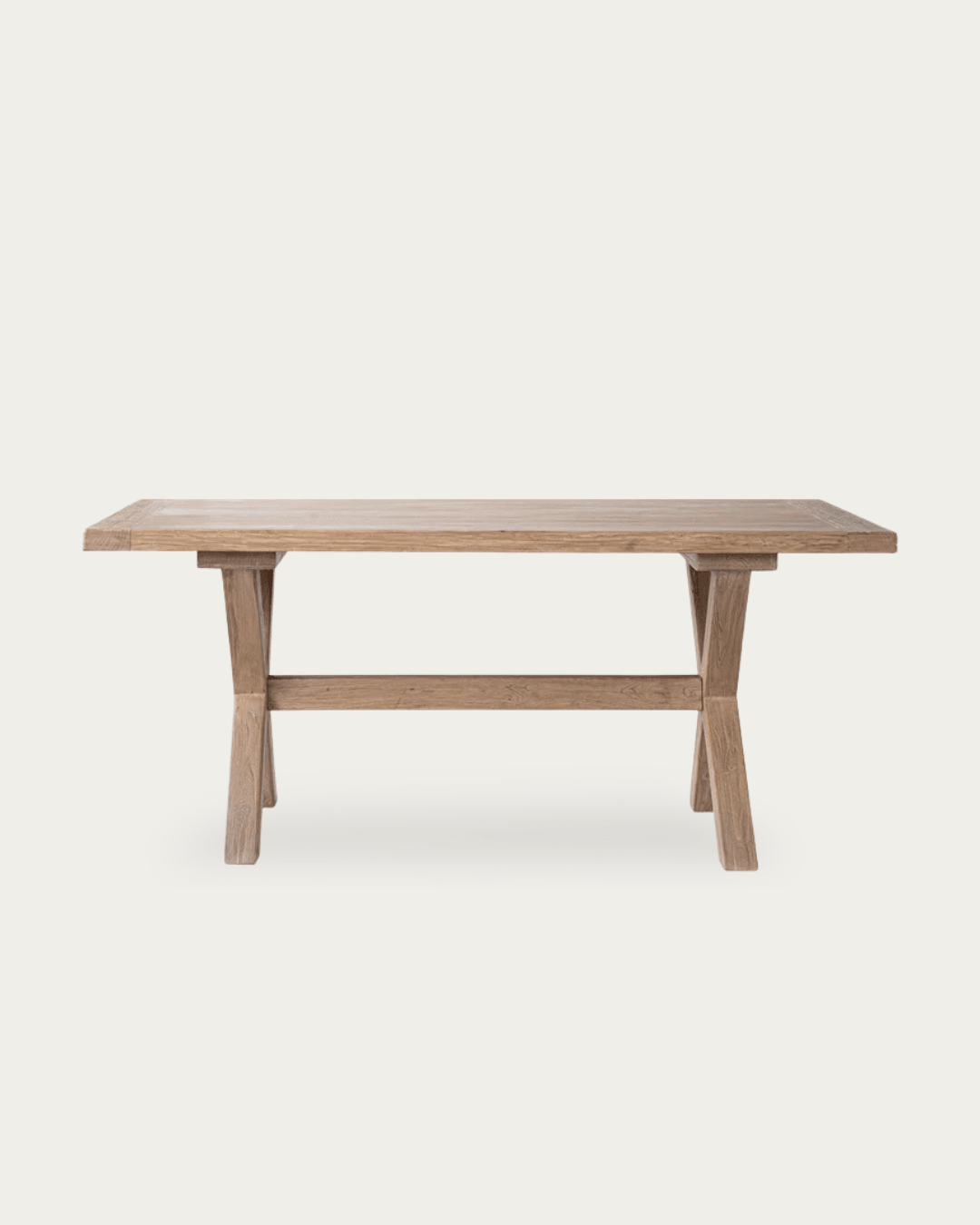
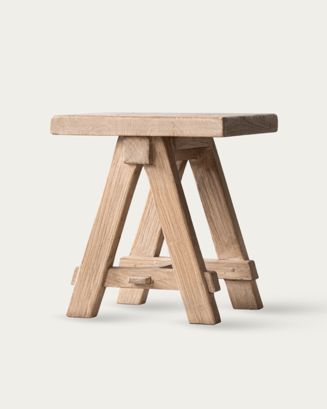
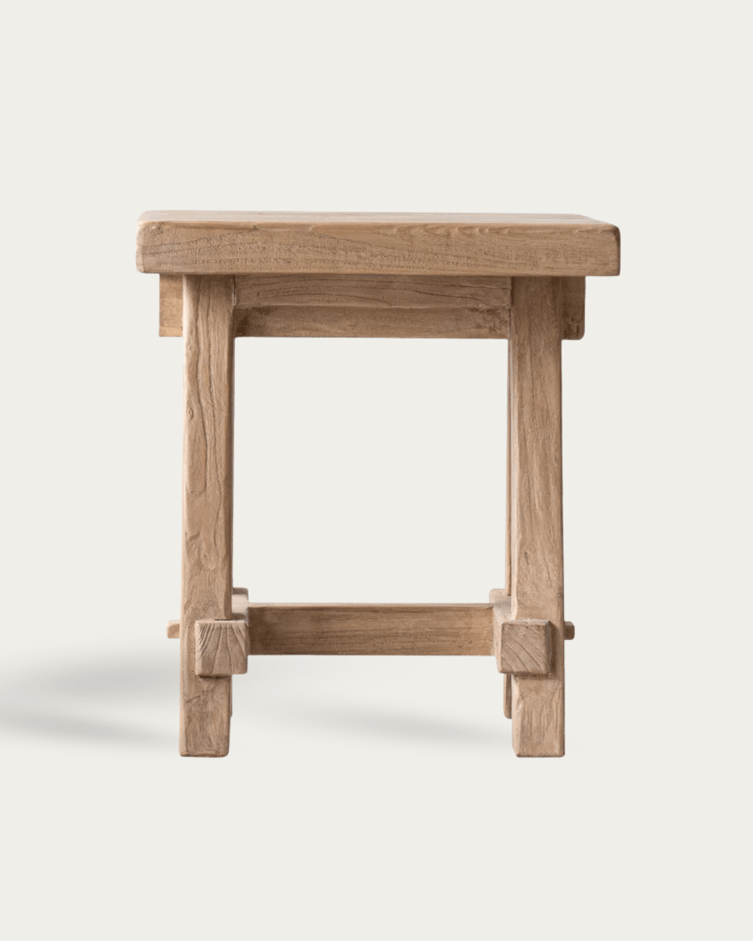
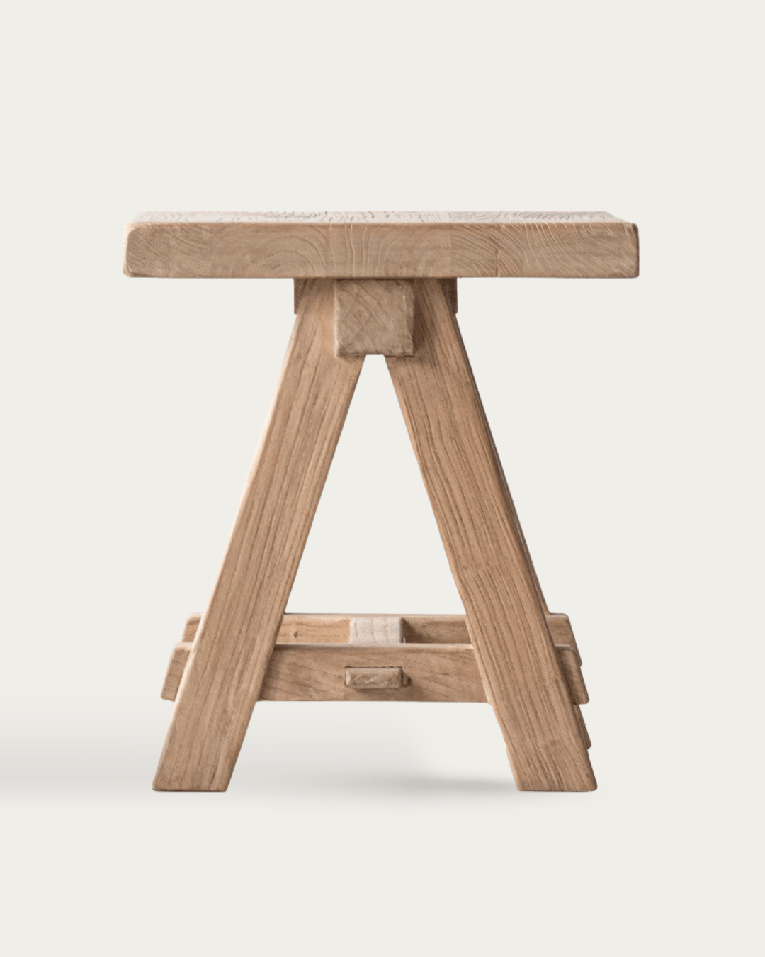
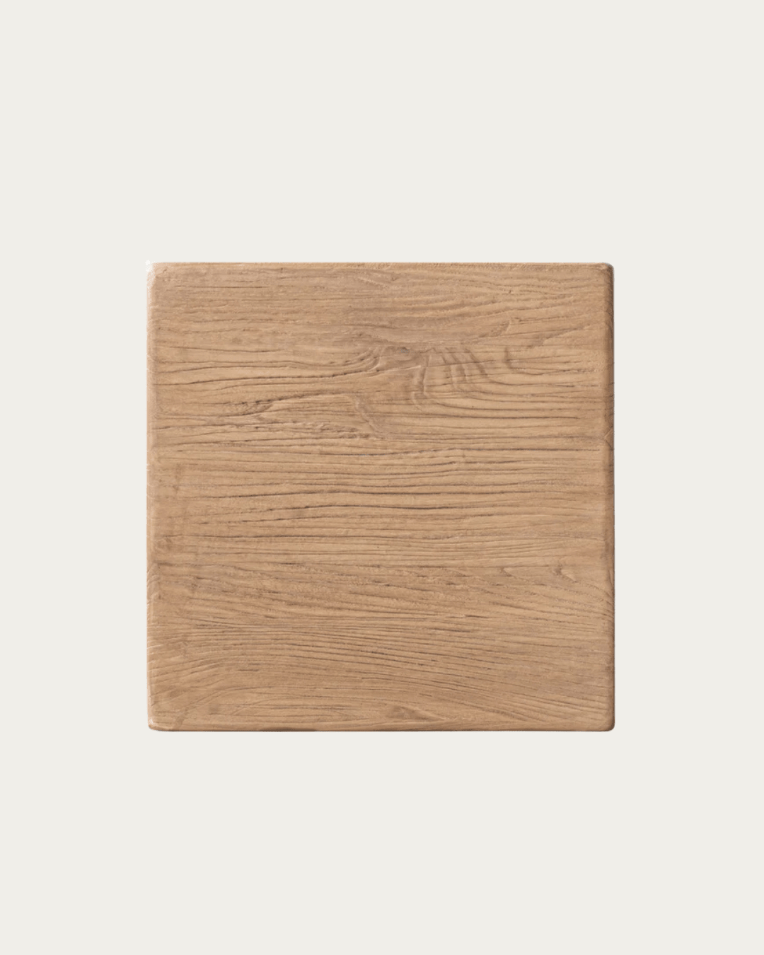
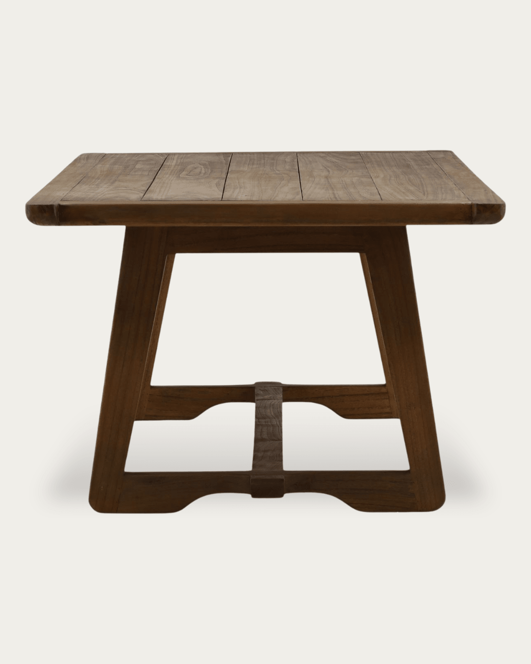
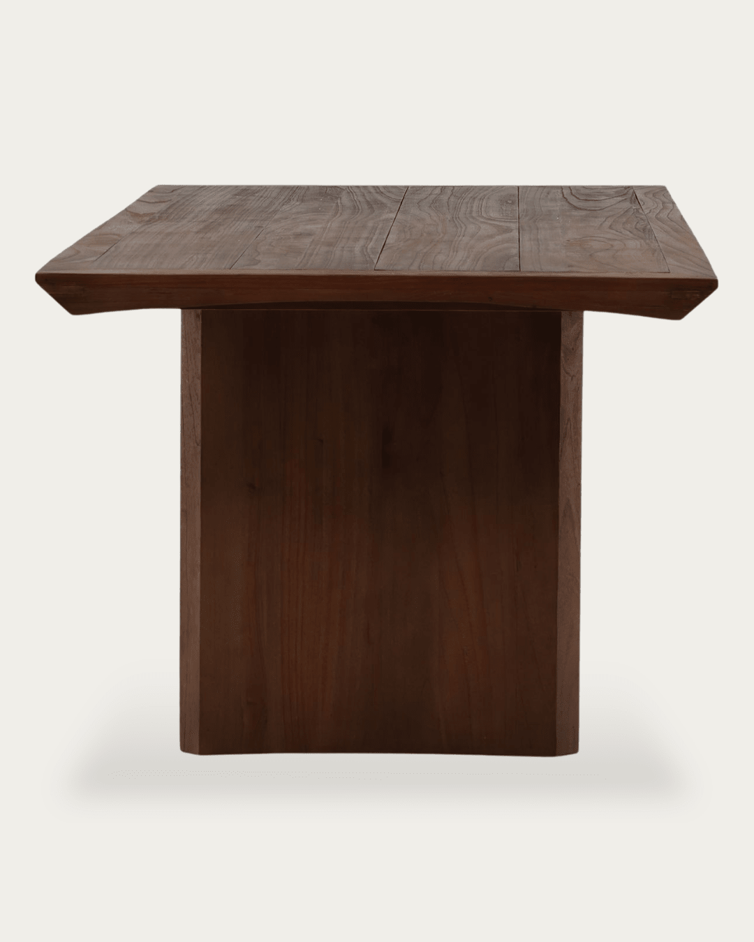
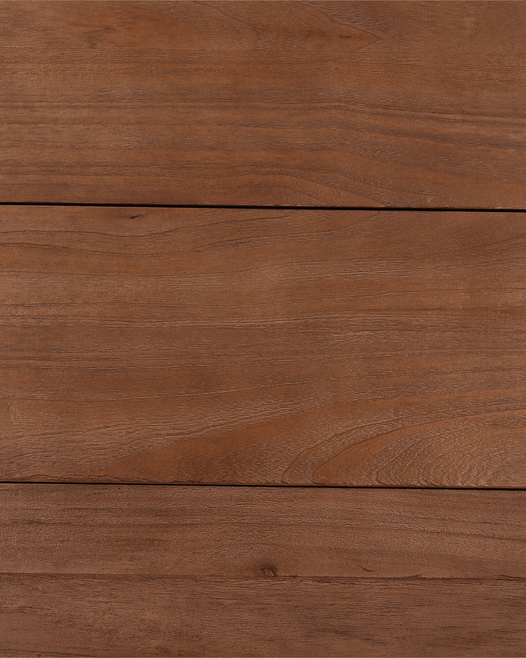
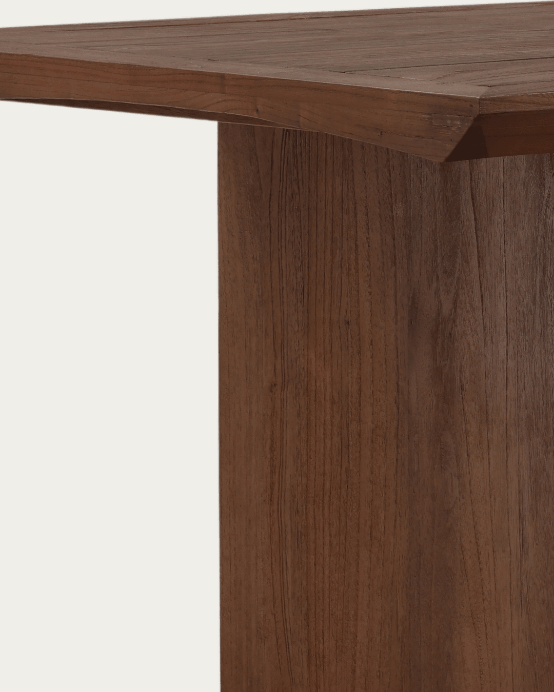
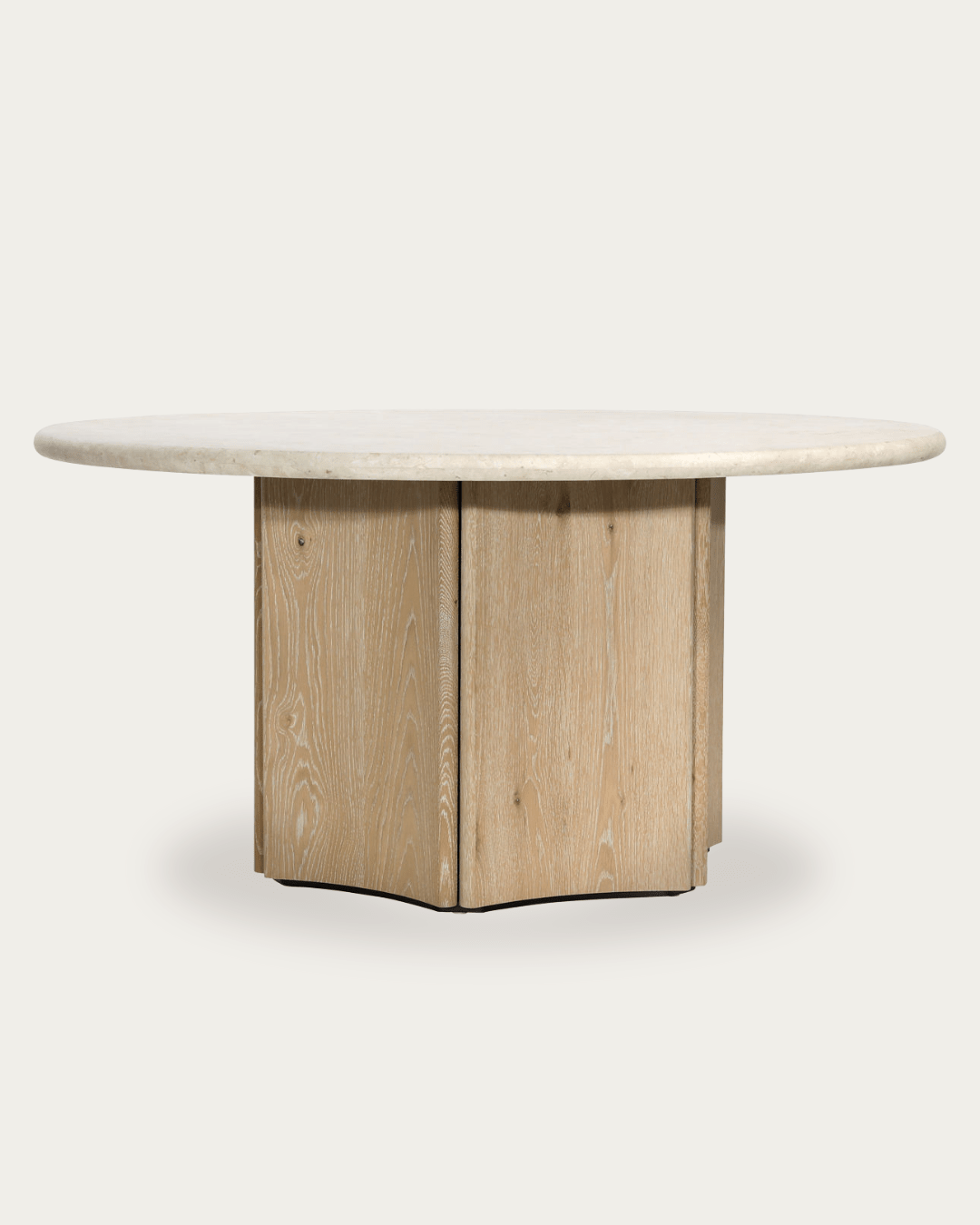
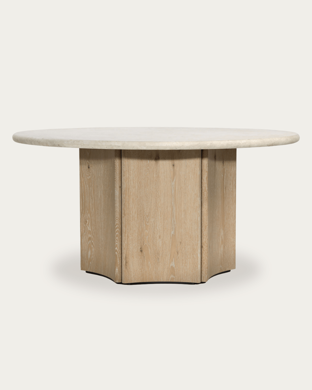
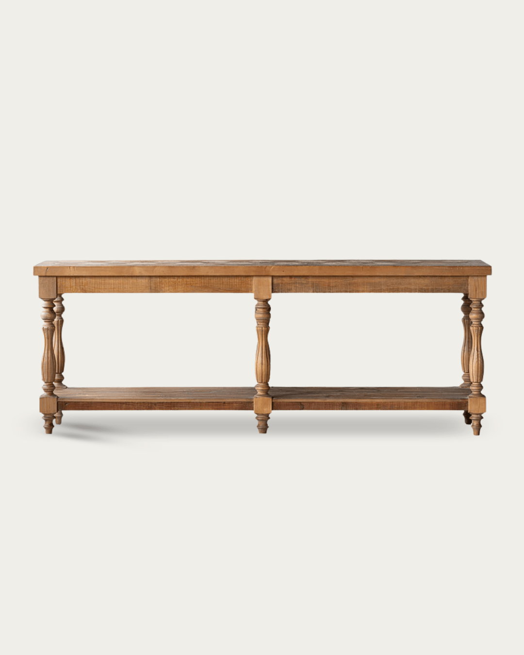
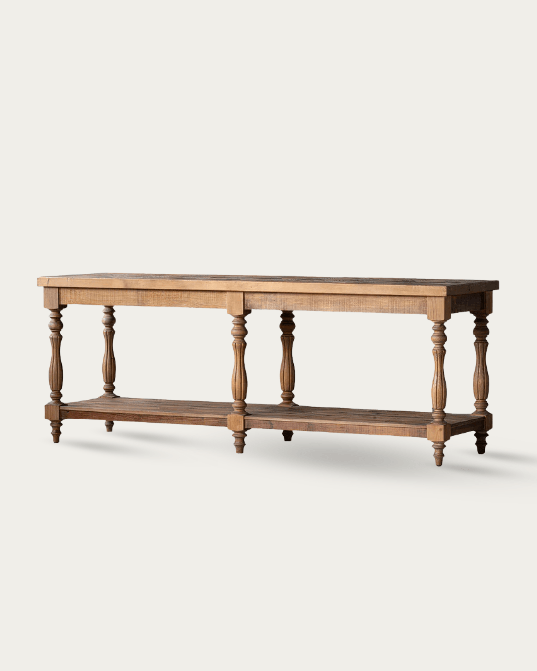
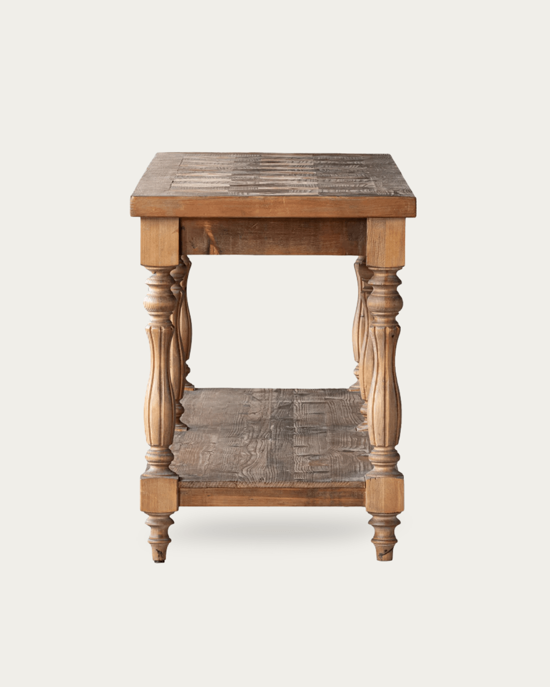
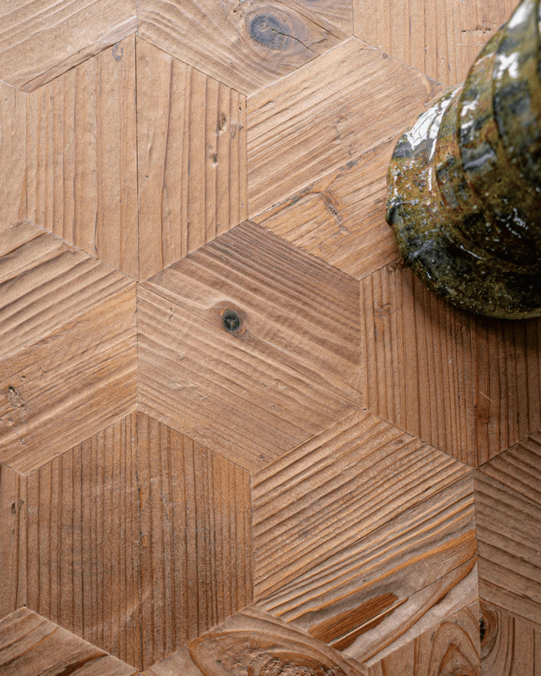
Finn Collection - A New Favorite
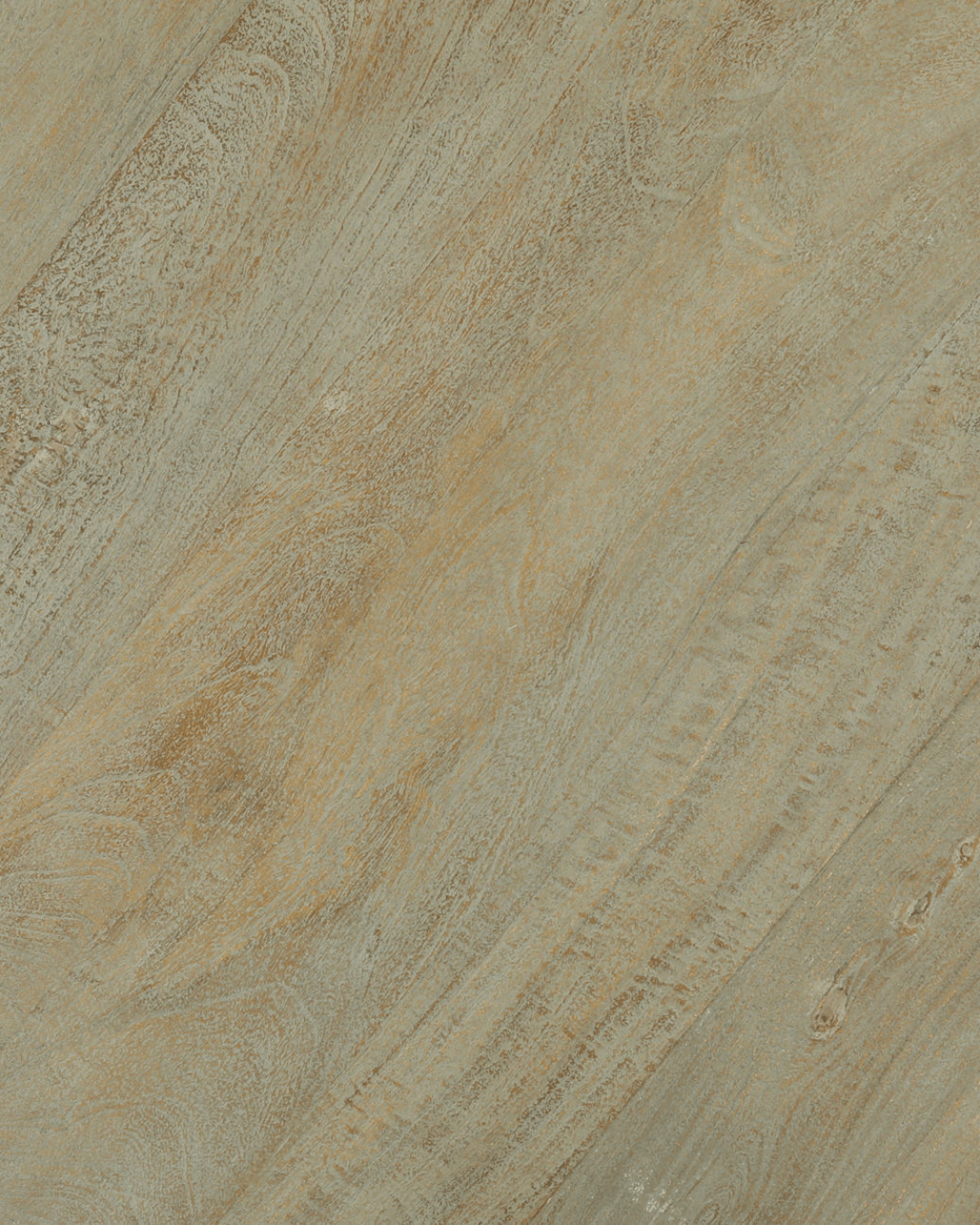
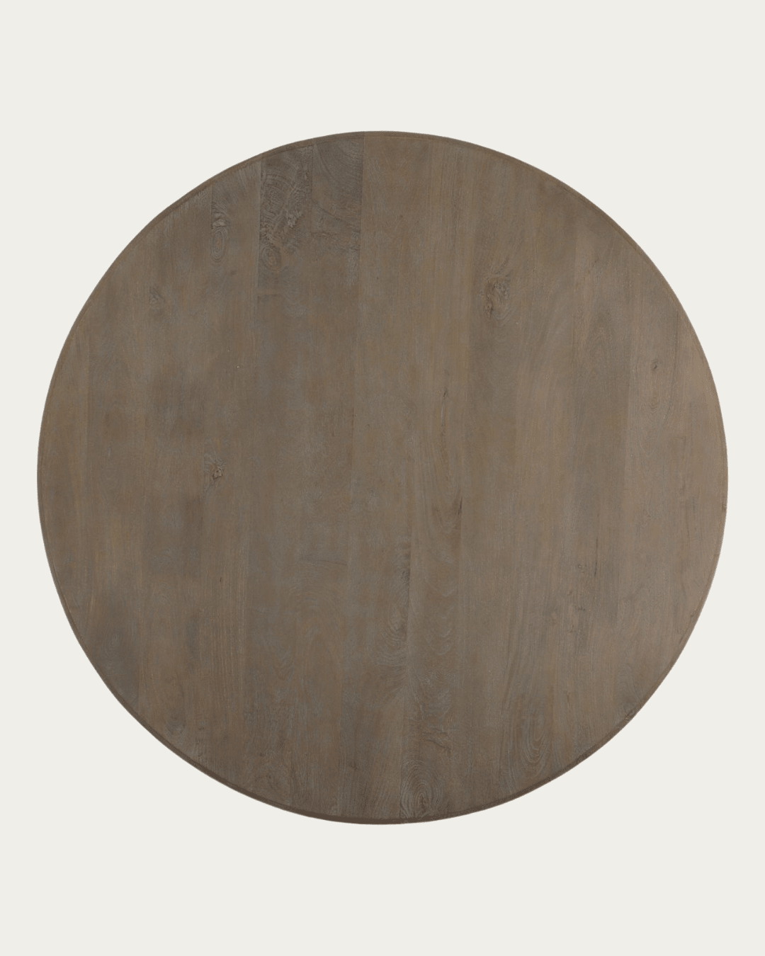
Not every surface needs to be pristine—some tell a story. The Finn coffee table embraces the natural imperfections of upcycled wood, where every mark adds character. This rustic coffee table features a bleached wood tabletop, each board with its own unique coloration and veining, making every piece one of a kind.