

We begin projects by asking our clients to send examples of spaces they like. For this kitchen remodel project our client was inspired by two very different styles - modern and clean, and warm and eclectic. It was so much fun going back and forth with her to figure out a way to combine these very different aesthetics. We’re talking some bright blues and oranges and then some that were perfectly serene and neutral. It isn’t often someone loves such polar opposite styles. And we had so much fun working with her on the design.
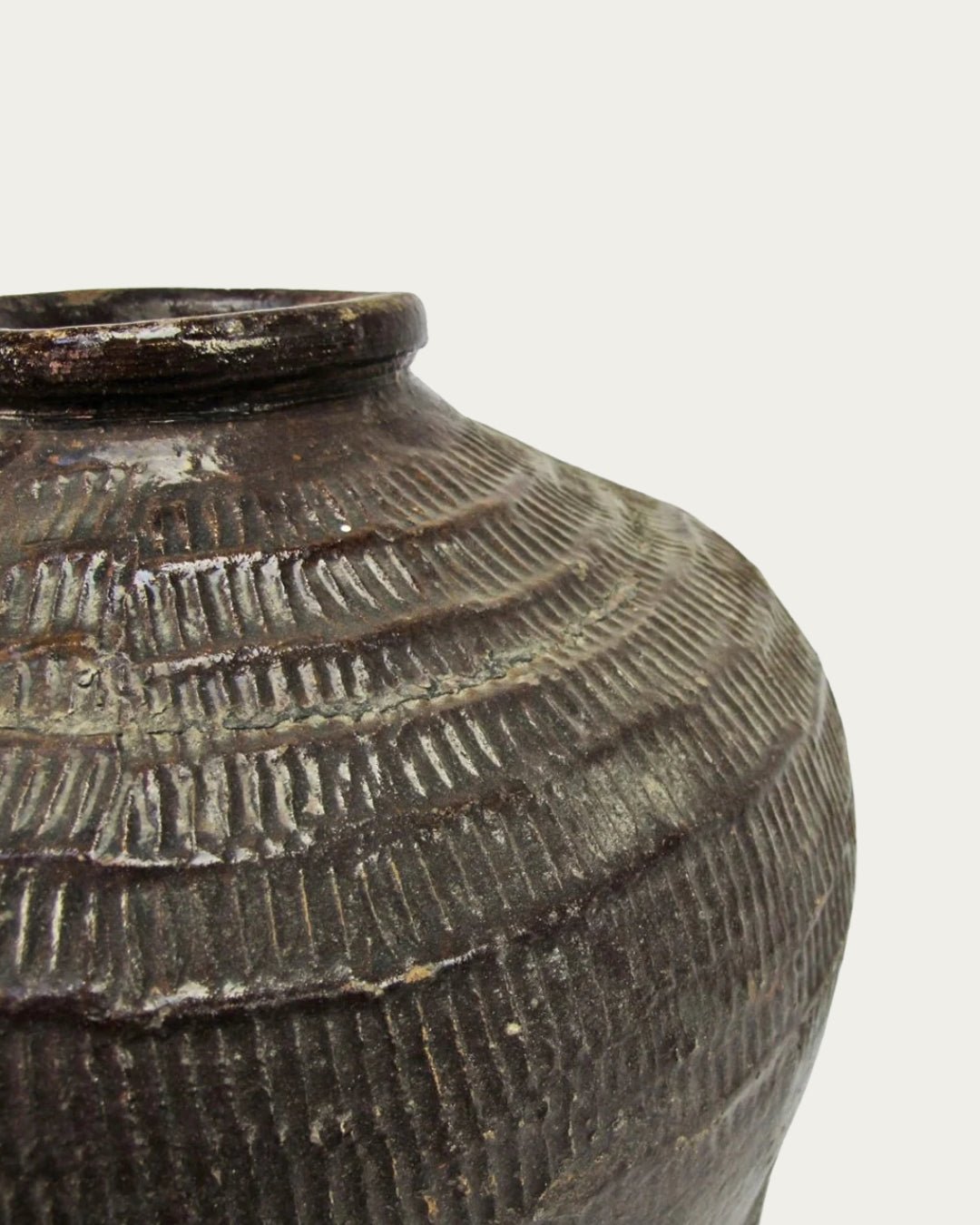
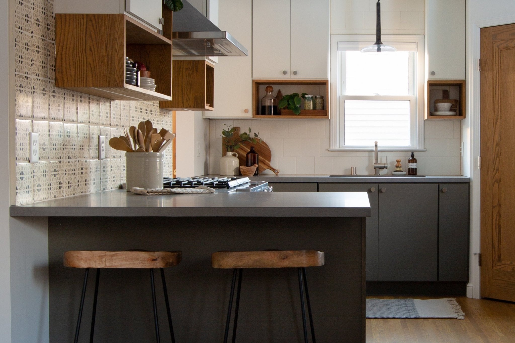
But, before we dig into the design plan and before pics, here’s an after shot. Pretty gorgeous handmade tile, amiright?

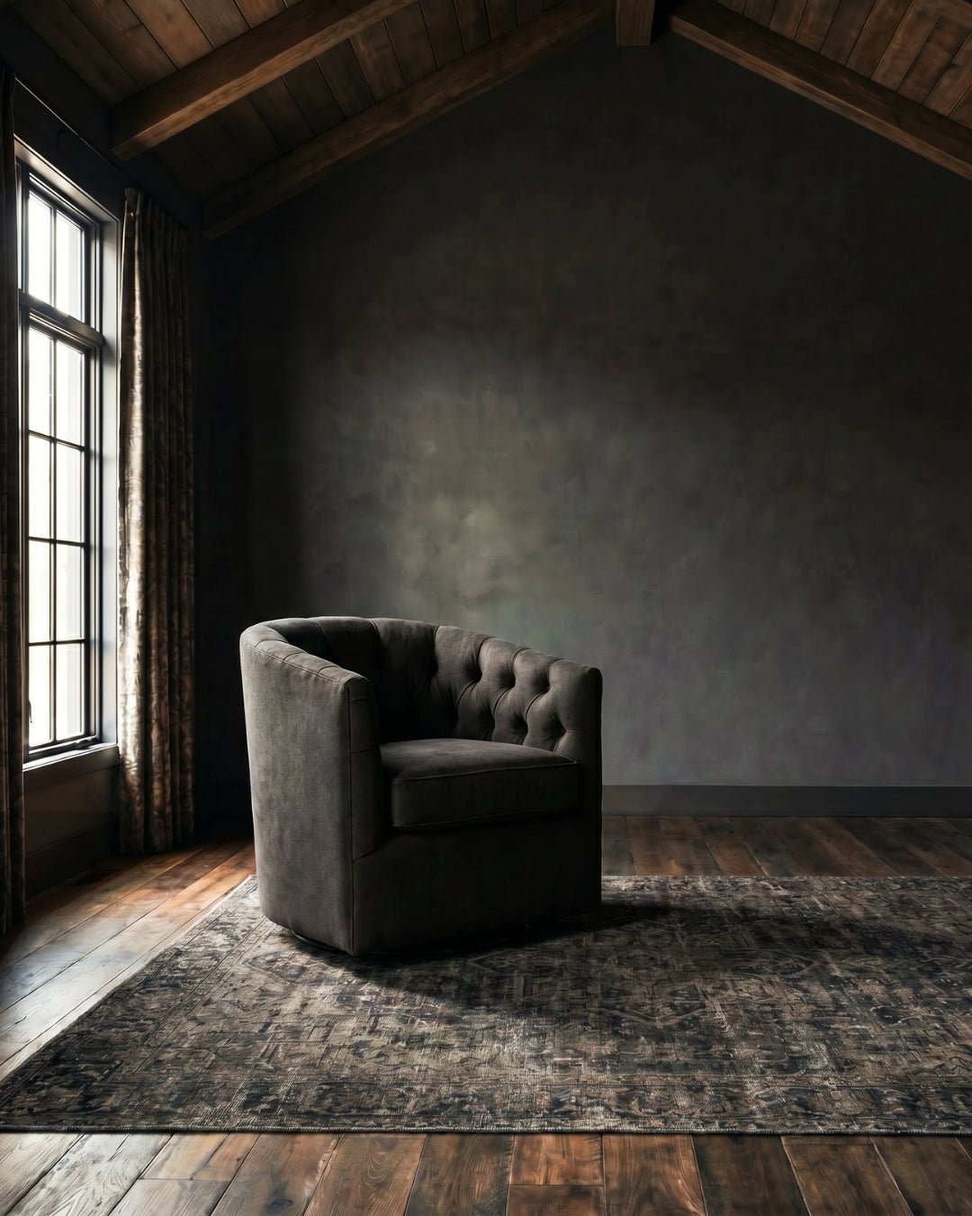
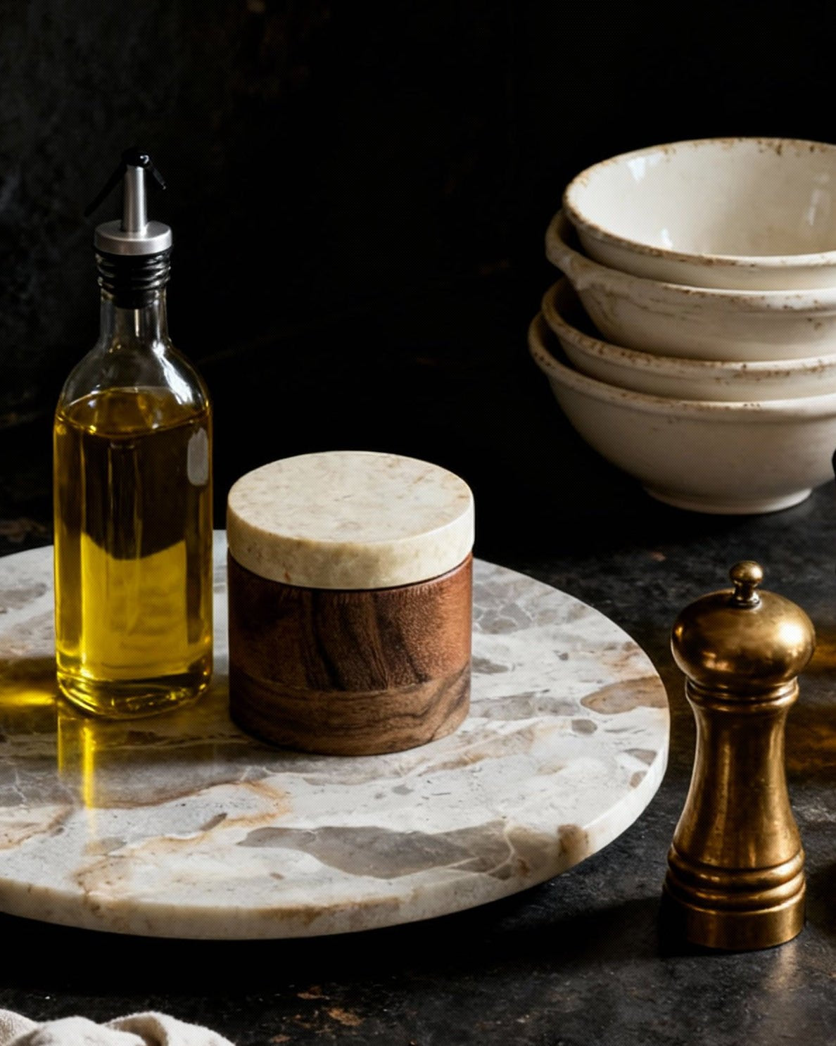
photo: belu.photography
DESIGN PLAN

We are opening up the wall between the kitchen and living spaces so that we can create a peninsula that will comfortably seat 2-3 people. This will also make it so that the first thing you see when you walk into the house is the stove wall. We always have one focal point in a room which serves as a wow-factor. In this space we chose a handmade tile for the entire stove wall, which will bring in that eclectic vibe our client loves.

We proposed, but didn’t end up building, a custom built-in unit with a wine rack around the window and moving the fridge to the opposite wall in order to open up the space for the peninsula. It’s not that uncommon to start seeing things come together and shift your original plan. We originally thought the wine rack would bring in the wood tone to that side of the kitchen, but once we started wrapping things up we realized it wasn’t needed, and to just embrace that open space.

We are keeping the sink centered under the window and adding a custom corner pantry for tons of hidden storage. People are often shocked to see how we can fit a good-sized pantry into a not-so-big kitchen. In a small kitchen it's actually a great way to be smart with your space and (bonus!) cram in a ton of storage.
We are ditching these outdated cabinets and going with flat panel cabinetry to play to our client's modern taste. We are adding warmth by painting the bottom cabinets an earthy green and the top cabinets white. To further warm up the space we are installing custom open shelving and cubbies in a natural wood tone, but are keeping their design simple and modern. Lastly, we’ll finish off the design with brushed nickel cabinetry hardware (similar to these for doors, and these for drawers), a matte black faucet, and stainless steel appliances including a modern range hood.


We mocked up a few variations of these design choices for our client so she could see how they would play out in the actual space. We often know what our recommendation will be from the beginning but it's important to mock up a few options so that the client can see for themselves why we recommend what we do.

In this mock up we used a blue tile for the feature wall and dark wood for the shelving and cubbies. Although our client loves the color blue, we ultimately decided, and our client agreed, that this combination was too dark.

In this design, we tried a lighter patterned tile on the feature wall which made a world of difference and really brightened up the space.

Even though the lighter tile helped, it still felt a bit heavy to us. So in the above design you see we went with a lighter wood and reduced the wood wrapping around the outside of the cabinets. Once we put this together we knew we had the winning look. This combination allows for the gorgeous patterned tile on the wow-factor wall to speak for itself and without competing with the dark wood.
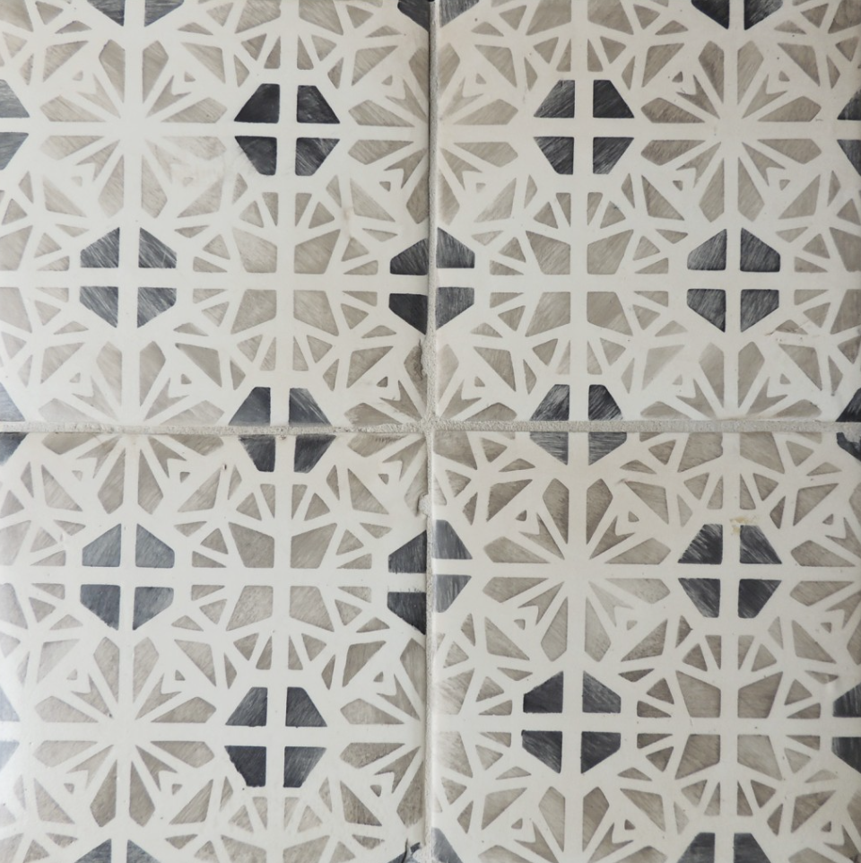
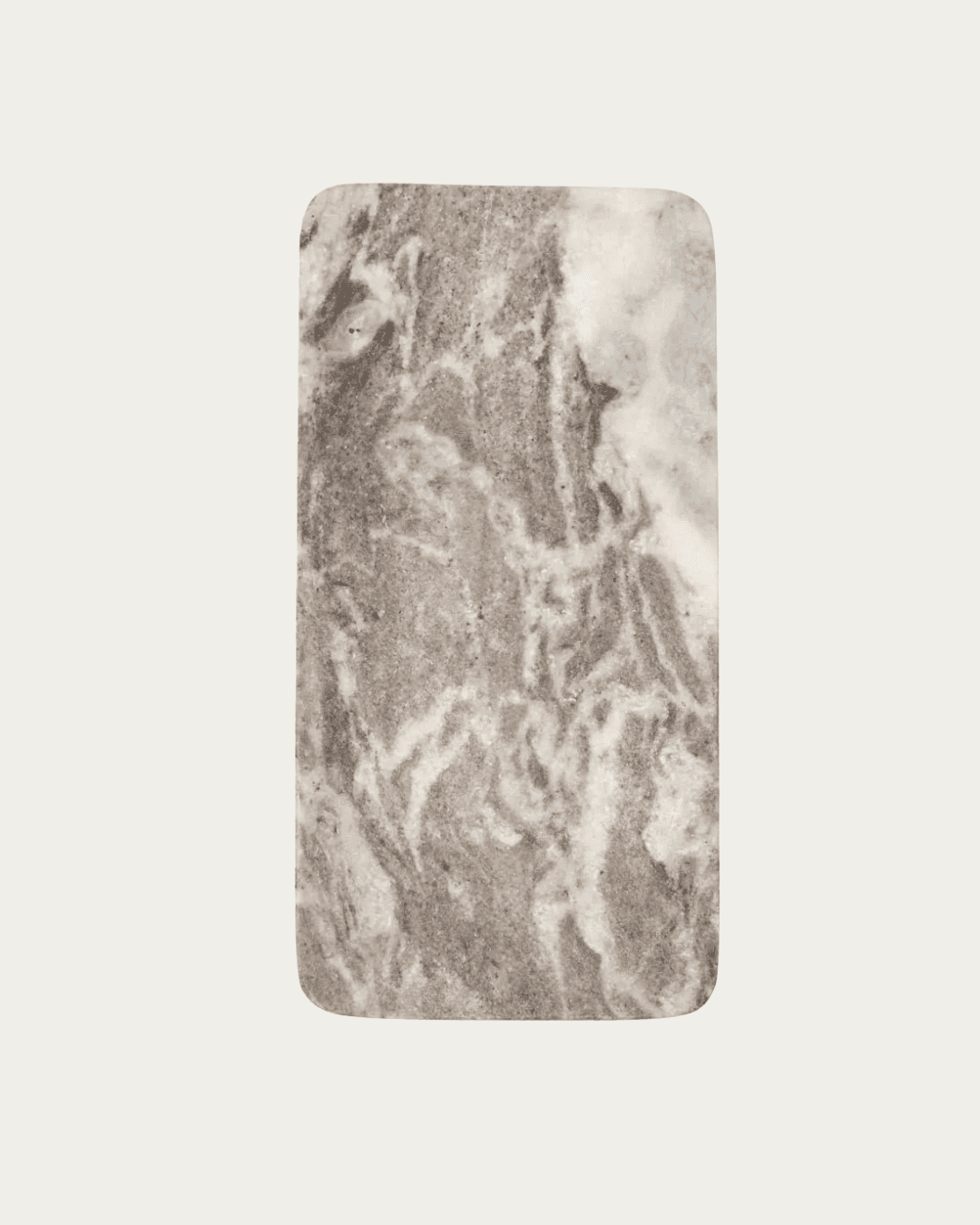
Here is a sample of the tile we decided on for the feature wall. And for the rest of the backsplash walls we chose a warm white porcelain matte finish so as to not take away from the feature wall.

I think the best part of this kitchen is that it’s not huge and we packed a ton of personality into it. Not to mention an absurd amount of storage with that pantry. It’s in a mid century rambler so we wanted to keep the budget on point with the rest of the house. We packed in a ton of customization yet on a pretty dang modest budget. And I tell ya what, there’s nothing more boring than a sea of the same cabinets and backsplash tile around a kitchen. There are so many layers going on in here, and a constant back and forth between her modern and natural/textural styles that it’s just overall a pretty fun place to be.
AND NOW FOR THE AFTER PICS

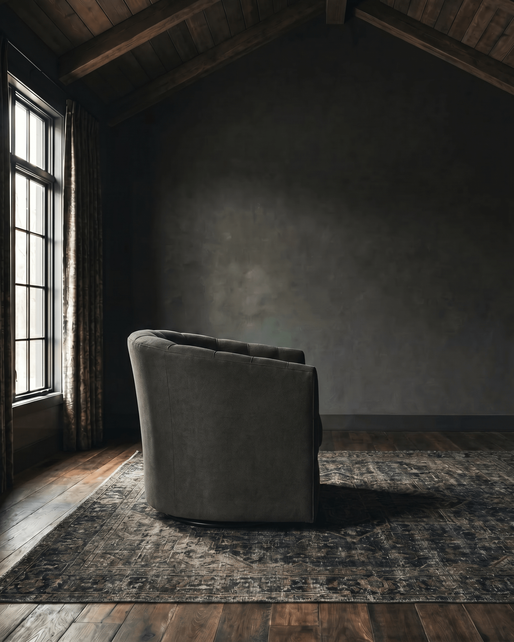
photo: belu.photography

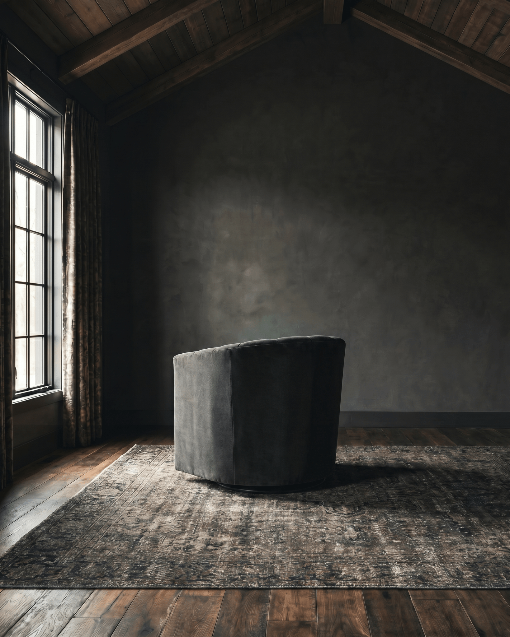
photo: belu.photography

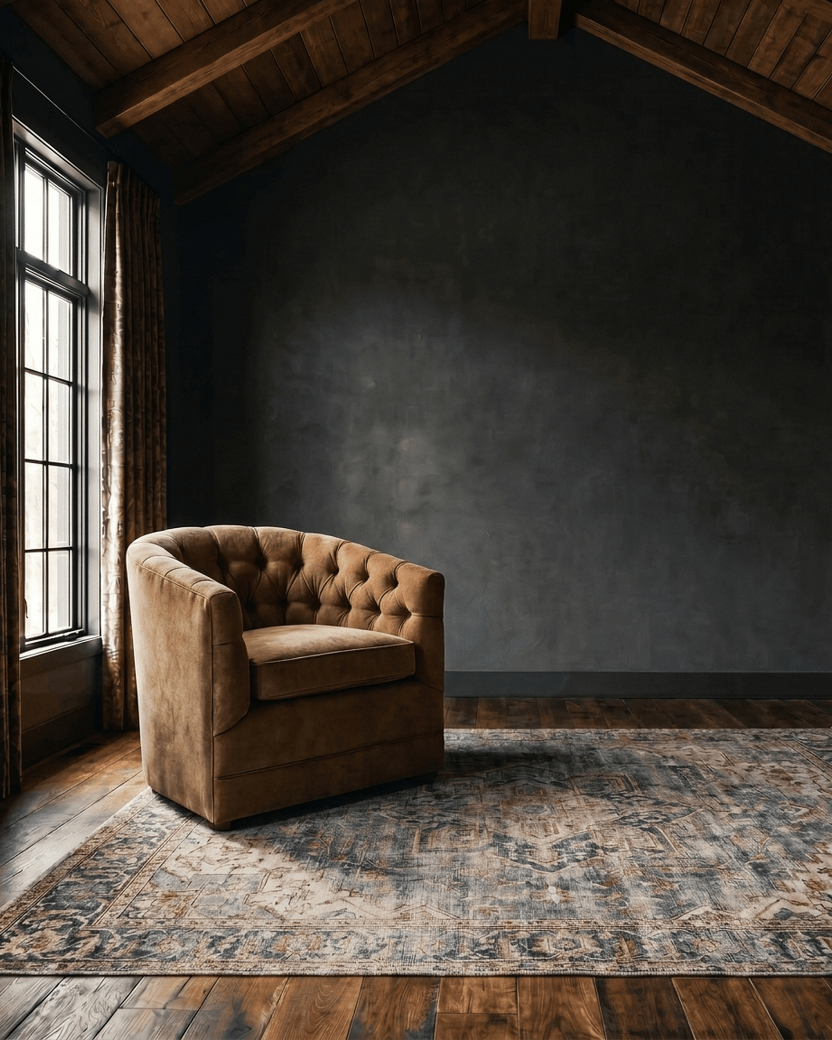
photo: belu.photography

photo: belu.photography

photo: belu.photography

photo: belu.photography