


We made it to the FINAL REVEAL for the One Room Challenge, our very first time partaking in this awesome design event.
If you’re new to this bathroom, check out our first 5 posts to see before pictures, the design plan, our plan for the never-before-seen tile install, all the final material selections, tile installation progress and what caused us issues with my crazy install idea. and then all of the materials and fixtures installed but before I threw in a BIG design change at the last minute.
DESIGN PLAN RECAP
For those of you who haven’t been following along, here’s the gist on this project. Our client LOVES glam. And if you know me, that’s the polar opposite of my personal aesthetic (ah, minimalist, masculine, industrial, apothecary. NOT glam nor feminine.), so it has been a ton of fun diving into her world and coming up with a design she’ll truly love. We’re doing another bath, 4 staircases, and a treehouse (with a custom mural on a 3 curved walls and a pitched ceiling) for her too, so make sure to catch those on the blog.
DESIGNING THIS SPACE
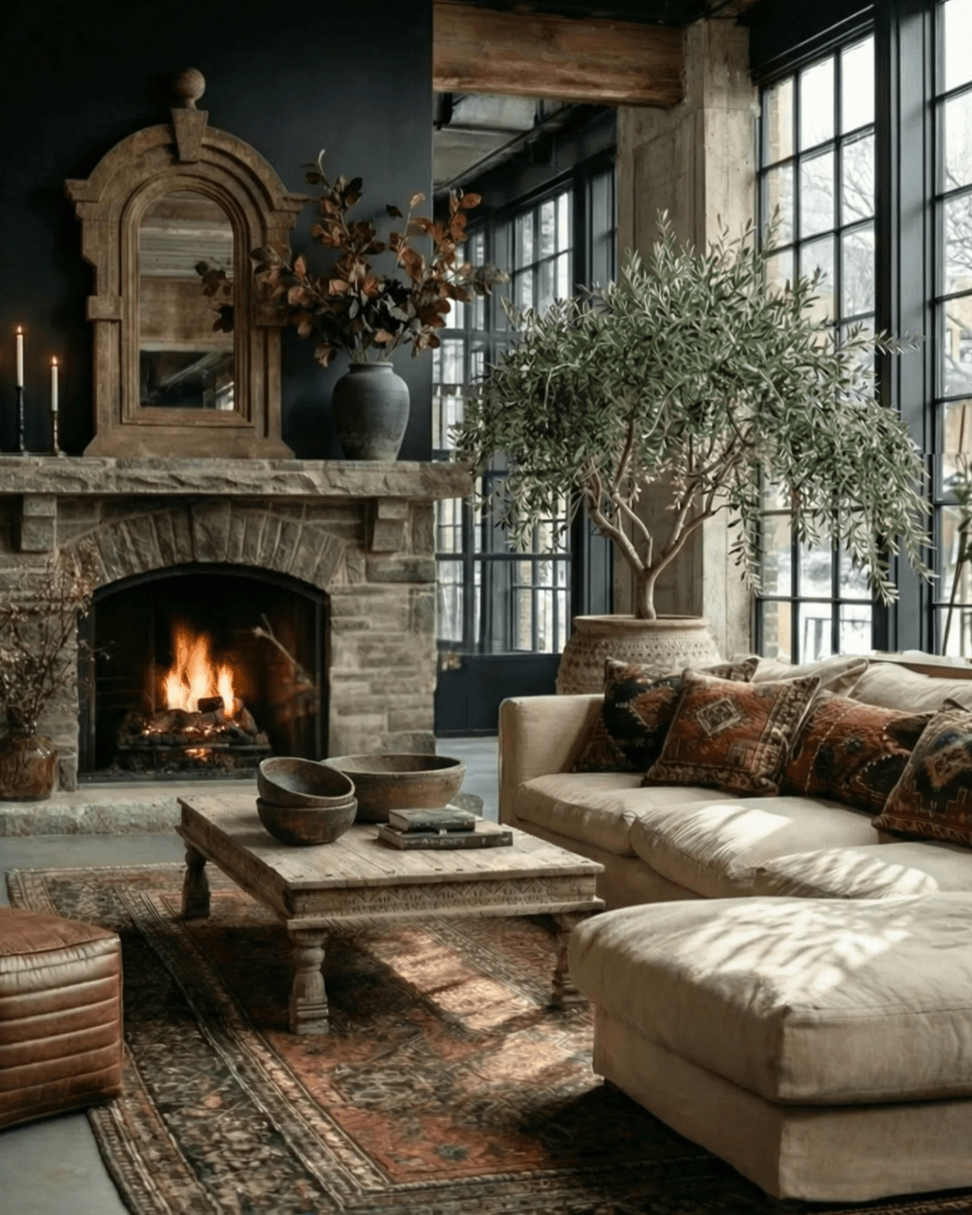
We always have one major focal point in a room, and in this space we chose the tile. I have no idea how or why I thought of this tile idea, but i did and it was a ton of fun (and complex!) to execute. I’d never seen it done before so to explain to my client was a bit humorous, actually. If you look closely, you’ll notice that the floor to wall transitions curve, as does from wall-to-wall. I wanted to make sure we didn’t have any trim and wanted the walls to blend in with the floor so that the focus was on the unique shape created by the grey tile.
Of course that meant we had to cut a curve into anything that butted up against the walls, meaning the back of the vanity and shower glass.
I also made sure not to have a shower curb as that’d have taken your eye away from the shape and seamless wall to floor transitions.
We sketch every project, and that’s just what this one needed to explain the tile install idea.

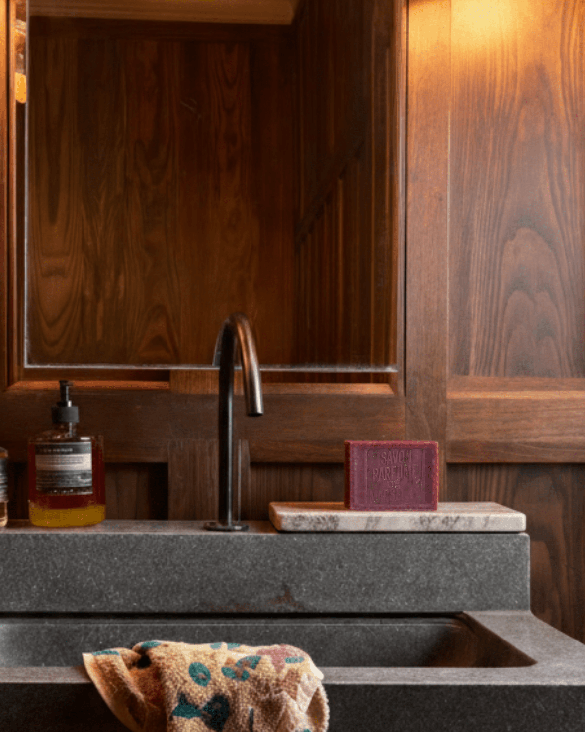
The bathroom is fairly small, narrow, but with high ceilings. To make the space feel larger I only used a few materials and made them big so your eye didn’t bounce around from lots of little things. That meant I ran the tile all the way up the walls and covered ALL of them except for a huge custom mirror on one side (which bounces light and reflection around, which makes the space feel larger. Design tricks FTW).
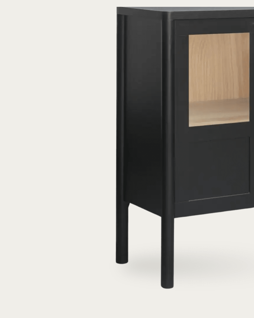
We did a custom vanity in a mauve pink, topped with a 3” slab of Carrara marble. I designed the grooves so that the gap between the doors perfectly line up with the rest. The grooves are slight but play off the penny rounds and geometric squished rhombus made by the grey tile. And I put it on a short pedestal so it sort of floats in the room. A bit romantic. The pedestal is set back just a couple inches so that you don’t see it, but should you ever drop an earring you can still reach it. It’s those details I love most in every project. We did a matte enamel finish and it turned our perfect.

I raised the height of the shower head to bring an architectural element up high so that we could accentuate those tall ceilings. We did a large chrome shower head as it was the only element in that side of the bathroom. And going big meant it became a bit of an art piece in itself.
I ran the custom shower glass from floor to ceiling so that again (I’m on repeat here aren’t I) nothing took away from the tile.
To me the tile install is art. This bathroom is off the main living floor so when you walk past it’s impossible not to look. Bathrooms need to function but they aren’t usually pushed when it comes to standing alone as a focal point in a home, and certainly they’re rarely considered art. But that’s just what we did.
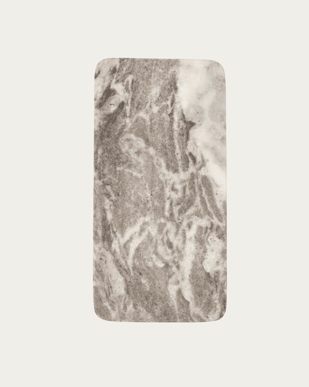
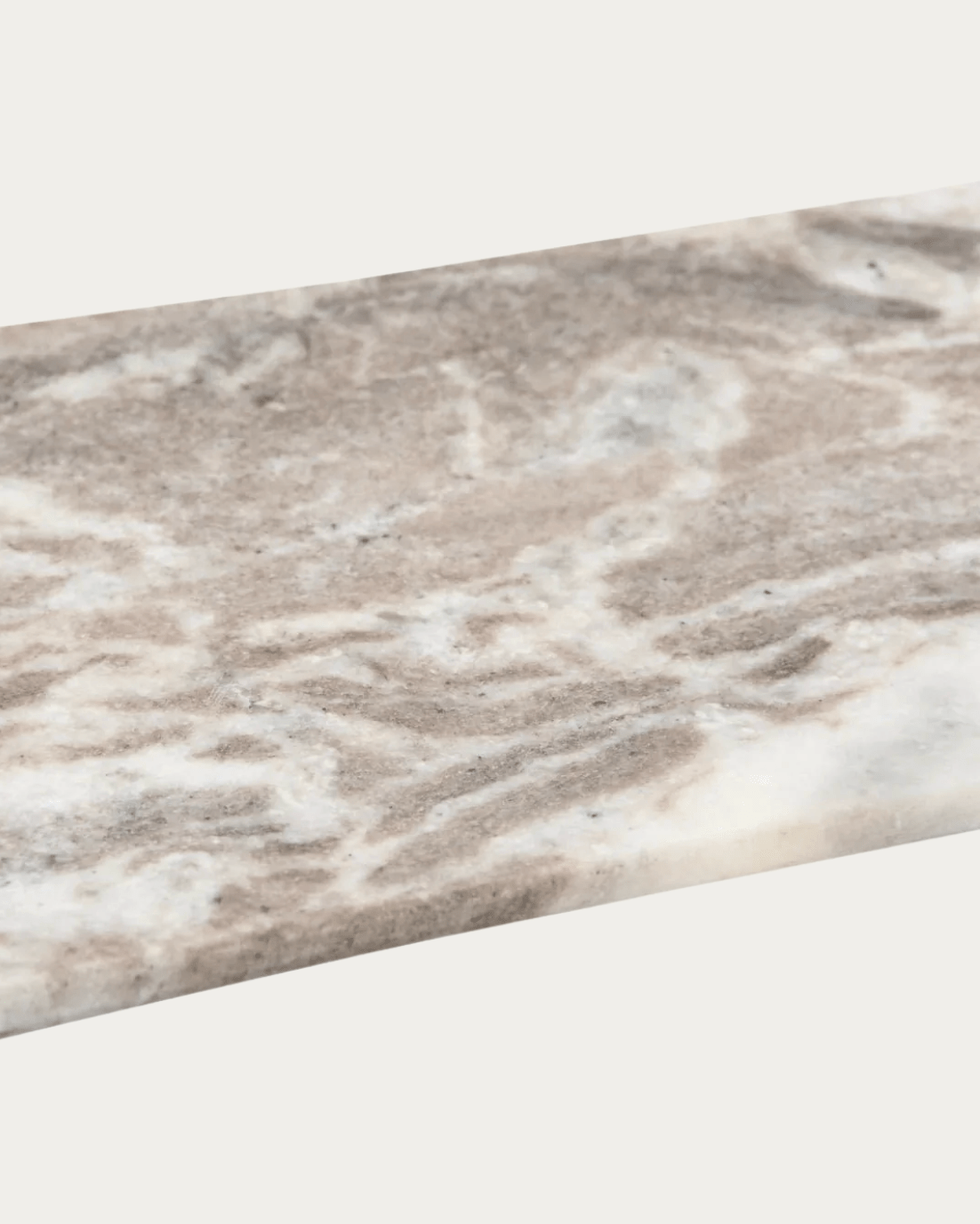
All materials that weren’t custom are linked in this blog post.
BEFORE
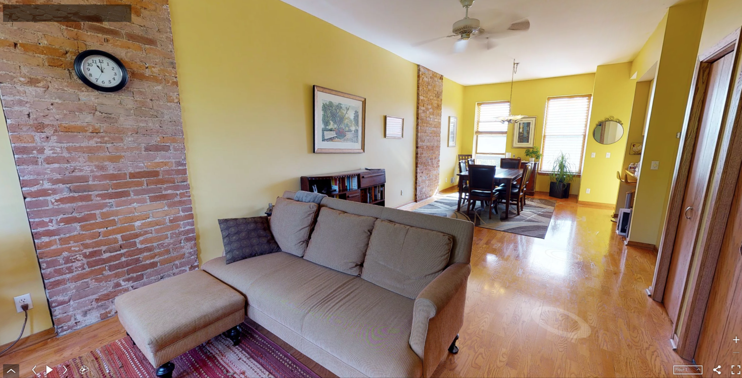
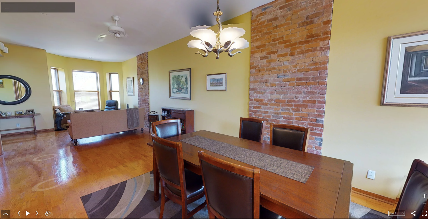
Here are some before shots of the entire 4-story loft before our client purchased it. In the pictures where you see the kitchen stools you’ll notice a door immediately to the right - that’s this bathroom. Notice the lower ceilings. We raised them up to about 9’ 4”.


PROGRESS


DESIGN RECAP

READY FOR THE REVEAL? BUT FIRST, STYLING
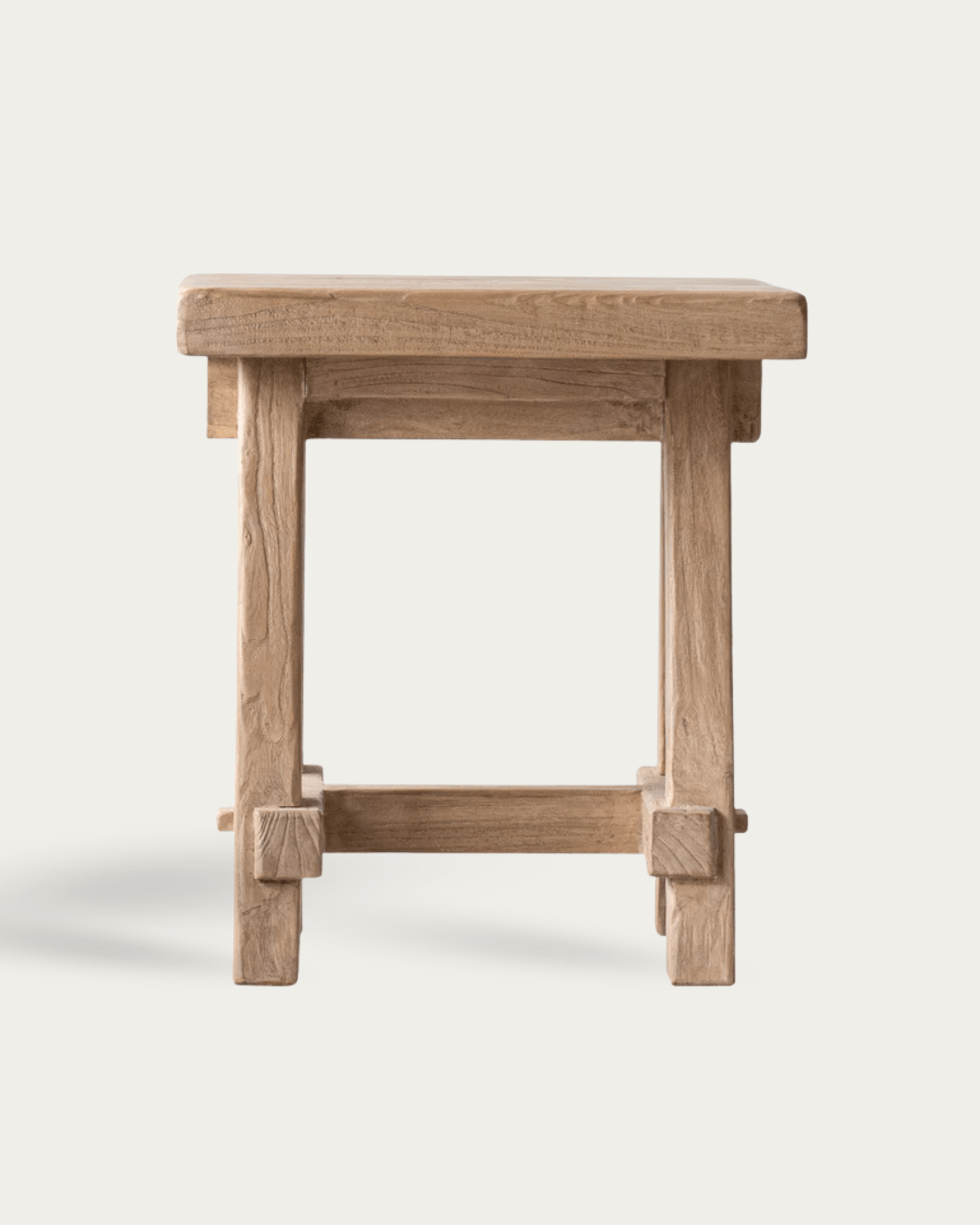
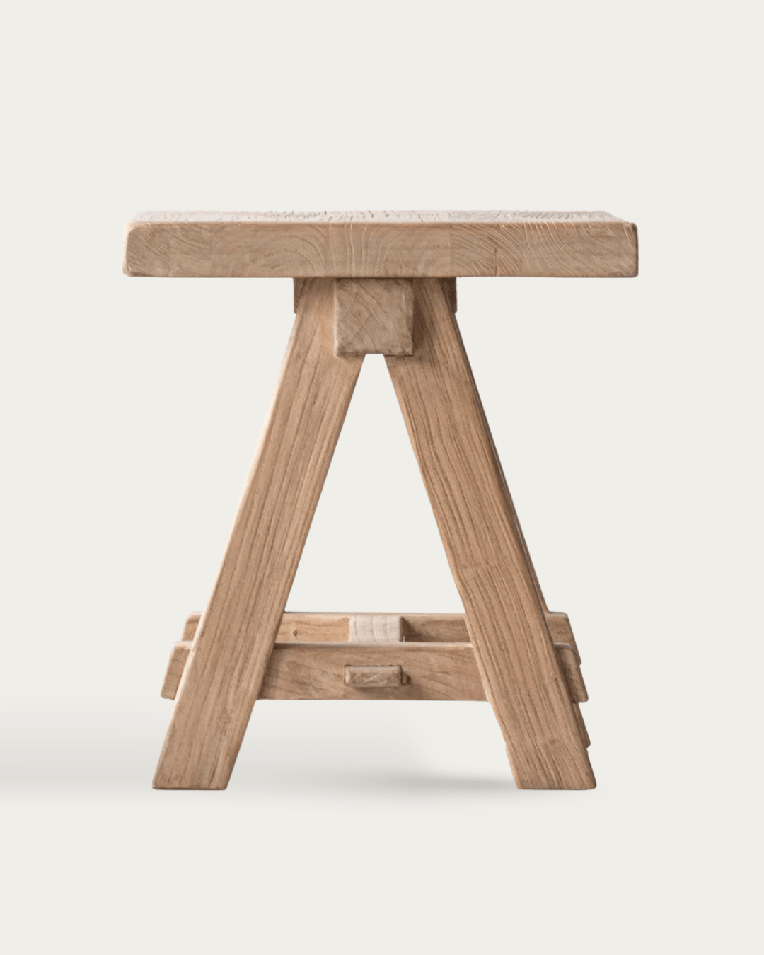
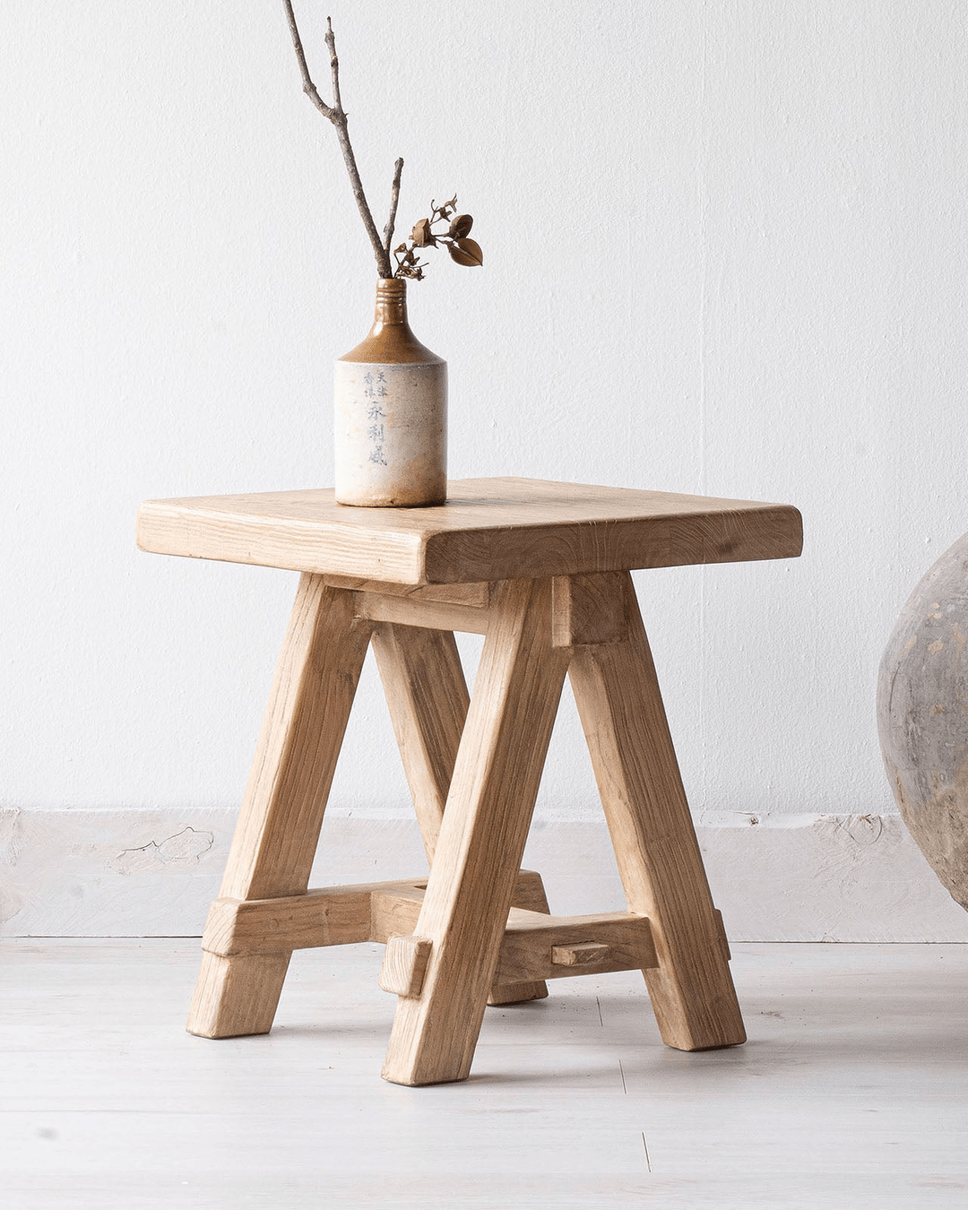
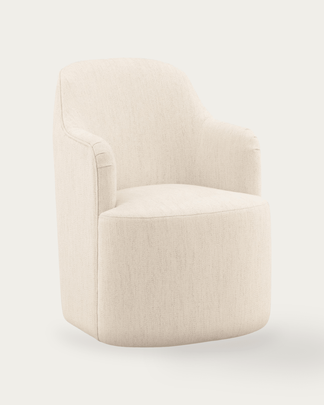
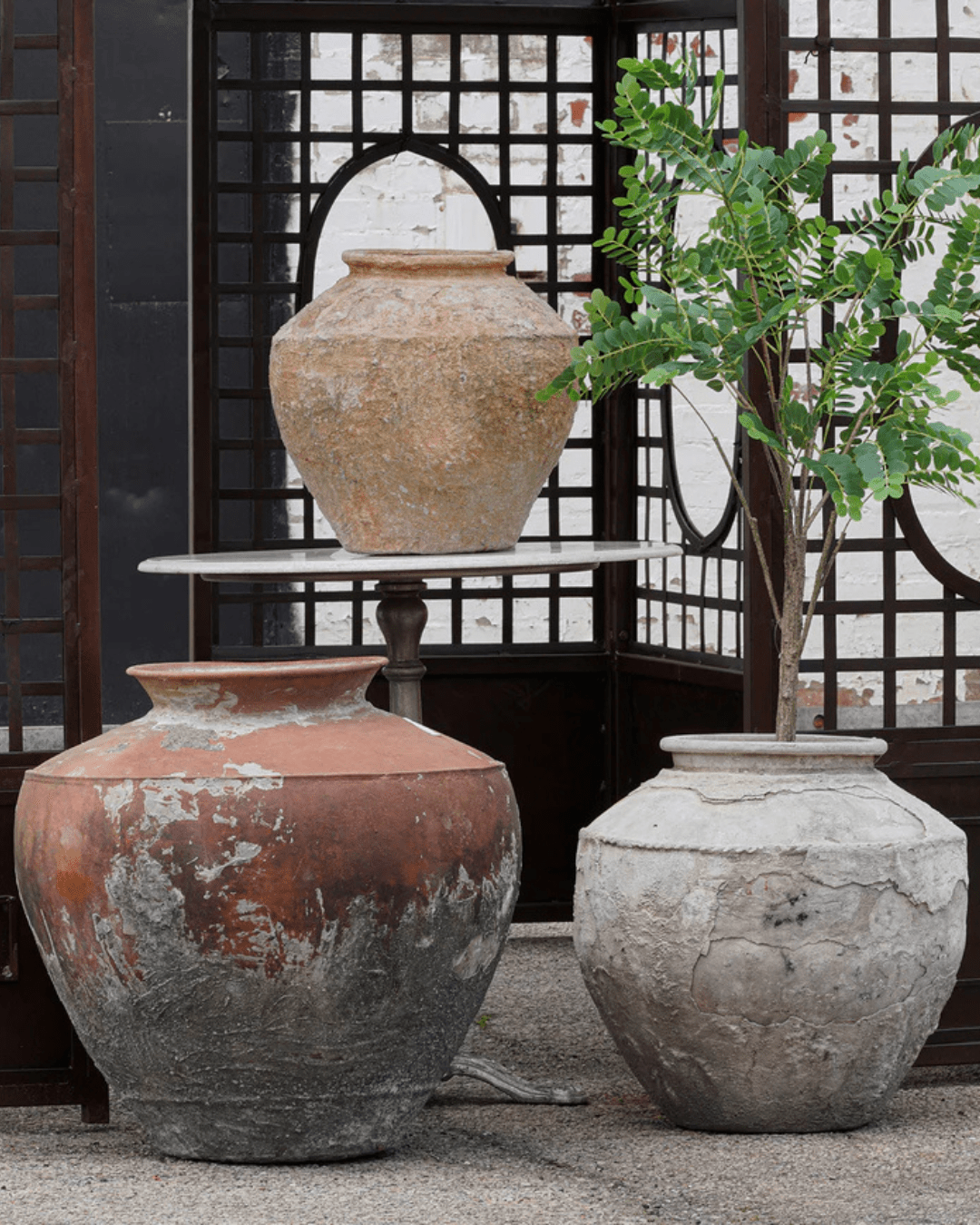
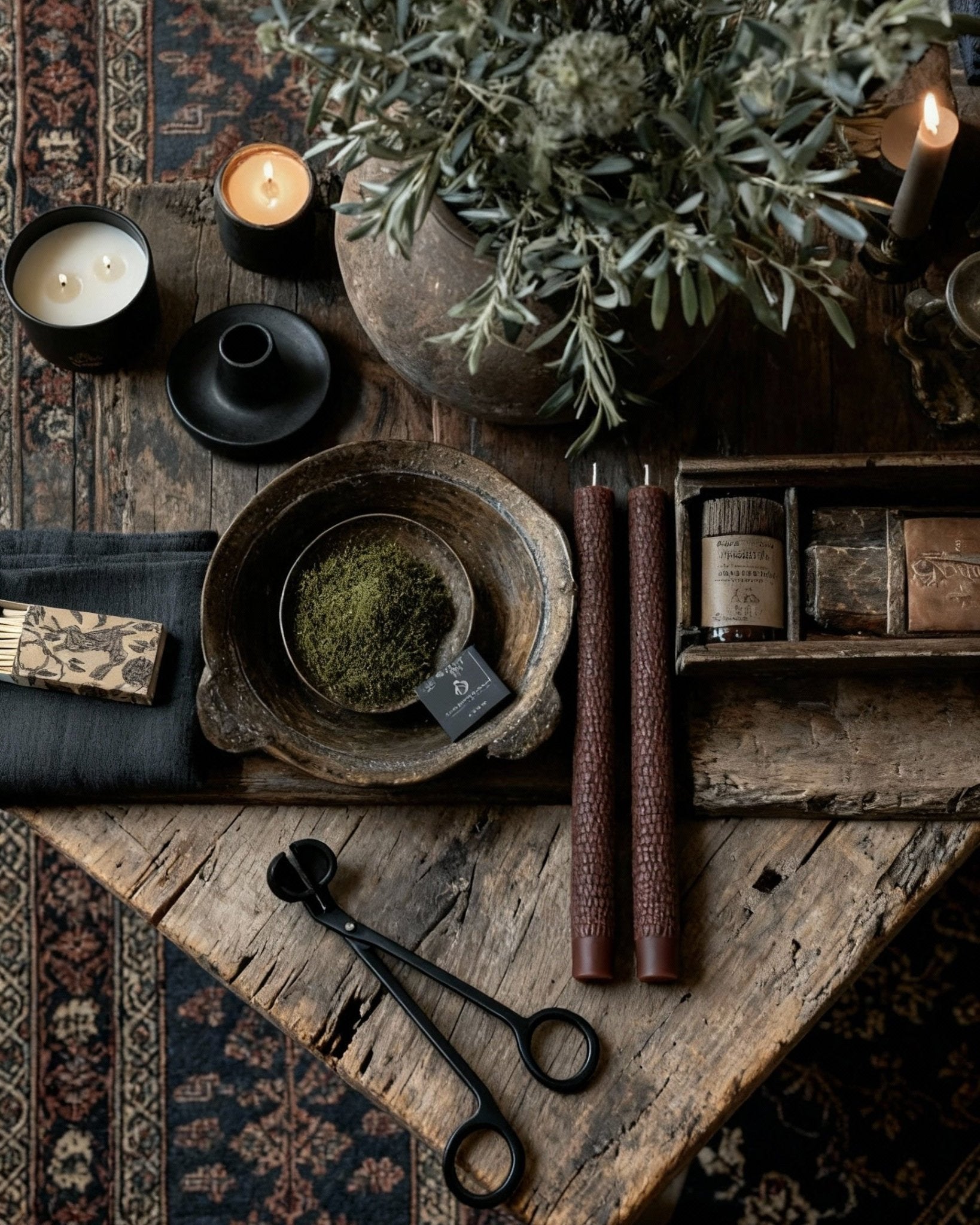
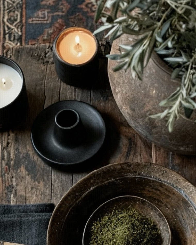
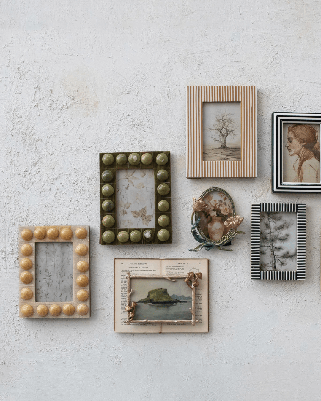
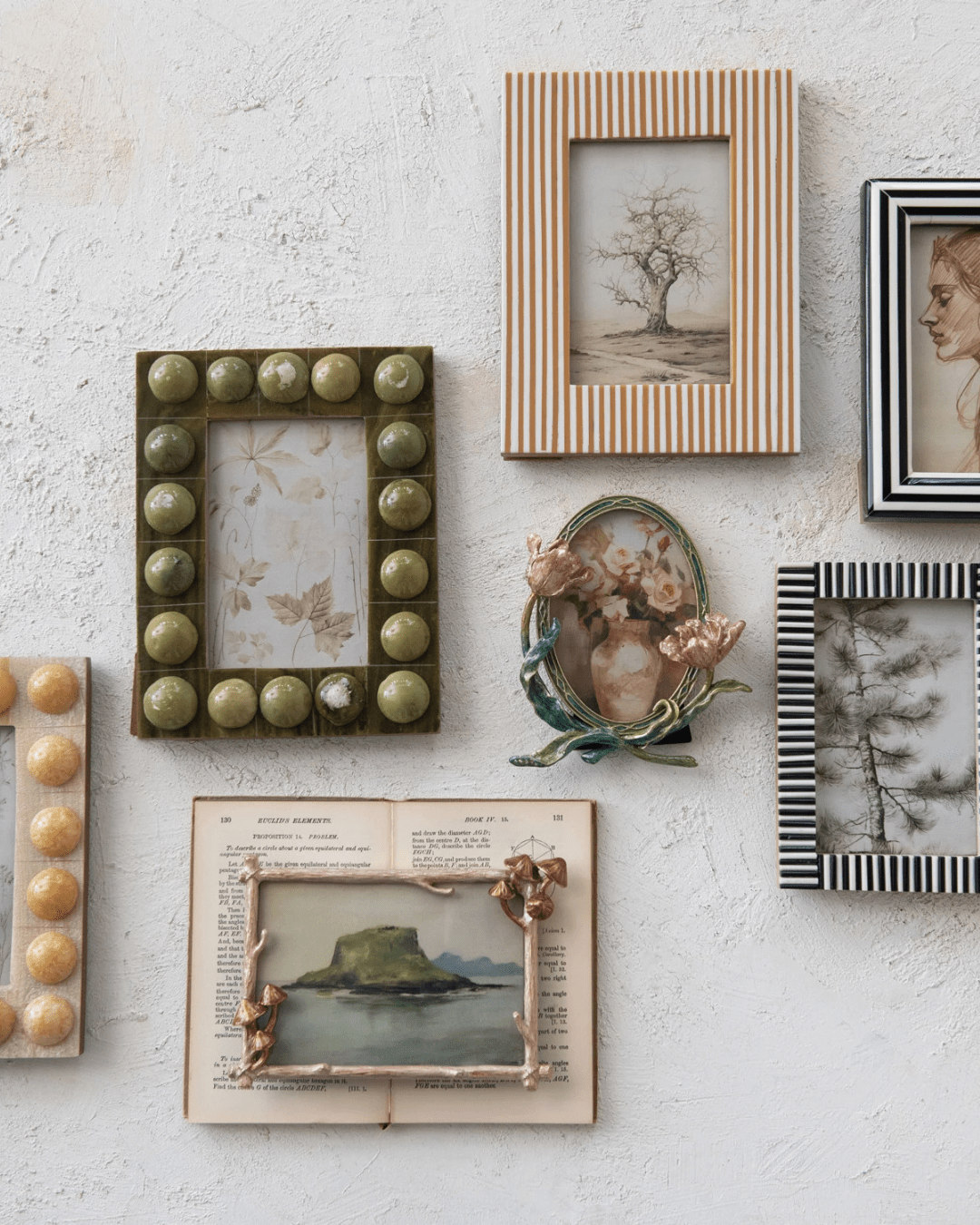
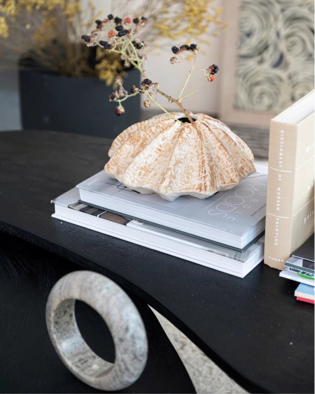
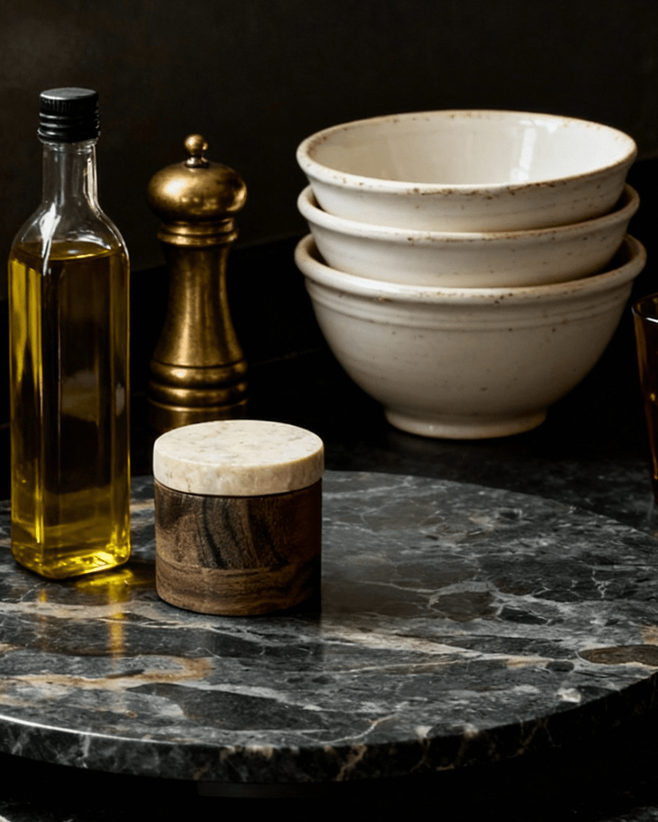
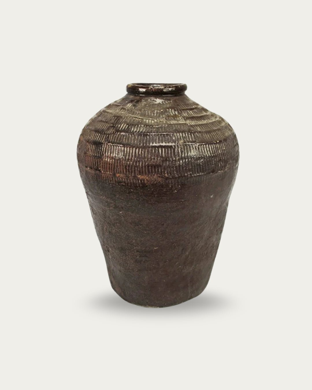
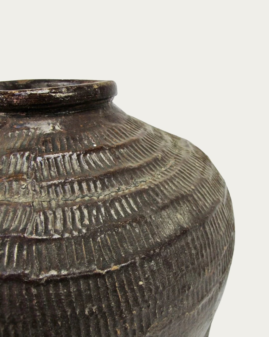
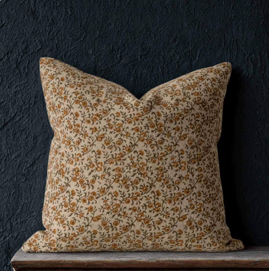
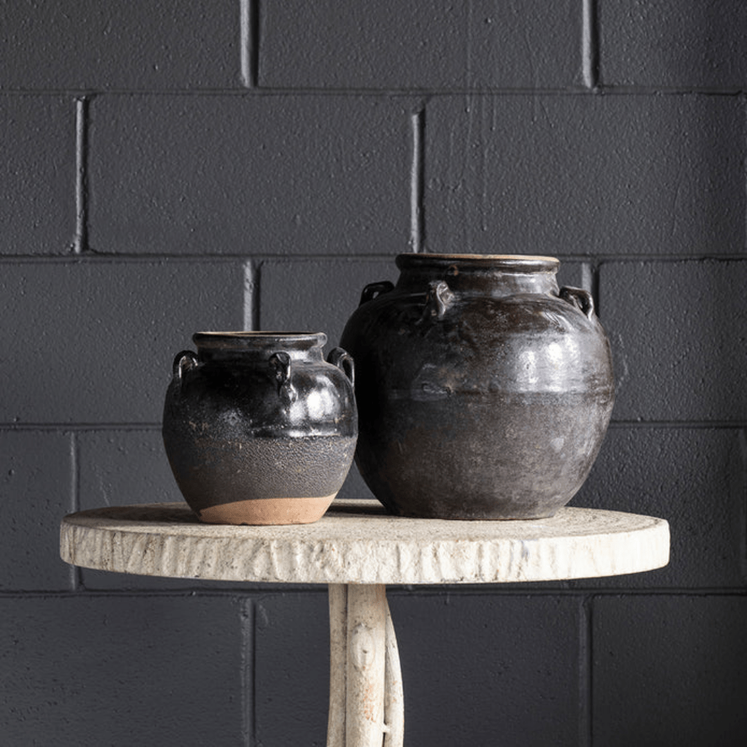
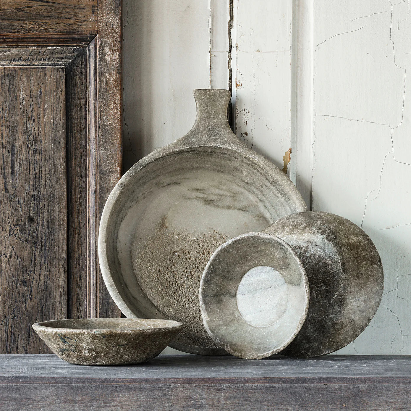
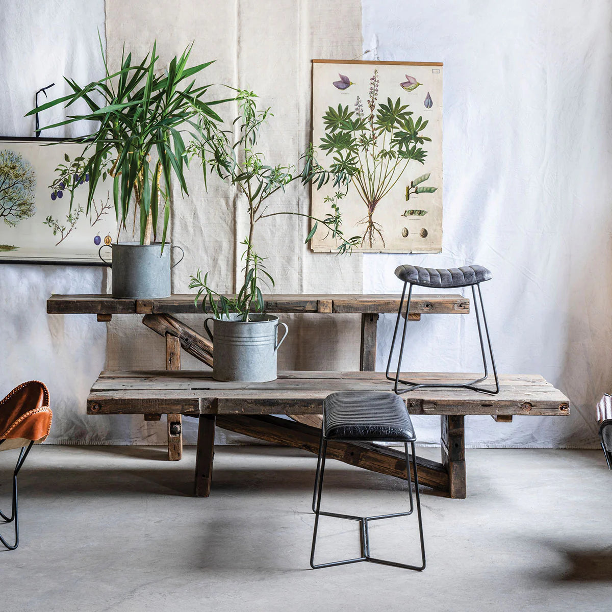
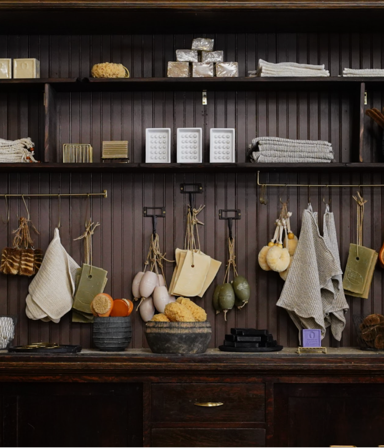
Anyone can throw a stool in the corner and a towel on the wall (and hey, we did one for ya). But that wouldn’t be glam enough for this client, nor would it play up the tile install. If the tile was art, then the styling needed to be, too. So we went with a romantic meets vintage meets flower market look. We’re loving it, and hope you do, too! So without further adieu, here are the after pics!

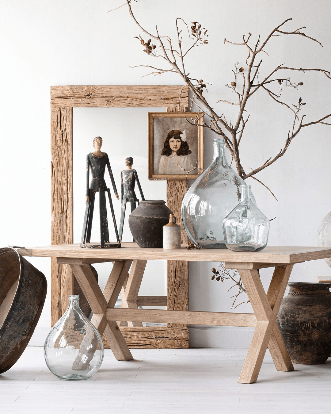
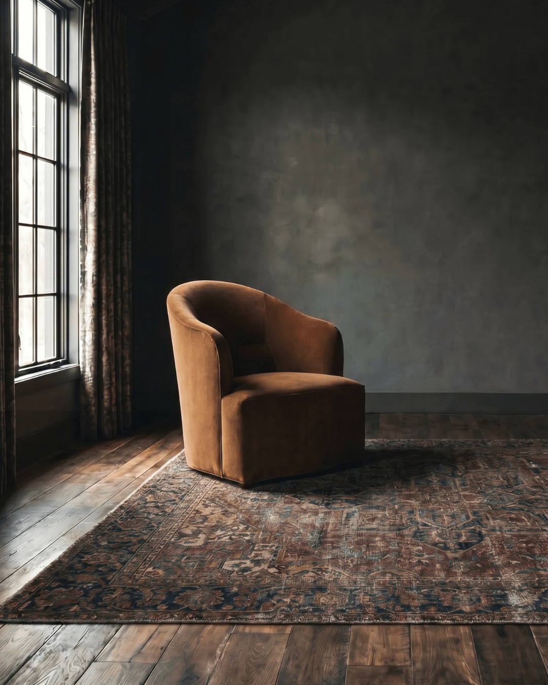
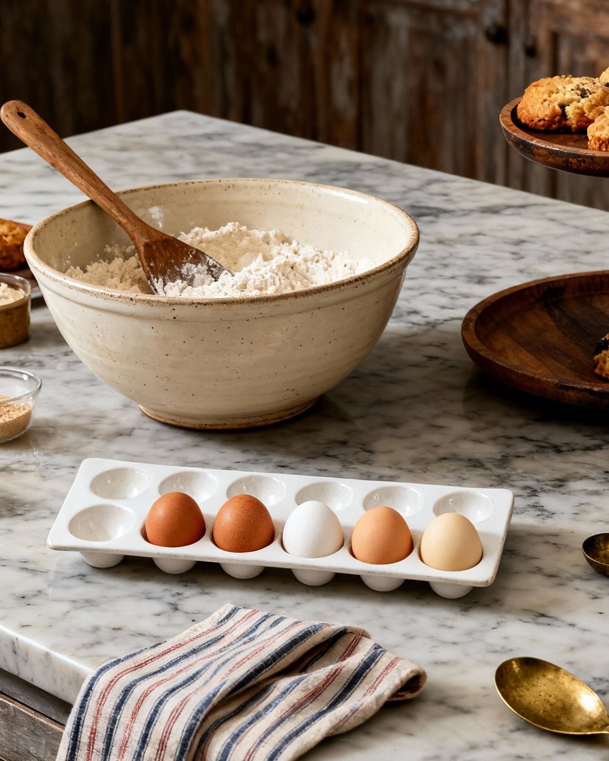
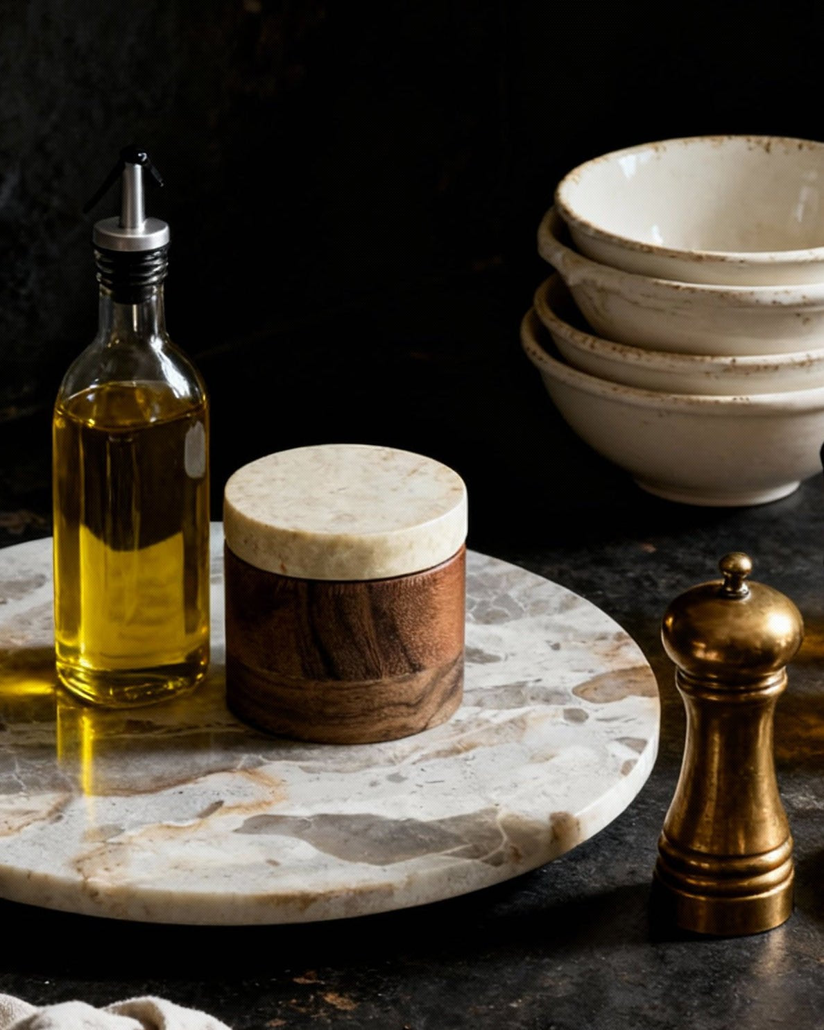
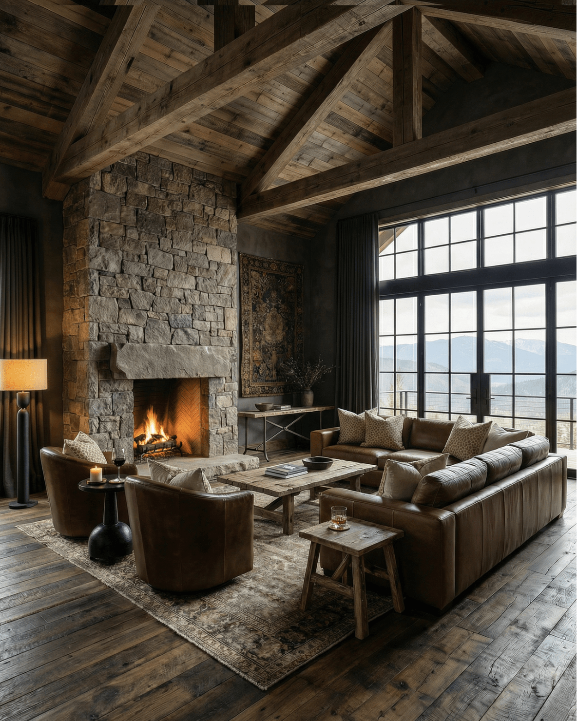
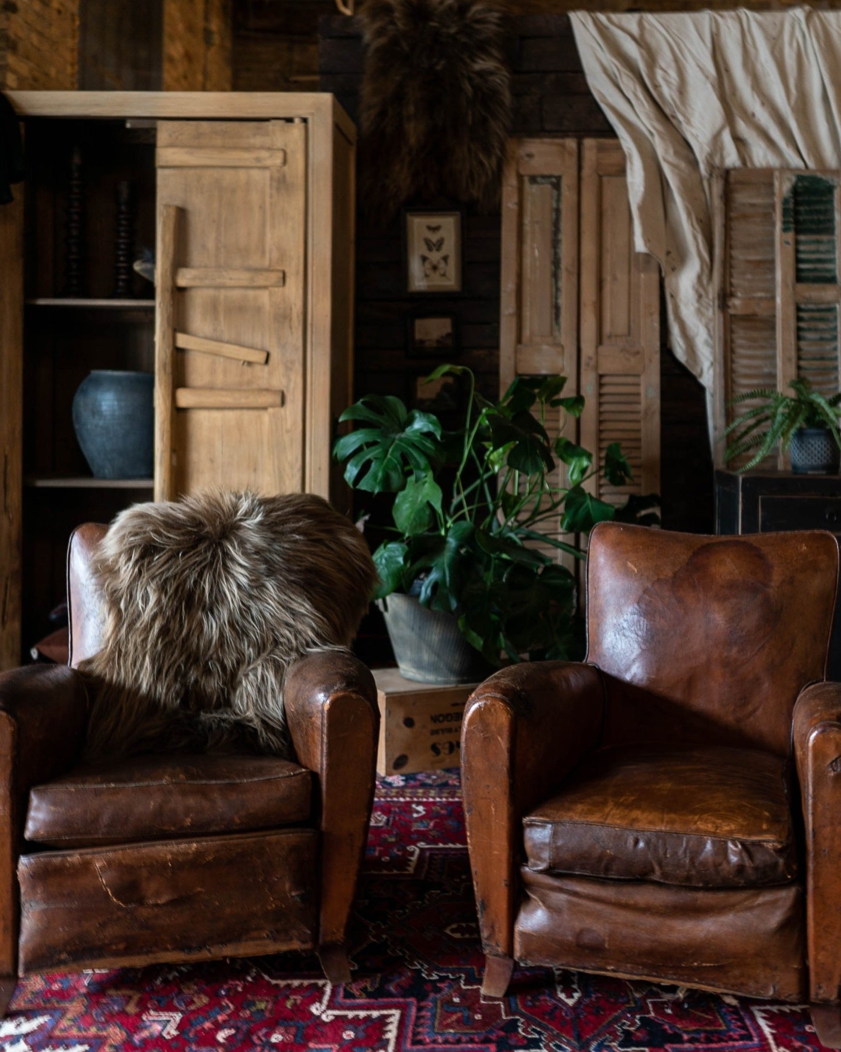
photography: Jordan Powers

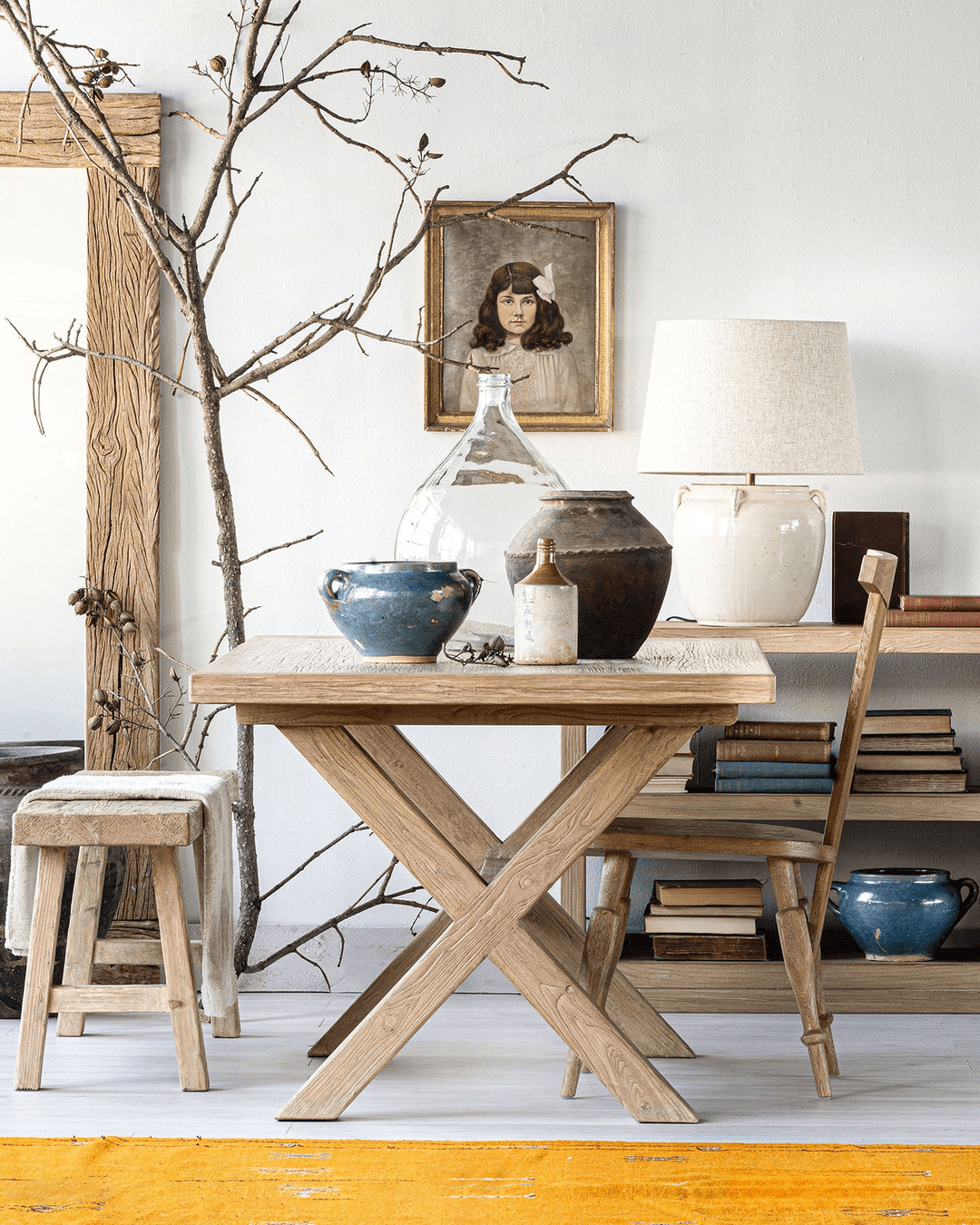
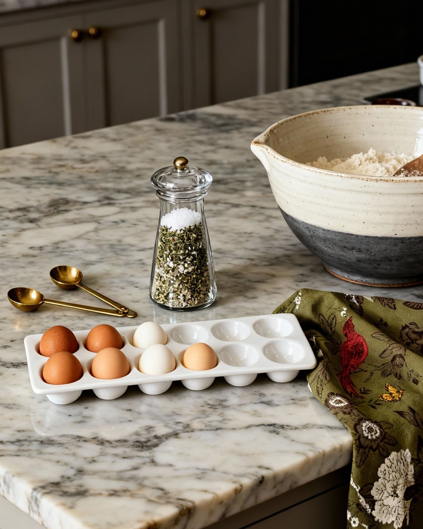
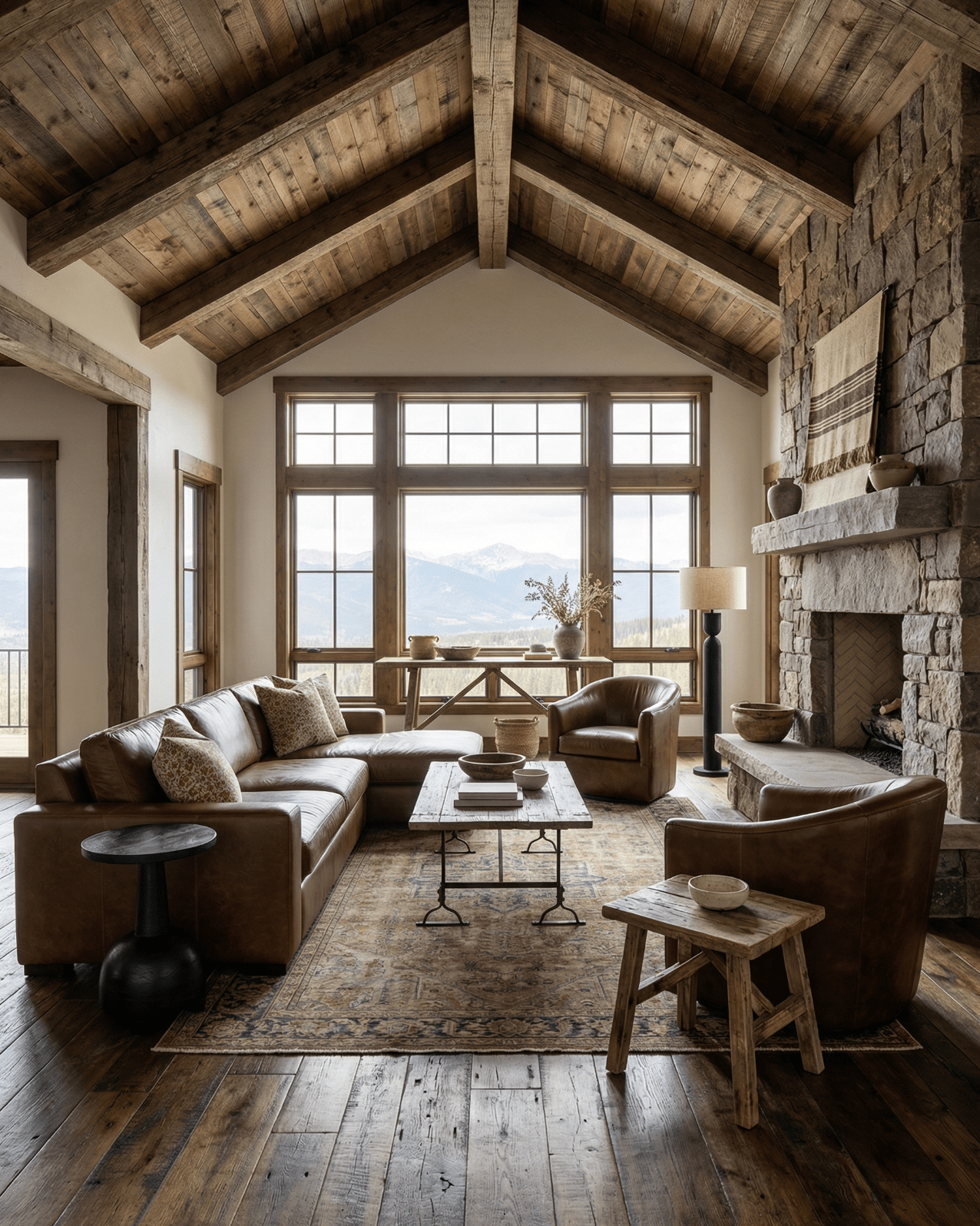
photography: Jordan Powers

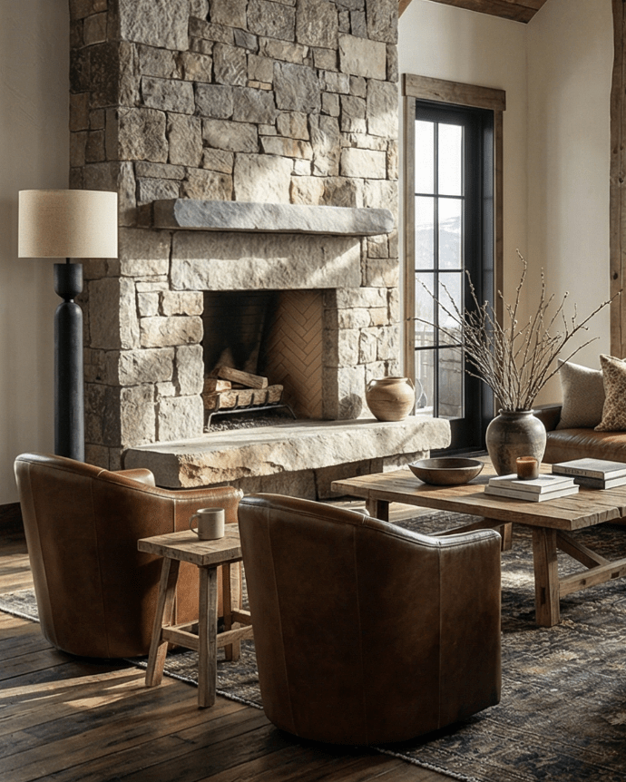
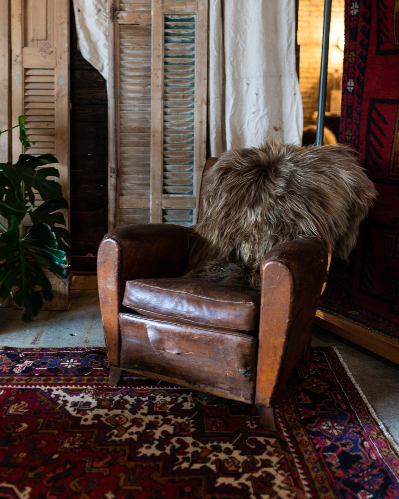
photography: Jordan Powers

photography: Jordan Powers

photography: Jordan Powers

photography: Jordan Powers

photography: Jordan Powers

photography: Jordan Powers

photography: Jordan Powers
AND THAT’S A WRAP!
Thanks so much for following along. Reminder to check out our other projects for this client. We’re starting the second bathroom now, and are nearly finished with the treehouse and 4 staircases. Make sure to follow us on Instagram where we do daily updates and don’t forget to check out all the other ORC participants!